A Visual History of OmniFocus for Mac

The Omni Group has been around for 25 years.

Founded in 1989 as a technology consulting firm, they used to build custom software for NextSTEP users until Apple bought NeXT in 1997. Now Omni builds and sells their own software for OS X and iOS. Not least of which is OmniFocus.

But did you know OmniFocus for Mac was somewhat built by chance?

OmniFocus’s roots are as an add-on to OmniOutliner Pro called Kinkless (kGTD), which was built and developed by Ethan Schoonover. Though it was incredibly brilliant, kGTD was a hack. It was a bunch of AppleScripts that sat on top of a single OmniOutliner document with some custom buttons and even some Quicksilver actions for quick entry.

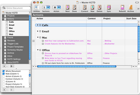
Here is what Kinkless GTD looked like (circa 2006):

Khoi Vihn's Kinkless GTD Setup

In 2006, Omni Group asked Schoonover, along with Merlin Mann, to help take the ideas and functions of kGTD and turn them into an official Omni task-management application…

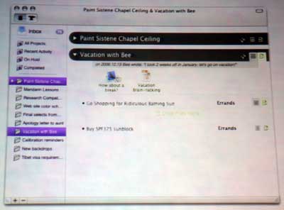
Here’s the first publicly displayed mockup of what OmniFocus could have looked like:

Original OmniFocus UI Mockup

After more than a year of private development with a group of about 500 alpha users, OmniFocus went into public beta in November 2007. At that time they also began pre-selling licenses and OmniFocus pre-sold over 2,500 copies in the first 5 days of the public beta.1

Finally, on January 8, 2008, OmniFocus 1.0 was launched.2

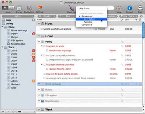
OmniFocus 1.0 (circa January 2008):

OmniFocus Version 1.0

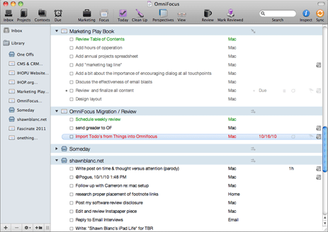
Here’s the latest public version of OmniFocus (version 1.10):

OmniFocus User Interface, version 1.8

As you can see, not much in the UI has changed from the original Kinkless implementation of 2005 to what OmniFocus is today in 2010. You could say that OmniFocus 2 is kGTD 2.

But all that changed with the beta of OmniFocus for Mac 2.

On February 1, 2013 the beta of OmniFocus 2 for the Mac was introduced.

Beta 1 of OmniFocus 2 (circa Feb 2013):

Beta 1 of OmniFocus 2 for Mac

Beta 1 of OmniFocus 2 for Mac

However, during the beta testing process, the Omni Group realized they needed to go back to the drawing board, and in June 2013 they pressed pause on the public beta.

Last year, during the testing window, I gave the beta 1 a good college try but just kept drifting back to my original version of OmniFocus that I’ve been using for the past 4 years. In short, I never felt all that comfortable navigating the previous OmniFocus beta.

However, earlier this week, Omni Group re-introduced the OmniFocus for Mac beta with a significantly updated design.

Beta 2 of OmniFocus 2 for Mac (circa March 2014)

Beta 2 of OmniFocus 2 for Mac

There are quite a few noticeable changes between the beta 1 and beta 2 designs of the new OmniFocus for Mac.

For one, the left-aligned checkboxes have been swapped out with right-aligned checkcircles (a cue from the iPhone app). Additionally, the whole task hierarchy now has a clear structure that flows from left to right.

On the left-most side are the tabs for different views, then in the next column is the list of information relevant to the selected tab, next to that is the main task list displaying the tasks for the project, context, or date selected, and then on the right-most pane is the task’s information panel where you can fine-tune metadata related to that task if you so desire.

Aside from the right-hand alignment of the new checkcircles, I think every one of the changes in this newest OmniFocus beta is an improvement on an app that has been desperate for a visual overhaul for years.

The new beta version of OmniFocus for Mac feels peaceful to me. It’s open, clean, organized, and logical. I like it.


  1. Contrast that against today’s public beta which has 30,000 users on the list.
  2. It seems like OmniFocus has been around for ages, but it’s actually younger than the iPhone.
A Visual History of OmniFocus for Mac

Checkmark 2

Here is a huge update to my favorite location-based reminders app, Checkmark.

In addition to location-based reminders, Checkmark 2 now supports scheduled and repeating reminders as well as a general project/list section. So not only is Checkmark the best app for location-based reminders, but it now aims to be your one-stop shop for all tasks and reminders, regardless of when, where, or what they are for.

I’m still deep into OmniFocus for my general to-do list, and I usually use Siri or Fantastical for setting time-based reminders. But the location-centric stuff in Checkmark is the best there is, and now it’s even better than before.

The big update with how Checkmark handles the location-based reminders is that you can now create location groups. Hooray!

Now, I don’t know about you, but my wife and I don’t shop at just one grocery store all the time; we shop at like six. In Checkmark 2, I created a location group with all the grocery stores we shop at. Then, no matter which of those stores I show up to, Checkmark will remind me of any items I’ve added to that group. (Gosh would I love to see shared reminders with this.)

Here’s how you create a group:

  • You start out just like you would create a location.
  • From the “Where” section, tap the plus button and name your location (example: “Grocery Stores” / “Hardware Stores” / “Ice Cream Shops”).
  • Next tap “Add from map” to search for the places you want to add (or Add from location if you’re at the place you want to add).
  • Once you’ve found one of the locations and the pin for it has dropped, then tap into the search box again to search for the next place you want to add.
  • Once you’ve got all the pins for that group dropped, then tap “Done”
  • Select your icon and tap Done again.

Now you have a location group and you are on your way to being the the master of never forgetting to check out this season’s sink selection next time you go to the hardware store to buy charcoal for your grill.

You can add or remove locations from a group by tapping into that group, tapping the settings gear icon in the upper-right corner, and then editing the location. I have found creating and editing groups to be a little bit finicky at times. But once a group is created, then your golden.

In addition to the awesomeness of the new groups feature, Checkmark is still faster than using any other app for adding a location-based reminder (even for specific spots, not groups). And, most importantly, Checkmark is incredibly reliable for triggering upon the arrival / departure of a location.

My one quibble with Checkmark is it’s assumption that time-based reminders are the most important. When launching Checkmark, it opens to wherever you last were in the app. If however, the app has been cleared from memory since the last time you launched it, or if you’ve restarted your iPhone, then Checkmark’s default landing screen is the “When” section. And currently there’s no way to change this setting. Which oftentimes means creating a new location-based reminder requires two additional taps: one to open the basement menu and one to tap the “Where” tab. But this is a minor quibble, and I’ve heard it may be resolved in a future update to the app.

I’ve long been a user and a fan of Checkmark because I think it handles location-based reminders better than any other app out there, including Apple’s own Reminders app. You can snag Checkmark 2 in the App Store for just $3.

Checkmark 2

This Is a Review of Day One’s New Publish Feature

Day One Publish

In a nut, the new Publish feature in Day One is a way to share your thoughts and memories with your closest friends and family or with the whole world.

Publish lets you selectively upload Day One entries to the Web, and from there you can share the URL with whomever you like.

For example, here is an entry in my Day One journal about my recent excursions at a local coworking space. And here’s another entry with a rating/review of this morning’s cup of coffee.

As of this review, you can only publish an entry via the iPhone app, though there’s a soon-coming update for iPad that will allow publishing. Meanwhile, the Mac app has been updated to support the new custom Publish metadata (such as views on an entry, retweets, etc.), but an update to the Mac version that allows you to publish entries won’t be available until later this year.

To publish an entry from your iPhone, start by creating an entry (or going to one that you’ve already made) in Day One. Then tap the little ribbon-bookmark icon in the bottom left corner (that’s the Publish icon). If it’s your first time you’ll be prompted to create an account, and then you can publish that entry to the Web.

Before publishing, you get control over if that entry is auto-posted to your Twitter, Facebook, or Foursquare account. You also get to choose if the location of that entry is shared.

Once you’ve published an entry, the Day One app will show you stats about how many people have viewed that entry and how many liked, faved, or RTed your tweet / Facebook status update about that journal entry. And Published entries are quickly identified within your Day One app’s timeline view because of their blue date instead of black. Moreover, you can update a published entry and/or remove it from being published.

You don’t have to share your published entries with your legions of social network followers. You see, people can only get to entries that they have the direct link to. So, say, for example, you publish two entries: one you share with all of your twitter followers and the other you share with just your family. Well, neither group will ever come across a link that would send them on to the other entry you published.

Day One Publish is not like a blog where links to other entries are auto-generated and once you come across one you can find all the others. No, each published entry is an island.

I asked Paul Mayne, the man behind Day One, to share a bit more about just how private / non-discoverable published entries are and why there is not an option for password protecting them. Paul wrote to me in an email, saying:

By default, published entries are hidden from search engines and visible only to anyone you give the URL. Of course, if you are sharing to a public feed on Twitter, Facebook, or Foursquare, the URL will be indexed and searchable.

We feel our current approach is a solid solution to share entries semi-privately with close friends and family. Also, we’re planning to add an option to easily share published entries via email in a future update.

I’m satisfied with how Day One handles the privacy of each entry. I’m obviously never going to publish anything that is so sensitive or personal that I wouldn’t want just anybody to come across it. If and when there are certain journal entries that I don’t want to be online at all but that I do want to share with close friends or family, it’s quite easy to just email those entries from within the Day One app.

After using Day One’s Publish feature for the past two weeks, I think it’s cool on a couple of levels.

For one, Publish gives you the chance to share moments you want to share. And thus, it actually gives a bit of “social motivation” to enter things into Day One. The truth is, we like to share thoughts, photos, quotes, and musings with the world, but a lot of times we also want to save those moments for later. Publish is a classy way for us to create journal entries in our own personal journal, but then, with the tap of a button, we can share those entries with whomever we want — even the whole world.

Secondly, with Publish, the Day One team also wins because when people share their Published entries they are, in a sense, advertising for Day One. They’re providing an awesome service to current users that will, in term, generate new users, and therefore make the app’s development more sustainable and profitable.

This brings me to another question I asked Paul, regarding the cost of Publish and if it would be free forever. He replied that the current offering is free, but they are looking into additional premium features in the future.

Also, Paul wrote to me saying: “We’re currently hard at work on Day One 2.0. A cool feature with it will be current and historical activity feeds as starting points for creating and adding entries to Day One. We are [also] working towards enabling more web-based Publish and Day One features.”

* * *

The whole point of a journal (digital or analog) is to chronicle as much of our life as we are willing. I’ve been using Day One for a couple of years now, and the more I use it, the more I get ideas for how to use it better.

The guys at Day One say that Publish has been a side-project of theirs since the very beginning and is the start of “an exciting 2014 for Day One.” In my short time with Publish, I’ve found that it has a surprisingly ancillary effect of encouraging the journaling process just a little bit more. I still consider Day One to be the best journaling app out there, and if this is just the start of what they’ve got in store for updates coming this year, then I’m excited to see what’s next.

You can get Day One for iPhone + iPad here and the Mac version here. Although, right now you can only use the Publish feature from the iPhone version of the app.

This Is a Review of Day One’s New Publish Feature

Unread for iPhone: A New Breed of RSS Reader

There are some apps which, due to the nature of their usage and/or contents, seem to earn a more personal connection from the user than other apps. Twitter apps I think are like this because they’re filled with the life updates, corny jokes, and selfies of our friends and family. Writing apps also can garner a connection with their users because they serve as the tool where we express our thoughts and feelings.

And though one might expect an RSS app to be insipid, or, at best, utilitarian, I find them quite the opposite — because they’re filled with the recent articles, photographs, and stories of my hand-chosen, favorite writers, photographers, and news outlets.

An RSS reader is the window into your curated world.

* * *

Like so many other life-changing moments, my relationship with RSS readers began in a church pew.

It was a Sunday morning in early 2007, and our Church had Wi-Fi, and I was sitting in a back corner with a friend, and instead of using my PowerBook G4 to take notes I was surfing the web reading all my favorite blogs.

If you’ve read my review of NetNewsWire, you’re already familiar with the story: I used to keep all the blogs I enjoyed reading in a bookmark folder in Safari on my Mac. But that Sunday morning, sitting next to my friend, he introduced me to an RSS reader.

“You can follow all those sites in one spot, you know?”

I didn’t know.

He set me up with the RSS reader in Safari (which has long since been removed). But I soon moved on to Vienna, and then NetNewsWire 3.1 on the Mac (which, in my humble opinion, is one of the all-time best pieces of Mac software ever).

I’ve also used Google Reader, NewsGator Online, Reeder for Mac, iPad, and iPhone, ReadKit, NetNewsWire on my iPhone, Byline, Fever, and probably a few more.

And now, today, we have Unread. It’s a brand new RSS app for the iPhone, and it is fantastic.

Unread

I have been using Unread throughout its beta period for the past two months, and in that time it has quietly usurped the previous RSS reader on my home screen.

Unread works with Feed Wrangler, Feedbin, and Feedly. I’ve been using it with my Feed Wrangler account and it loads my unread items extremely quickly.

Unread is also very fun. It’s full of subtle animations and easy gestures. The app is understated, extremely readable, and welcoming.

It’s not that there’s anything in particular. There’s just a simple elegance to it. The app is well designed and nice to use.

It’s on launch sale for just $3 and I think it’s worth 10 times that. I paid $30 for NetNewsWire on my Mac half a decade ago, and now, years later, I’m using Unread on my iPhone instead.

Unread is somewhat different than any other app I’ve used before. And yet it’s also quite familiar. It has all the expected features — you can send an article to Instapaper or share it on Twitter or text message it to your friends — and yet they feel unexpected. The share sheet slides in from the right-hand side, and feels akin to the bouncy and playful animations of Tweetbot 3.

Design

I’ve long been a fan of Jared Sinclair’s design taste, and I consider Riposte to be one of the finest apps on my iPhone. I can’t put my finger on precisely what it is, but if I had to explain it in one word then I’d say Unread is peaceful.

But my hunch is that Unread will prove to be a somewhat polarizing app. Some, like me, will love it. Others, undoubtedly, will not like it.

The app has nearly both feet in iOS 7, but there is still a toe or two in iOS 6. There are little things — such as the design of the status bar at the top of the screen — that still feel reminiscent of iOS designs from yesteryear. But don’t read that as a dig against the app’s design…

The status bar doesn’t look like it belongs in the past, but it does have a slight nostalgic feel to it that is reminiscent of the more skeumorphic, graphics-heavy iOS designs of old. I am a fan of the status bar.

Gestures

When talking about Riposte, developer Jared Sinclair, said this:

We take push/pop transitions at face value: swiping to go back is like pulling yourself back to where you were before. If I can’t picture an app as a set of cards laid out in a grid on a table, I can’t understand it.

That exact same gesture-reliant design philosophy is prevalent all throughout Unread as well. The set of cards include (starting at the left-most, topmost “card”) the Home screen, the list of subscribed feeds and any folders or groups, the list of articles in those feeds, and then the article itself.

Hovering (theoretically) at all times to the right, is the share/action card. Pulling from right-to-left in any screen slides in the share sheet. From there you get access to a list of relevant actions and settings.

Unread App - Share Sheets

Common settings include changing themes (dark, light, and others), marking all articles as read, and more.

But the action sheet shows different options based on the context of when it was summoned. If you’re acting on a specific article, for example, then you have the option to “Share” the article and thus send it to Instapaper, Pinboard, OmniFocus, Twitter, your Safari Reading List, and more. To share a specific article directly from the article list view you have to tap and hold on that article.

By using this gesture-based share sheet, Unread has no persistent toolbar when reading an article. When in the various list views you see the status bar on top and a “navigation” bar on bottom that tells you where you are in the app. But when reading an individual article, you’re in full screen mode with nothing visible but the article itself.

Navigation and density

Unread’s home screen is where you start with access to the app’s settings and other special miscellany, as well as the RSS syncing platform of your choice (FeedWrangler, Feedbin, and/or Feedly). You then drill down to the high-level list of your feeds under your syncing engine account, and from there you can select which list of your articles you want to dig in to: all unread, all articles, one of your smart streams or folders, or your specific site feeds.

All of these sections — these “cards” — exude the basic design philosophy and opinion of Jared Sinclair: that the app would be a relaxing and enjoyable experience. But it is especially present when perusing down your list of individual unread articles.

Unlike most other RSS apps I’ve used, Unread shows considerably more content-per-article when viewing the list of articles. I’m used to seeing a condensed list of articles that shows each article title and time of posting (akin to email). In Unread, however, you see the article title, name of the website, time of posting, the first few sentences of the article, and, if there is an image as part of the article, then the image is shown as well.

Unread is not dense.

Unread App - Article List View

At first, this less-dense view irked me. But I quickly acclimated to it and now prefer it, even look forward to it.

Scrolling is free. In a context where I am assessing each individual article to decide if I want to read it or not, viewing just 2 or 3 article summaries on the screen at a time can be just as efficient as viewing 5 or 6 headlines. In fact, I’d argue that this less-dense list view is more efficient. For one, it presents more data per article, allowing you to read a bit of the article to help with your decision to drill down and read it in its entirety or not. And secondly, it is far easier to make a choice between 2 options than 6.

Quibbles

I do have a few nits to pick, however.

  • As it is now, when you are done reading an article, you can not go directly on to the next unread article. It would be nice to be able to go from one unread article to the next without having to go back to the list first.

  • By default, unread items persist in the list of articles (in a grayed-out state). You can get around this by tapping directly on the unread item count in a list instead of tapping on the list’s name in which you will see only the unread items in the list. However, I wish this behavior were reversed.

  • When you’re going to read a web page, the previously-loaded web page is there waiting for you until the new one comes up. Something about this feels slow or unconsidered to me.

Hooked

It was the design of Unread that hooked me right away — the app is clean, friendly, and warm, and all its type is set in Whitney — but the more I used it the more I began to appreciate and enjoy the functionality and feature decisions built into the app.

Unread is refreshingly simple and elegant. If you subscribe to RSS feeds and read them on your iPhone, take some time and use Unread for a while — I think you’ll be glad you did.

* * *

You can get Unread on the App Store (still propagating) for just $2.99.
Unread for iPhone: A New Breed of RSS Reader

The CODE Keyboard with Clear Switches

It’s quite easy to nerd out over mechanical keyboards (I have the blog posts to prove it). There is a type of satisfaction that comes with typing on a mechanical keyboard that is rare in our touch-screen, trackpad, chicklet key world. The thud, the click, the clack — the physical work it takes to type — of a mechanical keyboard is something that hooked me once I experienced it.

My first mechanical keyboard was the Macintosh version of the Das. It’s splendid, but giant. After testing a half-dozen other mechanical keyboards over the course of a few months, I’ve been using a Filco Majestouch-2 Ninja for quite a while now and I think it’s fantastic. The Filco Ninja is tenkeyless, well built, and uses the Blue switches.

I did not order a CODE Keyboard when it went on sale because the keyboard uses Clear switches which I knew I didn’t want.

My cousin, however, did order one, and over the holiday he brought it out to Kansas City so I could use it for a few weeks and then he left it with me to use for a while because he’s cool like that.

I’ve been typing on this keyboard since December 21st and my consensus is this: The CODE is an awesome keyboard, but I don’t like the feel of the Clear switches.

Right off the bat, anyone familiar with a keyboard using the popular Blue switches, will notice that the Clears are quieter. They are more muted and produce a “thud” rather than a click. The keyboard is quieter but not necessarily quiet. If you were in a small office, sitting next to someone, the keyboard is still going to make a bit of a thud and clack as the key caps themselves bottom out when you’re typing, but there isn’t the neighborhood-waking click-clack that accompanies the Blue switches.

The CODE Keyboard has been sold out for a few months primarily because of the difficulty of getting Clear switches. On the keyboard’s website they’ve posted a few updates (one last September and another last November) stating that new keyboards are in production and will include a variety of switches to chose from: Green, Brown, and Blue.

The Green switches are a new switch. They’re pretty much identical in sound and feel to the Blue switches in that they are tactile and clicky, but the Green’s have an actuation force of 80g and a bottom-out force of 105g (the Blue switches are 50g and 65g respectively). Thus, the Greens are going to offer noticeably more resistance than just about any keyboard you’ve ever used.

If/when the CODE keyboard becomes available with Blue switches, I’ll buy it in a heartbeat. Of all the different types of mechanical keyboards I’ve tried, I still remain a fan of the sound, feel, and tactile feedback of the Blue Switches. The CODE keyboard is of equal build quality as my Filco Ninja, but the LED backlighting of the CODE is just fantastic and I love it. It’s unfortunate WASD Keyboards don’t let you build a custom keyboard with LED backlighting as an option.

The CODE Keyboard with Clear Switches

First Thoughts on Writer Pro for iOS

The iPad makes for a fantastic writing device.

A cup of hot coffee, my bluetooth keyboard, and my iPad makes for one of my favorite ways to write. The one-app-at-a-time mentality along with the relatively difficult way to switch between apps (when compared to the Mac’s CMD+Tab) make iOS a pretty good “anti-distraction writing enviroment”.

Moreover, there are some truly exceptional writing apps for the iPad.

Over the years I’ve spent a lot of time with a lot of writing and note-taking apps. The ones that have stood out to me the most?

  • Simplenote (which I don’t really use for long-form writing, but I do use often because I have lots and lots and lots of notes in there).
  • iA Writer: For whatever reason, I never got into iA Writer all that much (neither on the iPad, iPhone, or Mac). Mostly because, as silly as this may sound, it didn’t have a “night theme”.
  • Byword: What I use on the Mac for all long-form writing.
  • Writing Kit: I used this app for quite a while because of its built-in web browser and several other nifty features.
  • Editorial: the iPad markdown writing app that changed the world.

Now, I am, of course, writing this text in Writer Pro on the iPad. It just came out a few hours ago and so naturally I can’t say too much about it yet. But iA Writer has a well-deserved fantastic reputation, and this new version of the app — Writer Pro — promises to take things to the next level. And, clearly, it does.

Is Writer Pro a significant upgrade from iA Writer? Absolutely.

Writer Pro has all the simplicity and charm of its predecessor but now applied to the whole workflow of writing process — from idea to done.

What’s special about Writer Pro is its obsessive focus is on the writing process. There are four “sections” your documents can be slotted in to: Notes, Writing, Editing, Reading. Each section has its own typeface and cursor color. The “Writing” section is, more or less, what the whole iA Writer app used to be.

This is an organization structure I could get behind. I follow this concept loosely already by keeping all of my notes and ideas in Simplenote and all of my “currently writing” articles in Dropbox (where I use Byword on the Mac and Editorial on the iPad). No other app that I know of has this sort of persnickety focus and structure.

So, after poking around and doing some typing, do I find Writer Pro awesome enough to pull me away from my current apps? It’s early to say, but I don’t think so…

I have three quibbles:

  • Unfortunately, Writer Pro on iOS has no auto-markdown completion, nor markdown syntax highlighting.

  • Secondly, there is no document storage option like iA Writer had (in iA Writer on iOS you could chose iCloud or Dropbox for document syncing). Writer Pro syncs with iCloud or nothing. Which means your documents are sandboxed into the app. And there is no export option to get out all the documents at once. (You can email individual documents out of the app.)

And, from what I can tell, if you use iCloud document syncing for both iA Writer and Writer Pro, the two apps do not have access to one another’s files. But, since Writer Pro on the Mac can access documents you have in Dropbox, if wanted to use Writer Pro on your Mac you could keep it in sync with iOS apps that have access to Dropbox (such as Byword, Editorial, etc.).

  • Third, when writing in Writer Pro with a Bluetooth keyboard (as I am now) the custom keyboard row does not persist at the bottom of the screen. And so to get access to the custom Editing and Syntax highlighting buttons you have to bring up the entire soft keyboard, tap your options, and then dismiss the soft keyboard.

Update: Anton Sotkov points out that the keyboard shortcuts in the Mac app work on iOS as well.

Update 2: The Writer Pro team told me via Twitter that many of these issues will be gone in future updates. I understand that you’ve got to draw the “1.0 line” somewhere, and I have a lot of appreciate for opinionated software like iA Writer and Writer Pro.

Is Writer Pro an impressive, beautiful, and useful piece of software? Absolutely. Is it going to find a place in my iPad writing workflow? I don’t think so.

First Thoughts on Writer Pro for iOS

The Olympus E-PL5 Mirrorless Camera: My One-Year Review

It’s been a year since the Olympus E-PL5 showed up at my door, and I want to give a report.

The Olympus E-PL5

The Olympus E-PL5

The E-PL5 is the first nice camera I’ve ever owned. A year later, as I look back at how often I’ve used the camera, the pictures I’ve taken with it, and what my opinion is of the camera itself, the short answer is that I still use it regularly and often, and I’m still very happy with it.

It was the fall of 2012 that I began researching mirrorless cameras to find a setup I could easily take with me anywhere I went, and which cost under $1,000 (for the body and a nice prime lens). I wanted the camera to have an Auto mode so I could just point and shoot if I needed to (I still am a beginning photographer, and don’t always know which manual adjustments to make to get the exposure right). I also wanted an Auto mode so I could hand the camera over to a family member to let them point and shoot with. But it also needed to have good manual modes so I could learn and grow into the manual controls as I learned more about the technical details of photography.

The setup I went with was the then-new Olympus E-PL5 and the world-famous Panasonic 20mm f/1.7 pancake lens.

As I mentioned in my official review, it was the iPhone that actually led me to getting a better camera. I was taking more and more and more pictures, but wasn’t doing much with them other than keeping them on my iPhone. A year later, I still couldn’t be happier about my decision to get a nice camera and I am still very happy with the camera I chose.

I’ve had and used the E-PL5 through Thanksgiving 2012, Christmas, my son, Noah’s, first birthday, a few trips to Colorado, a trip to San Francisco, a camping trip, a trip to New York, the birth of my second son, Giovanni, and countless other weekend and weekday excursions.

Last year we bought several new photo frames to put around the house. And every couple of months I order a few new 8×10 photos printed from Shutterfly and we swap out all the pictures in the house. It’s inexpensive1 and it’s so wonderful to have high-quality photos of our kids and family.2

Something we did last year, and which we’ll do again this Christmas, was get a few of Apple’s iPhoto photo books. Photo books make great Christmas presents to parents and grandparents. Last year’s book was half photos from my iPhone covering January through October, and then half photos from my E-PL5 covering November and early December. This year the photo book will probably be 90-percent (or more) E-PL5 photos.

I still consider the E-PL5 to be one of the best-kept secrets in the mirrorless camera landscape. For the body only, it’s very reasonably priced. And it’s fast, has great battery life, works with all the micro-four thirds lenses, is well built, has 4-axis in-body image stabilization, and has the same sensor found inside the critically acclaimed Olympus E-M5. It’s a beast and it won’t break the bank.

On Twitter I was asked if a better camera in this space has come along. For the same price as the E-PL5, no, I don’t think so.

Of course, since I got my E-PL5 a year ago, the mirrorless camera landscape has improved quite a bit. There’s now the Fuji x100s and X-E2, the Olympus E-P5, and the new Olympus E-M1 (to name a few). These are all really great, but they’re also all more expensive than the E-PL5.

You can get the E-PL5 body and a very nice prime lens for about $800-$900 (depending on the lens you pick). The E-P5 is $900 for the body alone; the Fuji x100s is $1,300 and comes with a great lens (that cannot be swapped out), but it is not a beginner’s camera.

In my opinion, someone looking to get a great camera and a great lens (where by “great lens” I mean “a prime lens” — not the kit zoom lens), can’t go wrong with the E-PL5. It’s compact, it’s easy enough to use that a beginner could pick it up and take decent shots with it (no comment about technique), and it has most of the same internal components (same sensor, similar IBIS) found in Olympus’ top-of-the line cameras, the E-M1 and the E-P5.

Here are answers to a few other questions I got from folks on Twitter:

  • What’s the best first lens? The Panasonic 20mm f/1.7. It’s one of the less expensive among the good prime lens selection; it’s a pancake lens, so it takes up very little space; it takes wonderful photographs; and the 20mm focal length (which is the 40mm equivalent on a full-frame camera) is in the sweet spot range for all manner of photos. So, if you don’t know which lens to get, get the Panasonic 20/1.7.

Other great lenses include the Panasonic 25mm f/1.4, the Olympus 45mm f/1.8, and the Olympus 17mm f/1.8. I’ve rented the 25/1.4 and the 45/1.8 and they are both fantastic.

  • What is your most-used lens? Just the one I have: the panasonic 20/1.7. It’s a fantastic lens for the price and size. My favorite lens of all the ones I have used is the Pany 25/1.4, but I like the size of the 20/1.7 pancake too much. And, since the 20mm and the 25mm are so close in focal length, it seems silly to keep them both.

  • Have you been tempted by any other cameras? Yes; the E-P5. It has all that’s awesome about the E-PL5, but in a nicer body with more manual controls (without giving up automatic modes), and with an even better sensor and IBIS. However, the E-P5 is several hundred dollars more expensive, and I honestly don’t know if that increase in price is worth it for me at my current skill and usage levels.

  • How do you travel with it? For outings, I use my DSPTCH strap. As for a case, I don’t have one yet because I haven’t yet found one I like (well, the Hard Graft camera bag looks gorgeous, but I’d rather buy a lens).

  • What do you wish was different? What annoys you about the camera? The same thing that I’m tempted by with the E-P5: I wish the E-PL5 had better manual dials. You can set it in Aperture or Shutter priority modes, but you have to use the menu dial to quickly change the aperture / exposure / shutter settings. This can be a bit awkward or inaccurate. But… It doesn’t bother me so much to dislike the camera, and like I mentioned above, I’m not sure it’s worth the cost for me to buy a more expensive camera right now. I’ll probably keep the E-PL5 for a few more years and invest my money in lenses instead of upgrading my camera body.

  • Has your frequency of use decreased since you first got the camera? Yes and no. I’m not forcing myself to take it out like I did when I first got it. But I still use it often around the house and at family events, trips, and other things. Since the first day of owning it I have always felt silly taking it out and using it. But, looking back, I wish I would get out with the camera more often.

  • What about ergonomics? The camera feels great. It’s very light, it has incredible build quality, and it’s very easy to hold with one hand. The flip-out view screen makes it easy to take photos at all sorts of angles.

  • Auto-focus and other settings? The E-PL5 with my Panasonic 20mm lens does hunt a fair bit in super low light, but in my understanding it’s no better or worse than most other cameras like this. When I was renting the Olympus 45/1.8 lens, the auto-focus was a bit quicker, but not significantly so.

I mostly shoot in Aperture Priority mode, but when I’m having trouble I’ll switch to Auto and the camera does a great job at deciding what sorts of settings I want.

  • To what degree does the camera’s physical size impact when/where you use it. How often have you wished you had it but didn’t? The size of the camera is fantastic. It’s small enough to fit in my winter coat pocket or my small laptop bag without bothering me. It’s also light enough that when I’m wearing it with the shoulder strap I can have it on for hours and never consider its weight.

There are often times I wish I had taken it somewhere but didn’t. This, however, has everything to do with me not being in the discipline of taking the camera and using it. It has almost nothing to do with the size of the camera.

  • What is the most important thing you’ve learned about photography since getting this camera? That I regret 100% of the shots I don’t take. Too cliche? Okay, fine. But it’s true. Like I said above regarding frequency of use, I want to get out with the camera more often.

  • What is your usage of the E-PL5 compared to your iPhone camera? I certainly use my iPhone more often than the E-PL5 just because of the fact that my iPhone is with me all the time. But I don’t often take “great photos” with my iPhone. Usually they are cool snapshots that I will then share on Instagram, email to friends and family, or put into Day One. And that’s exactly why I got the E-PL5. I didn’t want to all-out replace my iPhone, but I wanted something I could use to take much, much better photos when it mattered most.

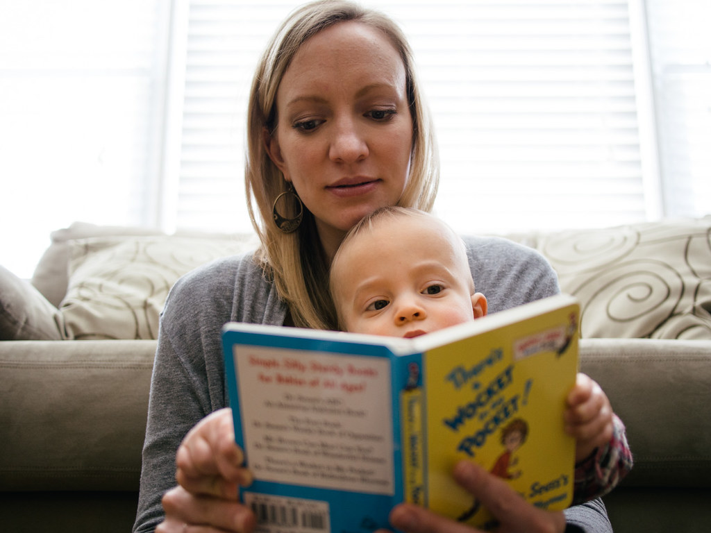
  • What are your favorite pictures taken with the E-PL5? This one is probably my most favorite:

Anna and Noah reading

These are also favorites:

The B&B Cafe

Nohawk

You can see more of the photos I’ve taken on my Flickr page.

* * *

So. If you’re in the market for an awesome and pocketable camera, I’ve got good news and bad news…

The good news is, there are a lot of really great options. The bad news is, there are a lot of really great options. Good luck!


  1. 8×10 prints are normally 3.99 each, but Shutterfly seems to have sales all the time to get things for 40-percent off or more. I’ve also heard great things about WHCC’s pricing and quality, but haven’t yet used them myself.
  2. I’ve also been using the camera to take “fancy” hero images for use on this site and on The Sweet Setup.
The Olympus E-PL5 Mirrorless Camera: My One-Year Review

Editorially

Leading up to the launch of The Sweet Setup, we were wrangling about 20 active documents. I was working with half-a-dozen different authors on their app reviews along with writing several reviews and blog posts of my own, and Jeff Abbott was editing everything.

To manage all of these documents we use Editorially.

It’s awesome. Here’s why.

  • Markdown support: All the writers we work with prefer to write in Markdown. I prefer markdown. And, well, Editorially supports markdown syntax highlighting in the browser. It also displays images inline. When you’re done writing you can export your writing as an html, markdown, plain text, Latex, rich text, MS Word, or ePub file. Wow.

  • Collaboration: invite people to join the document as read-only privileges or with editing privileges. You can highlight words and passages to make notes about, and you can comment on the document in general.

  • Track changes and version control: Editorially auto-saves as your working on a document, so if your browser crashes you don’t lose your work. It also keeps all the versions of a document, and allows you to compare the changes of one version with another.

  • Document status: Documents start as “Draft”, and as you progressively work on them you can change their status to “Reviewing”, “Revising”, “Copyediting”, and “Final”.

These states worked perfectly with our workflow, and followed perfectly the progression of our articles from the initial submission by a contributor, my reviewing of it, the author’s revising of it, and then Jeff’s editing of it. When visiting my Editorially dashboard I could see instantly what the state of each document was, and knew which ones I needed to attend to myself.

  • Dropbox support: you can link Editorially to a folder in your Dropbox and then send an article to that folder. This is Editorially’s answer to “archiving” since there is nowhere to move documents that are in their final state and which have been published and that you no longer need to keep on your dashboard. This is how I archive all of our published articles, and it works very well.

  • Pasting into a document: Copy rich or formatted text from one place and when you paste it into Editorially it will format in Markdown. Even images. Amazing.

  • iPad and iPhone friendly: Editorially is a web app only with no native apps. However, it has a responsive design that works great in Safari on the iPad and iPhone. It can be a bit clunky if you’re making lots and lots of notes and annotations, and I wouldn’t want to spending hours a day, every day, working in Editorially on my iPad. But I edited several documents from my iPhone and iPad with no trouble.

Our Editorially Workflow

Being editor-in-chief, I was reaching out to potential writers asking them if they’d like to do an article for the site. Once they submitted their draft to me I would paste it into Editorially and read through it.

Because Editorially lets me make highlight words and passages, it was easy to make comments about what I felt were good, what needed improvement, and what was missing altogether. I would also make general comments on the document itself such as, “All done. Your turn.”

If I hadn’t already, I would then invite the author to join the document so they could see all my comments and edits, and then they make any changes and leave comments of their own.

Some articles were done after just one pass. Others took several rounds of back and forth work to get it to a place where we were completely happy with it.

Once the article reached the point where the author and I were happy with it, then I would invite Jeff to join. (Jeff is the editor for The sweet Setup.) He would then read through the article for the first time, making sure it had a good flow, made sense, covered all the bases, and was free from typos and other grammatical errors.

When Jeff was done, he’d set the article’s status to “Final”. I would then export the markdown out of Editorially and paste it into our CMS. Editorially also supports publishing to WordPress, but I don’t use this feature — we have quite a few custom fields and other metadata tables set up in our WordPress install that hinder us from just publishing straight to the site from Editorially.

Technically, Editorially is still in beta. There are a few bugs here and there (for example, the dashboard doesn’t remember my preference for displaying documents in a grid format or a list) and there are some other features I’d love to see added (such as the ability to transfer ownership of a document from one user to another, or an “inbox” that listed all the recent activity on all my documents). But these are small issues, and Editorially has proven to be an invaluable tool for us.

We are using it to get a lot of work done without losing our minds. I can’t imagine what our workflow would look like without Editorially.

Editorially

iPad Mini and iPad Air First Impressions: Both Favorites

These two new iPads are marvels.

It’s already amazing that there exists gadgets made of aluminum and glass which weigh less than a pound and have screens that rival the resolution of a printed magazine. Now add to that the fact these devices have touch screens so true-to-life and so responsive that it feels as if you’re literally manipulating the pixels with your fingers.

And it doesn’t end there.

Pacing around the coffee table in my office, thinking about the new iPads while contemplating the big picture of things like personal computers that fit in our pockets and purses, it’s easy to get swept away in just what an incredible day and age we live in.

These devices are also connected to the world wide web — allowing me to communicate with friends, family, members, and strangers alike. A photo I took of my son using my phone has magically appeared on my iPad, and I can email it to my parents with ease; I can write words and publish them to a place where anyone in the world can come to read; I can download music and books; and so, so much more.

But then, returning to Earth, what are the brass tacks here? I’ve been sending emails for over half my life; I’ve never owned a cell phone that couldn’t send a text message; I’ve been making my living publishing to the web for nearly three years; and this isn’t my first iPad.

But yet, in a way, this is my first iPad.

The iPad Air is, hands down, the most amazing iPad I’ve ever owned. And I’ve owned several.

I bought an original iPad on launch day; I bought the iPad 2 on its launch day; and I bought the iPad 3 on its launch day. Each of those successive devices got better and better and better.

Keeping with tradition, I bought the iPad Air on launch day, too. Thirteen days later I can say, unequivocally, that it is the greatest iPad ever. The change in size and weight and speed when compared to the iPad 3 is something that must be experienced and not read about. Trying to describe the difference in usability between the iPad Air and its predecessors is an exercise which puts my wordsmithing skills to the test.

My iPads have always received quite a bit of use from me. Even from the very first generation iPad, I have toted these things with me to meetings, coffee shops, vacations to the Rocky Mountains, “business” trips to WWDC, my living room, and everywhere in between.

Moreover, I am quite comfortable using the iPad as my “laptop”. My work is such that I’m fortunate enough to be able to do pretty much everything I need from the iPad. Nearly all of my daily tasks and routines related to work or play are things I can do on iOS.

Every design and engineering progression with the iPad has been a nice, incremental, and welcomed step. Thinner and lighter, then Retina, then faster. But the iPad Air is a leap and not a step. It feels impossibly thin and impossibly light while also being extremely fast and responsive. It is quintessential.

And then, yesterday, the iPad mini with Retina display appeared. And, well, it is also the best iPad I’ve ever owned.

Here is a device that will fit inside my wife’s purse or the pocket of my peacoat. And it’s ideal for all the most common personal computing tasks of doing email, surfing the Internet, and checking Facebook and Twitter. And we all know the iPad can do so much more — there’s no reason why the iPad mini couldn’t be someone’s only computer.

And that fascinates me. Who knew that one day our uncompromising personal computers would cost a few hundred dollars and would comfortably fit inside a woman’s purse?

I’ve been using the Retina mini for just a day now, but I am confident that I could use it for all the tasks which I’ve been using my full-sized iPad for all these years. The question is not about the capabilities of the mini; the question is about my own preferences. And, at the moment, I don’t have an answer.

It’s different than deciding between an 11- or 13-inch MacBook Air, or between a 13- or 15-inch MacBook Pro. For laptops you mostly use them while they are placed on top of a desk or table (or perhaps your lap) while you sit in front of them. You mostly pick which laptop you need based on your computing tasks and needs, size plays a role in terms of portability, but once the laptop is out and on the desk it mostly doesn’t matter what size it is (unless you’re sitting in coach).

But with the iPad Air and iPad mini, computing usage is not the only factor. There’s also a tangible, kinesthetic-centric factor at play here. Because the iPad is something you hold and touch while using.

Which is better: an iPad Air that has a bigger screen and which is thin and light enough? Or an iPad mini that is very thin and light and which has a screen that is big enough? I just don’t think you can pit these two devices against one another. They are not competing — they are two of a kind.

They are both great. Both favorites.

Over the next several weeks and months I plan to use both iPads for the same tasks. It’ll be interesting to see how the dust settles and if I’ll naturally be drawn more to the smaller device or the larger one, and why.

iPad Mini and iPad Air First Impressions: Both Favorites

Fantastical 2 for iPhone: The Best Gets Better

The new Fantastical is the best calendar app on the iPhone. It was great before, but now, it’s, well, fantastic.

Fantastical 2 for iPhone

Let’s talk for a moment about friction, learning interfaces, and natural language parsing

I’ve always been a fan of Fantastical’s natural language parsing and it’s simple-yet-powerful design. When I say Fantastical is the best calendar app for the iPhone, I define “the best” as being the easiest to use (adding/editing events) and the easiest to read (checking schedule) for most people.

About a month ago I took a little poll on Twitter. It’s nothing scientifically conclusive, but it does provide some interesting data points to say the least. In the poll I asked people how many events they enter into their iPhone on a weekly basis.

Of 179 total responses:

  • 73% enter 1 or fewer events per day (130 people)
  • 21% enter an average of 2 events per day (38 people)
  • 6% enter an average of 3 events per day (10)
  • Less than 1% enter 4 or more events per day (1)

So, 94-percent of the total respondents use their iPhone’s calendar app 2 or fewer times per day to enter in a new event with most of those people actually using it just once or less per day.

Think about the situations you’re typically in when adding an event to your calendar using your iPhone. For me, I’m usually in the middle of a conversation with someone and we’ve just agreed upon our next meeting or a meal together. Or I’m in the lobby at my kids’ doctor’s office making their next checkup appointment, or I’m at my dentist making my next cleaning appointment. Etc.

In short, the times I’m using my iPhone to enter an event are times when I’m usually in the middle of something else. I want to add the event and get on with life.

The more we become familiar with a calendar app’s new-event interface, then the faster we can navigate it. However, as my Twitter poll hints, people entering in just one event or less per day is not much usage to learn an app’s interface.

I’ve been using my iPhone to enter calendar events since 2007, and the default new event entry sheet provided by iOS has always felt like an obstacle course. If most of us are entering one event or less per day on our iPhones, then are we ever really learning the event input interface of our calendar app?

That is why natural language parsing is so divine. Because what’s an “interface” we are all extremely familiar with? Natural language.

We say sentences like “I’m having lunch with Steve tomorrow” all the time. It’s called “natural language” for a reason — we say these sentences in our everyday conversations, emails, text messages, etc. It’s natural to us.

And so a calendar app that can understand our own natural language is one that we can use as infrequently as we want without suffering the consequences of not learning its input UI.

Fantastical has, by far and away, the best natural language input mechanics of any other calendar app on the iPhone. It is fast and smart at parsing just about any event- or reminder-based sentence, and it has easy-to-understand animations which let us know how the app is translating our words.

As Dr. Drang pointed out, Fantastical’s animations do more than dazzle:

The animations are providing instant feedback on how Fantastical is parsing your words and, more important, they’re teaching you Fantastical’s syntax.

What’s New in Fantastical 2?

In a sentence, it’s faster, it’s built and designed for iOS 7, it has Reminders integration, light and dark modes, and there’s a swell new week view if you flip your iPhone on its side.

Let’s dive in.

Landscape Mode’s Week View

Flip your phone into landscape mode and Fantastical shows you your week view with the time plotted on the calendar (not unlike Calendar shows you on the Mac).

Fantastical week view in Landscape mode

I’m a fan of this view because it’s a great way to visualize what blocks of time I’m booked for during the day and what blocks of time are open.

Moreover, from this weekly view you can drag and move events very easily. You can adjust their start and end times. And if you tap and hold on an empty spot, you can create a new event
(which also means, by the way, that Fantastical now supports the landscape keyboard for creating a new event or reminder).

Speed

Pulling down on the day ticker and/or the month view is how you transition between one or the other. This animated transition is smoother and faster in the new version of Fantastical.

iOS 7

Updated with a 64bit architecture, background updating, and dynamic text. New events and reminders you add via your Mac or iPad or any other app beyond Fantastical still will sync to Fantastical in the background.

Reminders Integration

You can add a reminder by typing “Remind me to…”, or you can manually tap the toggle on the new event creation window that will switch Fantastical between new calendar event and new reminder.

Custom keyboard row

If you’ve got an iPhone 5 or 5s, above the QWERTY row is a 5th row with numbers, a forward slash, and a colon to help enter in calendar data faster. In my time testing the app over the past several weeks this row has proven to be immensely helpful.

Auto-import your settings

Your Fantastical 1 settings auto-import into Fantastical 2.

This seems like a non-trivial thing, right? We’re used to updating our apps and having our settings persist through the update.

But with developers releasing new, iOS 7-only, paid updates to their apps, a paid update like this is actually like installing a new app. Of course your calendars sync right up, but your app-specific display settings — such as having weekends highlighted, if days with no events show up in the day ticker, etc.. — are imported from Fantastical 1 into Fantastical 2. It’s the sort of thing you’d only notice if it didn’t happen.

So?

If you’re not satisfied with your current calendar app, Fantastical is just $3 on the App Store.

Fantastical 2 for iPhone: The Best Gets Better

The New Tweetbot for iPhone and iOS 7

Long have I been a fan of Mark Jardine’s heavy-handed design aesthetic. The dark grey industrial materials, the gradients, noise textures, and the playful graphics and icons. These design elements have been inextricably tied to the signature and brand of the Tapbots app lineup.

Today, that all changes.

The new Tweetbot is a ground-up re-design and re-thinking of what is one of the most popular Twitter clients out there.

Tweetbot 3 for iOS 7 - Account Screen

This is the new Tweetbot, for iOS 7. As you can see the design is very new. It’s a starting over, not only for the app itself, but for the Tapbots’ brand.

For this new app, Mark and Paul had to out-Tweetbot Tweetbot. And I think they did just that.

Tweetbot 3 for iOS 7 - the main timeline view

This new version has all the underpinnings of what has made the app great since its 1.0 release in April 2011. It has fast and smooth scrolling, it has clever animations all throughout, swipe or tap-and-hold to act on a tweet, etc.

But, be it familiar, it is still an all new app.

Save for the icons, the new Tweetbot is a radical departure from the look Tapbots has become world famous for. The main timeline view now sports circle avatars and a white, gradient-free background. Tapping on images blurs brings them up full-screen while the background goes blurry. This app has all the design elements of a native iOS 7 app, but with a unique twist all its own.

It’s not all just a new coat of paint. The new Tweetbot supports background updating in iOS 7, which means that when you launch it your tweets are already there waiting for you. (This feature alone is worth the price to upgrade.)

Also, Tweetbot uses dynamic text from the size you set in the iOS system settings. Personally, I find this to be unfortunate. I prefer my system text (such as for emails and Safari’s “Reader mode”) to be just one notch above the tiniest. However, I find that size of text to be too big in Tweetbot. Even at the very smallest setting for dynamic system text size, it is still too big for me in the Tweetbot timeline.

When it comes to whimsy and personality, though the heavy-handed design aesthetic is now mostly gone, there are fun animations and bounce effects to nearly every element of the app. One of my favorites is tapping the profile image up to to bring up the account switcher — the individual account pictures and names slide in from the right and bounce off the left margin.

When you launch the new Tweetbot for the first few times, there is certainly a bit of shell shock at just how different it is. But, as you use it, you realize that it’s still a Tapbots app at heart. It’s just as delightful and just as powerful as its siblings, but it marks the next generation of Tapbots apps. And I’m looking forward to what’s next.

The new Tweetbot is a paid update for all users, and is on sale right now for $2.99 in the App Store.

The New Tweetbot for iPhone and iOS 7

Weather Line

Weather Line is a cool new weather app from Ryan Jones. Ryan sent me a copy of the app earlier this month and I’ve been using it for a bit.

When I launched Weather Line for the first time my initial impression was that it’s not a general purpose weather app. I assumed it was more niche, with a focus on forecast data rather than current conditions.

But that’s not the case at all.

As you can see from the screenshot, the primary element of the app is its line graph (the “weather line”) which shows the temperature forecast.

Weather Line

When you launch Weather Line, or navigate between the Hourly, Daily, and Monthly tabs, the left-most temperature animates itself with a sort of balloon effect. This instantly grabs the attention of your focus and draws your eye to the current temperature.

So, Weather Line is, in fact, a nice general purpose weather app. And, as I’ve been using it, I have come to enjoy the quick view I get of the current conditions right now and how they will change in the next 8 hours.

However, I do have two quibbles with the app:

  • All the navigation is up top. To navigate between locations you swipe on the location name; to navigate between Hourly, Daily, and Monthly forecasts you tap on those respective tabs. But on an iPhone 5/5s these tap targets are just out of reach for my thumb and it makes the app a little bit difficult to fully navigate one handed.

  • No radar view. Though Weather Line does use the Dark Sky API to give the 60-minute precipitation forecast, it does not have an actual radar view. Ryan, the man behind the app, said the reason there’s no radar view is because he can’t find one that is beautiful enough for him.

In an email, he said to me, “Our app takes ugly boring data and uses beauty to make it easily understood, we want the radar that does the same thing.”

I appreciate Ryan’s commitment to excellence, but for me, a weather app without radar is an incomplete weather app. My two favorite weather apps — Perfect Weather and Check the Weather — both have the standard radar views and I’ve never thought them to be ugly.

So, is Weather Line the best new general purpose weather app you can buy? I don’t think so (because of its lack of radar). But it is a fantastic app nonetheless.

Weather Line is simple, delightful, and very responsive. It feels right at home on iOS 7. And the icon is fantastic — it’s one of the best weather app icons on my iPhone. Just $3 bucks in the App Store.

Weather Line

Revisiting All My Past Product Reviews and Recommendations: What Stuck and What Didn’t?

I’ve been writing about hardware and software for years. Some things I review because I think they’re awesome and I want to recommend them. And then some of the things I link to or review are things I find noteworthy for one reason or another.

But things change over time — things like my own workflow habits, my software preferences, and even the software itself.

This site’s design puts the most emphasis on that which has been most-recently published. But what about that review of MarsEdit I wrote back in 2008? How can you know if I am I still using that app (if you ever even read the review in the first place)?

This is something I’ve been thinking a lot about lately. It can be easy to write a positive review of a cool new app or gadget, but how does that product hold up over time when the newness wears off and the routine of life settles back in?

There are a lot of apps that I’ve endorsed after a few weeks or months worth of usage, but am I still using them years later?

Well, over the past three days I went through every single review and recommendation I’ve written in the past 6 years in order to take inventory of which products I still use and which I don’t.

(I encourage all of us who write about, review, and recommend products to do something like this. Especially when we highly recommend something, it would be a great benefit to come back to that review in 6 months or a year and let our readers know if we are still using that product or not.)

My list below contains about 50-or-so apps and gadgets. Surprising (to me, at least) is that only 13 of them are products which I no longer use.

Which means I’m still using about 75-percent of the things I’ve reviewed and recommended over the past 6 years. So either I’m incredibly lazy, or I have excellent taste.

What Software am still using?

  • OmniFocus: I’ve been using the OmniFocus suite of apps (Mac, iPhone, and iPad) for over three years now. Sometimes I wonder if they are overkill for me now that I’ve somewhat settled into a grove with my work-from-home schedule. But I just can’t quit them because it’s a task management system that I trust. I know that if and when an important task becomes due, then OmniFocus will show it to me.

  • Simplenote: Gosh, I’ve been a hardcore Simplenote user since I first learned of it back in 2008 (thanks to John Gruber). Recently I even went looking for alternatives to Simplenote, but I just couldn’t quit it. And, I’m a big fan of the updated Simplenote app for iOS 7, and the Mac app, too, has become a daily driver for me as. In short, I put a lot of text into Simplenote and am happy to do so.

  • MarsEdit: This, my friends, is quality software. It’s hard to believe I’ve been using this app just about every day for 6 years.

  • Rdio: Access trumps ownership, or so they say. Anyway, I am an avid fan of Rdio. And I still use Airfoil to adjust the EQ of Rdio’s output and to send the audio to my nicer sound system that’s hooked up to the Apple TV if I want.

  • Keyboard Maestro: I haven’t written any formal reviews of Keyboard Maestro because I don’t know where I would start, and once I did start reviewing the app I don’t know how I could stop. I’ve been using Keyboard Maestro for years and it does just about everything. About a year ago, Ben and I recorded a Tips & Tricks episode of the B&B podcast (RIP) giving some use-case scenarios for Keyboard Maestro.

  • LaunchBar: Another critical app that I haven’t written a review about but have long been an advocate of. This is my application launcher of choice. Also, there’s a B&B podcast Tips & Tricks episode about LaunchBar in the archives as well.

  • Hues: When I’m designing a website, Hues is always running. Been using it for a few years now.

  • Coda 2 and Diet Coda: I’ve been using and loving Coda since it shipped years ago. I’m not a developer, but I do know enough HTML, CSS, and PHP to build and maintain my own WordPress websites. And when I do need to update, create, or fix something I do so in Coda 2 (or Diet Coda if my Mac’s not nearby).

  • Editorial: I’ve only been using it for 2 months, but it’s splendid.

  • Byword: On the Mac, I do almost all of my longform writing in Byword. I then keep all my “in-progress” articles in a folder in Dropbox. If/when I need to access them on the iPhone I use Byword on the iPhone (the iOS 7 update is splendid, by the way). But on the iPad I use Editorial.

  • Reeder: Reeder has long been the best RSS reading app on iOS.

  • ReadKit: This app is good enough. So far as I know this is the only Mac app that syncs with Feed Wrangler. The app has seen a lot of consistent development and improvement over the past few months, but I still consider it pretty slow at updating my feeds and it’s not extremely easy to navigate using the keyboard.

  • Tweetbot: Still my go-to twitter client on the Mac, iPhone, and iPad. I talk often of how awesome Twitterrific is — it’s beautifully designed.

  • Riposte: I think Riposte is more than just the best ADN client for the iPhone — it is one of the nicest iPhone apps, period. I find it very easy to use; it’s fast, clever, well designed, and it has a slew of killer features.

  • Feed Wrangler: This has been my post-Google Reader sync service of choice and after several months I’m still quite content with it.

  • 1Password: Gosh. I’ve been using 1Password for several years, and the more I use it the more I’m glad I use it. Such a well-done and valuable app.

  • Transmit: It’s the best FTP client for the Mac, so why wouldn’t I still be using it?

  • TextExpander: No official review of this fine utility, just many links to it over the years. You bet I’m still using the OS X and iOS versions.

  • Backblaze, SuperDuper, Arq, and Dropbox: This is still my backup strategy, and I’m quite happy with it. Though (thankfully) I have yet to encounter a time where I needed disaster recovery of my data, so it’s hard to say exactly how it would all pan out were my laptop and external HDDs all destroyed or stolen.

  • Day One: This is certainly the best journaling app out there. I keep the iOS apps on both my iPad’s and iPhone’s Home screen and write in them often. I have the Mac version as well, but don’t use it nearly as much. Probably because journaling is something I don’t tend to do when sitting at my desk. And also, a lot of my Day One entries are photos I take with my iPhone.

  • Fantastical and Agenda: These are the two calendar apps I’ve written about over the years. I still use and love Fantastical on the Mac, and up until recently used Agenda on the iPhone (the latest iOS update to Agenda is quite nice).

However, there’s a new website project I’m working on that has me doing a lot of digging and testing with iOS calendar apps right now. Calendars 5 is a new entry to the iOS calendar market and it’s pretty amazing. And so, honestly, I don’t know which of these three (Agenda, Calendars 5, Fantastical) are my favorite on iOS. They’re all great in their own way — the jury is still out.

  • Junecloud’s Delivery Status app: still use this to track shipments. It’s great.

  • Droplr: I’ve been using Droplr since it was in beta back in 2010, and I still use it every single day.

  • Checkmark: Checkmark does location-based reminders better than iOS does, in my opinion. It’s faster at setting them up and more accurate at reminding you. Though I don’t set reminders like this very often, when I do I still use Checkmark.

  • Breaktime: This app is helping me live longer. It’s sitting in my menu bar right now, reminding me that in 21 minutes I need to stand up again and walk around for a bit.

  • Bartender: My goodness I am so thankful for this app. It cleans up your Mac’s Menu bar. Still highly recommended.

  • Quickshot: Still using this to take photos of receipts (for tax purposes) and then upload them to Dropbox. A Hazel rule then moves them to my receipts folder.

  • DropVox: This app is extremely dated, but it still works and I still use it to record Shawn Today episodes whenever I’m away from my Mac. And, so far as I know, there are no other apps which take a voice recording and pipe it to Dropbox.

  • Timer: The guys behind Timing were sponsors of the site a few times in the past, but I’ve also personally had this app running in the background since it came out in 2011. And even though I use it, I don’t really make use of the data it tracks — I have a hard time parsing it all myself. I’ve been considering setting up an account with Rescue Time instead, to see if the reporting there is better and more useful.

What gadgets am I still using?

  • Mid-2011 MacBook Air: Stilly gutsy, still glorious, still using it every single day.

  • iPad 3: I still use my iPad as a laptop replacement (though, to be honest, I do leave the house with my MacBook Air a bit more often these days).

  • Last Year’s Kindle Paperwhite: Still love it. I wouldn’t mind getting the new one, but I don’t think it’s worth paying to upgrade.

  • My Clicky Keyboard: After a whole lot of fiddling and typing on mechanical keyboards (both big ones and tenkeyless versions) I picked the Filco Majestouch-2 Ninja with the Cherry MX Blue switches. I’ve been typing on this keyboard for over a year now and still love it. And, as a matter of fact, I’m typing on it at this very moment. Click! Clack!

  • Uni-ball Signo DX 0.38mm: Still the greatest, inexpensive, fine-tip gell ink pen in the world.

  • Audyssey Computer speakers: Earlier this year I bought these white Audyssey Bluetooth speakers because their sibling version (which are black and non-Bluetooth) were recommended by The Wirecutter. I don’t use the Bluetooth connectivity, but I think the white is much better looking than the black and the price is actually cheaper. The Audyssey’s are bigger than they look in the pictures, and they sound absolutely fantastic. Very full, rich, and crisp. For $145, you can’t go wrong. I’m jamming out with them as I type this very sentence.

  • E-PL5 mirrorless camera and Panasonic 20/1.7 pancake lens: It has been almost a year since I got this camera and lens and I am still very satisfied. While I do wish it had more dials for faster manual adjustment of the aperture and other settings, I have never felt frustrated or constrained. If I were buying a mirrorless camera today, I’d probably go with the new E-P5.

  • Doxie Go, Hazel, and my Paperless Office: Still using this setup and workflow every single week to keep my office paperless. Of course it’s a chore, but one that’s easy enough I don’t not do it. (See also my review of the Doxie Go.)

  • Origami Workstation for iPad: I’ve had this thing for a few years now and still use it near daily. What I wrote in my review still stands. One thing I’m noticing is that the velcro on the tabs that holds the flaps together is starting to lose a bit of its grip strength. My guess is that in a year or less I’ll need to replace the velcro somehow.

  • AeroPress: You know I’m still brew coffee with it just about every single day (if I’m not brewing with a Clever or a v60).

  • Blue Yeti: Still use (almost) every day to record my Shawn Today podcast. I also used it to record all the interviews and the audio book version of Delight is in the Details.

  • My gray-market 27-inch IPS LCD: I bought this display last fall when my 23-inch Apple Cinema Display died. It’s great for the price, and I’ve been happily using it for over a year. But a very faint shadow has appeared across the bottom of the screen. I am crossing my fingers that Apple will update their Thunderbolt displays later this year so I can upgrade.

What I am no longer using

Here are apps and gadgets that I’ve recommended and said I liked but am no longer using today.

  • The Jawbone UP: I thought it was so cool at first, and I still do love the idea of it, but the bracelet never got comfortable for me. Over time I just tired of charging it and syncing it and wearing it in my sleep.

  • Triage: This is a very clever email app for the iPhone. But when I installed the iOS 7 beta onto my iPhone 5 earlier this summer, I wiped the phone and started fresh. Triage just never got installed again.

And, so long as we’re on the subject, no 3rd-party email client has ever stuck for me beyond the stock Apple email apps (on iOS and on OS X). I’ve tried Postbox, Sparrow, Mailbox, Triage, and probably a dozen others, but I always just come back to Apple’s email apps.

  • Writing Kit: This is a great iPad writing app, and it was my favorite until Editorial came along.

  • NetNewsWire 3: This was one of the best. It would still work as a standalone RSS reader, but I use Feed Wrangler to sync my feeds and the old NNW doesn’t sync with anything any longer.

  • Recall: Another really cool app that just never stuck for me.

  • Yojimbo: I raved about this app for years, and I still consider it to be one of the finest Mac apps I have ever used. But alas it didn’t scale well for my needs, and I ended up moving to a few individual applications and services.

  • Nexus 7 tablet: I think I’ve got it sitting in the bottom of a drawer around here somewhere.

  • Visual, iOS timer: I used this for a while as a way to keep my time spent on email to a minimum. But it never became habit and the app never stuck for me.

  • Instacast: Instacast is great, but I just don’t listen to podcasts any longer. And with a toddler, I no longer queue podcast episodes up for road trips — instead we listen to white noise or music.

  • Pastebot: Some apps you just slowly stop using, and Pastebot was one of those for me. It’s neat, but I no longer use it for the things I used to use it for. And with the ever-increasing number of apps and services which sync, I don’t have as much need to copy/paste things between my Mac and iPhone.

  • Fever: I have Fever running on a server, but never ever check it these days.

  • Mint: I would still be using Mint, but something in its database farted out on me a few months ago and MySQL is something I know nothing about. So I signed up for an account with GoSquared, which is nice but I don’t love it.

  • Things: I stopped using things because I really needed a to-do list app that synced over the air. So I switched to OmniFocus in 2010. But then, even after Things got OTA sync, I kept using OmniFocus because the iPad app and the review function are just so, so great.

Revisiting All My Past Product Reviews and Recommendations: What Stuck and What Didn’t?

The New Simplenote Apps

If asked to trim my iPhone and iPad Home screens down to just one app, that app would be Simplenote.

I have been using Simplenote for as long as I can remember. What first won me over to the app was certainly not the icon. Rather, it was (a) Simplenote’s ability to sync my notes over-the-air to my Mac, and (b) its use of Helvetica. These were two huge improvements on Apple’s native Notes app which synced over USB and used Marker Felt as the typeface.

Simplenote shipped in 2008 when the iPhone App Store was fresh and there was only a rumor of an iPad. In many ways, the app has barely changed since its very first version, seeing mostly only refinements and iterations of the original design.

Today, 5 years later, look at the App store today and you’ll find no shortage of minimalistic, well-designed, note-taking apps that sync over-the-air. And many of these apps are absolutely fantastic. But, even after my foray into Simplenote alternatives and doing research and trying out other note-taking apps, I’ve stuck with Simplenote as my iOS note-taking app of choice.

So much of how I use my iPhone and iPad is text based: ideas, articles, to-do items, lists, and more. Because I have an affinity for apps that do one thing well, currently all these “text-based” things are handled by unique apps:

However, I could consolidate them all into just one app if I had to. And that app would be Simplenote. The reason I’d choose Simplenote is because it’s a quick, easy-to-use app with great search and it has fast, reliable sync.

Today we find a significant update to Simplenote on iOS as well as a brand-new, native Simplenote app for the Mac.

These huge updates to Simplenote came as a bit of a surprise to me. When Simperium, the Simplenote development team, was acquired by Automattic, I was hopeful yet also had concerns that the future of Simplenote was in question. The announcement stated that Automattic founder, Matt Mullenweg, was a fan of Simplenote and had plans to keep its development, but that’s not always how things pan out after an acquisition.

Fortunately, I was wrong. And today we see one of the best updates to Simplenote yet.

Simplenote on iOS

The new iOS 7 version of Simplenote for the iPhone and iPad is even more simple (if that were possible) than its predecessor.

From a feature standpoint, what’s new about new Simplenotes is more like a list of what’s gone from the previous version.

In the previous version of Simplenote there was a modicum of preferences that allowed you to adjust a handful of options. Such as how your “timeline” list of notes was sorted, what font size you wanted for reading and editing a note’s text, and more.

However, in the new Simplenote, those options are all gone save one: the option for your list of notes to show a preview of text under each title or not.

Simplenote old and new side-by-side preferences

In one of the early iOS builds I tested, the preference for condensing the note list wasn’t even there. Fortunately, the developers were willing to be persuaded to add back in this preference which I consider essential.

The option to sport a collapsed notes list is huge for how I use Simplenote. Since I usually have around 10 active notes going at any given time, I love being able to see all of them at a glance when I open Simplenote on my iPhone.

I have no doubt that other preferences will slowly be added back in. But this initial purging marks the beginning of the next generation for Simplenote.

In the iOS apps, the most significant change you’ll see right away is Simplenote’s new typeface: Source Sans Pro. Other than the many refinements to several current features (such as sharing and version history) almost all of the biggest changes are under the hood. In fact, iOS apps have been re-written from the ground up in order to lay a new foundation for future iteration and evolution.

Tom Witkin, who also went to work for Automattic a few months back and is now one of the Automattic team members working on Simplenote, said to me that their general thinking throughout the entire Simplenote design process has been “to create a great platform to build Simplenote upon going forward.”

For an app with simple in the name, I’m delighted to see that it’s staying true to its nature. While I do miss a few of my legacy features, after a few weeks with the betas, I would not go back to the old version. The app feels faster, more professional, more modern, and more refined. Everything the new Simplenote does, it does very well.

Search

Search itself remains as great as ever. Simplenote’s search has always been second to none, and it continues to be one of the app’s finest features. I use it often, and it’s one of the primary reasons I chose to stay with Simplenote when looking into alternatives (as mentioned above). I can’t say how glad I am that search in Simplenote continues to be a top-priority for the developers.

In the new Simplenote, search has seen some nice design improvements that makes it a more polished and refined experience. When searching a term, the list of notes is pared down in real time to only those with that term in the title or the body text. If the term exists in the title, that word gets set in blue text. Tapping on a note from the search results takes you to the first result of that term within the note’s body text, and that term is highlighted in a blue rounded rectangle. Arrow buttons at the bottom-right in the note’s toolbar take you to the next and previous instances of the term, and next to those arrows you’re told how many total instances of the search term there are in the current note.

If you’re familiar with search in Simplenote, the overall experience is more or less the same. What’s new is primarily the above mentioned design details (the blue treatment on the words and the better highlighting within a note). But these are details that make the searching experience easier and more efficient.

Collaboration

What used to be called Sharing is now called Collaboration. This works on the Mac and iOS versions of Simplenote.

You collaborate a note with someone by adding their email address as a tag to your note. If you add the email address associated with that person’s Simplenote account then the shared note shows up in your collaborator’s Simplenote list. If you add an email address that’s not associated with a Simplenote account, then that person will get an email and can either (a) log in to Simplenote if they have their Simplenote account associated with a different email, and the note will be added; or else (b) create an account.

In the new Simplenote app, there is no longer an icon letting you know which notes in your list you’re collaborating on. Which means if someone shares a note with me, then the only way I know it’s been shared is because I notice there’s a new note there that didn’t exist before.

Moreover, if someone shares a note with you, the only way to know who has shared it is by the email alert. For an incoming shared note, there are no tags with the originator’s email addresses, nor does their email appear in the “Collaborators” list.

I’d love to see the collaboration area improve even more, by (a) offering better information about who is collaborating on a note regardless of the originator, (b) giving me the option to accept or decline incoming shared notes; and (c) some sort of marker letting me know a note in the list is shared.

Also, I see some options for pro features here, such as a list of trusted collaborators whose notes automatically get added to my list (first assuming Simplenote added the ability to accept/decline incoming shared notes), push notification options for new shared notes and when updates to a note are synced, and better visibility into the changes of a note when peering back at the note’s history. Also it’d be nice to add more email address to my Simplenote account (similar to how you can have several iMessage IDs).

Additional Tidbits Regarding New / Updated Features

  • As mentioned above, the default typeface is no longer Helvetica. Simplenote now uses Source Sans Pro for the note list and note body text. Though, as you can clearly see in the above screenshot, the settings pane still uses Helvetica.

Source Sans Pro: the new Simplenote typeface

  • Simplenote on iOS now auto-completes unordered bullet lists when you start a list and continue it by tapping the return button.

  • Publishing your note to a URL (so you can make that note’s contents public to anyone you like) has a much nicer in-app interface, and an updated look to the Simplenote website is in the works as well.

  • When typing in a note on the iPhone version, the top navigation bar “minimizes” (a la Safari) when scrolling down in your note, and in landscape orientation, the nav bar disappears altogether when you scroll down. A nice touch.

  • The Pro subscription has been temporarily removed. For now, all Pro users will keep on getting their benefits (no API sync limit, Dropbox syncing, etc.) while the Simplenote guys figure out what to do next with the Pro subscription model.

  • Gesture navigations: On the iPhone you can swipe left-to-right on a note to return to the note list. On the iPad, you can “pinch” the note closed.

  • On the iPad there is no longer the 2-column view that sports the list of notes on the left and the text on the right. There is only one view at a time: your list of notes or else the note you’re viewing/editing. I prefer this “simplified” viewport setup because it often saves me an extra tap, since I usually prefer to view my notes in the iPad in fullscreen mode anyway. Now, they always are.

Simplenote on Mac

For the past several weeks that I’ve been testing the new Simplenote apps, I’ve eschewed my regular use of nvALT to give my full attention to the Simplenote Mac app.

Some things I like about it are its clean and classy design that feels very open and yet not wasteful. Also it features full integration with all the Simplenote features (obviously).

However, there is no autocompletion of any syntax such as unordered lists, there is very little keyboard navigation — CMD+F for search and CMD+N for a new note. Though I’m told that the basic syntax completion is planned for a future release.

Since nvALT now uses the new Simplenote API (the same API that the native Simplenote Mac app uses), as someone who’s grown used to the keyboard-friendly features of nvALT I see no advantage of switching to the Simplenote Mac app unless you make heavy use of tags, collaboration, or you prefer the design.

Wrap Up

The new Simplenote apps are free. The Mac app is available only in the Mac App Store, and the iOS apps are, obviously, only available in the iOS App Store.

While there are a lot of things I use my iPhone for — email, text messaging, Twitter, Instapaper, RSS, taking photos and videos, journaling, to-do list managing, music listening, and more — the one thing I would likely miss the most is the ability to take notes, make lists, write ideas, and have those all in sync with my Mac and iPad. Which is why Simplenote continues to be one of my favorite and most-used apps.

The New Simplenote Apps