Jorn Barger was on to something.
Back in 1997, when he coined the term “weblog”, his hope was that each site would contribute to the Web by amplifying the links its author liked best. And now, businesses, social networks, and publishing platforms are all thriving because we want other people to tell us about sweet stuff. And when we find it we want to share it too.
Community-run Sweet Stuff Aggregator1 will only show us so much. They excel at finding the stuff that may be interesting to everyone, but they are virtually impotent at promoting what would be truly fascinating to a few.
The sweetest stuff has to be unearthed and recommended by people we trust. Which is why everyone should blog. When you blog there are two types of entries:
- The Post: your stuff.2
- The Link: someone else’s stuff.
The Post is important because it’s where you give the world what you have to give. It doesn’t have to be cute, or complex, or mind blowing. Just genuine. (And preferably a good read.)
The Link is important too; this is where you become the Sweet Stuff Aggregator for your readers. The Link is a completely legitimate member of the weblog family and should be treated with just as much care as The Post.
But there’s a trick to The Link. By nature its intent is to send readers away from your site and over to someone else’s. Which means you’re not just a Sweet Stuff Aggregator, you’re also a Traffic Director…
And there is more than one way to aggregate and direct:
I. The Aside
As seen on: Geek & Mild / kottke.org / Ignore the Code

The Aside is a Link Post in disguise. It often looks and acts just like a short post on your website — except you’re talking about someone else’s stuff. When people click on The Aside’s title they stay on your site, going to The Aside’s permalink. (Though, when viewed on your website, The Aside may or may not display a post title.)
What makes an Aside count as a Link Post at all are two things: (a) somewhere in the text is a link, and that link is the focal point of what The Aside is all about; and (b) The Aside is styled, written, or in some other way treated different so as to set it apart from The Post.
By nature of its format The Aside encourages a full read of what you’ve written rather than a quick scan followed by a click on the Link. Which means it’s also a huge opportunity for clever and informed writing — more so than any other type of Link Post. Which is why The Aside is ideal for those who like to bring up and discuss content on the web as if having a conversation with friends.
II. The Out and About
As seen on: Waxy Links / Daring Fireball / Airbag’s Longboard

The Out and About is nearly the opposite in style and nature as The Aside. Its primary purpose is to unearth news and content on the Web and send readers there uninterrupted.
What especially sets The Out and About apart is its feed format. Because not only do the Link Post titles point directly to the linked-to content, but so do those in the RSS feed.
The permalink to your Out and About is either found at the bottom of your post, or else not at all.
The Out and About is a great way to aggregate Sweet Stuff and point readers in that direction with maximum ease and brevity. But don’t use it as an excuse to avoid adding your own clever and informed words.
III. The DoubleTitle
As seen on: Michael Mistretta / Justin Blanton / and formerly on shawnblanc.net

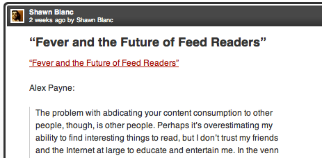
The DoubleTitle is like a step-sister of The Out and About. Its name comes from the way it displays in an RSS feed, where you see not only the link-post’s title, but also a duplicate “sub-title”, directly at the top of the content. Like so:
Clicking on the main post title from within the RSS feed sends readers to your permalink. Clicking on the sub-title in the RSS article sends reader to the linked-to article.
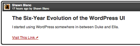
The advantage of The DoubleTitle is that the reader is by default sent to your post’s permalink as their starting point — the same default behavior as all but one of the link-post types. The disadvantage is the redundancy of two repeating titles, plus the loss of the first line of the post, as seen here:

Despite this, The DoubleTitle has become a common, accepted, and even preferred format for The Link.
IV. The DownUnder
As seen on: shawnblanc.net (RSS Feed) / Subtraction (Website) / Hivelogic / Ryan Gonzalez

The DownUnder places the link to the external article at the end of the post, while the permalink to the link post is still in the title (virtually the exact opposite layout as The Out and About).
The advantages of The DownUnder: it avoids the redundancy found in The DoubleTitle, and it has a more clearly defined link target than The Aside does. The disadvantage is that because it’s not as common as The Out and About, readers may get confused as to which link is pointing to where. (Which one to your stuff, which one to their stuff?)
V. The TitleFree
As seen on Tumblr sites: Minimal Mac / log.chrisbowler.com

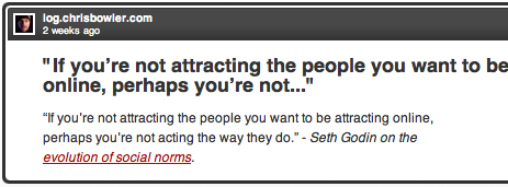
In The TitleFree the first ninety-or-so characters of the post usually make up the run-on title in the RSS feed.
Also, due to the “@usernames”, the “via usernames”, the nested links inside nested blockquotes, and so on, the reader must take great care which link they click on or they may end up somewhere other than the actual linked-to article you’re talking about.
However, The TitleFree — which commonly contains photos, quotes, links, and re-posted posts — looks fine in its native environment on your tumble blog, as well as in the Tumblr Dashboard. With a little bit of TLC, it could look good in an RSS reader as well.
An Aside Regarding The Out And About
So long as you’re aggregating sweet stuff, make sure you give everyone the biggest bang for their click.
Back in 2007, John Gruber experimented with his Linked List behavior in the Daring Fireball RSS feed. For years his links were pointing away from daringfireball.net, but for a week he let them point to his site to see the reader’s response. People overwhelmingly disliked it.
Concurring, John went back to the original format, saying, “I personally prefer the original style, with links pointing away from daringfireball.net, and most readers do too, so I switched it back. […] I’m convinced this is a better design, however. The point of the Linked List is to send you away from Daring Fireball to read or look at something elsewhere, and the feed format should reflect that.”
When The Link wasn’t as common as it is now, sending the reader away to the Sweet Stuff directly from the RSS feed made perfect sense. When readers were only readers, they would agree to let bloggers post something interesting and all they asked for in return was little bit of ‘why’ before being sent on to something sweet.
But now those readers are also bloggers, and – especially in the tech-savvy ring – a lot of those bloggers are publishing links, too. Even those without their own weblog are still aggregating Sweet Stuff on Twitter and Facebook.
When you read and write every day it’s helpful to know how you got somewhere to be able to give credit where credit is due; not only do you want to link forward to something great, you want to link backwards to where you got it from. Which is why the design and function of The Link on your website and in your RSS feed is so important. Like Merlin Mann once said, “If linkbloggers wrote more, shovelbloggers thought more, and a-listers cited more, the web would get 15% more interesting overnight.”
Your website is a non-communal, isolated starting point for your readers. If they follow your link, clicking the back button in their browser will return them to their starting point again, if need be. A feed reader, however, is more like a router piping in a whole community’s worth of stuff. If you follow a link out from your feed reader there is no back button to starting point; it’s buried in the feed reader.
Beginning from an isolated starting point is especially great for the times when you’ve sent me to something I find unusually sweet. Once I’m there chances are good I’ll want to: (a) re-read your comments about why you sent them there in the first place; and/or (b) link to it myself and credit you for the find.
If I got to the article directly from an Out and About Link in my feed reader then it’s up to my memory to remember who sent me there. Not a big deal if I’m eating lunch and am only taking the time to visit one or two new links. But that’s not how I most often consume stuff the Web.
The way I read online is that at some point in my day I will open up my feed reader and read through the latest stuff. I rarely read articles in my reader — instead, I open them in Safari in the background. After I’ve combed through my feed reader I then go to the open tabs in Safari and start reading.
At this point it’s not uncommon to have a dozen tabs with a dozen articles ready for me to read.3 Which is why – depending on your site’s posting rhythm and personality – sending people directly to your linked-to article is not necessarily the best design. Here’s why:
Since my feed reader is filled with sites and folks I’m familiar with, the majority of the open tabs in Safari are websites I affectionately recognize. But if I come to a tab with a site I don’t recognize my first thought is usually, what is this? Why am I here?
Because I don’t always remember exactly who’s link post I read to send me to that article, nor what it was they had to say about it that prompted me to visit, it’s a lot like coming back to a conversation without being able to ask, “Now, where were we?”
In an email, reader Jacob Pogson explained his similar reading workflow:
Some sites (eg. Coudal Partners) basically are all links. However, one is required to click particularly on the link within the post to go to the link, rather than just follow the post. I do not find that annoying. It is inefficient, yet I don’t mind having Safari go the the Coudal site and sit waiting for me to further direct it to the link.
I like to have the mental starting block of Coudal, before I follow the link; it’s almost like a context to the link. Similarly to you, I end with a whole lot of tabs (on a good day) that are the result of following articles/links from NetNewsWire. Changing to Safari is also a mental change to ‘serious’ digestion mode, where I have decided something requires another look.
This is exactly how I like to read on the Web. I am not so much concerned about reading quickly and efficiently, as I am reading with interest and intent.
The Out and About is efficient; it’s ideal for the power user who’s primarily interested in what is being aggregated more than who is aggregating it or why they are. My fear is that if more and more Cool Stuff Aggregators start linking with The Out and About, there will be an increasing disconnect between the aggregated and the Aggregator.
Which is why, when I switched from The DoubleTitle, I went to The DownUnder and not the Out and About. The DownUnder is a cleaner design, the post’s title sends readers to my link post’s permalink by default, and it has a very discernible click target — if you’ve read the title and the commentary in the feed reader, the link to the Sweet Stuff is right there if you want it.
The Why
Before linking something up, think for a moment…
Was it worth your time?
What makes for the best of the best, personally recommended link links is that it’s a selection of only what you find most inspiring and engaging. It’s the kind of stuff you would bring up at dinner:
“I saw this fascinating chart on The New York Times today about how we spend our time. Did you know it only takes 4% of Americans to keep our country running at night?”
You would never talk to your mom about the fifty free Photoshop brushes you found online today. Well, hopefully you wouldn’t.
Is it worth my time?
When I click your link it’s a commitment. I’ve agreed to let you post something interesting and all I ask for in return is little bit of why before being sent on to what you’ve deemed as something sweet.
And if I’m going to trust you to be my personal Sweet Stuff Aggregator, I want to know you’re not wimping out on me and just re-linking the same stuff everyone else is buzzing about. I want to know that you’re linking to it because it grabbed you — even if just for a second — and that you are confident it will grab me too.
But more than the what is the why. Noteworthy things will always have a way of getting discovered.
