An extremely clever and fun website by Tory Hobson showcasing iPhone Home Screens. There’s a great lineup of people so far, including yours truly.
Snow Leopard Miscellany
When first tinkering in a new OS you don’t always know what is actually new and what is just something you’ve been oblivious to for the past who-knows-how-many years. But one way or another, here are some miscellaneous thoughts, observations, and the like, regarding Snow Leopard — most of which I am pretty sure are related to new features.
Listed in order of noteworthiness to the author:
- Quicksilver: Version B56a7 was posted Friday, and though it’s labeled as Snow Leopard compatible, I couldn’t even get it to launch at first. I was only updating the Quicksilver app in my Applications folder, but that wasn’t enough. I also had to delete Quicksilver’s application support folder (~/Library/Application Support/Quicksilver) before replacing the app itself.
The horror of having to delete the app support folder was the loss of all Quicksilver’s “learned behaviors” — years of Quicksilver learning and memorizing my workflow just thrown in the trash. So I decided it was time to mix things up and give LaunchBar a shot.
LaunchBar runs faultlessly on Snow Leopard. What I like most about it is how well it blends in with the OS — it very much feels like a native app (though I wish it didn’t appear up top by the Menu Bar), and in only a few days of use LaunchBar has mostly acclimated itself to my most-used apps and files.
After using LaunchBar, I realize that what I liked most about Quicksilver wasn’t so much its power, but rather its mystery. As if every time I used it I wasn’t just launching an app, I was doing a magic trick. To truly dive deep into a relationship with Quicksilver isn’t to become a power user, but rather, a magician.
Which is to say, what I like least about LaunchBar isn’t its smaller feature set compared to Quicksilver, but rather its lack of mystique and awe.
Truly, the difference in feature scope is not a big deal. Because what LaunchBar lacks in its support of custom keyboard shortcuts for triggering AppleScripts, applications, and more, can easily be amended with Daniel Jalkut’s notorious FastScripts.1
The shortcut triggers I used in Quicksilver were to launch apps, AppleScripts, and Javascript bookmarklets that I frequently use. For instance: instead of hitting cmd+space, followed by the letter ‘m’ and then return, I could just hit cmd+shift+m to launch (or switch to) Mail.
But now, a simple three-line AppleScript takes care of the exact same workflow. I just tell FastScripts to run this script whenever I press cmd+shift+m and I’m as good as gold.
Tell application "Mail"
    Activate
End Tell
And although it’s hard to tell for sure – it may be due to Snow Leopard or something else – but I think FastScripts has a better trigger-to-launch response time than Quicksilver did.
- Automation and Services: Compared to how big of a breakthrough this is for OS X, I really haven’t toyed with it enough. Services and automation are such fantastic and powerful features of OS X, but up till now they’ve mostly been ignored or treated as annoying second-class citizens. Just the fact that this got so much T.L.C. from Apple makes a lot of us very happy. And there are so many ways to use these new features, and they are so easy to use and implement, Snow Leopard is sure to make partial nerds such as myself feel like full-fledged, bona fide nerds.
- EPS Files and Quick Look: The actual EPS image is now visible in Quick Look instead of the pixelated EPS icon we’ve been spacebaring into for the past two years. Designers, et al. rejoice.
- Seriously Snappy: In Snow Leopard launching apps, moving files, compressing folders, booting up, shutting down, waking from sleep, and more, are all noticeably faster.
- Exposé: The subtle layout and GUI tweaks, along with better integration with the Dock, have made it feel much more sturdy and easy to use. I very much appreciate how Snow Leopard differentiates a minimized window with one that is not, by displaying them smaller and at the bottom. It used to be that minimized windows didn’t show up in Exposé at all.
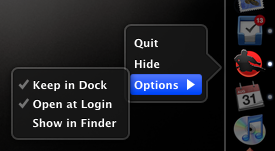
- The Dock: Speaking of minimized windows, they can now shrink into their application’s icon in the Dock, rather than becoming a new addition by the trash. This is an option that can be selected under Dock in the System Preferences.
And two of my favorite new GUI designs (not that there are many to choose from anyway) are the new contextual menu you get when you click and hold an icon in the Dock, and how the whole screen gets dim except for the clicked-on icon.

Though it’s not all roses. As Pat Dryburgh pointed out, clicking and holding on the Trash icon in a left- or right-aligned Dock that’s pinned to the bottom will display its contextual menu about two icons above the Trash.
- The Installation Process: I always prefer to install a major new OS release onto the blank canvas of an erased hard drive. It’s an ideal time to shake my feet from the dust of unused apps and preferences.
In previous releases it has been easy to choose to erase and install. This time, not so much. There was no clear option to “Erase and Install”. Once I had inserted the install disc I had read a PDF that listed the info on how to erase down towards the bottom — as if an afterthought. Basically, there is no standard option to Erase and install anymore. You have to to do it the old-fashioned way by re-starting your computer, launching Disc Utility, choosing to erase your hard drive, and then begin the installation process. No doubt too many people were innocently wiping their hard drives clean. Apple wants to make sure you are really aware of what you’re doing. So much so, that it even made me second guess the whole process.
In the past, once I have my fresh OS installed, I have only ever imported my user preferences during the initial startup process. Then, I setup .Mac (now MobileMe) and sync from the cloud to my computer. Next I would re-download and install any applications – from memory so as to only install the ones I knew I used – and import their app support and library files from my backup.
But this time was different. Before the install as I was sifting through my applications folder, I only found ten apps I don’t regularly use. So instead of re-installing everything from scratch this time, I simply deleted the ten and after installing Snow Leopard imported everything from my old user account. (This is more or less the exact same thing as doing an archive and install, except that it takes twice as long.)
- Dictionary: This oft-used app now remembers – and keeps open – any previously looked-up words until you actually close their window. Meaning, if I look up synonyms of creative in the thesaurus, quit, and then later highlight ignominious from Safari and choose “Look Up in Dictionary” from the contextual menu, there will be two windows open when Dictionary launches: the previous one with the synonyms of creative, and the new one, with the definition of ignominious. Currently I find this is simultaneously helpful and annoying.
Also new to the Dictionary app is a Chose the Right Word tailpiece. It’s a semi-brief snippet of text meant to “show fine distinctions in meaning between closely related synonyms to help you find the best word.” It isn’t there for every word, just some. Like creative:
Choose The Right Word
creative, inventive, original, resourceful, imaginative, ingenious
Everyone likes to think that he or she is creative, which is used to describe the active, exploratory minds possessed by artists, writers, and inventors (a creative approach to problem-solving). Today, however, creative has become an advertising buzzword (creative cooking, creative hair-styling) that simply means new or different.
Original is more specific and limited in scope. Someone who is original comes up with things that no one else has thought of (an original approach to constructing a doghouse), or thinks in an independent and creative way (a highly original filmmaker).
Imaginative implies having an active and creative imagination, which often means that the person visualizes things quite differently than the way they appear in the real world (imaginative illustrations for a children’s book).
The practical side of imaginative is inventive; the inventive person figures out how to make things work (an inventive solution to the problem of getting a wheelchair into a van).
But where an inventive mind tends to come up with solutions to problems it has posed for itself, a resourceful mind deals successfully with externally imposed problems or limitations (A resourceful child can amuse herself with simple wooden blocks).
Someone who is ingenious is both inventive and resourceful, with a dose of cleverness thrown in (the ingenious idea of using recycled plastic to create a warm, fleecelike fabric). - The Addition of Four-Finger Gestures for All Multi-Touch Trackpads: I’m on a previous model MacBook Pro and keep forgetting I can use these now.
- Menlo: The cool new monospace font that ships with Snow Leopard. I would compare it to Panic Sans in that it seems great for writing code, but not to Inconsolata in that Menlo stinks for writing lengthy amounts of text (in MarsEdit). Moreover, since Menlo comes with four weights it’s great for writing and editing AppleScript.
- TimeMachine:
The first backup after installing took over 24 hours (6:00pm Friday until 7:00pm Saturday). First it calculated changes, then erased my entire TimeMachine backup, did an entirely new backup, and once done told me my backup disk was almost full.
- Gamma 2.2:
This is now the default instead of 1.8. This is the same default as Windows, and means the graphics have more contrast. It’s most noticeable with dark images / backgrounds.
- Noteworthy is that when Daniel rolled out the 2.4 version of FastScripts this past June, he merged the full and light versions into one. Now you can use the full-powered version for free, but if you want more than ten custom keyboard shortcuts, it’s only $15. ↵
Save PDF to Web Receipts Folder →
For a moment I thought this was a new menu item in Snow Leopard. But no. Apparently I’ve been glossing over it for three and a half years — “Save PDF to Web Receipts Folder” was a new menu item in Tiger. Just because it’s old, however, doesn’t mean it’s not a clever idea. Though I still use Yojimbo to store all my receipts so I can tag and, if necessary, encrypt them.
(Tip: If you have used, or start using this automator workflow, you may want to read this first, so you don’t overwrite previously saved PDFs.)
Ordinary and Uncomfortable
While I wasn’t looking a lot of random categories managed to sneak their way into the post meta. I noticed it’s taking longer and longer to peruse the list of categories, finding just the right twenty-seven that match the post. Too much!
It’s funny, because I don’t even make a big deal of categories here. The WordPress search engine does a great job of finding any and all instances of a longed-for word or topic.
Even if I did parade the list of every post’s category you’d be sure to ignore it — as even the names are redundant and ordinary. For instance, there was Software, Software Reviews, and then, just, Reviews. There was Apple, and iPhone, and Technology; even a Life and Journal category.
Looking deeper, I could see how nearly every post was mingled within in a slew of uneventful definitions; far from simple and enticing. So this morning I deleted all but ten categories and renamed the unimaginative ones.
Journal and Life got the axe as Life in Full Color emerged in their stead. (Speaking of which, this is a category I very much want to add more to. I think this site would do well to have a more personal touch and some transparent stories. Posts such as “Marketing Shoes” and “Josephine” come to mind as the type of writing I’d like to do more of in the future.)
While shoring up the categories I also took time to read through a lot of older posts. And I remembered how I try to forget that so much of what I used to write is riddled with embarrassing grammar, poor attempts at wit, and a generally dull use of the english language.
I like to assume that I’ve always written as I do now. Though I suppose from my own point of view I have — insofar as I have always written as well and honestly as I can at that moment. But now, when I read what two years ago I thought was well written, I want to edit the snot out of it. But I restrained; I want to leave my previous links and articles as-is.
Hopefully in another two years time I’ll look back at what I’m writing now and feel the same abashment I felt this afternoon.
“Typographers Are Actors” →
A fantastic article by the aforelinked Josh Farmer:
As with any supreme art, great typography lets us become absorbed in the unspoken feeling of the moment because the artists themselves were able to inhabit and express that aura. In this, typographers are actors. They step out of themselves and become something else: the ’70s, velvety, robotic, disinterested, love, fearful, regal, luscious. They transfer the feeling to us—not just the letter or the word. And they do it with aplomb, convincing the public of the time and place the typeface represents.
Josh is an amazing writer, and his weblog, Words From a Father, is by far one of my favorite sites to read. He was keeping his site under the radar for a while, but now that he’s written this full-length essay I have no choice but to link to it and introduce you guys to his writing. Enjoy.
Mac OS X Over The Years →
Screenshots, release dates, and more from every Mac OS X release in the past nine years other than Snow Leopard. (Via David Kaneda.)
Reader’s Setup: Chris Bowler
Chris Bowler is a member of the team at Fusion Ads. He also links often and has a love for good software.
Chris’s Setup:
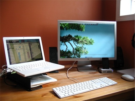
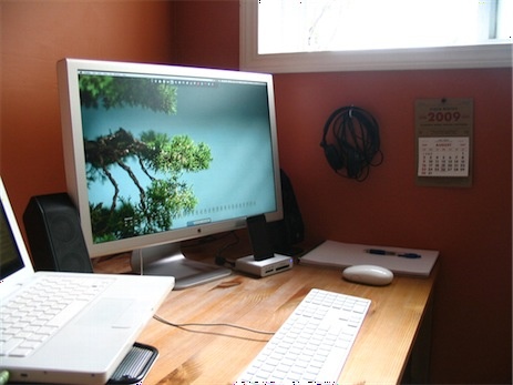
1. What does your desk look like?


2. What is your current Mac setup?
My setup is fairly basic. I work daily on a 3 year old white Macbook 1.83 GHz Intel Core Duo with 1.5 GB of RAM. Paired with a beautiful matte finish 23″ Apple Cinema Display, this is the best computer setup I’ve ever used. My data is backed up daily via Time Machine to a 500 GB Time Capsule on the other side of the house. I also perform a full backup to a 125 GB external drive every week using SuperDuper.
All input is entered via a wired Apple Aluminum keyboard and a Mighty Mouse. Sound is delivered over a pair of some-particular-model-of-Logitech-speakers-I-cannot-recall.
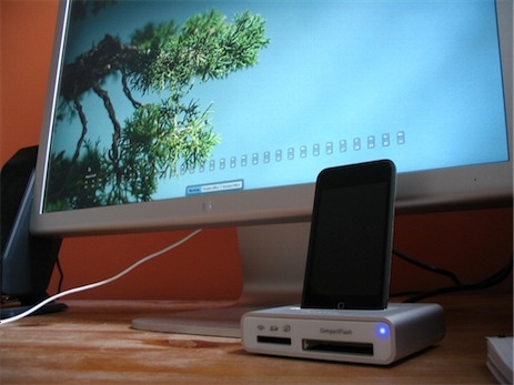
Oh, and I have a Griffin Simplifi to sync and charge the iPod’s and transfer images from memory cards.
3. Why are you using this setup?
In regards to the peripherals, I loved the Macbook style of keyboard ever since I bought this machine. The Aluminum keyboards are the closest thing I’ve found to the Macbook keyboard and I can’t imagine ever switching to something different. My Mighty Mouse was a gift and for the most part, has done the job.
The portability of a laptop is almost a given these days. The ability to move around the house and take everything I need on the road is priceless. And for the sake of simplicity, I reduced all my computer gear down to the barest necessities. For me, this is the biggest reason for my setup. I could upgrade to a new machine, but I don’t need to. I’ll keep using this one until it dies.
4. What software do you use on a daily basis, and for what do you use it?
First things first — the most important piece of software I use is OS X. Those who haven’t had to use anything else for a long time fail to mention this beautiful product far too often.
Apart from the best operating system available, I use the following everyday:
- Mailplane: multiple account support with the gmail threaded conversations. Until something better comes along, I love this app.
- BusyCal: a recent update over my iCal + BusySync setup.
- Safari: Many moons ago I was a hardcore Firefox user (probably due to my Windows usage). Once Safari was available on both operating systems, I never looked back. Now using Firefox on the Mac just feels wrong.
- Fluid + 37signals: at Fusion, we use Backpack, Highrise, Basecamp and Campfire. This setup gives all but Campfire in one application window.
- Propane: and to access Campfire, I use this. It makes Campfire more enjoyable.
- Things: the best task management tool available. I love how this app scales to the needs of the user.
- iTunes: my favorite piece of software. Ever. It’s not perfect, but it meets my needs in every way and only brings pleasure, no pain.
- Yojimbo: I flirted with Evernote for several months. It has some great features as well, but like Firefox, just never quite fit in. Yojimbo is a pleasure to use and has great AppleScript support.
- Tweetie: the unofficial Fusion motto — dance with the one that brung you.
- TextMate: such a great piece of software that I barely scratch the surface of. Mostly used for plain text, HTML and CSS, but it makes me wish I was more technical. Maybe one day.
- Numbers: like most of their work, Apple took a common concept and added some nice polish. We use Numbers to manage our monthly ads and it works so well for us.
- Acorn: I’m not a graphics guy at all, but when I have job that’s too much for Quicksilver and Preview to handle, Acorn is a pleasure to use.
- Awaken: i love this application. I use it to display the time on my secondary monitor, but also occasionally use it to create alarms or time myself.
- LittleSnapper: another nice tool, but one I haven’t used as much as I should. I’m working on it.
- Today: Another tool that sits on my secondary display, Today is my ‘today list’, and syncs with BusyCal (and therefor also syncs with Things).
- Quicksilver: the most important tool on the list, it should be first, middle and last on the list. I can’t imagine living without it — it’s too ingrained within my workflow.
A few other tools that are worth mentioning, but that I don’t use every day: Coda, WriteRoom, and Billings.
5. Do you own any other Mac gear?
Simply a first gen iPod Nano and a 1st gen iPod Touch. The nano I keep around for exercise (with the Nike+ kit) and the Touch for everything else.
6. Do you have any future upgrades planned?
I will probably purchase a new MBP in the next year — with my transition to self-employment, the work supplied second laptop that was primarily used by my wife went away. So our busy house now is at a point where two machines our a need rather than merely a want.
When I do upgrade, it’s probably going to be a 13″ MBP. As well, I will need a cell phone at some point and will get my first iPhone, but would settle for an older used model. And lastly, when the Mighty Mouse dies I’ll probably try something else — possibly a Logitech Revolution MX that everyone raves about.
But the focus will still be on having only what I need — I try my best not to succumb to the constant upgrade cycle that Apple encourages.
More Sweet Setups
Chris’s setup is just one in a series of sweet Mac Setups.
Murphy’s Law →
John Gruber’s age-old advice for upgrading to a major new OS release.
So, in short:
- Do a complete backup clone to an external FireWire drive.
- Test that the backup is indeed bootable and up to date.
- Unplug the backup drive.
- Boot from the installer DVD and perform a default upgrade.
Things 1.2: Now With More Nerdery →
Today’s update to Cultured Code’s Things includes a slew of new keyboard shortcuts and a much more useful Quick Entry Panel, which can auto-populate with any highlighted text and a link to the email message, Safari URL, or Finder file you are currently viewing. (Now I can toss the clunky AppleScript I’ve been using.)
Peruse the release notes for more info on the updates and for a complete list of the keyboard shortcuts.
Gizmodo Explains How to Make Coffee →
A good read for the 51% of shawnblanc.net readers who had a cup of coffee this morning. (A conical burr grinder and a french press is how it’s brewed over here.)
“Marty McFly Meets the Star Trek Crew and Both Battle The Terminator” →
David McCandless’ avant-garde infographic of time travel from popular movies and TV shows:
What I really love about this image, though, is the idea that this information has never been seen before. Despite the fact that it exists, in some way,somewhere, wrapped in various plots, it’s never been given form in this way.
This is just one page from his upcoming book, The Visual Miscellaneum, due out a month from tomorrow in the US.
Phil Coffman’s iPhone Wallpapers →
Some of the best I’ve ever seen. Hands down.
But where’s the zip file for those of us who want to download them all, Phil?
Yojimbo Widescreen Hack →
This hack by Jon Hicks is actually going on two years old, but I just discovered it this evening. It changes the default layout of the Yojimbo window and turns it into a three-panel “widescreen” layout, not unlike the one found in NetNewsWire.
USS Midway in San Diego Circa 2008
Yesterday I told Ben about the CameraKit app for his iPhone. This morning he sends me this photo in an email, saying, “I found this old picture in a box in the garage the other day. Remember when we were in the Navy together? Crazy times huh?” Oy.
