Awesome as always. And I did not know about those new Exposé tricks.
Minimal Desktop Day →
Love scoping out other people’s computer desktops? Today is your day.
Reader’s Setup: Toby Leftly
Toby Leftly is a UK-born, Ontario-based web developer and IT consultant. His love of the web, Apple and all things tech position him as a mild annoyance to friends and family, and a goldmine of useless, obsolete knowledge to everyone around him.
Toby’s Setup:
1. What does your desk look like?
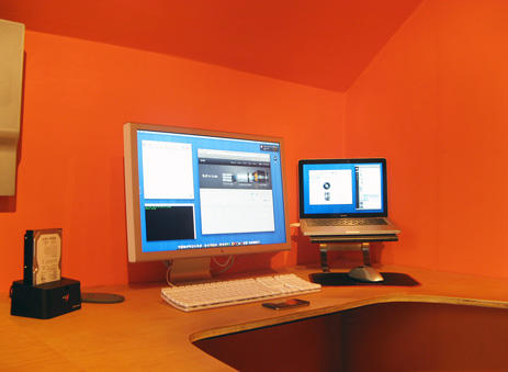
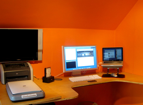
2. What is your current Mac setup?
My Current Mac is a unibody 13.3″ MacBook 2.4ghz with 4gb of RAM. I purchased the 15″ unibody the week it was announced but found it too cumbersome to be truly portable and downgraded when the opportunity arose. At home I connect it to an older 23″ Apple Cinema Display which doesn’t even come close to satisfying my need for pixel real estate.
I use a Microsoft Bluetooth 8000 Laser Mouse and the older white Apple Pro Keyboard. The laptop stand in the pictures is actually an Ikea Hack, but it works surprisingly well.
The last possibly unidentified item on my desk is a Thermaltake Hard Drive Docking Station. because my last system was a Mac Pro, I have three SATA hard drives with various backups and data stored on them, this seemed like the easiest way to continue accessing them.
3. Why are you using this setup?
My previous Mac was a quad core Mac Pro which was fantastic. But since I spend a great deal of time visiting clients, a laptop makes much more sense. And with every revision, Apple’s laptops get closer to the power and capability of traditional desktop systems.
My wife was tempted into the Apple realm by a trusty old Mac mini 1.25ghz Core Solo (boo!) but is hoping to get her hands on my laptop after my next upgrade. At that point I’ll hook the Mac mini up to our big screen TV as a media server.
4. What software do you use on a daily basis, and for what do you use it?
I use a wide range of software on a daily basis, but the applications you’ll find open in my dock at all times are:
- Mailplane (I’m a huge Google Apps fan)
- Tweetie (the best Mac Twitter client in my humble opinion)
- Yojimbo
- Last.fm (scrobble scrobble)
- TextMate
- Safari (can’t get along with the Firefox GUI, despite all the great add-ons)
- Terminal (slowly becoming more proficient with SSH)
Photoshop and Illustrator are the main apps I use for graphics work, although I long for the day when I can summon the courage to replace them with Pixelmator and Lineform. For cramming previously mentioned graphics into otherwise dull blocks of code I mostly use TextMate, although I’m buy-curious about Coda and Espresso.
I use Google Picasa for managing images on a large scale, Panic’s Transmit for pushing, shoving and pulling files, Skype for calling overseas and audio/video chat with friends and co-conspirators, and Google Apps for anything and everything else — email, calendars, contacts and very rarely spreadsheets.
I’ve recently discovered Firebug Lite, not officially an app but a very useful tool. I use Chyrp for blogging and Mint for web stats.
5. Do you own any other Mac gear?
My wife and I both own iPods — her’s a 16gb green Nano, mine an 8gb first gen touch which I love.
I’ve considered other Apple equipment, such as the iPhone, Apple TV and a Time Capsule, but ended up passing on all of them – the Mac and OS X really are Apple’s finest creations.
I use a regular old Motorola phone right now but when I do eventually upgrade to a smart phone it will most likely be the iPhone, although I had high hopes for the Pre (dismissed because of the superior build quality of the iPhone and the Pre’s questionable iTunes sync method).
6. Do you have any future upgrades planned?
I’d love a 30″ display, but I’m assuming Apple plans to update these eventually.
I’m looking forward to seeing what Apple does with the Macbook Air – with more RAM and slightly better specs it could be tempting enough for my next big purchase.
A small purchase I’m looking forward to is the Wireless Apple keyboard to replace my aging white Pro keyboard.
Not exactly an Apple product, my next upgrade will most likely be a hosting one – my current host, Media Temple, is beta testing Leopard Server hosting, which has me salivating like crazy.
More Sweet Setups
Toby’s setup is just one in a series of sweet Mac Setups.
Postbox →
A new $40 desktop email client for Mac and Windows that boasts some tall-order features, such as a Gmail-style conversation view and the ability to search through attachments only.
The Software Sweet Spot
I have always been the most enthusastic of applications that sit in the Software Sweet Spot.
Photoshop, for example, is not such an app. It has a steep learning curve, and if you don’t use it for for the heavy-lifting design for which it was built it feels bulky. Hence Neven Mrgan’s gripe: “My problem with Photoshop is that it was designed for 300 dpi work, but I mostly use it for 72.009 dpi images.”
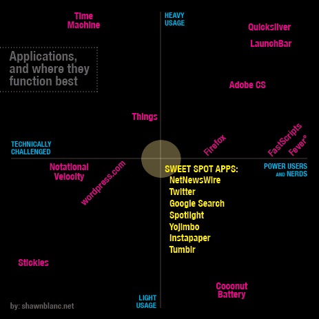
In my mind I imagine the scalability of an app as being two dimensional — stretching both horizontal and vertical. “Horizontal Scalability” means the app is useful and helpful for basic users and power users alike. It doesn’t matter if you’re a total noob or a total nerd, the app works great for you.
“Vertically Scalability” could mean two things: First, that regardless of if you utilize one feature or all of them the app sustains its ease and joy of use. Meaning, you aren’t missing out if you only use a few features, nor are you held back if you use many. Secondly, it could mean if you use the app all day every day, or only once in a while, you still get a bang for your buck.
Here is a chart with many apps I use, and where I think they land in terms of scalability. Admittedly, it is somewhat flawed from the start, but I still think it accurately communicates the point.
There is no good or bad area on this chart — the top right is no better than the bottom left. I am extremely fond of nearly every app on this chart. However, the apps I most frequently recommend are the ones that sit in the Sweet Spot. These apps are great regardless of who uses them and how often they get used.
An interesting side note: the majority of apps seemed to fall into the top right and bottom left areas. Also, it was surprisingly difficult to find an app for the bottom right spot. Coconut Battery was the only app I could think of that is geared for power users and nerds yet isn’t necessarily something you would use on a regular basis.
BezelHUD for Quicksilver on Snow Leopard →
This Quicksilver interface is, in my opinion, the best Quicksilver interface. It broke on QS version B56a7 for Snow Leopard, but Ben Cochran has updated it. (Via Julius.)
Colin Devroe Talks to Steven and Cabel About Coda →
Steven Frank: “The next stop for Coda is 2.0.”
Also, Colin’s input from web developers regarding text editors is right on par with what’s seen in the Mac Setups: by far the most-used editor is TextMate.
Append Text Without Quicksilver →
And the move to LaunchBar gets easier and easier.
Reader’s Setup: Ryan Gonzalez
Ryan Gonzalez writes about technology, design, or any interesting subject he comes across at his blog. A designer at heart, but a budding young writer from the cultural hub of South Carolina, he’s been in love with the Mac since kindergarten and can be found on Twitter as @rmg7344.
Ryan’s Setup:
1. What does your desk look like?
2. What is your current Mac setup?
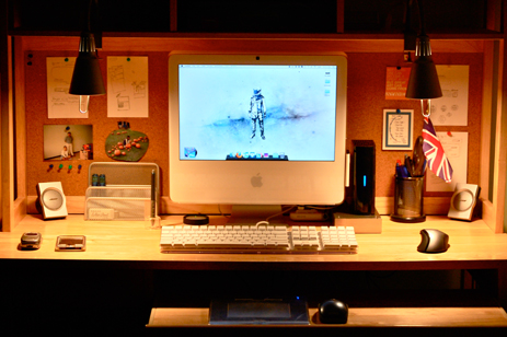
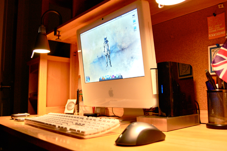
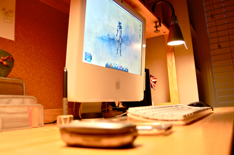
I have a 17″ white iMac, circa Fall 2006, running at 2.0 GHz with a Gig of RAM and a very small (160GB) amount of storage. It’s not customized at all, a stock version plucked off the shelves of the (now defunct) local CompUSA.
Connected to the Mac, I have:
- 1TB Western Digital MyBook Essential, for extra storage
- 320 GB Lacie Porsche Drive, for Time Machine backups
- The included Apple Wired Keyboard
- Logitech MX620 Mouse
- Bose Companion 3 Speaker Set
- Wacom Graphire Tablet, for design work
Behind all the technology, there’s a cork-board that’s very helpful when organizing my thoughts on everything, particularly for my design sketches.
3. Why are you using this setup?
It’s long-winded-story time: I remember playing with an ancient Apple II back in kindergarten, all the text based and 8-bit games fascinated me for as long as I could use the computer. So, at that point I decided I would get a Mac; unfortunately, until 7th grade I was left with a half-way decent Dell Desktop. By then, I knew it was time to finally get a real computer. Over my first year in middle school, I saved the $1299 to get the iMac; looking back, it seems like money well spent.
I told my parents it was mainly going to be used for schoolwork. That was a lie. So, not surprisingly, I use it more for writing, designing, and general web browsing. So far the computer has run sufficiently enough, though Photoshop does get a hiccup from time to time. Even with these shortcomings, I still love my iMac, my first but certainly not last Mac.
4. What software do you use on a daily basis?
Firefox has been my main browser for a while, though I did flirt with the Safari 4 beta until I learned about its horrid cache of hidden files. I’m not an extension man though, because I have only a couple installed with Firefox: Firebug for development, and Greasemonkey/Stylish for making the web a little better looking. iTunes is for my music, podcasts, and archive of films. Photoshop, obviously, is for my creative exploits. Tweetie is my preferred Twitter app for now, though I like reading on my iPod touch more. I use Ecto for writing and publishing my blog, and Scrivener for long pieces. Google Reader might be my most used app, overall; I have a Fluid instance set up for it.
5. What other mac gear do you own?
Before even my iMac, I had the 3rd-Gen iPod, the first one with the click-wheel. It’s still in use, though it is somewhat messed up (skipping songs, etc.) My Dad has a video iPod that was mine for a couple years; he also has a 2nd-Gen iPod Nano. My mother has a 2007 MacBook that my little sister plays with constantly. Last, but certainly not least, I have an original iPod touch. It’s the most important gadget that I carry around, even more so than my (ancient) cellphone.
6. Do you have any future upgrades planned?
Actually, I’m in the process of a making a major transition technology-wise and with life in general. In a few months, I’ll be moving to a public boarding school that’s set up like a college. Living there for two years means that I’ll need something portable, powerful, and sufficient enough to replace my iMac (it’s staying home.) The $1699 15″ MacBook Pro fits that perfectly; hopefully I’ll have it within the next month or so.
Like I mentioned earlier, my cellphone is ancient — it’s pre-Treo, let alone pre-iPhone. Though it pains me to say, I’ll be moving to AT&T from Verizon just to get the iPhone 3GS. If only there was a Verizon iPhone…
More Sweet Setups
Ryan’s setup is just one in a series of sweet Mac Setups.
‘La Premiere’ →
A very likable short film based on the story of the Lumiere Brothers and the invention of the cinema as we know it.
Also worth watching (if not even more so than La Premiere), is The Butterfly Circus.
Relocating and Resizing the LaunchBar Bar
The LaunchBar community is a lot bigger than I imagined. I was shocked at how many emails I got in response to my post on Monday about switching from Quicksilver to LaunchBar — mostly with tips in response to my dislike of the default location of LaunchBar.
Previously unbeknownst to me you can easily move the LaunchBar bar with a click and drag of the mouse — pulling it away from the Menu Bar and and putting it wherever you like. Also, you can adjust the width of the bar by placing your mouse near the edge until you see the resize cursor.
But, if like me, you want LaunchBar to show up in a down-to-the-exact-pixel spot, reader Chip Warden’s surprisingly simple tip for editing the preferences file is for you.
Open the file ~/Library/Preferences/at.obdev.LaunchBar.plist in a text editor, and find this bit of code:
<key>LaunchBarHorizontalPosition</key>
    <real>0.5</real>
<key>LaunchBarScreen</key>
    <integer>0</integer>
<key>LaunchBarVerticalPosition</key>
    <real>1</real>
<key>LaunchBarWindowWidth</key>
    <real>430</real>
The three, editable variables in there are pretty self explanatory.
- The
LaunchBarHorizontalPositionvalue moves LaunchBar left and right. A value of “1” pushes it all the way to the right side; a value of “0” pushes it all the way to the left. I’ve left this value at the default “0.5”. -
The
LaunchBarVerticalPositionvalue moves LaunchBar up and down. A value of “1” (the default) pushes the bar to the top of your screen, directly underneath the menu bar; a value of “0” pushes it all the way to the bottom. I have mine set to “0.667” in honor of the rule of thirds. -
The
LaunchBarWindowWidthvalue adjusts the width of the bar in pixels. Mine is set to “430”.
Don’t forget to make a backup of the preferences file, and you’ll want to quit LaunchBar before editing or your changes won’t stick.
A Better One-on-One Form
If you are a manager you need 1:1s with your team. My Tuesday afternoon is pre-booked with my direct reports. I meet with them all, one at a time, and it’s worth every minute.
Since I don’t have the world’s most amazing memory, I use a form to jot down the things I want to talk about during our 30 minutes and to keep record of what they have to say. Also, since it’s not uncommon to end up talking about things we need to do, there needs to be a spot for action items.
At first I used a generic form I found on the Internet. But I kept getting frustrated by its horrendous layout and lack of flexibility. So I designed my own. And then re-designed it. And re-designed it again. I’ve gone through many different 1:1 forms over past Tuesdays, and I’ve finally found a minimal and flexible design that woks.
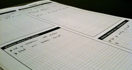
The font is Gotham Bold, each text box has a quarter-inch grid, the headings are written in very plain and inviting terminology, and the color is 1/0 so a lot of these can be printed for dirt cheap.
I keep used and empty forms in a binder near my desk. It helps me not think about Tuesday afternoon until it’s Tuesday afternoon, when I just pull out last week’s forms and jot down any left-over items onto this week’s. If something comes up in-between Tuesdays I just pull out the binder. Or if I’m not at my desk, there’s a text file on my Mac that I throw things into.
If you’d like to use the form, redesign it and make it better, or anything else, feel free to go nuts:
-
Download the source files (InDesign and EPS)
Yojimbo 2.0 →
The long-awaited, somewhat-doubted update to Yojimbo. It’s $20 to upgrade, unless you bought version 1.5 in the past 9 months.
Yojimbo 2.0 comes with a polished UI, a new icon, and a slew of well thought-out usability additions related to how info goes in and how it comes out. You can read the release notes here where you’ll see there are no flashy new features, and no mention of an iPhone app.
What the Bare Bones team decided to add, and what they decided to leave out, says a lot. Version 2, as I see it, isn’t trying to win people over from Evernote. (If it was, there would have been an awkward iPhone app.) This is an update for current Yojimbo users, and for people who’s lives don’t hinge on having an info management app that syncs to their iPhone. Your milage may vary, but from where I’m sitting, almost every addition in version 2 meets an actual need in my day-to-day usage of Yojimbo.
The reason it’s not a 1.6 update is because of the fundamental concept behind Yojimbo: minimalism; ease of use; “low friction data collecting”. Bare Bones didn’t lay new tracks, they greased the skids even more. And that is precisely what makes or breaks an app like Yojimbo.
Fusion Ads’ Newest Members →
Jon Hicks and Minimal Mac join the network. Nice.
