Absolutely gorgeous photos, most of which are straight out of people’s cameras. Curator, Tom Coates, summed it up best:
Difficult for me to describe how beautiful this one is in any way that would exceed the photo itself.
Absolutely gorgeous photos, most of which are straight out of people’s cameras. Curator, Tom Coates, summed it up best:
Difficult for me to describe how beautiful this one is in any way that would exceed the photo itself.
Oh my stars. (Via Jordan Smith.)
Grant Blakeman makes magical things on the internets. He runs [gb] Studio, a small, Boulder, Colorado-based design studio where he designs interfaces, brands companies, and builds web apps. He also likes to help bands promote their music.
In his spare time, he pretends to write, takes photos, and makes the occasional video.
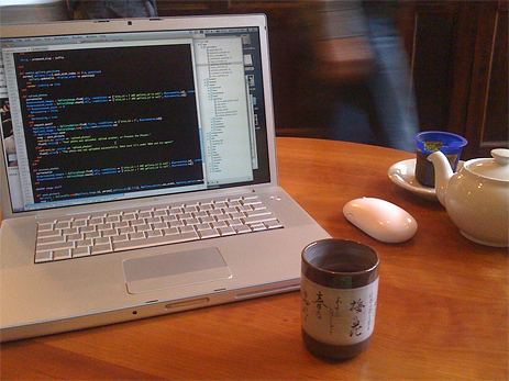
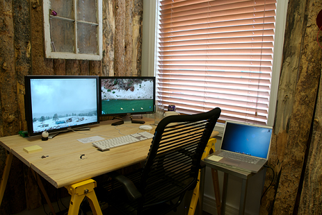
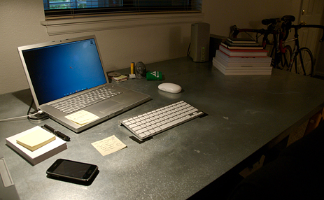
In the few years I’ve now been working for myself, one thing I’ve come to realize is that space is important. My workspace, whether it be digital (on the computer) or physical (where I’m sitting at a given moment) has a huge influence on both my creativity and productivity at any given moment in time. I’ve also come to recognize that I work best in focused chunks of time, and that changing my work venue throughout the day is simply more enjoyable than working from one place for 8-12 hours straight.
The Rotation
I rotate my work day between several different work spaces. I usually start the day at Trident, my favorite coffee shop in Boulder. It’s about a 5 minute walk from my apartment, in the heart of town, on the west end of Pearl Street. I like the mix of people, and, after showing up at relatively the same time every day for a couple years, the community. For whatever reason, it’s one of the most creatively stimulating places for me. If I need to sketch some logos or mull over a creative problem, it’s often the space I turn to.
I show up, get a pot of green tea, and crack open the 15″ MacBook Pro. I’ve got one of the weird 2.33 GHz Core 2 Duo versions that can only address 3gb of RAM—even though it has 4gb installed—but it gets the job done. Mornings are usually spent catching up on email, perusing blogs, and maybe getting one significant chunk of work done on what’s left of the battery.
The office is usually the next stop in my day. I’m lucky enough to share some office space with skinnyCorp Boulder, the fantastic folks behind Threadless. Their building is another 5 minutes walk from Trident, to the other end of Pearl Street. I love being able to walk everywhere, and the breaks in my day create nice distractions or impromptu meetings with others from around town. My own office is hard to miss as you come up the stairs. Former officemate, Andrew Hyde, and I decided to deck it out as a legit mountain log cabin. We even grabbed some pine boards from a sawmill and hung them on the wall. Let’s just say I have a permanent pine air freshener.
In the office, I network my laptop with my Mac Pro via firewire. Projects I’m currently working on always reside on the MacBook Pro for mobility, but in the office I take advantage of the 2 2.66GHz Dual-Core Xeon chips and 7gb of RAM in the Mac Pro. I love Apple’s aesthetic, but I couldn’t beat Dell’s prices when it came to 24″ and 20″ monitors. I also use Teleport. to control the laptop that sits beside my desk with the keyboard and mouse from the desktop.
Some days I play ping-pong work late into the night at the office, others I head back home to my apartment home office—the third of my primary work spaces. I use the MacBook Pro at home, and also keep an old HP ScanJet scanner handy for pulling in sketches and other stuff. My apartment is small, but I love the flexibility of being able to work from home so it is still important to me to dedicate space in the apartment for work. I use MobileMe to get back into the office virtually if I need to.
Your mileage may very, but for me, it’s important to mix the day up. I work a lot of hours, and the little breaks and transitions between places help keep me going. I also love having the ability to choose a different work location based on a whim—what kind of mood I’m in, or what kind of creative space I am looking for. The MacBook Pro and MobileMe keep me, well, mobile, but I love the power of the Mac Pro and large screens for heavy lifting. Having an office outside of my home, with other amazingly creative people, also allows me to set a personal/work boundary when I need too and not feel like I should be working whenever I’m at home. When I first went out on my own, I worked exclusively from my house and this became a problem.
On the more technical side, the Mac Pro has 4 500gb drives in it. One is for active projects, a second is for archival. Both of those back up to the other two internal drives on a nightly basis via SuperDuper. The laptop is backed up automatically when I’m home via a 500gb Time Capsule. I also use 2 sets of 500gb Lacie Drives in rotation for offsite backups. Once you lose work due to a hard drive failure like I did years ago, you take backups very seriously. There is also the expectation in the design industry that former clients could come back even years later and ask for access to files they assume you still have.
Desktop Apps
Web Apps
Server Software
I just ordered the Mac Box Set with Snow Leopard. Eventually I’m guessing a 3GS will find its way into may hands, and I’m actually having to come up with good reasons not to buy a new MacBook Pro, because I really don’t need one. I’m also hoping to do some sort of Mac Mini / Flat-screen TV combo in the not-too-distant future.
Grant’s setup is just one in a series of sweet Mac Setups.
A re-link in honor of NetNewsWire 2.0 for iPhone. Because “when reading lots of text on a MacBook Pro, I prefer a serif. lots of text on iPhone, sans. Lots of text in a book, coffee.” (Via me.)
Man, I think Nick is spot on:
The result of all this is that it’s even harder to find blogs that you can read for pleasure.
Maybe Lamond’s best advice yet.
How to add Tumblr sharing to your Fever feed reader. (Via LKM’s Stuff.)
For over a decade across my teenage years I studied and practiced Karate and Tae Kwon Do.

Martial Arts isn’t just about kicking wooden boards held by your cringing, fellow fighters. It’s also about becoming a better person. A true Martial Artist has physical goals as well as internal values: speed, skill, flexibility, and the ability to take a punch; honesty, integrity, perseverance, and respect.
Every day at Omega Karate we would recite our student creed — reminding ourselves that yes, we wanted to be like Bruce Lee, but we also needed to grow in character.
It’s been nearly another decade since I last tied on my Black Belt, but, because of these values, I never really took it off.
John Hicks updates his 3-panel widescreen hack to work with Yojimbo 2.0.
Cory Doctorow:
The single worst piece of writing advice I ever got was to stay away from the Internet…
Cory’s advice reminds me a lot of Natalie Goldberg’s tone in Writing Down the Bones: just write.
Based in Salem, MA, Michael Bester works remotely as a Software Architect in the Interface Engineering Group at Schematic. Practically speaking, that means he authors HTML, CSS and a truckload of Javascript for a variety of projects. He occasionally writes on his personal site, Kimili, and tries his hand at witty banter on Twitter.
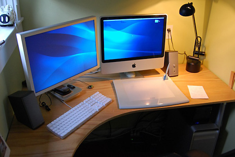
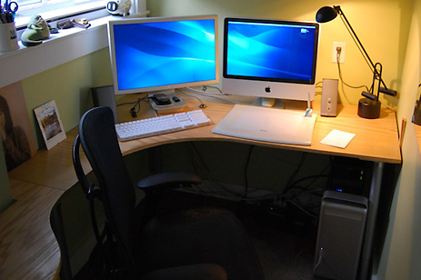
All of my work for Schematic is done on a 2.4 GHz Intel Core 2 Duo iMac with 3 GB of RAM. My personal machine is a quad-core 2.5 GHz PowerMac G5 loaded with 6.5 GB of RAM and a Terabyte of internal drive space. It doesn’t get nearly enough use these days to justify all that computing power.
An IOGear Micro DVI KVM switch connects both machines to a single keyboard, a 23″ aluminum Apple Cinema HD Display and an old Wacom Intuos 9×12 tablet, which I use for all my mousing needs. A Drobo loaded with a pair of 500GB WD Caviar drives stores all my photos, video and music. A set of Bose Companion 2 speakers rounds out the setup.
In the case of my personal machine, I tend to get the most powerful system I can, as I typically go a long time between upgrades. For example, before my quad-core G5, I had one of the first G4 desktops ever made. It lasted me 6 years.
The iMac is Schematic-issue, and is a recent upgrade from a white 2.16 GHz Core 2 Duo MacBook (which simply crumbled under the weight of running things like Photoshop, Firefox and VMware simultaneously). As a web development workstation, the iMac gets the job done with aplomb.
The last mouse I used with any regularity was the hockey puck that came with my aforementioned G4. The experience left my forearm so sore that it soured me on using a mouse at all. It was then that I purchased the Wacom tablet. I’ve never looked back since.
Some things I don’t use daily, but are still essential:
I’ve got a few iPods lying around, including a 3rd generation 15 GB model — the last one with a monochrome screen (what a relic!) — as well as a previous generation 1 GB iPod Shuffle. I also borrow my wife’s 2.16 MHz Core Duo 2 MacBook with 2 GB RAM on the rare occasion that I have to take a computer with me somewhere.
Not in the immediate future, but when the time comes to upgrade the G5, I may transition it to a MacBook Pro. I’ve been skeptical in the past about using a laptop as my main machine because of the limited upgradability and generally slower performance when compared to a tower. However, I think recent generations of the MacBook Pro are bridging that gap.
Michael’s setup is just one in a series of sweet Mac Setups.
John Hicks wrote some custom CSS to better use Simplenote in Fluid. Also, the Simplenote crew has posted hi-res versions of their icon. Even though it’s exponentially more ugly at 550 pixels than at 57, at least it will match your iPhone.
Four out of five of you are nerds. On your computer exists your hobbies, your current and/or future career, and the rest of your daily life. You don’t own a snowboard, but you do have a blog, a Twitter, an RSS reader, and a pirated copy of Photoshop.
You, my friend, need an Anything Bucket.
This is not the same as your tried and true System for saving and finding things. The System is for everything. Your Anything Bucket, however, is for everything else. And you need both.
There are lots of options out there. Off and on for years I tried to use Yojimbo, but it frustrated me because I treated it as a replacement for the Finder. On more than one occasion I endeavored to replace my tried and true System of filing things with this single piece of software — attempting to save nearly everything in Yojimbo. That is a horrible way to live, and it’s why I always abandoned the app.
Yojimbo is not an Everything Bucket. A more fitting description, I think, is Anything Bucket.
Because apps like Yojimbo are not where you should keep everything, but rather, where you can throw anything. They are not replacements for the Finder – nor the opposite – you should use them both.
John Gruber lays this out ever so clearly in his article, “Untitled Document Syndrome“. The gist of John’s article is that apps such as Yojimbo are successful because they’re simple. He says: “When you don’t have to do much before (or after) doing what you want to do, you do surprisingly more.”
Summing up Mark Hurst’s advice about simple computing, Andrew White says: “Use the simplest, sanest application that will get the job done. Avoid extraneous clutter in menus, on desktops, in applications. Pick the utilities that will give you the most — ahem — utility, and use and learn the crap out of them.”1
Anything Buckets should be more about ease of use than about depth of features. The very best ones lend themselves to perpetual use. And if you use them, depth will come from breadth.
The info we throw at them can be permanent, temporary, important, or trivial. It doesn’t matter. Regardless of who, what, when, where, or why, the best Anything Bucket is ready to receive any bit of information that threatens to elude you.
Yojimbo. Hitting shelves in January 2006 it has sat on four different Mac operating systems and has gone virtually unchanged since its initial release. It is a simple and charming piece of software that packs a lot of punch.
The previous version of Yojimbo, 1.5.1, was released on February 2, 2008. The 2.0 release shipped on September 1, 2009, nearly 19 months later (longer than most of the previous major OS X release cycles). The 2.0 update to Yojimbo came with a new icon, a database upgrade, a few new features, and a lot of refinements.
Yojimbo 1.5 is to OS X Leopard what Yojimbo 2.0 is to Snow Leopard. Which is to say version 2 is an attestation to the charm and punch Yojimbo 1.0 came out of the gate with. Even though version 1.5 sat there for over 19 months, it was still whispered about at the water cooler as people fiddled with their Evernote iPhone app. And that, my friends, says something profound about the quality of this simple piece of software.
Looking at version 2 and what Bare Bones Software decided to add, and what they decided to leave out, says a lot about Yojimbo. I couldn’t help but imagine the 2.0 release as being similar to the scene in 300 between King Leonidas and Xerxes’ messenger.
In the scene, a messenger from King Xerxes arrives at the steps of King Leonidas’ home. As they walk through the streets, the messenger calmly demands that Sparta submit itself to the will of King Xerxes and begin giving offerings or else face war against the King’s vast army. The scene climaxes in one of the most memorable and quotable moments of the movie as Leonidas kicks the messenger into the city’s well, defying the demand to submit, shouting, “This! Is! Sparta!”
Sure, it’s a little over the top to compare a software release to an epic war movie, but the plot line in this scene is analogous to the current Anything Bucket market and the path that Yojimbo has taken. Not to say other apps have taken the wrong path and Yojimbo the right one, but in the midst of many options — and many requests for features that other apps have — Yojimbo’s feature scope has remained unwavering.
The latest Yojimbo, as I see it, is not fighting the same way their competitors are. After 19 months without an update, many were looking at the Bare Bone team: Choose your next features wisely. And but so, when 2.0 finally shipped Bare Bones Software chose not to lay new tracks, but instead, grease the current ones. “This! Is! Yojimbo!”
Yojimbo’s most powerful feature won’t be found in the release notes. In this regard it is very similar to Quicksilver. At first glance, when you look at Quicksilver and see it’s an application launcher, you think, Cool. But so what? I have Spotlight and the Dock. Why should I learn a new app?
Even if you read the support documentation and learn about the plugins and the extensibility that Quicksilver offers, it’s not until you use it that Quicksilver becomes a part of you in a way you can’t explain. Nor could anyone have done it justice in explaining it to you.
It is likely that many people confuse a tried and true system and a system they use as being the same thing. In my experience, it is one thing to have a clear and organized structure for where you put quotes, notes, passwords, and the like. But it is another thing altogether to actually fill that system’s folders with content.
Like I said earlier, this confusion was the reason I tried and abandoned Yojimbo so many times — I completely misunderstood the purpose and advantage of an Anything Bucket. Yojimbo is great not because it replaces your organized filing system, but because it encourages perpetual capture of all sorts of information.
Put plainly, Yojimbo is the simplest way possible to save any bit of spontaneous information. No matter how indispensable or arbitrary that information is.
As Patrick Woolsey of Bare Bones Software said, “The intent of […] all of Yojimbo’s input mechanisms is to make entering info as easy as possible, so that you’re more likely to do so.”
And Yojimbo’s input mechanisms aren’t just easy, they abound. You can get info into Yojimbo just about any way you can imagine: quick input windows, drags and drops, bookmarklets, javascripts, AppleScripts, and more. Choose your own adventure.
With input options around every corner, my rule of thumb for getting the most out of Yojimbo is to dump as much in as possible. Here are some of those ways, listed in order of what the author uses most:
My Safari and Mail scrips (invoked by FastScrips) are by far my most used methods for sending info to Yojimbo.
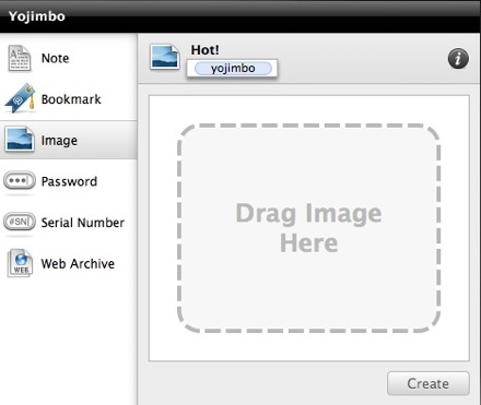
There is a whole lot of cool when it comes to this thing. It can be brought up at any time, in any application, via a keyboard shortcut (so long as Yojimbo is running). And it is the perfect place to drop notes, ideas, passwords, images, and more, without having to bring Yojimbo to the frontmost window.
If you have text copied to the clipboard when you invoke the Input Panel, Yojimbo will automatically populate the new item with that content. It’s even smart enough to know if it’s an image, an URL for a bookmark, or text for a note. Moreover, if you close the Input Panel before creating your item, Yojimbo keeps that info in there.
When you invoke it again, yet happen to have new content saved to the clipboard, Yojimbo gives you the option to keep what you used to have or fill the panel what you’ve currently got in your clipboard.

Similar to the Quick Entry HUD in Things, Yojimbo’s input panel is an easy and ubiquitous way to capture info on the fly. Unlike the HUD in Things, however, is the Quick Input Panel’s frustrating behavior with click-through. I am a big fan of how the Quick Input HUD from Things handles click through: when HUD is frontmost you can navigate, click, select, drag, and drop all around your Mac without the HUD closing. The Yojimbo input panel operates the opposite: when creating a new item, clicking outside of the input panel will instantly cause it to disappear. The info isn’t lost, you just have to re-invoke the panel to get to it again.
My only other gripe is need to press the Enter – not Return – to create a note item after entering some text. Though the reason for this makes perfect sense because the Quick Input Panel supports rich text editing (hit cmd+r while inputting text and you’ll see what I mean), it is still a keyboard shortcut I haven’t gotten used to.

Similar to the way Mail will launch and create a new message with the file you dropped as the attachment, Yojimbo will open and display a new item with whatever it was you just dragged and dropped. (You can even take iTunes URLs right out of iTunes for albums, apps, and movies that you want to revisit some other time.2)
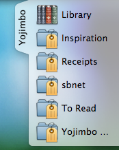
For one, when dropping an item into a Tag Collection that is in the drop dock, the respective tags for that Collection will be automatically assigned to the new item. Secondly, you can now choose what collections show up in the Drop Dock. Honestly, I can’t think of two more useful feature additions to the Drop Dock.
Yojimbo is the only app I use tags with. I don’t use them in Things, Mail, or even on my own website.
And I don’t just use them, I use them religiously in Yojimbo. So much so that I added tag-input dialogs to the Mail and Safari scripts I use so often. Though ironically, I don’t know that I’ve ever found a file in Yojimbo exclusively thanks to its tag. What I do use tags for is smart Collections (especially when working on a project).
The reason I don’t tag my to-do items in Things is because bothering with them on the front doesn’t ever prove useful on the back end. But in Yojimbo tagging an item is a big contributor for how information gets organized (assuming you even want it so), and for how it gets found later.
You can have folders (called Collections) and smart folders (called Tag Collections). Standard Collections only get populated by manually dropping a Yojimbo item into them. Whereas Tag Collections auto populate with every item in your Library that contains one or more of the tags you’ve assigned to that Collection. If you drop an item into a Tag Collection all the tags assigned to that Collection are added to the item, and, obviously, that item gets pulled into the Tag Collection.
It used to be that a Tag Collection would only hold items that matched an exact list of tags. But now I am very grateful that you can populate with items that match either all or any in a list of tags.
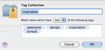
And if you’re not a huge fan of the default icons used for collections you can change them. Just find a folder who’s icon you do like, and copy/paste it from that folder’s info panel into Yojimbo’s info panel for your (now attractive) Collection. This can be especially helpful for regular / smart Collections you keep around indefinitely.
Bill Bryson once said: “The remarkable position in which we find ourselves is that we don’t actually know what we actually know.”
And this is the very reason Yojimbo is so remarkably helpful — getting information back out is nearly as easy as getting it in.
Since the fastest way to find something in Yojimbo is to search for it, I’ve set a global hotkey to bring Yojimbo frontmost and put the cursor in the search box. And searching for something in Yojimbo is outlandishly quick. Results never hang, and I’ve never been unable to find what I was looking for.
Moreover, all of the Library items are indexed by Spotlight. If something you’re looking for in Spotlight exists in Yojimbo, you’ll see it there. Or you can do an app-specific search by prefixing your Spotlight query with “kind:yojimbo”.
In addition to finding what you know you are looking for, the new Tag Explorer helps you find what you don’t know you’re looking for. It is a great way to delve into the random things you’ve thrown into Yojimbo that you may have forgotten about. In a way, it is a similar concept to Shaun Inman’s Fever feed reader, in that, the Tag Explorer can help you aggregate the contents of your Yojimbo library. You never know when you’ll find some long, lost gem you had forgotten about. It may just be the funnest addition to version 2.
Back to the beginning: the greatest feature of an Anything Bucket is simplicity that leads to regular use. For me, I don’t see what good is it to have my files synced across my laptop, my phone, and my friend’s Web browser if I am rarely putting any files in. I’m not concerned about using an app that will cover my butt for that one day when I might need to access that one bit of info when I’m not at my laptop.
Rather, I want an app that will actually get used… a lot.
It’s not to say, though, that simple cannot be married with mobile. It just means if Bare Bones does launch an iPhone app there is a lot for them to consider. Primarily: syncing and accessing the database, and iPhone app development.3
If I were to sync my entire Yojimbo library to my iPhone, it would be a little less than 1,000 items with a database of 86 MBs right now. Even for someone like John Gruber, who has been using Yojimbo since the beta days, it wouldn’t be a massive chore to get his Yojimbo data onto his iPhone. John’s total library is 5,500 items and 375 MBs. Not that big of a file for just about any given iPhone. A single movie easily takes up three or four times that amount of space.
(An interesting tid-bit of info: Patrick Rhone, who recently migrated his data from Evernote back to Yojimbo, went from 1,220 items and a 1.3GB library in Evernote, to 1,432 items and a 403MB library in Yojimbo. His database weighed in at one-third the size after the migration. Obviously none of his audio or video attachments were able to be transferred into Yojimbo, but that’s not the only reason the database was shored up. Evernote treats text files as HTML and uses WebKit to render notes. Patrick and I agree that, because of the way Evernote handles even basic text notes, extra size gets added due to the code which is wrapped around even the simplest of notes.)
If Yojimbo offered multiple syncing options, such as over-the-air, same-wireless-network (like Things), and USB, it could allow for a user’s first sync to be over USB. Thus getting the initial heavy lifting of the data over to the iPhone that way, and then allowing wi-fi and/or over-the-air sync as the default.
Ultimately, without over-the-air syncing Yojimbo would not be the world’s best info-management mobile app. The biggest need for me wouldn’t be having my notes with me all the time, but having them with me at an unanticipated moment.
This is exactly why Apple’s iDisk app for the iPhone isn’t that exciting for me. It meets a perceived need, but not a real-life need. If I know ahead of time what documents, songs, and images I will want on my iPhone then hooray for me that I can drop them onto my iDisk and find them later. But it’s virtually impossible to plan ahead for all the items I may want access to when away from my computer. Let alone, just the files that I would only want to view, listen to, or share (since iDisk files are read only on the iPhone).
Functionality isn’t all that Bare Bones has to consider. Designing an iPhone version of a desktop app requires much to be reconciled. As I wrote about in my review of Things, when creating an iPhone version of a desktop app you can’t just drag and drop the code and click the “iPhoneitize This” button. You have to completely start from scratch.
There are two dynamics to successfully building two versions of the same app onto two unique platforms (one for iPhone and one for the Mac).
Both apps need to feel like they are one in the same. Meaning, the Bare Bones team will have to reconcile the two-fold need for their iPhone version of Yojimbo to feel like a native iPhone app while also feeling like the very same application they’ve made for the desktop.
Not only would the Yojimbo iPhone app need to stand on its own for those who only use it on the iPhone, it must also feel like a natural extension of the desktop version for those who will use both.
Reconciling these goals is the same issue Apple had to tackle with apps such as iCal and Mail. iPhone’s Calendar app feels great all by itself, but if you also use iCal on your Mac you don’t necessarily feel like you’re working with two different programs. They are simultaneously the same and different.
Moreover, the problem of Plain Text versus Rich Text notes would have to be solved. iPhone OS doesn’t have native rich-text-editing features. Yojimbo’s iPhone app would have a handful of possibilities for how they would let users make edits to a rich text note:
Keep formatting, but any text that is added/edited would be unformatted;
Not allow edits of notes, only appending of new text (this is how Evernote handles it);
Build an in-app rich text editor (see: Documents to Go [iTunes link]).
Based on how I most use Yojimbo, I would be happy to have a “convert to plain text-only” option that would allow me full read/write access in sacrifice of rich text notes.
In the mean time, however, I get along just fine without an iPhone Yojimbo app. When I think of an idea or something that I know I’ll want in Yojimbo I usually just email it to myself. Otherwise I throw it into Simplenote.
Though I did have this crazy idea of using Evernote and Yojimbo. Not sure if it’s feasible, or worth the trouble, but I had this thought about scripting Evernote to export all its notes as RTF and then have Yojimbo import them. It could be set to run once or twice a day automatically, and that way I could use the Evernote iPhone app for capture and the note would automatically end up in Yojimbo. It simultaneously seems cool and over the top; it may be easier to just set up a Mail rule and a script instead.
Security: Perhaps Most important of all, your data is safe. Not only does Yojimbo use industrial strength encryption, it also doesn’t jack with your data. The data and files you import stay untouched, making it just as easy to pull your images, PDFs, and what have you, out as it was to put them in.
The New Icon: Not a fan of the new gear box.
![]()
Web Archives: If I archive a Web page, Yojimbo provides no easy way to go back to the original permalink of that archived page.
Moreover, I don’t often use Yojimbo to archive for the sake of reading later, but for the sake of usefulness later — archiving articles which I may need as references one day. Having an easy (or at least obvious) way to return to the permalink of archived Web pages would be most appreciated.
Update: I just discovered that the URL for a Web archived item exists in the Comments section of the item and there is are contextual menu items to copy and visit the original URL in your default browser. (Thanks Steve!)

Better Keyboard Navigation: By far and away, the keyboard navigation is the most frustrating user interaction in Yojimbo for me.
There is no easy way to move around in the Yojimbo UI using the arrow keys. This is what I adore most about NetNewsWire — how easy it is to move left, right, up, and down between groups, feeds, and items using nothing but the arrow keys. Having this capability within Yojimbo would be a dream. Especially the ability to quickly get from the search box to the list of returned search items without having to use the mouse.