Link posts outnumber articles on shawnblanc.net three to one. And I’ve been considering a change for how link posts show up in the RSS feed.
Up until today, a link post could be identified in my RSS feed by its duplicate “sub-title”.
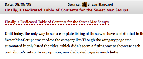
If you arrow out or click on the item’s primary title link you arrive at the post’s permalink here on shawnblanc.net. Clicking the “sub-title”, which is in the body of the post, takes you to the linked-to article.
This isn’t a new technique. And how it’s done is actually quite simple — the sub-title is hand written into the post’s body, and on shawnblanc.net link posts are coded to not display the main title.
What I like about this design for the RSS feed is that the default “ element for the article points to shawnblanc.net/example-permalink/ rather than to the linked-to article. (This is the same as how kottke.org, Subtraction, Justin Blanton, and many others do it, but is the opposite of Daring Fireball or Waxy Links.)
More and more weblogs writers are adapting link posts as part of their publishing routine. But most of them do not post dozens of links every week.
This past July, John Gruber posted 200 linked list items to Daring Fireball. Andy Baio posted 136; and Jason Kottke, 146. I, on the other hand only posted thirteen. If you add June in there too, then John, Andy, or Jason each posted more (or nearly as many) links as I have in the entire life of this weblog (367).
Which is why, in my opinion, the behavior of a link post in its RSS feed should not be defined based on the type of post it is, but rather by that post’s relationship to the website publishing it.
Authors who publish only a handful of links may want to consider a different type of link post behavior in their RSS feed, as compared to those who post half-a-dozen per day.
In my interview with John Gruber, his attitude towards his Linked List was that it’s not the individual links that are important so much as it is the whole day’s worth:
As for what I link to and what I don’t, it’s very much like Justice Stewart’s definition of obscenity: “I know it when I see it.” There’s a certain pace and rhythm to what I’m going for, a mix of the technical, the artful, the thoughtful, and the absurd. In the same way that I strive to achieve a certain voice in my prose, as a writer, I strive for a certain voice with regard to what I link to. No single item I post to the Linked List is all that important. It’s the mix, the gestalt of an entire day’s worth taken together, that matters to me.
The intense frequency of the Daring Fireball, Waxy, et al. links warrant a more direct-to-link style of RSS behavior.
I am not convinced that this is also the best feed behavior for shawnblanc.net. But based on a lazy poll I did on Twitter it seems a lot of people wish it were. The advantage to the DF-style link post behavior is primarily that it saves a click. But according to the shawnblanc.net feed and click-through stats, the majority of this site’s readers seem have no trouble clicking directly on the sub-header and going directly to the linked-to article from their feed reader if they want to.
Moreover, the primary reason I prefer this site’s current link post behavior is that it falls in line with my own feed reading habits.
The way I read online is that at some point in my day I will open up my aggregator and read through what’s new. I rarely read an article in my reader. Instead I open up the interesting stuff in Safari in the background, and then go to Safari’s open tabs and start reading.
At this point it’s common to have a dozen articles ready to read. Which is why being sent directly to someone’s linked-to article is not the best design.
Since I’m reading articles by folks I’m familiar with, the majority of the open tabs in Safari are websites I recognize. But when I come to a tab with a site I don’t recognize my first thought is usually, “What is this? How did I get here?”
Not because I’m confused, but because I don’t always remember exactly who’s link post I read and clicked through to that sent me to whatever it is I’m now staring at. Nor do I remember what it was they had to say about this link that prompted me to visit. It is very much like coming back to the middle of a conversation without being able to ask, now, where were we?
Through an email dialog, Sean Sperte gave me some wise input, saying that when someone clicks on the title link it indicates their desire to read more. Which means it is up to the author to decide what “read more” means. Does it mean, go to the link I’m talking about right now? Or does it mean, this trail is best begun on my site. On shawnblanc.net I think the latter is more appropriate.
Which Brings Us to the New RSS Format Experiment
Though I’m not too keen on moving to a DF-style format for my link posts, I am certainly wanting to move away from the duplicate “sub-title” design. My desire is to make the link-posts very easy to use and read while maintaing a clean design and logical behavior.1
In truth, I have always had these goals but they were not easily attained in WordPress. To implement this new feed and on-site post formatting required the use of custom fields. No problem if you publish from your WordPress web interface. But I don’t. I am a hard and fast MarsEdit user.
Unfortunately, MarsEdit has never had support for custom fields in WordPress. Which meant that for me to change my link-post behavior in the RSS feed I would have to publish all link posts from my WordPress Web interface. And that just isn’t going to happen. But praise the Lord, the latest builds of the 3.0 alpha, which I’m fortunate enough to help with testing for Daniel, now support custom fields in WordPress.
Which means that with this new feature in MarsEdit all I needed was a simple plugin, a few tweaks to my site’s theme and RSS code, and now a world of opportunities for RSS link post behavior have opened up.
The previous formatting for a link post in the RSS feed looked like this (as also seen in the screen shot at the beginning of this article):
- Main Title (pointed to https://shawnblanc.net/example-permalink/)
- Sub Title (duplicate text as Main Title, and points to the linked-to item)
- Commentary, additional content, etc.
The new, experimental, formatting looks like this:
- Main Title (points to https://shawnblanc.net/example-permalink/)
- Commentary, additional content, etc.
- Visit This Link ➚ (points to the linked-to item)
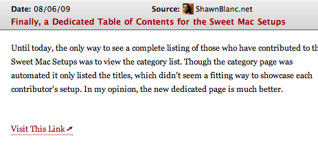
The design and behavior on shawnblanc.net has remained unchanged. (Though the back-end code has not.)
Since this is a new design, and the duplicate “sub-titles” were very good at allowing for quick identification of a link post, I am debating over the need for another way to quickly and easily identify a link post versus a full-length article. Sean Sperte does this by placing check marks next to his “asides” posts; Gruber places a star next to his articles. As of yet, I haven’t implemented any type of identification.
Feedback Please
As readers who interact with this feed every day, I would be delighted to hear your guys’ feedback (positive or negative) on the new format. And especially if you encounter any problems with the feed.
Subscribe to the RSS Feed here: https://shawnblanc.net/feed.
Email me here: [email protected].
- Some people have commented on the current feed format as being more friendly to page views. While this is true, it has nothing to do with why the feed is formatted this way. Those that have been reading this site for any length of time know that I’m not into gaudy ads, non-legit pageviews, or un-interested readers. This whole site has been built with care for the readers and for the author. Having a link-post behavior that sends readers here first is not a gimmick but rather a design decision that I think suits the personality of shawnblanc.net the best. ↵


