All You Need is Simplenote

Simplenote is a note-taking app for your iPhone and iPad that syncs with the Web. It is the sort of app adored by those who pride themselves in their use of beautiful and uncomplicated software.

It is also an app for people with ideas. It’s for those who need some way to jot an idea down, build on it, and refine it until they’re sick and tired of it; regardless of where they are or if they brought their laptop.

As a writer, Simplenote could very well be your principal writing app. It has a straightforward design that makes it effortless to use. In Simplenote there is no text formatting, it’s just plain. There is no document titling — when you create a new note, the first line is the title. There is no saving a note — you just write and your note is backed up in real time, and even synced with any other other devices you use: iPad, iPhone, and Mac.

This humble application began a few years ago in response to two big needs of iPhone users: (1) the need for a notes app that synced over-the-air; and (2) the need for a notes app that didn’t use Marker Felt.

In some respects the app has barely changed since 2008. In fact, arguably the most obvious changes have been to the icon. The original icon was as a yellow sticky note taped to the front of a locker. That changed into a grey note card resembling a garage door, which then changed to a white notecard with a blue wi-fi bubble, which changed again to what you see today.

The Simplenote Icon Evolution

To say the app has barely changed since 2008 is, of course, not to say that Simplenote is the same as it was two years ago. It has been refined, polished, and updated with taste. Only a handful of new features and UI improvements have been added over the years, with many of the most notable changes just recently emerging in version 3.

Compare for a moment Simplenote to Apple’s two text and note-taking apps for the iPad, Pages and Notes. Pages was one of the first apps I bought for my iPad. It was touted as having most of the features of Pages for Mac, but on the iPad. For me, after a bit of use, Pages was quickly relegated to nothing but a full-screen typing app. It is a great showcase for what sort of apps the iPad is capable of running, and for those who need to edit Pages documents on their iPad it is a necessity. But it is somewhat difficult to get documents in and out, and the document syncing process is flat out ridiculous.

Notes is Apple’s other in-house note taking app. It ships with iOS and is quite simple (in fact, much of the foundational user experience that Simplenote has is parallel with the built-in Notes app). As it is with Pages, the biggest downfall with Apple’s built-in Notes app is, again, sync. Though the system for syncing in Notes is better than in Pages (your notes sync into your IMAP email account), nobody I know actually uses the IMAP sync.

The Simplenote developers actually beat Apple at their own game. They made an app with a better design (Helvetica!), better functionality (over-the-air sync), and they proved that less (compared to Pages) is, in fact, more.

Version 3

The latest update to Simplenote sports a slew of new toys. But, as Charlie Sorrel said in his review on Wired, “if you don’t want them, you won’t even notice.”

The most notable for me is the full-screen writing environment on the iPad app. When writing on the iPad I prefer to use Simplenote. But at times, I may want to see just the page with no list of notes next to it. Up until now, I would copy my text out of Simplenote and paste it into Pages. But now there is a subtle, full-screen button at the bottom-right corner of your note — tap that and Pages on the iPad all but becomes obsolete.

The Simplenote fullscreen button

Perhaps the most clever of the new features is sharing notes with others. When in a note, tap the icon that resembles a phone with an arrow pointing out. From there you can enable note sharing and email the person whom you want to share with. This is a great way to empower team collaboration and keeping others in the loop with information and ideas.

One of the many thing I keep in Simplenote is meeting agendas — especially talking points for 1:1s. Now for my 1:1s I can share those talking points in a note with the other person I’m meeting. This way he or she can see what’s on the docket, and even add items of their own. Furthermore, with the addition of version history, we can drill down within the same note to see what last week’s agenda items were.

Additional cleverness comes in to play here: if my friend doesn’t have Simplenote installed then I’m going to bug him to get it. And I’m going to bug him to use it so that our collaborating is actually useful. Which means not only is sharing notes useful and helpful for users like me, it is indirectly word-of-mouth marketing for the Simplenote crew. Nicely done.

This is just one example of how the more you use Simplenote the more you find new ways you to use it. People are using it for recipes, ideas, lists, blog posts, chapters of books they’re writing, and more. And for all those power users who are finding themselves with a list of notes longer than there arm, a way to organize may be in order. But a folder structure could slightly hurt the simplicity of Simplenote. Tags on the other hand are a great way to add structuring to your notes if you want.

And one way that I see tags as coming in especially handy is in regard to the aforementioned shared notes feature. Since Simplenote does not label who is sharing a note with you, you can tag that note using their name. Which means someone you’re sharing a lot of docs with, you can see them all at once using a tag filter.

What’s in my Simplenote?

What's in my Simplenote

So what do I actually have in my Simplenote at this moment? All sorts of things. Some are notes of importance which I want synced on all my devices. Others are completely trivial and are in Simplenote by sheer virtue of it being my note taking app of choice.

  • Meeting agendas and talking points: mostly for upcoming 1:1s. These meetings are usually informal and quick. And, in fact, the very point of a 1:1 meeting is so the two of you only have to connect and meet once a week — saving all your conversation topics for that one meeting. Being able to jot down questions, ideas, and the like using Simplenote has long been my workflow.

  • Ideas for businesses, software projects, and other things.

  • A list of gift ideas for friends and family.

  • Blog posts in all stages: I usually write them in Simplenote or Notational Velocity, and finish them in MarsEdit.

  • Recipes: well, actually only one recipe: Grilled Artichoke with golden mustard dipping sauce.

  • Reminders of things to order next time I’m at a restaurant I don’t regularly visit.

  • And other simple notes: such as cool quotes, shopping lists, miscellaneous data, and the like.

For a wider look at what is in other people’s Simplenote, check out Patrick’s community listing on Minimal Mac.

Other Reviews

If you liked this review of Simplenote, there are more like it here.

All You Need is Simplenote

Go Gowalla

Several months ago I began checking in to places on Gowalla.

What first turned me on to Gowalla was its design. The website and mobile apps are beautiful, and Gowalla’s use of cute icons and graphics throughout makes for a great experience.

But it’s not just the design that I like about Gowalla. It’s fun, and it’s meant for people who like to get out, whatever the reason. Errands, dates, local events, road trips, and the like — if you like to get out you might like to Gowalla.

And this focus on travelers (adventurers?) is what makes Gowalla so interesting and fun for me. I don’t have to have a metric ton of “friends” on to make it worth using. And though I suppose it would be more fun to use if more of my friends Gowallad, chances are good that even the 30 friends I do have aren’t paying much attention to where I check in. And that’s okay. Because what is most enjoyable about Gowalla is the cataloging of your own journey.

I just returned from a two-week vacation in Colorado. On the first day of our trip I put the Gowalla iPhone app right on my home screen and decided that while I was traveling around the Colorado Front Range and the Rocky Mountains I would check in at every spot I could.1

Also, in preparation for my Colorado vacation I created a Gowalla trip called “Classic Castle Rock“, which features some of the premier spots around my home town. I built most of the trip on the Gowalla website before I even left Kansas City. There were a couple spots I wanted to be a part of the trip that weren’t created already, so once I got in to town last week I spent one of my mornings driving around and creating the final few spots.

It’s unfortunate that creating new locations and checking in at spots is limited by my connection to the internet. If I’m not connected I can’t check in. And this is particularly unfortunate because some of the most fabulous, visit-worthy locations are in areas with no cell service and no wireless internet.

For instance, my family and I spent a few days in Pine Grove staying at my grandparent’s cabin. It’s an old, red cabin that sits right by Elk Creek. And a half-mile upstream is the Bucksnort Saloon, home of the Buck Burger. We also spent one morning in Bailey to have breakfast at the Cutthroat Cafe and visit Coney Island’s new location. Sadly, my AT&T-connected iPhone couldn’t get a lick of signal at any of these fabulous spots.

It just so happened that on The Big Web Show last week, Jeffery and Dan interviewed Josh Williams, the founder of Gowalla. And they discussed this very issue of mobile connectivity versus spot check-in and creation. Josh is hoping that the Gowalla team will find a way to store GPS location data on your phone even when you don’t have cellular service. Then, once you’re connected to the internet again, you could use that stored GPS location data to check in and/or create the spots you were at.

This would be a great solution considering the situation, but ultimately we just need better cellular coverage. You see, it’s one thing for me to be able to create the Bucksnort Saloon 48 hours after being there, but that won’t necessarily help someone in the area use Gowalla to find the Bucksnort when they’re out in the middle of No Network Land looking for great burger joints.

It has taken me a while to decide how I use Gowalla (though I’m still not sure exactly what that is). At first I had to check in as soon as I arrived at a spot — as if I was punching in on a time clock. If I didn’t check in right away, I wouldn’t check in at all.

Now I check in when I have a few spare minutes. But there are some people who check in to spots they don’t even walk into but that they just walk by and notice. Is that breaking the rules? What are the rules, even?

For me, I prefer to only check in at places I’ve actually walked into and spent at least a little bit of time. But even then there are times I am on the go and don’t have a few spare minutes to check in with Gowalla.

And this is perhaps the most frustrating part of using Gowalla. It usually takes at least a minute or two to fully complete the check-in process on my iPhone. And that’s assuming the spot I’m checking in to has already been created, and I have good 3G coverage. It takes an extra couple of minutes if I also need to create the spot I’m at.

I would love to see a part of Gowalla’s future solution for checking in at places where you don’t have service to also include a way to check in quickly, or even in the background. If my wife and I are out on a fancy date you bet I want to check in at J. Gilbert’s. But giving my wife the attention she deserves is significantly more important. Which is why I want Gowalla to let me check in for my hot date at the best steakhouse in town while also letting me ignore my iPhone and have a great evening out.

Coming back to my question, I don’t think there are any rules. Much of what makes Gowalla so cool is that it’s still being defined and discovered by its developers and users. Every day I seem to discover a new use for Gowalla, and as it grows the more useful and fun it will be.


  1. This check-in behavior is different than what I normally do here at home in Kansas City. Here, I normally only check in to a few spots per week. Though that is mostly because I forget or else don’t make too much of a point to check in to the same place more than once.
Go Gowalla

A Brief Review of iOS 4

iOS 4 is now available, and it is fantastic. But as a long-time iPhone user some old habits die hard.

The unified inbox is great. But I still find myself tapping the “Mailboxes” header on the Inboxes view in attempts to go back one more screen, despite the fact there is no button there.

Folders are great. But I now have to re-learn where my apps are. I used to know where on the screen they were located, now I have to remember which folder I put them in.

Multitasking is great. But double tapping the Home button doesn’t get me to Phone favorites anymore — a function I have used dozens of times a day for the past three years (I’m one of the few who uses my iPhone to make phone calls). In earlier iOS betas you could at least double tap and hold the home button to launch favorites. But alas, that function didn’t make it into the Gold Master.

But eventually I will acclimate and the above quibbles will be non-issues.

Apple’s new mobile OS is the most feature-rich and robust one to date. Just as the iPhone 4 is the biggest leap forward for the hardware since the original iPhone, iOS 4 is the biggest leap forward for the software.

iOS 4 is packed to the brim with features and functions we only dreamt about in 2007. Yet in spite of all the new, nearly everything about this OS is expected. Not because we’ve seen pre-release demos, but because the features are implemented so naturally. There are no new features that require much, if any, explanation. And, save but one, no new features do anything mind blowing.

That is exactly how Apple rolls. The implementation of a feature is just as much a feature as the functionality which it provides. Apple didn’t just add the ability to now create folders, they built the best possible user experience around that functionality that they could.

Current iPhone and iPod Touch users who are able to upgrade to iOS 4 will have no trouble using all the new toys found in iOS 4 without missing a beat. Even the most “hidden” of the new, highlighted features, fast-app switching via the Tray, is easily discoverable to the average user since activating the Tray is now tied to one of the most common functions of double tapping the Home Button.

The New Look

Every major update to the iPhone’s operating system has mostly only provided feature enhancements. iOS 4 is the first to sport a significant change in the look. And it’s beautiful.

Earlier this year I jailbroke my iPhone to install a different GUI and add a Home screen wallpaper and custom icons. But many of the graphical changes in iOS 4 negate my reasons for wanting to jailbreak. From what I’ve noticed, all of the new graphical elements are fantastic. Well, all but one: the default water drops wallpaper is bizarrely ugly. I’m currently using the fun but unobtrusive Pictotype Purple wallpaper from Veer.

I was never, ever, keen on the 3D Dock introduced in Leopard, but on the iPad and iPhone it’s great. For one, it’s much more open than the ‘grid’ Dock in previous iPhone OSes. This makes for a cleaner looking, more simple Home screen. Secondly, the square icons don’t look at all awkward while sitting on the 3D dock, which is not always the case in OS X.

Additionally, I’m a big fan of the scratched fabric texture which shows up in the background when drilling into a folder or when fast-app switching via the Tray. It’s a darker version of what you see behind the Google map if you click on the bottom-right page curl. And it’s the same background Reeder uses for its iPad app.

Folders

Folders are swell, but I suck at naming them.

Choosing a proper and usable name for a folder is proving to be more difficult than I thought. Also difficult is remembering which folder has which apps.

Thanks to folders, my first Home screen now has the apps which used to occupy my first two home screens. These are the apps I use daily or weekly. And the OCD in me decided it would be best to name each folder with names that were five characters long. So: Tools, Photo, Stats, and Sweet.

On my second Home screen, I have seven folders: Rare, Reference, Utilities, A Games, B Games, Misc, and Tools. But off the top of my head I couldn’t even tell you what apps are in each of those folders.

The Rare folder holds all the apps which previously lived on the very last Home screen wasteland. A Games and B Games are just that — except I hardly ever play games on my iPhone so I don’t really know which games are the more or less favorites. And the difference between Reference, Misc, Tools, and Utilities is (embarrassingly) a bit lost on me. I chose those names because I was trying to avoid having four folders with the same name, Utilities. But unfortunately my current solution is just as confusing as the alternative.

Once I’ve nailed down some proper names, my only gripe with folders will be the spacial arrangement of the individual apps. As Lukas Mathis points out, the placement of an app’s icon is in one location in the folder’s icon view, but it’s in another location when you open that folder. (Similar to the same spacial issues the iPad has when you rotate the device from landscape to portrait.)

The Tray and Multitasking

But Apple doesn’t really intend for users to navigate through folders for the apps they use regularly. Instead, they’ve given us the Tray and multitasking.

It used to be that when you were done using an app and you pressed the Home Button you were quitting that app. Some app developers were smart enough to build state persistence into their app. Which meant when you came back to that app, it would load itself at the same spot you left it, but it still had to load.

Now you are no longer quitting the app when you press the Home Button. Instead the app is put into the background and its icon gets slotted into the Tray. You access the Tray by double tapping the Home Button and from there you can swipe through all the apps you’ve recently used. But the computer-savvy geek in me wants to quit out all the apps that I’m not using. It pains me to see an app in that tray which I know I only use once or twice a month. That app is taking up precious memory.

Neven Mrgan wisely advises:

This is not the multitasking you’re used to. The sooner you accept this, the better.

And so I’m learning not to play the Tray because iOS 4 is clever and responsible enough to quit apps on my behalf. The least-recently-used app gets the boot once the system actually begins to run low on memory. And with iPhone 4 rocking twice the memory my 3GS has, there will be even less reason to manually monitor which apps are running in the background.

John Gruber explains the new multitasking quite well:

The new model [of multitasking], […] is that apps are not quit manually by the user. You, the user, just open them, and the system takes care of managing them after that. You don’t even have to understand the concept of quitting an application — in fact, you’re better off not worrying about it.

The Tray and its fast app switching are just one element of multitasking in iOS. There are also a handful of background APIs which 3rd-party apps can now take advantage of. The most heralded have been the APIs for background music, location, and VoIP. Respectively: Pandora can play music while in the background; GPS apps can give directions while in the background; and Skype can host a phone call while in the background. I don’t use Pandora, GPS apps, or Skype, so these new features, while great, do not really change my life for the better at the present moment.

The API which I am most thankful for, in that it affects my day-to-day usage the most, is task completion. Now I don’t have to wait while Twitter uploads my latest tweet or Simplenote syncs my latest note. But unfortunately, the other side of the coin to task completion, background updating, is not baked in to iOS 4. When you open apps like Simplenote, Twitter, or Instapaper, even if they’ve been running in the background, they will not have been able to update. They still have to wait until they are the frontmost app before they can download any new data.

A Brief Review of iOS 4

Diary of an iPad Owner

Saturday, April 3, 2010

7:00 am: Ben, Terry, and I are driving down to the Leawood Apple store to stand in line for an iPad. Well, technically it’s me who’ll be standing in line to buy an iPad — the guys are coming along because I convinced them it’d be fun.

7:30 am: We are here. Coffee in hand. And only 75 people in line ahead of us. I talked to the first few folks who apparently arrived the night before around 8:00 pm (a group of them, too, yet only one guy who’s actually buying the iPad). I guess the next group showed up around 2:00 am, and all the rest of us have been trickling in since 6:00.

7:32 am: A young guy and his mom get in line behind us. The guy is wearing a “WWSJD” t-shirt. I like to think that I’m less nerdy than he is, but the fact is I am ahead of him in line.

7:39 am: We are awkwardly interviewed by a young college student, and then a lady comes by handing out menus for breakfast pizza from California Pizza Kitchen. CPK will deliver to us while we wait in line. It’s a clever idea, but nobody orders (I know I’d rather spend that $10 on a few apps).

7:46 am: The WWSJD dude sends his mom to get Starbucks.

8:11 am: The couple in front of us share some of their donuts. (This would have been better 30 minutes ago when my coffee was still hot.)

8:55 am: The store is about open. There have been random bursts of cheering and clapping coming from inside for the past half hour.

Our line (which has grown to about 200 people by now) is directed to split into two groups: those who pre-ordered their iPads, and those who did not. Those of us who didn’t pre-order outnumbered those who did at least five to one. Yet those in the pre-order line were served by the Apple sales team about four to one versus those of us in the non-pre-order line. Considering I’m stuck in the non-guaranteed-to-get-one, slow-moving iPad line, this is seriously annoying.

And now that the line is moving rumors are running amuck that the store is already approaching sold-out status. All of us who came so early to share donuts and buy iPads may have to come back at 3:00 pm to share sandwiches and fight for the leftover iPads (if there even are any).

10:19 am: It’s been nearly three hours in line. The store is not sold out of iPads, and I am finally next to go in. I am equally excited to get out of the cold and into the warm store as I am to actually drop 500 bucks on the iPad. Linda, a nice older lady, greets me and lets me in. She helps me gather my order, charges my Visa, and then sends me on my way. I buy the 16GB iPad, Apple’s black fitted iPad case, and a bluetooth keyboard.

11:00 am: I am back home and ready to unbox. Terry and Ben went home — they had their fun playing with the iPad at the Apple store while I was spending money. Now it’s my turn. Just me and my iPad.

My wife loves me, so she humors me and joins me for the unboxing.

I love her too, so I humor her and let her be the first to click the home button. Hmmm… oddly the thing is already powered on. As Anna clicks the home button the iPad brings up the “plug me into iTunes” display. Well, okay then.

It takes me over an hour to sync it for the first time and fine tune the placement of the icons. But the wait is worth it. In the meantime I surf iTunes and spend next month’s coffee budget on Apps.

12:49 pm: Oh my goodness… my iPhone is so crowded and small and slow and tiny.

1:12 pm: My sister calls me asking what Anna’s and my plans are for Easter dinner and if she can join us.

“Of course you can,” I tell her.

She asks me what I’m up to today, and I tell her I’m playing with my new iPad. “What’s an iPad?” She asks.

2:04 am: My bout against the iPad’s battery has failed. I can barely keep my eyes open and this thing is still running bright.

Sunday, April 4

7:20am : Holy battery. Last night I plugged this thing in to my MacBook Pro with 11% battery life and five hours later it’s only at 62%. Clearly I need a dedicated wall charger.

8:25 am: I am so taking the iPad to church. What a great use-case scenario… I mean who needs a Bible, a note pad, and a pen in your pocket when you’ve got an iPad? It’s the future!

9:17 am: So I’m embarrassed to actually use the iPad for anything. I’m leaving it under my seat because I don’t want to attract any attention. This reminds me a lot of when I bought my iPhone. When the iPhone first came out they were so rare and exotic for the six months or so that every time I’d pull it out people would be like, “Woah! Is that an iPhone?!” And so using my iPhone in public felt like bragging.

11:29 am: I wish Amazon would gift me a free Kindle version of all the new, hard-cover books I’ve ordered lately. Instead of carrying Linchpin, REWORK, and Your Marketing Sucks in my backpack all at the same time it would be ergonomically glorious to have them on my iPad instead. I may never buy a physical book again.

Monday, April 5

7:00 am: The week begins, and I am spending my daily coffee and reading routine downstairs and on the couch this morning.

This is also when I scrub my to-do list and plan my day. And though Things for the iPad is beautiful, it is not nearly as robust as its Mac counterpart. There are so many features on the Mac desktop version that I use regularly. Such as linking emails inside of to-do items and re-shuffling tasks to another due date which I know I won’t get today. But Things on the iPad is more akin to the iPhone version and so a lot of this I can’t do.

But perhaps I don’t necessarily mind the division between work and play. It’s actually a bit nice to do my reading with coffee from the living room and then scrub my email and to-do list from the office.

And speaking of reading: the Wall Street Journal app sucks. It’s slow and will not relent in up-selling me to a subscription. I would consider a subscription if this non-subscriber’s experience were not so horrendous.

9:52 am: So I was going to bring only my iPad to work today, but I wimped out. I will try to do all I can to see if I can get by with just the iPad today, but I’ve got my MacBook Pro with me just in case…

10:19 am: Just met with Jono in a side room to show off our website’s glorious lack of video compatibility on an iPad. For some reason, seeing our website in 1024×768 instead of 480×320, the need to get a non-flash video solution becomes much more real.

12:00 pm: Combing through my email at work for pass number two today. Email on the iPad is easy and delightful, but my workflow and systems are kinda broke now. All the weekly reports that get sent to me on Monday mornings couldn’t be saved to their folders on my Laptop (which means I have to just delete those emails, or process them again later).

12:14 pm: An email from Isaac with the PDF mockup of this month’s Partners Journal. The Journal looks fantastic on this display. But the 12-page, 6MB file is not easily flicked around in quick view.

12:59 pm: I bring the iPad to our first meeting together. Other than passing it around the table for my directs to check out, it gets no use at all. I write my notes down on the meeting handout as I usually do, and when I do need some info that is digital it is resting with my MacBook Pro and not my iPad.

3:10 pm: Sitting down at my desk and thanks to the florescent lights in my office the iPad is virtually unusable in here. I plug in my laptop to my 23-inch cinema display and work as I have every other day — with a mouse and a keyboard.

7:00 pm: I am done for the day at the office and am heading home. The battery is still at 60% — looks like the iPad got more use today than I’ve let on.

Tuesday, April 6

11:55 am: On my way to a noon meeting. I stop at the coffee shop for a lunch-time Americano. Eddie is walking by sees the iPad under my arm as I head in. He jumps in line with me and I give him a guided tour of some apps: Pages, Sketchbook Pro, and others. The presence of the iPad commanded the attention of everyone in line, even the cashier and barista (I should have asked for a discount).

Noon: Just like yesterday, the iPad’s only use in this meeting was to it show the fellow attendees.

One of the iPad’s best apps is Safari — especially when showing the big touch-screen display to people. It’s a great demo app because it gives them a chance to see something they’re familiar with (a web site) but experience it in a whole new way. Even for iPhone owners it is great to watch people take some time and hold the Web in their hands. Unfortunately the wi-fi in this back office is lousy. So I show them Mail and iBooks instead.

2:51 pm: Back at my office I walk across the hall to show Phil the iPad. He says he’s not getting one for a while because he doesn’t like to buy first-generation gadgets (as he pulls out his first-generation iPhone).

Phil’s wife, Alison, comes in to pick him up while we’re chatting over the iPad. He slides it over to her so she can check it out. She opens up Notes and begins typing away with no trouble at all. “Alison is awesome”, she taps.

It is a tense event to let someone play with your iPad. There is nothing which i want to hide, but it is quite personal to freely let people look at your email inbox, read your notes, and see what web page you were last viewing.

3:21 pm: Just downloaded WeatherStation Pro. It’s a good thing apps are a tax write off I keep telling myself.

4:29 pm: I’ve got a meeting in one minute with Jarrod. I walk out to grab a print out and leave the iPad on my desk. As I walk back in Jarrod’s in my office waiting and perusing the apps on my iPad. Later I open the Notes app to discover a new note: “Jarrod is awesome, too.”

10:15 pm: Up until now it’s always been at my desk where I spend so much of my time. It is where I work and where I create. I write, design, pay bills, share pictures, and more. Something the iPad has really helped me do is disconnect work from play from entertainment from incessant nagging that all exists on my computer.

Unlike my laptop, the iPad is not a do-all, be-all device. Its limited scope helps me stay connected to news and others things which I enjoy but without the distraction of all those things I could be doing at that time.

Wednesday, April 7

6:00 am: My morning routine hits the iPad again. The iPad is great for reading and replying to email, but it’s not great at processing email. At least not the way I process it. I can’t send an actionable email into Things as a to-do item when I’m using the iPad. I can’t save a file from the email into a project’s folder in Dropbox. All this means that checking and processing email on my iPad is about as productive as checking email on my iPhone (though it certainly is a better experience).

Checking email on my iPad is, more often than not, an interim checking. I reply to conversations or other threads but can’t really do much else. And so I have to come back to many of some of those messages a second time when I am at my laptop so I can fully process them into my workflow.

7:00 am: The iPad should have shipped with fingernail clippers and a screen cleaning cloth made of denim.

8:19 am: It’s interesting how some apps, like Pages, require use of the devices orientation for certain functionality.

1:15 pm: Reading in Instapaper. Again. This app has become one of the most-used on my iPad (I use it much more than I use it on my iPhone). It’s a gift to guys like me who have a very hard time doing only one thing at at time. And I love it so much I’ve even started sending articles to Instapaper which I want to read right at that moment, but would rather read in Instapaper on my iPad than in Safari on my MacBook Pro.

1:32 pm I wish iPhone OS shipped with Menlo. But more than that, I wish there was an iPad-version of MarsEdit. Currently I’m unable to post links on shawnblanc.net with the iPad due to some lame limitations in the WordPress Web interface, and because the WP app does not support custom fields. And speaking of writing: All this typing and I have not yet used that bluetooth keyboard. Primarily I guess because it’s not with me most of the time (right now it’s sitting on a shelf above my home office desk).

9:01 pm: Ay caramba. I wish “spp” would auto-correct to “app” instead of “spa”.

Thursday, April 8

7:40 am: Today begins the first real-life, 4-day test of my iPad. I am fairly certain that my iPad can’t replace my laptop. But it could replace my iPhone as the new Command Central for times like today.

This afternoon begins a four-day conference which we are hosting. And so this weekend my normal work schedule and tasks all get put on hold while we host 2,000 conference goers. There will be a lot of communicating via emails (though not as much as through phone calls and texts), and a good deal of short pow-wows.

For the past three years I’ve used my iPhone as Command Central when running marketing at our conferences. This weekend it will be interesting to see if and how the iPad holds up as a replacement for my laptop and an addition to my iPhone.

8:38 am: Test failed: the Monoprice Power Station portable iPhone battery backup dongle does not charge my iPad.

12:15 pm: Sitting in the back room with the rest of the Web team. They’re updating the website, and I’m checking my email. Nick comes in to say hello. He’s my only other friend who owns an iPad and I haven’t seen him since last Friday. So I make him sit down and we geek out over our favorite apps.

I show him some of my embarrassing finger paintings from SketchBook Pro, and he asks me to help him figure out one of the puzzles in Labrynth 2. We’ve officially established ourselves as the nerdiest two in the room.

4:40 pm: I bump into Mark in the main auditorium. He heard I got an iPad and wants to check it out. I hand it to him and he wimpishly peruses it. And so I’ve realized that when showing the iPad to someone, it helps to walk them through how to use it. Or at least show them which apps to tap on, and what do do from there. A lot of people like to see it and hold it, but would rather that I demo it for them.

5:30 pm: So I’ve been thinking a lot today if this iPad could actually replace my MacBook Pro or not. There are certainly some great advantages to it. Like how small and lightweight it is, and the incredible battery life. Some other things I don’t mind:

  • The screen size: Perhaps it’s because i’m used to software like this running on a 3.5-inch screen instead of a 10-inch one, or perhaps it’s the single-app view versus my MacBook Pro’s multi-window view, but the smaller screen (compared to my 15-inch laptop and my 23-inch Cinema Display) really doesn’t bother me.

  • The software keyboard: It certainly takes some getting used to, but for casual use it is perfectly fine. In no way does the software keyboard make me want to chuck this iPad like a frisbee. Sure, I can’t type long-form papers or articles on it, but that’s okay. That’s what the bluetooth keyboard is for.

Friday, April 9

7:40 am: With my iPhone (or just about any other gadget for that matter) it’s not uncommon for the battery life to affect the workflow and interaction I have with the device. But it’s always a negative issue: crappy battery life interrupts and hinders my use of the device.

But with do to the iPad, this is the first time ever that incredible battery life has affected my workflow and usage of a device. Since the iPad’s battery lasts so long I rarely need to plug it in to charge it. Moreover, since it won’t charge through my USB hub, when I do plug it in I rarely connect it to my computer. Thus, I have to make a concerted effort to remember to connect my iPad to my computer and sync it. Why I can’t sync via Wi-Fi (like Cultured Code does with Things) is beyond me.

8:03 am: Every Friday morning Josh and I go get coffee at Einstein Bagels. He just got a new Audi so normally he drives, but today I do so he can play with the iPad. He teases me about the email in the Notes app that I sent to John Gruber pointing out some typos. It’s a little embarrassing, but not really. But clearly I am going to have to start using 1Password for notes that i don’t want other folks to see. People will fiddle around on your iPad and find stuff much more easily than they would if they were fiddling around on your laptop.

10:40 am: I comb through this morning’s fury of new emails related to the conference and yet I’m still thinking if the iPad could actually replace my laptop or not. The blaring hurdles for that to happen are:

  • To-do management: maybe I’m complicated, but it bugs me that I have no way to send tasks into Things. And I have no way to sync over the air so that my iPhone and iPad are in sync without needing my Mac as the mediator.

  • Blogging: Yeah, I still don’t have a way to post links to my website…

  • No Dropbox: all of the files and projects I am currently working on are kept in Dropbox. This keeps them backed up and secure in real time, but also makes them available for viewing and emailing if I’m away from my computer. No doubt the Dropbox team is working on an iPad app, which will be lovely (since this other app called GoodReader sucks), but even still it will only be a useful app for viewing files which are already in my Dropbox and not for syncing or transferring files to and from my iPad.

  • No file storage or management (I have to leave emails in my inbox if they contain files I want to save)

  • No document syncing: Well, no good document syncing, that is. I want the document I’m writing to exist on my Mac and on my iPad (and why not my iPhone, too?). Krikey… I am dying for Simplenote to make its way to my iPad (but even then, it would just be for plain text files). I spent $10 on Pages… really wish I could have some of those documents synced without the nightmare of USB and manual version control.

The size, weight, and battery life of the iPad make me want to leave my laptop at home forever. But the above unordered list necessitates that I don’t. My next laptop could be a MacBook Air.

2:08 pm: Watching a video in a sun-lit room… Oh yeah, this is why I hate glossy displays.

Sunday, April 11

8:39 am: I take the iPad to church again; my confidence to use it in public has grown. Also, Anna and I sit in a row occupied by nobody else.

I try to tap out notes from this morning’s sermon, but I can’t keep up — my tap typing is too slow. The iPad’s auto-correct turns my would-be notes into fragmented sentences less understandable than my own chicken-scratch hand writing. At least I can email them to myself for decoding later.

Diary of an iPad Owner

iPhone’s Missing Feed Reader

I spend a prodigious amount of time reading on my iPhone.

Half the apps on my iPhone’s Home screen alone involve reading as a predominant, if not exclusive, feature. Mail, Messages, Safari, Tweetie, Instapaper Pro, Simplenote, and Reeder: these are my most-used apps, and each one is used for reading in some way or another. And yet the app which serves no other purpose than to read, seems to be the most frustrating to use for said purpose.

  • In Mail I read and reply.
  • In Messages I read and text.
  • In Safari I read and surf.
  • In Tweetie I read and tweet.
  • In Instapaper I read and drink coffee.
  • In Simplenote I read and write and edit.
  • In Reeder (or any other feed reader app, such as Byline, Fever, Google Reader, NetNewsWire, NewsRack, MobileRSS, etc.) I read.

The predicament with feed reading apps is most certainly not in the quantity of the selections; rather, the quality. This is not to say that most of the legitimate feed reading apps on the iPhone have not been developed with care — but as agents of delivery for my favorite authors, and as contrivances meant for enjoying lengthy bits of text, I prefer a simple app that does less and does it better.

In total fairness asking for the “best feed reader app” is like asking for the “best shirt”. Just as John Gruber so aptly laid out last April when writing on the the UI playground of Twitter clients. John said:

[D]ifferent people seek very different things from a Twitter client. TweetDeck, for example, is clearly about showing more at once. Tweetie is about showing less. That I prefer apps like Tweetie and Twitterrific doesn’t mean I think they’re better. There is so much variety because various clients are trying to do very different things. Asking for the “best Twitter client” is like asking for the “best shirt”.

It is my safe assumption that readers of this website also prefer apps which do less, but do it well. And so read on for a high-level look at some of the more popular iPhone feed readers, what I find good and not-so-good about them, and my suggestions for amelioration.

Reedie

As of this writing the iPhone App Store has nearly 4,000 apps in the News category. This is where all the RSS reading apps are listed. If you search for just “RSS” you’ll get over 700 results, or roughly 18% of the 4,000 news apps. Searching for “RSS Reader” nets you 203 results, and if you get even more specific and search for “Google Reader”, you get 50 apps.

But now compare this to the Social Networking category. It has 2,600 apps, and searching for “Twitter client” returns only about 65 results. There are over three times as many RSS reader apps than there are Twitter Clients in the App Store (based on search results).

Of the 4,000 news apps, the most downloaded are the dedicated apps provided by popular news sources such as the New York Times, USA TODAY, the Associated Press, NPR News, Wall Street Journal, and etc. The first RSS feed reading app you listed amongst the most popular News apps is “Free RSS Reader“; with NetNewsWire Free right on its heals. Surely “Free RSS Reader” is the most downloaded RSS reader by virtue of name alone.

In the most popular social networking apps, the first Twitter client listed is the free version of Twitteriffic. Over its life in the App Store it has received 139,000 reviews, mostly positive. Now compare that to Free RSS Reader which has about 17,000 reviews (mostly negative).

And thus we find a conundrum: the amount of RSS readers for the iPhone that of Twitter client apps, and yet the tables are turned when it comes to quality.

According to a small poll I conducted via Twitter, the app people spend the most amount of time reading from while on their iPhone is Instapaper, followed closely by Tweetie and then Mail.

Tweetie and Instapaper are two classy apps. They are easy to read from, easy to get around in, and a ton of fun. But tweeting and reading things later should not be the only place where all the action is. I would love to see a top-notch, Tweetie-level, RSS reader for the iPhone…

Reedie.

Why? Because when Tweetie 2 blew every other Twitter client out of the water it also sunk a few apps that were in a different part of the pool, and it’s time for a comeback.

There are tons of nerds who were using Twitter way before Ashton was and who have been riding the RSS train for years and years. And since nerds are the pickiest of all when it comes to usability and interface design, they are the ones most in need of a great feed reader app for their iPhone.

Secondly, what Twitter has done for Twitter clients, so has Google Reader done for feed reader apps. As Loren Brichter said during his interview with Macworld:

One of the fantastic things about Twitter clients is how easy it is for users to jump from one to another. Just type in a username and password and off you go. It’s possible for anyone to write a Twitter client nowadays and have the opportunity to completely blow everyone else out of the water.

Granted, the initial set up of a new Twitter account is really simple compared to the same for Google Reader. Twitter asks for your name, desired username, and password, and then you’re free to follow friends and strangers at will. A process significantly more straightforward than creating a Google account, activating Reader, and then finding and populating it with RSS and Atom feeds.

But the type of people that would use a feed reader (nerds!) are also the types of people who already have Google accounts (we’ve been beta testing Gmail since 2004), and who are even more likely to have an OPML file sitting around ready to be imported.

– – –
Up until today, all of my software reviews have been about programs which I find fantastic. But today I’m trying to get out there that I see a chance for improvement in the iPhone App market. But the only way I know how to pinpoint the opportunity is to highlight those who are trying to meet it, and (in my opinion) not quite hitting the mark. It’s not that I have only negative things to say about the following apps, it’s just not all moonbeams and rainbows. Also note that I hold Brent, Sean, Milo, and the other developers all in the highest regard. They are busting their butts to make great software; thank you, guys. Please keep it up.

Google Reader (Mobile Web App)

The online RSS feed reader that took over the world. It was a big day when they began offering public APIs for developers to sync to and from G-Reader, and it was a smart move for NewsGator to abandon their home-brewed syncing platform to allow NetNewsWire (on desktop and iPhone) and FeedDemon to sync via Google Reader.

The mobile version of Google Reader is not too shabby. More than one well respected nerd uses it instead of any number of native iPhone apps which sync to it. And I actually prefer the mobile version over the full web version. However, the mobile version doesn’t support many of the favorite features found in a native iPhone app such as emailing articles and links, saving to Instapaper, and a few others. But it is a classy, speedy mobile web app. And it’s free. Hello.

Byline

Version 1.0 came out in July 2008. It cost a whopping $10 and sported a much more Mail-like UI. Three months later Milo release Byline 2. Then version 2.5 came out in July 2009, and now 3.0 is due for release soon (and will be free for existing users).

Version 3 will finally support Instapaper and Twitter, as well as a few other cool new features and UI refinements. But for the most part it will still look and feel just like the most current version. If you’re not already sold on Byline, version 3.0 will surely not be Just What You Always Wanted. But for the many, many fans of Byline that already exist this next release is sure to be a home run worth waiting for.

There’s quite a bit to like about Byline. For starters, it’s been around for nearly two years — it was one of the original iPhone feed reading apps and has continued to see forward movement. What makes Byline stand out is its caching of your feeds. If you do a lot of offline reading (or if you live in New York or San Francisco) a huge motivation to use Byline may be its ability to store the text and images of your feeds, as well as linked-to Web pages, right on your iPhone. It will also remember stars and unread/read state, and it all syncs back to Google Reader when you’re next online. (The 3.0 version will even have the ability to cache your feed content while the screen is locked.)

However, my biggest quibble with Byline is the GUI. I know that Milo has to develop graphics that look good on many different generations of iPhones and iPod touches, and that he is proud of the look and feel of his app. But in my opinion the heavy gradients used throughout the app are too much, and give an overall impression of immaturity to the app. If it’s not a delight to look at and read from, it’s less of a delight to use.

Since most people voted that if they were reading, chances are they were in Instapaper or Tweetie, I thought it would be interesting to contrast the heavy gradients used in Byline to the subtle gradients used in Tweetie to to the complete lack of gradients used in the iPhone’s Mail app:

Mail vs Tweetie vs Byline in regards to fradients

(FYI: Even though Instapaper won the “most read from app” question, since it uses the same no-gradient design as Apple’s own Mail, I chose Mail for the comparison so as to have a native Apple app in the mix.)

NetNewsWire

Though NNW is arguably the best desktop RSS reader on the planet the iPhone version is not quite as mind blowing as its older brother.

NetNewsWire for iPhone is quick, reliable, and just the right balance of feature-richness versus simplicity. One of its most clever feature by far is the option to choose which feeds are downloaded and synced by your iPhone. Especially handy for those crazy folks that like to sit right in front of the RSS fire hydrant. However NNW feels more like a utility program built for accessing feeds, rather than a contrivance for enjoying them.

Mobile RSS Pro for Google RSS

Here is a clever app. Clearly the developers have put a ton of time and thought into this. And though a few of the features are simply re-works from some of Loren’s popular Tweetie 2 user interactions (such as swipe to reveal options below a listed item, and pulling down a list to refresh), they’ve got some additional great things going for them:

  • MobileRSS Pro saves state perfectly (better than any of the feed readers listed here).
  • It’s fast.
  • It’s got a good-looking, ‘dark’ theme (it’s called “Black” but it’s actually blue).
  • The way they implemented the unread badge count for each feed as a little tag that hangs over the edge of the feed list columns is very cute.

But despite all this, the app just doesn;t feel right due to a handful of little things which make it feel unbalanced:

  • Such as the way my gmail account in shown large type at the top.
  • The large vector icons for “All items”, etc., contrasted against the small favicons for the each feed.
  • I only have one folder, and at the bottom of the root screen it says, “52 Feeds, 1 Folders” (oops).
  • On the item view list of any given feed it has my gmail account name crammed into the back; arrow, with the title of the feed somewhat off center, and then a little “info circle” icon pushed to the right-hand side.
  • It uses the familiar “share” / “export” icon at two different places in the app, yet for for two completely different things: (1) when viewing an individual article, tapping the icon brings up options to email the article’s link, save it to Instapaper, etc.; (2) when viewing an entire feed with its list of articles the same icon is there, and tapping it in this context gives you the options to sort by oldest/newest or to mark all as read.

With a little bit more polish and attention to detail, MobileRSS Pro could be a much more classy app.

Fever

Shaun Inman’s Fever is the best dressed web-based feed reader out there. (I wrote about it at length when it first came out last June.) And the mobile-optimized version of Fever is just as great. It is a delight to use, easy to read from, and is always in sync with itself (duh!).

The downside to Fever’s mobile version is the same as any other mobile web app: no state saving, no caching for offline reading, and little to no sharing/saving features.

I stopped using Fever about four or five months ago when I took a break from RSS feeds all together. Through the holiday season I hardly ever checked my feeds. Similar to the olden days I would visit individual sites on occasion by typing the URL in by hand; and I was happy.

So happy in fact I decided to slash my OPML and only subscribe to that small handful of sites which have a history of enriching my day.

I wanted to keep Fever fully loaded so as to make use of the Hot list on occasion, but I didn’t want the bloat of loading all those feeds in a browser every time I wanted to check RSS. So about six weeks ago I came back to NetNewsWire on my desktop and populated it with only 25 time-worthy feeds.

Now, my current RSS setup is Reeder on my iPhone and NetNewsWire on my Mac — all synced via Google Reader.

Reeder

Reeder’s approach to their app design is brilliant. They’ve sought to bring back some of the nostalgia of reading while on a digital device by virtualizing the look and feel of an old, trusted book. And they did this without sacrificing the ‘touchability’ of a well-designed iPhone app.

The custom GUI goes beyond just the torn-paper markers and off-white background. The pop-up menu for sharing an item unique, being more akin to what you may see on Android OS instead of using the standard buttons on iPhone OS. And there are a few custom, intuitive swipe gestures which can be used to mark individual articles as read, unread, or starred.

In his review of Reeder on Download Squad, Nik Fletcher aptly wrote: “Reeder balances the familiar with custom elements, and as a result the interface looks great when browsing (and reading) content.”

So yes, Reeder is more unique than any of the aforementioned feed reading apps while still feeling familiar and friendly. It is by far the best feed reader app available in the App Store right now. Yet some of its cleverness feels too clever, and since Reeder is so close to being beyond great, its shortcomings seem so much shorter.

For instance, the status bar takeover is neat, but is it necessary? I find myself distracted by it every time open the app. It always makes me think of the stoplight countdown before a Super Mario Kart race begins: Beep. Beep. BEEEEEEEP!1

Secondly, the GUI is not contrasty enough. I love the texture and the vintage, off-white coloring, but it can be difficult to quickly see the difference between a read and an unread item, as well as the lighter colored text which makes it not quite as easy to read on. But this is a subtle quibble…

My primary gripe is the lack of saving state. Regardless of where you are in the app when you quit out of it you will always start back at the beginning when you re-launch it. Compare this against the convenience of state saving found in Instapaper. Instapaper actually saves two types of states: (1) those of individual articles: if you are reading an article and then return to the item list view, and then come back to that article later, it will open in the same place you left it; and (2) overall state: upon a re-launch of Instapaper you will always find it just as you left it.

Reedie

A good feed reader is quick, reliable, and readable. But a great feed reader has to be all of those and more. It has to be clever, very polished, and, of course, fun.

My ideal feed reader app would look like some sort of marriage between Tweetie 2, Instapaper, and Reeder. It would have the sounds and UI elegance of Tweetie 2, the typographic and state saving bliss of Instapaper,2 and the uniqueness of Reeder. (For bonus points it would swipe the swipe-top-navigation-bar-to-go-home feature from Tweetie 2.)

I don’t want another iPhone feed reader, I want a better one. Because apps like Tweetie, Twitteriffic, Birdhouse, and Birdfeed are all outstanding Twitter clients — each one is clever, polished, and fun. And who says feed reading can’t be as enjoyable as tweeting?


  1. Tapping the menu bar while Reeder is syncing will change it back and forth from total menu bar takeover to showing the upating status via icon over the battery.
  2. And speaking of state saving bliss, the 2.0 version of Reeder will have state persistence. (Hat tip to Michael.)
iPhone’s Missing Feed Reader

Pastebot: A Copy and Paste Playground

The best way to describe the handsome apps from Tapbots is as half tool and half toy. Mark and Paul have taken three straightforward utilities and converted them into three delightful apps for your iPhone. This third and most recent app, Pastebot, is perhaps the most useful and most delightful so far.

Pastebot is more powerful and versatile than its siblings, and it comes with all sorts of tricks and surprises floating around. To get the most out of it requires a minimal understanding of how the app works. When you first launch Pastebot you are guided through a cute and succinct tour. Later, when you find yourself in various screens within the app, little help tips will pop up to point out functionality.

Using and mastering Pastebot borders on entertainment.

Daily Usage

Other than the clipboard history in LaunchBar, I have never used a true clipboard manager. My ‘clipboard manager’ is Yojimbo. That’s where I throw random bits of info, web clippings, text, images, PDFs, and more — some to be stored indefinitely, some to be deleted when I don’t need them anymore, and some which will no doubt be forgotten.

Using a clipboard manager on your iPhone for boilerplate management is an obvious solution. At times it can be easier and quicker to copy and paste a canned response to a text or email than to thumb one out. And this is what most clipboard managers in the app store boast about: their ability to store text snippets for quick access. But very few brag about their ability to capture bits of info from your iPhone…

An app that auto-populates itself with the contents of your clipboard is surely the simplest way to throw bits of info into an app on the iPhone. Which is why a clipboard manager is, in my opinion, a foundational functionality for an attractive, capable Anything Bucket app for the iPhone. And Pastebot is the closest I’ve seen for this type of app.

On my Mac, the key to a good anything bucket is its ubiquity — that at any time, in any application, you can throw something into it. On the iPhone however, you can’t run 3rd-party apps in the background. Which is why the most important feature of Pastebot is launch time. In my usage with a mostly-full clippings folder littered with text, images, and other paraphernalia, Pastebot loads (and pairs with my Mac) in less than a few seconds.

Once running, whatever you last copied on your iPhone appears at the top of the Clipboard list. And if you’ve got the Pastebot Sync utility installed, anything you copy on your Mac pops right into the Pastebot app while its open.

From there it’s a copy and paste playground. You can sort, edit, add, delete, use, transfer, and more.

Miscellaneous Observations From Copying and Pasting Various File Types Between my Mac and my iPhone Using the Pastebot Sync Utility

  • Text: Even thousands of words copy over quickly, and text is the only data type that you can copy from one mac and past to another using Pastebot as the middle-man.

  • Images: Copying a photo from within iPhoto will send the actual picture. Though the title of the image from iPhoto does not transfer.

Copying a whole slew of images from iPhoto gives Pastebot a datatype that it doesn’t recognize:

Pastebot - Unknown Mac Data

However, it still maintains the data. For example, I copied 9 images from iPhoto, they showed up in Pastebot as unknown Mac data, but from there I was still able to paste them onto my Desktop.

Also, copying an image from Preview will get the full image onto your iPhone and allow you to use it on your iPhone. But copying the image file from the Finder only sends the file-type icon.

  • Audio and Video: Copying an audio or video file from iTunes sends the metadata to Pastebot. But it’s metadata based on where in iTunes the file was copied from. For example, trying to copy Star Trek to Pastebot from my Recently Added playlist sends this info:

Star Trek 2:06:47 J.J. Abrams 11/18/09 7:48 PM

(The same info that is shown in the playlist’s columns: Name, Time, Artist, and Date Added.)

But trying to copy Star Trek from the Movies playlist sends this:

Star Trek 2:06:47 Sci-Fi & Fantasy 2009
The greatest adventure of all time begins with Star Trek, the incredible story of a young crew’s maiden voyage onboard the most advanced starship ever created: the U.S.S. Enterprise. On a journey filled with action, comedy and cosmic peril, the new recrui
Star Trek – iTunes Extras Sci-Fi & Fantasy

On the other hand, if you copy an audio or video file from within the Finder it sends that file’s relevant icon to Pastebot. And if you then paste that icon back to the Finder, it will paste the audio or video file; pasting it when in a plain text document will paste the filename; pasting it in a rich text document or an email will attach the file; and trying to paste into iTunes does nothing.

  • Folders & Zip Files: You can copy an entire folder or zip file. It shows up in Pastebot as a folder or zip icon, but pasting it back to the Finder the whole folder, with all its contents, shows up unscathed.

You can email a file that Pastebot itself doesn’t recognize but it gets sent as an icon file. Sending a ZIP file you copied into Pastebot will only send the 512×512 icon titled as filename.zip. Similarly, sending a folder sends the icon of a folder named after the folder you had copied.

Pastebot - emailing a folder

  • PDFs: Copying a page of a PDF document from within Preview will send that actual page. You can then paste it into the finder and you’ll get the page as if it were dragged out from Preview.

Transferring Data from one Mac to another using Pastebot and the Pastebot Sync utility

Using Pastebot Sync you can pair Pastebot on your iPhone with as many Macs as you like. But as far as I can tell, the only data you can transfer between multiple Macs using Pastebot as the mediator, is text clippings. If any file or image originates on Mac #1 when it gets copied into Pastebot, it won’t paste to Mac #2.

Although anything that was added to Pastebot from within your iPhone can be pasted to any synced Mac.

– – –
They say a man buys something for a good reason, and the real reason. You buy an app from Tapbots because it does something useful, but in truth, you just wanted to play with it.

Pastebot: A Copy and Paste Playground

What Loren has done in his design of Tweetie 2 is similar to what many of the best authors do in their writing. Some authors lay out plainly points 1, 2, 3, and 4, so we, the readers, are sure to be with them when they reach the height of point 5.

But, in my estimation, only the best writers have the skill to skip 2 and 4 while still bringing us to 5 — their prose alludes to the missing pockets of plot just right so that we figure it out on our own. And this they do without us realizing, because though we were actually led by the writer, we feel like smarter readers.

It is in this regard that software developers are not unlike writers. But instead of a plot they have a feature set, and instead of prose, a UI. The developer can lay out the whole of their feature set before the user with menus, sub-menus, and more. Or they can hide pieces of it hoping that each feature will be discovered, but knowing that perhaps they won’t.

But ignorance can still be bliss, because in my book a simple, well-written application that delights is far better than a feature-rich one which overwhelms. And this is why Tweetie 2 is not just my favorite Twitter application on any platform, period, it may also just be my favorite iPhone app.

Tweetie 2.0

Yojimbo, and The Case for Anything Buckets

Four out of five of you are nerds. On your computer exists your hobbies, your current and/or future career, and the rest of your daily life. You don’t own a snowboard, but you do have a blog, a Twitter, an RSS reader, and a pirated copy of Photoshop.

You, my friend, need an Anything Bucket.

This is not the same as your tried and true System for saving and finding things. The System is for everything. Your Anything Bucket, however, is for everything else. And you need both.

There are lots of options out there. Off and on for years I tried to use Yojimbo, but it frustrated me because I treated it as a replacement for the Finder. On more than one occasion I endeavored to replace my tried and true System of filing things with this single piece of software — attempting to save nearly everything in Yojimbo. That is a horrible way to live, and it’s why I always abandoned the app.

Yojimbo is not an Everything Bucket. A more fitting description, I think, is Anything Bucket.

Because apps like Yojimbo are not where you should keep everything, but rather, where you can throw anything. They are not replacements for the Finder – nor the opposite – you should use them both.

John Gruber lays this out ever so clearly in his article, “Untitled Document Syndrome“. The gist of John’s article is that apps such as Yojimbo are successful because they’re simple. He says: “When you don’t have to do much before (or after) doing what you want to do, you do surprisingly more.”

Summing up Mark Hurst’s advice about simple computing, Andrew White says: “Use the simplest, sanest application that will get the job done. Avoid extraneous clutter in menus, on desktops, in applications. Pick the utilities that will give you the most — ahem — utility, and use and learn the crap out of them.”1

Anything Buckets should be more about ease of use than about depth of features. The very best ones lend themselves to perpetual use. And if you use them, depth will come from breadth.

The info we throw at them can be permanent, temporary, important, or trivial. It doesn’t matter. Regardless of who, what, when, where, or why, the best Anything Bucket is ready to receive any bit of information that threatens to elude you.

My Favorite Anything Bucket

Yojimbo. Hitting shelves in January 2006 it has sat on four different Mac operating systems and has gone virtually unchanged since its initial release. It is a simple and charming piece of software that packs a lot of punch.

The previous version of Yojimbo, 1.5.1, was released on February 2, 2008. The 2.0 release shipped on September 1, 2009, nearly 19 months later (longer than most of the previous major OS X release cycles). The 2.0 update to Yojimbo came with a new icon, a database upgrade, a few new features, and a lot of refinements.

Yojimbo 1.5 is to OS X Leopard what Yojimbo 2.0 is to Snow Leopard. Which is to say version 2 is an attestation to the charm and punch Yojimbo 1.0 came out of the gate with. Even though version 1.5 sat there for over 19 months, it was still whispered about at the water cooler as people fiddled with their Evernote iPhone app. And that, my friends, says something profound about the quality of this simple piece of software.

Looking at version 2 and what Bare Bones Software decided to add, and what they decided to leave out, says a lot about Yojimbo. I couldn’t help but imagine the 2.0 release as being similar to the scene in 300 between King Leonidas and Xerxes’ messenger.

In the scene, a messenger from King Xerxes arrives at the steps of King Leonidas’ home. As they walk through the streets, the messenger calmly demands that Sparta submit itself to the will of King Xerxes and begin giving offerings or else face war against the King’s vast army. The scene climaxes in one of the most memorable and quotable moments of the movie as Leonidas kicks the messenger into the city’s well, defying the demand to submit, shouting, “This! Is! Sparta!”

Sure, it’s a little over the top to compare a software release to an epic war movie, but the plot line in this scene is analogous to the current Anything Bucket market and the path that Yojimbo has taken. Not to say other apps have taken the wrong path and Yojimbo the right one, but in the midst of many options — and many requests for features that other apps have — Yojimbo’s feature scope has remained unwavering.

The latest Yojimbo, as I see it, is not fighting the same way their competitors are. After 19 months without an update, many were looking at the Bare Bone team: Choose your next features wisely. And but so, when 2.0 finally shipped Bare Bones Software chose not to lay new tracks, but instead, grease the current ones. “This! Is! Yojimbo!”

Yojimbo’s most powerful feature won’t be found in the release notes. In this regard it is very similar to Quicksilver. At first glance, when you look at Quicksilver and see it’s an application launcher, you think, Cool. But so what? I have Spotlight and the Dock. Why should I learn a new app?

Even if you read the support documentation and learn about the plugins and the extensibility that Quicksilver offers, it’s not until you use it that Quicksilver becomes a part of you in a way you can’t explain. Nor could anyone have done it justice in explaining it to you.

Input: A Juggernaut for the Onslaught

It is likely that many people confuse a tried and true system and a system they use as being the same thing. In my experience, it is one thing to have a clear and organized structure for where you put quotes, notes, passwords, and the like. But it is another thing altogether to actually fill that system’s folders with content.

Like I said earlier, this confusion was the reason I tried and abandoned Yojimbo so many times — I completely misunderstood the purpose and advantage of an Anything Bucket. Yojimbo is great not because it replaces your organized filing system, but because it encourages perpetual capture of all sorts of information.

Put plainly, Yojimbo is the simplest way possible to save any bit of spontaneous information. No matter how indispensable or arbitrary that information is.

As Patrick Woolsey of Bare Bones Software said, “The intent of […] all of Yojimbo’s input mechanisms is to make entering info as easy as possible, so that you’re more likely to do so.”

And Yojimbo’s input mechanisms aren’t just easy, they abound. You can get info into Yojimbo just about any way you can imagine: quick input windows, drags and drops, bookmarklets, javascripts, AppleScripts, and more. Choose your own adventure.

With input options around every corner, my rule of thumb for getting the most out of Yojimbo is to dump as much in as possible. Here are some of those ways, listed in order of what the author uses most:

  • Scripts: Getting my other most-used apps to help me toss stuff into Yojimbo via AppleScripts is surprisingly easy. There are ample scripts available to help you create new Yojimbo items from Safari, Mail, NetNewsWire, Mailsmith, and more.

My Safari and Mail scrips (invoked by FastScrips) are by far my most used methods for sending info to Yojimbo.

  • The Quick Input Panel: A close tie with the scripts is my use of the Quick Input Panel.
    yojimbo-quick-entry.jpg

There is a whole lot of cool when it comes to this thing. It can be brought up at any time, in any application, via a keyboard shortcut (so long as Yojimbo is running). And it is the perfect place to drop notes, ideas, passwords, images, and more, without having to bring Yojimbo to the frontmost window.

If you have text copied to the clipboard when you invoke the Input Panel, Yojimbo will automatically populate the new item with that content. It’s even smart enough to know if it’s an image, an URL for a bookmark, or text for a note. Moreover, if you close the Input Panel before creating your item, Yojimbo keeps that info in there.

When you invoke it again, yet happen to have new content saved to the clipboard, Yojimbo gives you the option to keep what you used to have or fill the panel what you’ve currently got in your clipboard.

Yojimbo Auto-Fill Option

Similar to the Quick Entry HUD in Things, Yojimbo’s input panel is an easy and ubiquitous way to capture info on the fly. Unlike the HUD in Things, however, is the Quick Input Panel’s frustrating behavior with click-through. I am a big fan of how the Quick Input HUD from Things handles click through: when HUD is frontmost you can navigate, click, select, drag, and drop all around your Mac without the HUD closing. The Yojimbo input panel operates the opposite: when creating a new item, clicking outside of the input panel will instantly cause it to disappear. The info isn’t lost, you just have to re-invoke the panel to get to it again.

My only other gripe is need to press the Enter – not Return – to create a note item after entering some text. Though the reason for this makes perfect sense because the Quick Input Panel supports rich text editing (hit cmd+r while inputting text and you’ll see what I mean), it is still a keyboard shortcut I haven’t gotten used to.

  • Saving PDFs: One of the features updated in version 2 is the “Save PDF to Yojimbo” option that shows up under the PDF button in the print dialog box. You can now change the items’ title and add tags, labels, comments, and/or flag it.

save-pdf-to-yojimbo.png

  • Dropping Stuff Onto the Dock Icon: Typical to most apps in the Dock, you can drag any Yojimbo-supported file and drop it over the Yojimbo Dock icon to import it as a new item.

Similar to the way Mail will launch and create a new message with the file you dropped as the attachment, Yojimbo will open and display a new item with whatever it was you just dragged and dropped. (You can even take iTunes URLs right out of iTunes for albums, apps, and movies that you want to revisit some other time.2)

Yojimbo Drop Dock

  • Drop Dock: I have gone back and forth with using Drop Dock, but its new feature set in 2.0 has made it worth another look.

For one, when dropping an item into a Tag Collection that is in the drop dock, the respective tags for that Collection will be automatically assigned to the new item. Secondly, you can now choose what collections show up in the Drop Dock. Honestly, I can’t think of two more useful feature additions to the Drop Dock.

Storage and Organization

Yojimbo is the only app I use tags with. I don’t use them in Things, Mail, or even on my own website.

And I don’t just use them, I use them religiously in Yojimbo. So much so that I added tag-input dialogs to the Mail and Safari scripts I use so often. Though ironically, I don’t know that I’ve ever found a file in Yojimbo exclusively thanks to its tag. What I do use tags for is smart Collections (especially when working on a project).

The reason I don’t tag my to-do items in Things is because bothering with them on the front doesn’t ever prove useful on the back end. But in Yojimbo tagging an item is a big contributor for how information gets organized (assuming you even want it so), and for how it gets found later.

You can have folders (called Collections) and smart folders (called Tag Collections). Standard Collections only get populated by manually dropping a Yojimbo item into them. Whereas Tag Collections auto populate with every item in your Library that contains one or more of the tags you’ve assigned to that Collection. If you drop an item into a Tag Collection all the tags assigned to that Collection are added to the item, and, obviously, that item gets pulled into the Tag Collection.

It used to be that a Tag Collection would only hold items that matched an exact list of tags. But now I am very grateful that you can populate with items that match either all or any in a list of tags.

Yojimbo's Tag Collection Info Panel

And if you’re not a huge fan of the default icons used for collections you can change them. Just find a folder who’s icon you do like, and copy/paste it from that folder’s info panel into Yojimbo’s info panel for your (now attractive) Collection. This can be especially helpful for regular / smart Collections you keep around indefinitely.

Output

Bill Bryson once said: “The remarkable position in which we find ourselves is that we don’t actually know what we actually know.”

And this is the very reason Yojimbo is so remarkably helpful — getting information back out is nearly as easy as getting it in.

Since the fastest way to find something in Yojimbo is to search for it, I’ve set a global hotkey to bring Yojimbo frontmost and put the cursor in the search box. And searching for something in Yojimbo is outlandishly quick. Results never hang, and I’ve never been unable to find what I was looking for.

Moreover, all of the Library items are indexed by Spotlight. If something you’re looking for in Spotlight exists in Yojimbo, you’ll see it there. Or you can do an app-specific search by prefixing your Spotlight query with “kind:yojimbo”.

In addition to finding what you know you are looking for, the new Tag Explorer helps you find what you don’t know you’re looking for. It is a great way to delve into the random things you’ve thrown into Yojimbo that you may have forgotten about. In a way, it is a similar concept to Shaun Inman’s Fever feed reader, in that, the Tag Explorer can help you aggregate the contents of your Yojimbo library. You never know when you’ll find some long, lost gem you had forgotten about. It may just be the funnest addition to version 2.

Sans-iPhone

Back to the beginning: the greatest feature of an Anything Bucket is simplicity that leads to regular use. For me, I don’t see what good is it to have my files synced across my laptop, my phone, and my friend’s Web browser if I am rarely putting any files in. I’m not concerned about using an app that will cover my butt for that one day when I might need to access that one bit of info when I’m not at my laptop.

Rather, I want an app that will actually get used… a lot.

It’s not to say, though, that simple cannot be married with mobile. It just means if Bare Bones does launch an iPhone app there is a lot for them to consider. Primarily: syncing and accessing the database, and iPhone app development.3

Syncing and Accessing the Database

If I were to sync my entire Yojimbo library to my iPhone, it would be a little less than 1,000 items with a database of 86 MBs right now. Even for someone like John Gruber, who has been using Yojimbo since the beta days, it wouldn’t be a massive chore to get his Yojimbo data onto his iPhone. John’s total library is 5,500 items and 375 MBs. Not that big of a file for just about any given iPhone. A single movie easily takes up three or four times that amount of space.

(An interesting tid-bit of info: Patrick Rhone, who recently migrated his data from Evernote back to Yojimbo, went from 1,220 items and a 1.3GB library in Evernote, to 1,432 items and a 403MB library in Yojimbo. His database weighed in at one-third the size after the migration. Obviously none of his audio or video attachments were able to be transferred into Yojimbo, but that’s not the only reason the database was shored up. Evernote treats text files as HTML and uses WebKit to render notes. Patrick and I agree that, because of the way Evernote handles even basic text notes, extra size gets added due to the code which is wrapped around even the simplest of notes.)

If Yojimbo offered multiple syncing options, such as over-the-air, same-wireless-network (like Things), and USB, it could allow for a user’s first sync to be over USB. Thus getting the initial heavy lifting of the data over to the iPhone that way, and then allowing wi-fi and/or over-the-air sync as the default.

Ultimately, without over-the-air syncing Yojimbo would not be the world’s best info-management mobile app. The biggest need for me wouldn’t be having my notes with me all the time, but having them with me at an unanticipated moment.

This is exactly why Apple’s iDisk app for the iPhone isn’t that exciting for me. It meets a perceived need, but not a real-life need. If I know ahead of time what documents, songs, and images I will want on my iPhone then hooray for me that I can drop them onto my iDisk and find them later. But it’s virtually impossible to plan ahead for all the items I may want access to when away from my computer. Let alone, just the files that I would only want to view, listen to, or share (since iDisk files are read only on the iPhone).

App Development

Functionality isn’t all that Bare Bones has to consider. Designing an iPhone version of a desktop app requires much to be reconciled. As I wrote about in my review of Things, when creating an iPhone version of a desktop app you can’t just drag and drop the code and click the “iPhoneitize This” button. You have to completely start from scratch.

There are two dynamics to successfully building two versions of the same app onto two unique platforms (one for iPhone and one for the Mac).

  1. Both apps need to feel native on their respective platform. The iPhone app needs to feel like it belongs on the iPhone, and the desktop app needs to feel like it belongs there. This doesn’t just mean the GUI should be different. It also means the layout and display of core functionality, along with the flow of navigation and the user interaction within the application all have to pull together to form a well developed iPhone app that still has striking familiarity to its desktop counterpart.

  2. Both apps need to feel like they are one in the same. Meaning, the Bare Bones team will have to reconcile the two-fold need for their iPhone version of Yojimbo to feel like a native iPhone app while also feeling like the very same application they’ve made for the desktop.

Not only would the Yojimbo iPhone app need to stand on its own for those who only use it on the iPhone, it must also feel like a natural extension of the desktop version for those who will use both.

Reconciling these goals is the same issue Apple had to tackle with apps such as iCal and Mail. iPhone’s Calendar app feels great all by itself, but if you also use iCal on your Mac you don’t necessarily feel like you’re working with two different programs. They are simultaneously the same and different.

Moreover, the problem of Plain Text versus Rich Text notes would have to be solved. iPhone OS doesn’t have native rich-text-editing features. Yojimbo’s iPhone app would have a handful of possibilities for how they would let users make edits to a rich text note:

  • Strip all formatting, turn the note into plain text, and let the user edit;

  • Keep formatting, but any text that is added/edited would be unformatted;

  • Not allow edits of notes, only appending of new text (this is how Evernote handles it);

  • Build an in-app rich text editor (see: Documents to Go [iTunes link]).

Based on how I most use Yojimbo, I would be happy to have a “convert to plain text-only” option that would allow me full read/write access in sacrifice of rich text notes.

In the mean time, however, I get along just fine without an iPhone Yojimbo app. When I think of an idea or something that I know I’ll want in Yojimbo I usually just email it to myself. Otherwise I throw it into Simplenote.

Though I did have this crazy idea of using Evernote and Yojimbo. Not sure if it’s feasible, or worth the trouble, but I had this thought about scripting Evernote to export all its notes as RTF and then have Yojimbo import them. It could be set to run once or twice a day automatically, and that way I could use the Evernote iPhone app for capture and the note would automatically end up in Yojimbo. It simultaneously seems cool and over the top; it may be easier to just set up a Mail rule and a script instead.

Final Miscellany

  • Reliability: I can’t think of one time Yojimbo has even beach balled on me, let alone crashed. It is a solid, fast, and well-made app. It is one thing to complain that a feature is missing, and quite another to complain that an implemented feature is busted. Anyone can do the former, but in Yojimbo the latter is hard to come by.

  • Security: Perhaps Most important of all, your data is safe. Not only does Yojimbo use industrial strength encryption, it also doesn’t jack with your data. The data and files you import stay untouched, making it just as easy to pull your images, PDFs, and what have you, out as it was to put them in.

  • The New Icon: Not a fan of the new gear box.
    Black Belt

  • Web Archives: If I archive a Web page, Yojimbo provides no easy way to go back to the original permalink of that archived page.

Moreover, I don’t often use Yojimbo to archive for the sake of reading later, but for the sake of usefulness later — archiving articles which I may need as references one day. Having an easy (or at least obvious) way to return to the permalink of archived Web pages would be most appreciated.

Update: I just discovered that the URL for a Web archived item exists in the Comments section of the item and there is are contextual menu items to copy and visit the original URL in your default browser. (Thanks Steve!)

Open Web Archive Contextual Menu

  • Jon Hicks 3-Panel Widescreen Hack: Changes the default layout of the Yojimbo window and turns it into a three-panel widescreen layout, not unlike the one found in NetNewsWire. (Currently only works in 1.5.1)

  • Better Keyboard Navigation: By far and away, the keyboard navigation is the most frustrating user interaction in Yojimbo for me.

There is no easy way to move around in the Yojimbo UI using the arrow keys. This is what I adore most about NetNewsWire — how easy it is to move left, right, up, and down between groups, feeds, and items using nothing but the arrow keys. Having this capability within Yojimbo would be a dream. Especially the ability to quickly get from the search box to the list of returned search items without having to use the mouse.

  • A Preference Option for New Notes to Be Created as Plain Text by Default: Nine times out of ten when I’m dropping in copy/pasted text as a new note I don’t want the former stylizing that came with it. This is how I do email, and I’d be delighted to see the same in Yojimbo.

  1. Some may note the irony of referencing Mark Hurst at the beginning of a glowing article on Yojimbo, as he advises people to keep everything in plain text files because “plain text is the simplest possible format for storing text data.” However, Mark also says: “When you spend so much time in an application that doesn’t work well, it’s painful, it’s like a stone in your shoe. […] People should think about the time they spend in any one application, then think about the tools they can use to maximize efficiency.”
  2. Thanks to Beau Colburn for this iTunes tip.
  3. I have no doubt that an iPhone app (iJimbo?) is the most requested feature. Nearly everyone I know of that switched from (or passed by) Yojimbo for Evernote did so because of the iPhone client and Evernote’s ability to sync across many platforms. I, too, gave Evernote a college try, but it just didn’t work for me. Getting items in was too tedious.Lately, I seem to be averaging about a dozen new items into Yojimbo every day. If those bits of info can’t go flying in just right, and with minimal effort, I’ll skip it. And granted, twelve new items a day is a lot. But even if it were just one or two, the easier the better.
Yojimbo, and The Case for Anything Buckets

Snow Leopard Miscellany

When first tinkering in a new OS you don’t always know what is actually new and what is just something you’ve been oblivious to for the past who-knows-how-many years. But one way or another, here are some miscellaneous thoughts, observations, and the like, regarding Snow Leopard — most of which I am pretty sure are related to new features.

Listed in order of noteworthiness to the author:

  • Quicksilver: Version B56a7 was posted Friday, and though it’s labeled as Snow Leopard compatible, I couldn’t even get it to launch at first. I was only updating the Quicksilver app in my Applications folder, but that wasn’t enough. I also had to delete Quicksilver’s application support folder (~/Library/Application Support/Quicksilver) before replacing the app itself.

    The horror of having to delete the app support folder was the loss of all Quicksilver’s “learned behaviors” — years of Quicksilver learning and memorizing my workflow just thrown in the trash. So I decided it was time to mix things up and give LaunchBar a shot.

    LaunchBar runs faultlessly on Snow Leopard. What I like most about it is how well it blends in with the OS — it very much feels like a native app (though I wish it didn’t appear up top by the Menu Bar), and in only a few days of use LaunchBar has mostly acclimated itself to my most-used apps and files.

    After using LaunchBar, I realize that what I liked most about Quicksilver wasn’t so much its power, but rather its mystery. As if every time I used it I wasn’t just launching an app, I was doing a magic trick. To truly dive deep into a relationship with Quicksilver isn’t to become a power user, but rather, a magician.

    Which is to say, what I like least about LaunchBar isn’t its smaller feature set compared to Quicksilver, but rather its lack of mystique and awe.

    Truly, the difference in feature scope is not a big deal. Because what LaunchBar lacks in its support of custom keyboard shortcuts for triggering AppleScripts, applications, and more, can easily be amended with Daniel Jalkut’s notorious FastScripts.1

    The shortcut triggers I used in Quicksilver were to launch apps, AppleScripts, and Javascript bookmarklets that I frequently use. For instance: instead of hitting cmd+space, followed by the letter ‘m’ and then return, I could just hit cmd+shift+m to launch (or switch to) Mail.

    But now, a simple three-line AppleScript takes care of the exact same workflow. I just tell FastScripts to run this script whenever I press cmd+shift+m and I’m as good as gold.

    Tell application "Mail"  
        Activate
    End Tell  
    

    And although it’s hard to tell for sure – it may be due to Snow Leopard or something else – but I think FastScripts has a better trigger-to-launch response time than Quicksilver did.

  • Automation and Services: Compared to how big of a breakthrough this is for OS X, I really haven’t toyed with it enough. Services and automation are such fantastic and powerful features of OS X, but up till now they’ve mostly been ignored or treated as annoying second-class citizens. Just the fact that this got so much T.L.C. from Apple makes a lot of us very happy. And there are so many ways to use these new features, and they are so easy to use and implement, Snow Leopard is sure to make partial nerds such as myself feel like full-fledged, bona fide nerds.
  • EPS Files and Quick Look: The actual EPS image is now visible in Quick Look instead of the pixelated EPS icon we’ve been spacebaring into for the past two years. Designers, et al. rejoice.
  • Seriously Snappy: In Snow Leopard launching apps, moving files, compressing folders, booting up, shutting down, waking from sleep, and more, are all noticeably faster.
  • Exposé: The subtle layout and GUI tweaks, along with better integration with the Dock, have made it feel much more sturdy and easy to use. I very much appreciate how Snow Leopard differentiates a minimized window with one that is not, by displaying them smaller and at the bottom. It used to be that minimized windows didn’t show up in Exposé at all.
  • The Dock: Speaking of minimized windows, they can now shrink into their application’s icon in the Dock, rather than becoming a new addition by the trash. This is an option that can be selected under Dock in the System Preferences.

    And two of my favorite new GUI designs (not that there are many to choose from anyway) are the new contextual menu you get when you click and hold an icon in the Dock, and how the whole screen gets dim except for the clicked-on icon.

    dock-gui.png

    Though it’s not all roses. As Pat Dryburgh pointed out, clicking and holding on the Trash icon in a left- or right-aligned Dock that’s pinned to the bottom will display its contextual menu about two icons above the Trash.

  • The Installation Process: I always prefer to install a major new OS release onto the blank canvas of an erased hard drive. It’s an ideal time to shake my feet from the dust of unused apps and preferences.

    In previous releases it has been easy to choose to erase and install. This time, not so much. There was no clear option to “Erase and Install”. Once I had inserted the install disc I had read a PDF that listed the info on how to erase down towards the bottom — as if an afterthought. Basically, there is no standard option to Erase and install anymore. You have to to do it the old-fashioned way by re-starting your computer, launching Disc Utility, choosing to erase your hard drive, and then begin the installation process. No doubt too many people were innocently wiping their hard drives clean. Apple wants to make sure you are really aware of what you’re doing. So much so, that it even made me second guess the whole process.

    In the past, once I have my fresh OS installed, I have only ever imported my user preferences during the initial startup process. Then, I setup .Mac (now MobileMe) and sync from the cloud to my computer. Next I would re-download and install any applications – from memory so as to only install the ones I knew I used – and import their app support and library files from my backup.

    But this time was different. Before the install as I was sifting through my applications folder, I only found ten apps I don’t regularly use. So instead of re-installing everything from scratch this time, I simply deleted the ten and after installing Snow Leopard imported everything from my old user account. (This is more or less the exact same thing as doing an archive and install, except that it takes twice as long.)

  • Dictionary: This oft-used app now remembers – and keeps open – any previously looked-up words until you actually close their window. Meaning, if I look up synonyms of creative in the thesaurus, quit, and then later highlight ignominious from Safari and choose “Look Up in Dictionary” from the contextual menu, there will be two windows open when Dictionary launches: the previous one with the synonyms of creative, and the new one, with the definition of ignominious. Currently I find this is simultaneously helpful and annoying.

    Also new to the Dictionary app is a Chose the Right Word tailpiece. It’s a semi-brief snippet of text meant to “show fine distinctions in meaning between closely related synonyms to help you find the best word.” It isn’t there for every word, just some. Like creative:

    Choose The Right Word

    creative, inventive, original, resourceful, imaginative, ingenious

    Everyone likes to think that he or she is creative, which is used to describe the active, exploratory minds possessed by artists, writers, and inventors (a creative approach to problem-solving). Today, however, creative has become an advertising buzzword (creative cooking, creative hair-styling) that simply means new or different.
    Original is more specific and limited in scope. Someone who is original comes up with things that no one else has thought of (an original approach to constructing a doghouse), or thinks in an independent and creative way (a highly original filmmaker).
    Imaginative implies having an active and creative imagination, which often means that the person visualizes things quite differently than the way they appear in the real world (imaginative illustrations for a children’s book).
    The practical side of imaginative is inventive; the inventive person figures out how to make things work (an inventive solution to the problem of getting a wheelchair into a van).
    But where an inventive mind tends to come up with solutions to problems it has posed for itself, a resourceful mind deals successfully with externally imposed problems or limitations (A resourceful child can amuse herself with simple wooden blocks).
    Someone who is ingenious is both inventive and resourceful, with a dose of cleverness thrown in (the ingenious idea of using recycled plastic to create a warm, fleecelike fabric).

  • The Addition of Four-Finger Gestures for All Multi-Touch Trackpads: I’m on a previous model MacBook Pro and keep forgetting I can use these now.
  • Menlo: The cool new monospace font that ships with Snow Leopard. I would compare it to Panic Sans in that it seems great for writing code, but not to Inconsolata in that Menlo stinks for writing lengthy amounts of text (in MarsEdit). Moreover, since Menlo comes with four weights it’s great for writing and editing AppleScript.
  • TimeMachine:

    The first backup after installing took over 24 hours (6:00pm Friday until 7:00pm Saturday). First it calculated changes, then erased my entire TimeMachine backup, did an entirely new backup, and once done told me my backup disk was almost full.

  • Gamma 2.2:

    This is now the default instead of 1.8. This is the same default as Windows, and means the graphics have more contrast. It’s most noticeable with dark images / backgrounds.


  1. Noteworthy is that when Daniel rolled out the 2.4 version of FastScripts this past June, he merged the full and light versions into one. Now you can use the full-powered version for free, but if you want more than ten custom keyboard shortcuts, it’s only $15.
Snow Leopard Miscellany

By far and away my favorite thing to write is an in-depth review. And based on feedback, they are also, by far, your favorite thing to read.

Currently, there are nearly 30,000 words worth of software and hardware reviews hidden on this site. And until today there wasn’t a one-stop-spot for all the reviews I’ve written. Which is why I felt it was high-time these articles became first-class citizens by receiving a dedicated table of contents page.

A Dedicated Table of Contents Page for Reviews

Fever Really is That Hot

Shaun Inman has taken the problem of individual RSS overload and solved it with a brilliant, beautiful web-based feed reader called Fever.

I had the honor of helping beta test Fever over the past year, and six months ago I actually switched away from NetNewsWire and now use Fever exclusively.

It really is that hot.

The reason I switched is because the selling point of Fever (subscribe to as many feeds as humanly possible, and never feel stressed about not being able to keep up with all of them) actually translated to my experience. Fever is much more than a good idea with a pretty face — Fever really works.

Up until now feed readers have pretty much had only one function, and that is to collect all your unread items. Which is why the only solution to feed-reader overload is to slash and hack your subscription list.

Naturally, Fever works splendidly as a standard feed reader. You can group and browse your feeds just like you always have. But it doesn’t stop there, and neither should you.

Suppose you want to simply check in quickly and see if anything new or exciting is going on. In any other reader you would have to scan through all your feeds, and mentally assess what’s going on. That’s a lot of thinking, and it certainly doesn’t happen quickly. Which is why people are constantly feeling the need to cut back on feeds.

Yet this is the main point of Fever.

As Shaun put it, “Fever takes the temperature of your slice of the web and shows you what’s hot.” Which means the more feeds you’re subscribed to, the better Fever works. Go nuts! Subscribe to as many feeds as you can.

All these extra feeds are called “Sparks”. Once you subscribe to them, you never have to look at them, sort through them, or worry about them again. But you DO get to use them to help keep your Hot tab alive and active.

It’s Hotter in a Site-Specific Browser

The way I check feeds in Fever is the same way I used to check feeds in NetNewsWire: using the arrow keys exclusively to find new articles, but reading the articles on their respective websites. This is why I prefer to run Fever in Fluid.

In Fluid’s preferences, under Behavior, I checked the box for links sent to default browser to open in the background. Since I like to read articles in their perspective author’s site, when I right-arrow out to an article or a link it then opens up in Safari, and in the background. Once I’ve opened up the small handful of things I want to read, I close Fever and begin reading.

If Fluid is opening an additional tab or window every time you arrow out to an article then go to Fever’s preferences (not Fluid’s), and de-select “open links in new window/tab”.

Hot Tips

  • Make sure you put the Feedlet into your browser’s bookmark bar. You can’t set Fever as your default RSS reader in Safari’s preferences, so clicking on the RSS icon in the Address Bar won’t subscribe you to the feed in Fever.
  • The main keyboard shortcuts I use are “a” (for marking an entire feed as read), and “s” (for saving an article). Fever has a slew of keyboard shortcuts; you can find them in Fever’s main menu.
  • Selecting “Show Unread” from the menu, or pressing “u”, will show you only the feeds that actually have unread items in them. Removing the clutter of lots of feeds that have old articles you already read last month.
  • Though the iPhone interface of Fever is extremely slick, it can get a bit borked when you visit a webpage. A quick tilt of the phone to change the orientation will fix it.
  • Fever installs automatically, and its updates are pushed automatically (not unlike WordPress’ in-app update feature).
  • In Fluid’s General Preferences I’ve checked to show the dock badge. This way you can see your unread count in the dock (assuming you want to).

If you need some help getting Fever populated, here is my current OPML file, which includes about 200 feeds altogether.

More Reviews

This is just one of a handful of winded and entertaining software reviews.

Fever Really is That Hot

A Review of Two Things: One For the Mac and One For iPhone

How many task-management apps have you used in the past six months?

Finding that single piece of software which does exactly what we need when we ourselves don’t actually know what it is we need can be a pain. It’s a Tinkerfest.

Task-management apps are multiplying faster than you can say “get this done.”1 And the nerds that use them are moving to each new release in hopes of relieving the clutter and stress that is their life. It’s also a Switcherfest.

I don’t think the new spins on productivity software are because we have yet to witness the creation of the Ultimate App and Workflow. These unique and diverse apps are being written because people are unique and diverse.

Each of us has our own way of dealing with responsibility and our own expression of productivity. Tinkering and then switching is usually not the fault of the software. We’re not looking for the best app, but rather the best app for us.

Chris Bowler wrote, “One cost of consistent tinkering is that you never spend the time digging deeper in an application.”

I am not a GTD guru, but I do take being organized seriously. I have been using Cultured Code’s task-management apps, Things, for quite a while, and I have had nothing but fantastic user experiences and have witnessed un-anticipated scalability.

Also I am an evangelist of great software. If I have to use it all day every day it had better not be crap. And Things is not crap.

I Used to Just Worry About my Comic Book Collection

When I was a kid my cousin used to visit every summer, and our first job was working at a greenhouse.

It was my parent’s greenhouse so Nate and I got paid a very generous four dollars-per-hour. In cash (we didn’t have bank accounts), which was convenient so we could leave immediately after work to buy comic books and rare coins.

In those younger days we had just two things to be responsible for: (1) Be to work by 9:00, and (2) keep out of trouble the rest of the time.

Wow. It’s not like that anymore. But I wouldn’t want it to be…

In Benjamin Franklin’s autobiography, he says, “When men are employed, they are best contented; for on the days they worked they were good-natured and cheerful, and, with the consciousness of having done a good day’s work, they spent the evening jollily; but on our idle days they were mutinous and quarrelsome.”

Having responsibility can be fantastic. When there is a job that needs accomplishing, it makes a person want to get out of bed in the morning. It’s good for the soul.

When you are in charge of your own self, there are many things that need to get done simply to keep up with the pace of life. It’s not the same as when you were 12. It’s also not the same for every person.

Some people only need 10 minutes in the morning with a cup of java, a pen and a piece of scratch paper. They think for a moment, then they jot down all that needs to be done that day. And that’s the end of it.

For others of us the things we place on our to-do list carry all sorts of intricate details. We don’t live our life one day’s to-do list at a time. We have multiple projects, jobs, and responsibilities all spinning at once. They span over weeks, months, and years. They involve multiple people and multiple areas of life.

A system for Getting Things Done is much more than just a place to dump the multitude of tasks and responsibilities as opposed to absorbing them until you explode. David Allen knew that responsibility is good for you but that it can also totally stress you out. But with a cool head, a good tool, and some focus, you too can live a stress-free and productive life.

Things

Things came on the scene when Version 0.8a was released as a private alpha to 12,000 users on December 10, 2007. It later went public beta, until the spit-and-polished version 1.0 was released at Macworld on the 6th of January 2009, and went on to win the Macworld Best of Show award.

If you missed some of the development process of Things along its journey, I highly recommend you read through Cultured Code’s weblog archive. Some fantastic stories of how key features came about (such as the repeating task dialog box, or the iPhone app’s UI). And if you really want to geek out, you can peruse the release notes for versions 0.8a right on up to the latest.

Something that makes Things such a great task management tool is that it seamlessly scales to suit any person’s productivity.

From his interview with MacApper, Jürgen Schweizer, the president of Cultured Code says:

Right from the beginning we wanted to create a tool that was easy to pick up yet powerful. It is no exaggeration, with Things it is possible to manage thousands of to-dos, but Things is also the application with the most modest learning curve.

Things not only scales horizontally — working transparently for the light GTDer and the guru alike. It also scales vertically, easily allowing you to create massively-long lists, multiple projects and detailed notes. Or, if you prefer, very few.

When I first began using Things, I only had a handful of to-do items each day. I had no projects and only a few areas of responsibility.

Currently I have 8 projects, 6 areas of responsibility and close to 100 individual to-do items logged. 16 of the to-do items are in my Today list and there is one straggler task waiting in my Inbox.

As my dependance on Things has increased over the months, I have yet to hit a learning curve. Not once did I stop and reassess what the heck I was doing with the thing. It just flowed. And it’s as helpful and organized for me now as it was when I had much less to do.

The reason I’ve grown so fond of Things is that it helps me to set it and forget it.

A Forgetful Task App

For better or for worse, I am a naturally organized person, and my brain is always thinking things through. Which means I don’t very much want a task management app for the sake of remembering something, but rather for the sake of forgetting it.

I need a place to dump all the ideas, projects and to-do items that come my way so I can happily live in the here-and-now rather than in the what’s-to-come. And Things’ ability to handle vast amounts of tasks while keeping them in order with lists and notes is better than any other app I’ve used.

Since I am always thinking things through, the most important feature for me has to be an easy and ubiquitous way to input my thoughts. This is common practice for productivity, so Things isn’t breaking the mold here. But the way it helps you capture your thoughts are smart and out of the way.

On the desktop version there is the HUD interface. Like Quicksilver, the HUD can be brought up at any time, in any application, via a keyboard shortcut (so long as Things is running in the Dock).

Things HUD. Click for Full-size

On the iPhone version there is a plus (+) symbol that lives in the bottom left-hand corner at all times (unless the on-screen keyboard is active). Regardless of what screen you are, on adding a new task is only a tap away.

Things touch. The bottom plus symbol. It's everywhere.

Both of these core features shout, you can jot down that pesky to-do at any moment it strikes your mind.

Notice how these two identical features have a completely different implementation? It’s a testimony to how well each individual app was thought through and developed. Not only are the two applications parallel to one another, they also hold their own as individual apps and are best-of-breed for their respective platform. But more on that later.

Ubiquitous capture is a great start, but it is just the start. Things also needs to work with me as I process and organize those tasks.

Using Things

Other than the quickies, entering in a task usually involves three parts:

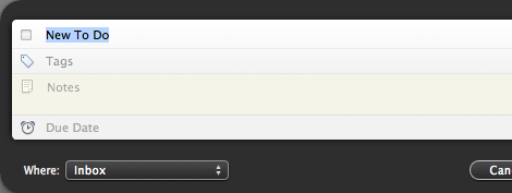
  1. The Task Title. No rules. I jot down whatever is on my mind so I can get it out of my mind.
  2. Task Notes. Many of my daily responsibilities revolve around sending and replying to emails, so I get a lot of action items via my email inbox. Often there are files attached to the email, or other valuable info which may be relevant for when I get to that task. The email gets linked in the ‘Notes’ box of the task, and then moved to the Action folder in Mail.Links to email are dynamic, so if you drop the email link into Things while the email is in your Inbox, but then you move it to another folder, the link in Things follows the email. Even to the trash.
  3. Due Dates. I don’t want to leave all upcoming projects in the Inbox, nor do I want them in the ‘Today’ view. But it can be easy for a few important tasks to get lost in the sea of all the other tasks. Especially if it’s not related to a current project.I usually assign a due date to the task and then drop it into its area of responsibility or the project it belongs with.

    If it’s a loner task, I pick the due date based on my schedule and current priorities for my job. There are a few times in my week that I have large chunks of time blocked out with no set agenda. These are my “Open Work Times” and they are when I work on my to-do list. Usually.

    By setting due dates, I know that my own computer will bring the task back to my attention by shooting it into the “Today” list at its appointed time. And if the task becomes a priority before the due date I gave it, I have no doubt someone will be sure to let me know.

The elephant in the room that I continue to ignore is tags. Not because I don’t see the use for them, but because I never felt that bothering with them on the front end would prove useful to me on the back end.2

Using tags in Things could make a lot of sense if my day was constructed in such a way that I could sit down at my desk for 30 minutes with a single focus of, say, returning phone calls. In this situation bringing up all the tasks pinned with the ‘Phone’ tag (ha!) would be genius. But I don’t work that way in real life. So I don’t bother with tags.

One way I might see myself using tags for would be to mark priority. However, priorities are relative. What may be a priority today, may not be a priority tomorrow. And vice-a-versa. Thus, I rest my case.

Quick Entry HUD

About 90% of my tasks get put into Things via the quick entry HUD; even when Things is the forefront window already.

I have the keyboard shortcut set as SHIFT+COMMAND+SPACE. Since it’s the second most used keyboard shortcut for me I set it to be nearly identical to Quicksilver’s (CMD+SPACE), which is the first.

Inbox Management

I don’t worry about keeping my Things inbox at zero.

There are rarely more than a handful of tasks sitting there at any given time, and it’s usually because I don’t have a spot to put them yet. Or because it has been a long day.

Usually they are not something to be done today and just need some info and a due date before I slot them into a current project or area of responsibility (both of which will also add the task to the master ‘Next’ list).

If it is a very contrite task it gets left as-is and put into the ‘Someday’ list. About once a week I peruse through the ‘Next’ and ‘Someday’ lists to see if anything needs doing. I usually take care of one or two tasks just to feel good about myself.

This process is nearly the exact same way Chris Bowler cranks through his Inbox as well:

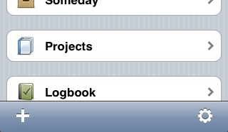
The great feature that I feel separates Things from other task management applications is the differentiation between projects and areas (areas of responsibility). I receive a lot of tasks that are not projects. And they fall under one of my areas I am responsible for. Things makes this a real ease and pleasure to document.

Seventy percent of the time I add items to Things, it is done through the Quick Entry panel and added to the Inbox. So I usually organize these tasks once a day, near the end of the day. Tasks are dragged to specific areas or added to existing projects. And when needed, new projects are created.

Moreover, when processing a task there is a clever feature which comes in handy if the task you wrote down should have been a project. By dragging a task out of its list, into the sidebar and dropping it over “Projects” will take the name of the task and create a new project automatically.

This is very handy feature indeed. Especially if you’ve created a single task which you realize may need to be broken down into multiple, smaller tasks…

Drag-n-Drop a task into a new project with Things

Projects

Benjamin Franklin, a productivity and time-management mastermind, said, “Little strokes, fell great oaks.”

When building a task-list for a project, keep each task bite-sized. Each task should be something with a clear and tangible goal, helping lead to the end of the completed project. A good comparison is a tried-and-true technique my father-in-law teaches for those seeking to get out of debt — technique Dave Ramsey refers to as the “Debt Snowball”.

You gather all your debts, and put them in order of amount owed. Nothing else. While paying the minimum on all current debts, you focus all extra money to pay off the debt with the smallest balance first. Once that debt is paid, you take the left-over money you’re not putting towards it and apply it to the next smallest. And so on until all your debts have been paid.

It’s great financial advice, and it has practical application in other projects beyond financial.

Breaking down a project into easily definable steps (“little strokes”), you are able to work with focus on a single goal at a time. Procrastination is easier to avoid when there is no ambiguity, which makes completing the project (“great oak”) on time with less stress a reality.

Printing a List

To keep the memory of old-fashioned lists alive, Things offers the ability to print your to-do list.

This can actually be very helpful if a project has multiple to-do items that need to be reviewed with your team and then farmed off to the poor sap who decided to sit in the corner.

Unfortunately, the printed version of a task list doesn’t look nearly as pretty as the screen version. Though I don’t want (or even expect) all the fancy UI elements to print out, I do want the list to be well-formatted. A cleaner layout, use of a serif and more white space would be a good start.
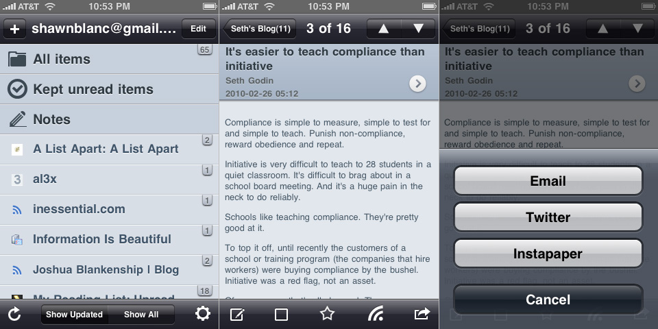
Things on iPhone

I use both versions of Things, and am very impressed at how much the two apps work and feel identical to one another. This may seem like a “well duh” observation, but think about the back-room thought that had to go into developing the iPhone version of Things.

When creating an iPhone version of a desktop app you can’t just drag and drop the code and click the “iPhoneitize This” button. You have to completely start from scratch. In this situation, the result was a fine-tuned, highly polished iPhone app which doubles as a fully functional, stand alone GTD tool. Not bad for one month’s worth of work.3

Those who use both the desktop and the iPhone version may not have considered that the iPhone version of Things had to hold its own since many of its users do not own a Mac or do not use Things on their desktop.

There are two dynamics to successfully building two versions of the same app onto two unique platforms (one for iPhone and one for the Mac).

  1. Both apps need to feel native on their respective platform. The iPhone version needs to feel like it belongs on the iPhone app, and the desktop version needs to feel like it belongs there.This doesn’t just mean the GUI should be different. It also means the layout and display of core functionality, along with the flow of navigation and the user interaction within the application all have to pull together to form a well developed iPhone app that still has striking familiarity to its desktop counterpart.

    It’s like the difference between Clue the board game, and Clue the card game. Same game, completely different implementation and interaction.

  2. Both apps need to feel like they are the same app. Meaning, the Cultured Code team had to reconcile the two-fold need for their iPhone version of Things to feel like a native iPhone app while also feeling like the very same application they made for the desktop.

Reconciling these goals was the same issue Apple had to tackle with their own programs such as iCal or Mail. iPhone’s Calendar app feels great all by itself. But if you use iCal on you Mac as well, you don’t feel like you’re working with two different programs. They are simultaneously the same and different.

And Cultured Code did it…

The desktop version of Things is very much Macintosh-esque. A great piece of software in terms of functionality and design. Mac users have high standards for their software beyond just that they work.

Similarly, the iPhone version of Things is very iPhone-y. All the functionality of a fully loaded task management app married to the ease of use of what feels like a native iPhone app.

In and Out

Things on the iPhone is only about as good as it is fast.

The sheer virtue that Things for iPhone is an app used on a mobile device means it will be used mostly by people when they are on the go. This is why the ability to create a new task from anywhere in the app is so important.

Something clever with Things on iPhone is that the “plus” (+) icon is dynamic. Meaning if you open up the task entry screen from the main window, the default location for that new task is the Inbox. But if you are working within an area of focus and tap the “plus”, then the default location for that new task is your current area of focus.

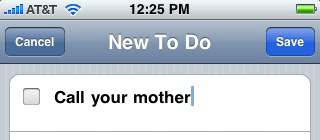
What I also like about adding new tasks to Things on the iPhone is that the keyboard slides up automatically and instantly, when the “New To Do” screen is launched. Though unfortunately it is not quite as refined as Mail on the iPhone where after tapping to create a new email message the on-screen keyboard slides up at the very same time as the blank email.

If you want to add a new task to a particular list or area of focus rather than the Inbox it is best to tap into the list you want to add the new task to first, and then create the task. Rather than creating the new task from the main screen and then selecting your desired location.

Choosing to create a new task from the home screen that you want to end up in the “Someday” list, the order would go something like this: (1) Tap the plus to invoke the New To Do window; (2) type in the task name; (3) tap the “Create In” box; (4) select from the lists, and finally; (5) Save.

That’s five total taps, not including the amount of letters and spaces in your task’s title.

If you add the new to-do from the already appropriate list you save yourself one tap: (1) Select list; (2) tap the plus symbol; (3) type in task name; (4) save.

Ubiquitous

I do not use Things on my iPhone to manage my shopping list when out on errands. I use it almost exclusively as my parking lot. Regardless if I’m in a meeting, at Wal-Mart, or waiting for the oil to be changed, there is no way to tell when a thought will pop into my head. When it does, I need a place to drop it.

Call Your Mother

I used to jot those thoughts onto the palm of my hand.

Then I bought a Palm Pilot. Then a pocket Moleskine, then a notepad. But through all that, the only thing I ever had with me all the time was my cell phone. I’ve had a mobile device of some sort ever since my first pager in 7th grade. It’s 2nd nature to check my pockets as I walk out the door. Keys. Phone. Wallet. Let’s go.

Once I owned a cell phone that sent emails too, I had two spots to drop my ideas: one was my to-do list manager of choice at the time, and if that wasn’t handy I would send myself an email. Then later, the email would get turned into a to-do item.

Though I originally bought Things for my iPhone based on the novelty of having a to-do list app that worked on both platforms and would sync between the two, I have found that I rarely use its full features. It has primarily become my input collector, which I then just sync to my Mac.

Syncing

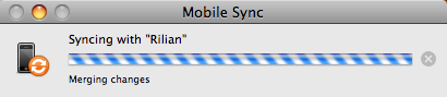
To sync Things on your iPhone with Things on your desktop simply make sure they are both on the same wireless network, then launch them both. If they have not yet been paired, a you’ll be asked to enter a 4-digit pin onto your phone. It is a cinch to set up and virtually no trouble at all to keep the two in unity.

When a sync is in progress your iPhone goes into “don’t touch me I’m syncing” mode, with a large black screen and a spinning “ticker-wheel”. At the same time, on the Mac, this progress bar appears:

Things syncing on a Mac. It almost looks like it's spinning, doesn't it?

If you want to force a sync, simply open the preferences pane on the desktop version, select iPhone and click “Sync Now”.

I find it interesting that the only way to sync Things’ iPhone library to the desktop’s is through a wireless network. You can’t plug it in to sync, and there is no cloud server offering over-the-air syncing like MobileMe does.

If you are not near a wireless network, you can still sync by using your computer’s airport card to create a network. Click the airport menu icon, and choose “Create Network…” Then join that network on your iPhone, via the Wi-Fi menu under Settings.

Additionally, Things does not currently sync between two desktop Macs. Trying to use the iPhone as a mediator or carrier of info between two computers is doable, since each Mac must be paired to the iPhone individually for over-network syncing.

Since I only use one computer, this is not an issue for me. But for those of you who do use multiple Macs, Cultured Code has documented a work-around which uses Dropbox to keep your Things library in sync, and which many people seem to be doing successfully.

More Reviews

This is just one of a handful of winded and entertaining software reviews.


  1. Without much work at all, I was able to pick out 10 task-management apps for the Mac (not including Things): iCal and Mail (on Leopard), iGTD, OmniFocus, Midnight Inbox, TaskPaper, Kinkless GTD, Anxiety, The Hit List, What’s Next, and The Action Method.
  2. Not just for Things, but for all the applications I use.
  3. And currently enjoying the #1 for-pay productivity app in the iTunes App Store.
A Review of Two Things: One For the Mac and One For iPhone

The iTunes Genius

The most significant feature introduced with iTunes 8 in September was Genius: the automatic playlist generator. John Gruber describes Genius as being “like the shuffle feature but with a hint.”

Genius is, in fact, so clever that I now have a hard time listening to music any other way.

Once Genius is enabled1, your computer anonymously sends information about your music library and listening habits to Apple’s iTunes Store where it is combined with the information of millions of other iTunes users and then processed. The results are continually sent back to your computer in order to “update” your personal Genius’ algorithms—effectively making the Genius feature smarter every single day.

By having the updated algorithms downloaded, it also eliminates the need for Genius to be constantly connected to the Internet to function. Also, these Genius algorithms are synced with your iPod and/or iPhone.

To create a new Genius playlist you have two options: you can start a song and then click the Genius icon located in the bottom right corner of the iTunes window, or CTRL+CLICK a song and choose “Start Genius” from the contextual pop-up menu.

Once you’ve effectively created your Genius playlist there is a info/menu bar near the top of the iTunes window. From there you can select how many songs you want in the playlist, you can refresh the list and save the list. Refreshing builds a new mix of songs which are based on the original first song you began with; saving will create a new Genius playlist titled after the song-title the playlist is based on.

What’s interesting is that you still have the option to “refresh” a playlist even after it has been saved as its own list, though you cannot re-save a saved playlist even if it’s been refreshed. It seems to me that perhaps the point of saving a Genius playlist is not to keep the order of songs in tact, but rather to quickly access the song which the playlist was built on. If this is the case, it would make sense to build a handful of Genius playlists based on your favorite songs from the different genres in your library.

Something I discovered today – though I am sure it is not a new feature – is the ability to “gift” somebody a playlist via the iTunes Store. When a playlist is selected the “iTunes Store arrow” appears. Clicking the arrow gives you the option to gift the playlist or create an iMix.

iTunes Gift a Playlist Option

When I was a kid, gifting a playlist meant creating a mix-tape through hours of play/pause recording on a dual tape deck.

Genius also gives you the option to buy more songs from the iTunes store to ‘complete your playlist’. Regardless of what context you are listening to music in, if the Genius sidebar is open you will see related music available for sale on the iTunes store.

Michael Mistretta summed up his thoughts on Genius by saying, “…in the end, it will simply be used to sell you more music.” And rightly so.

Through iTunes, Apple is in the music selling business. And what better way to capitalize on permission and word of mouth marketing, then by brilliantly recommended songs and albums right from the familiarity of someone’s own computer?

Additionally, as Dan Philibin said in the comments of the aforementioned article, “Genius is only possible because of the amount of people that use iTunes, something that’s taken years to improve and perfect.”

The Genius engine not only exists as part of iTunes 8, but also as part of every new iPod and every iPhone or iPod touch using iPhone OS 2.x.

Building a Genius playlist on iPhone’s mobile version of iTunes works exactly opposite of the desktop version of iTunes, though it is never confusing in context. On the desktop version you create a Genius playlist by selecting the song first, whereas on iPhone you select the song last.

To build a Genius playlist on mobile iTunes you start by selecting “Playlists” and then “Genius”. iTunes then asks you to choose a song to create a Genius playlist and shows you a list of all your songs in alphabetical order. If that is not how you want to pick a song, you can still select “Artists” or “Albums” from the bottom navigation menu without leaving the Genius song-selection state. What you cannot do is rotate your phone to cover-mode and select a song that way.

UPDATE: So, apparently you can start a Genius playlist on the iPhone by selecting the song first. When a track is playing, and you tap the cover art to reveal the timeline bar, there is the Genius icon right in-between the repeat icon and the shuffle icon. Tapping the Genius button builds a playlist with 25 songs in it. From there you can Save, Refresh or build a new Genius playlist.

On my iPhone, with just a little over 5 GB of audio from 65 or so albums, Genius has no trouble creating a fantastic playlist which is always delightful for airplane rides or waiting while getting an oil-change. My point being, Genius doesn’t need a whole ton of songs to build a good playlist.

Now, when I want to listen to music I find the one song that I most want to listen to, and let Genius do the rest. The success rate of a great playlist via Genius is better than simply shuffling all songs, and the amount of thought which goes into building a quality mix is virtually zero when I let Genius build it for me.

After several weeks of use, I have more confidence in Genius than in myself to build a good playlist. I have so much confidence in fact, that when I was asked to provide the music for a friend’s wedding reception a few weeks ago I simply chose one good jazz song from my iTunes library and let Genius do the rest, un-monitored.

It is simultaneously humbling and fascinating that Genius is a better DJ than I am. Even without a massive music library (25.52 GB), Genius has no problem finding all the songs I had forgotten I owned and am delighted to hear again.

What makes Genius so fantastic is not so much the algorithms it builds behind-the-scenes, but the fact that it is what it says it is: Genius is a genius.

Thanks to the massive success and user-base of iTunes Apple now has the ability to tell people – with surprising accuracy – what they want to listen to.


  1. Genius is not automatically enabled in iTunes. You have to turn it on under the “Store” menu.
The iTunes Genius

Three Generations of Macs (Unofficially) Benchmarked

Stats and info are always interesting, so naturally I read the benchmark tests before I bought my new MacBook Pro. But once I had the computer in my own hands I wanted to do some benchmark testing of my own.

Benchmarking the MacBook Pro, Mac Pro and PowerBook G4

I wanted to do my own personal, “real-life” benchmarks to see how the three current Macs in my office compare to one another. Also, I was secretly hoping to discover an excuse to sell the Mac Pro, keep the laptop, and move to a one-computer work-flow. (Let’s face it, syncing sucks.)

And please note, these are by no means official benchmarks — I timed everything with my iPhone for goodness’ sake…

Technical Specs

Each computer is currently running OS X 10.5.2.

Computer Processor Memory Hard-Drive Screen
MacBook Pro 2.4 GHz Intel Core 2 Duo, “Penryn” 4 GB 200 GB, 7200 RPM 15.4-inch LED backlit display with 1440×900 resolution
MacPro 3.0 GHz Quad-Core Intel Xeon, “Woodcrest” 4 GB 250 GB, 7200 RMP primary hard-drive; 500 GB, 7200 RPM backup hard-drive 23-inch Apple Cinima HD Display with 1920×1200 resolution
PowerBook 1.33 GHz Power PC 1.25 GB 100 GB / 7200 RPM 12-inch Display with 1024×768 resolution

1. Video Encoding

Using Handbrake 0.9.2, I encoded the “The Three Amigos” (a classic). I turned the 1:42:16 long DVD into an iPhone friendly 635×346, 1.16GB MPEG-4 Video on each of the machines.

Computer Time to Encode “The Three Amigos”
MacBook Pro 1 Hour, 14 Minutes, 21.5 Seconds
MacPro 45 Minutes, 17.8 Seconds
PowerBook 2 Hours, 58 Minutes, 16.1 Seconds

As you can see the Mac Pro was nearly 30 minutes faster at encoding the movie from disc, but I am quite sure the speed there is primarily due to the 16x SuperDrive, versus the MBP’s 8x.

2. Booting Up

The time it took from when I pressed the power button to when OS X had fully loaded and Quicksilver’s icon finally appeared in the menu bar.

Computer Startup Time
MacBook Pro 1 minute 19.8 seconds
MacPro 1 minute 5.6 seconds
PowerBook 1 minute 11.1 seconds

3. Zip Compression

I had each machine take a 272.2 MB folder and compress it into a 108.9 MB ZIP archive.

Computer File Compression Time
MacBook Pro 24.2 seconds
MacPro 22.1 seconds
PowerBook 43.6 seconds

4. The Infamous “Open All Apps” Test

I selected every application in the Applications folder (except for Spaces and Front Row), and hit CMD+O. I then waited until all the icons in the dock stopped bouncing.

Computer # of Apps Time To Open All Apps
MacBook Pro 85 2 minutes and 34 seconds
MacPro 80 4 minutes and 29 seconds
PowerBook 57 Beachballed and had to be force-restarted after 12 minutes

5. FTP File Upload

Using Transmit, I uploaded an 8 MB folder, which contained four images, onto my server.

Computer FTP File Upload Time Internet Connection
MacBook Pro 2 Minutes, 27.8 seconds Wireless
Mac Pro 2 Minutes, 24.4 seconds Ethernet Cable
PowerBook 2 Minutes, 22.9 seconds Wireless

6. The Nitty Gritty

Day in and day out, the apps I have running while working are Mail, Safari, Photoshop and Illustrator. This is my “real life” test.

With Mail and Safari both open, and iTunes playing some hits, I opened a 1.1 GB Photoshop file to manipulate it (turning it into a 1.42 GB file). I then re-saved it, and then exported it as a TIFF.

Computer Open a 1.1 GB File in Photoshop Save the new 1.42 GB File Export as TIFF
MacBook Pro 38.5 seconds 51.9 seconds 13.6 seconds
Mac Pro 25.2 seconds 42.7 seconds 14.3 seconds
PowerBook Adobe only allows you to have two computers authorized at a time, and I already de-authorized the G4 N/A N/A

Conclusion

As I mentioned in my review earlier this week, I have decided to sell the Mac Pro and move to a one-machine setup. It’s true that the Mac Pro won nearly every benchmark, it wasn’t by a lot (in most cases). The time I may lose in performance with the MacBook Pro, I will gain back by not having to sync files and worry about which machine has the latest version of a project I’m working on. Additionally, the idea of owning two, expensive, “pro” machines is a bit against my nature.

And for those wondering why I would keep the laptop and sell the tower: It is because I travel quite a bit and do a lot of work outside of my office. Having a portable is a necessity for me.

Three Generations of Macs (Unofficially) Benchmarked