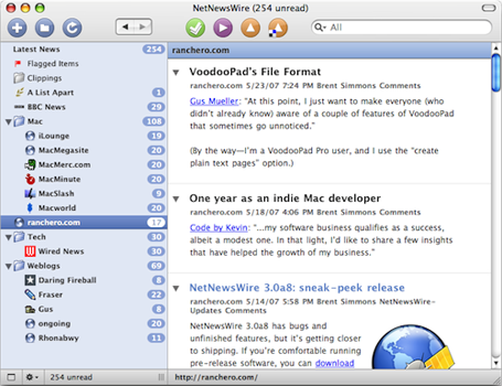
Coda is a text-editing, CSS-styling, WebKit previewing, file-managing, FTPing, terminal-accessing, web-site-building and publishing application for the Macintosh.
And, Coda has no duct tape.
All Inclusive Applications
If you are going to write an application that has and does “everything” there are a few key dynamics you have to keep in mind.
First of all you need to make it easy, simple and clear for the user to do all their work in your “one window”. This is where usability and interface make or break the application. And, fortunately for Coda, this is where Panic excels in, and Coda does a superb job as a “one-window application”.
Before Coda I always had at least three windows open at any given time when doing web-design: Transmit, TextWrangler and Safari. And I know that for those who are more web-design and development savvy people than I, only three apps open would be like a vacation.
For the past several weeks as I’ve been writing this article I have used nothing but Coda for web designing, and it has broken my age-old habits of CMD+TABbing between multiple apps.
Using Coda’s one-window interface has been especially wonderful when I am away from my home office and thus coding on my 12″ PowerBook’s 1024×768 screen resolution. But even on my 23″ display at home, I prefer to have Coda’s window sized to about 85% of my screen and make use of the Text Editor and the Preview panes rather than have two apps running side-by-side at 45% screen-realestate each.
Another reason Coda has helped break my habit of multiple-app web designing is the way it saves your previous work session, but more on that later.
Coda’s use of tabbed windows plays a critical part in its claim to fame as a one-window tool. Nowadays tabs come standard with good apps. Therefore, just having tabs is not enough. You have to have tabs that are above the norm of other applications and which meet the user’s expectations. Especially when it’s the tabs which are part of the foundation of your “one-window” application.
There seem to be three major ingredients which make up a good tabbed-window interface. First is design. One of the reasons I have never used NetNewsWire’s built in browser is the slighly odd look and feel of the tabs. They just feel clunky to me. Coda’s tabs are clean, subtle and easily identifiable. They are intelligently placed, and don’t go weird places when you have 20 of them open. (Though if you have 20 tabs open, you probably have bigger things to worry about than tab placement.)
The second ingredient is navigation. If you’re working in tabs you must be able to get from one to the other quickly and easily. Coda’s tabs work identical to virtually all other tabbed interface apps in that you can hot-key between them with the standard CMD+SHIFT+[ or CMD+SHIFT+] keys.
Finally, and most important, is user-interface. This seems like a moot issue, but there are still many apps that don’t utilize it. Coda does utilize it, and utilizes it well.
The most important user-interface aspect of tabbed-windows is the ability to re-order the tabs. A simple click and drag does the trick just perfectly. Moreover, Coda has more than just hot-key commands for new tabs. There is a “plus” symbol just under the toolbar, to the right of the file browser that you can click on to create new tabs. And to the far right is the “split window” symbol. A click on that and your current window gets split vertically or horizontally.
So at the end of the day, Coda’s claim to be a one-window app is valid. Coda is a great one-window application.
But there’s more to it than that…
The second challenge for a do-it-all application is to avoid overwhelming the user with too many options; i.e. “bloating” your app.
Coda is most certainly not bloated. If anything it could be argued the opposite – that Coda’s features are too skimpy.
However, put yourself in the developer’s shoes for moment. You’re going to take a Text Editor, CSS Editor, FTP client and a Terminal app. Then bundle them together, add a WebKit based prievewer and debugger, and offer some good documentation of PHP, CSS, Javascript and HTML. And finally: sell it for less than the cost of just a good text editor.
Panic didn’t set out to make the best text editor, CSS editor, etc… They set out to make one single application that contains all you need to build a website. And Panic has done a great job at keeping each of Coda’s components concise, powerful and focused – giving you the features you need while not requiring you to learn 4 or 5 new applications simultaneously to be able to use Coda efficiently. Sometimes good development decisions are about what you don’t put in.
An Aside Regarding Dreamweaver
When talking about one-window website development applications it’s hard not to mention Adobe Dreamweaver. And though Coda may easily be compared to the features Dreamweaver offers, Coda is much less bloated, much more snappy and infinitely more Macintosh-like.
In his Coda review for MacUser, Nik Rawlinson says,
“[Coda] could teach Adobe a thing or two, as it puts Dreamweaver’s multi-paged dialog to shame, and beats its sidebar-based CSS designer hands down. […] If you’re…ready to step up from Dreamweaver’s built-in code-based environment, Coda is an excellent choice.”
Coda was developed for people who work at the raw code level to build their websites. In contrast to Dreamweaver there are no pre-fabbed templates or WYSIWYG editors in Coda. Anyone who uses Dreamweaver would do well to look at Coda. Especially those in the market to buy, since Coda’s price tag is 5 times less than Dreamweaver CS3’s.
Starting With 1.0
On Monday, April 23rd, 2007 – exactly 10 years and a day after Panic was born – Coda 1.0 was launched, and it received quite a bit of buzz all about the internets.
- Cabel Sasser –
This was by far the most complicated program we’ve ever built. I realized this when it dawned on me that I had never stopped doing design work for it. With most of our prior applications, I may spend a month or two creating a all-purpose Photoshop layout, cut up any important art, and then hand it over to the guys, possibly coming back to make a tweak every now and then. With Coda, the number of features and the scope of the project meant that even as soon as yesterday I was cranking out some interface pieces as .pdf’s
- John Gruber –
One way to judge the scope of an app is to think about how much time you’re intended to spend using it. There’s plenty of room for apps you use here and there for a few minutes at a time, or which you launch just once or twice a week. There’s hardly any room at all, though, for apps you work in for hours at a time, every day.
By this measure, Coda, the new app from Panic, is an epic.
- MacUpdate’s Review Forum is full of ravings –
Wow. Do the folks at Panic ever make a mistake. Everything in Coda is amazing, it’s so intuitive it’s scary. Auto completion works great, the sites page is amazing, inline ftp, preview, all of it amazing. One thing I did notice, doesn’t seem to like flash, but hardly a dealbreaker. Bought and paid for this morning about an hour after release.
Moreover, April 23rd was also the submission deadline for the 2007 Apple Design Awards. And, waddayaknow but a few months later at the WWDC07, Coda won the award for Best Mac OS X User Experience –
Coda is a unique web development environment that offers a complete file browser (both locally and remotely), publishing, full-featured text editor, WebKit-based preview, CSS editor with visual tools, full-featured terminal, built-in reference material, and much more. Coda is the Mac’s first one-window Web development application that integrates numerous modules into one cohesive user experience. Coda is a great Mac OS X citizen…
User experience has always been one of Panic’s fortés, and Coda is no exception. It truly is a beautiful, powerful, intelligently designed, all-in-one website building tool.
However, it’s important to note that there is something interesting I have seen in many of the reviews I’ve read about Coda. There seems to be this relatively universal love/hate relationship with the people who use it.
Even in my own experience with Coda it just doesn’t quite cross over from, “Wow! This is smart, incredible and beautiful!” to, “How will I ever live without this?”.
Joe Kissell says –
…it’s like buying your dream car, only to find out that the seats are kind of uncomfortable and there’s no heater. Coda comes so close to being great that its shortcomings are especially annoying. Having tried this way of working, I’m loath to return to having four applications open all the time – and yet I keep running into issues that irritate me almost enough to give it up.
Yet, let’s not forget Coda is still only a 1.x product, it is extremely affordable for the features it offers and Panic has a fantastic reputation for producing outstanding software for the Mac.
Coda’s components are all masterfully crafted and seamlessly integrated. It has all you need to code, debug, validate, stare at, drool over and then publish your website.
Steven Frank says that when the beta-testers were asked what their favorite feature was they all replied: “The integration. The way it all fits together. How everything’s somehow right where you need it when you need it.”
“Sites”
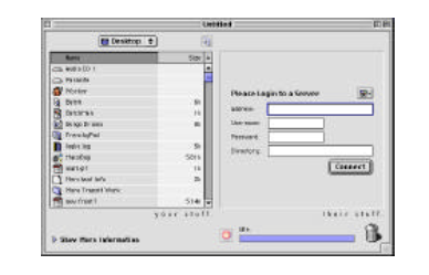
When you launch Coda this is where you start. Coda uses “Sites” the same way Transmit uses “Favorites”, and when opening Coda for the first time you are given the option to import some or all of your Transmit favorites if you like. You can also import them later.
Each “Site” is basically a collection of info and details about a website you’re working on or maintaining. Your “Sites” are represented by taped-up pieces of paper with a picture of your home-page drawn on the front:

Coda gets the icon images by taking a screenshot of your site’s homepage / root URL, which you can designate in the site’s info pane.
Having the visual icons to represent your sites is a nice touch, but a problem may arise if you have more than one saved site for the same root URL. Such as shawnblanc.net and shawnblanc.net/images. Both of those icons would display the same image on the taped up piece of paper. However, I don’t have my /images/ folder saved as a site, so it’s not a problem for me. And I think it’s clear that Coda wasn’t intended to replace your dedicated FTP client, so I doubt it will be a problem for many others.
But if you do encounter that problem the good news is you can choose custom images for each “Site”. To put your own image onto the taped-up paper, simply control-click on the site and “Change Image” to browse your finder for the image of your choice.
When you double-click on a “Site” the page flips around and expands into the full width of Coda’s window, revealing your previous workspace layout. Files, tabs, splits, everything is just the way you last left it and it is all ready to go. (Unless you left it in a mess. Try not to do that.)
The restored work session is one of my favorite features in Coda. It seems that most of the time I am opening up the same files for a site over and over. I can’t describe how wonderful it is to simply open up a “site” and have my previous session restored right the way I left it.
John Gruber expounds –
In terms of historical user interface traditions and conventions, Unix and the Mac could hardly be more different, but there is one similar philosophy shared by both cultures — a preference for using a collection of smaller, dedicated tools that work well together rather than using monolithic do-it-all apps.
Coda seemingly swims in the face of this tradition, in that it ostensibly replaces a slew of dedicated apps. Coda’s premise, though, isn’t so much that it is one app that obviates several others, but rather that web development can and should be treated, conceptually, as a single task. That you don’t think, I need to download, edit, save, upload, and preview a change to the web site; you think, I need to make a change to the web site.
There is something else that has stuck out to me in my use of Coda, which I don’t quite know where to talk about, so I’ll bring it up here: When using Transmit I always disconnect before quitting. I press CMD+D to disconnect and then CMD+Q to quit out. But the same key combo doesn’t disconnect you from your site in Coda. (Pressing CMD+D or CMD+SHIFT+D moves you to the next or previous symbols within a text document.)
If you want to disconnect from your “Site” before quitting not only are there no hot-keys to do so, you have to click the circle-encompassed “x” next to the name of your site up in the top left corner of the application.
And as many of you “don’t use the mouse if you don’t have to” / “I love Quicksilver” nerds will agree: clicking the disconnect button is too much. Therefore, since I can’t disconnect with a hot-key I find myself just quitting out, and it feels a bit like I’m unplugging my computer without powering it down first.
The Text Editor
For most users the text editor will be one of the two most-used features in Coda. (The other obviously being the Transmit turbo-engine-powered file manager / FTP client.)
Coda’s text editor is not a blow-your-brains-out-the-back-of-your-head kind of text editor. It wasn’t meant to be.
Coda’s text editor is its own licensed version of SubEthaEdit, which is one of few text editors which prides itself in being “a high-performance, sleek editor”; i.e. minimalism. To say the least, Coda’s text editor is powerful, clean and smart. It even comes with its own font, “Panic Sans”.
When it comes to text editors there are those who live and breath inside theirs, and everything else is just details. These people know every feature, every bug, every nook and every cranny of their editor and they use it for virtually everything. And these people just may pull their hair out when they try using Coda and discover it doesn’t have the ability to search within all the files on a site –
What Coda majors on is taking the most important features and implementing them in an intuitive, no-nonsense way.
For instance the bracket highlight feature: When your cursor passes through the beginning or end bracket a little blue beacon pops out at the other bracket, letting you know where the current symbol begins or ends. Simple, smart features like this are peppered all throughout Coda.
And not only are Coda’s little features smart, their interface is beautiful.
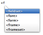
Compare Coda’s auto-complete pop-up list above to Dreamweaver’s below:
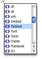
Not only is Dreamweaver’s box clunky and sports a drop shadow straight from 1997, but it brings up the entire code listing with empty brackets next to each tag. There is way too much going on. Notice how Coda only shows the tags that begin with ‘f’?
CSS Editor
CSS editors are becoming more and more popular. And for good reason. If I could remember everything I would much prefer to write my CSS from scratch by hand. But editing and writing CSS that way requires a bit more jujitsu than I have.
Coda’s CSS editor, much like its text editor, is simple and straight forward. You don’t have to examine it for an hour before you can figure out what you’re doing with it and how to work it.
If you already have a style sheet you’re working with you can open it in the CSS editor. It will display all the style elements on the left column with the built-in editor on the right-hand side. Click on an element to edit its type, margins, padding, color, border, etc… All the CSS properties are available for you to use and master.
You can build a style-sheet from the ground up as well; creating each element as you go. Or if you prefer, use the text editor to hand write all the elements you will be using then use the CSS editor to set the styles of those elements.
With Coda there’s no reason you shouldn’t have a fully-functionable and beautiful style sheet.
In addition to tabbed windows, Coda also allows you to split a window vertically or horizontally, and I’ve found that splitting the window vertically is extremely useful when working on a style sheet. I can then see and edit my CSS file’s text by using the text editor on the right, and then on the left split I put the dedicated CSS editor with a list of all my symbols and the visual style-selector; giving me the best of both worlds in one window.
“Preview”
Coda has its own internal browser so you can view the changes you make to your website right within the app.
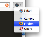
It is a WebKit based browser, so your site will look virtually identical in Coda as it does in Safari. But nobody does browser testing in only Safari. To preview the same page in other browsers you simply click the icon to the right of the Coda’s Address Bar and highlight the browser you want to launch.
DOM Hierarchy Inspector
While in a Preview window you can activate Coda’s Document Object Model Hierarchy Inspector by clicking the magnifying glass icon at the bottom of the screen when in Preview mode. You may then scroll over the various modules in your webpage to see them highlighted in blue with their logical structure outlined below.
Not only is the DOM hierarchy inspector fun to play with as you watch blue boxes pop up here and there while you fling your mouse all over the place, but it is also a great way to get a visual grasp on how your code actually plays itself out, and is especially helpful for debugging and finding goofy errors with Javascript and HTML.
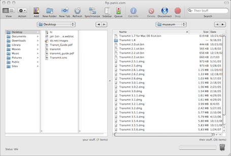
FTP Client and File Manager
Coda has Panic’s new “Transmit Turbo Engine”. (Get it?) For basic file transfers Coda actually claims to be quicker. It’s not a dedicated FTP client, but is certainly does the job it needs to do. The file-browser/Transmit combo works so seamlessly you may forget you’re working on a remote server.
When you click on a file either remote or local, that file opens up in a new tab. You can then tinker away to your heart’s content. If you are working on a file from your server, when you save will automatically upload the updated file.
When working on local files you can keep them local or choose to upload them to the current folder you have open on your server. Control-clicking gives you the option to upload, or to “Mark For Uploading”. When a file has been marked for uploading, Coda puts an up-arrow to the right of the file. Clicking that arrow uploads the file to the current folder you have open on your server.
When working on several files that will incorporate interlinked changes across your whole site, it is usually preferable to upload them all at once. Marking them for uploading helps keep them organized for you. Then you can close out the file, but keep it marked and when you’re done, upload all of them together.
The integration of the file manager and the FTP client is so seamless it is easy to take it for granted. The file manager is out of the way, but ready and available when you need to use it. And that, my friends, is the mark of a well-designed feature.
The Terminal
This is where I confess I am not that hard-core of a nerd. I am not a Terminal junkie, and in-fact, have not once used Coda’s built in terminal. Though if I needed to, Coda has made it as easy as possible by taking my “Site” information and using it to log me in via SSH.
Reference Books
Coda includes two books: A PHP reference guide and the “Web Programmer’s Desk Reference: HTML, CSS and JavaScript“, by Lázaro Issi Cohen and Joseph Issi Cohen –
The Web Programmer’s Desk Reference is the only book to serve as a single point of reference for all three primary web programming languages. Each listing includes the latest syntax and functionality, compatibility with other elements, and cross-browser compatibility issues.
The content in these books is comprehensive, easy to understand and very well laid out.
The biggest complaint is that the books are only available when you’re connected to the internet. Their content is hosted by Panic. This certainly defeats much of the purpose of having built-in reference guide. If I can only access it when I am online I could just as easily use Google to find what I need help with.
I would love to see these books saved locally to make them accessible when the internet is not.
The Little Things
It’s the little things in Coda that you may or may not notice that make it worth owning and using. The way a “Site” fades away if you delete it, or the way each of the primary six components in Coda have a numbered hot-key.
In fact, the little things in Coda matter so much it’s why Brent Simmons recently purchased a copy –
I used [Coda] to update NetNewsWire’s Help book for the latest release, and I liked the flow of it. I liked the easy flip between edit and preview modes. I liked having the list of files on the left. I liked the tabs. I liked the keyboard command for closing a tag. Etc.
But, most importantly, I liked the overall feeling of the program, and the sense that it would take care of me — that is, I felt like it probably had features I didn’t know I needed, and anything missing would probably be added in the future (things like multi-file find/replace). Part of this is just judging the app, and part comes from considering Panic’s track record.
Here are a few of the little things that stand out to me:
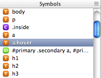
Symbols Quick Navigator
Clicking the brackets at the bottom toolbar underneath the file-manager brings up the Symbols Quick Navigator. It is a funky little table of contents for all the style-sheet symbols in your current open window.
The 3-Pixel Conundrum
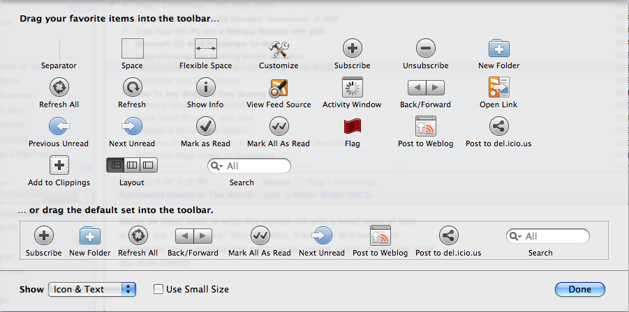
If you’re a fan of the new look for selected icons in Leopard’s toolbars you have Cabel and Panic to thank for it. Cabel was un-satisfied with the default selection state in Apple’s toolbar. To make a long story short, Panic’s development team coded their own toolbar to make up for the trouble Apple’s toolbar gave them when trying to get the look they wanted. But someone at Apple noticed and the design became Leopard’s default. (Read the whole story, here.)
Clips
Michael from WordPress Candy points out how helpful Coda’s “Clips” feature is for doing WordPress theme development.
You can save any text you want as a “Clip”. This is extremely helpful for keeping common tags available at all times. And Clips has a Global database as well as a site-specific database. If you are working on a WordPress based site you can save your WordPress tags for that site, and if you are also working on a Textpattern site your tags for that are saved when that site is open.
Double clicking a specific clip paste that text starting at the cursor’s current location. Or you can click and drag a clip to any location in your file.
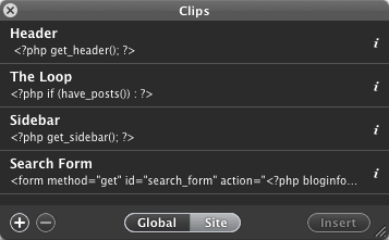
To open up the Clips use the hot-key CTRL+CMD+C, or navigate to “Window” then select “Clips”.
Miscellaneous
- If you move the location of your local root directory, Coda keeps track of where it goes. Even if it goes to the Trash.
- A dot to the right of the file name inside the file manager, or in the file’s tab tells you the file has had changes since the last save.
- The way the toolbar stays fluid with the file manager’s width. It’s hard to explain, but adjust the width of the file-manager window and watch what happens up by the toolbar. The icons stay fixed above the window, the site name stays centered above the file-manager.
More Reviews
This is just one of a handful of winded and entertaining software reviews.