Reader’s Setup: Michael Bester

Based in Salem, MA, Michael Bester works remotely as a Software Architect in the Interface Engineering Group at Schematic. Practically speaking, that means he authors HTML, CSS and a truckload of Javascript for a variety of projects. He occasionally writes on his personal site, Kimili, and tries his hand at witty banter on Twitter.

Michael’s Setup:

1. What does your desk look like?

Michael Bester's Mac Setup

Michael Bester's Mac Setup

2. What is your current Mac setup?

All of my work for Schematic is done on a 2.4 GHz Intel Core 2 Duo iMac with 3 GB of RAM. My personal machine is a quad-core 2.5 GHz PowerMac G5 loaded with 6.5 GB of RAM and a Terabyte of internal drive space. It doesn’t get nearly enough use these days to justify all that computing power.

An IOGear Micro DVI KVM switch connects both machines to a single keyboard, a 23″ aluminum Apple Cinema HD Display and an old Wacom Intuos 9×12 tablet, which I use for all my mousing needs. A Drobo loaded with a pair of 500GB WD Caviar drives stores all my photos, video and music. A set of Bose Companion 2 speakers rounds out the setup.

3. Why are you using this setup?

In the case of my personal machine, I tend to get the most powerful system I can, as I typically go a long time between upgrades. For example, before my quad-core G5, I had one of the first G4 desktops ever made. It lasted me 6 years.

The iMac is Schematic-issue, and is a recent upgrade from a white 2.16 GHz Core 2 Duo MacBook (which simply crumbled under the weight of running things like Photoshop, Firefox and VMware simultaneously). As a web development workstation, the iMac gets the job done with aplomb.

The last mouse I used with any regularity was the hockey puck that came with my aforementioned G4. The experience left my forearm so sore that it soured me on using a mouse at all. It was then that I purchased the Wacom tablet. I’ve never looked back since.

4. What software do you use on a daily basis, and for what do you use it?

  • Quicksilver — primarily as an application launcher, but occasionally to control iTunes or open files in a certain app.
  • Safari — because it’s fast and because its text rendering kicks ass.
  • TextMate — because I think there is no better editor in the world for most of my coding needs. The only thing I don’t code in TextMate is CSS. For that I use…
  • CSSEdit — because its code hinting and live preview are invaluable for authoring CSS.
  • xScope — is’s the toolbox for picking colors on screen, magnifying details or quickly measuring things in comps.
  • Default Folder X — because it adds much-needed functionality to OS X’s save dialogues.
  • Tweetie — because Twitter has supplanted RSS for me, and there is no finer Twitter client than this.
  • Adium — to keep tabs on my friends, colleagues and coworkers. Being a telecommuter, this is an especially important tool.
  • Photoshop CS4 — mostly to tear apart comps I get from designers.
  • Em Calculator — because I’m a sucker for vertical rhythm in my layouts and this AIR app from James Whittaker makes the math easy.
  • Apple Mail — to handle my IMAP and Exchange accounts in one place.
  • Terminal — for mucking around on remote servers and dealing with Subversion.
  • Spirited Away — to keep window clutter down and help maintain focus on the task at hand.
  • Preview — the unsung hero of OS X. Not simply for PDFs and images, I regularly open Photoshop files in it simply to avoid the spinning beach ball of death.
  • iTunes — Because most days, I work more efficiently with a soundtrack.

Some things I don’t use daily, but are still essential:

  • Firefox 3.5 running Firebug — because developing Javascript applications without this combo is sheer lunacy.
  • VMware Fusion — because I occasionally have to check my work on that other operating system.
  • Aperture 2 — to manage my rapidly growing photo library. It has all the tools I need to post-process and organize my photos.

5. Do you own any other Mac gear?

I’ve got a few iPods lying around, including a 3rd generation 15 GB model — the last one with a monochrome screen (what a relic!) — as well as a previous generation 1 GB iPod Shuffle. I also borrow my wife’s 2.16 MHz Core Duo 2 MacBook with 2 GB RAM on the rare occasion that I have to take a computer with me somewhere.

6. Do you have any future upgrades planned?

Not in the immediate future, but when the time comes to upgrade the G5, I may transition it to a MacBook Pro. I’ve been skeptical in the past about using a laptop as my main machine because of the limited upgradability and generally slower performance when compared to a tower. However, I think recent generations of the MacBook Pro are bridging that gap.

More Sweet Setups

Michael’s setup is just one in a series of sweet Mac Setups.

Reader’s Setup: Michael Bester

Yojimbo, and The Case for Anything Buckets

Four out of five of you are nerds. On your computer exists your hobbies, your current and/or future career, and the rest of your daily life. You don’t own a snowboard, but you do have a blog, a Twitter, an RSS reader, and a pirated copy of Photoshop.

You, my friend, need an Anything Bucket.

This is not the same as your tried and true System for saving and finding things. The System is for everything. Your Anything Bucket, however, is for everything else. And you need both.

There are lots of options out there. Off and on for years I tried to use Yojimbo, but it frustrated me because I treated it as a replacement for the Finder. On more than one occasion I endeavored to replace my tried and true System of filing things with this single piece of software — attempting to save nearly everything in Yojimbo. That is a horrible way to live, and it’s why I always abandoned the app.

Yojimbo is not an Everything Bucket. A more fitting description, I think, is Anything Bucket.

Because apps like Yojimbo are not where you should keep everything, but rather, where you can throw anything. They are not replacements for the Finder – nor the opposite – you should use them both.

John Gruber lays this out ever so clearly in his article, “Untitled Document Syndrome“. The gist of John’s article is that apps such as Yojimbo are successful because they’re simple. He says: “When you don’t have to do much before (or after) doing what you want to do, you do surprisingly more.”

Summing up Mark Hurst’s advice about simple computing, Andrew White says: “Use the simplest, sanest application that will get the job done. Avoid extraneous clutter in menus, on desktops, in applications. Pick the utilities that will give you the most — ahem — utility, and use and learn the crap out of them.”1

Anything Buckets should be more about ease of use than about depth of features. The very best ones lend themselves to perpetual use. And if you use them, depth will come from breadth.

The info we throw at them can be permanent, temporary, important, or trivial. It doesn’t matter. Regardless of who, what, when, where, or why, the best Anything Bucket is ready to receive any bit of information that threatens to elude you.

My Favorite Anything Bucket

Yojimbo. Hitting shelves in January 2006 it has sat on four different Mac operating systems and has gone virtually unchanged since its initial release. It is a simple and charming piece of software that packs a lot of punch.

The previous version of Yojimbo, 1.5.1, was released on February 2, 2008. The 2.0 release shipped on September 1, 2009, nearly 19 months later (longer than most of the previous major OS X release cycles). The 2.0 update to Yojimbo came with a new icon, a database upgrade, a few new features, and a lot of refinements.

Yojimbo 1.5 is to OS X Leopard what Yojimbo 2.0 is to Snow Leopard. Which is to say version 2 is an attestation to the charm and punch Yojimbo 1.0 came out of the gate with. Even though version 1.5 sat there for over 19 months, it was still whispered about at the water cooler as people fiddled with their Evernote iPhone app. And that, my friends, says something profound about the quality of this simple piece of software.

Looking at version 2 and what Bare Bones Software decided to add, and what they decided to leave out, says a lot about Yojimbo. I couldn’t help but imagine the 2.0 release as being similar to the scene in 300 between King Leonidas and Xerxes’ messenger.

In the scene, a messenger from King Xerxes arrives at the steps of King Leonidas’ home. As they walk through the streets, the messenger calmly demands that Sparta submit itself to the will of King Xerxes and begin giving offerings or else face war against the King’s vast army. The scene climaxes in one of the most memorable and quotable moments of the movie as Leonidas kicks the messenger into the city’s well, defying the demand to submit, shouting, “This! Is! Sparta!”

Sure, it’s a little over the top to compare a software release to an epic war movie, but the plot line in this scene is analogous to the current Anything Bucket market and the path that Yojimbo has taken. Not to say other apps have taken the wrong path and Yojimbo the right one, but in the midst of many options — and many requests for features that other apps have — Yojimbo’s feature scope has remained unwavering.

The latest Yojimbo, as I see it, is not fighting the same way their competitors are. After 19 months without an update, many were looking at the Bare Bone team: Choose your next features wisely. And but so, when 2.0 finally shipped Bare Bones Software chose not to lay new tracks, but instead, grease the current ones. “This! Is! Yojimbo!”

Yojimbo’s most powerful feature won’t be found in the release notes. In this regard it is very similar to Quicksilver. At first glance, when you look at Quicksilver and see it’s an application launcher, you think, Cool. But so what? I have Spotlight and the Dock. Why should I learn a new app?

Even if you read the support documentation and learn about the plugins and the extensibility that Quicksilver offers, it’s not until you use it that Quicksilver becomes a part of you in a way you can’t explain. Nor could anyone have done it justice in explaining it to you.

Input: A Juggernaut for the Onslaught

It is likely that many people confuse a tried and true system and a system they use as being the same thing. In my experience, it is one thing to have a clear and organized structure for where you put quotes, notes, passwords, and the like. But it is another thing altogether to actually fill that system’s folders with content.

Like I said earlier, this confusion was the reason I tried and abandoned Yojimbo so many times — I completely misunderstood the purpose and advantage of an Anything Bucket. Yojimbo is great not because it replaces your organized filing system, but because it encourages perpetual capture of all sorts of information.

Put plainly, Yojimbo is the simplest way possible to save any bit of spontaneous information. No matter how indispensable or arbitrary that information is.

As Patrick Woolsey of Bare Bones Software said, “The intent of […] all of Yojimbo’s input mechanisms is to make entering info as easy as possible, so that you’re more likely to do so.”

And Yojimbo’s input mechanisms aren’t just easy, they abound. You can get info into Yojimbo just about any way you can imagine: quick input windows, drags and drops, bookmarklets, javascripts, AppleScripts, and more. Choose your own adventure.

With input options around every corner, my rule of thumb for getting the most out of Yojimbo is to dump as much in as possible. Here are some of those ways, listed in order of what the author uses most:

  • Scripts: Getting my other most-used apps to help me toss stuff into Yojimbo via AppleScripts is surprisingly easy. There are ample scripts available to help you create new Yojimbo items from Safari, Mail, NetNewsWire, Mailsmith, and more.

My Safari and Mail scrips (invoked by FastScrips) are by far my most used methods for sending info to Yojimbo.

  • The Quick Input Panel: A close tie with the scripts is my use of the Quick Input Panel.
    yojimbo-quick-entry.jpg

There is a whole lot of cool when it comes to this thing. It can be brought up at any time, in any application, via a keyboard shortcut (so long as Yojimbo is running). And it is the perfect place to drop notes, ideas, passwords, images, and more, without having to bring Yojimbo to the frontmost window.

If you have text copied to the clipboard when you invoke the Input Panel, Yojimbo will automatically populate the new item with that content. It’s even smart enough to know if it’s an image, an URL for a bookmark, or text for a note. Moreover, if you close the Input Panel before creating your item, Yojimbo keeps that info in there.

When you invoke it again, yet happen to have new content saved to the clipboard, Yojimbo gives you the option to keep what you used to have or fill the panel what you’ve currently got in your clipboard.

Yojimbo Auto-Fill Option

Similar to the Quick Entry HUD in Things, Yojimbo’s input panel is an easy and ubiquitous way to capture info on the fly. Unlike the HUD in Things, however, is the Quick Input Panel’s frustrating behavior with click-through. I am a big fan of how the Quick Input HUD from Things handles click through: when HUD is frontmost you can navigate, click, select, drag, and drop all around your Mac without the HUD closing. The Yojimbo input panel operates the opposite: when creating a new item, clicking outside of the input panel will instantly cause it to disappear. The info isn’t lost, you just have to re-invoke the panel to get to it again.

My only other gripe is need to press the Enter – not Return – to create a note item after entering some text. Though the reason for this makes perfect sense because the Quick Input Panel supports rich text editing (hit cmd+r while inputting text and you’ll see what I mean), it is still a keyboard shortcut I haven’t gotten used to.

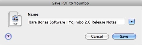
  • Saving PDFs: One of the features updated in version 2 is the “Save PDF to Yojimbo” option that shows up under the PDF button in the print dialog box. You can now change the items’ title and add tags, labels, comments, and/or flag it.

save-pdf-to-yojimbo.png

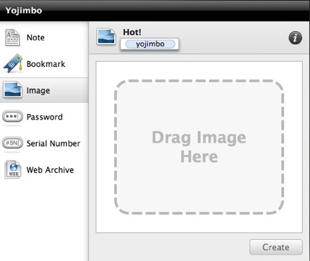
  • Dropping Stuff Onto the Dock Icon: Typical to most apps in the Dock, you can drag any Yojimbo-supported file and drop it over the Yojimbo Dock icon to import it as a new item.

Similar to the way Mail will launch and create a new message with the file you dropped as the attachment, Yojimbo will open and display a new item with whatever it was you just dragged and dropped. (You can even take iTunes URLs right out of iTunes for albums, apps, and movies that you want to revisit some other time.2)

Yojimbo Drop Dock

  • Drop Dock: I have gone back and forth with using Drop Dock, but its new feature set in 2.0 has made it worth another look.

For one, when dropping an item into a Tag Collection that is in the drop dock, the respective tags for that Collection will be automatically assigned to the new item. Secondly, you can now choose what collections show up in the Drop Dock. Honestly, I can’t think of two more useful feature additions to the Drop Dock.

Storage and Organization

Yojimbo is the only app I use tags with. I don’t use them in Things, Mail, or even on my own website.

And I don’t just use them, I use them religiously in Yojimbo. So much so that I added tag-input dialogs to the Mail and Safari scripts I use so often. Though ironically, I don’t know that I’ve ever found a file in Yojimbo exclusively thanks to its tag. What I do use tags for is smart Collections (especially when working on a project).

The reason I don’t tag my to-do items in Things is because bothering with them on the front doesn’t ever prove useful on the back end. But in Yojimbo tagging an item is a big contributor for how information gets organized (assuming you even want it so), and for how it gets found later.

You can have folders (called Collections) and smart folders (called Tag Collections). Standard Collections only get populated by manually dropping a Yojimbo item into them. Whereas Tag Collections auto populate with every item in your Library that contains one or more of the tags you’ve assigned to that Collection. If you drop an item into a Tag Collection all the tags assigned to that Collection are added to the item, and, obviously, that item gets pulled into the Tag Collection.

It used to be that a Tag Collection would only hold items that matched an exact list of tags. But now I am very grateful that you can populate with items that match either all or any in a list of tags.

Yojimbo's Tag Collection Info Panel

And if you’re not a huge fan of the default icons used for collections you can change them. Just find a folder who’s icon you do like, and copy/paste it from that folder’s info panel into Yojimbo’s info panel for your (now attractive) Collection. This can be especially helpful for regular / smart Collections you keep around indefinitely.

Output

Bill Bryson once said: “The remarkable position in which we find ourselves is that we don’t actually know what we actually know.”

And this is the very reason Yojimbo is so remarkably helpful — getting information back out is nearly as easy as getting it in.

Since the fastest way to find something in Yojimbo is to search for it, I’ve set a global hotkey to bring Yojimbo frontmost and put the cursor in the search box. And searching for something in Yojimbo is outlandishly quick. Results never hang, and I’ve never been unable to find what I was looking for.

Moreover, all of the Library items are indexed by Spotlight. If something you’re looking for in Spotlight exists in Yojimbo, you’ll see it there. Or you can do an app-specific search by prefixing your Spotlight query with “kind:yojimbo”.

In addition to finding what you know you are looking for, the new Tag Explorer helps you find what you don’t know you’re looking for. It is a great way to delve into the random things you’ve thrown into Yojimbo that you may have forgotten about. In a way, it is a similar concept to Shaun Inman’s Fever feed reader, in that, the Tag Explorer can help you aggregate the contents of your Yojimbo library. You never know when you’ll find some long, lost gem you had forgotten about. It may just be the funnest addition to version 2.

Sans-iPhone

Back to the beginning: the greatest feature of an Anything Bucket is simplicity that leads to regular use. For me, I don’t see what good is it to have my files synced across my laptop, my phone, and my friend’s Web browser if I am rarely putting any files in. I’m not concerned about using an app that will cover my butt for that one day when I might need to access that one bit of info when I’m not at my laptop.

Rather, I want an app that will actually get used… a lot.

It’s not to say, though, that simple cannot be married with mobile. It just means if Bare Bones does launch an iPhone app there is a lot for them to consider. Primarily: syncing and accessing the database, and iPhone app development.3

Syncing and Accessing the Database

If I were to sync my entire Yojimbo library to my iPhone, it would be a little less than 1,000 items with a database of 86 MBs right now. Even for someone like John Gruber, who has been using Yojimbo since the beta days, it wouldn’t be a massive chore to get his Yojimbo data onto his iPhone. John’s total library is 5,500 items and 375 MBs. Not that big of a file for just about any given iPhone. A single movie easily takes up three or four times that amount of space.

(An interesting tid-bit of info: Patrick Rhone, who recently migrated his data from Evernote back to Yojimbo, went from 1,220 items and a 1.3GB library in Evernote, to 1,432 items and a 403MB library in Yojimbo. His database weighed in at one-third the size after the migration. Obviously none of his audio or video attachments were able to be transferred into Yojimbo, but that’s not the only reason the database was shored up. Evernote treats text files as HTML and uses WebKit to render notes. Patrick and I agree that, because of the way Evernote handles even basic text notes, extra size gets added due to the code which is wrapped around even the simplest of notes.)

If Yojimbo offered multiple syncing options, such as over-the-air, same-wireless-network (like Things), and USB, it could allow for a user’s first sync to be over USB. Thus getting the initial heavy lifting of the data over to the iPhone that way, and then allowing wi-fi and/or over-the-air sync as the default.

Ultimately, without over-the-air syncing Yojimbo would not be the world’s best info-management mobile app. The biggest need for me wouldn’t be having my notes with me all the time, but having them with me at an unanticipated moment.

This is exactly why Apple’s iDisk app for the iPhone isn’t that exciting for me. It meets a perceived need, but not a real-life need. If I know ahead of time what documents, songs, and images I will want on my iPhone then hooray for me that I can drop them onto my iDisk and find them later. But it’s virtually impossible to plan ahead for all the items I may want access to when away from my computer. Let alone, just the files that I would only want to view, listen to, or share (since iDisk files are read only on the iPhone).

App Development

Functionality isn’t all that Bare Bones has to consider. Designing an iPhone version of a desktop app requires much to be reconciled. As I wrote about in my review of Things, when creating an iPhone version of a desktop app you can’t just drag and drop the code and click the “iPhoneitize This” button. You have to completely start from scratch.

There are two dynamics to successfully building two versions of the same app onto two unique platforms (one for iPhone and one for the Mac).

  1. Both apps need to feel native on their respective platform. The iPhone app needs to feel like it belongs on the iPhone, and the desktop app needs to feel like it belongs there. This doesn’t just mean the GUI should be different. It also means the layout and display of core functionality, along with the flow of navigation and the user interaction within the application all have to pull together to form a well developed iPhone app that still has striking familiarity to its desktop counterpart.

  2. Both apps need to feel like they are one in the same. Meaning, the Bare Bones team will have to reconcile the two-fold need for their iPhone version of Yojimbo to feel like a native iPhone app while also feeling like the very same application they’ve made for the desktop.

Not only would the Yojimbo iPhone app need to stand on its own for those who only use it on the iPhone, it must also feel like a natural extension of the desktop version for those who will use both.

Reconciling these goals is the same issue Apple had to tackle with apps such as iCal and Mail. iPhone’s Calendar app feels great all by itself, but if you also use iCal on your Mac you don’t necessarily feel like you’re working with two different programs. They are simultaneously the same and different.

Moreover, the problem of Plain Text versus Rich Text notes would have to be solved. iPhone OS doesn’t have native rich-text-editing features. Yojimbo’s iPhone app would have a handful of possibilities for how they would let users make edits to a rich text note:

  • Strip all formatting, turn the note into plain text, and let the user edit;

  • Keep formatting, but any text that is added/edited would be unformatted;

  • Not allow edits of notes, only appending of new text (this is how Evernote handles it);

  • Build an in-app rich text editor (see: Documents to Go [iTunes link]).

Based on how I most use Yojimbo, I would be happy to have a “convert to plain text-only” option that would allow me full read/write access in sacrifice of rich text notes.

In the mean time, however, I get along just fine without an iPhone Yojimbo app. When I think of an idea or something that I know I’ll want in Yojimbo I usually just email it to myself. Otherwise I throw it into Simplenote.

Though I did have this crazy idea of using Evernote and Yojimbo. Not sure if it’s feasible, or worth the trouble, but I had this thought about scripting Evernote to export all its notes as RTF and then have Yojimbo import them. It could be set to run once or twice a day automatically, and that way I could use the Evernote iPhone app for capture and the note would automatically end up in Yojimbo. It simultaneously seems cool and over the top; it may be easier to just set up a Mail rule and a script instead.

Final Miscellany

  • Reliability: I can’t think of one time Yojimbo has even beach balled on me, let alone crashed. It is a solid, fast, and well-made app. It is one thing to complain that a feature is missing, and quite another to complain that an implemented feature is busted. Anyone can do the former, but in Yojimbo the latter is hard to come by.

  • Security: Perhaps Most important of all, your data is safe. Not only does Yojimbo use industrial strength encryption, it also doesn’t jack with your data. The data and files you import stay untouched, making it just as easy to pull your images, PDFs, and what have you, out as it was to put them in.

  • The New Icon: Not a fan of the new gear box.
    Black Belt

  • Web Archives: If I archive a Web page, Yojimbo provides no easy way to go back to the original permalink of that archived page.

Moreover, I don’t often use Yojimbo to archive for the sake of reading later, but for the sake of usefulness later — archiving articles which I may need as references one day. Having an easy (or at least obvious) way to return to the permalink of archived Web pages would be most appreciated.

Update: I just discovered that the URL for a Web archived item exists in the Comments section of the item and there is are contextual menu items to copy and visit the original URL in your default browser. (Thanks Steve!)

Open Web Archive Contextual Menu

  • Jon Hicks 3-Panel Widescreen Hack: Changes the default layout of the Yojimbo window and turns it into a three-panel widescreen layout, not unlike the one found in NetNewsWire. (Currently only works in 1.5.1)

  • Better Keyboard Navigation: By far and away, the keyboard navigation is the most frustrating user interaction in Yojimbo for me.

There is no easy way to move around in the Yojimbo UI using the arrow keys. This is what I adore most about NetNewsWire — how easy it is to move left, right, up, and down between groups, feeds, and items using nothing but the arrow keys. Having this capability within Yojimbo would be a dream. Especially the ability to quickly get from the search box to the list of returned search items without having to use the mouse.

  • A Preference Option for New Notes to Be Created as Plain Text by Default: Nine times out of ten when I’m dropping in copy/pasted text as a new note I don’t want the former stylizing that came with it. This is how I do email, and I’d be delighted to see the same in Yojimbo.

  1. Some may note the irony of referencing Mark Hurst at the beginning of a glowing article on Yojimbo, as he advises people to keep everything in plain text files because “plain text is the simplest possible format for storing text data.” However, Mark also says: “When you spend so much time in an application that doesn’t work well, it’s painful, it’s like a stone in your shoe. […] People should think about the time they spend in any one application, then think about the tools they can use to maximize efficiency.”
  2. Thanks to Beau Colburn for this iTunes tip.
  3. I have no doubt that an iPhone app (iJimbo?) is the most requested feature. Nearly everyone I know of that switched from (or passed by) Yojimbo for Evernote did so because of the iPhone client and Evernote’s ability to sync across many platforms. I, too, gave Evernote a college try, but it just didn’t work for me. Getting items in was too tedious.Lately, I seem to be averaging about a dozen new items into Yojimbo every day. If those bits of info can’t go flying in just right, and with minimal effort, I’ll skip it. And granted, twelve new items a day is a lot. But even if it were just one or two, the easier the better.
Yojimbo, and The Case for Anything Buckets

Reader’s Setup: Toby Leftly

Toby Leftly is a UK-born, Ontario-based web developer and IT consultant. His love of the web, Apple and all things tech position him as a mild annoyance to friends and family, and a goldmine of useless, obsolete knowledge to everyone around him.

Toby’s Setup:

1. What does your desk look like?

Toby Leftly's Setup

Toby Leftly's Setup

2. What is your current Mac setup?

My Current Mac is a unibody 13.3″ MacBook 2.4ghz with 4gb of RAM. I purchased the 15″ unibody the week it was announced but found it too cumbersome to be truly portable and downgraded when the opportunity arose. At home I connect it to an older 23″ Apple Cinema Display which doesn’t even come close to satisfying my need for pixel real estate.

I use a Microsoft Bluetooth 8000 Laser Mouse and the older white Apple Pro Keyboard. The laptop stand in the pictures is actually an Ikea Hack, but it works surprisingly well.

The last possibly unidentified item on my desk is a Thermaltake Hard Drive Docking Station. because my last system was a Mac Pro, I have three SATA hard drives with various backups and data stored on them, this seemed like the easiest way to continue accessing them.

3. Why are you using this setup?

My previous Mac was a quad core Mac Pro which was fantastic. But since I spend a great deal of time visiting clients, a laptop makes much more sense. And with every revision, Apple’s laptops get closer to the power and capability of traditional desktop systems.

My wife was tempted into the Apple realm by a trusty old Mac mini 1.25ghz Core Solo (boo!) but is hoping to get her hands on my laptop after my next upgrade. At that point I’ll hook the Mac mini up to our big screen TV as a media server.

4. What software do you use on a daily basis, and for what do you use it?

I use a wide range of software on a daily basis, but the applications you’ll find open in my dock at all times are:

  • Mailplane (I’m a huge Google Apps fan)
  • Tweetie (the best Mac Twitter client in my humble opinion)
  • Yojimbo
  • Last.fm (scrobble scrobble)
  • TextMate
  • Safari (can’t get along with the Firefox GUI, despite all the great add-ons)
  • Terminal (slowly becoming more proficient with SSH)

Photoshop and Illustrator are the main apps I use for graphics work, although I long for the day when I can summon the courage to replace them with Pixelmator and Lineform. For cramming previously mentioned graphics into otherwise dull blocks of code I mostly use TextMate, although I’m buy-curious about Coda and Espresso.

I use Google Picasa for managing images on a large scale, Panic’s Transmit for pushing, shoving and pulling files, Skype for calling overseas and audio/video chat with friends and co-conspirators, and Google Apps for anything and everything else — email, calendars, contacts and very rarely spreadsheets.

I’ve recently discovered Firebug Lite, not officially an app but a very useful tool. I use Chyrp for blogging and Mint for web stats.

5. Do you own any other Mac gear?

My wife and I both own iPods — her’s a 16gb green Nano, mine an 8gb first gen touch which I love.

I’ve considered other Apple equipment, such as the iPhone, Apple TV and a Time Capsule, but ended up passing on all of them – the Mac and OS X really are Apple’s finest creations.

I use a regular old Motorola phone right now but when I do eventually upgrade to a smart phone it will most likely be the iPhone, although I had high hopes for the Pre (dismissed because of the superior build quality of the iPhone and the Pre’s questionable iTunes sync method).

6. Do you have any future upgrades planned?

I’d love a 30″ display, but I’m assuming Apple plans to update these eventually.

I’m looking forward to seeing what Apple does with the Macbook Air – with more RAM and slightly better specs it could be tempting enough for my next big purchase.

A small purchase I’m looking forward to is the Wireless Apple keyboard to replace my aging white Pro keyboard.

Not exactly an Apple product, my next upgrade will most likely be a hosting one – my current host, Media Temple, is beta testing Leopard Server hosting, which has me salivating like crazy.

More Sweet Setups

Toby’s setup is just one in a series of sweet Mac Setups.

Reader’s Setup: Toby Leftly

The Software Sweet Spot

I have always been the most enthusastic of applications that sit in the Software Sweet Spot.

Photoshop, for example, is not such an app. It has a steep learning curve, and if you don’t use it for for the heavy-lifting design for which it was built it feels bulky. Hence Neven Mrgan’s gripe: “My problem with Photoshop is that it was designed for 300 dpi work, but I mostly use it for 72.009 dpi images.”

In my mind I imagine the scalability of an app as being two dimensional — stretching both horizontal and vertical. “Horizontal Scalability” means the app is useful and helpful for basic users and power users alike. It doesn’t matter if you’re a total noob or a total nerd, the app works great for you.

“Vertically Scalability” could mean two things: First, that regardless of if you utilize one feature or all of them the app sustains its ease and joy of use. Meaning, you aren’t missing out if you only use a few features, nor are you held back if you use many. Secondly, it could mean if you use the app all day every day, or only once in a while, you still get a bang for your buck.

Here is a chart with many apps I use, and where I think they land in terms of scalability. Admittedly, it is somewhat flawed from the start, but I still think it accurately communicates the point.

Sweet Spot Chart

There is no good or bad area on this chart — the top right is no better than the bottom left. I am extremely fond of nearly every app on this chart. However, the apps I most frequently recommend are the ones that sit in the Sweet Spot. These apps are great regardless of who uses them and how often they get used.

An interesting side note: the majority of apps seemed to fall into the top right and bottom left areas. Also, it was surprisingly difficult to find an app for the bottom right spot. Coconut Battery was the only app I could think of that is geared for power users and nerds yet isn’t necessarily something you would use on a regular basis.

The Software Sweet Spot

Reader’s Setup: Ryan Gonzalez

Ryan Gonzalez writes about technology, design, or any interesting subject he comes across at his blog. A designer at heart, but a budding young writer from the cultural hub of South Carolina, he’s been in love with the Mac since kindergarten and can be found on Twitter as @rmg7344.

Ryan’s Setup:

1. What does your desk look like?

Ryan Gonzalez's Mac Setup

Ryan Gonzalez's Mac Setup

Ryan Gonzalez's Mac Setup

2. What is your current Mac setup?

I have a 17″ white iMac, circa Fall 2006, running at 2.0 GHz with a Gig of RAM and a very small (160GB) amount of storage. It’s not customized at all, a stock version plucked off the shelves of the (now defunct) local CompUSA.

Connected to the Mac, I have:

Behind all the technology, there’s a cork-board that’s very helpful when organizing my thoughts on everything, particularly for my design sketches.

3. Why are you using this setup?

It’s long-winded-story time: I remember playing with an ancient Apple II back in kindergarten, all the text based and 8-bit games fascinated me for as long as I could use the computer. So, at that point I decided I would get a Mac; unfortunately, until 7th grade I was left with a half-way decent Dell Desktop. By then, I knew it was time to finally get a real computer. Over my first year in middle school, I saved the $1299 to get the iMac; looking back, it seems like money well spent.

I told my parents it was mainly going to be used for schoolwork. That was a lie. So, not surprisingly, I use it more for writing, designing, and general web browsing. So far the computer has run sufficiently enough, though Photoshop does get a hiccup from time to time. Even with these shortcomings, I still love my iMac, my first but certainly not last Mac.

4. What software do you use on a daily basis?

Firefox has been my main browser for a while, though I did flirt with the Safari 4 beta until I learned about its horrid cache of hidden files. I’m not an extension man though, because I have only a couple installed with Firefox: Firebug for development, and Greasemonkey/Stylish for making the web a little better looking. iTunes is for my music, podcasts, and archive of films. Photoshop, obviously, is for my creative exploits. Tweetie is my preferred Twitter app for now, though I like reading on my iPod touch more. I use Ecto for writing and publishing my blog, and Scrivener for long pieces. Google Reader might be my most used app, overall; I have a Fluid instance set up for it.

5. What other mac gear do you own?

Before even my iMac, I had the 3rd-Gen iPod, the first one with the click-wheel. It’s still in use, though it is somewhat messed up (skipping songs, etc.) My Dad has a video iPod that was mine for a couple years; he also has a 2nd-Gen iPod Nano. My mother has a 2007 MacBook that my little sister plays with constantly. Last, but certainly not least, I have an original iPod touch. It’s the most important gadget that I carry around, even more so than my (ancient) cellphone.

6. Do you have any future upgrades planned?

Actually, I’m in the process of a making a major transition technology-wise and with life in general. In a few months, I’ll be moving to a public boarding school that’s set up like a college. Living there for two years means that I’ll need something portable, powerful, and sufficient enough to replace my iMac (it’s staying home.) The $1699 15″ MacBook Pro fits that perfectly; hopefully I’ll have it within the next month or so.

Like I mentioned earlier, my cellphone is ancient — it’s pre-Treo, let alone pre-iPhone. Though it pains me to say, I’ll be moving to AT&T from Verizon just to get the iPhone 3GS. If only there was a Verizon iPhone…

More Sweet Setups

Ryan’s setup is just one in a series of sweet Mac Setups.

Reader’s Setup: Ryan Gonzalez

Relocating and Resizing the LaunchBar Bar

The LaunchBar community is a lot bigger than I imagined. I was shocked at how many emails I got in response to my post on Monday about switching from Quicksilver to LaunchBar — mostly with tips in response to my dislike of the default location of LaunchBar.

Previously unbeknownst to me you can easily move the LaunchBar bar with a click and drag of the mouse — pulling it away from the Menu Bar and and putting it wherever you like. Also, you can adjust the width of the bar by placing your mouse near the edge until you see the resize cursor.

But, if like me, you want LaunchBar to show up in a down-to-the-exact-pixel spot, reader Chip Warden’s surprisingly simple tip for editing the preferences file is for you.

Open the file ~/Library/Preferences/at.obdev.LaunchBar.plist in a text editor, and find this bit of code:

<key>LaunchBarHorizontalPosition</key>
    <real>0.5</real>
<key>LaunchBarScreen</key>
    <integer>0</integer>
<key>LaunchBarVerticalPosition</key>
    <real>1</real>
<key>LaunchBarWindowWidth</key>
    <real>430</real>


The three, editable variables in there are pretty self explanatory.

  • The LaunchBarHorizontalPosition value moves LaunchBar left and right. A value of “1” pushes it all the way to the right side; a value of “0” pushes it all the way to the left. I’ve left this value at the default “0.5”.

  • The LaunchBarVerticalPosition value moves LaunchBar up and down. A value of “1” (the default) pushes the bar to the top of your screen, directly underneath the menu bar; a value of “0” pushes it all the way to the bottom. I have mine set to “0.667” in honor of the rule of thirds.

  • The LaunchBarWindowWidth value adjusts the width of the bar in pixels. Mine is set to “430”.

Don’t forget to make a backup of the preferences file, and you’ll want to quit LaunchBar before editing or your changes won’t stick.

Relocating and Resizing the LaunchBar Bar

A Better One-on-One Form

If you are a manager you need 1:1s with your team. My Tuesday afternoon is pre-booked with my direct reports. I meet with them all, one at a time, and it’s worth every minute.

Since I don’t have the world’s most amazing memory, I use a form to jot down the things I want to talk about during our 30 minutes and to keep record of what they have to say. Also, since it’s not uncommon to end up talking about things we need to do, there needs to be a spot for action items.

At first I used a generic form I found on the Internet. But I kept getting frustrated by its horrendous layout and lack of flexibility. So I designed my own. And then re-designed it. And re-designed it again. I’ve gone through many different 1:1 forms over past Tuesdays, and I’ve finally found a minimal and flexible design that woks.

1-on-1 Tracking Form

The font is Gotham Bold, each text box has a quarter-inch grid, the headings are written in very plain and inviting terminology, and the color is 1/0 so a lot of these can be printed for dirt cheap.

I keep used and empty forms in a binder near my desk. It helps me not think about Tuesday afternoon until it’s Tuesday afternoon, when I just pull out last week’s forms and jot down any left-over items onto this week’s. If something comes up in-between Tuesdays I just pull out the binder. Or if I’m not at my desk, there’s a text file on my Mac that I throw things into.

If you’d like to use the form, redesign it and make it better, or anything else, feel free to go nuts:

A Better One-on-One Form

Snow Leopard Miscellany

When first tinkering in a new OS you don’t always know what is actually new and what is just something you’ve been oblivious to for the past who-knows-how-many years. But one way or another, here are some miscellaneous thoughts, observations, and the like, regarding Snow Leopard — most of which I am pretty sure are related to new features.

Listed in order of noteworthiness to the author:

  • Quicksilver: Version B56a7 was posted Friday, and though it’s labeled as Snow Leopard compatible, I couldn’t even get it to launch at first. I was only updating the Quicksilver app in my Applications folder, but that wasn’t enough. I also had to delete Quicksilver’s application support folder (~/Library/Application Support/Quicksilver) before replacing the app itself.

    The horror of having to delete the app support folder was the loss of all Quicksilver’s “learned behaviors” — years of Quicksilver learning and memorizing my workflow just thrown in the trash. So I decided it was time to mix things up and give LaunchBar a shot.

    LaunchBar runs faultlessly on Snow Leopard. What I like most about it is how well it blends in with the OS — it very much feels like a native app (though I wish it didn’t appear up top by the Menu Bar), and in only a few days of use LaunchBar has mostly acclimated itself to my most-used apps and files.

    After using LaunchBar, I realize that what I liked most about Quicksilver wasn’t so much its power, but rather its mystery. As if every time I used it I wasn’t just launching an app, I was doing a magic trick. To truly dive deep into a relationship with Quicksilver isn’t to become a power user, but rather, a magician.

    Which is to say, what I like least about LaunchBar isn’t its smaller feature set compared to Quicksilver, but rather its lack of mystique and awe.

    Truly, the difference in feature scope is not a big deal. Because what LaunchBar lacks in its support of custom keyboard shortcuts for triggering AppleScripts, applications, and more, can easily be amended with Daniel Jalkut’s notorious FastScripts.1

    The shortcut triggers I used in Quicksilver were to launch apps, AppleScripts, and Javascript bookmarklets that I frequently use. For instance: instead of hitting cmd+space, followed by the letter ‘m’ and then return, I could just hit cmd+shift+m to launch (or switch to) Mail.

    But now, a simple three-line AppleScript takes care of the exact same workflow. I just tell FastScripts to run this script whenever I press cmd+shift+m and I’m as good as gold.

    Tell application "Mail"  
        Activate
    End Tell  
    

    And although it’s hard to tell for sure – it may be due to Snow Leopard or something else – but I think FastScripts has a better trigger-to-launch response time than Quicksilver did.

  • Automation and Services: Compared to how big of a breakthrough this is for OS X, I really haven’t toyed with it enough. Services and automation are such fantastic and powerful features of OS X, but up till now they’ve mostly been ignored or treated as annoying second-class citizens. Just the fact that this got so much T.L.C. from Apple makes a lot of us very happy. And there are so many ways to use these new features, and they are so easy to use and implement, Snow Leopard is sure to make partial nerds such as myself feel like full-fledged, bona fide nerds.
  • EPS Files and Quick Look: The actual EPS image is now visible in Quick Look instead of the pixelated EPS icon we’ve been spacebaring into for the past two years. Designers, et al. rejoice.
  • Seriously Snappy: In Snow Leopard launching apps, moving files, compressing folders, booting up, shutting down, waking from sleep, and more, are all noticeably faster.
  • Exposé: The subtle layout and GUI tweaks, along with better integration with the Dock, have made it feel much more sturdy and easy to use. I very much appreciate how Snow Leopard differentiates a minimized window with one that is not, by displaying them smaller and at the bottom. It used to be that minimized windows didn’t show up in Exposé at all.
  • The Dock: Speaking of minimized windows, they can now shrink into their application’s icon in the Dock, rather than becoming a new addition by the trash. This is an option that can be selected under Dock in the System Preferences.

    And two of my favorite new GUI designs (not that there are many to choose from anyway) are the new contextual menu you get when you click and hold an icon in the Dock, and how the whole screen gets dim except for the clicked-on icon.

    dock-gui.png

    Though it’s not all roses. As Pat Dryburgh pointed out, clicking and holding on the Trash icon in a left- or right-aligned Dock that’s pinned to the bottom will display its contextual menu about two icons above the Trash.

  • The Installation Process: I always prefer to install a major new OS release onto the blank canvas of an erased hard drive. It’s an ideal time to shake my feet from the dust of unused apps and preferences.

    In previous releases it has been easy to choose to erase and install. This time, not so much. There was no clear option to “Erase and Install”. Once I had inserted the install disc I had read a PDF that listed the info on how to erase down towards the bottom — as if an afterthought. Basically, there is no standard option to Erase and install anymore. You have to to do it the old-fashioned way by re-starting your computer, launching Disc Utility, choosing to erase your hard drive, and then begin the installation process. No doubt too many people were innocently wiping their hard drives clean. Apple wants to make sure you are really aware of what you’re doing. So much so, that it even made me second guess the whole process.

    In the past, once I have my fresh OS installed, I have only ever imported my user preferences during the initial startup process. Then, I setup .Mac (now MobileMe) and sync from the cloud to my computer. Next I would re-download and install any applications – from memory so as to only install the ones I knew I used – and import their app support and library files from my backup.

    But this time was different. Before the install as I was sifting through my applications folder, I only found ten apps I don’t regularly use. So instead of re-installing everything from scratch this time, I simply deleted the ten and after installing Snow Leopard imported everything from my old user account. (This is more or less the exact same thing as doing an archive and install, except that it takes twice as long.)

  • Dictionary: This oft-used app now remembers – and keeps open – any previously looked-up words until you actually close their window. Meaning, if I look up synonyms of creative in the thesaurus, quit, and then later highlight ignominious from Safari and choose “Look Up in Dictionary” from the contextual menu, there will be two windows open when Dictionary launches: the previous one with the synonyms of creative, and the new one, with the definition of ignominious. Currently I find this is simultaneously helpful and annoying.

    Also new to the Dictionary app is a Chose the Right Word tailpiece. It’s a semi-brief snippet of text meant to “show fine distinctions in meaning between closely related synonyms to help you find the best word.” It isn’t there for every word, just some. Like creative:

    Choose The Right Word

    creative, inventive, original, resourceful, imaginative, ingenious

    Everyone likes to think that he or she is creative, which is used to describe the active, exploratory minds possessed by artists, writers, and inventors (a creative approach to problem-solving). Today, however, creative has become an advertising buzzword (creative cooking, creative hair-styling) that simply means new or different.
    Original is more specific and limited in scope. Someone who is original comes up with things that no one else has thought of (an original approach to constructing a doghouse), or thinks in an independent and creative way (a highly original filmmaker).
    Imaginative implies having an active and creative imagination, which often means that the person visualizes things quite differently than the way they appear in the real world (imaginative illustrations for a children’s book).
    The practical side of imaginative is inventive; the inventive person figures out how to make things work (an inventive solution to the problem of getting a wheelchair into a van).
    But where an inventive mind tends to come up with solutions to problems it has posed for itself, a resourceful mind deals successfully with externally imposed problems or limitations (A resourceful child can amuse herself with simple wooden blocks).
    Someone who is ingenious is both inventive and resourceful, with a dose of cleverness thrown in (the ingenious idea of using recycled plastic to create a warm, fleecelike fabric).

  • The Addition of Four-Finger Gestures for All Multi-Touch Trackpads: I’m on a previous model MacBook Pro and keep forgetting I can use these now.
  • Menlo: The cool new monospace font that ships with Snow Leopard. I would compare it to Panic Sans in that it seems great for writing code, but not to Inconsolata in that Menlo stinks for writing lengthy amounts of text (in MarsEdit). Moreover, since Menlo comes with four weights it’s great for writing and editing AppleScript.
  • TimeMachine:

    The first backup after installing took over 24 hours (6:00pm Friday until 7:00pm Saturday). First it calculated changes, then erased my entire TimeMachine backup, did an entirely new backup, and once done told me my backup disk was almost full.

  • Gamma 2.2:

    This is now the default instead of 1.8. This is the same default as Windows, and means the graphics have more contrast. It’s most noticeable with dark images / backgrounds.


  1. Noteworthy is that when Daniel rolled out the 2.4 version of FastScripts this past June, he merged the full and light versions into one. Now you can use the full-powered version for free, but if you want more than ten custom keyboard shortcuts, it’s only $15.
Snow Leopard Miscellany

Ordinary and Uncomfortable

While I wasn’t looking a lot of random categories managed to sneak their way into the post meta. I noticed it’s taking longer and longer to peruse the list of categories, finding just the right twenty-seven that match the post. Too much!

It’s funny, because I don’t even make a big deal of categories here. The WordPress search engine does a great job of finding any and all instances of a longed-for word or topic.

Even if I did parade the list of every post’s category you’d be sure to ignore it — as even the names are redundant and ordinary. For instance, there was Software, Software Reviews, and then, just, Reviews. There was Apple, and iPhone, and Technology; even a Life and Journal category.

Looking deeper, I could see how nearly every post was mingled within in a slew of uneventful definitions; far from simple and enticing. So this morning I deleted all but ten categories and renamed the unimaginative ones.

Journal and Life got the axe as Life in Full Color emerged in their stead. (Speaking of which, this is a category I very much want to add more to. I think this site would do well to have a more personal touch and some transparent stories. Posts such as “Marketing Shoes” and “Josephine” come to mind as the type of writing I’d like to do more of in the future.)

While shoring up the categories I also took time to read through a lot of older posts. And I remembered how I try to forget that so much of what I used to write is riddled with embarrassing grammar, poor attempts at wit, and a generally dull use of the english language.

I like to assume that I’ve always written as I do now. Though I suppose from my own point of view I have — insofar as I have always written as well and honestly as I can at that moment. But now, when I read what two years ago I thought was well written, I want to edit the snot out of it. But I restrained; I want to leave my previous links and articles as-is.

Hopefully in another two years time I’ll look back at what I’m writing now and feel the same abashment I felt this afternoon.

Ordinary and Uncomfortable

Reader’s Setup: Chris Bowler

Chris Bowler is a member of the team at Fusion Ads. He also links often and has a love for good software.

Chris’s Setup:

1. What does your desk look like?

Chris Bowler Mac Setup

Chris Bowler Mac Setup

Chris Bowler Mac Setup

2. What is your current Mac setup?

My setup is fairly basic. I work daily on a 3 year old white Macbook 1.83 GHz Intel Core Duo with 1.5 GB of RAM. Paired with a beautiful matte finish 23″ Apple Cinema Display, this is the best computer setup I’ve ever used. My data is backed up daily via Time Machine to a 500 GB Time Capsule on the other side of the house. I also perform a full backup to a 125 GB external drive every week using SuperDuper.

All input is entered via a wired Apple Aluminum keyboard and a Mighty Mouse. Sound is delivered over a pair of some-particular-model-of-Logitech-speakers-I-cannot-recall.

Oh, and I have a Griffin Simplifi to sync and charge the iPod’s and transfer images from memory cards.

3. Why are you using this setup?

In regards to the peripherals, I loved the Macbook style of keyboard ever since I bought this machine. The Aluminum keyboards are the closest thing I’ve found to the Macbook keyboard and I can’t imagine ever switching to something different. My Mighty Mouse was a gift and for the most part, has done the job.

The portability of a laptop is almost a given these days. The ability to move around the house and take everything I need on the road is priceless. And for the sake of simplicity, I reduced all my computer gear down to the barest necessities. For me, this is the biggest reason for my setup. I could upgrade to a new machine, but I don’t need to. I’ll keep using this one until it dies.

4. What software do you use on a daily basis, and for what do you use it?

First things first — the most important piece of software I use is OS X. Those who haven’t had to use anything else for a long time fail to mention this beautiful product far too often.

Apart from the best operating system available, I use the following everyday:

  • Mailplane: multiple account support with the gmail threaded conversations. Until something better comes along, I love this app.
  • BusyCal: a recent update over my iCal + BusySync setup.
  • Safari: Many moons ago I was a hardcore Firefox user (probably due to my Windows usage). Once Safari was available on both operating systems, I never looked back. Now using Firefox on the Mac just feels wrong.
  • Fluid + 37signals: at Fusion, we use Backpack, Highrise, Basecamp and Campfire. This setup gives all but Campfire in one application window.
  • Propane: and to access Campfire, I use this. It makes Campfire more enjoyable.
  • Things: the best task management tool available. I love how this app scales to the needs of the user.
  • iTunes: my favorite piece of software. Ever. It’s not perfect, but it meets my needs in every way and only brings pleasure, no pain.
  • Yojimbo: I flirted with Evernote for several months. It has some great features as well, but like Firefox, just never quite fit in. Yojimbo is a pleasure to use and has great AppleScript support.
  • Tweetie: the unofficial Fusion motto — dance with the one that brung you.
  • TextMate: such a great piece of software that I barely scratch the surface of. Mostly used for plain text, HTML and CSS, but it makes me wish I was more technical. Maybe one day.
  • Numbers: like most of their work, Apple took a common concept and added some nice polish. We use Numbers to manage our monthly ads and it works so well for us.
  • Acorn: I’m not a graphics guy at all, but when I have job that’s too much for Quicksilver and Preview to handle, Acorn is a pleasure to use.
  • Awaken: i love this application. I use it to display the time on my secondary monitor, but also occasionally use it to create alarms or time myself.
  • LittleSnapper: another nice tool, but one I haven’t used as much as I should. I’m working on it.
  • Today: Another tool that sits on my secondary display, Today is my ‘today list’, and syncs with BusyCal (and therefor also syncs with Things).
  • Quicksilver: the most important tool on the list, it should be first, middle and last on the list. I can’t imagine living without it — it’s too ingrained within my workflow.

A few other tools that are worth mentioning, but that I don’t use every day: Coda, WriteRoom, and Billings.

5. Do you own any other Mac gear?

Simply a first gen iPod Nano and a 1st gen iPod Touch. The nano I keep around for exercise (with the Nike+ kit) and the Touch for everything else.

6. Do you have any future upgrades planned?

I will probably purchase a new MBP in the next year — with my transition to self-employment, the work supplied second laptop that was primarily used by my wife went away. So our busy house now is at a point where two machines our a need rather than merely a want.

When I do upgrade, it’s probably going to be a 13″ MBP. As well, I will need a cell phone at some point and will get my first iPhone, but would settle for an older used model. And lastly, when the Mighty Mouse dies I’ll probably try something else — possibly a Logitech Revolution MX that everyone raves about.

But the focus will still be on having only what I need — I try my best not to succumb to the constant upgrade cycle that Apple encourages.

More Sweet Setups

Chris’s setup is just one in a series of sweet Mac Setups.

Reader’s Setup: Chris Bowler

MailToYojimbo Script, With Tags Input and Growl Notification

For a long time I have been using Jim Correia’s MailToYojimbo AppleScript to send a currently selected message from Mail to Yojimbo as a new note. The original script, posted by Jim to the Yojimbo Mailing list about three years ago, was very bare bones — simply using the subject of the email as the title of the new note and the message body as the content.

I’ve made my own iteration of the MailToYojimbo script which adds a Tag input pane and Growl notification support. Now when invoked, the script prompts the user to enter any tags before the message is sent to Yojimbo, and subsequently displays a Growl notification once the note has been successfully created. (A hat tip to a couple scripts by John Gruber and Fraser Spiers for which the tag-input and Growl notification code is heavily based upon.)

Download

Updated on March 20, 2012 to work with the Mac App Store version of Growl.

MailToYojimbo Script, With Tags Input and Growl Notification

Reader’s Setup: Josh Farmer

For those chomping at the bit for a setup that doesn’t belong in a magazine, here is a real-life setup submitted by my real-life friend, Josh Farmer. Josh is one of the best dads, husbands, writers, and editors I know. He also has a flare for the sarcastic.

Josh’s Setup:

1. What does your desk look like?

It looks like my kitchen table. After a Church’s Chicken tornado.

Josh Farmer's Setup

Josh Farmer's Setup

2. What is your current Mac setup?

PowerBook G4 15″ laptop and a 500 GB backup disk somewhere in my house . . . really need to find that thing.

3. Why are you using this setup?

Because in my 900-square-foot home, it’s all I’ve got right now (besides the bathroom, which is apparently my fault). I have four children under the age of 5 (no twins), I’m in full-time school, work part-time, do editing and ghostwriting projects on the side, and consume all things related to Apple, Macintosh, and LOLCats. w00t!!!!!11!!

4. What software do you use on a daily basis, and for what do you use it?

Farmer Screenshot

Safari for the Web; iTunes for music; iPhoto for pictures; Word for, um, words; InDesign for editing .indd files (upgraded from MS Paint recently). Tinker Tool handles any UI system changes I want to make, but that usually comes down to changing fonts. (Right now I’ve got Hobo, Arial, and Comic Sans in various places. They are extremely legible because each letter is different.)

I have also found that keeping all my applications open makes them readily available and cuts down on their startup time. But I have to keep my iTunes kinda loud to drown out the funny sounds my drive sometimes makes — it’s a difficult balance during the kids’ naptime.

5. Do you own any other Mac gear?

I have an original iPod (called a Walkman). Oh, yeah, and I also have a 4GB iPod. It’s blue because I like blue. But it’s so difficult to use. I can’t even get it to play. Every time I hold it, I push the hold button to let it know what I’m doing, but it still won’t work. I have a puppy named Macintosh, so that should count I think.

6. Do you have any future upgrades planned?

You already forgot my answer to question #3, didn’t you? Seriously, though, if something breaks I’ll obviously have to replace it. They say necessity is the mother of all loans, right?

More Sweet Setups

Josh’s setup is just one in a series of sweet Mac Setups.

Reader’s Setup: Josh Farmer

The Link Post

Jorn Barger was on to something.

Back in 1997, when he coined the term “weblog”, his hope was that each site would contribute to the Web by amplifying the links its author liked best. And now, businesses, social networks, and publishing platforms are all thriving because we want other people to tell us about sweet stuff. And when we find it we want to share it too.

Community-run Sweet Stuff Aggregator1 will only show us so much. They excel at finding the stuff that may be interesting to everyone, but they are virtually impotent at promoting what would be truly fascinating to a few.

The sweetest stuff has to be unearthed and recommended by people we trust. Which is why everyone should blog. When you blog there are two types of entries:

  • The Post: your stuff.2
  • The Link: someone else’s stuff.

The Post is important because it’s where you give the world what you have to give. It doesn’t have to be cute, or complex, or mind blowing. Just genuine. (And preferably a good read.)

The Link is important too; this is where you become the Sweet Stuff Aggregator for your readers. The Link is a completely legitimate member of the weblog family and should be treated with just as much care as The Post.

But there’s a trick to The Link. By nature its intent is to send readers away from your site and over to someone else’s. Which means you’re not just a Sweet Stuff Aggregator, you’re also a Traffic Director…

And there is more than one way to aggregate and direct:

I. The Aside

As seen on: Geek & Mild / kottke.org / Ignore the Code

The Aside

The Aside is a Link Post in disguise. It often looks and acts just like a short post on your website — except you’re talking about someone else’s stuff. When people click on The Aside’s title they stay on your site, going to The Aside’s permalink. (Though, when viewed on your website, The Aside may or may not display a post title.)

What makes an Aside count as a Link Post at all are two things: (a) somewhere in the text is a link, and that link is the focal point of what The Aside is all about; and (b) The Aside is styled, written, or in some other way treated different so as to set it apart from The Post.

By nature of its format The Aside encourages a full read of what you’ve written rather than a quick scan followed by a click on the Link. Which means it’s also a huge opportunity for clever and informed writing — more so than any other type of Link Post. Which is why The Aside is ideal for those who like to bring up and discuss content on the web as if having a conversation with friends.

II. The Out and About

As seen on: Waxy Links / Daring Fireball / Airbag’s Longboard

The Out and About

The Out and About is nearly the opposite in style and nature as The Aside. Its primary purpose is to unearth news and content on the Web and send readers there uninterrupted.

What especially sets The Out and About apart is its feed format. Because not only do the Link Post titles point directly to the linked-to content, but so do those in the RSS feed.

The permalink to your Out and About is either found at the bottom of your post, or else not at all.

The Out and About is a great way to aggregate Sweet Stuff and point readers in that direction with maximum ease and brevity. But don’t use it as an excuse to avoid adding your own clever and informed words.

III. The DoubleTitle

As seen on: Michael Mistretta / Justin Blanton / and formerly on shawnblanc.net

An Example of The DoubleTitle

The DoubleTitle is like a step-sister of The Out and About. Its name comes from the way it displays in an RSS feed, where you see not only the link-post’s title, but also a duplicate “sub-title”, directly at the top of the content. Like so:

Clicking on the main post title from within the RSS feed sends readers to your permalink. Clicking on the sub-title in the RSS article sends reader to the linked-to article.

The advantage of The DoubleTitle is that the reader is by default sent to your post’s permalink as their starting point — the same default behavior as all but one of the link-post types. The disadvantage is the redundancy of two repeating titles, plus the loss of the first line of the post, as seen here:

The DoubleTitle in Fever

Despite this, The DoubleTitle has become a common, accepted, and even preferred format for The Link.

IV. The DownUnder

As seen on: shawnblanc.net (RSS Feed) / Subtraction (Website) / Hivelogic / Ryan Gonzalez

The DownUnder

The DownUnder places the link to the external article at the end of the post, while the permalink to the link post is still in the title (virtually the exact opposite layout as The Out and About).

The advantages of The DownUnder: it avoids the redundancy found in The DoubleTitle, and it has a more clearly defined link target than The Aside does. The disadvantage is that because it’s not as common as The Out and About, readers may get confused as to which link is pointing to where. (Which one to your stuff, which one to their stuff?)

V. The TitleFree

As seen on Tumblr sites: Minimal Mac / log.chrisbowler.com

tumblr.png

In The TitleFree the first ninety-or-so characters of the post usually make up the run-on title in the RSS feed.

Also, due to the “@usernames”, the “via usernames”, the nested links inside nested blockquotes, and so on, the reader must take great care which link they click on or they may end up somewhere other than the actual linked-to article you’re talking about.

However, The TitleFree — which commonly contains photos, quotes, links, and re-posted posts — looks fine in its native environment on your tumble blog, as well as in the Tumblr Dashboard. With a little bit of TLC, it could look good in an RSS reader as well.

An Aside Regarding The Out And About

So long as you’re aggregating sweet stuff, make sure you give everyone the biggest bang for their click.

Back in 2007, John Gruber experimented with his Linked List behavior in the Daring Fireball RSS feed. For years his links were pointing away from daringfireball.net, but for a week he let them point to his site to see the reader’s response. People overwhelmingly disliked it.

Concurring, John went back to the original format, saying, “I personally prefer the original style, with links pointing away from daringfireball.net, and most readers do too, so I switched it back. […] I’m convinced this is a better design, however. The point of the Linked List is to send you away from Daring Fireball to read or look at something elsewhere, and the feed format should reflect that.”

When The Link wasn’t as common as it is now, sending the reader away to the Sweet Stuff directly from the RSS feed made perfect sense. When readers were only readers, they would agree to let bloggers post something interesting and all they asked for in return was little bit of ‘why’ before being sent on to something sweet.

But now those readers are also bloggers, and – especially in the tech-savvy ring – a lot of those bloggers are publishing links, too. Even those without their own weblog are still aggregating Sweet Stuff on Twitter and Facebook.

When you read and write every day it’s helpful to know how you got somewhere to be able to give credit where credit is due; not only do you want to link forward to something great, you want to link backwards to where you got it from. Which is why the design and function of The Link on your website and in your RSS feed is so important. Like Merlin Mann once said, “If linkbloggers wrote more, shovelbloggers thought more, and a-listers cited more, the web would get 15% more interesting overnight.”

Your website is a non-communal, isolated starting point for your readers. If they follow your link, clicking the back button in their browser will return them to their starting point again, if need be. A feed reader, however, is more like a router piping in a whole community’s worth of stuff. If you follow a link out from your feed reader there is no back button to starting point; it’s buried in the feed reader.

Beginning from an isolated starting point is especially great for the times when you’ve sent me to something I find unusually sweet. Once I’m there chances are good I’ll want to: (a) re-read your comments about why you sent them there in the first place; and/or (b) link to it myself and credit you for the find.

If I got to the article directly from an Out and About Link in my feed reader then it’s up to my memory to remember who sent me there. Not a big deal if I’m eating lunch and am only taking the time to visit one or two new links. But that’s not how I most often consume stuff the Web.

The way I read online is that at some point in my day I will open up my feed reader and read through the latest stuff. I rarely read articles in my reader — instead, I open them in Safari in the background. After I’ve combed through my feed reader I then go to the open tabs in Safari and start reading.

At this point it’s not uncommon to have a dozen tabs with a dozen articles ready for me to read.3 Which is why – depending on your site’s posting rhythm and personality – sending people directly to your linked-to article is not necessarily the best design. Here’s why:

Since my feed reader is filled with sites and folks I’m familiar with, the majority of the open tabs in Safari are websites I affectionately recognize. But if I come to a tab with a site I don’t recognize my first thought is usually, what is this? Why am I here?

Because I don’t always remember exactly who’s link post I read to send me to that article, nor what it was they had to say about it that prompted me to visit, it’s a lot like coming back to a conversation without being able to ask, “Now, where were we?”

In an email, reader Jacob Pogson explained his similar reading workflow:

Some sites (eg. Coudal Partners) basically are all links. However, one is required to click particularly on the link within the post to go to the link, rather than just follow the post. I do not find that annoying. It is inefficient, yet I don’t mind having Safari go the the Coudal site and sit waiting for me to further direct it to the link.

I like to have the mental starting block of Coudal, before I follow the link; it’s almost like a context to the link. Similarly to you, I end with a whole lot of tabs (on a good day) that are the result of following articles/links from NetNewsWire. Changing to Safari is also a mental change to ‘serious’ digestion mode, where I have decided something requires another look.

This is exactly how I like to read on the Web. I am not so much concerned about reading quickly and efficiently, as I am reading with interest and intent.

The Out and About is efficient; it’s ideal for the power user who’s primarily interested in what is being aggregated more than who is aggregating it or why they are. My fear is that if more and more Cool Stuff Aggregators start linking with The Out and About, there will be an increasing disconnect between the aggregated and the Aggregator.

Which is why, when I switched from The DoubleTitle, I went to The DownUnder and not the Out and About. The DownUnder is a cleaner design, the post’s title sends readers to my link post’s permalink by default, and it has a very discernible click target — if you’ve read the title and the commentary in the feed reader, the link to the Sweet Stuff is right there if you want it.

The Why

Before linking something up, think for a moment…

Was it worth your time?

What makes for the best of the best, personally recommended link links is that it’s a selection of only what you find most inspiring and engaging. It’s the kind of stuff you would bring up at dinner:

“I saw this fascinating chart on The New York Times today about how we spend our time. Did you know it only takes 4% of Americans to keep our country running at night?”

You would never talk to your mom about the fifty free Photoshop brushes you found online today. Well, hopefully you wouldn’t.

Is it worth my time?

When I click your link it’s a commitment. I’ve agreed to let you post something interesting and all I ask for in return is little bit of why before being sent on to what you’ve deemed as something sweet.

And if I’m going to trust you to be my personal Sweet Stuff Aggregator, I want to know you’re not wimping out on me and just re-linking the same stuff everyone else is buzzing about. I want to know that you’re linking to it because it grabbed you — even if just for a second — and that you are confident it will grab me too.

But more than the what is the why. Noteworthy things will always have a way of getting discovered.


  1. See Alex Payne’s Essays, Fever and the Future of Feed Readers and CSAs; Gush for Je‘
  2. The reason it’s called “The Post” and not “The Article” is because not everyone publishes articles to their weblogs. Many people publish video, audio, and/or photography in addition to or instead of article.
  3. And I’m a lightweight feed subscriber with picky taste about where I spend my time.
The Link Post