There are a few things I have learned over the past year of perfect Apple Watch Activity, and one of them is how to have a recovery day without breaking your workout and activity streak.
Sometimes I think the Apple Watch fitness tracking is amazing.
And sometimes I feel that my Apple Watch is trying to kill me.
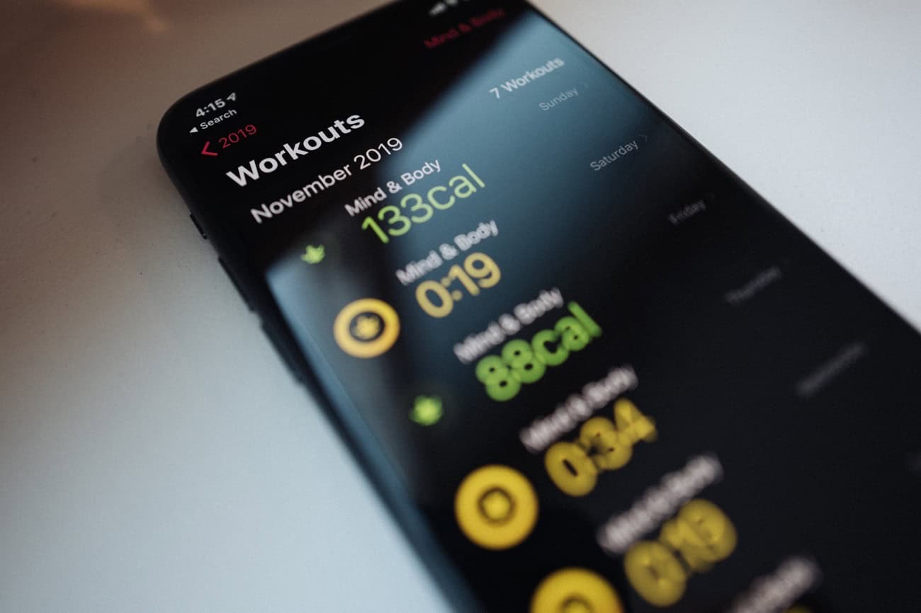
For example… My November 2019 challenge is to get a total of 1,690 exercise minutes, which is an average of 56 minutes every single day. Almost double my normal goal. No thanks.
Or, consider the “stand trend”. The whole point of these trends is that you are supposed to be always trending upward! But, at what point is enough standing enough? Some of us sleep while lying down…
Anyway, my point is that the Apple Watch is always pushing and challenging. And even though I joke about it, for the most part I do like that my Watch is pushing me to stay active.
But, at the end of the day, I am the one in charge of my health and fitness. My Watch is not a personal trainer.
That’s why I have been happily taking recovery days without breaking my activity streak.
Here’s how…
. . .
On the Apple Watch there are several default workout types, but all of them are active. (Well, walking and yoga could be a bit on the chill side.)
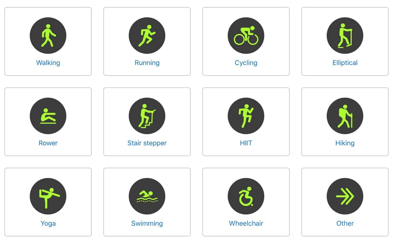
But there are also about 60 more workout types that are buried within the Other workout option.
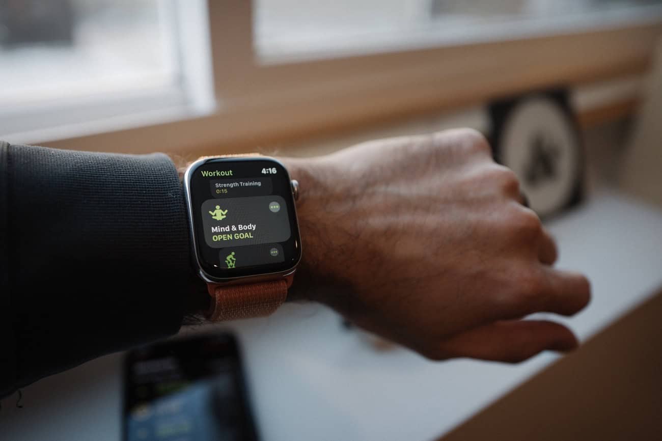
One of those buried workout types is called Mind and Body. The Mind and Body workout is one that I have been using for the past few months as part of my recovery day “workout” each week. I have also begun using it in order to track my times of quiet meditation.
How to Unlock the Apple Watch’s Other Workout options
As I mentioned, there are about 60 other workouts. But you wouldn’t know it unless you went through a specific series of actions.
In order to “unlock” one of the awesome, Other workouts, just do the following:
- Start a new workout on your Apple Watch and select Other as the workout type.
- Go about your workout.
- When you are done, you’ll be able to choose a name for the workout.
- Now, that workout type will be available to you in your list of workouts.
What are the “Other” Workouts?
There are about 60 of them. From Barre method to Curling, Fishing to Golf. You can see a complete list here.
The ones I use on a regular basis are Play, Mind & Body, Flexibility, Climbing, Indoor Cycle, Core Training, and Strength Training.
Using “Mind and Body” On Your Recover Day
A few months ago when I discovered the Mind and Body workout type, I began using it on my recovery days.
I would start the workout and then take 15-30 minutes to sit in quiet without any digital devices nearby. Sometimes I will have a book to read, or I will spend the time in personal prayer and meditation, or just sit in quiet.
And so I am still being intentional with that time — I am using it for quiet reflection — but I am not doing an intense or active workout.
Is this Cheating?
Nope! For me, it is a very fair and legit way to stay intentional about my health and my fitness while also being realistic about the fact that I don’t want to do an intense workout every single day of my life forever and ever until I die.
What’s great about having a recovery day workout is that I still get the motivation and momentum of keeping my workout streak going while also getting the benefits of a recovery and rest day.
The recovery day helps me keep going during the other days of the week. I’m able to take a break without breaking my streak, so to speak.
The Apple Watch is pretty great for tracking and managing your health and fitness. I’m incredibly thankful for how much it has helped me over the years. But the more I use it, the more I also see that it does still have a long way to go.
If I felt that I had to continually push myself further and further and further, eventually you can’t go any further. But the Apple Watch will never tell you that.
In fact, I’ve come to to be more and more thankful for this workout type. Because, by starting a Mind and Body workout for 15 minutes, I’m actively doing something: I am being intentional with my health. And it has helped me to be less restless and more focused during those times of quiet.