From the overall conclusion:

The E-M10 very much feels more like a third generation OM-D model than a step-down from its two brothers. It borrows many qualities we liked from both of them and presents them in a slightly smaller, lighter package.

I’ve read a few other reviews of the E-M10 and they are all glowing like this one. When the E-M10 was first announced a lot of people pooh-poohed it, saying it was just a poor man’s OM-D. But I think that’s missing the point entirely.

Last year when I wrote my one-year review of the E-PL5, I said there were no cameras enticing enough for me to consider upgrading. I spent some time with the E-P5 over Christmas and was actually underwhelmed by it — I wasn’t getting any shots out of it that I couldn’t also get with my E-PL5, and yet the E-P5 was bigger, heavier, more expensive.

But the E-M10 has turned out to be a fantastic upgrade from my E-PL5. For one, it’s almost exactly the same size (but with the EVF on top). It has a better back menu dial button (a 4-button d-pad instead of a spinning dial), it has the two dial control rings for adjusting Aperture, Shutter Speed, and/or exposure on the fly.

But something I’ve found myself using quite often is the Wi-Fi. I thought it was just a neat novelty, but turns out it’s actually quite useful.

As an example, a couple weeks ago I was at my nephew’s 2-year birthday party. I snapped a bunch of photos of him blowing out his cake. Then, as everyone was eating cake, I import a couple of the photos onto my iPhone, edited them in VSCO Cam, and then sent them to my folks who live in Colorado.

I have plans to write a more comprehensive review of the E-M10, but in the meantime I’ll say that I’m extremely happy with it. I’m not shooting more often than I already was with the E-PL5, nor has the E-M10 suddenly made me a brilliant photographer. However, I am taking advantage of all the extra features and functions that E-M10 has over the E-PL5. And that’s the point.

For further listening, check out a few weeks back, on one of my Weekly Briefly episodes where I talked about the E-M10 and why I decided to stick with Micro Four Thirds.
DPR’s Review of the Olympus OM-D E-M10

I think he likes it:

Sometimes a lens comes along that is special. This is one of those lenses.

The shots look fantastic, and as I’m quickly learning with photography gear: you get what you pay for.

Olympus makes some stellar lenses at incredible prices, but there is a slight sterility to them. The Panasonic lenses, however, have a special character to them which I really prefer.

I’ve rented the Olympus 45/1.8 lens a couple of times and love it. But looking at some of Huff’s side-by-side comparisons between the Olympus 45 and the Panasonic 42.5, it’s clear that the character and contrast of the latter is there.

Steve Huff’s Review of the new Panasonic Leica Nocticron 42.5 f/1.2

Igloo is an intranet you’ll actually like: built with easy-to-use apps like shared calendars, Twitter-like microblogs, file sharing, and more. Everything you need is built-in, and everything is social. This means if you upload a file or write a corporate blog post, your coworkers can share it, comment on it, rate it, like it, and even make changes as a new
version.

The whole idea is to get your company communicating better and more openly.

If your company has a legacy intranet or a customer community built on SharePoint, you should give Igloo a try. This report from Igloo and Osterman Research outlines the five main areas SharePoint falls short and how Igloo does it better.

Igloo has customer case studies to show you how other companies have made the switch. And best of all, Igloo is free to try with up to ten people.

* * *

My thanks to Igloo Software for sponsoring the RSS feed this week.

Sponsor: Igloo

On this week’s episode of The Weekly Briefly, I share my history with to-do lists, my initial impressions of the new OmniFocus 2 for Mac beta and how it compares to OmniFocus on the iPad and iPhone, and thoughts on giving areas of responsibility a designated time-slot during the day / week.

Brought to you by:

OmniFocus 2, Time, and To-Dos

A Visual History of OmniFocus for Mac

The Omni Group has been around for 25 years.

Founded in 1989 as a technology consulting firm, they used to build custom software for NextSTEP users until Apple bought NeXT in 1997. Now Omni builds and sells their own software for OS X and iOS. Not least of which is OmniFocus.

But did you know OmniFocus for Mac was somewhat built by chance?

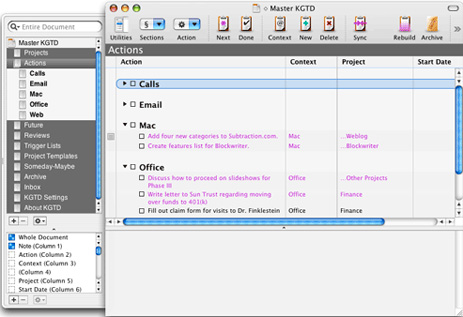
OmniFocus’s roots are as an add-on to OmniOutliner Pro called Kinkless (kGTD), which was built and developed by Ethan Schoonover. Though it was incredibly brilliant, kGTD was a hack. It was a bunch of AppleScripts that sat on top of a single OmniOutliner document with some custom buttons and even some Quicksilver actions for quick entry.

Here is what Kinkless GTD looked like (circa 2006):

Khoi Vihn's Kinkless GTD Setup

In 2006, Omni Group asked Schoonover, along with Merlin Mann, to help take the ideas and functions of kGTD and turn them into an official Omni task-management application…

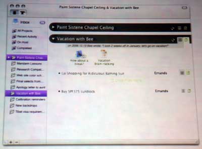
Here’s the first publicly displayed mockup of what OmniFocus could have looked like:

Original OmniFocus UI Mockup

After more than a year of private development with a group of about 500 alpha users, OmniFocus went into public beta in November 2007. At that time they also began pre-selling licenses and OmniFocus pre-sold over 2,500 copies in the first 5 days of the public beta.1

Finally, on January 8, 2008, OmniFocus 1.0 was launched.2

OmniFocus 1.0 (circa January 2008):

OmniFocus Version 1.0

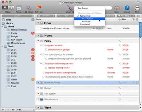
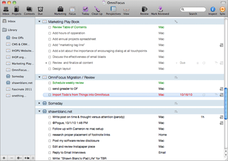
Here’s the latest public version of OmniFocus (version 1.10):

OmniFocus User Interface, version 1.8

As you can see, not much in the UI has changed from the original Kinkless implementation of 2005 to what OmniFocus is today in 2010. You could say that OmniFocus 2 is kGTD 2.

But all that changed with the beta of OmniFocus for Mac 2.

On February 1, 2013 the beta of OmniFocus 2 for the Mac was introduced.

Beta 1 of OmniFocus 2 (circa Feb 2013):

Beta 1 of OmniFocus 2 for Mac

Beta 1 of OmniFocus 2 for Mac

However, during the beta testing process, the Omni Group realized they needed to go back to the drawing board, and in June 2013 they pressed pause on the public beta.

Last year, during the testing window, I gave the beta 1 a good college try but just kept drifting back to my original version of OmniFocus that I’ve been using for the past 4 years. In short, I never felt all that comfortable navigating the previous OmniFocus beta.

However, earlier this week, Omni Group re-introduced the OmniFocus for Mac beta with a significantly updated design.

Beta 2 of OmniFocus 2 for Mac (circa March 2014)

Beta 2 of OmniFocus 2 for Mac

There are quite a few noticeable changes between the beta 1 and beta 2 designs of the new OmniFocus for Mac.

For one, the left-aligned checkboxes have been swapped out with right-aligned checkcircles (a cue from the iPhone app). Additionally, the whole task hierarchy now has a clear structure that flows from left to right.

On the left-most side are the tabs for different views, then in the next column is the list of information relevant to the selected tab, next to that is the main task list displaying the tasks for the project, context, or date selected, and then on the right-most pane is the task’s information panel where you can fine-tune metadata related to that task if you so desire.

Aside from the right-hand alignment of the new checkcircles, I think every one of the changes in this newest OmniFocus beta is an improvement on an app that has been desperate for a visual overhaul for years.

The new beta version of OmniFocus for Mac feels peaceful to me. It’s open, clean, organized, and logical. I like it.


  1. Contrast that against today’s public beta which has 30,000 users on the list.
  2. It seems like OmniFocus has been around for ages, but it’s actually younger than the iPhone.
A Visual History of OmniFocus for Mac

Excellent piece by Evie Nagy for Fast Company, interviewing and talking to a bunch of Pixar Alums:

Our conversations revealed recurring themes about applying Pixar’s principles in other organizations: delight and storytelling as driving forces, the elimination of ego as management strategy, the idea that creativity can come from anyone, and the balance between patience and action.

It’s not often I’m taking notes and getting inspired while reading through my Instapaper queue. Though that probably says more about my reading habits than the quality of writing available out there. Nevertheless, so many great nuggets in this article about creativity, community, quality, and more.

Building The Next Pixar

Our latest review on The Sweet Setup is an excellent one by Robert McGinley Myers.

I’ve always just used the default iPhone email app, but when working with Rob for this review I was persuaded to switch to Dispatch, and I’m glad I did.

There are some truly great things to like about Dispatch. Specifically that it uses TextExpander and it has built-in OmniFocus integration via URL-schemes. Using OmniFocus Mail Drop is pretty great, but the url-scheme-based actions that Dispatch uses are better.

The Best iPhone Email App for Power Users Is Dispatch

Good news: OmniFocus 2 for Mac ships this June. And today, the private beta (if you can call a beta group of 30,000 testers “private”) has re-begun.

I’ve been using this latest beta for the past couple of days, and I’m pleasantly surprised about where things are headed.

For one, the best aspects of the iPad App been brought over the Mac app: an easier-to-use Review mode, and (finally!) Forecast mode. Additionally, the design of this version of OmniFocus for Mac is clearly inspired by the iPhone. Though I’m not a massive fan of OF2’s iPhone design, it works very well here in the Mac version.

When compared with the OF Mac beta from last year, there are quite a few noticeable changes in this latest version and I think every one of them is a significant improvement. Last year I gave the beta a good college try but just kept drifting back to my original version of OmniFocus that I’ve been using for the past 4 years. In short, I never felt all that comfortable with the previous OmniFocus beta.

However, this new beta is quite nice. I can’t put my finger on what the one thing is that makes it so much better than the previous beta. But I’d describe it as “peaceful”. It’s open, clean, organized, and logical. I like it.

OmniFocus 2 for Mac Beta

Craig Hockenberry:

Tim Cook has openly stated that Apple is working on “new product” categories. Many people, customers and competitors alike, assume that means some kind of wearable computing device. And of course that means it has to be some kind of “smartwatch”, right?

I don’t think so.

Wearing Apple

Great article by Federico Viticci regarding the potential for wearable tech, and how the a “smartwatch that only displays notifications and counts steps misses the point entirely”:

The current crop of smartwatches feels like a replay of smartphones before the iPhone. Smartphones were bulky, had some convenient features, and tried to cram old metaphors of PC software into a new form factor, resulting in baby software. Most smartwatches I see today are bulky, have some convenient features, and try to cram features and apps from smartphones and tablets into a form factor that’s both new and old (watches have been around for centuries), but the “smartwatch” tech gadget has become a trend only recently. As a result, smartwatches on the market today appeal mostly to tech geeks who are interested in some of those few interesting features (namely notifications, map directions, and the intersection of smartphones and watches), but they’re not really smart because they generally fetch data from a primary device — the smartphone — and they’re not really good as watches either.

Thinking Outside The Watch

Federico Viticci:

The new menu, a scrollable bar with suggestions for searches related to the current search, allows users to discover more apps in search by tapping on suggestions, receiving a fresh set of results. Multiple suggestions can be selected in a single session: searching for “indie games”, for instance, displays suggestions for “action games”, which include “action RPG” into their own suggestions. The new suggestion bar doesn’t alter the way search results are displayed — Apple is still using a cards layout on the iPhone — and, for now, the feature doesn’t appear to be available on the App Store for iPad and desktop computers.

Any changes to App Store search that bring about better results are like sips of cold water to someone walking through the desert. I oftentimes know precisely the app I’m looking for and yet still have a difficult time finding it using App Store search. It’s usually faster to search Google.

Apple Testing Related Search Suggestions on the App Store

Brett Peters worked remotely as an IT professional for 7 years, until suddenly the company he was working for shut its doors.

Brett wrote an excellent article about the sudden change, and he shares some of his thoughts on the past 7 years of doing digital work and working remotely for a tech company:

Building virtual things leaves very little behind. There’s nothing to grasp, nothing to point to, no buildings or monuments to your labor. I think we forget sometimes how important that is. It might seem childish, or at least child-like, to want to commemorate important events with ribbons and trophies and badges — but that’s unfair and unkind. Kids recognize a truth we try to forget as adults — a physical representation of an achievement gives you something to hold on to.

Brett’s right. There are two sides to the digital task- and project-management coin. There is the awesome side: your tasks and projects are scalable, collaborative, in sync between all your devices, and you can easily attach emails, URLs, photos, and all sorts of other data to your tasks.

However, the not-as-awesome side to digital tools is that when a task is completed it disappears and leaves no trace it ever existed; no scratched out note commemorating a job well done and a hard day’s work.

For a year and a half I kept a hipster PDA in the form of a small, pocket-sized Moleskine. It served as my to-do list and note-taking tool. Like Brett, I also keep my old notebooks. My pocket Moleskine sits in the same box as all my used and unused Field Notes.

From time to time I’ll page through that old hipster PDA and just look at page after page after page of tasks I’d written down and crossed off. This morning I was flipping through it again, when I realized something curious. The tasks and notes trail off right around the summer of 2008… the same time the iPhone App Store launched.

Twenty-Two Notebooks