What you need is more bad ideas.
You know the drill. It’s late in the morning on Saturday and you’re outside mowing the lawn.
Or maybe you don’t mow the lawn. So, say it’s a Monday evening and you’re taking a walk through the neighborhood. Or it’s Tuesday morning and you’re taking a shower.
And then… bam! You have an idea. Seemingly out of nowhere.
Awesome. But why aren’t you having more ideas in more places?
I think we put far too much emphasis on the when, where, why, and how of good ideas. We should talk more about the when, where, why, and how of bad ideas.
We all need to have more bad ideas. More crappy first drafts. More embarrassing design mock ups. More failures. More awkward moments.
Something I mentioned in my article yesterday was about how this world we now live in, where everyone has the internet in their pocket, is totally new. Nobody has ever lived like this before.
One of the things that comes with having the internet in our pocket is that we can share moments and slices of our life with the world. But most of us are sharing the highlights. We share the best photos of the grandest places. Which is fine. But it also can cause a slight sense of disillusionment.
Gee, everyone I follow on Instagram lives in the mountains or on the beach and eats incredible food. I live in the suburbs and had a tunafish sandwich for lunch.
When we see other people’s beautiful Instagram lives and fine-tuned Pinterest taste, we think they live like that 24/7.
It can be challenging when we start to overlap the perfect and curated “world” we see through our smartphones and the messy and challenging world we live through our own eyes and skin.
That’s why you need to have more bad ideas.
Ideas are good for the soul. They’re good for your creative imagination. They’re brain food. They help you build motivation. But it’s not just good ideas that build motivation — bad ideas do this too.
When was the last time you had a real whopper of a terrible idea?
You’re probably embarrassed to even recall. As if having a bad idea is the same as farting during a fancy dinner.
It’s not the same; not the same at all. We need bad ideas. You need bad ideas.
Out of ten thousand ideas, only one of them might be truly great. If you sit around waiting for the great one, how are you going to get it? And then (well, this is a topic for another post, but what I’m trying to say is that) once you have a great idea, that’s only the very beginning — doing something about it is what matters most.
How to Strengthen Your Creative Imagination
So here you are. Standing at a place that is “Not Amazing” and you’re trying to get over there to “Amazing”. There is no shortcut except to go through the mud of “Not Yet Amazing.”
I want to have more bad ideas, more terrible first drafts, more embarrassing design mock ups, more failures, and more awkward moments.
While that may sound like the worst Christmas List ever, what it actually means is that I want to try harder and have less fear of failure. More bad ideas, more terrible first drafts, and more failed attempts, means more work created.
All that said, here are some thoughts about ideas, and why I think you should try and come up with more (bad) ideas every day.
Ideas are a commodity
If you think ideas are rare it’s because you’re not used to coming up with any.
The more ideas you come up with then the more ideas you’ll come up with. I love how Jonas Ellison put it:
Never be stingy with your ideas. Don’t say you’ll save them for another post, another story, another day. Put it out there. Circulate your ideas freely so your mind can generate new.
Amen.
Since ideas (especially bad ones) are a dime a dozen, there’s no fear in giving them away and sharing them early and often. In fact, a bad idea in your hands might be a great idea in someone else’s. That’s because…
People are Greater Than Ideas
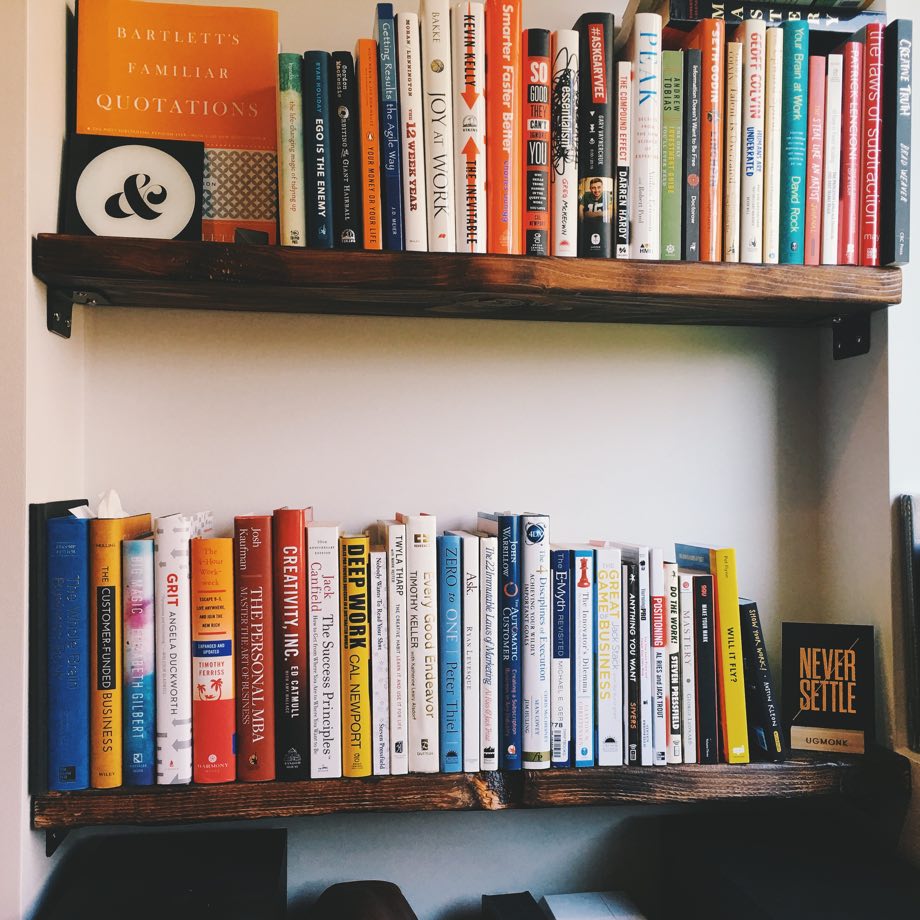
In Creativity, Inc., Ed Catmull writes about how people are far more important than ideas. Saying:
If you give a good idea to a mediocre team, they will screw it up. If you give a mediocre idea to a brilliant team, they will either fix it or throw it away and come up with something better. The takeaway here is worth repeating: Getting the team right is the necessary precursor to getting the ideas right.
Catmull also writes about how ideas are not singularly, perfectly-formed things. They’re half-thoughts. What-ifs, hunches, gut feelings, whispers of a dream, foggy afternoons.
That’s why…
A Bad Idea Does Not Reflect Your Talent, Character, or Taste
If you’re in an environment where you are afraid to share a bad idea, you need to change that environment. Don’t despise your own bad ideas and don’t despise other people’s.
We put so much emphasis on only having good ideas that we’ve assumed this posture where all ideas should be acted on. That’s silly. Just because you’ve had an idea doesn’t mean it now must be cared for and built.
Feel free to have lots and lots of horrible ideas and then throw them out. Give yourself freedom to have bad ideas. Give everyone you know — your friends, family, co-workers, bosses, peers, strangers you meet while standing in line at the coffee shop — permission to have bad ideas.
In fact, why not just…
Start With the Worst Idea You Can
I dare you.
Seriously, why not?
What is it you’re stuck on right now? What is the worst possible solution to that problem?
Coming up with a bad idea is so much easier than coming up with a good one. Start with the worst idea you can and let that build your momentum.
Bad ideas become the stepping stones to good ideas.
As you get more comfortable coming up with many ideas all of the time, you’ll learn to adapt this very important rule, which is…
Don’t be a Slave to the Tyranny of a New Idea
Ever feel like you have more ideas than time? I hope you do.
Having too many ideas is not a dilemma. The dilemma is to have no ideas at all.
We think having more ideas than time is a dilemma because new ideas are exciting, and we feel obligated to act on them and do something about them.
Don’t feel obligated. It’s okay to let good ideas die. You don’t have to act on every idea you come up with. Don’t give in to the tyranny of a new idea simply because it’s new.
As I said, and as I’m sure you are aware, there is something more important than coming up with ideas: finishing them.
If you have more ideas than time, that’s great. Focus on what you can do now. Believe me when I say that…
Great Ideas Come Back
Last fall (October 2014) we completely re-designed and re-booted the Tools & Toys website. I brainstormed with my team, worked with our designer/developer (Pat Dryburgh), and we made something awesome.
About 5 months later I stumbled across a page in my notebook from almost two years ago. On the page was a list of goals and ideas for Tools & Toys, and the list was filled with the exact same outline of goals and ideas that we’d just implemented. I had written it, forgot about it, and two years later when I was starting over “from scratch” those ideas came right back and I didn’t even know it.
But two years can be a long time to wait on an idea. Sometimes an idea won’t let you go. You know the ones I’m talking about. And so, in those cases, try to act quickly because…
Ideas Demise Over Time
When an idea truly grabs ahold of you, keeps you up at night, and wakes you up early in the morning, then it’s time to take action.
You know what I’m talking about. If and when you can, act on those best ideas quickly. When they grab ahold of you like that, it means they’ve got life on them.
When an idea has life on it like that…
Listen to What Your Idea Wants
Eventually the idea will take over. It will begin to think for itself. It will have its own needs and wants.
Listen to it. What does it want? What other ideas are branching out from this original one?
This happened to me as I was writing my book, The Power of a Focused Life. I spent 5 months writing the first draft. Then as I was doing research and working on the second draft I realized that this idea wanted to be different than what I originally imagined.
In response, I turned the book upside down, pulled it all apart, and re-wrote everything from scratch to create The Focus Course instead.
I never would have built the Focus Course if I hadn’t first started with the book. I needed to be in the midst of that project before I could see where it was ultimately headed.
It’s a rule of the universe of creativity that…
Action Brings Clarity
Once you start moving and acting on an idea, then you begin to get clarity about what the next step needs to be. It’s okay not to have it all figured out before you begin. Just begin, and let your feet take you.
Challenge: Come up with 5 ideas today
Or 7 if you’ve had your coffee; 10 if you’re feeling brave.
Below I’m sharing with you my 10 ideas for today. This is a list that is building off another idea I’ve had in the back of my mind for a while about doing a bunch of podcast miniseries that each focus on a very specific topic. Here are 10 topic ideas:
- Kansas City coffee shop reviews
- Short stories about inspirational and fascinating people
- Working from home
- Debt and budgeting
- Writing
- Meaningful Productivity
- Photography
- Making coffee at home
- Book reviews
- Parenting
* * *
The ability to solve interesting problems is an integral part of doing our best creative work. And doing work that matters means having the guts to try things that might not work.
If we’re a slave to every single new idea then we’ll never have the focus to finish a single thing. And if we’re afraid that our idea might be a bad one, we’ll never even get started.
* * *
Today’s article is a part of my countdown to The Focus Course. If this article hit home for you, then I believe you will love the course. One of the primary goals of the Focus Course is to help you strengthen your creative imagination, find margin for thought, and do your best creative work.