Pro Portable: A Review of the New MacBook Pro

As far back as I can remember I have been fascinated with laptops. Primarily for what I considered to be the coolness factor: they were portable and foldable. Growing up I would cut out and save ads from magazines selling laptops at Best Buy or Wal-Mart.

After high school I took all graduation money and bought my first computer: A Dell Inspiron 3800 (laptop). Five years later I bought my next laptop: A 12-inch PowerBook G4. And two weeks ago I purchased my third laptop: A 15-inch MacBook Pro.1

Last spring, as my PowerBook began to show its age due in the graphics work I was using it for, I decided to buy a tower instead of a new laptop. The idea behind buying the Mac Pro was that (1) it would last for years: I had already been using my PowerBook for more than two years, who’s specs were far below the Mac Pro’s and it was still chugging along well. And then, (2) the ease and affordability to expand the Mac Pro’s specs would make it all the easier to make sure it lasted even longer.

Therefore the PowerBook became my secondary computer. I used it when traveling and when not in the office – which was still quite a lot – and the Mac Pro became my primary work machine. Then, about a month ago my wife got a new position at work and now needed her own laptop. She hooked me up big-time by taking the PowerBook and letting me get the new laptop. (I owe you big-time, babe!)

I ordered the new 15-inch, multi-touch MacBook Pro with a 2.4GHz processor and the 200 GB 7,200 RPM hard drive. I watched FedEX as they picked it up in China, swung by Alaska, and finally dropped it off at my place a week ago.

When you use two computers you have to pick one that will be the “primary” computer; the home base. It’s your only hope for any sort of syncing sanity (if there is hope).

The point of picking one main machine is that you now know where to keep all the most recent versions of files, it’s where all your iTunes purchases are done, and it’s what everything syncs with.

While I was had the PowerBook it was a no-brainer that the Mac Pro would be home base. And even still, when I purchased the MacBook Pro I fully expected that it too would be my secondary computer, just as the PowerBook had been.

However, it quickly became obvious that the MacBook Pro should be the main computer. It just made sense. For several reasons:

  • The PowerBook had a 100 GB hard drive, which was enough to keep many important files, some songs and some photos, but not enough to keep all the data I have. The MacBook Pro, on the other hand, can hold all my data. The 200 GB 7,200 RPM hard drive is plenty big enough to store all my files with room to spare.
  • The entire reason I purchased the Mac Pro was because the PowerBook couldn’t keep up with the graphics-intensive work I was doing. The PowerBook couldn’t be my “work” computer anymore, and therefore became my “write, email and surf the web, while away from home” computer. However, the MacBook Pro has better benchmarks than the G5 Power Macs, and is even quite comparable to my Mac Pro’s performance in many of the most common tasks I do every day. The MacBook Pro is clearly a capable work and road machine.
  • The biggest pain in the butt when using two computers is keeping them synced. Whenever I needed to go on a trip while also in the midst of a major design project I would have to transfer all the relevant files over to the PowerBook. Additionally, I never knew if the one or two other projects which I just finalized may come back to haunt with some pre-print, last-minute emergency; so I would have to transfer them over as well.With the MBP as my main computer I can just put it in my backpack and go to another city without worrying about forgetting an important photoshop file. And that is an ease of mind is worth its weight in gold.

Although I originally didn’t intend it to, the MacBook Pro now has become my primary computer. Which naturally leads me to the next logical question: Do I even need to keep the Mac Pro? The answer is no.

I don’t need the Mac Pro. The loss in horsepower is negligible for what I do, and the gain in simplicity cannot be expressed with words. I’m selling the tower and going back to being a one-computer consumer, and connoisseur of fine laptops.

If I had known this would be the outcome before I ordered the MacBook Pro I would have ordered the mid-level, 2.5GHz processor which has the higher 6MB of L2 cache, the faster bus speed and the better graphics card.

But even still, this thing is a fantastic machine and herein is my review:
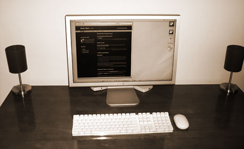
Packaging

I very much appreciate the minimum amount of items included in the MacBook Pro’s box. Aside from the computer, the box only contained the power cord, a DVI to VGA adapter, the remote control I paid $19 for and a small black “Designed by Apple in California” box.

In the small black box were two things: One labeled “Everything Mac” and another labeled “Everything Else”. Everything Mac is the user’s manual, and Everything Else is a cardboard sleeve holding the install discs, the bluetooth info sheet, the obligatory Apple stickers and a very nice screen cleaning cloth.

What I love so much about the small amount of peripherals and paperwork included is that it gives more attention to what comes in the box. The concept is similar to a printed flyer: If the flyer is covered in text you won’t read any of it. But if it has just a few phrases you will read those. When un-boxing the MacBook Pro it was like each piece was there for a purpose – not “just because”. Less is more.

And along these same lines is the size itself of the MacBook Pro’s box. It is quite a bit thinner than my PowerBook’s was. Though I remember when un-boxing my PowerBook, there was a great deal of open space underneath the computer.

It’s almost as if the boxes themselves communicate the form factor of the enclosed laptop: Wider and thinner versus shorter and “stubbier”.

Form Factor

After using a 12-inch PowerBook for so long I still haven’t adjusted to the bigger look of the 15-inch when I’m using it. It’s not so much the screen that throws me off as it is the extra space next to the keyboard where the speakers are. I’m used to looking at a bigger screen, but not used to typing on a laptop with an extra inch-and-a-half of hardware on either side.

When I see other people using their 15-inch laptop it doesn’t seem large at all, but when I’m sitting right in front of mine it seems huge. Though a quick glance at the “airplane wing” style 17-inch, and the 15-inch seems quite proportionate again.

Otherwise the size difference is most welcome. The larger footprint makes the MacBook Pro feel safer and more comfortable on my lap. And since it weighs nearly the same as my old PowerBook, it’s a win/win situation for me.

Other differences – such as the better speakers and the extra input jacks (Finally: FireWire 800!!) – are great. I’ve quickly become a fan of my $19 remote control, but the IR sensor on the front of the laptop is a serious eye sore.

And of course, some old habits will die hard – like trying to put CDs in the right-hand side.

Unchanging

Apple’s professional laptops have gone virtually unchanged for nearly 5 years. The new MacBook Pros looks nearly identical to the original aluminum PowerBooks that came out in fall of 2003. I could just imagine a conversation along these lines:

“Hey, is that Apple’s newest laptop?”

“No. It’s my 4 year old PowerBook.” 2

Not that any of you would ever ask that question, but you see my point, don’t you? The above conversation reveals two things: That (a) Apple’s laptop hardware is still attractive and appealing; and (b) that it is not uncommon to see someone still using their four or five-year-old PowerBook on a daily basis. Even though 5 years is a virtual eternity in computer-land, the previous generation of Apple’s laptops – the aluminum PowerBooks – are still hearty machines.

I’m sure that much of the PowerBook’s longevity is due to the fact that Apple fully controls the development and engineering of the operating system and the hardware it runs on. Simply put: Apple doesn’t need to conform to the lowest common denominator.

Set-Up

After un-boxing the first thing I did was install 4 GB of new memory. There’s no reason not to max out your RAM; it’s the single most affordable and effective way to minimize any cases of beach-ball-itis. Laptop memory is just about as cheap as tower memory nowadays, and swapping out the two 1 GB sticks for two 2 GB sticks was just as easy as adding RAM to the Mac Pro (a machine that’s famous for being easy to upgrade).

Migration

With the new memory installed I booted up and migrated my data.

Ideally I would have done a clean install of all my applications, manually transfer the documents and let .Mac sync the rest, but I wasn’t in the mood for the extra time and attention it would take. I had a few meetings to go to that afternoon and I wanted to come back to a ready to use laptop; therefore I used the Migration Assistant instead.

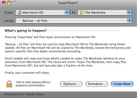
Instead of using the Mac Pro, I used my external FireWire drive which holds a bootable clone of my Mac Pro via SuperDuper. This way my tower wasn’t out of commission while I transfered files, and I saved the time it takes to do a Time Machine restore.

Migrating roughly 180 GBs of data over the FireWire 800 port took about 2.5 hours. And once all the files were successfully migrated the thing booted up perfectly and was ready to roll. Well, except for a few oddities…

Network Settings

Once I had the machine up and running the first thing I had to do was make sure the internet worked. I mean, without internet what good is the thing? Seriously…

I hadn’t been thinking and I had the migration assistant transfers network settings. Regardless of the network capabilities of the old machine verses the new machine, it just sets up the new network settings to be identical to the old ones. Which means since I was transferring from the Mac Pro, laptop’s Airport option now read as “Ethernet 2”, even though it had the radar icon next to it.

Mac Pro's Network Settings on the MacBook Pro

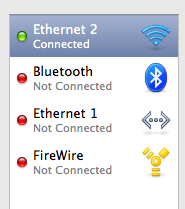
Additionally, the Airport icon up in the menu bar was displayed in the “empty” state, as if it was turned off. Clicking on it said the airport was not configured. But the MBP was getting signal from my wireless network because I had internet with no cables.

The weirdness was easily fixed by simply re-configuring everything using the location setup assistant.
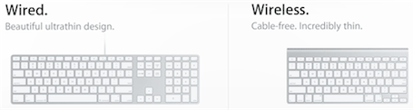
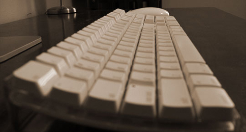
MacBook Pro Standard Network Settings

The Keyboard

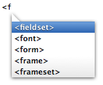
I have always been jealous of the backlit keyboards. I think they’re brilliant and my 12-inch PowerBook didn’t have one. Naturally, one of the first things I played with was my new keyboard’s backlighting. But, it was broken. At first I thought the mapping for the hardware keys (F5/F6) was broken because in normal light I was totally unable to manually turn on the keyboard’s backlight.

When pressing the adjustment keys this would appear:

Backlit Keyboard Dialog

I assumed the unresponsive lighting had something to do with the same migration trouble I had with the Network Settings. I repaired the disk permissions, reset the PRAM and still had no luck. After searching online with no results I called Apple..

The general technician was clueless on how to fix it. He assumed I would need to re-install the OS due to the hardware mapping problem from the migration. But before making that giant executive decision, he transfered me to a product specialist.

I again described the problem, and he too was unsure about a solution. I noted how the lights came on when it was dark in the room (or when I put my palms over the speakers), and then, at that point I could adjust the brightness level. But I could not manually turn the backlights on if they weren’t first turned on by the ambient light sensor.

The product specialist concluded it must be a new feature in the latest MacBook Pros since they have the new F1 – F12 keyboard layout and what-not. And that was the end of that.

Those of you who have a 15-inch Mac are probably rolling right now. Since I’ve never owned a laptop with backlit keyboards I had no clue, but apparently this has been the standard function all along! (Read: over four years!)

To recap: You can’t adjust the backlit keyboard unless it’s dark in the room.

Now, as far as real keyboard changes go, there are quite a few (Apple Care phone support, take note):

  • As expected, the F1 – F12 layout in the MBP is now the same as the slim keyboard’s, the MacBook Air’s and the MacBook’s.
  • The Enter key to the right of the spacebar has been replaced by the option key.
  • The num lock key is gone, as are the keypad style numbers.
  • The “speed tap safety feature” for the caps lock key (a.k.a. the antiCAPSLOCK campaign) has been implemented. The reason it exists only in the new laptops, and not in all of our computers via some software update, is because as Rentzsch discovered: “The activation delay occurs in the keyboard itself, before the operating system even sees the key-down.”

Point being: all of Apple’s keyboards are now the same. The only differences are the F5 and F6 keys: on the MacBooks and the slim-desktop keyboards those two keys are blank, whereas on the MBPs and MBAs they have the icons for the keyboard’s backlight adjustment.

The Screen

The LED screen is gorgeous. Naturally I got the matte screen, since (no offense, but) glossy is synonymous with cheesy to me. The display is bright, clear and sharp. And even though it’s not quite as bright as my Apple Cinema Display, it is a very satisfactory alternative when not at my desk.

The 1440×900 pixel resolution is the same as the old 17″ PowerBooks used to have a few years back. And it is in-fact a higher pixel per inch density than my 23″ ACD is (114 PPI for the MacBook Pro versus 98 PPI for the Cinema Display). One of the primary advantages of a higher density screen is font-rendering — especially on the Web. If you like to read on the web, the MacBook Pro makes great companion.

Of course, when working at my desk the Cinema Display is still more pleasant – on the eyes and the neck – which means I’ll be diving back into the world of connecting to an external display on a regular basis. I’m reminded of how fantastically my PowerBook handled external monitors. As John Gruber put it:

The PowerBooks’ support for external displays is quite clever. When the PowerBook wakes from sleep (or starts up), it detects which displays are available and uses them. This means you can walk around using the built-in display, set it down, connect an external display, and it automatically recognizes the just-connected external display and uses it. If you keep the PowerBook open, it uses the external display in addition to the built-in display; if you keep the PowerBook closed, it uses the external display instead of the internal. Disconnect the external display, and the right thing will happen, where by “right thing” I mean that any windows which were open on the no-longer-available display will be moved to the internal display, and resized, if necessary, to fit.

Moreover, it seems the MacBook Pro now has instant monitor detection. I’m not sure just how new this is, but it’s new to me. When I plug in an external monitor while the MBP is open and running it detects the new monitor right away and adjusts accordingly with only a few seconds of light-blue-screen down time. Likewise, if I unplug the external monitor the MBP adjusts, and, as John says, “does the right thing.”

Next is the ambient light sensor. It’s a nice feature, but I can’t seriously imagine anyone leaving it on for the internal display. I often have my left hand off to the side of the keyboard (and therefore over top of the left speaker) keeping my thumb on the CMD key and my middle finger on the tab key, and I often bring my right hand up and it would dim the screen every time – not too much, but just enough to make you feel crazy. It only took about 45 seconds of use before I realized I would have to turn it off.

Otherwise, my only gripe about the MacBook Pro’s display is the amount it will tilt back, or rather, won’t tilt back. Compared to my PowerBook the difference in angle is substantial, and I miss it. I’m not sure, but from what I can tell the primary reason for the tighter angle is the slimmer form factor of the new MacBook Pro. Meaning if the screen did tilt back any further I think the outside edge of the display would actually lift the back end of the laptop up.

Multi-Touch

Like I do when almost any of Apple’s new products are announced, I didn’t think of the multi-touch as necessary to my everyday laptop use. That is, until it actually was a part of my everyday laptop use. Sure, I knew it would be nice, and if I could choose between getting a laptop that had it or one that didn’t, I would choose the one that did. But for the most part, I was impartial.

Now, after a week with the multi-touch, I am hooked. Not only are the old multi-touch features (two-finger scrolling) new to me, but the newest features (three-finger swipe, pinch, and etc.) are brilliant.

Just like on the iPhone, the multi-touch gestures make perfect sense in context. Which means I don’t have to think about them. Once I settled that three fingers swiping from left to right means “next” I find myself naturally using it in places I hadn’t even thought about, without thinking about it. It already feels natural.

In iCal the three-finger swipe takes you to the next or previous day/week/month in your calendar. In Apple’s Mail the swipe takes you to the next email message. In Preview, you get the next page. And it’s the same with pinching: On the desktop, pinching enlarges or shrinks your icon sizes. In Preview, it enlarges the image or document. And, more…

Even the short tutorial videos in the trackpad preferences pane are brilliant. What a perfect way to demonstrate how to use all the different options.

Right now, multi-touch to the trackpad is what keyboard shortcuts are to the the keyboard. But But it’s apparent that multi-touch to the trackpad can be what Quicksilver is to the keyboard.

Since multi-touch is really only helpful inside apps which are primarily designed as mostly mouse-input apps (iCal, Safari, iPhoto) versus keyboard-input apps, if you’re in an app that is mostly a keyboard-input app, forcing yourself to use multi-touch instead of keyboard shortcuts is a little more trouble than it’s worth. But, if you’re fingers are already on the trackpad then multi-touch features can be great.

Clearly, multi-touch won’t be able to replace all the keyboard shortcuts. But certainly the most common ones.

To see how multi-touch would work with some of the 3rd Party apps I use regularly, I installed the beta of MultiClutch.

MultiClutch takes keyboard shortcuts and maps them to trackpad gestures for certain applications. I honestly haven’t found it indispensable, since the applications that I find myself using multi-touch functionality already support it: Mail, iCal and Safari. But I have been able to set a couple new convenient gestures.

The MultiClutch setup pane is pretty straight forward. You add an application to the list, select the multi-touch gesture and then pick the keyboard shortcut you want accompany it and.

MultiClutch Setup Menu

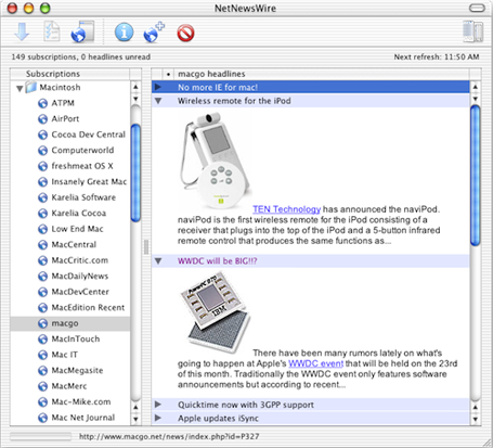
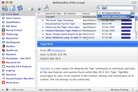
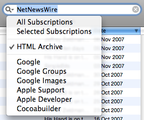
When I’m in an app that I wish had some multi-touch functionality I can go to MultiClutch, add the gesture, and the new mapping works instantly. As of now I’ve only added four gestures in MultiClutch. Two in NetNewsWire and two global shortcuts.

In NNW I wanted to map three-finger swipe to the space bar — this makes sense because the swipe means “next” and pressing spacebar takes you to your next unread feed. But MultiClutch doesn’t allow me to map the spacebar as a shortcut key.

Fortunately, pressing CMD+/ also takes you to “Next Unread”, and pressing CMD+’ takes you to previous unread. I mapped these to the three-finger swipes for previous and next, respectively. This actually works better though, because CMD+/ takes you directly to the next unread item, whereas spacebar also scrolls down the article until it gets to the end, and then takes you to the next unread item. I can use the swipe shortcut and the two-finger scrolling to read a bit easier in NNW than what just spacebar alone offers.

For the two global shortcuts, I mapped “Swipe Up” and “Swipe Down” to “Page Up” and “Page Down” respectively. This has been great for Safari, and other similar situations where I want to get to the very top or very bottom of the page.

Unfortunately, Adobe CS3 doesn’t get any love from MultiClutch. It would be great if pinching in or out would zoom respectively, and three-finger swiping would take me to the next page in InDesign, but gesture mapping through MultiClutch doesn’t work with Carbon apps.

Obviously multi-touch has a bright future. I think it’s a privilege to be around from the start, so one day I can say something like, “I remember when I had to click on the sidebar and drag down to see the rest of the page.”

Hard Drive

I am determined not to be a digital pack-rat. I delete anything and everything I can and try to keep around only the files which I am quite confident I will need again in the future. I simply hate keeping something on my computer simply because I might, maybe, possibly need it one day.

Needless to say, upgrading the hard-drive’s speed instead of capacity was a no brainer. I paid the $100 upgrade to get the 200 GB 7,200 RPM hard drive. Looking in the System Profiler, I found the drive is from Hitachi.

The MacBook Pro’s hard drive is as quiet as my PowerBook’s used to be before I manually replaced the drive in the G4 a few months ago. (I took out the stock Hitachi 80 GB 4,500 RPM drive it came with and put in a Seagate 100 GB 7,200 RPM drive I bought from NewEgg.) The first thing I noticed with my PowerBook’s new drive was the hum and even some vibration.

The Mac Pro tower currently has two hard drives: The 250 GB Western Digital drive it came with and an additional 500 GB Seagate drive I added later. The drives are quiet, but it’s the fans that make so much noise.

All this to say I am very impressed at how quiet the MacBook Pro is: The fans and the hard drive.

Sleeping

If I leave the MacBook Pro alone for awhile and the screen goes to sleep, the white LED comes on, but at full-strength (not pulsing or breathing). I am not quite sure what the point of that feature is, though. I suppose it’s so I can instantly tell the state of my Mac if the screen is off.

This feature also comes in to play when closing the lid to put the Mac to sleep. The white LED will come on right away at full-strength, but won’t start “breathing” until the laptop actually goes to sleep. I’m used to waiting until the LED comes on, but now I have to watch it and wait for it to start breathing before I can pack up the laptop. I wish they would have left that alone.

Unfortunately, putting the MacBook Pro to sleep takes 30-45 seconds. This is a long time to wait when you’re ready to go. But the reason it takes so long to sleep is because your computer is writing all the information that’s in RAM to your disc. This way you won’t lose any info if your battery dies, or falls out while in sleep mode. But with 2 to 4 GB of RAM it can take quite a while.

There’s a short terminal command (via Paul) to change the sleep-mode from the default “3” to “0” which fixes the slow sleep frustration:

sudo pmset -a hibernatemode 0

You’ll be prompted to enter your administrator password, and then you’re good to go. And make sure you logout before quitting terminal or the change won’t keep.

What this command does is change your laptop’s sleep-mode from “safe” to “instant”. That means if your battery dies while your laptop is sleeping you’ll lose all your session data.

But I always save – and usually quit out of – everything anyway, so it would be no loss if the battery died. And now the laptop sleeps in about 5 -7 seconds instead of 30 – 45. Hallelujah.

UPDATE: SmartSleep.

Proper Baggage

Finding the right bag seems to be a never-ending venture. I knew I would miss my little Brenthaven bag for the 12-inch PowerBook, but Brenthaven’s 15-inch MBP version was a bit too clunky. I found a slick Burton Bandwidth Case from Turntable Labs. It’s slim, has very little extra storage, and is perfect for the times I just need to take my laptop and nothing else.

That case is not my everyday bag, though. For everyday use I’ve decided I need a backpack: One that doesn’t look like it belongs in a sci-fi movie; one that holds my laptop safely; And one that is the right size (not too big, but not too small).

I’m currently using the Case Logic XN Backpack, and so far, it seems to fit the bill. Granted, I have a pretty bad track record of keeping bags. I’ve been through about 8 in the course of my three laptops, but with each one I get closer to perfection.

Odds and Ends

  • There has been a lot of hub-ubb about the new battery-life claims on Apple’s website. Are the new computers getting worse battery life or are the claims actually realistic? From my own experience so far I’m quite sure the claims are dead-on.I haven’t done any legit testing, but earlier today the battery lasted nearly four hours with the power settings on “Better Performance” and the screen at full brightness — all while typing, surfing the web, listening to music through the built-in speakers, and I downloaded a 1.13 GB movie from iTunes.

    I have no doubt with more caution I could squeeze 5 hours out of the battery.

  • The new Penryn processor runs much cooler than my old PPC G4. Even on processor intensive apps, with the MacBook Pro on my lap it stays cool and the fan runs virtually silent.
  • The MacBook Pro shipped with it’s own build of OS X 10.5.2 — Build 9C2028. (My PowerBook and Mac Pro are both running Build 9C31.) I imagine this has something to do with the new trackpad new multi-touch features.
  • The MagSafe power adapter is a brilliant invention. Aside from the “safety” factor it’s much easier to connect and disconnect. But the orange or green indicator light only comes on about once every four plug-ins, even though the battery icon in the menu bar indicates charging. I’ll probably take it into the genius bar some-day to get it replaced.
  • When reading on the Apple website I just noticed they refer to the computer as MacBook Pro, not the MacBook Pro. Like iPhone.
  • Something else I’ve noticed about the MacBook Pro’s internal display is that when dimming the screen the increments seem rather far apart. Instead of a gradual dimming, each step is a bit jarring. Though I honestly don’t know for sure, I assume this has something to do with the way an LED display is lit, verses the older CCFL technology.

More Reviews

This is just one of a handful of winded and entertaining software reviews.


  1. Ironically all three machines are still in the family: I passed the Dell on to my dad a few years ago, and my wife just inherited the PowerBook. As you’ll see in another post with some benchmark stats, even though the PowerBook is much slower than the MBP, my wife insists that what is most important is that her laptop is the “cutest” computer in the house.
  2. Not unlike the original VW Beetle’s body style:“Is that a 1968 VW Bug?”

    “No. It’s a ’91.”

Pro Portable: A Review of the New MacBook Pro

SuperDuper, Time Machine, and Bulletproof Backups

My advice for a good backup strategy? Keep it simple. Keep it safe. Don’t stress the details.

The “you should backup regularly” argument needs little coaxing. Everybody “knows” they should backup the problem is they don’t. A backup plan is only as good as its followthrough – which is why Time Machine is so epic. It backs up every hour for you. You don’t even know it’s running but you hear the hard drive spinning, and watch your system slow down for a few minutes.

Once people jump on the backup regularly bandwagon, the sinkhole that many fall into is to stress the details: the absurd fear that some day there will be some file that they will absolutely have to have. And when that day does come they will discover that they have deleted the file – or overwritten it, or something else catastrophic – and thus, by not having that one file at the theoretical moment of truth they will not impress their fellow nerds in a, “Look what I kept for all these years. What do you mean, “so what?”” moment of glory.

Of course, there are those who do need multiple backups, archive history and the ability to roll back, and you know who you are. But for the average user here is my advice: keep it simple; use SuperDuper to keep a bootable copy of your main startup drive, and let Time Machine do its thing to archive stuff. And hope you never need to use either.

Backing Up

With the advent of Time Machine backup awareness went through the roof. So far I have only used Time Machine once since Leopard came out…

It was while working on the NetNewsWire review. I made a folder with some screenshots and had it sitting on my desktop for a day or two. I moved the folder, and a few weeks later when I was ready for the screenshots I couldn’t remember where I had moved the folder to or what it was even called. What I did remember was that the folder had been on my desktop. So I launched into outer space and found the archived version and restored it.

To recap: the only time I have ever used Time Machine was to find a misplaced folder.

My point? Time Machine makes a better archive system than it does a catastrophic events solution. Not that Time Machine is not a good backup solution, but it’s not the best answer to every data-loss problem. Which is why SuperDuper is the ideal companion to everyone using Leopard and an absolute necessity to everyone on 10.4 and below.

On page 14 of his epic Leopard review, John Siracusa talks about Time Machine and shares some (pre-Leopard) backup stats of Mac users based on a poll Apple took:

Eighty percent of Mac users said they knew they should backup their data. (This is scary already. Only 80 percent?) Twenty-six percent said they do backup their data. That actually doesn’t sound too bad until you get to the next question. Only four percent backup regularly.

In a nutshell, this means that if you could snap your fingers and make one Mac user’s main hard drive disappear, there’s a 96 percent chance that you just destroyed files that are completely unrecoverable.

Now, for those of you that know you should backup regularly, but don’t, I’m guessing there are two main reasons:

  1. Negligence – You just haven’t gotten around to buying a backup hard drive, or if you have you don’t feel like plugging it in to your laptop every. single. night… Ugh.
  2. Ignorance – I don’t know the real numbers, but before Time Machine came along I’m sure the vast majority of the average Mac user had no idea where to start in regards to setting up a backup plan.I know most of you reading this are much more tech savvy than the average user, but think of how many people you know need help just to sync their iPod. It’s those people who saw backing up as an intimidating venture they didn’t have the energy to figure out, if they thought of it at all.

Time Machine is creating a new mindset for the average user that backing up is important and it can be done without as much effort as they think; arguably making Time Machine the most significant addition to an operating system ever. But not without drawbacks…

SuperDuper’s tag line brags that their software is for “mere mortals”. Meaning people like you and me and even our iPod challenged friends. SuperDuper is not difficult or intimidating. In fact it’s just about as easy to use as Time Machine. But what’s more is that SuperDuper offers some data recovery and emergency response solutions which Time Machine doesn’t.

An Aside About Hardware

To have backups you have to have hard drives. I own four. One in my laptop, two in my Mac Pro and one external firewire.

The HDD in my laptop doesn’t get backed up. It’s my secondary machine, and any important files I may create on it during the day get moved to the Mac Pro. If my laptop dies on me I’m not afraid of losing any vital data. If I do happen to lose some vital file that only exists on my laptop I don’t know what it is anyway, so I’ll let ignorance be bliss.

Of the two HDDs in my tower, one is a 250GB boot disc and the other a 500GB drive for Time Machine. I purposefully bought a smaller backup drive for Time Machine as a way to “hem myself in.” At 500GB it looks like i will get about 6 months worth of archived info, which is more than I need (or want). I don’t want years and years of old files waiting around never to be used like a room in the basement filled with boxes of potentially important keepsakes that most likely belong to my great-aunt twice removed anyway.

My fourth and final hard drive is the most important component of my backup hardware: a Lacie 250GB FireWire400/FireWire800/USB drive dubbed “The Wardrobe”. It sits on the floor behind my Mac Pro and holds the nightly build of my Mac Pro’s boot disc. This is the drive I use with SuperDuper. It will plug into any Mac to give me instant access to my files and operating system. You can buy your own from Amazon.

What I like about the external drive holding the clone of my boot disc is that I can take it with me wherever I want and have an exact copy of my main machine that I can plug into any other Mac. I hardly ever do this, but it’s important to me for two reasons:

Since my laptop is my secondary machine there can be times when it doesn’t have a file I need. Usually it’s not a problem, and I just get the file later in my day when I go home. But if I”m on a long trip I need a different plan. Since Back To My Mac is not exactly reliable yet – and even when it does work it’s less than speedy – having an exact clone of my main hard drive readily available eliminates the possible stress of “client emergencies”.

Secondly, having all my data cloned on the external drive means if I ever sell my Mac Pro, send it to the repair shop or lose it, I am not out of my data. And I’m not sure how you lose a 60 pound tower, but I’m just sayin’…

The Right Tool for the Right Job

For the most part, there are only a few situations when you will be glad you have a backup:

  • When you realize you’ve deleted something that was extremely important.
  • When your hard drive takes a nose dive and all your info is gone, and you don’t want to pay $2,000 for the guys in space suits to extract your data with tweezers and chewing gum.
  • When something else on your computer, unrelated to your hard drive brakes and you have to send your whole computer in for repair, and it conveniently comes back with a clean install of OS X.
  • The latest software update or some new application suddenly barfs all over your system and everything is now buggy and unusable. (We’ll get more into this particular situation with SuperDuper’s “Sandboxing” later on.)

Only one of the above four scenarios is best solved by Time Machine; leaving SuperDuper as the ideal solution to the other three.

Time Machine

Like I said earlier, Time Machine makes a better archive system than a backup solution. There are several great reviews of Time Machine already, and there is clearly no need to go into detail on the ins, outs, whats and hows of Time Machine. But for the sake of context here is a brief, laymen’s terms overview of what Time Machine does…

When you first plug in your 2nd hard drive Time Machine asks if you want to use this as your backup drive. You say yes and it copies all your files over to the backup. From that point on Time Machine works in the background.

Every hour it takes a quick look at your whole computer to see if any file, setting or program is new or has changed. If something is new or changed Time Machine backs up those files — thus making “snapshots” of what your computer looked like at any given point in time. (So that’s where they got the name!)

At the end of the day Time Machine will fold your hourly backups into a single backup “snapshot” of that day, and at the end of the month it folds the daily backups into single snapshots for the week.

Time Machine keeps old backups as long as there is room on your backup drive. When the drive gets full, Time Machine starts replacing the oldest snapshots with the newest ones.

So this all comes in to play if you lost, accidentally deleted or (in my case) misplaced a file. You simply open up time machine to get instant access to all the archives. Then use the big arrows to go backward and forward in time, or use the tick marks on the right to select a specific snapshot.

One look at the finder-based interface and it’s clear to anyone that Time Machine’s main purpose is to go back in time to recover lost or missing files.
Time Machine User Interface

The biggest problem with Time Machine will arise if and when your startup drive becomes unusable for whatever reason. If all you have is your startup disc and your Time Machine backup then you will need to get a new hard drive, and restore your backup onto it. Even if you can run out to the store and be back lickety-split you’ll still be spending several hours waiting on Time Machine to restore its backup to your new drive.

What then if you need to keep working? Well, if you have a recent backup via SuperDuper you can easily re-start your computer using the backup drive and carry on as you were in a matter of minutes. Minutes! And even suppose you were working on files this morning that you need but you backed up with SuperDuper last night? Once you’re re-booted from your backup, you can then access Time Machine and restore the archived files that Time Machine automatically backed up earlier.

On the Shirt Pocket Watch weblog Dave Nanian explains more on how SuperDuper compliments Time Machine:

Our tagline, Heroic System Recovery for Mere Mortals, tries to sum up the whole idea: SuperDuper! is designed to provide excellent failover support for the all-too-common case where things fail in a pretty catastrophic way, such as when a drive fails, or your system becomes unbootable. We do this by quickly and efficiently creating a fully bootable copy of your source drive. Perhaps more importantly, recovery is near immediate, even if the original drive is completely unusable, because you can start up from your backup and continue working.

You can even take your backup to a totally different Macintosh, start up from it, and work while your failed Macintosh is in the shop… then, when it comes back all fresh and shiny, restore things and keep working. And even if the other Mac is a different CPU type, you can still open and edit the files on the backup.

You cannot do this with Time Machine: Time Machine copies are not bootable until they’re restored.

In SuperDuper!, system recovery is done with a minimum of fuss and bother, and with respect for your time. Yes, Time Machine can restore a full system, but that’s not its strength. Doing so requires you to actually start up from the Leopard DVD (which you’ll need to have with you) and then take the time to restore the backup in full, which interrupts your workflow, requires a working, entirely separate destination device, and takes a lot of your time — at the exact moment when you can least afford it.

The Clearly Time Machine has in no way made SuperDuper insignificant or inconsequential. In fact, if I had to choose between the two I’d stick with SuperDuper. Here’s why…

SuperDuper!

Over the past fews months as I have been writing these reviews it wasn’t until I was writing about MarsEdit that I realized each application has something in common: feel and depth.

NetNewsWire, Mint, Transmit, Coda, MarsEdit and now SuperDuper; each one is an applications which feels light and easy to use but has a depth of features and ability. Each of these apps are useful; from the most basic users to the most advanced tech savvy Apple gurus.

I have only ever used SuperDuper for one thing: absolute headache free backups of my system.

Those 7 words are the entire reason I’m writing this article. Each night when I’m done at my computer I quit out of everything and launch SuperDuper. (If I wanted to set a schedule I could, but I prefer to just do it manually – I’m a control freak.)

SuperDuper! Home Screen
I double check the Copy from and the to. It looks good, o.k. then, Copy Now. Off to bed, and I know that all the work I did that day is safe.

If I wake up tomorrow to find my start-up disc went kaput I can just boot up from the external drive as if there was no problem and get right to work. Then when I have time I can replace my drive and restore from SuperDuper or Time Machine at my own leisure.

The good news with SuperDuper now being Leopard compatible,1 is that it integrates with Time Machine…

Time Machine and SuperDuper!

There are two ways SuperDuper works with Time Machine: One is the ability to copy your Time Machine backup over to another drive without losing the archived history.

Second is the ability to store a bootable backup via SuperDuper along side the same files on the same drive as Time Machine. This means if you already have an external hard drive with your Time Machine backup, you can put bootable clone on there as well without interrupting anything. Or if you only want to own one backup hard drive you can use it simultaneously as a bootable clone and as the Time Machine archives.

Unfortunately there is currently no documentation on how SuperDuper operates in conjunction with Time Machine other than what’s mentioned in the release notes.

So to make things as clear as I understand them, to create a bootable backup along side Time Machine you have to select your startup volume in the Copy menu, your Time Machine drive in the to menu, “Backup – all files” in the using menu and, most importantly, be sure you choose “Smart Update [Time Machine drive] from [Startup Drive]” in the options tab under the During copy menu.
During copy menu options

And even when you do have the correct options set up in SuperDuper and are ready to make your bootable backup onto your Time Machine drive the “What’s going to happen?” text is so poorly written it’s not clear what exactly you’re doing. It even sounds as if you may ruin something:

Pressing “Copy Now” will first repair permissions on Macintosh HD. The Time Machine backups on Time Machine will be preserved. […]

Smart Update will copy and erase what’s needed to make Time Machine identical to your selections from Macintosh HD. The result will mimic “Erase Time Machine, then copy files from Macintosh HD”, but will typically take a fraction of the time.

If not for the second sentence in the first paragraph stating the preservation of the Time Machine backups, it sounds like SuperDuper plans on deleting your whole Time Machine drive to make room for the new backup.

Comparing the “Smart Update…” description to the “Erase then Copy…” description does make the former a little more clear:

Pressing “Copy Now” will first repair permissions on Macintosh HD, and then erase Time Machine. The Time Machine backups on Time Machine will be erased as well. To preserve your Time Machine backups, choose Smart Update.

Despite the copy text not being super duper clear, I have no doubt the process can be trusted.

Sandbox

The “Sandbox” is where SuperDuper shows of some serious backup kung-fu. For those who may not be familiar with what the Sandbox is, it’s easiest to explain with a (simplified) drawing:
SuperDuper! Sandbox Diagram
A Sandbox is basically an isolated copy of your system files. SuperDuper will create this for you on a local partition of your startup volume or on an external drive. (If you’re using a laptop SuperDuper recommends partitioning your internal HDD to hold the Sandbox because it has to be always accessible as the start up volume.)

SuperDuper creates the Sandbox by copying over all important system files, then setting the Sandbox as the “startup volume”. Now your computer will boot up and use the Sandbox system files instead of your primary system files. The advantage to this is that you can use your computer just like normal with no worries about installing system updates or new applications. The files will install in the Sandbox and not in the primary system folder.

If a system update or application has a major bug it’s no skin off your back. You can just reboot out of the Sandbox and your back to your clean system files then repair the Sandbox. No harm done, rest easy.

The Sandbox feature is a bit too rich for my blood, and I don’t use. But it is a great testimony to the extent and depth of features that SuperDuper offers for what could be considered a simple “copy and paste” backup utility.

Documentation

Shirt Pocket’s documentation notes on SuperDuper are quite clear and exhaustive, with much more info on the additional features. I recommend you look there for more details, although as of now it hasn’t been updated with any Leopard specific information.

More Reviews

This is just one of a handful of winded and entertaining software reviews.


  1. Am I the only one surprised to not see a 512×512 pixel icon accompany the 2.5 Leopard compatible update? Shirt Pocket is still using SuperDuper!’s original 128×128 icon. Additionally there is no mention of Leopard compatibility features (i.e. Time Machine stuff) in their help files or reference manual.
SuperDuper, Time Machine, and Bulletproof Backups

MarsEdit: Helping the Personal Publishing Revolution

Applications are solutions.

At the very core, the entire point of developing an application is to solve a problem; inasmuch as a program fills a need, it succeeds.

Furthermore, if an application can not only solve a problem, but help the user enjoy the process, it succeeds even more. And often, the most popular applications of all are those which solve problems that didn’t necessarily need to be solved in the first place. These apps provide a solution that is so enjoyable and makes so much sense to the user the app becomes a necessity. And this is where the desktop publisher, MarsEdit, takes off…

Originally, desktop publishers were developed to fix a problem: The ugly, clunky and sluggish integrated editors that were part of blogging applications such as Blogger and Movable Type.

With the advancement that content management apps and their integrated editors have had over the years – along with the advent of high-speed internet (remember when 14.4k was blazing?) – many people don’t see the need for a desktop publisher. The “problem” sorta fixed itself by default.

Desktop Publishers

The most widely assumed purpose of a desktop publisher is so you can “write your blog posts offline.” Well we all know that you don’t need a desktop publisher to write a blog post while you’re on an airplane. (Ironically, I am doing just that right now. Seriously. I’m in seat 12F; next to my wife and a middle aged woman reading some Oprah endorsed romance novel.)

Let me briefly mention here that MarsEdit tackles the “writing offline issue” like nobody has ever tackled it before with a feature called “Perfect Preview”. But I’ll get to that in a bit…

Other advantages of desktop publishers include features like storing login and relevant meta info for multiple weblogs, (and multiple CMS platforms) which gives you the ability to publish to several sites from one spot.

To genuinely grasp the solution a desktop publisher offers, you have to think outside your paradigm of what you think a desktop publisher is. For starters it is much more than word processors with a “send to weblog” button.

You may not have thought about the fact that when you write a post from your CMS’s “Write a Post” browser interface you are typing into a text field. All the tags are black and blend right in with all the text (also black). There are no shortcut keys for custom tags, and you’re subject to the speed of your internet connection and availability of your server. (Have you ever tried posting an update or edit to an article while on Digg’s homepage?)

Not to say that CMS browser interfaces are the world’s biggest nightmare; I have gone back and forth several times…

My first blog started a few years ago with Blogger. That was a clunky publisher to say the least. I later moved to a self-hosted WordPress blog and went in and out between the WordPress interface and another popular desktop publisher, ecto.

Even though ecto was full of features, my user experience never seemed to “settle”, so I went back to using the online WordPress interface. But that wasn’t a long-term solution either, because as I began writing longer posts (specifically interviews which contain quite a bit of markup), WordPress’ lack of editing features and tag coloring became a deal breaker.

I finally landed with MarsEdit as my preferred method for publishing. I think I made a pretty good choice too, because the more I use it the more I feel it’s a Mac app which truly is out of this world. (Get it?)

Daniel Jalkut –

I don’t think anybody doubts that the web (and by extension, the world) is in the midst of a personal-publishing revolution, and most Mac users want to take part in it. I see MarsEdit today as the best-of-class application for achieving that…

MarsEdit

The fact that MarsEdit is still around – let alone in continued development as a fantastic application – is nearly a miracle. It has certainly seen quite a bit of action over the years.

Brent Simmons is the author of MarsEdit. It was originally a feature of the 1.x version NetNewsWire; you could read all your favorite weblogs and publish your own, all from the same application. But the feature (Notepad) eventually split off into its own app.

The name and icon for MarsEdit are actually spawns from another app that never even made it past the drawing board: MarsLiner.

MarsLiner was meant to be the outliner of Brent’s dreams. But alas, the market was too small to justify the time and energy it would take to develop. So instead, Brent took the MarsLiner logo kept the “Mars”, dropped the “Liner”, added the “Edit” and turned it into the stand-alone weblog editing application, MarsEdit.

After its original conception with NNW in 2002, MarsEdit 1.0 was released at the end of 2004. Brent Simmons expounds:

The genesis of MarsEdit was the idea of mitosis, that we could remove NetNewsWire’s weblog editor and create a new, separate weblog editor—and thereby create a better newsreader and a better weblog editor. […]

When we decided to bag MarsLiner and do a separate weblog editor instead, I wanted to use the name Mars somehow and use Bryan’s cool icon. Hence the name MarsEdit. We rationalized the name by saying it represents editing at a distance, since you’re not editing local documents, you’re editing documents that live on the web somewhere.

But really it was because I like Mars and spaceships and we already had a great Mars icon.

And icon designer, Bryan Bell, was kind enough to show off the stages of the design process:

MarsEdit Icon Evolution

Later, NewsGator bought MarsEdit as part of its acquisition of Ranchero Software in 2005, and Gus Mueller got contracted out to work on the 1.1.2 release.

Finally, Daniel Jalkut – who launched Red Sweater Software in 2000 while he was working for Apple as a software engineer until going indie in 2002 – bought MarsEdit on February 22nd, 2007.1

With a talented, and motivated developer, MarsEdit finally graduated to version 2.0 in September 2007. The 2.0 release brought a wave of much needed attention to the app, and highlighted it to a much broader audience; breathing fresh life back into it.

This weekend, Daniel has released the next major update, 2.1, with some great new features and fixes.

Your Very Own Editor

Perhaps one of the finest features of the desktop publisher is that it is also a text editor.

When publishing from your CMS’s online text field you’re using just that: a text field, not a text editor. Thus there’s no tag highlighting, no find & replace, etc… You can get around the text field problem by using a stand-alone text editor to write your posts, copy/paste to the online text field and then publish. But what makes having a desktop publisher for your weblog the better solution is that all the ‘stuff’ involved with writing and publishing is in one dedicated location.

In MarsEdit the default editor window is not quite the ideal layout. Well, at least not for me. It is small and doesn’t display the options I want. Opening the application dozens of time each week and having to adjust the editor window every time sure made for an annoying workflow thus making my primary turn-off towards MarsEdit the seeming innability to customize the default editor window’s size, layout or features.

Fortunately, after a bit of looking around I found out Daniel actually made it quite a breeze to adjust the default editor’s layout, size and features. I’m just blind sometimes:

Save Default Window Size

So here is how I have customized my editor window:

  • I prefer to have the options open at all times. This can be set from the Prefs in the “Editing” tab. Select “Open The Options Pane”.
  • With the options pane set, adjust your editing window to the width and length you want, then in the “Window” menu click “Save Default Window Size”.
  • I also prefer to name my own slugs for post permalinks. This can easily be done in the “Slug” field, which sits right under the “Title” field. To enable it, click on the “View” menu and check “Slug Field”.
    MarsEdit Title and Slug Fields

WYSIWYG

Something to note about MarsEdit is the blatant absence of a WYSIWYG editor, which many people might see as a fault.

In all my experience with WYSIWYG editors I have found them a clumsy enemy of fine web typography. Typing a weblog post in a WYSIWYG editor is a bit like laying out a book in Microsoft Word.

MarsEdit’s long-time competition, ecto, offers both a HTML editor and a WYSIWYG editor. Unfortunately, when writing in ecto, you cannot switch between the two editor windows without shooting you markup in the foot. If you begin in ecto’s HTML editor and switch to the WYSIWYG, ecto turns all your hand-coded CSS-friendly tags into HTML spans, which is, to say the least, highly annoying and extremely counter-productive.

If you have spent any time at all tweaking your site’s style sheet, and if you have any pride in your weblog’s type then using a WYSIWYG editor is most likely a crutch, not a tool.

I suspect most of you are at least a bit HTML savvy and prefer the use of monospace type and a HTML editor anyway. But for those who are getting weak in the knees at the thought of having to type your own HTML relax. MarsEdit has combined many of the WYSIWYG concepts and implemented them into the HTML editor making it all very easy to use.

For example, CMD+B will place <strong>strong</strong>
tags around your text; CMD+I places <em>em</em> tags, etc.

Not only can you customize any of your own shortcut keys for markup – such as setting CMD+SHIFT+A as a link tag – MarsEdit 2.1 now offers markup right in the contextual menu.

Just control-click on a highlighted passage of text or a single word and choose your desired markup…
MarsEdit's Contextual Markup Window

The Feel Factor

The absence of the WYSIWYG editor fits perfectly into context with the overall feel of MarsEdit.

Making an application which at first glance feels thin is always a risk to developers. Folks may try out your program for a day or two, and when they don’t instantly see the exact features they want they assume your app is only half-full, so they leave it untouched and un-registered in their Applications folder to collect little bits of binary dust particles.

But if a developer can successfully create an application that feels light, though in truth is quite capable and feature-rich, they will succeed in the long run.

The more I use MarsEdit, the more I discover it functions exactly how it was intended to. It does not take much time to familiarize yourself with the application and customize it to work precisely how you want it to: with all the features sitting just below the surface, out of the way and ready to be utilized.

This is precisely the way a good weblog editing application should work.

An app like this must have the ability to offer all you want and need to publish your weblog according to the way you have it set-up. It must work seamlessly with over a dozen popular content management systems, and offer an interface for each one in a clean, simple fashion so as not to get in your way, slow you down or distract you while you’re writing. And this is where MarsEdit excels.

This feel of MarsEdit has been there from the very beginning. Even in the initial development and design phases, Brent had it as a part of his vision for the app: “The phrase ‘maximum elegance’ was just a personal reminder to myself to simplify as much as possible. With something as complicated as weblog editing, you have to be relentless about simplification, or it will get away from you.”

I am extremely impressed by how intuitive MarsEdit is and how well it serves the writer.

Perfect Preview

Hands down one of the finest features of MarsEdit is the Preview.

MarsEdit takes your post content and puts it into a preview template so you can read sans-markup. Cool, but not cutting edge.

What does make it so amazing is the ability to edit your preview template which allows you to read your article just as it would appear on your site after being published. You can set the Preview window right next to the editor window to watch changes and updates as you type them.

Daniel wrote a very succinct how-to on the Red Sweater Blog. Additionally you can find directions in MarsEdit’s help menu.

However, to step your “Perfect Preview” up an extra notch you may want to try tweaking the preview template to use localized files instead of your server-based, hosted files.

By doing this, not only will your preview window load and refresh faster, you will be able to write offline and still have the “live” preview of what your post will look on your own website.

If you are online – as you no doubt usually will be – you can preview remote files (such as uploaded images which are part of your post) and the localized files, which makes this desktop publisher all the more enticing.

Tweaking the preview template to become localized is extremely easy if you are even the least bit code savvy.

  1. Start by following MarsEdit’s instructions for editing the Preview Template. They can be found in the help menu.
  2. Once your initial Preview template is set up and working, download your weblog’s theme folder, or at least the style sheet.2
  3. Download each of the images in use on your ‘single post’ page. Place all these files into the same folder as your CSS file, and place the folder somewhere out of the way for safe, long-term keeping.
  4. If your Masthead image is a CSS background you’ll need to download that image and go in and adjust the the CSS code to point to the local file instead of the remote one.
  5. Now go into the local folder and control click the CSS file you just downloaded and open it in Safari.Copy all the text in the address field. This is the local address of your CSS file. It will look something like, file:///Users/……../style.css
  6. Return to the MarsEdit Preview Template, and find the line of code referencing your CSS file. Replace the current href address with the local address you just copied.
  7. Scroll through the rest of the template and find the code for each of the images you downloaded. In the src tags, replace whatever the online address was with the new local address.

Something to keep in mind now that your preview template has been localized is that changes you make to your website won’t be reflected in MarsEdit’s preview window. You’ll have to make the changes your local files separately if you want everything to match.

Media Manager

If you’ve used WordPress’ built-in uploader you know that anything can be better than that. My previous workflow would be to upload any images via Transmit and then code the img tags by hand.

MarsEdit has the ability to upload images to your weblog for you. You can drag an image right into the editor – dropping it in the location you want it to appear in your post. The Media Manager will then pop up, giving you a few options and a button to “Upload & Insert”. MarsEdit then generates all the code for you right where you wanted it.

There is one major drawback which I’ve found regarding the file uploader: There is no way to adjust the auto-generated code. I have custom image classes set in my style sheet that I want to use instead of MarsEdit’s default markup styles. Since I can’t make my own I have to ‘fix’ the code for images I upload through MarsEdit.3

Something you may not know is that the Media Manager auto detects what folder to upload files to. It would be nice to have the option hard code your own custom folder, but that requires MarsEdit to have FTP support which it currently doesn’t.

Right now it simply auto detects what folder to upload to by talking to your CMS. Fortunately, most CMSs allow you to customize the folder yourself. Since I prefer to send any images to my site’s /images/ folder as opposed to the standard /wp-content/uploads/ folder, I went to my WordPress admin panel, clicked on Options, Miscellaneous, and then changed the default uploads folder.

The Little Things…

Post Status

Something new in 2.1 is that you can now adjust the post status of your post.

This gives you the ability to send your post to your weblog as a Draft instead of a Published article. Assuming your CMS handles drafts, and assuming your CMS knows how to communicate draft status. WordPress and Movable Type suck at this right now, but Daniel created a little built-in hack for us:

…add a category “MarsDraft” to any of your posts, and when MarsEdit sees the category, it will automatically assume that the post is to be treated as a draft. So to make sure you don’t accidentally publish something early, just add the magic category, and remember to turn it off when you change the status to Published.

Anyway, the Post Status drop-down menu sits in the bottom of the options pane along with the Text Filter, Comments and TrackBacks options:
MarsEdit Post Status

I would love to see local draft syncing between multiple Macs. But since that feature is still MIA at the moment one of the cool advantage of the new “Post as Draft” feature is the ability to have (jimmy-rigged) synced drafts between versions of MarsEdit on multiple computers.

Unfortunately this is certainly not the ideal way to sync drafts. When you post the article it goes from your local drafts folder into the main weblog article list. As it sits there, it will eventually get pushed down the list until it disappears if you post too many real articles before publishing the draft. One way to work around this by setting the time-stamp to a date far in the future.

Another problem with remote drafts is that if you open one, edit it and save it (not re-send it), the edited version of your post becomes a local second copy. You have to send the local draft to your weblog to send the edits and get back down to one copy of your post. This is all very confusing and I see lots of potential for accidentally publishing the wrong version of a post or even deleting the right version.

If you use Daniel’s category workaround and my time-stamp workaround, if you want to take a draft and publish it you have to open it, re-adjust the time-stamp, uncheck the MarsDraft category, change the Post Status to “Published” and then send it to your weblog again as a bona fide post. Not exactly the best solution. Ah well.

To recap, I see three options for draft syncing: (a) Create your own workflow based on the workarounds; (b) don’t try to sync your drafts; or (c) wait for true local draft syncing via .Mac/FTP or something else. (Will us dual-computer folks ever get a break?)

The good news is, if you’re not worried about syncing to multiple Macs the draft feature as a draft feature works just fine.

Scriptable

MarsEdit is scriptable. Which means that in addition to having several, intelligent scripts built-in, you can also add your own.
MarsEdit Scripts

The Text Statistics script may be my favorite, simply because I’m a nerd for stats and info. Though the text counter always seems to be generous; according to MarsEdit, this article weighs in at 4,160 words.

Safari Bookmarklet

MarsEdit has a built in bookmarklet which can be used to generate a brand new post from any webpage. To set it up choose Install Bookmarklet from the MarsEdit menu.

Now if you find a sweet article in Safari, and you want to write about that article on your own weblog, just highlight the text you want to use in your post and then click your new fandangled bookmarklet. MarsEdit will open – if it’s not already – and generate a new post for you.

The webpage’s title will be your new post-title, and the text you had highlighted will show up in the body along with a link back to the article. But that’s just the start…

From the prefs window click the “Attribution” tab to go nuts customizing the markup and the layout you want to be used when you generate a new post with the Safari bookmarklet.

My customized syntax looks like this:

<a href="#url#">#title#</a> -

<blockquote>#body#</blockquote>

MarsEdit Attribution Code

What the above code does is put the name of the article as a link back to the web address I’m quoting, and then any selected text into block quotes from there. I usually tweak this a bit but it’s a great starting place for all of my asides and link-posts.

Command, Shift, D

Perhaps the feature that stands out to me the most is the shortcut key-command to publish your post: CMD+SHIFT+D.

It is the same shortcut used in Apple Mail to send an email. It’s a smart feature, and although it’s small it makes the app instantly more coherent and familiar to the Mac user.

Here is a free tip: When I customized my toolbar I took the “Send to Weblog” button right out. I found it is almost as easy to accidentally click the send button instead of save as it is to press command, shift, D when you’re actually ready to publish.

More Reviews

This is just one of a handful of winded and entertaining software reviews.


  1. There was a great Q&A done by NewsGator with Brent Simmons and Daniel Jalkut, but the origial page has gone missing from NewsGator’s site. Fortunately you can still find it on the Wayback Machine, and if that happens to go gone, I also saved a screenshot of the Q&A webpage here.
  2. If you’re not sure where your site’s CSS file is, simply open up your homepage and view your source. Look for a line of code that reads something like this:<link rel="stylesheet" type="text/css" media="screen" href="...style.css" />

    Copy the href location and paste it into your browser’s address bar, hit return and you should see your style sheet. Save it to your hard drive, and put into a new folder.

  3. Daniel has told me this is high on his list of feature additions.
MarsEdit: Helping the Personal Publishing Revolution

Coda: The One-Window Wonder

Coda is a text-editing, CSS-styling, WebKit previewing, file-managing, FTPing, terminal-accessing, web-site-building and publishing application for the Macintosh.

And, Coda has no duct tape.

All Inclusive Applications

If you are going to write an application that has and does “everything” there are a few key dynamics you have to keep in mind.

First of all you need to make it easy, simple and clear for the user to do all their work in your “one window”. This is where usability and interface make or break the application. And, fortunately for Coda, this is where Panic excels in, and Coda does a superb job as a “one-window application”.

Before Coda I always had at least three windows open at any given time when doing web-design: Transmit, TextWrangler and Safari. And I know that for those who are more web-design and development savvy people than I, only three apps open would be like a vacation.

For the past several weeks as I’ve been writing this article I have used nothing but Coda for web designing, and it has broken my age-old habits of CMD+TABbing between multiple apps.

Using Coda’s one-window interface has been especially wonderful when I am away from my home office and thus coding on my 12″ PowerBook’s 1024×768 screen resolution. But even on my 23″ display at home, I prefer to have Coda’s window sized to about 85% of my screen and make use of the Text Editor and the Preview panes rather than have two apps running side-by-side at 45% screen-realestate each.

Another reason Coda has helped break my habit of multiple-app web designing is the way it saves your previous work session, but more on that later.

Coda’s use of tabbed windows plays a critical part in its claim to fame as a one-window tool. Nowadays tabs come standard with good apps. Therefore, just having tabs is not enough. You have to have tabs that are above the norm of other applications and which meet the user’s expectations. Especially when it’s the tabs which are part of the foundation of your “one-window” application.

There seem to be three major ingredients which make up a good tabbed-window interface. First is design. One of the reasons I have never used NetNewsWire’s built in browser is the slighly odd look and feel of the tabs. They just feel clunky to me. Coda’s tabs are clean, subtle and easily identifiable. They are intelligently placed, and don’t go weird places when you have 20 of them open. (Though if you have 20 tabs open, you probably have bigger things to worry about than tab placement.)

The second ingredient is navigation. If you’re working in tabs you must be able to get from one to the other quickly and easily. Coda’s tabs work identical to virtually all other tabbed interface apps in that you can hot-key between them with the standard CMD+SHIFT+[ or CMD+SHIFT+] keys.

Finally, and most important, is user-interface. This seems like a moot issue, but there are still many apps that don’t utilize it. Coda does utilize it, and utilizes it well.

The most important user-interface aspect of tabbed-windows is the ability to re-order the tabs. A simple click and drag does the trick just perfectly. Moreover, Coda has more than just hot-key commands for new tabs. There is a “plus” symbol just under the toolbar, to the right of the file browser that you can click on to create new tabs. And to the far right is the “split window” symbol. A click on that and your current window gets split vertically or horizontally.

So at the end of the day, Coda’s claim to be a one-window app is valid. Coda is a great one-window application.

But there’s more to it than that…

The second challenge for a do-it-all application is to avoid overwhelming the user with too many options; i.e. “bloating” your app.

Coda is most certainly not bloated. If anything it could be argued the opposite – that Coda’s features are too skimpy.

However, put yourself in the developer’s shoes for moment. You’re going to take a Text Editor, CSS Editor, FTP client and a Terminal app. Then bundle them together, add a WebKit based prievewer and debugger, and offer some good documentation of PHP, CSS, Javascript and HTML. And finally: sell it for less than the cost of just a good text editor.

Panic didn’t set out to make the best text editor, CSS editor, etc… They set out to make one single application that contains all you need to build a website. And Panic has done a great job at keeping each of Coda’s components concise, powerful and focused – giving you the features you need while not requiring you to learn 4 or 5 new applications simultaneously to be able to use Coda efficiently. Sometimes good development decisions are about what you don’t put in.

An Aside Regarding Dreamweaver

When talking about one-window website development applications it’s hard not to mention Adobe Dreamweaver. And though Coda may easily be compared to the features Dreamweaver offers, Coda is much less bloated, much more snappy and infinitely more Macintosh-like.

In his Coda review for MacUser, Nik Rawlinson says,

“[Coda] could teach Adobe a thing or two, as it puts Dreamweaver’s multi-paged dialog to shame, and beats its sidebar-based CSS designer hands down. […] If you’re…ready to step up from Dreamweaver’s built-in code-based environment, Coda is an excellent choice.”

Coda was developed for people who work at the raw code level to build their websites. In contrast to Dreamweaver there are no pre-fabbed templates or WYSIWYG editors in Coda. Anyone who uses Dreamweaver would do well to look at Coda. Especially those in the market to buy, since Coda’s price tag is 5 times less than Dreamweaver CS3’s.

Starting With 1.0

On Monday, April 23rd, 2007 – exactly 10 years and a day after Panic was born – Coda 1.0 was launched, and it received quite a bit of buzz all about the internets.

  • Cabel Sasser

    This was by far the most complicated program we’ve ever built. I realized this when it dawned on me that I had never stopped doing design work for it. With most of our prior applications, I may spend a month or two creating a all-purpose Photoshop layout, cut up any important art, and then hand it over to the guys, possibly coming back to make a tweak every now and then. With Coda, the number of features and the scope of the project meant that even as soon as yesterday I was cranking out some interface pieces as .pdf’s

  • John Gruber

    One way to judge the scope of an app is to think about how much time you’re intended to spend using it. There’s plenty of room for apps you use here and there for a few minutes at a time, or which you launch just once or twice a week. There’s hardly any room at all, though, for apps you work in for hours at a time, every day.

    By this measure, Coda, the new app from Panic, is an epic.

  • MacUpdate’s Review Forum is full of ravings –

    Wow. Do the folks at Panic ever make a mistake. Everything in Coda is amazing, it’s so intuitive it’s scary. Auto completion works great, the sites page is amazing, inline ftp, preview, all of it amazing. One thing I did notice, doesn’t seem to like flash, but hardly a dealbreaker. Bought and paid for this morning about an hour after release.

Moreover, April 23rd was also the submission deadline for the 2007 Apple Design Awards. And, waddayaknow but a few months later at the WWDC07, Coda won the award for Best Mac OS X User Experience

Coda is a unique web development environment that offers a complete file browser (both locally and remotely), publishing, full-featured text editor, WebKit-based preview, CSS editor with visual tools, full-featured terminal, built-in reference material, and much more. Coda is the Mac’s first one-window Web development application that integrates numerous modules into one cohesive user experience. Coda is a great Mac OS X citizen…

User experience has always been one of Panic’s fortés, and Coda is no exception. It truly is a beautiful, powerful, intelligently designed, all-in-one website building tool.

However, it’s important to note that there is something interesting I have seen in many of the reviews I’ve read about Coda. There seems to be this relatively universal love/hate relationship with the people who use it.

Even in my own experience with Coda it just doesn’t quite cross over from, “Wow! This is smart, incredible and beautiful!” to, “How will I ever live without this?”.

Joe Kissell says

…it’s like buying your dream car, only to find out that the seats are kind of uncomfortable and there’s no heater. Coda comes so close to being great that its shortcomings are especially annoying. Having tried this way of working, I’m loath to return to having four applications open all the time – and yet I keep running into issues that irritate me almost enough to give it up.

Yet, let’s not forget Coda is still only a 1.x product, it is extremely affordable for the features it offers and Panic has a fantastic reputation for producing outstanding software for the Mac.

Coda’s components are all masterfully crafted and seamlessly integrated. It has all you need to code, debug, validate, stare at, drool over and then publish your website.

Steven Frank says that when the beta-testers were asked what their favorite feature was they all replied: “The integration. The way it all fits together. How everything’s somehow right where you need it when you need it.

“Sites”

When you launch Coda this is where you start. Coda uses “Sites” the same way Transmit uses “Favorites”, and when opening Coda for the first time you are given the option to import some or all of your Transmit favorites if you like. You can also import them later.

Each “Site” is basically a collection of info and details about a website you’re working on or maintaining. Your “Sites” are represented by taped-up pieces of paper with a picture of your home-page drawn on the front:
Coda's Site's

Coda gets the icon images by taking a screenshot of your site’s homepage / root URL, which you can designate in the site’s info pane.

Having the visual icons to represent your sites is a nice touch, but a problem may arise if you have more than one saved site for the same root URL. Such as shawnblanc.net and shawnblanc.net/images. Both of those icons would display the same image on the taped up piece of paper. However, I don’t have my /images/ folder saved as a site, so it’s not a problem for me. And I think it’s clear that Coda wasn’t intended to replace your dedicated FTP client, so I doubt it will be a problem for many others.

But if you do encounter that problem the good news is you can choose custom images for each “Site”. To put your own image onto the taped-up paper, simply control-click on the site and “Change Image” to browse your finder for the image of your choice.

When you double-click on a “Site” the page flips around and expands into the full width of Coda’s window, revealing your previous workspace layout. Files, tabs, splits, everything is just the way you last left it and it is all ready to go. (Unless you left it in a mess. Try not to do that.)

The restored work session is one of my favorite features in Coda. It seems that most of the time I am opening up the same files for a site over and over. I can’t describe how wonderful it is to simply open up a “site” and have my previous session restored right the way I left it.

John Gruber expounds

In terms of historical user interface traditions and conventions, Unix and the Mac could hardly be more different, but there is one similar philosophy shared by both cultures — a preference for using a collection of smaller, dedicated tools that work well together rather than using monolithic do-it-all apps.

Coda seemingly swims in the face of this tradition, in that it ostensibly replaces a slew of dedicated apps. Coda’s premise, though, isn’t so much that it is one app that obviates several others, but rather that web development can and should be treated, conceptually, as a single task. That you don’t think, I need to download, edit, save, upload, and preview a change to the web site; you think, I need to make a change to the web site.

There is something else that has stuck out to me in my use of Coda, which I don’t quite know where to talk about, so I’ll bring it up here: When using Transmit I always disconnect before quitting. I press CMD+D to disconnect and then CMD+Q to quit out. But the same key combo doesn’t disconnect you from your site in Coda. (Pressing CMD+D or CMD+SHIFT+D moves you to the next or previous symbols within a text document.)

If you want to disconnect from your “Site” before quitting not only are there no hot-keys to do so, you have to click the circle-encompassed “x” next to the name of your site up in the top left corner of the application.
Coda's Disconnect X

And as many of you “don’t use the mouse if you don’t have to” / “I love Quicksilver” nerds will agree: clicking the disconnect button is too much. Therefore, since I can’t disconnect with a hot-key I find myself just quitting out, and it feels a bit like I’m unplugging my computer without powering it down first.

The Text Editor

For most users the text editor will be one of the two most-used features in Coda. (The other obviously being the Transmit turbo-engine-powered file manager / FTP client.)

Coda’s text editor is not a blow-your-brains-out-the-back-of-your-head kind of text editor. It wasn’t meant to be.

Coda’s text editor is its own licensed version of SubEthaEdit, which is one of few text editors which prides itself in being “a high-performance, sleek editor”; i.e. minimalism. To say the least, Coda’s text editor is powerful, clean and smart. It even comes with its own font, “Panic Sans”.

When it comes to text editors there are those who live and breath inside theirs, and everything else is just details. These people know every feature, every bug, every nook and every cranny of their editor and they use it for virtually everything. And these people just may pull their hair out when they try using Coda and discover it doesn’t have the ability to search within all the files on a site –
Coda's Search Scope

What Coda majors on is taking the most important features and implementing them in an intuitive, no-nonsense way.

For instance the bracket highlight feature: When your cursor passes through the beginning or end bracket a little blue beacon pops out at the other bracket, letting you know where the current symbol begins or ends. Simple, smart features like this are peppered all throughout Coda.

And not only are Coda’s little features smart, their interface is beautiful.
Coda's Auto Complete

Compare Coda’s auto-complete pop-up list above to Dreamweaver’s below:
Dreamweaver's Auto Complete

Not only is Dreamweaver’s box clunky and sports a drop shadow straight from 1997, but it brings up the entire code listing with empty brackets next to each tag. There is way too much going on. Notice how Coda only shows the tags that begin with ‘f’?

CSS Editor

CSS editors are becoming more and more popular. And for good reason. If I could remember everything I would much prefer to write my CSS from scratch by hand. But editing and writing CSS that way requires a bit more jujitsu than I have.

Coda’s CSS editor, much like its text editor, is simple and straight forward. You don’t have to examine it for an hour before you can figure out what you’re doing with it and how to work it.

If you already have a style sheet you’re working with you can open it in the CSS editor. It will display all the style elements on the left column with the built-in editor on the right-hand side. Click on an element to edit its type, margins, padding, color, border, etc… All the CSS properties are available for you to use and master.

You can build a style-sheet from the ground up as well; creating each element as you go. Or if you prefer, use the text editor to hand write all the elements you will be using then use the CSS editor to set the styles of those elements.

With Coda there’s no reason you shouldn’t have a fully-functionable and beautiful style sheet.

In addition to tabbed windows, Coda also allows you to split a window vertically or horizontally, and I’ve found that splitting the window vertically is extremely useful when working on a style sheet. I can then see and edit my CSS file’s text by using the text editor on the right, and then on the left split I put the dedicated CSS editor with a list of all my symbols and the visual style-selector; giving me the best of both worlds in one window.

“Preview”

Coda has its own internal browser so you can view the changes you make to your website right within the app.

It is a WebKit based browser, so your site will look virtually identical in Coda as it does in Safari. But nobody does browser testing in only Safari. To preview the same page in other browsers you simply click the icon to the right of the Coda’s Address Bar and highlight the browser you want to launch.
Previewing a site in another browser from Coda.

DOM Hierarchy Inspector

While in a Preview window you can activate Coda’s Document Object Model Hierarchy Inspector by clicking the magnifying glass icon at the bottom of the screen when in Preview mode. You may then scroll over the various modules in your webpage to see them highlighted in blue with their logical structure outlined below.
Coda's DOM Hierarchy Inspection

Not only is the DOM hierarchy inspector fun to play with as you watch blue boxes pop up here and there while you fling your mouse all over the place, but it is also a great way to get a visual grasp on how your code actually plays itself out, and is especially helpful for debugging and finding goofy errors with Javascript and HTML.

FTP Client and File Manager

Coda has Panic’s new “Transmit Turbo Engine”. (Get it?) For basic file transfers Coda actually claims to be quicker. It’s not a dedicated FTP client, but is certainly does the job it needs to do. The file-browser/Transmit combo works so seamlessly you may forget you’re working on a remote server.

When you click on a file either remote or local, that file opens up in a new tab. You can then tinker away to your heart’s content. If you are working on a file from your server, when you save will automatically upload the updated file.

When working on local files you can keep them local or choose to upload them to the current folder you have open on your server. Control-clicking gives you the option to upload, or to “Mark For Uploading”. When a file has been marked for uploading, Coda puts an up-arrow to the right of the file. Clicking that arrow uploads the file to the current folder you have open on your server.

When working on several files that will incorporate interlinked changes across your whole site, it is usually preferable to upload them all at once. Marking them for uploading helps keep them organized for you. Then you can close out the file, but keep it marked and when you’re done, upload all of them together.

The integration of the file manager and the FTP client is so seamless it is easy to take it for granted. The file manager is out of the way, but ready and available when you need to use it. And that, my friends, is the mark of a well-designed feature.

The Terminal

This is where I confess I am not that hard-core of a nerd. I am not a Terminal junkie, and in-fact, have not once used Coda’s built in terminal. Though if I needed to, Coda has made it as easy as possible by taking my “Site” information and using it to log me in via SSH.

Reference Books

Coda includes two books: A PHP reference guide and the “Web Programmer’s Desk Reference: HTML, CSS and JavaScript“, by Lázaro Issi Cohen and Joseph Issi Cohen –

The Web Programmer’s Desk Reference is the only book to serve as a single point of reference for all three primary web programming languages. Each listing includes the latest syntax and functionality, compatibility with other elements, and cross-browser compatibility issues.

The content in these books is comprehensive, easy to understand and very well laid out.

The biggest complaint is that the books are only available when you’re connected to the internet. Their content is hosted by Panic. This certainly defeats much of the purpose of having built-in reference guide. If I can only access it when I am online I could just as easily use Google to find what I need help with.

I would love to see these books saved locally to make them accessible when the internet is not.

The Little Things

It’s the little things in Coda that you may or may not notice that make it worth owning and using. The way a “Site” fades away if you delete it, or the way each of the primary six components in Coda have a numbered hot-key.

In fact, the little things in Coda matter so much it’s why Brent Simmons recently purchased a copy –

I used [Coda] to update NetNewsWire’s Help book for the latest release, and I liked the flow of it. I liked the easy flip between edit and preview modes. I liked having the list of files on the left. I liked the tabs. I liked the keyboard command for closing a tag. Etc.

But, most importantly, I liked the overall feeling of the program, and the sense that it would take care of me — that is, I felt like it probably had features I didn’t know I needed, and anything missing would probably be added in the future (things like multi-file find/replace). Part of this is just judging the app, and part comes from considering Panic’s track record.

Here are a few of the little things that stand out to me:

Symbols Quick Navigator

Clicking the brackets at the bottom toolbar underneath the file-manager brings up the Symbols Quick Navigator. It is a funky little table of contents for all the style-sheet symbols in your current open window.
Coda's Symbols pane

The 3-Pixel Conundrum

If you’re a fan of the new look for selected icons in Leopard’s toolbars you have Cabel and Panic to thank for it. Cabel was un-satisfied with the default selection state in Apple’s toolbar. To make a long story short, Panic’s development team coded their own toolbar to make up for the trouble Apple’s toolbar gave them when trying to get the look they wanted. But someone at Apple noticed and the design became Leopard’s default. (Read the whole story, here.)

Clips

Michael from WordPress Candy points out how helpful Coda’s “Clips” feature is for doing WordPress theme development.

You can save any text you want as a “Clip”. This is extremely helpful for keeping common tags available at all times. And Clips has a Global database as well as a site-specific database. If you are working on a WordPress based site you can save your WordPress tags for that site, and if you are also working on a Textpattern site your tags for that are saved when that site is open.

Double clicking a specific clip paste that text starting at the cursor’s current location. Or you can click and drag a clip to any location in your file.
Coda's Clips Box
To open up the Clips use the hot-key CTRL+CMD+C, or navigate to “Window” then select “Clips”.

Miscellaneous

  • If you move the location of your local root directory, Coda keeps track of where it goes. Even if it goes to the Trash.
  • A dot to the right of the file name inside the file manager, or in the file’s tab tells you the file has had changes since the last save.
    Coda's Save Dot
  • The way the toolbar stays fluid with the file manager’s width. It’s hard to explain, but adjust the width of the file-manager window and watch what happens up by the toolbar. The icons stay fixed above the window, the site name stays centered above the file-manager.

More Reviews

This is just one of a handful of winded and entertaining software reviews.

Coda: The One-Window Wonder

Briefly on Flow and its Icon

The upcoming contender to Transmit is Flow. I’ve seen the videos and it looks impressive. Mostly though, it seems to be just another interface for the same functions Transmit offers.

One small thing that stands out to me from the demos is the copy to URL function. Say you upload a jpg to your images folder. You can then copy the URL from inside the ftp client, and paste it wherever you like. You can even set Flow to auto-copy to your clipboard for you.

The one thing about Flow that gets me though is the icon. Cameron pointed out Sebastian’s own post about how he designed it.

If the Dock was a voliére (a birdhouse, in good English), the Flow icon would be a paradise bird.

I’m not sure if I’m a fan of the icon or not, but reading Sebastian’s post was fascinating to say the least. It’s obvious Sebastian did a great job concepting and developing the icon.

P.S. Anyone know how I can get in on the beta testing for Flow?

Briefly on Flow and its Icon

Transmit

Ever since the Pony Express, people have loved special deliveries.

You know what I’m talking about. The brown UPS truck drives down the street and you think to yourself, “Is that the book I ordered off Amazon, the RAM from NewEgg, or the authentic Star Trek Tricorder I won on eBay?” Regardless of what random item is coming today, you’re excited…

Transmit works that same spot in your brain that loves to send and receive. But instead of brown trucks and cardboard boxes with tracking numbers, you’re working with the files and servers and FTP on the internets.

Transmit is the FTP client for Mac users.

And anyone that uses a Mac knows I mean more than, “Transmit is an FTP client for the Mac platform”. Mac users have a high standard for their software. It has to do more than just work; Mac applications have to possess style, class and be enjoyable to use, and work like a charm.

Introduction

To truly appreciate Transmit, it helps to have at least a basic introduction to the dynamic duo that is the Mac software company, Panic, Inc..

Steven Frank and Cabel Sasser co-founded Panic about 11 years ago. Their original essays regarding the launch can be read in full here, with my hand-selected excerpts below:

Steven said:

Another thing that seems to have disappeared is the cool software company. Is there a Beagle Bros. of the 90’s? Most seem really straight-laced and are obsessed with “biz”. There are a few with a sense of humor, of course, but they are seldom seen and often overlooked in favor of the “serious” companies. With the software industry being so huge now, compared to the days of the II+, is it possible for a software company to be as personal as Beagle Bros.? Is it still possible to build a software company that will capture the imagination of the next generation of computer users? I don’t know. But I’d really like to find out.

And Cabel said:

I realize that I have to own and believe in my computer. My computer should give me something to fight for. My computer has to have a culture. […] we’ll always be Macintosh first, and Macintosh at heart. The users are consistently more supportive, intelligent, less likely to use ALL CAPS in beta reports, and excited about products.

The Mac, truly, rules. Any developer that says otherwise has forgotten what it means to love computers.

Panic, Inc. is a trend-setting, software development Dojo. Transmit was the first application I bought and is no less than fantastic.

Transmit Started Sans-M

Transit 1.0 Userguide
Cabel and Steven released the first version of Transmit in 1998. It was for OS 9 and was actually called Transit. No “m”.

From the original user’s guide Panic tells us that “Transit was designed from the start to be clean, beautiful, and powerful all at once, just like the MacOS is.”

Transit 1.0

Transit 1.0

Later, in version 1.2, Panic added the “m”. (If you read the definitions of transit versus transmit, transit seems to make a bit more sense for an FTP client. I’m guessing they changed the name because they didn’t want their application ending in zit. UPDATE: Scratch the zit theory.)

In 2002, Transmit 2 for OS X came out, and now, over 10 years since its original launch, Transmit is at version 3.6.3. It’s universal binary, Leopard friendly and hailed as the best FTP client for Mac. (“It’s name is not Fetch.”) Among its recognitions Transmit has won an Eddy Award, MacWorld Best of Show, and an Apple Design Award.

Transmit FTP Client

Transferring Files

Let’s start at the basics for a second. Such as acronym definition. FTP stands for File Transfer Protocol. Which is basically the way you take files from your computer and put them onto your website, and the other way around. You can put PHP, HTML, MP3, MOV and more. Anything you want, anywhere you want.

For the light-weight users Transmit is a great pick because of its reliability, quick transfers and its dashboard widget. I know many people who use free FTP clients, such as CyberDuck, and have had their fair share of headaches. Like poor Cameron, I too used CyberDuck for a while, but it crashed on a semi-regular basis, and just felt buggy and unreliable.

There is always a free “works just like the for-pay version” of virtually every application out there. But there is a reason the for-pay apps are for-pay. Transmit cost thirty bones. You just install it and go. Making peace of mind and reliability worth their weight in gold.

For the power user, Transmit has all the features you could ever use, making it like the huge dude in the gym that makes everyone else look like 7th graders.

What sets Transmit apart, is that it works great for everyone: the single-blog publisher, to the large-scale website developer. Transmit’s interface and usability is clean, easy to understand and works without fail, time after time. And that’s just the beginning. Transmit is packed to the brim with features you never knew you needed.

Like Panic.com says, “If you manage a web site, need to send a file to a friend running an FTP server, need to post eBay images to a image host, or download a lot of software updates, then Transmit is the perfect program for you: it makes FTP easy and fun”

The basic interface of Transmit is perfectly blunt. You’ve got “Your Stuff” on the left and “Their Stuff” on the right.

Transmit Your Stuff, Thier Stuff Window

Your Stuff is what’s on your computer, and Their Stuff is what’s on the server. I like the idea, but I do think it could be named better. Just because a file is on another server doesn’t mean it’s “theirs”. I would prefer to see these named as “Here” and “There”, or “Local” and “Over Yonder”.

A drag and drop from either location, to either location begins the transfer. But you are not restricted to dragging and dropping from within the application. With an open connection, Transmit still acts just like a Finder window. You can take a file on your desktop, drag it and drop it over the “Their Stuff” window to begin an upload and vice-a-versa… It’s file transfering made obvious.

And more than just obvious – Transmit is powerful. It works with practically any server that uses FTP, SFTP, FTP TLS/SSL, WebDAV, or secure WebDAV. And, it works with your iDisk or Amazon S3 file hosting.

Connections

The one thing I surely use the most is Favorites. I have 14 server locations saved. I use about 3 or 4 of them every day, another 3 or 4 every month or so, and the rest on occasion.

(One thing that would make favorites better would be the ability to add notes. For instance, I have a handful of printers’ login information saved but it would be great if I could have a few notes attached to that info that reminded me who to contact after an upload, and other relevant information. I have that info on my computer somewhere else, but it would be nice to have it all in one spot.)

Working in-line with your Favorites is the Drag-n-Droplets the Widget, and (of course) Quicksilver integration.

To create a Droplet, navigate to an ftp destination, then CTRL+CLICK and select “Save Droplet for Folder…”

Transmit Droplet Creation

A dialog box shows up to save the droplet. You can assign the name, save point of the droplet and choose to save the login password as part of the droplet or to prompt for it.

Once you’ve created your new Drag-n-Droplet, just do like you would think: drag and drop a file. Transmit automatically launches, uploads the file, disconnects and quits.

The Widget is the same idea, but on your Dashboard.

Transmit Widget for File Transfer

And with Quicksilver’s Transmit plugin you’ve got QS integration as well. Simply get the file you want to upload in Quicksilver, tab over, invoke Transmit, then use the arrow keys to choose the Favorite you want to upload to.

From inside Transmit, another great feature is tabbed connections. You can simultaneously upload/download to and from multiple servers and folders. Even cross-transfer files from server to server. This is great for working on other files while a big upload is raging in the background of a different server.

Data Worry-Warts – Worry Not

Ever since its conception, Transmit has been more than just an application for moving files from one place to another. Additionally, it is an invaluable tool for those who use online file storage and syncing.

From the Version 1.0, user’s guide:

If you maintain a web site, prepare a software mirror, or otherwise frequently maintain remote files, you’ve probably need to synchronize — match or mirror remote files to local files on your hard-drive.

But chances are, you either did it painfully by hand, (the “eenie-meenie-minie-moe” system), shouted across the room to co-workers to figure out which files to upload (the “heyPhilwhatsthelatestheaderpic” system), or tried to hand-synchronize files and lost some really important files during the process (we can’t print the name of this one). By using Transit’s built-in synchronization system, you can easily keep remote and local files up-to-date with little effort.

This is great for backing up important data, or syncing entire file folders.

The Little (and not-so-little) Things

  • File Editing: Turn to the person sitting next to you, and say “brilliant”.Transmit allows you to edit remote files locally – text files, images, whatever.

    Control+Click on a file and choose what program you want to edit it with. Transmit then downloads the file into a cache and opens it in your chosen application. When you save it, Transmit automatically uploads the saved version.

    Gone are the days of downloading a file, finding it, opening it, editing it, saving it and uploading it… Good luck breaking that old habit.

  • Transfer Status Notification: When a file or batch of files are being uploaded or downloaded a little status notifier shows up over the dock icon.A blue up-arrow for uploading, a blue down-arrow for downloading and a green checkmark for completed.

    Transmit Dock Transfer Status Icon

    These circle icons also show up in the CMD+TAB application list, and coincide with Growl notification. All of which are extremely helpful for knowing the status of a transfer. I am often uploading large files, and will work on something else while waiting to send an “upload complete” email.

  • .Mac Favorites Syncing: Yet one more thing that can stay in sync between your multiple computers. Super helpful for when I’ve added an ftp site onto my PowerBook while at the office then come home and need the same info on my Mac Pro.As an aside: Although it wasn’t a Transmit-only problem, I had some trouble with my favorites once I upgraded to Leopard. I had to fix all the login passwords for my entire Leopard keychain. It fixed 99% of my problems but some favorites I ended up having to delete and re-create.
  • Speed: A few file transfers onto my (mt) Media Temple (gs) Grid Server via my home office’s 8MB/sec cable internet averaged 59.6KB/sec.
    • A 745,968 byte file uploaded in 13.5 seconds
    • A 1,826,571 byte file uploaded in 30.2 seconds
    • A 7,087,614 byte file uploaded in 117.5 seconds
    • A 4,791,477 byte folder with 3 files in it uploaded in 79.3 seconds
  • Extras: For more Panic culture you’ve got to visit their Extras page.

More Reviews

This is just one of a handful of winded and entertaining software reviews.

Transmit

The Full Mint-y

Everyone has that moment when the spark of inspiration hits and they decide to publish a website.

Any sort of website. Perhaps an online cat-food shop, a photo journalism e-school, or a weblog about Star Wars Pizza Hut cup-toppers figurine collections. The options are endless, but the motivation is the same: To give something to the world. (Or to make a lot of money.)

And why not share your passions with people from all across the globe? Back before the internet people had to hand-write by candlelight using feathers and ink on parchment paper. And then if they were even fortunate enough to get their book or article printed perhaps local general store might be able to sell a few copies.

But now you can sit in Starbucks with your cappucino and your iPod while hammering away on your laptop. With one tap of the “Publish” button all the world can read your ideas and comment on your cup-topper collection.

At first you start your website for noble purposes. But after a while when you notice a few new people commenting on your posts you start to wonder, “just how many people read this thing anyway?” And that’s when it starts…

Even though you keep reminding yourself that it’s not about the traffic every time you get a boost in visitors, or a post gets extra comments, or someone new subscribes to your feed your heart skips a beat.

On the other hand, there are many perfectly logical reasons for keeping an eye on your website’s traffic and readership. Such as: Discovering the primary search terms that are driving traffic, or seeing who’s referring traffic in your direction, and more…

You can use whatever reasoning you like, but if you have a website you will use some sort of analytics program. So may I suggest you use one that rocks?

Mint: A Fresh Look at Your Site

Good Taste

I have often wondered why, but there are some people who will order a steak at Denny’s or Village Inn. They want it cooked well-done, (if it comes any other way) and they coat it in A1 Steak-Sauce (to add flavor). But they don’t even bat an eye. To them, a steak is a steak. It’s the name “steak” that tells them they’re living large. And they seem oblivious to the taste of the overcooked, gritty meat.

And then there are people like my good friend Josh from Texas. He will spend an entire day on Saturday preparing meat for a grill-out on Sunday. He tenderizes and marinates the cuts. Then he cooks it all to perfection, and we all savor every bite because it’s goooood.

And Shaun Inman‘s Mint is a website analytics program for those kinds of people: The people who highly appreciate spectacular (and tasty) things.

In a recent Be A Design Cast Interview Shaun Inman gave a brief explanation of how Mint came to be –

What Mint came from is that I had my own personal site and I never found a stats package that fit my needs. They had the rainbow graphs. All this information I didn’t need, and they took a day to render stats. I started playing around with PHP and MySQL, I took all these things that other people were suggesting and created this thing called Mint and wrapped it up in this nice design package. And really the idea was just to have this stats package that was just barebones, no-nonsense, “give me what I want to look at”. The number of hits I’m getting, where they’re coming from, what they’re looking at…

So I built this little application, and I launched it two years ago and it was this cool suprise success.

Version 1

The graphical interface from Mint 1 is very much like the debut of Aqua from OS X 10.0 – in that both were huge breakthroughs in interface design in their respective markets. Both looked completely different and much more appealing than anything else people were using at the time.

I thought it would be fun to reminisce and look at a few screenshots of what Mint Version 1 looked like. So scroll down slowly and enjoy…

A Mint Install on Day One: September 2005

Dustin Diaz's Mint Install

Ben Gray's old Mint install

The Full Minty

And before it was even released the beta testers were singing it’s praises. So while we’re remminiscing, here are some excerpts from a few of the beta testers’ initial reviews.

Rob Weychert, “Mint: A Stats Odyssey” –

I have owned a few web sites in my day, and like anyone who makes their work available to the public, I like to know the whos, how manys, from wheres, and so on, of the people checking out my stuff. Luckily for me and my fellow narcissistic publishers, there are plenty of stats packages out there that can inform us how many hits our sites have gotten, where our visitors are coming from, what browsers they use, and much more. Unluckily, most of those stats packages suffer from shortcomings that undermine their usefulness. Every one I tried either focused on one narrow statistic or presented me with more information than I knew what to do with.

Jason Santa Maria, “Pepper Makes Mint Better” –

…word on the street is Mint even has an Easter Egg. Needless to say, I haven’t touched Refer in all the months of beta testing. Shaun did it, I’m a convert.

Mike Davidson, “Mint: The Flavor of The Month” –

It’s not Urchin, it’s not Analog, and it’s not designed to record every single hit to your website since the beginning of time.

But that is its strength.

Form and Function

The initial structure and feel of Mint hasn’t changed much, but it has certaily been spruced up since 2005. In version one the first thing you noticed was Mint’s clean, beautiful look.

And the same goes with version two, but it’s even better. Have a look-see. (With the Dark Pepper Mint style installed.)

The Mint Interface

And just for fun, let’s compare the daily hits/visitors pane from Mint with the same pane from Webalizer…

Mint UI versus the Webalizer UI

Now onto Function….

Mint lives and breathes within the panes. This is where all the information you want to see about your site can be found. Not only are the panes an intelligent implementation of your data, they are full of fine detail.

Talk about form and function: Mint’s panes are a seamless blend of the two.

Each pane serves up a specific class of data. Such as “Visits”, “Referrers”, “Pages”, “Searches” and more. But within each pane is not just a generic list of numbers. There are several tabs to serve these numbers up in different, useful dishes.

For example, take the Referrers pane. Just mash down on any one of the four tabs to see information about referrers to your site in a different, but still very useful way.

The Referrers Pane Tabs

Moreover, an additional bonus to the Newest Unique tab is the RSS feed it offers. Here you can subscribe to the newest unique referrers to your site and track them from the comfort of your favorite reader. This provides a fantastic way to keep tabs on new, incoming links to your site. Which ultimately leads to the Mint High-Five, but I’ll get to that later.

Another helpful pane is “Searches”. Here you can see your most common queries that land people to your site. This is more than just “oh, neat” information. By knowing what people are searching for, you are secretly informed on which Star Wars cup-topper is the most popular. It can be extremely helpful if you want your site to be more relevant and visitor friendly.

For me, the light turned on when I saw that there was one particular search that was dominating for keywords: “iPhone Tips”. Over the past few months that search query has sent ten times more Googlers to my site than any other search, and they all are landing on the same page: my iPhone Tips and Tutorials List.

When I saw that thanks to Google my iPhone tips page was the second most popular landing page on my site I decided to put a little bit (emphasis on little) of effort into warming the page up to newcomers.

All these stats aren’t exclusive to Mint, of course. There are certainly other other analytics programs which inform you of searches and visitors too. But when you’re looking at ugly charts your eyes can get blurred and your brain can turn off and you can easily miss out on important information.

In the end though, it’s always the little things that stand out to me. My favorite graphical element in Mint is the transparent cross-hatches at the top of the screen. They sit just under the navigation bar.

They’re discreet, sly and add the finishing touch to an overall superb design.

The Transparent Cross-Hatches at the top of the Mint panes

Now pause, and think about this: How was Shaun able to get numbers and URLs to look so incredible and feel so noble? Thanks to Mint, even our puny site stats still seem stunning and exciting.

Setting Up Mint

To use Mint you need your own hosted domain and your hosting server needs support for MySQL and PHP to setup the database. This is basically the same thing a good CMS needs, and if you’re paying more than $2 a month for hosting you should be fine. (If you’re looking for a good hoster, Mint and I both recommend (mt).)

Installing Mint is a cinch. You fill in your database info, upload the folder and then follow the instructions. If you’re not too savvy with phpMyAdmin, there is a great step-by-step guide for setting up a database and user on the WordPress Codex site.

If you need some assistance configuring Mint with your CMS here are some helpful threads from the Mint forums:

Pepper

Even if all we got were the basic functions bundled with Mint – or a “Thin Mint” install – it would still be worth the cost. But Shaun has opened the app for 3rd party developers to create additional “plugins” called Pepper – as in Peppermint.

By adding Pepper to your Mint installation you are able to expand its capabilities. And thanks to the many 3rd party developers that have produced some fantastic additions, there is a wide variety of fantastic peppers available to widen the scope of your Mintabilities.

I have a pretty small Pepper lineup on my Mint installation. Other than the bundled “Default” and “Backup/Restore” peppers I only have the “User Agent 007”, “Trends”, “Outbound” and “iPhone” peppers installed.

The Peppers I have installed
Here’s what they do:

  • The Default Pepper covers the basics. It is responsible for tracking the number of page views and unique visitors, where they are coming from and what they are looking at, as well as which search terms led them to my site. These statistics are displayed within four data-specific panes.Note: It is always a bummer to see the latest 15 referrers to your site as Google Images domains. Ramanan posted a list of all the google images sites to enter in to the Referrers Prefs panell so they don’t show up in your newest unique list. For archive’s sake, I posted the list as a text file, here. Just select all, copy and paste.
    Google Images websites to not show in the unique referrals list
  • Backup/Restore does not record or display any data in Mint. It is simply a utility to backup and restore my Mint database tables. Though I have yet to need it.
  • User Agent 007 goes undercover to uncover who’s using which browser on which platform at what resolution and with which plug-ins installed.
  • Trends simply tracks trends across a specified period. Such as which permalinks are up or down in page views compared to last weeks.
  • The Outbound Pepper tracks clicks to links on external sites.
  • The iPhone Pepper enables single-column mode in Mint when browsing from an iPhone—leaving the default multi-column experience for the desktop. Mint on the iPhone is gorgeous.

You can find a list of all the Peppers at at Mint’s Peppermill or at the Peppermint Tea site.

Junior Mint, The Dashboard Widget

24 hours on the Daring Fireball Linked List
When checking your stats is only an F12 (or F4) away, the the Junior Mint Dashboard Widget can get addicting.

If you’re not using Mint version 2, or your not on OS X 10.4+ there is still a solution for you. You can use the Stale Mint widget for Mint 1, a Yahoo Widget, or a Windows Vista sidebar gadget.

The dashboard widget combined with your Newest Unique Referrers Feed make a great pair. Going hand in hand for discovering and then determining the source of a new traffic spike. When you notice on your Widget that more visitors are coming in than normal you can open your feed reader and check the Referrers List to see who’s sending the traffic.

The Com-mint-ity

More than the design and the functionality of Mint, there is also a community of users. Rob Goodlatte nails it saying,

It’s one thing to have a lot of customers, but it’s an amazing accomplishment to have so many customers who are rabid fans of the product — like everyone I know who uses Mint.

Mint is being worked on, developed and used by people just like you and me. It truly is what Shaun wanted it to be: A simple, fantastic, beautiful, “show me what I want to see” application. It is fun to use, it’s constantly updated, and there is a community of happy Mint users.

Which brings us to the high-five…

One way the Mint community connects is through what I like to think of as the Mint Referrer High-Five. There is something about seeing someone-elses-site.com/mint/ in your referrers list that tells you they were intrigued, and wanted to see why your site was showing up in their referrers list. They wanted to know what you were saying and why you were sending them traffic, so they came over to check things out.

Their …/mint/ referral showing up in you referrer’s list is like a high-five from them to you.

A Visit From haveamint.com/mint

As long as were on the topic of community, other Minters include Sean Sperte, Panic Software, John Gruber, Ben Gray, Dave Caolo, Kevin Cornell, Glenn Wolsey, Cameron Hunt, Michael Lopp and of course – Shaun Inman.

More Reviews

This is just one of a handful of winded and entertaining software reviews.

The Full Mint-y

NetNewsWire: Just What You Wanted

NetNewsWire is arguably the most popular desktop feed reader on the planet.

That does not, however, mean that NetNewsWire is the most popular RSS reader, period. Far from it, actually. Web-based feed readers seem to be dominating the market share. (Worth noting is Greg Reinacker’s article unraveling part of the mystery behind the growing domination of online feed readers.)

I wasn’t able to find any cut and dry feed reader market share stats that were any more recent than the ones FeedBurner published two years ago. But based on various articles, conversations and website statistics it is pretty clear that online readers are the most popular feed reader. Specifically Google Reader. Just look at your own site’s stats, and I’m sure they’ll concur. (For the most part.)

According to the stats for ShawnBlanc.net, 75% of readers are subscribed to my feed through an online reader. Of that total online readership Google takes up 49%, NewsGator 26%, Apple RSS (various) takes 8%, Firefox Live Bookmarks takes 5%, Bloglines 4%, and various other online readers add up to the final 8%. (With 1% too much because I rounded up.)

The remaing 25% of my subscribers are using desktop feed readers. With NetNewsWire accounting for over 50% of my desktop reader’s market share, or 13% of the total market share for ShawnBlanc.net

In addition to being the most popular desktop feed reader for ShawnBlanc.net, NetNewsWire’s built in browser is the fourth most used browser for viewing this site. Right after Safari, Firefox and IE.

NetNewsWire's Browser Market Share on ShawnBlanc.net

Web-Based Feed Readers

My intention here is not to sway 75% of my readers away from your online feed readers. I am aware that there are many reasons you may use an online reader. Such as:

  • Nothing to Download and Install: If you’re reading feeds on not-your-computer on a regular basis this is a convenient feature indeed.
  • Universal Uniformity and Syncronization: Your reader looks the same and acts the same and is always just how you left it no matter what computer you access it from.This can be very helpful (or very un-pet-peevish) if you work in a cubicle on a windows machine and then come home to a Mac.

    The advantages of having your feeds synced between multiple computers can be huge. And if you’re reading feeds on multiple platforms an online feed reader is pretty much the only option.

    UPDATE: Tom from Evolvepoint mentions that NetNewsWire syncs with the complete NewsGator RSS suite which includes the PC application, FeedDemon. I don’t use a PC so I hadn’t even considered FeedDemon.

  • Free: Online feed readers are free feed readers. That’s always nice.The draw of using a free feed reader is a big one. Especially if that free reader is powerful enough to handle all your feed needs and leave you with a smile at the end of the day. But in my experience I’ve noticed two major drawbacks to using free readers: First off is the interface. No offense, but Google reader is not very exciting to look at. And secondly, many of the free desktop readers I’ve tried out are sorely lacking in usability, options and developer support.

If you’re using a web-based feed reader because it’s free, you need to take a look at the upcoming release of NetNewsWire Lite 3.1 (the free version of NNW), because those who refuse to pay for their feed reader are in for a real treat. But more on that in a minute.

Getting The Perfect Gift

Giving someone the perfect gift is not easy. Tons of clueless husbands have botched it up anniversary after anniversary. Countless grandparents have resorted to just giving away cash at Christmas. And why do you suppose the gift card is so darn popular?

My uncle, on the other hand, is a superb gift giver. Every year at Christmas he finds the thing you never knew existed, and most certainly never would have asked for. And when you unwrap it, you realize it’s exactly what you wanted.

Discovering the perfect program is quite a bit like receiving the perfect gift.

But it’s not easy to find a piece of software that is exactly what we want, when we ourselves often don’t know exactly what it is we want.

Sometimes we find it on accident. Sometimes we find it on a hunt for an unknown solution to a problem. Usually we find it by a random combination of both…

Sunday Morning

For me, it started a few years ago on a Sunday morning while I was at church.

My church has wireless internet, which is ideal for downloading the Sunday morning notes. It is also ideal for checking email and reading blogs when I’m supposed to be listening.

Let me back-track a bit…

This would be quiet a different story if I had not been introduced to personal blogs only a few months prior.

Additionally, if it had not been for the illustrious blogroll which inhabited every sidebar, I never would have been introduced to the lives of other people whom I’d never met and who barely knew how to put a sentence together. Within a few short months of reading sites and following sidebar links I had compiled (within a bookmarks folder) well over 15 different blogs!

To keep up with these sites I would open my bookmarks folder about three or four times a week and visit each blog one at a time as I casually checked up on the latest story.

Visiting each site one at a time is more personal and relaxing for sure. But it didn’t take long for my list of 15 sites to grow into the low-twenties. As I began checking in daily, the task of keeping up became more and more tedious. Eventually my reading time turned into Russian Roulette – Blog Style. Keeping up with the new articles was quickly becoming less and less fun. I needed a way to know what sites had new content so I could spend my time reading instead of looking. I needed an RSS reader. And I didn’t even know it.

This brings us back to the Sunday morning in which I casually glanced over at my friend’s PowerBook. He had his feeds pulled up in Safari’s feed reader.

“What in the world?!” I thought.

He was reading news headlines and articles from all sorts of different websites, and they were all put together neatly into one window. Incredible. I didn’t know exactly what I was seeing but I instantly recognized its potential to solve my problem. By the end of the sermon I had subscribe to all my favorite blog’s feeds using Safari and the church’s wireless.

But let’s be honest. Anyone using Safari’s RSS reader as a serious point of entry for information will quickly discover that it doesn’t cut it. And just as Brian had predicted, the Safari RSS reader contributed to the sale of a dedicated feed reader. Because within a week I was already looking for something better.

It wasn’t until after I fumbled around with a few not-so-great readers that I came accross Brent Simmon‘s smash hit RSS reader, NetNewsWire.

I first jumped on board with NetNewsWire Lite 2.1, and I used it for several months until Brent and Ranchero released the 3.0 full version. I downloaded the free trial and was blown away once again. Seriously. The interface, the layout, the simplicity. Everything. I was hooked, and my wallet was 29 dollars lighter.

NetNewsWire has changed my expectation for Mac application development. I’m not a programmer, but Brent and his Eddy Award winning program have been an onramp for me to learn more about the indie Mac Development community, and that is why I’m so fond of this application. NNW has become a marker to me for when my eyes were opened to the many heroes of the Mac community who create amazing software and make our OS X lives that much better.

NetNewsWire

What makes NetNewsWire so great is that it at once appeals to every level of user.

For the basic user who checks a few feeds once a day, NNW provides a familiar and friendly environment. For an average user who has several dozen feeds to keep up on, NNW is quick and effective. And even the power user, who lives and breaths inside their feed reader, will discover that NNW has the horsepower to feed their need for feeds.

From the NNW homepage, Cory Doctorow says, “This is the app that lets me drink straight from the Internet firehose, and I couldn’t live without it.”

At its initial launch, NNW was already in a class of its own. Brent patterned the traditional 3 panel layout after common email layouts, like Mailsmith, Outlook and Apple Mail. The general look and feel of NetNewsWire has been consistent ever since version 1, but it has certainly received a good spit and polish over the years.

Have a look…

Version 1.03
NetNewsWire 1.03 screenshot, showing the combined view

Version 2.0
NetNewsWire 2.0 screenshot

Version 3.0
NetNewsWire 3.0 screenshot

Version 3.1beta
NetNewsWire 3.1 Screenshot

As of this writing wersion 3.1 is in the final beta stages of development. And even though it’s not a major x.0 release, Brent sure is treating it like one. (I suppose largely because of the upcoming release of NetNewsWire 3.1 Lite (the next big upgrade for the free Lite version which is currently still at 2.1.1.), and the software updates for compatibility with Leopard.)

When version 3.1 (Full and Lite) does come out of beta I imagine nearly every user will upgrade. Either to the for-pay version (3.1 Full) or the freeware version (3.1 Lite).

For those already using the 3.0 Full version the most obvious changes they’ll see in 3.1 are visual: The new toolbar icons and the Leopard style folders in the subscription list and site drawer.
NetNewsWire 3.1's new Toolbar Look

Those who upgrade from 2.1.1 Lite to 3.1 Lite will discover much more than just spectacular visual changes.

I’m taking a complete shot in the dark, but my guess is that the number of NNW Lite users is more than double the amount of NNW Full users. Meaning that the vast majority of those who upgrade to 3.1 (Lite or Full) in the near future will be upgrading from 2.1.1 Lite or switching from another reader. Meaning a lot of people are all in for a real treat.

Top to bottom, NetNewsWire 3.1 Lite is primed to be the best, free news-reader available for Mac.

A Few of My Favorite Things

The majority of the strong, underlying features available in the current full version will also be available in the new Lite version. Just because it’s a free news-reader doesn’t mean it’s a wuss. Quite the opposite, in fact.

Here are a few of my favorite features that will be a part of the new NetNewsWire 3.1 Lite.

    • Syncing: I have a Mac Pro in my home office, a PowerBook that I use out of the office and on the road, and an iPhone that I use, well, all the stinkin’ time. NewsGator’s online feed reader syncs all the feeds and their groups, across Macs and on the iPhone NewsGator web app. All three locations are always in sync. Everyone together now: “Ahhhhhh…”Syncing via NewsGator is not your only option. You can also sync with .Mac or your own FTP server.

NetNewsWire Syncing Options

  • Spacebar: Similar to the “J” in Google Reader is the spacebar in NNW. You use the spacebar to take you to the next unread article and then to page down through the content of that article. If you start at the top of your feeds and hit nothing but the space bar you will work your way all the way down. Voila!I didn’t even know this feature existed until Brent listed it as his favorite in our interview. Although it’s not my favorite, the feedback I’ve heard from other’s tells me it’s popular.
  • The Way the Arrow Keys Work in The Traditional Layout: NetNewsWire’s traditional layout is similar to the layout of most email applications. The sites list is in the left hand window, the headlines are shown in the top right window, and the article content is displayed in the bottom right window. This is the layout I use because I read my articles by site, not as a compiled list of headlines.When using the traditional view, one thing I love is the way the arrow keys work. Using the arrow keys you can navigate anywhere you want. From the subscription list to the headlines, down the headlines to an article. Back to the list and so on and so forth. I don’t know how many times I’ve tried to do the same thing in Apple Mail only to get the error dong noise.
  • The Animated Arrow-Out to Permalinks: Sometimes it’s the little things.As odd as it sounds this was the main reason I bought NNW 3.0. I don’t read websites in the feed reader. I use NNW only for checking up on new content. When an article shows up that I want to read I “arrow out” to the website and read it there.

    I like the animated arrow-out for two reasons:

    1. It gives a visual response to the action of leaving the headline and going to the article. Since I have web-pages open up in the background in Safari it’s great to have that visual feedback.
    2. It’s very un-selfish. The whole structure of NNW is designed to serve the user and give them exactly what they want without making them feel as if they’re using it for something it wasn’t specifically intended for.

    This is most likely exactly the type of feeling Brent was looking to develop with his software.

    In Brent’s interview with John Gruber in 2005, John asked if Brent had ever considered limiting the number of subscriptions in the Lite version of NNW. Brent’s reply:

    For maybe one second. I hate limits like that. It’s one thing to not have an entire feature like the Weblog Editor, but quite another thing to arbitrarily limit the number of subscriptions. Doing that would, in my mind, make the Lite version no more than an advertisement for the Pro version.

    The animated arrow is a positive, visual feedback given when leaving the application. And even though it’s just a small element when compared to the whole program, it is a dynamic statement of the way NNW is built: to serve the user.

  • The New Toolbar Icons: In previous versions, the toolbar icons were designed by Bryan Bell and John Hicks.But Bobby Anderson designed the new icons for version 3.1 and I think he did a fantastic job. They’re much cleaner and less clunky.

    And simply by looking at the new “Refresh All” button and comparing it to version 2’s, you can see that Mr. Anderson did his homework.

    The new toolbar icons in NNW 3.1

  • Rands’ First Law of Information Management Which reads: “For each new piece of information you track, there is an equally old and useless piece of information you must throw away.” (via)By continually adding new feeds to your subscription list, you’ll eventually reach such a point of information overload that you end up losing the very purpose for which you first began reading websites. (That is of course, unless you want to simply scan the headlines of hundreds and hundreds of articles, in which case you must be very happy about the space bar feature.)

    Eventually you have to get rid of some feeds. I clean my subscriptions out every few months. NetNewsWire has made it more than easy. Click on “Window” > “Feed Reports” > “Dinosaurs” / “Most Attention” / “Least Attention” / “Bandwith Usage”.

    The Dinosaurs report tells you who hasn’t updated in 30 days, the Attention report lets you know what sites you give the most attention to and what sites you give the least attention to. Bandwidth report tells you which feeds are the bulkiest.

  • The Sites Drawer: Click on “View” > “Show Sites Drawer” and you have access to hundreds of sites. Chances are pretty good that several of the sites you’re already reading are in the drawer.

The Pay-For Full Version

NetNewsWire Lite is a fantastic app, and I have no doubt that many people will see no need to pay for the full version. Before I met Brent, I knew very little about the Apple indie developers community and even less about the time and energy they put into their software. But now I’m sure that supporting great software and the people who make it is a worthy cause.

If you want more than just a worthy cause, here are a few of the extra features you’ll find in the Full version of NetNewsWire.

    • Flagging: You can flag items and they stay in the reader forever. I use this all the time to highlight articles that I want to come back to for reference.
    • Tabbed Browswer: You can open web pages directly in NetNewsWire. And these tabs save themselves even if you close NNW. This is great for opening an article’s homepage within NNW, but coming back to read it later.
    • Interface Options: The widescreen, three-column view and the combined view. I prefer to use the traditional.
    • Search: You can search the feeds within NetNewsWire, you can search on Google, Google Images, and more. Including the new HTML Archive.

NetNewsWire's new search feature: HTML Archives

  • HTML Archiving: This is one of the new features in the Full version that I suspect most people will not notice, or simply skip over when they upgrade.In previous versions you could only keep articles long-term if you flagged them, and you could only search feeds that were currently cached in NNW. But that is no longer the case.

    From the NNW Beta page Release Notes –

    NetNewsWire can now store news items on disk as separate HTML files. The idea is to give people a way to archive and save stuff without having to keep it in NetNewsWire.

    The fewer news items in NetNewsWire’s storage, the better it performs. This feature is designed to give you a way to keep an archive without having it hurt NetNewsWire’s performance.

    The obvious benefit of the HTML archive is that it’s searchable because a local copy of every article is kept indefinitely on your hard drive. This is fantastic if you want to find something that was read several months ago, and you don’t have internet access.

    A potential issue is that the archive takes up its fair share of disc space. With just the feeds that were in my reader the archive folder weighs in at 12MB. And I don’t even have that many subscriptions.

UPDATE: NetNewsWire is now free. You can download it here.

More Reviews

This is just one of a handful of winded and entertaining software reviews.

NetNewsWire: Just What You Wanted

A Series of Reviews: Some of The Greatest Software Available For Your Mac

“In Mac OS X, you vote with your dock.”Michael Lopp

Who doesn’t love great software? I wanted to write these reviews for two reasons: (a) I love to brag on the things I use and enjoy, and (b) perhaps you’ll find something you can spend your lunch money on.

The apps I’ll be reviewing are:

  1. NetNewsWire – Arguably the best desktop feed reader on the planet.
  2. Mint – The site stats application for people who love great (and tasty) things.
  3. Transmit – Yellow Cab, Purple Box, FTP. What more could you ask for?
  4. Coda – The One-Window Wonder.
  5. MarsEdit – Helping the Personal Publishing Revolution.
  6. SuperDuper! – Hard drive backup for mere mortals.
  7. iCal – People think I actually remember all my meetings.
  8. Apple Mail – You’ve got mail!
  9. My Task Notebook – How I get things done every day. (UPDATE: Not any more.)

The first five are related to this site, and I thought it would make sense to “start here” and work my way “out”. The sixth app, SuperDuper!, is sort-of in a class of it’s own within the list, so I thought I’d put it in the middle.

The final three are free apps (heck, one isn’t even an application at all), but since I use them constantly I thought I would share a bit of how I use them.

A Series of Reviews: Some of The Greatest Software Available For Your Mac

Apple’s New Wireless Keyboard

As anyone will admit, the new iMacs look stunning. But since I’m not in the market for a new computer, it’s the new keyboard that has my attention.

Since I already have a wireless desktop I didn’t even consider the new wired keyboard. But that doesn’t make the wireless version the obvious choice. Because – unlike white plastic keyboards of yesterday – there is a big difference between these new wired and wireless keyboards.

The Apple Wireless Keyboard versus the wired. Who's got a numberpad?
The wired keyboard connects via USB 2.0 and has a full complement of keys, including document navigation controls, a numeric keypad, and special function keys for Mac features such as brightness, volume, eject, play/pause, Exposé, and more.

The wireless one connects via Bluetooth 2.0, and in the words of Apple –

Giving you the freedom to work or play up close or across the room. […] Intelligent power management conserves battery life by automatically powering down the keyboard when you’re not using it and turning it on the instant you start typing.

But the big blaring difference between the two is the missing buttons over on the right hand side. Primarily there’s no delete and there’s no number pad; supposedly for the sake of mobility.

Form and Function

What did Apple have in mind when designing the wireless keyboard?

  1. Mobility:
    During the keynote Steve told us that a lot of people get the bluetooth keyboard so they can put it on their laps. Say hu? I highly doubt that. I don’t know one person who owns a bluetooth keyboard for use on their lap. Just try it for a minute. It’s uncomfortable and un-natural. You can’t type from there, and the mouse is now 18 inches away instead of 6.It also says on Apple’s website that you can “work from across the room”. I like the ability to move my keyboard around if I need to, but I’ve never wanted to type up a word document from 8 feet away.

    We all know that the reason we go wireless is so we can be just that: wireless.

  2. Battery Life:
    It seems as if this was Apple’s primary influence for the design of the new wireless keyboard.It only needs 3 AA batteries instead of four, and it has a new intelligent power management which conserves battery life by turning off the keyboard when you’re not using it.

    But honestly, I don’t think battery life is much of an issue. I have Apple’s original bluetooth keyboard and only replace the batteries about once every 6-8 weeks. My bluetooth MightMouse uses more batteries than that.

Same Trick. New Product.

I was actually surprised to see a wireless version of the new keyboard get released today.

I assumed the new keyboard refresh would be the same as when the MightyMouse came out.

If you remember – when Apple introduced the MightyMouse you could only get it as a USB device. It was until a few months later that Apple released the bluetooth version. So if you wanted a bluetooth mouse bad enough then you had to get the original single button.

The new wireless keyboard is just like that single button wireless mouse was. It’s missing some unnecessary features, but who cares?! It’s bluetooth!

Apple’s New Wireless Keyboard

Thirty Months with a 12-inch PowerBook G4

In January 2005 I made the switch to Mac. I turned in my Dell Inspiron 3800 and crossed over to a 12″ PowerBook G4. It was like going from olive loaf to Kobe, American to gouda, or Kia to BMW. I was blown away.

I was given a freedom that can only be given from a machine that has been “built by people who get it–and by “it” I mean UI/VI design and industrial engineering.”* In Laymen’s terms: Apple’s hardware coupled with OS X make for a consistently enjoyable and captivating user experience.

Thirty months later I am still using my PowerBook every day. For 28 months it has been my primary machine. Seeing me through emailing, note-taking, web-surfing, graphic designing, web-site developing, AIMing and Quicksilvering.

All this time and no official review? Well, that’s all about to change. Read on, my friends. Read on.

The Specs – Numbers and Acronyms

  • 12″ PowerBook G4
  • 1.33GHz PowerPC Processor
  • 1.25 GB of RAM
  • 80 GB HDD at 4200 RPM
  • 1024 x 768 Screen Resolution
  • CD-ROM Combo Drive
  • 13 Stickers featuring an old-school Apple logo, Ableton Live, Ride Snowboards and Dakine.
  • Affectionately named Reepicheep

Why the 12″?

It was a toss up between the 15″ and the 12″ PowerBooks. I knew I needed a laptop for portability and the iBooks lacked the punch I needed. I liked the size and feel of the 12″ but also liked the extra pixels on the 15″. But ultimately it was my budget that made the decision.

There have been a few times that I have regretted not waiting a bit longer to save the money for the 15″. But for the most part, I have loved this little guy. He can go anywhere, and the custom fitted Brenthaven bag (which they don’t sell anymore) is one sweet accessory.

900 Days of Consecutive Use

I have used my PowerBook to some capacity nearly every day of the 900ish that I’ve owned it. Virtually every area of my life exists on my computer. Work, home and play. As I mentioned earlier – not only do I use it for standard daily tasks, but also for processor-intensive tasks such as print and web design.

It has held up like a champ and a faithful friend. However, I am beginning to notice some lag and general slow-down. The CPU heats up hotter and quicker than it used to, causing the fan to turn on more often. Also, after getting a Mac Pro as my main computer the G4 now seems much more sluggish than before.

What’s Next?

I plan on running my PowerBook into the ground. When Leopard comes out I’ll clean off my hard-drive and give it a nice fresh OS install, and clean app installs as well. Something I’ve only done once in all the time I’ve owned it.

Knowing that my PowerBook won’t last forever, I’ve already begun saving for another laptop. However, 5 minutes with an iPhone at the Apple store diverted the attention of that savings account. But eventually I will need to get a new laptop and when I do it will be a MacBook Pro. Since there is no such thing as a 12″ MBP, and probably never will be, I expect to get the 15″ model. But even if I had the option of a powerful sub-notebook, I think it would be a nice change to go for something with extra screen real estate.

Thirty Months with a 12-inch PowerBook G4

Pixelated Ecstasy and Breakneck Processors – My Mac Pro Workstation

In January of 2004 I bought my first Mac. A 12″ 1.33GHz PowerBook G4. It was my first step into the world of print and web design. My PowerBook was so sweet and so fast that I never thought I’d buy a desktop. But – like many others accross the world – everything changed when the Mac Pro was announced in 2006.

Recently I began to see that my G4 wouldn’t cut it for much longer. I originally had plans to upgrade to a 15″ MacBook Pro. But since my PowerBook was still working (just not for design work) I started looking at the 24″ iMacs. But as I did the research I realized the Mac Pro was the obvious choice. I worked several extra freelance jobs and pinched my pennies. Finally, just a few weeks ago in May, I bought my dream machine.

Mac Pro CD Tray

Breakneck Processing

  • Mac Pro Quad 3.0GHz Intel Xeon – “Woodcrest”
  • Two 3.0GHz Dual-Core Intel Xeon processors
  • 4GB (4 x 512MB) / (2 X 1GB) memory (667MHz DDR2 fully-buffered DIMM ECC)
  • 250GB Serial ATA 3Gb/s 7200 rpm hard drive
  • 16x SuperDrive (DVD+R DL/DVD±RW/CD-RW)
  • ATI Radeon X1900 XT with 512MB memory
  • Affectionately Named “Azlan”

Pixelated Ecstasy

  • Apple Cinema HD Display
  • 23-inch (viewable)
  • 1920 x 1200 optimal resolution
  • 16.7 million colors
  • DVI Display Connector
  • 2 port USB 2.0 Hub
  • 2 FireWire 400 ports
  • VESA mount compatible

Apple Cinema Display

Why This Setup?

  1. The Mac Pro’s Upgradeability: I can’t imagine needing a more powerful machine. But the ‘upgradeability’ of the Mac Pro is one of it’s most attractive characteristics. Getting more RAM and/or more hard-drive space is extremely simple and affordable if I am ever in need of them.
  2. The Beauty of the Apple Cinema Display: There is quite a bit of talk out there about what brand screen to buy – Dell or Apple. I went with the 23″ Apple Cinema HD Display for one main reason:I sit at my desk, working at my screen for several hours a day, and I wanted be proud about the screen I was working on and staring at. I wanted it to be worthy of the powerhouse it was plugged into. The idea of setting up a Dell display with my Mac felt odd to me. Sorta like eating a veggie burger – all the components would have been there, but something’s not right.

    That’s why the extra cost for the Apple Display was worth it. So that my work and play experiences while at my desk would be as enjoyable as possible.

Apple Bluetooth Keyboard and Mighty Mouse

Working on my Mac Pro

Two words: Smokin’ fast.

The speed jump from my 1.33 GHz G4 PowerBook to the Quad Core was outrageous. Like driving a clunky Volkswagon Rabbit, and then sitting down behind the wheel of an 850 Horse-Power Shelby. I cannot imagine a faster, more powerful machine.

It begs to be pushed to it’s limits simply so it can show off – and without even breaking a sweat.

When no apps are running, Photoshop CS3 will start up in about 3 seconds. When I drag a file over the mail.app dock icon, it starts up Mail and opens the new message with the attachment almost as soon as I let off the mouse. I can easily have Photoshop and Illustrator running with several large files open in both programs while smoothly tabbing between them without a hiccup (or beach ball).

When it comes to getting things done, it’s one thing to have a focused work flow and an organized system, but there is something that a Mac Pro will do for your productivity that nothing else could.

Mac Pro

P.S. It’s Refurbished

I saved a substantial amount of money by getting my Mac Pro and Cinema Display through Apple’s refurbished online store. I had the money ready to spend, and so I waited. Each day I would check the refurbished page to see what was for sale. Then one day the 3.0 Quad Core and the 23″ Display showed up, and I bought them right away.

I didn’t have to settle on what computer I would purchase. In fact, I was able to buy something better than I had originally priced out for much less than I would have paid for a new model.

The Mac Pro came with 2 Gigs of Ram already installed, so I bought two more gigs through Crucial to finish the setup.

Pixelated Ecstasy and Breakneck Processors – My Mac Pro Workstation