One of my favorite co-workers, Gedy Rivera, made a pretty and simple set of icons for all your favorite networks. It’s the same set that Dan used on his redesign of SimpleBits, and they’re only $5. If you’ve got a Twitter, Flickr, Dribbble, or Facebook and you like simple, clean, design then these may be worth that latte.
Design, Typography, and the Like
More on the msnbc.com Redesign From Jim Ray →
Jim Ray:
Besides all of the new typography, navigation, color and multimedia, the real story is the fundamental rethink of what a story page should be. For too long, the formula of online news has been a spine of text that media elements hang off of like a sad Charlie Brown Christmas tree, competing with ads and widgets for attention. What these new pages do is suggest that a story is more than a jumble of these parts, in fact, it works best when every element ties together cohesively.
“Another Nail in the Pageview Coffin” →
Mike Davidson on the just-redesigned story page for msnbc.com:
This weekend, msnbc.com launched a sweeping redesign of the most important part of their site: the story page. The result is something unlike anything any other major news site is offering and is a bold step in a direction no competitor has gone down (yet): the elimination of pageviews as a primary metric. […]
We like big risks with big payoffs though and we feel that when you take care of the user and the advertiser at the same time, you’re probably onto something.
The new design really is fantastic. It’s readable, clean, has all related content inline, and seems to be showing the least amount of ads I’ve ever seen on a news site. Also: how clever is that “upscroll” header?
Is CSS the new Photoshop? →
Michael Slade in response to my tongue and cheek link yesterday about CSS being the new Photoshop. Michael’s point is that CSS, HTML, and JavaScript are to the webpage what PostScript was to the printed page, and what’s missing is a webpage version of PageMaker (now InDesign). (Sure there’s apps like FrontPage and iWeb, but no serious Web designer would be caught dead using these tools the way a serious print designer uses InDesign and Illustrator.)
Gedy Rivera’s Sweet Inspiration →
Reader-supported curation of design inspiration for print, web, packaging, typography, and more. Sweet.
Letterheady →
iPhone’s Missing Feed Reader
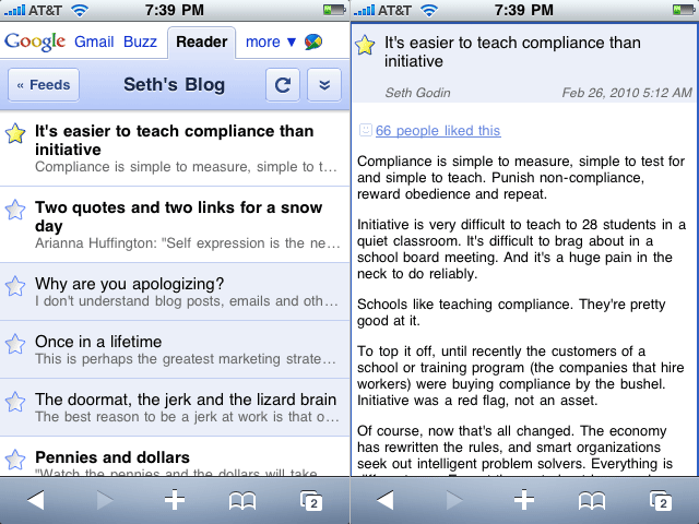
I spend a prodigious amount of time reading on my iPhone.
Half the apps on my iPhone’s Home screen alone involve reading as a predominant, if not exclusive, feature. Mail, Messages, Safari, Tweetie, Instapaper Pro, Simplenote, and Reeder: these are my most-used apps, and each one is used for reading in some way or another. And yet the app which serves no other purpose than to read, seems to be the most frustrating to use for said purpose.
- In Mail I read and reply.
- In Messages I read and text.
- In Safari I read and surf.
- In Tweetie I read and tweet.
- In Instapaper I read and drink coffee.
- In Simplenote I read and write and edit.
- In Reeder (or any other feed reader app, such as Byline, Fever, Google Reader, NetNewsWire, NewsRack, MobileRSS, etc.) I read.
The predicament with feed reading apps is most certainly not in the quantity of the selections; rather, the quality. This is not to say that most of the legitimate feed reading apps on the iPhone have not been developed with care — but as agents of delivery for my favorite authors, and as contrivances meant for enjoying lengthy bits of text, I prefer a simple app that does less and does it better.
In total fairness asking for the “best feed reader app” is like asking for the “best shirt”. Just as John Gruber so aptly laid out last April when writing on the the UI playground of Twitter clients. John said:
[D]ifferent people seek very different things from a Twitter client. TweetDeck, for example, is clearly about showing more at once. Tweetie is about showing less. That I prefer apps like Tweetie and Twitterrific doesn’t mean I think they’re better. There is so much variety because various clients are trying to do very different things. Asking for the “best Twitter client” is like asking for the “best shirt”.
It is my safe assumption that readers of this website also prefer apps which do less, but do it well. And so read on for a high-level look at some of the more popular iPhone feed readers, what I find good and not-so-good about them, and my suggestions for amelioration.
Reedie
As of this writing the iPhone App Store has nearly 4,000 apps in the News category. This is where all the RSS reading apps are listed. If you search for just “RSS” you’ll get over 700 results, or roughly 18% of the 4,000 news apps. Searching for “RSS Reader” nets you 203 results, and if you get even more specific and search for “Google Reader”, you get 50 apps.
But now compare this to the Social Networking category. It has 2,600 apps, and searching for “Twitter client” returns only about 65 results. There are over three times as many RSS reader apps than there are Twitter Clients in the App Store (based on search results).
Of the 4,000 news apps, the most downloaded are the dedicated apps provided by popular news sources such as the New York Times, USA TODAY, the Associated Press, NPR News, Wall Street Journal, and etc. The first RSS feed reading app you listed amongst the most popular News apps is “Free RSS Reader“; with NetNewsWire Free right on its heals. Surely “Free RSS Reader” is the most downloaded RSS reader by virtue of name alone.
In the most popular social networking apps, the first Twitter client listed is the free version of Twitteriffic. Over its life in the App Store it has received 139,000 reviews, mostly positive. Now compare that to Free RSS Reader which has about 17,000 reviews (mostly negative).
And thus we find a conundrum: the amount of RSS readers for the iPhone that of Twitter client apps, and yet the tables are turned when it comes to quality.
According to a small poll I conducted via Twitter, the app people spend the most amount of time reading from while on their iPhone is Instapaper, followed closely by Tweetie and then Mail.
Tweetie and Instapaper are two classy apps. They are easy to read from, easy to get around in, and a ton of fun. But tweeting and reading things later should not be the only place where all the action is. I would love to see a top-notch, Tweetie-level, RSS reader for the iPhone…
Reedie.
Why? Because when Tweetie 2 blew every other Twitter client out of the water it also sunk a few apps that were in a different part of the pool, and it’s time for a comeback.
There are tons of nerds who were using Twitter way before Ashton was and who have been riding the RSS train for years and years. And since nerds are the pickiest of all when it comes to usability and interface design, they are the ones most in need of a great feed reader app for their iPhone.
Secondly, what Twitter has done for Twitter clients, so has Google Reader done for feed reader apps. As Loren Brichter said during his interview with Macworld:
One of the fantastic things about Twitter clients is how easy it is for users to jump from one to another. Just type in a username and password and off you go. It’s possible for anyone to write a Twitter client nowadays and have the opportunity to completely blow everyone else out of the water.
Granted, the initial set up of a new Twitter account is really simple compared to the same for Google Reader. Twitter asks for your name, desired username, and password, and then you’re free to follow friends and strangers at will. A process significantly more straightforward than creating a Google account, activating Reader, and then finding and populating it with RSS and Atom feeds.
But the type of people that would use a feed reader (nerds!) are also the types of people who already have Google accounts (we’ve been beta testing Gmail since 2004), and who are even more likely to have an OPML file sitting around ready to be imported.
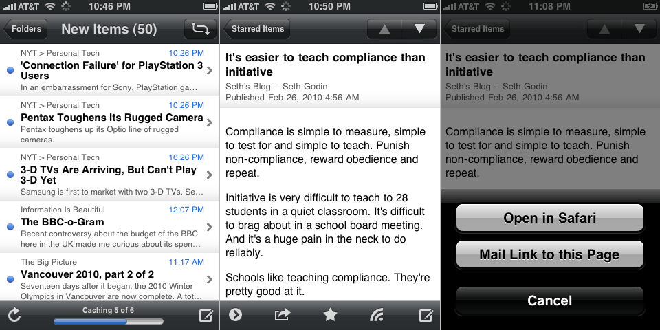
Google Reader (Mobile Web App)
The online RSS feed reader that took over the world. It was a big day when they began offering public APIs for developers to sync to and from G-Reader, and it was a smart move for NewsGator to abandon their home-brewed syncing platform to allow NetNewsWire (on desktop and iPhone) and FeedDemon to sync via Google Reader.
The mobile version of Google Reader is not too shabby. More than one well respected nerd uses it instead of any number of native iPhone apps which sync to it. And I actually prefer the mobile version over the full web version. However, the mobile version doesn’t support many of the favorite features found in a native iPhone app such as emailing articles and links, saving to Instapaper, and a few others. But it is a classy, speedy mobile web app. And it’s free. Hello.
Byline
Version 1.0 came out in July 2008. It cost a whopping $10 and sported a much more Mail-like UI. Three months later Milo release Byline 2. Then version 2.5 came out in July 2009, and now 3.0 is due for release soon (and will be free for existing users).
Version 3 will finally support Instapaper and Twitter, as well as a few other cool new features and UI refinements. But for the most part it will still look and feel just like the most current version. If you’re not already sold on Byline, version 3.0 will surely not be Just What You Always Wanted. But for the many, many fans of Byline that already exist this next release is sure to be a home run worth waiting for.
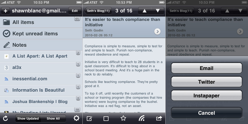
There’s quite a bit to like about Byline. For starters, it’s been around for nearly two years — it was one of the original iPhone feed reading apps and has continued to see forward movement. What makes Byline stand out is its caching of your feeds. If you do a lot of offline reading (or if you live in New York or San Francisco) a huge motivation to use Byline may be its ability to store the text and images of your feeds, as well as linked-to Web pages, right on your iPhone. It will also remember stars and unread/read state, and it all syncs back to Google Reader when you’re next online. (The 3.0 version will even have the ability to cache your feed content while the screen is locked.)
However, my biggest quibble with Byline is the GUI. I know that Milo has to develop graphics that look good on many different generations of iPhones and iPod touches, and that he is proud of the look and feel of his app. But in my opinion the heavy gradients used throughout the app are too much, and give an overall impression of immaturity to the app. If it’s not a delight to look at and read from, it’s less of a delight to use.
Since most people voted that if they were reading, chances are they were in Instapaper or Tweetie, I thought it would be interesting to contrast the heavy gradients used in Byline to the subtle gradients used in Tweetie to to the complete lack of gradients used in the iPhone’s Mail app:
(FYI: Even though Instapaper won the “most read from app” question, since it uses the same no-gradient design as Apple’s own Mail, I chose Mail for the comparison so as to have a native Apple app in the mix.)
NetNewsWire
Though NNW is arguably the best desktop RSS reader on the planet the iPhone version is not quite as mind blowing as its older brother.
NetNewsWire for iPhone is quick, reliable, and just the right balance of feature-richness versus simplicity. One of its most clever feature by far is the option to choose which feeds are downloaded and synced by your iPhone. Especially handy for those crazy folks that like to sit right in front of the RSS fire hydrant. However NNW feels more like a utility program built for accessing feeds, rather than a contrivance for enjoying them.
Mobile RSS Pro for Google RSS
Here is a clever app. Clearly the developers have put a ton of time and thought into this. And though a few of the features are simply re-works from some of Loren’s popular Tweetie 2 user interactions (such as swipe to reveal options below a listed item, and pulling down a list to refresh), they’ve got some additional great things going for them:
- MobileRSS Pro saves state perfectly (better than any of the feed readers listed here).
- It’s fast.
- It’s got a good-looking, ‘dark’ theme (it’s called “Black” but it’s actually blue).
- The way they implemented the unread badge count for each feed as a little tag that hangs over the edge of the feed list columns is very cute.
But despite all this, the app just doesn;t feel right due to a handful of little things which make it feel unbalanced:
- Such as the way my gmail account in shown large type at the top.
- The large vector icons for “All items”, etc., contrasted against the small favicons for the each feed.
- I only have one folder, and at the bottom of the root screen it says, “52 Feeds, 1 Folders” (oops).
- On the item view list of any given feed it has my gmail account name crammed into the back; arrow, with the title of the feed somewhat off center, and then a little “info circle” icon pushed to the right-hand side.
- It uses the familiar “share” / “export” icon at two different places in the app, yet for for two completely different things: (1) when viewing an individual article, tapping the icon brings up options to email the article’s link, save it to Instapaper, etc.; (2) when viewing an entire feed with its list of articles the same icon is there, and tapping it in this context gives you the options to sort by oldest/newest or to mark all as read.
With a little bit more polish and attention to detail, MobileRSS Pro could be a much more classy app.
Fever
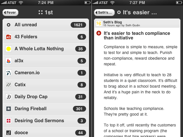
Shaun Inman’s Fever is the best dressed web-based feed reader out there. (I wrote about it at length when it first came out last June.) And the mobile-optimized version of Fever is just as great. It is a delight to use, easy to read from, and is always in sync with itself (duh!).
The downside to Fever’s mobile version is the same as any other mobile web app: no state saving, no caching for offline reading, and little to no sharing/saving features.
I stopped using Fever about four or five months ago when I took a break from RSS feeds all together. Through the holiday season I hardly ever checked my feeds. Similar to the olden days I would visit individual sites on occasion by typing the URL in by hand; and I was happy.
So happy in fact I decided to slash my OPML and only subscribe to that small handful of sites which have a history of enriching my day.
I wanted to keep Fever fully loaded so as to make use of the Hot list on occasion, but I didn’t want the bloat of loading all those feeds in a browser every time I wanted to check RSS. So about six weeks ago I came back to NetNewsWire on my desktop and populated it with only 25 time-worthy feeds.
Now, my current RSS setup is Reeder on my iPhone and NetNewsWire on my Mac — all synced via Google Reader.
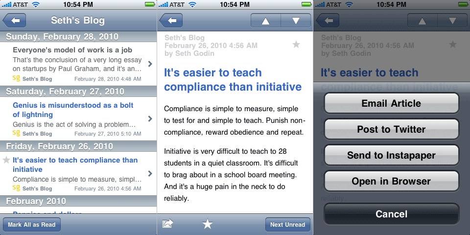
Reeder
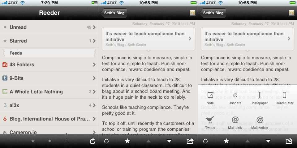
Reeder’s approach to their app design is brilliant. They’ve sought to bring back some of the nostalgia of reading while on a digital device by virtualizing the look and feel of an old, trusted book. And they did this without sacrificing the ‘touchability’ of a well-designed iPhone app.
The custom GUI goes beyond just the torn-paper markers and off-white background. The pop-up menu for sharing an item unique, being more akin to what you may see on Android OS instead of using the standard buttons on iPhone OS. And there are a few custom, intuitive swipe gestures which can be used to mark individual articles as read, unread, or starred.
In his review of Reeder on Download Squad, Nik Fletcher aptly wrote: “Reeder balances the familiar with custom elements, and as a result the interface looks great when browsing (and reading) content.”
So yes, Reeder is more unique than any of the aforementioned feed reading apps while still feeling familiar and friendly. It is by far the best feed reader app available in the App Store right now. Yet some of its cleverness feels too clever, and since Reeder is so close to being beyond great, its shortcomings seem so much shorter.
For instance, the status bar takeover is neat, but is it necessary? I find myself distracted by it every time open the app. It always makes me think of the stoplight countdown before a Super Mario Kart race begins: Beep. Beep. BEEEEEEEP!1
Secondly, the GUI is not contrasty enough. I love the texture and the vintage, off-white coloring, but it can be difficult to quickly see the difference between a read and an unread item, as well as the lighter colored text which makes it not quite as easy to read on. But this is a subtle quibble…
My primary gripe is the lack of saving state. Regardless of where you are in the app when you quit out of it you will always start back at the beginning when you re-launch it. Compare this against the convenience of state saving found in Instapaper. Instapaper actually saves two types of states: (1) those of individual articles: if you are reading an article and then return to the item list view, and then come back to that article later, it will open in the same place you left it; and (2) overall state: upon a re-launch of Instapaper you will always find it just as you left it.
Reedie
A good feed reader is quick, reliable, and readable. But a great feed reader has to be all of those and more. It has to be clever, very polished, and, of course, fun.
My ideal feed reader app would look like some sort of marriage between Tweetie 2, Instapaper, and Reeder. It would have the sounds and UI elegance of Tweetie 2, the typographic and state saving bliss of Instapaper,2 and the uniqueness of Reeder. (For bonus points it would swipe the swipe-top-navigation-bar-to-go-home feature from Tweetie 2.)
I don’t want another iPhone feed reader, I want a better one. Because apps like Tweetie, Twitteriffic, Birdhouse, and Birdfeed are all outstanding Twitter clients — each one is clever, polished, and fun. And who says feed reading can’t be as enjoyable as tweeting?
52 Weeks of UX →
“A discourse on the process of designing for real people.”
This relatively new weblog started by Joshua Brewer and Joshua Porter at the beginning of this year has some absolutely fantastic content, and, of course, a beautiful design. (I very much love the top navigation bar.)
You may want to start at week 1, where you’ll also find this gem of a quote: “You cannot not communicate. Every behaviour is a kind of communication. Because behaviour does not have a counterpart (there is no anti-behaviour), it is not possible not to communicate.†— Paul Watzlawick’s First Axiom of Communication
Behind the Scenes of Last Week’s Layer Tennis Match →
Khoi Vinh and Nicholas Felton’s blow-by-blow recap of their stellar, “exhibition” Layer Tennis match from last week.
Overcoming Creative Block →
Alex Cornell asked 25 creatives (including Nicolas Felton, Khoi Vinh, and Michael C. Place) what their strategies, tips, tricks, or musings were for overcoming creative block.
One of the best responses was by Chad Hagen:
Staying creative is hard work. Honestly, I don’t think when I got into art school I was very talented at all. I struggled to stand out. I struggled to stay in school. Staying creative was hard work. BUT, the one thing that kept me focused was my desire to be good. I wanted to be really good. I wanted to be as good as those people that WERE talented. I used to think I would eventually, if I worked hard enough, master art like a math equation and then I could relax and just make great stuff and let everything else follow. That time definitely never came, and I know now I never want it to, because the most important thing that keeps me creative is my wanting to be good. So if I’m ever in a rut, the best things to get me out of them is to put myself in places that engage that desire to be good. In a general sense this means to get out and be expose to others creating. In my opinion, there is no better way to trigger your own creativity, than to see what great things others have made or are making. Going to museums, galleries, shows, etc. always inspires my mind in a way that make me want to get back into my own work and make good things. Be good.
(Via Khoi.)
The 2009 Felton Report →
I highly recommend you order the 4-color, letterpressed, print version while you can. I’ve been getting these since the 2006 edition, and they’re always worth the few bucks.
What’s inside this year?
Each day in 2009, I asked every person with whom I had a meaningful encounter to submit a record of this meeting through an online survey. These reports form the heart of the 2009 Annual Report. From parents to old friends, to people I met for the first time, to my dentist — any time I felt that someone had discerned enough of my personality and activities, they were given a card with a URL and unique number to record their experience.
The Chiquita Banana Redesign →
What a clever and fun campaign. And don’t just skim the pictures, there’s a great interview with DJ Neff, the Creative and Art Director. (Via Neven.)
John Carey’s Most Excellent Photoblog →
In addition to subscribing to fiftyfootshadows.net, I also recommend that you: (a) download all of John’s desktop wallpapers; (b) set them to rotate every hour; and (c) enjoy.
What to Get for That Nerdy, Design-Savvy, Coffee-Loving, Snowboarding, Person in Your Life
Nerds are hard to shop for. We know precisely what we want, but we’re curiously passive about letting you know. Instead, we want you to know what we want without us having to say anything. Furthermore, the trick to being a great gift giver is to get someone the thing that they didn’t even know they wanted until they open it. Therefore, you’ll find below a list of gadgets, trinkets, and power tools.1
Except for that iPhone dock you see below, and the classic thermos, I own and use everything on this list. Each of these are great gifts, and I’d be proud to give any one of them to my other nerdy, design-savvy, coffee-loving, snowboarding friends or family members.
Nerdy

- Wooden Log iPhone Docking Station: $68
-
Twelve South BookArc: $50
-
Star Trek (2009 DVD): $21
-
Media Temple Web Hosting: $100
Design-Savvy

- Pilot 0.40mm Gel Pen: $16 / dozen
-
Gotham Typeface: $199
Coffee-Loving

- Chemex Coffee Maker and Filters: $50
Snowboarding

- Ride Concept Snowboard: $750
Miscellaneous Stocking Stuffers

-
J Crew Magic Wallet: $22
-
J Crew Argyle Socks: $15
-
Ticket to Ride: $38
-
WoodWick Candle: $15
- This list may also come in handy if you end up getting one of those Snuggie blankets with sleeves and after you’ve returned it don’t know where to spend the money. ↵