Fever Really is That Hot

Shaun Inman has taken the problem of individual RSS overload and solved it with a brilliant, beautiful web-based feed reader called Fever.

I had the honor of helping beta test Fever over the past year, and six months ago I actually switched away from NetNewsWire and now use Fever exclusively.

It really is that hot.

The reason I switched is because the selling point of Fever (subscribe to as many feeds as humanly possible, and never feel stressed about not being able to keep up with all of them) actually translated to my experience. Fever is much more than a good idea with a pretty face — Fever really works.

Up until now feed readers have pretty much had only one function, and that is to collect all your unread items. Which is why the only solution to feed-reader overload is to slash and hack your subscription list.

Naturally, Fever works splendidly as a standard feed reader. You can group and browse your feeds just like you always have. But it doesn’t stop there, and neither should you.

Suppose you want to simply check in quickly and see if anything new or exciting is going on. In any other reader you would have to scan through all your feeds, and mentally assess what’s going on. That’s a lot of thinking, and it certainly doesn’t happen quickly. Which is why people are constantly feeling the need to cut back on feeds.

Yet this is the main point of Fever.

As Shaun put it, “Fever takes the temperature of your slice of the web and shows you what’s hot.” Which means the more feeds you’re subscribed to, the better Fever works. Go nuts! Subscribe to as many feeds as you can.

All these extra feeds are called “Sparks”. Once you subscribe to them, you never have to look at them, sort through them, or worry about them again. But you DO get to use them to help keep your Hot tab alive and active.

It’s Hotter in a Site-Specific Browser

The way I check feeds in Fever is the same way I used to check feeds in NetNewsWire: using the arrow keys exclusively to find new articles, but reading the articles on their respective websites. This is why I prefer to run Fever in Fluid.

In Fluid’s preferences, under Behavior, I checked the box for links sent to default browser to open in the background. Since I like to read articles in their perspective author’s site, when I right-arrow out to an article or a link it then opens up in Safari, and in the background. Once I’ve opened up the small handful of things I want to read, I close Fever and begin reading.

If Fluid is opening an additional tab or window every time you arrow out to an article then go to Fever’s preferences (not Fluid’s), and de-select “open links in new window/tab”.

Hot Tips

  • Make sure you put the Feedlet into your browser’s bookmark bar. You can’t set Fever as your default RSS reader in Safari’s preferences, so clicking on the RSS icon in the Address Bar won’t subscribe you to the feed in Fever.
  • The main keyboard shortcuts I use are “a” (for marking an entire feed as read), and “s” (for saving an article). Fever has a slew of keyboard shortcuts; you can find them in Fever’s main menu.
  • Selecting “Show Unread” from the menu, or pressing “u”, will show you only the feeds that actually have unread items in them. Removing the clutter of lots of feeds that have old articles you already read last month.
  • Though the iPhone interface of Fever is extremely slick, it can get a bit borked when you visit a webpage. A quick tilt of the phone to change the orientation will fix it.
  • Fever installs automatically, and its updates are pushed automatically (not unlike WordPress’ in-app update feature).
  • In Fluid’s General Preferences I’ve checked to show the dock badge. This way you can see your unread count in the dock (assuming you want to).

If you need some help getting Fever populated, here is my current OPML file, which includes about 200 feeds altogether.

More Reviews

This is just one of a handful of winded and entertaining software reviews.

Fever Really is That Hot

Sweet Mac Setup: Shaun Inman

Shaun Inman’s jaw-dropping web-design skills, mind-boggling web-development skills, and really awesome name, all set him apart as a man who needs no introduction.

Shaun’s Setup:

1. What does your desk look like?

Shaun Inman's Sweet Mac Setup

Shaun Inman's Sweet Mac Setup

2. What is your current Mac setup?

I currently use a 2.33 GHz Intel Core 2 Duo MacBook Pro purchased at the end of 2006 as my primary machine. It’s maxed out at 3 GB of RAM.

Connected are a Microsoft Intellimouse Explorer 3.0, the full-size aluminum keyboard, a 20″ aluminum Apple LCD, the Bose Companion 3 speaker system, an original iSight, the Samson C01U USB Studio Condenser Microphone and the M-Audio 61-key USB keyboard.

3. Why are you using this setup?

I do a fare bit of travel and prior to this laptop I used a G5 at home and an iBook on the road. I just got tired of syncing before and after trips. The Intellimouse is the perfect fit for my hand; the copy/paste/back/forward buttons seem to have been designed with my thumb specifically in mind. The new Apple keyboards are equally delightful to use. The rest I neither love nor hate; they just get the job done.

4. What software do you use on a daily basis, and for what do you use it?

No real surprises here. I use the following on a daily basis:

  • Quicksilver strictly as an application launcher
  • Mail for all my passive aggressive needs
  • TextMate for code wrangling
  • Photoshop CS 3 for pixel pushing (anti-aliased or otherise)
  • Transmit for breaking things on live servers in real-time
  • BBEdit 8.2.6 for its Find and Replace with support for regular expressions and Find Differences
  • Safari for Twitter, Shortwave, Fever, Mint and Google
  • MAMP for local development

Frequently if not daily:

  • GarageBand for music composition and recording
  • Terminal for really breaking things on live servers in real-time

5. Do you own any other Mac gear?

Wi-fi is provided by an Airport Extreme. I’ve also hooked up the old G5 to the flat-screen in the family room. I picked up a cheap PlayStation-to-USB adaptor and setup ControllerMate to control the Finder, DVD Player, VLC and a number of emulators (NES, SNES, Gameboy Advance and PlayStation). I also have a jail-broken iPhone (for my carrier, not the apps).

6. Do you have any future upgrades planned?

Of course! In the next month or so I’m planning on picking up a new MacBook Pro and a Wacom Cintiq 12WX. Also, since my iPhone is jailbroken I’m planning on picking up an iPod touch as an easier-to-maintain development device.

More Sweet Setups

Shaun’s setup is just one in a series of Sweet Mac Setups.

Sweet Mac Setup: Shaun Inman

Sweet Mac Setup: Jon Hicks

For years John Hicks has been a top-shelf new-fangled media designer. He currently works for Opera Software and publishes the Rissington Podcast.

Jon’s Setup:

1. What does your desk look like?

Jon Hicks Mac Setup

2. What is your current Mac setup?

I have a unibody MacBook Pro (2.5ghz, 4gb RAM, 300gb HD) which is hooked up to one of the new 24″ LED Cinema Displays, with Apple keyboard and Logitech Revolution MX mouse. Backups are done onto a 1tb Western Digital MyBook, and online with Dropbox (see below).

3. Why are you using this setup?

I work in many locations aside the office — home, trips to Opera in Norway or Sweden, and we often spend around 6 weeks a year up in Glasgow. Working from a MacBook Pro means I always have my files and setup with me. Years ago I used to sync a PowerBook and G5 twice a day, and it became too tedious.

4. What software do you use on a daily basis, and for what do you use it?

Dropbox is my hero. I keep all my work in a Dropbox folder, so that I not only get an online backup, but also easy versioning. Once I forgot my Macbook Pro, and thanks to Dropbox, I was able to work from another machine.

Quicksilver, Main Menu, Caffeine, and BusySync are my favourite ‘blend in so much I take them for granted’ apps.

For work I use Fireworks, Coda, VMWare, xScope, IconBuilder, Candybar, Illustrator, LittleSnapper, CSS Edit and Leap. I’m also a Yojimbo lover for storing everything else.

5. Do you own any other Mac gear?

I still own a 1st generation MacBook Pro, as well as a last generation G4 Powerbook and 1st generation Titanium Powerbook. The Titanium is held together by stickers (I lost all the screws), and the stickers help prevent electric shocks from the coating that has been rubbed away on the top!

6. Do you have any future upgrades planned?

Having got recent upgrades: new MacBook Pro and LED Display, not much. But I do plan on getting a 32gb iPhone 3G S when it comes out! I held back from upgrading to the second version (3G), as I really wanted a better camera and much more storage space, which the 3G S has. Weird name though.

More Sweet Setups

Jon’s setup is just one in a series of Sweet Mac Setups.

Sweet Mac Setup: Jon Hicks

Sweet Mac Setup: Scott McNulty

Scott McNulty is a senior contributor to MacUser, a frequent Macworld contributor, and co-host of Fork You. He is also the author of ‘Building a WordPress Blog People Want to Read,’ which is best enjoyed when bought in multiples.

Scott’s Setup:

1. What does your setup look like?

Scott McNulty's Sweet Mac Setup

2. What is your current Mac setup?

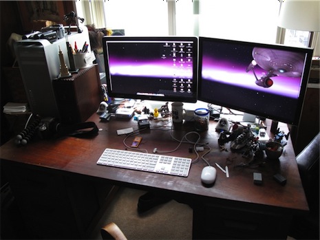
I have a dual 3.2 GHz Quad-Care Intel Xeon Mac Pro with 16 gigs of RAM, 3 internal hard drives (the stock 500 gig HD, and 2 1 TB Western Digital HDs that I added later), and the ATI Radeon HD 4870 Graphics card. Oh, and the Mac Pro has two SuperDrives for some reason (I bought it at an Apple Retail Store, and they only stock the low end Mac Pro or the high end Mac Pro… guess which one I bought).

Attached to the Mac Pro I have:

One of these cameras is usually attached to the Mac Pro as well:

I might have a technology problem.

3. Why are you using this setup?

Generally I’m using my Mac to do one of three things: read, write, or edit video (see? There’s a reason I have this ridiculous computer… so I can buy more cameras!). Clearly, video editing on this machine is a pleasure: lots of RAM and two monitors really make a difference (my previous machine was a MacBook Pro, which was great but the Mac Pro is sooo much faster at encoding video it isn’t even funny).

I would recommend that if you can afford to get yourself two monitors you should do it. I know some people think that it is overkill, but trust me once you use a dual monitor setup (whether it is using an external monitor with a laptop, or using two monitors in general) you’ll never want to go back. I couldn’t use my LED Cinema Display with the Mac Pro for a few months because it didn’t have a Mini DisplayPort and I really missed that extra real estate for writing or watching video (luckily Apple came out with the ATI Radeon HD 4870 Graphics card upgrade which sports a DVI connector and a Mini DisplayPort, exactly what I needed).

There are some who say, “Scott, do you REALLY need this much computer just to blog?” To those people I say, “Mind your own darn business! And how did you get into my apartment?” Clearly I have no need for this much Mac, but when it was time for me to get a new Mac I realized that I had never owned a Mac Pro. I felt it was my duty as a highly respected Mac pundit to experience the Mac Pro for myself.

4. What software do you use on a daily basis, and for what do you use it?

Here are all the apps I use on a regular basis:

  • Butler: Without this app I wouldn’t even know how to use my Mac. Once it became clear that QuickSilver development was slowing down I went on the look out for a replacement app launcher/Swiss Army Knife of Awesome for my Mac. I tried a bunch of the apps out there and fell in love with Butler (how can you not want to have a little icon wearing a bowler hat in your Menu Bar? I mean really.).
  • Camino: Safari is great and all, but Camino is my true browser love. I don’t use any FireFox extensions so Camino offers me the one thing I want from FireFox: the rendering engine. I must admit that Safari 4, top tabs and all, is slowly wooing me from Camino.
  • TextMate: I’m typing up this very document with TextMate. I write a lot, and most of that writing is done in TextMate (usually using MarkDown).
  • Scrivener: As of late people have started asking me to write books (I’m as shocked as you are) and Scrivener is my go to text application for large writing projects. It is an outliner, a word processor, and a note keeping application all rolled into one great package. I can’t imagine writing a book without it.
  • MarsEdit: I use this for all my personal blogging. I’ve been using it forever.
  • NetNewsWire: Speaking of apps I’ve been using forever, I’ve been a happy NNW user for a long, long time. At the moment I have a little over 600 feeds in it, and it never bats an eyelash.
  • Final Cut Pro: I have a silly little video podcast that I co-host and edit. All the editing happens in Final Cut Pro (though I could probably use the latest version of Final Cut Express for what I’m doing).
  • iTunes: This one must be on everyone’s list.
  • Skitch: I take a lot of screenshots of various things and I haven’t found an app that make it easier than Skitch.
  • Acorn: I do lots of small edits in Skitch, but when I need to do something major I launch Acorn. It is perfect for what I need, and so much easier to use than Photoshop for a graphic design novice, like myself.
  • iPhoto with FlickrExport: I’m not a very good photographer, but I do enjoy taking pictures. iPhoto organizes them, and the great plugin FlickrExport makes it super easy to upload all my crappy pictures to Flickr.
  • ClipStart: ClipStart is a young application, but it is to video what iPhoto is to pictures. Since I have all those video cameras I have lots of random video clips cluttering up my Mac. ClipStart gives me an organized view into that video chaos and an easy way to upload random videos to Flickr from time to time.
  • Tweetie: I think it is the law that Mac geeks must use the Twitter, and if you’re going to use a desktop app for Twitter than Tweetie is the best at the moment.
  • 1Password + Dropbox: For a long time everyone raved about 1Password, and I just didn’t get it. Then I found out about its keyboard shortcuts and paired it with Dropbox (so all the logins for all the Web sites I use are available on any Mac I have) and I was in love. 1Password as truly improved my computing experience, and it is rare that you come across an app that you can say that about.

5. Do you own any other Mac gear?

I have an AirPort Express somewhere in my apartment (it is so small!) and a first generation 1TB Time Capsule that both my Mac Pro and my fiance Marisa’s MacBook back up to.

There’s a 40 gig Apple TV in our living room that we use to stream music to and to watch the occasional movie trailer (when we have parties it comes in handy to have a picture slideshow and play music. That impresses people for some reason).

I, of course, have an iPhone 3G (black, 8 gigs), an 80 gig iPod, and a 16 gig iPod nano (orange because Marisa said orange best matched my personality, whatever that means). I also have a G4 Cube sitting on an end table looking cool (it still works, I just have no reason to actually run it).

6. Do you have any future upgrades planned?

I tell ya, just knowing that my Mac Pro supports 32 gigs of RAM and I only have 16 in there sometimes makes me think… but then I realize I hardly have a need for 16 so I really shouldn’t double it for no good reason (though it would be totally awesome, right?). I’m very happy with my current setup, and spent the money on my Mac Pro with the idea that it would last me a few years at the very least.

More Sweet Setups

Scott’s setup is just one in a series of Sweet Mac Setups.

Sweet Mac Setup: Scott McNulty

Sweet Mac Setup: Christina Warren

Christina Warren is the assistant lead blogger for both The Unofficial Apple Weblog, and Download Squad. Though she went to film school, and is known on Twitter as @film_girl, her passion really is writing, and it shows.

Christina’s Setup:

1. What does your desk look like?

Christina Warren's Sweet Mac Setup

Christina Warren's Sweet Mac Setup

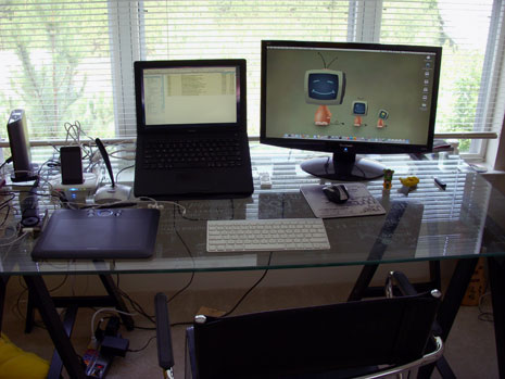
2. What is your current Mac setup?

I have a Black MacBook (August 2007, so it’s the mid-2007 revision), 2.16 Core 2 Duo, with 4 GB of RAM (only 3.3 is really usable, but whatever) and a 160 GB internal hard drive. I have that paired with a 22″ widescreen ViewSonic monitor (and incidentally, I would NOT recommend the monitor or ViewSonic, as after only six months I’m getting major backlight fluctuation and stuck pixels and will have to send it off for repair, I think I’ll replace it with an HP 22 or 23″ widescreen monitor and then use the ViewSonic as a TV).

I use an Apple Wireless keyboard (the super-hot aluminum version) and a Microsoft Bluetooth Notebook mouse when I’m connected to my desk (75% of the time) and the regular MacBook mouse/trackpad when I’m mobile.

I have a 750 GB Seagate external (USB 2.0) drive connected when I’m at my desk, and probably close to a terabyte in other FireWire and USB 2.0 drives that I have laying around my insanely messy office.

When recording Podcasts (like TUAW’s Talkcast or The Flickcast), I use a USB Logitech AK5370, which is cheap, but effective. I had a 4 speaker creative surround sound setup, but in my new office, they don’t quite work so I’m looking at some attractive replacements.

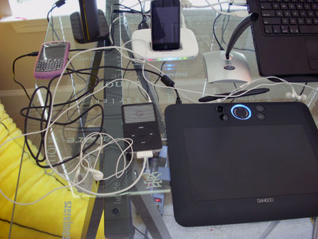
I have a Wacom Bamboo Fun (the medium size) for Photoshop and Illustrator work, and I love it. I also have a 32 GB iPod touch 2G and a 60 GB black iPod 5G. My fiance recently replaced the battery in my old-school 40 GB iPod 3G, so that’s around somewhere too.

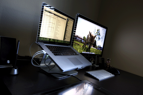
I display my MacBook on the Logitech Alto Express laptop stand. For anyone who is looking for an inexpensive laptop stand (you won’t get the wired ports or add-ons like with the Alto Connect), look at the getting the Alto Express. I got mine for like $12 shipped from Amazon.com (and this was NEW) and it has been fantastic. In fact, my fiance bought three more so that he could have one at work and two in his office at home.

Oh, and I have a BlackBerry Curve. But I hate it it (used to love it), so let’s not talk about it.

3. Why are you using this setup?

The MacBook has been a great primary computer, handling everything I’ve thrown at it and then some. Sure, doing high-end Motion work is out, but that’s not what I do. Having the second monitor has really opened up how I’m able to interact and work with my applications. I almost always have my e-mail (Apple Mail) open on the MacBook and then I do my work on the secondary monitor.

The MacBook keyboard is the best laptop keyboard I’ve ever used, so the Apple Wireless keyboard is a great way to bring that experience without having to be confined to the MacBook itself. Plus, since I’m using a Logitech Alto Express stand to display my MacBook at an angle, the keyboard is really a necessity.

4. What software do you use on a daily basis, and for what do you use it?

Web browsers go without saying, but I generally use Safari 4 Beta when I can. There are often situations where I have to use Firefox 3.10 (I was using FF 3.5 beta but it was still too incompatible with some of the plugins I explicitly use Firefox FOR, so that was scrapped), but I still prefer Safari.

NetNewsWire is my hands-down, favorite RSS reader. I prefer Newsgator to Google Reader and use Newsgator Mobile on my BlackBerry (the one good app on the thing), so NetNewsWire is the perfect facilitator of all my feed reading needs. I write about fashion, web technologies, film and everything Apple, so my newsreader is my productivity savior and also my productivity killer.

Since I primarily work as a freelance writer, Mail.app, Word and TextMate are some of my most heavily used applications. Some of my freelance work requires that I send articles via *.doc, and Word 2008 is the best way to do that. I have and love Pages ’09, but when it comes down to it, Word is often the easiest to use, especially when commenting and editing files. I use Google Apps to run the mail servers for my domains but use Mail.app as my mail application because I just don’t like to use a web-based client if I can help it.

Since a lot of the writing I do is online, I can technically do most of my posting via a CMS, but I’m REALLY not a fan of web-based editing systems. They are clunky, prone to bugs, and oftentimes the TinyMCE or fsckeditor implementations don’t work well with Mac browsers. For my personal blog, I use MarsEdit, which is just a fantastic tool. For my work with TUAW and DownloadSquad, I use TextMate. What makes TextMate special is its extensibility, especially when it comes to bundles. My fellow TUAW Blogger, Brett Terpstra, is a super-genius (seriously) and he created a Bundle package for TextMate that allows us to craft posts in amazing ways. It supports Multi-Markdown, in-line tagging based on TUAW’s tags, etc. And the best part is, he created a script that will auto-fill the web-based text window with the properly formatted HTML from TextMate. It’s a brilliant workaround to a system with very limited XML-RPC support.

I use Real Mac Software’s LittleSnapper for most of my screenshot needs — although sometimes that’s supplemented by Snapz Pro X or Skitch. I love LittleSnapper because it makes it easy to make edits, organize screenshots for galleries (something that I do a lot of) and most importantly, grabbing full-page webpage snaps.

When I’m not writing, I like to play around with web design and development. For that, I use Panic’s Coda and Macrabbit’s CSSEdit. For non-development based file transfer or for interacting with Amazon S3, I use Panic’s Transmit.

For design work, I use Adobe Photoshop CS4 and Illustrator CS4. I wasn’t exactly thrilled with CS3 (especially after having to buy it TWICE in four months — long story), but I think CS4 has made lots of improvements, and I actually like the one-window workflow option.

For photo editing, I switch off between Apple’s Aperture and Adobe’s Lightroom. While trying to make some corrections to the photos I took of my office, I was reminded why Aperture still doesn’t do it for me and why Lightroom is almost the tool I want to use. I still find nuances between the two, which means maintaining two separate identical libraries and using them for different things. That’s a pain. Fortunately I don’t deal with RAW images very often and mostly just color-correct snapshots I take with my Nikon S51 pocket digital.

When I’m reviewing Windows or Linux stuff for DownloadSquad, I use VMWare’s Fusion 2.0. I also have, and enjoy, Parallels for Mac 4.0, but Fusion is my go-to choice. I did have a problem a few months back with getting Fusion to recognize a Windows 7 disk image to install locally while I was at a training seminar held by Microsoft, and Parallels recognized it (the same image worked fine on an external drive), so I keep both around.

5. Do you own any other Mac gear?

My fiance has a White MacBook (almost the same specs as mine, except his is late-2007, so he has a slightly faster processor, the better integrated Intel graphics and the ability to actually use 4 GB of RAM). He also has a white 40 GB iPod 5G.

An Airport Extreme router (model before the new dual-channel). We have it paired with an old-ass D-Link 802.11g router, thus achieving dual-channel goodness.

We have an Apple TV (which we modded with boxee, of course), that we LOVE. I recently got the new in-ear Apple earphones with microphone, and have enjoyed them. I just hope they don’t break down like the lesser-quality first version of the in-ear headphones did.

Over the years I’ve had truckload of iPods (10 GB 2G, 30 GB 3G, 40 GB 3G, 2 20 GB 4Gs, the black 60 GB 5G, a blue Nano 2G that was stolen when Grant got his car repaired, and now the iPod touch 2G).

6. Do you have any future upgrades planned?

Right now I’m really debating about getting a new Mac Mini to replace the Apple TV in the living room (it would go in the bedroom) to act as a full home-media center PC. We have FreeNAS running on an old box in Grant’s office and because it is BSD based, it interacts great with the Mac. We have Boxee and XBMC connected to serve content off of it, but I’d like to have the ability to play back higher-bitrate MKV files too.

My laptop will be two years old in August, and while I don’t “NEED” a new machine, I’m thinking about getting either a 24″ iMac to become my main machine in my office (still connected to a second monitor) or getting a Unibody MacBook Pro. I’d be just as happy with the Unibody MacBook, but I need FireWire for my occasional DV and HDV editing.

Additionally, despite my longstanding hatred of AT&T, I’ve pretty much realized I’ll be going to an iPhone when the new models are released.

More Sweet Setups

Christina’s setup is just one in a series of Sweet Mac Setups.

Sweet Mac Setup: Christina Warren

The Sweet Mac Setup Series: Mark Jardine

Kicking off the Sweet Mac Setup series is Mark Jardine. Mark is the painfully talented designer for the indie iPhone software company, Tapbots.

This post marks the first in what will soon become a long and glorious tradition of posts, geeking out over how other people set up their workspace and what software and hardware they use.

Mark’s Setup:

1. What does your desk look like?

Mark Jardine Mac Setup

Mark Jardine Mac Setup

2. What is your current Mac setup?

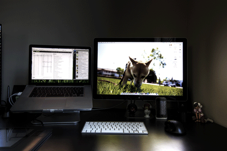
  • 15″ 2.8ghz Unibody Macbook Pro (with a 500gb 7200rpm HD)
  • 24″ Apple LED Cinema Display
  • Apple Aluminum Bluetooth Keyboard
  • Logitech MX 1000 Mouse (I love the mighty mouse, but after going through 4 of them with broken scroll balls, it’s just time to move on)

Related Gear:

  • Wacom Cintiq 12wx (really only use it for drawing)
  • FW800 Drobo (for archiving older data)
  • 1TB Dualband Time Capsule (daily backups of all the macs in the house)
  • Logitech Z-2300 THX 2.1 Speakers
  • Canon Pixma Pro 9000 Printer (for printing some of my photos)
  • Colorvision Spyder 2 Pro (monitor calibration tool)

3. Why are you using this setup?

Laptop: For the longest time, I’ve had a desktop computer as my workhorse and a laptop for portability. Keeping data in sync was always the biggest problem. Where do you keep your iTunes and iPhoto Library? .Mac Sync and Drop Box helped, but it was still a pain. With the specs on my current laptop, I don’t really need a desktop anymore. There’s plenty of power and space to do whatever needs to be done. There are rare occasions when more ram or an 8-core processor system would be nice, but having a second computer isn’t quite worth the headache or money to me. Nothing beats being able to just unplug my laptop from my desk, throw it in my bag, and continue working at a coffee shop.

LED Display: The main reason I moved to this display is because of it’s integration with the unibody macbooks. The built-in display port and mag-safe adapters are extremely convenient for me. I used to hate glossy displays and they can be annoying when there’s a bright light source behind you, but I’ve learned to love the new LED cinema displays.

4. What software do you use on a daily basis, and for what do you use it?

I use Safari, Mail, iChat, iTunes and iCal daily, but I’m sure most people do as well so I won’t say more than that. Here are some other apps I have running almost everyday:

  • NetNewsWire: I rely heavily on RSS for news and reading blogs. I’ve bought 4-5 RSS readers, but always come back to NNW. Sync and the built-in Webkit are probably why.
  • The Hit List: I manage my life and projects with this app. Omnifocus was too much, Things was not enough. The Hit List is the perfect balance of power, simplicity, and beauty. It doesn’t have an iPhone companion yet, but it’s so good I don’t mind waiting for it.
  • Tweetie: This is my twitter desktop client of choice. I have a few issues with Tweetie on the mac, but it’s still the best (IMO) so I’ll stick with it until something better comes along.
  • LittleSnapper: I’ve been collecting screen captures of anything inspiring, memorable, or noteworthy for months in LittleSnapper. It’s effortless and one of these days I will thank myself for doing it.
  • Photoshop: Ah, the work horse. There’s so much I hate about photoshop, yet it’s probably the most important application I own. I use it for 90% of my design and illustrative work.
  • Textmate: I own almost every major plain text editor on the mac including BBEdit, Coda, SubEthaEdit, and Espresso, but I always return to Textmate. I use it to code websites, edit plain text docs, and many times just to write.
  • Dropbox: Dropbox was a lifesaver when I used multiple macs. It kept all my important files in sync between my desktop and laptop. Even though I only use one computer, I keep it around as a 2nd (remote) backup for all of my work files.

5. Do you own any other Mac gear?

  • iPhone 3G (my daily device)
  • iPod Touch (for testing apps on future OS builds)
  • 120gb iPod Classic (for the car)
  • Apple TV

6. Do you have any future upgrades planned?

I usually replace my computer every 1-2 years depending on how significant the update is. However laptops these days are pretty powerful for 95% of the work I need to do. I’ve been really happy with mine, especially after upgrading to the 500gb hard drive. More ram (4gb is not enough for all the apps I like to run concurrently) and a beefier GPU (better performance in Aperture) would be nice, but I’m not complaining. So my answer is no, I don’t have any plans to upgrade at the moment.

More Sweet Setups

Mark’s setup is just one in a series of Sweet Mac Setups.

The Sweet Mac Setup Series: Mark Jardine

The Ideal iPhone

Last summer, when iPhone 3G was announced, I took future Sean’s advice and did not upgrade.

Happily, I stuck with my 1st-generation iPhone. Most of all because of the design of the 3G’s shell and the boosted cost of AT&T’s monthly plan for 3G customers. Even in the midst of reviews and testimonies about how much the speed of 3G smokes that of EDGE, my ignorance has been bliss. And to date, I have been happy to compromise cellular network speed for the sake of a better form factor and a tighter budget.

Another reason I held out last summer was in anticipation of the 3rd generation iPhone that is now just around the corner. Leap-frogging iPhone upgrades makes sense for two reasons: First is Apple’s subscription-based accounting for iPhone sales. This means they report the income for that phone sale as spread evenly across two years (or eight quarters), and is why iPhone owners get free software upgrades. When the two years are passed, iPhone owners will (presumably) have to begin paying for software upgrades, just like iPod Touch owners.

Secondly, when you sign up for, or renew a 2-year contract with AT&T you get to pay the subsidized cost ($199 / $299) of your new iPhone. If you purchased an iPhone without signing up for a new contract, or were to upgrade while still in the middle of your current contract you would have to pay full price for the phone ($599 / $699). Meaning, if you were to buy the latest iPhone every single year, you would only be able to pay the cheaper, advertised price every-other time, with the rest of the upgrades being at full price.

All that to say, it’s been two years and there is a new phone and a new OS on the horizon.

Below is an unordered list of the features and upgrades that would either (a) bring me the most joy, or (b) relieve me of the most irritation. My ideal iPhone, if you will. Some of these were already announced at Apple’s March 17 event as part of the 3.0 OS. The rest are rumors or simply my own pipe dreams.

  • A Faster Processor and More RAM: Primarily for the sake of quicker app launching and faster web page loading. But also for the sake of less frequent “sticky keyboard” situations.John Gruber’s commentary on the processor is that the boost in speed and memory will make the phone feel more like you are switching between apps rather than quitting one and launching another.

    That is quite a difference indeed. Think of how quick it is to switch from one open app to another on Mac OS; it is significantly faster than launching a new app. I am so used to the 5–10 seconds of wait-time for an app to load on iPhone that I can’t imagine such a significant boost in performance. If those rumors are true, I may actually have time to call people back.

  • A Hardware Design Based on the Original Metal Shell: As mentioned earlier, I do not like the 3G’s shell. It’s not necessarily ugly, but it certainly is not as attractive as the metal-cased design of the original iPhone.Even though the 3G feels better, with its less-slippery back which contours to fit the hand, it also feels cheeper with that fingerprint-hungry plastic case. And that thicker frame around the screen really irks me.

    Who knows why Apple redesigned the iPhone shell. Perhaps to cut their costs, perhaps to help users keep it in their hand better (the original iPhone sure is a slippery little sucker), or perhaps it’s because of all the new 3G and GPS technology that’s in there.

    Interestingly, if you compare original industrial design of the iPhone to the rest of Apple’s current product line, you find many similarities. The new MacBook and MacBook Pro lineup, the new LED Cinema Displays, and the new iMacs all have designs which include a brushed aluminum shell, a glass display, and elements of black plastic… Just like the original iPhone.

  • A More Intuitive / Less Annoying Auto-Caps Feature: I don’t know how many times I’ve mistyped a password because of annoying auto-capitalization function. Although the automatic engagement of the shift button is 90% correct, the 10% time that it is not really irks me.
  • A Native Tip Calculator: Just kidding.
  • Not All Glass is Created Equal: After twelve months of use, my first iPhone still had no scratches. When that one began to act wonky during a trip to DC, a Mac Genius replaced it for me. But after less than nine months of use with this second phone, it already has a decent amount of scratches (not too bad, but bad enough in the right light). I assume this is not so much an issue related to the overall hardware design as much as it is simply the luck of the draw.
  • MMS: Not so much a feature I want, as much as it is a feature my friends want. They are dying for me to be able to take pictures of funny things and send them via text message along with witty and hilarious commentary. Apple has taken what my friends want, and added even more functionality. In addition to photos, the new messages app will support the sharing of audio, contacts, and even locations.Unfortunately, due to hardware restrictions, the MMS functionality won’t be available on the original iPhone.
  • An Easier Way to Add a New Phone Number While Talking On The Phone: On my old Motorola, if you were talking to someone on the phone and punched in a number, it would get saved automatically as a note (or something).On the iPhone, if your having a phone conversation and you need to save a number to your phone there is no easy way to go about it. If you tap the number onto the phone’s numeric keypad you’ll lose the digits once you hang up. If you type it into the Notes app, you still have to remember it in order to dial and call the number.

    If you want to type the new number into your phone and have it easily accessible after you hang up, then you are in for a long and awkward conversation:

    “Oh, you’ve got the number ready? Hold on, let me tap to the contacts app. OK, just a second now. Let me open a new contact. OK, now let me tap in their first name, OK, last name, OK. Let’s see… tap on ‘Mobile’… Alright. Now, what is the number? Yep. Uh-hu. OK, Great! Now wait. Just another second here. Let me save this… Aaaaaaaand, got it! Thanks. Yep. Oh, and tell your mom I said ‘hi’, too.

    This could easily be solved if the numeric keypad kept any numbers punched into it, rather than clearing them once you hang up.

  • Search and Spotlight: Not only is an in-app search function going to be added to MobileMail, Messages, Calendar, iPod, and Notes, but a system-wide search engine, called Spotlight, will be added as well. Spotlight will sit as the left-most home screen, and is marked with a clever magnafying glass icon, rather than the standard little white dot.From the Spotlight screen you can search your whole iPhone — including contacts, emails, notes, songs, videos, apps, calendar appointments, and more. A much easier way to launch an app that’s buried on screen 10, or to quickly find someone’s cell phone number to give to your friend.

Thoughts on the Additional Features (Official or Rumored) of the 3rd Generation iPhone and the 3.0 OS Which I’m Not Totally Geeking Out Over

The irony isn’t lost on me that what may be the most sought-after new features to the next generation iPhone and the 3.0 OS are also the features that I am looking forward to the least. Not to say that these aren’t great new additions that I am excited about, but I have gotten on fine without them so far.

  • Notes Sync: In theory I love the idea of being able to sync notes with my laptop, but in reality, how helpful will it actually be?I am curious what app in OS X the notes will show up in? Will they sync as rich text files into a pre-designated folder? as some sort of message in Mail, alongside to-do items and RSS feeds? or something else altogether? And what about people running Windows?

    My guess is that synced notes will show up in the iTunes library alongside Music, Movies, Applications, etc. But if so, will they be editable? Because right now the content in the iTunes library is read only.

  • A Video-Capable Camera: Considering that I am just now regularly taking pictures with my iPhone, a video camera doesn’t fully light me up.
  • Cut, Copy, and Paste: Though I have no doubt that once in use I will wonder how I ever lived without it, this unordered-list mention is already more thought than I’ve given to the feature in the past two years.
  • The Landscape Mode and Keyboard in Primary Apps: In addition to MobileSafari, the ability to read and type text in landscape mode will be added to MobileMail, Notes, and the Messages App. In just a short amount of time we will be putting our previous type-speed tests to shame, and wondering how we ever lived with just the portrait-mode keyboard for so long.
  • More Storage: Without trying, my 8GB iPhone currently has just barely over 7GB worth of music, photos and apps. My point being, I’m not dying for more storage. However, a bigger hard drive will certainly be a welcomed addition when it comes to voice memos and (rumored) video recording capabilities.

Still Amazing

It is notable that after two entire years on the open market, iPhone continues to be, by far, the most advanced, responsive and beautiful mobile touch-screen device and software available. It is one thing for iPhone and iPhone OS to have been as ground-breaking and incredible as they were in 2007 when they debuted. But to still have that edge two years later? That’s amazing.

The Ideal iPhone

Josephine

Two years ago this afternoon, my Grandma Blanc passed away.

Josephine was 94 years old when she died. My 98-year-old grandpa, Louie, was there by her side, grieving at the loss of his life-long love, but deeply grateful that he was able to be with her all the way to the end.

Her funeral was a few days later. Over 200 people came from our small town of Castle Rock, Colorado to celebrate, laugh, and cry with us as we shared stories about my grandmother.

When Josephine was just 11 years old, her mom died giving birth to her younger sister. Four years later her father left them during the great depression, leaving my 15-year-old grandmother to take care of all her siblings. She always said it was the power of positive thinking and prayer that kept her going; she took charge and never looked back — raising a legacy and a very tight-nit family.

At the funeral, as we read through her memoirs, we came across her “values” — the things she tried to live by. They were short phrases: Be the first to say hello; Compliment three people every day; Live beneath your means; Let the first thing you say brighten everyone’s day; Don’t put off to tomorrow what you can do today; Always think the best of other people.

As I heard them, I realized just how much her prayers and her positive thinking really had influenced and affected our entire family. She was an amazing woman.

Josephine

A Broad Array of iPhone Keyboards

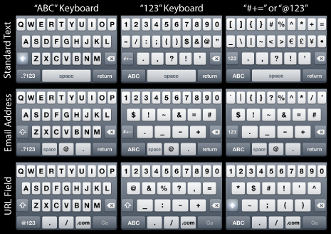
iPhone keyboard layouts come in threes.

Regardless of where you are entering text, there are almost always three different keyboards available to you. Each one with unique characters. But not all these keyboards are created equal — their contents and design usually change based on the type of the input field you are entering text into.

The three basic classifications of keyboards are:

  • The “ABC” Keyboard: The first keyboard you’re presented with when the keyboard slides up. You can only toggle to the “123” keyboard from here.
  • The “123” Keyboard: Contains numbers and common characters, and can be toggled to via the ABC keyboard.
  • The “#+=” or “@123” or other Keyboard: Contains additional, and less-common characters not found on the “123” keyboard, and sometimes contains numbers as well. It can only be toggled to via the “123” keyboard, but from here you can toggle back to the “123” or the “ABC” keyboard.

Depending on which type of input field you are entering text into — and which app that input field is in — the contents, and in some cases even the design, of the three keyboard layouts vary compared to another type of input field.

Most of the iPhone keyboards are very similar in their layout and contents, with only slight changes to their design or contents for the sake of the input field’s context. Added up, there are 12 unique keyboard layouts.1

Additionally there is the landscape keyboard, which is currently available only in Mobile Safari.2 The landscape keyboard has the same character placements as the vertical keyboard in Mobile Safari, but is 160 pixels wider since the phone has to be held sideways to use it. Meaing, its contents are the same, but its design is different (wider).

Adding in these six unique layouts of the landscape keyboard, iPhone has 18 unique keyboards as part of its native OS.

Below is a small and brief chart of the 9 most common keyboards. Click on the image for a full-size PDF of all 18 keyboards.

There are 18 unique keyboard layouts in iPhone OS 2.1.2


  1. Since the iPhone SDK allows for some customization of the keyboard, there are 3rd-party apps that use customized keyboards.
  2. iPhone OS 3.0 anticipates adding the landscape keyboard to additional apps, such as Mail and Notes.
A Broad Array of iPhone Keyboards

A Brief Comparison of Font and Background Colors Rendered Across Major Browsers in Mac OS X

There is an unfortunate side-effect to Websites that sport light text on a dark backgrounds: in general, the light-on-dark font appears as more bold than its dark-on-light counterpart.

The truth is, it is not actually more bold (in terms of the actual number of pixels that make up the stroke width), it simply appears more bold due to the anti-aliasing of the font by the browser and operating system.

It is easy to notice Web fonts rendering differently on different operating systems. But, fonts also render differently in different browsers, even within the same operating system.

There are three things I want to look at regarding font and background coloring, and how it renders in various browsers in Mac OS X.

First of all, we’ll compare the way dark text on a light background looks in a browser next to light text on a dark background in the same browser. Secondly, we’ll compare the rendering (anti-aliasing) of the text in various rendering engines. And finally, for fun, we’ll look at the un-expected differences in kerning.

Color Comparisons

The screenshots below are taken from each of the major Web browsers for Mac OS X.1 Firefox and Camino both use Mozilla’s Gecko rendering engine, Safari uses Webkit, and Opera uses Presto.

On the left side the background color is #a0a08b, and the font color is #393831. The right side is the flip-flopped style of that — background: #393831; color: #a0a08b; — and is the same styling as this website. The large, serif font is 16px Times New Roman (this site’s h1 tag) and the smaller sans-serif is 11px Lucida Grande (this site’s default body font).

Safari 4 Public Beta

Safari 4: Screenshot of Reversed Colors

Firefox 3.0.6

Firefox 3: Screenshot of Reversed Colors

Camino 1.6.7

Camino: Screenshot of Reversed Colors

Opera 9.64

Opera 9: Screenshot of Reversed Colors

At first glance, it is easy to spot how the dark text on light background appears less bold than the light text on the dark background. Especially in Times New Roman. Regardless of which browser is rendering the font, comparing and contrasting the stroke of the letters between light and dark you can see how the dark letters on the light background appear thinner, sharper, and better rendered.

Also worth noting before moving on is that the two Gecko-run browsers (Firefox and Camino) render both the light text on dark and the dark text on light thinner than Safari or Opera do.

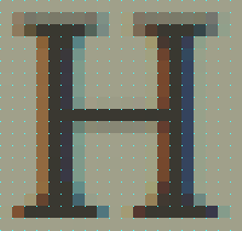
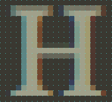
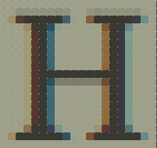
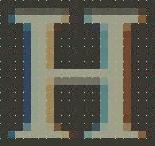
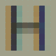
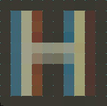
The main contributing factor to a font appearing as more or less bold is the color of the pixels that make up the stroke width. You’ll notice in the screenshots below, that the stroke for the leg of the “H” set in Times New Roman is five pixels wide. You have to look closely to count all five pixels of the H set on a light background, whereas you can easily see the five pixels of the light H on the dark background.

Browser-Specific Display of Pixel Colors Within the Stroke

As visible from the previous screenshots, when it comes to stroke width, the four browsers end up boiling down into two: Safari and Firefox.

Since Safari and Opera rendered identicaly in this comparison, I removed Opera. Firefox and Camino both use Gecko and they render identical to one another, so I removed Camino. This is convenient for the comparisons, because Safari and Firefox are the two most common browsers used in Mac OS X.

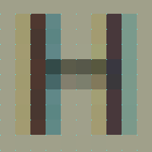
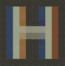
When looking at the below letters zoomed in, not only does it become clear as to why one color combination appears thinner than another, but it is fascinating to study the pixel-by-pixel differences between the colors and the strokes.

For example, compare how the Times New Roman “H” renders on the dark-background in Safari versus Firefox. In Safari, there is one pixel of space between the inside of the top and bottom serifs. However, in Firefox, they actually — though barely — touch.

Safari vs Firefox Rendering of Times New Roman at 1,100% (The cyan dots mark the pixel grid)

Safari 4 Beta

font: Times New Roman;
background: #a0a08b;
color: #393831;

Times New Roman: dark text on a light background

Safari 4 Beta

font: Times New Roman;
background: #393831;
color: #a0a08b;

Times New Roman: light text on a dark background

Firefox 3

font: Times New Roman;
background: #a0a08b;
color: #393831;

Firefox: dark text on a light background

Firefox 3

font: Times New Roman;
background: #393831;
color: #a0a08b;

Firefox: light text on a dark background

Safari vs Firefox Rendering of Lucida Grande at 2,250% (Again, The cyan dots mark the pixel grid)

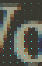
Similar to the H set in Times New Roman, you can easily see how the anti-aliasing of this H set in Lucida Grande differs in contrast depending on the color it is placed on.

Safari 4 Beta

font: Lucida Grande;
background: #a0a08b;
color: #393831;

Safari: dark text on a light background

Safari 4 Beta

font: Lucida Grande;
background: #393831;
color: #a0a08b;

Safari: light text on a dark background

Firefox 3

font: Lucida Grande;
background: #a0a08b;
color: #393831;

Firefox: dark text on a light background

Firefox 3

font: Lucida Grande;
background: #393831;
color: #a0a08b;

Firefox: light text on a dark background

Kerning

A final point of nerdery: beyond anti-aliasing differences, each browser also has its own opinion for kerning as well.

It is most noticeable between the “W” and the “o” in “World” for the font Times New Roman:

Safari, Camino, and Opera

X-Height = 13px
Kerning = 4px
W and O kerning in Safari

Firefox 3

X-height = 13px
Kerning = 1px
W and O kerning in Firefix

And the Point is?

Not only does anti-aliasing vary based on operating systems, monitors and which fonts you’re rendering, it also can change based on the rendering engine of the browser you’re using to view the Web page. But, in general, RGB anti-aliasing of dark fonts on light backgrounds appear as more crisp than for light fonts on dark backgrounds.


  1. Originally I included screenshots from Safari 3 and Firefox 2, since they are still in wide circulation. But they rendered identical to their more-recent-version counterparts, and there comes a point where “thorough” crosses the line and becomes “too much information”.
A Brief Comparison of Font and Background Colors Rendered Across Major Browsers in Mac OS X

A Shave and a Haircut

Sometimes a little design element on your own site pops out to you as suddenly being not quite right. And from that moment forward it’s as if your site has a huge zit right on its nose, and everyone is staring at it, unable to see anything else, anxiously waiting for you to pop it already.

For the past few months I was seriously considering a complete redesign of shawnblanc.net. When I finally sat down to begin the project I decided against a total re-do from the inside out, and went for a bold but familiar realign instead.

The Header

The idea to pull the header down was originally inspired by Phu Ly’s WordPress theme, Ambiru. That theme is now 3 years old, and I’ve always admired it. My thoughts to go with a tall header were encouraged even more by the fantastic designs of A Working Library and Designing The News.

My initial Photoshop mockups were with a shorter, 235-pixels tall, header. (235 pixels being one-half the measurement of the text column.) But I didn’t like that height. It felt as if it was reaching for something unique and bold but not quite landing it.

When I launched the design on Monday morning, the header was 350 pixels tall. I liked how bold and un-apologetic that size was. Not only did it look particularly great in a large browser window, but even those viewers with the shortest browser-window height of 410 pixels (according to my Mint stats), could still see the first post’s heading.

However, after letting it sit for a few hours and then coming back and staring at it, I got to thinking about those 350 pixels; that perhaps they were, in fact, a bit too much. As if they made the statement that the header was the most important element on the website — which it’s not. I then dropped it to 313 pixels (two-thirds of the text column’s width) but it still felt like too much.

The header is now 300 pixels tall, and, like Goldilocks’ 3rd bowl of porridge, is just right. Though 300 pixels does not fall onto the grid of the site, the baseline of the masthead and navigation menu sits at 255 pixels from the top, which is one-third the site’s total width of 766 pixels.

The header has been, by far, the primary topic of feedback; a lot of people like it, but a lot don’t. I wonder how much the power of suggestion influenced their opinions? My previous post which announced the new design was titled “A Very Tall Header”. What if instead the post had been titled “Finally, Some White Space and Breathing Room”? Perhaps the negative response would have been less? Who knows? Nevertheless, the negative feedback about the header has ceased. Perhaps shrinking to 300 pixels tall was all that was needed.

Ultimately, what I like most about the header is that it’s so big it’s polarizing. It is such a stand-out design element that people seem to either really love it or really not. And I’m o.k. with that because, like it or not, the thing has personality. And that is precisely what I wanted.

Color and Texture

As mentioned earlier, for a long time I considered a total overhaul of the site, which would have meant taking it to a dark on light color scheme with serif body text. The colors and fonts that people like Sean Sperte, Pat Dryburgh, Mandy Brown or Daniel Mall use on their sites kept teasing me to abandon the current branding of shawnblanc.net for something on the opposite side of the spectrum…

But I just couldn’t do it.

This site is nearly two years old, and even though I had the itch for something totally new with this refresh, I felt that keeping the visual familiarity was important for two reasons:

First of all, when you read someone’s site you are imagining their voice. Not only is that voice influenced by the style of their writing, but also by the design of the site itself. Drastically changing the colors and fonts of a site can have serious impact on the reader’s pre-established and familiar voice of your site.

Secondly, not everyone subscribes to a site the first time they visit. It could be months or years in-between visits, and most likely not by the same channels. Having a familiar element is, in my mind, crucial to a visitor thinking “Hey… I’ve been here before. This site must be pretty amazing; I think I’ll subscribe.” 1

What I did do to improve readability was take the texture that used to sit behind the content and move it into the header. I then made the header a little darker, and lightened up the background color for the main content.

Here is a side-by-side comparison of the same text with the previous, darker background on the left and the new, lighter background on the right:

Background Colors: side-by-side comparison

An Aside Regarding Fonts

One negative about light text on a dark background is that, in general, the font weight often appears to be more bold. It is not actually bold, but the color-contrast as the stroke blends into the background is more harsh with a light-colored font on a dark background than the opposite.

Compare these two screenshots of the same title, in the same font family and size, but on flip-flopped color schemes. The darker letters on the right look thinner:

Hello World! Side by side.

Looking at this cross-section of the “H” from the “Hello” zoomed in to 1120%, and comparing the stroke width, you can see how the darker colored letter blends into its light background much quicker, giving the appearance of a thinner stroke, though in reality the light and dark legs are both 5 pixels wide.

The Letter H cross cut

Styling of Links

Continuing on the issue of color: I got a couple questions regarding my rhyme and reasoning behind the seemingly sporadic styling of links.

If you count them up, there are about 10 uses for links on this site — each one with a unique placement and/or styling. But I see them all as just two types of links: expected or unexpected.

Links such as the navigation bar, the article titles, the word “Permalink” at the bottom-right of a post on the index page, and others are expected — the reader sees that word and they don’t need it to be orange to tell them it’s a link. Simply due to its context on this site and the consistency of the web, the reader is rightly and easily able to identify it as a link.

Since the orange is such a bold color (and too much of a good thing can spoil it), expected links, when in their un-active state, are the standard body-text color. Hover over those links and you’ll see the orange right away — proving your assumption was right.

Those links that are unexpected — such as words in the middle of a paragraph — need to be highlighted and styled so the reader knows they are links. Welcome to web-design 101. No further explanation needed.

And why the inconsistency between underlined and not underlined? That comes down to my personal taste. You’ll notice that only links in body text are underlined. I think the underline looks great there but not in the sidebar or footer (where I think it looks cramped). Thus, for the sake of design rather than consistency, not all links are underlined.

The Sidebar

A primary goal of the realign was to clean up and simplify the sidebar without loosing any of the elements in the process.

The previous sidebar’s contents were center-aligned. Though it looked good by itself, when looked at in context to the whole site it felt, to me, that the contents were floating and cluttered rather than securely and carefully placed. Left-aligning the sidebar helps the contents feel more secure.

Shrinking the sidebar from 232 pixels wide to a more slender 219 not only tightens the whole thing up, but also gives some additional breathing room between the left edge of the sidebar and the right edge of the content.

The “Get the Best RSS Feed Known to Man” button has been removed and replaced with a simple “RSS” link in the navigation menu. I am banking on the fact that those who want to subscribe to this site’s RSS feed don’t need me to remind them by placing a big button in their path. If they don’t already have a bookmarklet set to add a site’s feed to their reader, they are using a browser that identifies and provides a link to the site’s RSS feed right in the address bar.

I will admit that I was a fan of that button. It, too, had personality. It will be interesting to compare RSS readership growth over the next few months and see if it’s effected or not. My guess is it won’t be.

The previous sidebar had two typographic images highlighting some quality archives. In the original mock-ups I toyed with some new revisions of those designs, but I couldn’t land a concept that I liked. I still wanted a way to point people to some of the quality articles I’ve published here over the years, but I didn’t want to simply post a list of articles right in the sidebar. So I decided to try the route of a Popular Articles page. Unfortunately those are quite common and not always viewed as exciting or interesting.

Ironically, the content on my 404 page is specifically built for the uncertain, first-time visitor. (Though I will admit it still needs some help.) And being challenged to check out a 404 page is much more intriguing than a popular articles page any day.

However, I have a feeling that there is still a better solution out there, I just don’t know what it is. Reworking the 404 page? Making a dedicated “favorites” page after all? Something else all together? I’m not sure at the moment.

An Element of Style

Link posts now no longer have a dash after the title. My original intention for doing that was to help distinguish the title of a link post from the commentary underneath it, and to set it apart as being its very own post title, and not just a link that is part of the previous article.

But I learned that the dash after the title is poor form. And more than that, I don’t think it’s necessary. The link-post title is clearly identifiable as-is. I should have stopped doing it a while ago, but just never did.
  1. And then there are those who, like Cameron Hunt, are so fantastic and speedy at website design that they post re-designs, not articles, to keep their sites fresh.
A Shave and a Haircut

A Very Tall Header

Shawnblanc.net got realigned over the weekend and now sports a somewhat new look.

The site still feels familiar since the colors, fonts, and general layout have hardly changed. A few areas have been polished (specifically: the sidebar and the navigation), while the most noticeable change is obviously the very tall header (I figured go big or go home).

If you’re in your feed reader, please come over and check things out.

If you see something that looks busted, please let me know. And for those who look forward to geeking out on the what-and-why details of the realign, I will have a post up in the near future.

A Very Tall Header

Happy Monday

Monday mornings may be the best time to publish a new article. Everyone is getting into their weekly routine, and checking up on their feeds to see what’s new. That’s why feeds stats are always highest for Mondays.

This, in fact, is one reason I often publish my longer articles on Monday mornings: it’s the “prime-time” of blog reading. Well, that, and I usually do my writing on the weekends.

As many of you are checking your feeds I simply want to say that I hope you have a good day. I don’t know what you have planned for the day, but I will be in meetings, catching up on email, and finalizing a report. (It sounds less exciting than it actually is.) I spend my day with incredible people at an incredible ministry, and I love my job very much — especially when there’s a hot americano next to my keyboard.

Have a happy Monday, friends.

&mdash Shawn

Happy Monday