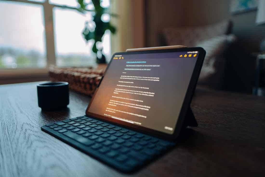
The 6am writing timeblock has been working well for me.
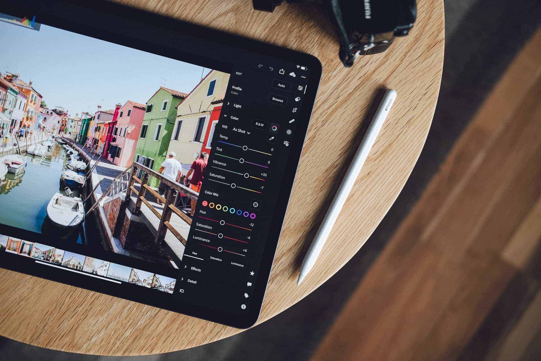
As I shared in my previous post, I have recently begun getting up around 6am to spend the first hour of my day writing in the kitchen with a cup of coffee, my iPad, and Ulysses.
By 7:15 all the boys are up, and so we have breakfast with the family.
Then, I head down to my home office around 8:30 to do more work. Followed by a workout before lunch. And then a few more hours of work before wrapping up around 4pm or so.
As I wrote a few weeks ago, this is a new writing routine for me that came out of my need to re-evaluate how I’ve been spending my work days.
I will admit that I fell out of this early morning writing routine a little bit last week because it was our sabbatical week. Last week I let myself sleep in that extra hour instead of getting up early to write, and I let myself stay up a bit later to do some woodworking in the garage — building a beautiful Quarantine Coffee Table that I will never forget.
But this morning… I was back at my early morning writing. And this time I had a new typing tool at my fingertips!
My iPad Magic keyboard arrived late last week.
On Thursday evening, to be exact. While I was out with my boys to get curbside pickup of BBQ from our favorite spot: Joe’s KC.
(Let’s just say that when we got back with our BBQ dinner ready to eat and I discovered an iPad Magic Keyboard sitting on the front porch ready to be unboxed… it was a dilemma. But I was hungry and so I was somehow able to let the keyboard wait until after the boys had gone to bed.)
Anyway…
Long-time readers of this website may be all-too familiar with some of my previous in-depth, winded, opinionated, articles about keyboards.
I love a good keyboard. And I love my iPad.
So you’d think that if Apple came out with an amazing keyboard for the iPad, it’d be my New Favorite Thing.
Well. I’m not entirely sure if it is my New Favorite Thing or not.
I’ve read the Magic Keyboard reviews. Watched the videos. And I have loved reading everyone’s opinion about this thing, because it’s a HUGE step forward for Apple (and the iPad) on many, many levels.
In 2018 we got the epic reinvention of the iPad Pro, followed by iPadOS in 2019, followed by amazing trackpad support last month, followed by this Magic Keyboard…
Apple is saying over and over again that the iPad has a bright, professional, awesome future.
But as for me and this Magic Keyboard…
I’m still not sure if I like it. Or, at least, I’m not sure how much I like it for day to day use around my house an in my home office.
But don’t read into things too much. Really. I’m 50/50 on this… it’s too early to tell.
Because I also have to say that now that I’ve been using the Magic Keyboard for several days I’m not sure I could go back to that Smart Keyboard Folio.
Today I spent just about my entire workday working from just the iPad and the Magic Keyboard. (Usually I spend about half my day on the iMac and half my day with the iPad.)
And the typing experience on the Magic Keyboard is far superior to that of the Smart Keyboard. I mean, of course it is. This is a real keyboard. With backlights. And it’s not some plastic-wrapped thingamajig. But with my 11-inch iPad, the keyboard does feel more cramped. I have typos galore, and I am having a hard time adjusting to the way that the iPad itself sort-of blocks access to the top row of number keys.
And the trackpad. This. This thing is quikly becoming so nice and useful and something I may never be able to go back to even though it is still early adoption within iPadOS and many of the apps. (Things 3 in particular really shines with it’s keyboard and trackpad support.)
I know there are many more iPad apps that will be supporting trackpad and keyboard support. And I bet we’re going to see an increase in professional-grade apps as well. So that’s another way this keyboard will be improving the iPad experience.
Down the road when our lives begin to return to some sort of normal, and travel is something that we can do again, the iPad Magic Keyboard will be the ideal travel accessory for the iPad Pro.
But for now, it’s stuck with me here at home. And I have more thoughts and specifics that I may get into later about exactly how this Magic Keyboard works for me at home.
But! At the very least, this keyboard will be my new 6am writing companion.
And if it can help me write and create more on a daily basis then that is a huge win.