Simplenote is a note-taking app for your iPhone and iPad that syncs with the Web. It is the sort of app adored by those who pride themselves in their use of beautiful and uncomplicated software.
It is also an app for people with ideas. It’s for those who need some way to jot an idea down, build on it, and refine it until they’re sick and tired of it; regardless of where they are or if they brought their laptop.
As a writer, Simplenote could very well be your principal writing app. It has a straightforward design that makes it effortless to use. In Simplenote there is no text formatting, it’s just plain. There is no document titling — when you create a new note, the first line is the title. There is no saving a note — you just write and your note is backed up in real time, and even synced with any other other devices you use: iPad, iPhone, and Mac.
This humble application began a few years ago in response to two big needs of iPhone users: (1) the need for a notes app that synced over-the-air; and (2) the need for a notes app that didn’t use Marker Felt.
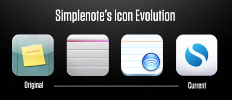
In some respects the app has barely changed since 2008. In fact, arguably the most obvious changes have been to the icon. The original icon was as a yellow sticky note taped to the front of a locker. That changed into a grey note card resembling a garage door, which then changed to a white notecard with a blue wi-fi bubble, which changed again to what you see today.

To say the app has barely changed since 2008 is, of course, not to say that Simplenote is the same as it was two years ago. It has been refined, polished, and updated with taste. Only a handful of new features and UI improvements have been added over the years, with many of the most notable changes just recently emerging in version 3.
Compare for a moment Simplenote to Apple’s two text and note-taking apps for the iPad, Pages and Notes. Pages was one of the first apps I bought for my iPad. It was touted as having most of the features of Pages for Mac, but on the iPad. For me, after a bit of use, Pages was quickly relegated to nothing but a full-screen typing app. It is a great showcase for what sort of apps the iPad is capable of running, and for those who need to edit Pages documents on their iPad it is a necessity. But it is somewhat difficult to get documents in and out, and the document syncing process is flat out ridiculous.
Notes is Apple’s other in-house note taking app. It ships with iOS and is quite simple (in fact, much of the foundational user experience that Simplenote has is parallel with the built-in Notes app). As it is with Pages, the biggest downfall with Apple’s built-in Notes app is, again, sync. Though the system for syncing in Notes is better than in Pages (your notes sync into your IMAP email account), nobody I know actually uses the IMAP sync.
The Simplenote developers actually beat Apple at their own game. They made an app with a better design (Helvetica!), better functionality (over-the-air sync), and they proved that less (compared to Pages) is, in fact, more.
Version 3
The latest update to Simplenote sports a slew of new toys. But, as Charlie Sorrel said in his review on Wired, “if you don’t want them, you won’t even notice.”
The most notable for me is the full-screen writing environment on the iPad app. When writing on the iPad I prefer to use Simplenote. But at times, I may want to see just the page with no list of notes next to it. Up until now, I would copy my text out of Simplenote and paste it into Pages. But now there is a subtle, full-screen button at the bottom-right corner of your note — tap that and Pages on the iPad all but becomes obsolete.

Perhaps the most clever of the new features is sharing notes with others. When in a note, tap the icon that resembles a phone with an arrow pointing out. From there you can enable note sharing and email the person whom you want to share with. This is a great way to empower team collaboration and keeping others in the loop with information and ideas.
One of the many thing I keep in Simplenote is meeting agendas — especially talking points for 1:1s. Now for my 1:1s I can share those talking points in a note with the other person I’m meeting. This way he or she can see what’s on the docket, and even add items of their own. Furthermore, with the addition of version history, we can drill down within the same note to see what last week’s agenda items were.
Additional cleverness comes in to play here: if my friend doesn’t have Simplenote installed then I’m going to bug him to get it. And I’m going to bug him to use it so that our collaborating is actually useful. Which means not only is sharing notes useful and helpful for users like me, it is indirectly word-of-mouth marketing for the Simplenote crew. Nicely done.
This is just one example of how the more you use Simplenote the more you find new ways you to use it. People are using it for recipes, ideas, lists, blog posts, chapters of books they’re writing, and more. And for all those power users who are finding themselves with a list of notes longer than there arm, a way to organize may be in order. But a folder structure could slightly hurt the simplicity of Simplenote. Tags on the other hand are a great way to add structuring to your notes if you want.
And one way that I see tags as coming in especially handy is in regard to the aforementioned shared notes feature. Since Simplenote does not label who is sharing a note with you, you can tag that note using their name. Which means someone you’re sharing a lot of docs with, you can see them all at once using a tag filter.
What’s in my Simplenote?

So what do I actually have in my Simplenote at this moment? All sorts of things. Some are notes of importance which I want synced on all my devices. Others are completely trivial and are in Simplenote by sheer virtue of it being my note taking app of choice.
- Meeting agendas and talking points: mostly for upcoming 1:1s. These meetings are usually informal and quick. And, in fact, the very point of a 1:1 meeting is so the two of you only have to connect and meet once a week — saving all your conversation topics for that one meeting. Being able to jot down questions, ideas, and the like using Simplenote has long been my workflow.
-
Ideas for businesses, software projects, and other things.
-
A list of gift ideas for friends and family.
-
Blog posts in all stages: I usually write them in Simplenote or Notational Velocity, and finish them in MarsEdit.
-
Recipes: well, actually only one recipe: Grilled Artichoke with golden mustard dipping sauce.
-
Reminders of things to order next time I’m at a restaurant I don’t regularly visit.
-
And other simple notes: such as cool quotes, shopping lists, miscellaneous data, and the like.
For a wider look at what is in other people’s Simplenote, check out Patrick’s community listing on Minimal Mac.
Other Reviews
If you liked this review of Simplenote, there are more like it here.

