A Brief Review of the Keychron Bluetooth Mechanical Keyboard for iPad

bluetooth mechanical keyboard for iPad

Last fall I helped Kickstart a new mechanical, bluetooth keyboard for my iPad: The Keychron. A few weeks ago it arrived at my house.

I’ve been a mechanical keyboard nerd for the better part of a decade now, using one clickety keyboard or another with my Mac since 2012. Now that I use the iPad for a significant amount of my work — especially my daily writing and editing — I’ve been considering a more fancy external keyboard for it as well. Because why not?

For about two years now I have simply been using the Smart Keyboard Cover (both with the 9.7” iPad Pro, then the 10.5”, and now the 11”). It is not a great keyboard by any means; but it’s been fine for me and I love the simplicity of just having it right there ready to go anytime I grab my iPad.

But when I saw the Keychron on Kickstarter, I thought it would be worth backing. While I don’t want to carry a keyboard with me when I’m out and about or traveling with the iPad. But I do like the idea of having a nicer keyboard at my home for the times when I’m using the iPad for writing while at my desk (such as at this very moment).
bluetooth mechanical keyboard for iPad

And so, what initially piqued my interest with the Keychron keyboard was that:

  • It has mechanical switches
  • It has LED backlighting for the keys
  • It’s Bluetooth
  • It has a dedicated Siri button.

In a moment I’ll share more about each of the above items.

Overall the Keychron looks beautiful. It’s a very clean, sleek, well designed keyboard.

Mechanical Switches

The Keychron uses low-profile blue switches. They are nice. While they are a bit less tactile they are also much quieter than my Filco Ninja with it’s Cherry MX blues, that’s for sure.

Typing on the keyboard feels like something right in the middle between my Cherry MX switches (which are big and bold) and the current bluetooth keyboards that Apple sells (which are thin and quiet).
bluetooth mechanical keyboard for iPad

LED Backlit Keys

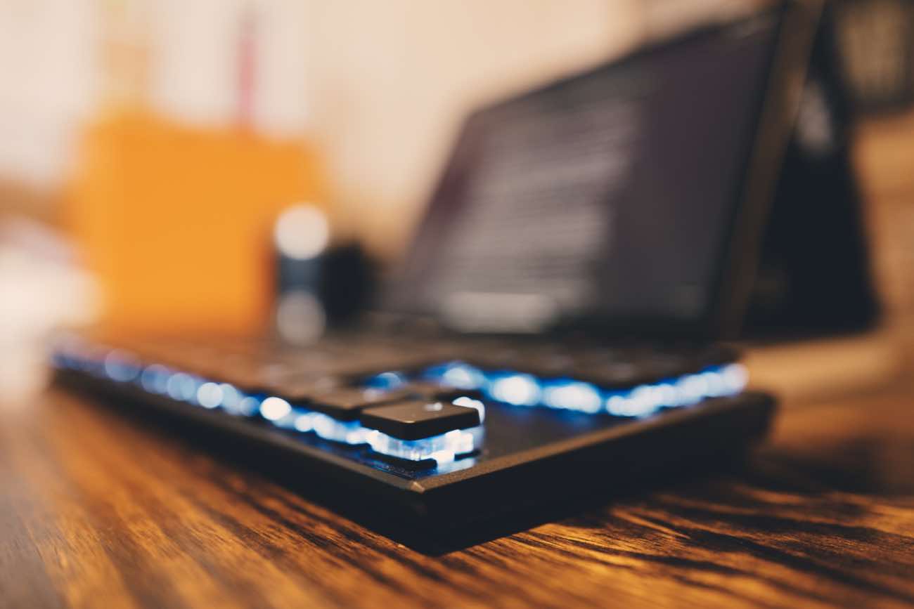
Another delightful feature of the Keychron is that each key is individually backlit. I opted for the simple blueish-white LEDs you see above, but there was also an option for full RGB colors which I did not get. I don’t want my keyboard to be a disco holiday light show, I just want it to be backlit.

Anything which hinders the writing process is no good. Anything which aids is most welcome.

There is an LED “Light mode” toggle button. But, oddly and nonsensically, it sits just to the left of the arrow keys.

This keyboard takes it’s light modes a bit too seriously.

The first few days I had this keyboard I accidentally toggled the light mode about every 100 words. Which is not great.

There are 10 different LED settings. Nine of which are some sort of fancy, wildly-distracting, party trick of light dancing around underneath the keys.

Which means that if you accidentally hit the light switch on the keyboard, suddenly the LEDs are bouncing around and flickering. And since there are about 10 different settings, you have to hit the button 10 more times to get back to where you were.

Bluetooth

Another selling point for me with the Keychron is that it’s bluetooth. Moreover, you can pair it with up to 3 differnet computers / devices. And you can then switch between those devices using the keyboard. Pretty clever.

It also has a USB-C connection that it uses for charging and connecting directly to a computer if you don’t want to use Bluetooth.

But for some reason, the USB-C to USB-C cable I use to charge my iPad doesn’t work as a way to wire the Keyboard to the iPad. I can connect the Keychron using my USB-C to USB-A adapter that I bought from Apple.

So, to reiterate the awkward and nerdy wired configuration: Even though the iPad and the Keyboard both have USB-C ports, I have to use a USB-C to USB-A cable and then plug that in to with a USB-A to USC-C adapter. And the adapter has to be plugged into the iPad. If it’s the other way around, it doesn’t work.

Also worth noting is that the iPad will charge the keyboard’s battery when the two are connected via USB.

Siri

On my iPad I use both Spotlight and “Text to Siri” as a sort of quick-action, keyboard shortcut workflow.

Having the ability to bring up the Text to Siri interface without having to press and hold the power button on the side of the iPad makes things much nicer.

Alas, on the Keychron, the Siri button is Mac-only. This is a huge bummer and I wish they would have been more clear / upfront about it on their Kickstarter page as I thought the Siri button would be able to bring up Siri on iOS as well.

A Brief Aside About Propping Up the iPad In Order to See the Screen While Typing on an External Keyboard

Sigh.

Apple’s Smart Keyboard cover (which I use and have attached to my iPad 90% of the time) will only prop up the iPad when it’s in the keyboard orientation. You cannot prop up the new iPads Pro in “media mode” the way you could with the previous generations and their Keyboard Cover.

Thus, for me to use an external keyboard like the Keychron along with the iPad means I have to have the keyboard portion of the keyboard cover sprawled out, sitting in front of the iPad and just behind the bluetooth keyboard. Ugh.

Now, I’m not a victim here; there are some workarounds for this. I could buy an iPad stand (the Twelve South Compass is awesome). Or I could also buy another case that lets you prop up the iPad, and then use that case when I’m using the external keyboard.

There’s also a partial workaround using the keyboard case I already have, but it only works if the iPad is on a rough-ish surface. You can flip the keyboard cover around like an “A Frame” and prop the iPad up that way. But on my desk, it just wants to slide open.
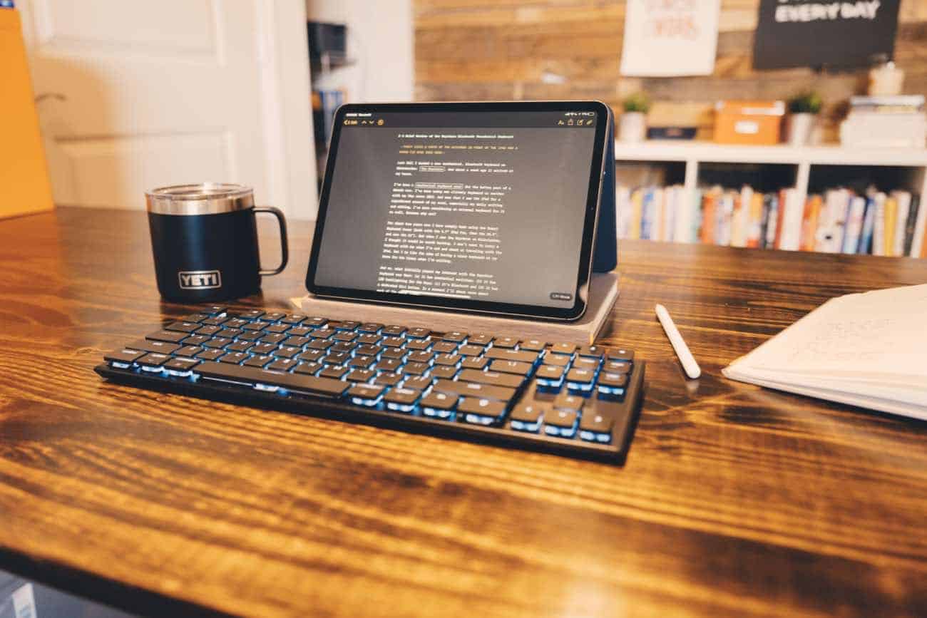
As you may have noticed from the photograph at the top of this article, my current solution has been to put the iPad on top of a used Baron Fig notebook. It’s not ideal, but it works for now I suppose. Shrug emoji.

bluetooth mechanical keyboard for iPad

Other Miscellany

  • The function and media keys all work as expected. So I can adjust the iPad’s volume and screen brightness, as well as control audio playback all from the keyboard.

  • There is also a screen grab button and a dictation button. The Screen Grab button works just like pressing the hardware Volume Up and Power buttons on the iPad, or hitting SHIFT + CMD = 4 on iOS: it takes a full screenshot and the puts you into the screenshot editing interface.

The dictation button, alas, is like the Siri button: it does not work on iOS. It just brings up the on-screen emoji keyboard.

Coda

I’m sad to say that after using the keyboard for a couple weeks my current feeling is that it is less than the sum of its parts. It’s a beautiful and well-made keyboard, and the more I use it the more it’s been growing on me. But for whatever the reason, it’s not delightful to use. And if you’re going to have a big, noisy keyboard, it ought to be nothing if not delightful.

Now the question remains: Do I keep using it because I’ve got it; bust out the Apple Extended Keyboard II that I’ve had in my office for 7 years; go back to using the Keyboard Cover that I’ve been using for a few years; or…. start further down this rabbit hole of bluetooth mechanical keyboards for the iPad?
A Brief Review of the Keychron Bluetooth Mechanical Keyboard for iPad

On Making the Switch From a Consumer to a Creator

Last week my friend Nathan Barry posted an article with 13 tips for making the switch from a consumer to a creator.

Suggestions number 3, 6, and 9 from Nathan’s list especially resonated with me since these three tips in particular had to do with the focus, intentionality, and routine of creating.

I also love how Nathan states right at the beginning that in order to make this shift you don’t have to become a fundamentally different person, nor do you have to make radical changes to your life. You just need to stack a handful of small changes together and let the momentum build.

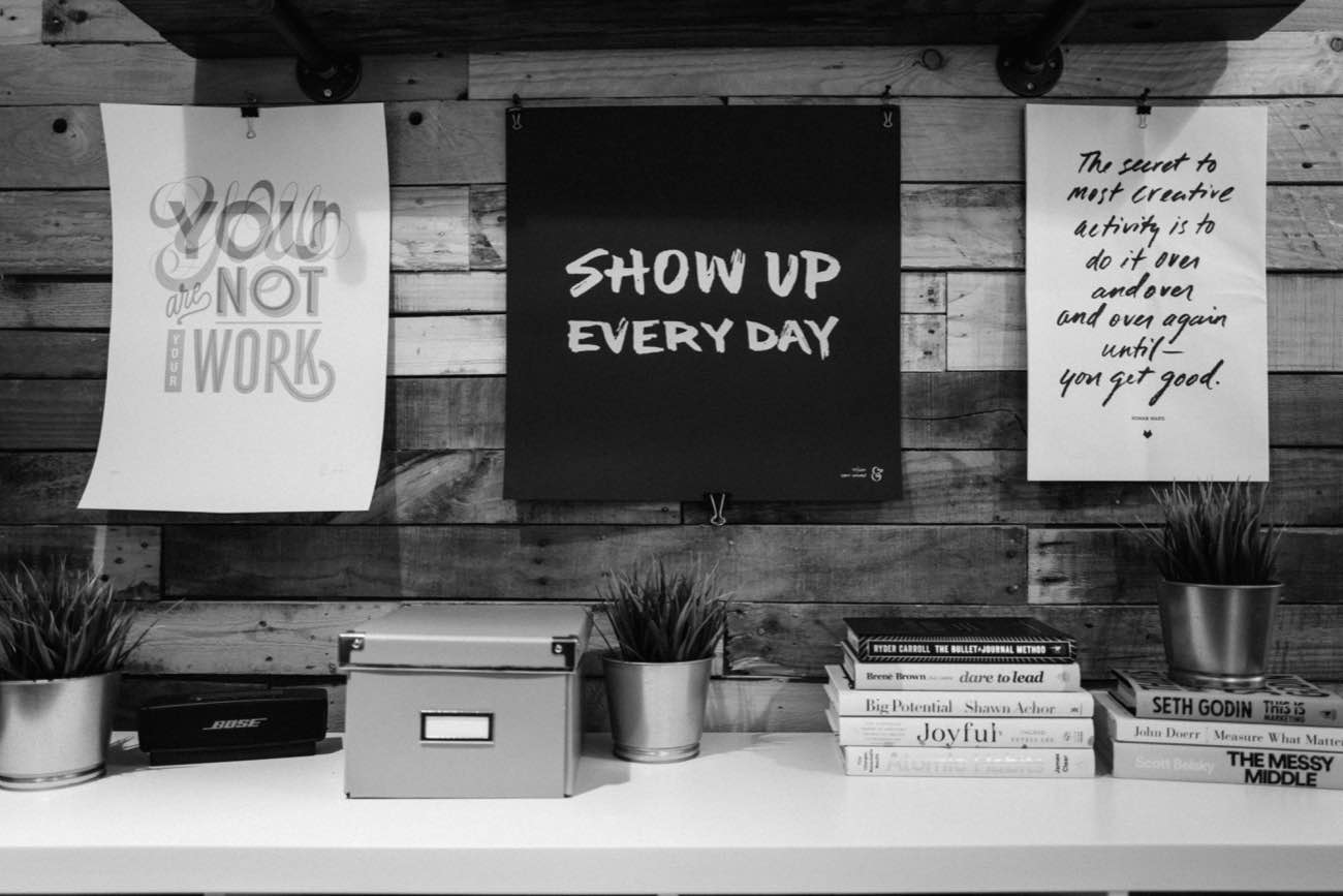
Show Up Every Day, Poster by Sean McCabe


The ”Show Up Every Day” print by Sean McCabe that I have hanging in my office.
As you seek to build a creative habit, it is professional-grade to be intentional with that time. You do this by (1) planning ahead; (2) scheduling yourself time to work; and (3) removing as many distractions as possible. This is literally what any top performer does. (I made a simple Show Up Every Day Worksheet that’s at the bottom of this article if you’re interested.)

And, not that Nathan asked, but since we’re blogging here I wanted to add an additional suggestion to his already excellent list:

Be intentional about what you consume.

What I mean by this is two-fold:

  • Making the switch from a “consumer” to a “creator” does not mean cutting out all media consumption. (More on that in a second.)

  • And therefore, consider what types of media consumption leave you feeling inspired, excited, and energized versus those which leave you feeling tired or complacent.

Which types of media take from you and which types give to you?

If I spend 15 minutes mindlessly scrolling Instagram or Twitter, I do not feel inspired or recharged.

But if I spend 15 minutes reading a book or a thoughtful article that’s saved in Instapaper, then my brain is usually bouncing with ideas and fresh inspiration.

Nathan’s article is all about making the switch from “consumer” to “creator” but I want to underscore the fact that the right kind of consumption helps with creating.

I think this is so valuable that not only do I have a habit goal to write every, I also have a habit goal to read every day.

Moreover I just deleted the social media apps from my iPhone so that I would have less opportunity for non-productive media consumption. (Even Peter McKinnon recommends quitting social media as a way to help overcome creative block.)

In his book, First Things First, Stephen Covey writes about what he calls “Sharpening the Saw”.

We often get so busy “sawing” (producing results) that we forget to “sharpen our saw” (maintain or increase our capacity to produce results in the future).

It took me a few years to to realize it was okay (even necessary) for me to take time away from “producing and creating” in order to maintain and increase my capacity to do my best creative work.

One of the ways you experience burn out is when you consitently try to create without any fresh, incoming inspiration. It’s like driving a without ever stopping to fill up — evenatually you will run out of gas.

Showing up to do the work is the noble part of the endeavor. But let us not get so busy producing that we forget to maintain and increase our capacity to keep producing results.

On Making the Switch From a Consumer to a Creator

I’m Turning on Do Not Disturb for Every Evening in February

In yesterday’s post I mentioned how, starting today, I have deleted Twitter and Instagram off my iPhone for the month of February.

There is something else I’m doing this month as well.

But first, if you don’t mind, I’d like to share a story…

I remember one evening when I was young and my family was having dinner. And for some reason that night we got several phone calls during dinner. I remember my dad stomping into the kitchen where the phone was and finally just taking the receiver off the hook so that we wouldn’t get any more interruptions. (Raise your hand if you remember when phones were plugged in to the wall.)

Growing up, we had dinner as a family several nights a week. Even though I totally rolled my eyes at it, I now look back and can see just how special of a time that was where the four of us were able to connect. My dad silenced the phone that night because he didn’t want other people having the priority of attention during that time.

Now that I’m married with kids of my own, I am jealous for consistent and quality time. But instead of telemarketers calling us, it’s friends text messaging. Or my own compulsions to check my email and social media inboxes.

Right now our kids are at the age where dinner is more like a circus. It’s crazy. More food is on the floor than on the table. But because we do dinner together almost every night of the week, the consistency of it adds up over time.

And I don’t want to invite my cell phone to the most important family hours of my day.

That’s why, for the month of February (at least) during the evening hours between 5:00 until 7:30 pm, both my wife and I are putting our phones in Do Not Disturb and leaving them in another room.

These are the hours every day when my family is all together. After we all have dinner together, my wife and I wrangle our three boys toward bed, hoping they’re down by 7pm.

It’s already a very busy and crazy time just due to the nature of our kids: 3 boys, ages 2, 5, and 7. And I don’t want it to be normal for my boys to always see me using my iPhone. I also just want to be more intentionally present with them — not having a baseline level of noise in the back of my mind that is distracting me and pulling me to just check my iPhone.

We have been dancing around this Do Not Disturb time a little bit here and there over the past month, and but so, now we are going to go all in for the month of February.

And I’m inviting you to join us. Is there an hour or two during your day that you’re willing to shut down your phone and put it away?

This is also something I will be tracking in my Baron Fig for February as one of my daily habits: how many days do I leave my phone alone between the hours of 5:00 – 7:30pm while I’m with my family?

I’m Turning on Do Not Disturb for Every Evening in February

We Are Bad at Moderation (Or: Why I’m Deleting Twitter and Instagram From my iPhone)

In a recent episode of his podcast, Tim Ferris interviewed Greg McKeown (who is the author of Essentialism).

And something Greg said that I thought was awesome.

He said we are bad at moderation. That it’s oftentimes better and easier to go all in.

As an example, Greg shared how he cut out sugar from his diet. He found it to be easier to completely eliminate all sugar rather than to eliminate 95% of sugar.

By trying to moderate his sugar intake rather than eliminate it altogether he had to constantly make choices and concessions and compromises for why it was okay or even necessary to have a certain dessert. (I totally can’t relate at all.)

However, by eliminating sugar altogether it removed all future sugar-related decisions. He didn’t have to think about it any more. Thus it was easier to go 100% without sugar than to go 95%.

And as I was at the red light, listening to this podcast, I was naturally translating Greg’s advice into my use of technology.

I immediately was thinking about my own social media usage. I already use Do Not Disturb quite liberally; I have a Screen Time max for my social media apps; I keep both Tweetbot and Instagram in folders off my main Home screen so they are not as easy to access. And yet! And yet I still find myself spending more time perusing my social media timelines than I would like.

Hold that thought…

Then, another conversation topic between Tim and Greg in the same aforementioned podcast episode, was related to making margin for that which is essential.

To help illustrate this point, Greg led Tim through an exercise by asking him these two questions:

  1. What is something in your life right now that you think is very essential and important, but is something you are not giving very much time or attention to?
  2. What is something in your life that you do NOT consider to be essential but yet it is receiving too much of your time and attention?

Right away I knew the answers to both of these questions for myself.

For me, as I have shared with you here already, I want to be writing and publishing more frequently to my personal blog. I consider that to be very essential and important and, as I told Sean McCabe, I want to give more time to writing.

And can you guess the thing in my life which I consider to be not very essential but which is receiving more of my time and attention than I think it deserves? Social media.

According to my iOS Screen Time reports I spend an average of 27 minutes per day on Twitter and 22 minutes on Instagram. That’s 49 minutes of social media scrolling that honestly does not add much, if anything, to my day-to-day life.

(I have a lot more thoughts on this, and I already have drafts of a few articles in the works that I look forward to publishing. Such as: the value of social media for building real-world relationships; the differences between a social media account and a personal weblog; and the pain of not being able to pursue every awesome tidbit of information we come across online.)

All this to say, I am taking the month of February and I am deleting the Twitter and Instagram apps from my iPhone. I’m not quitting social media altogether; I just don’t want to have it at my fingertips.

This is just an experiment, but it’s something that I’m excited to try. I don’t know what, if any, results will come from it. But I’m giving it a shot.

My desire is that without social media on my phone I’ll have more margin with my time and with my thoughts that will be unto more reading and more writing.


And as a side note, if you haven’t read Greg’s book, Essentialism, I highly recommend it. I’ll leave you with this apt and relevant quote from the book:

Today, everyone waiting around in an airport or a waiting room is glued to their technology tools of choice. Of course, nobody likes to be bored. But by abolishing any chance of being bored we have also lost the time we used to have to think and process.

The faster and busier things get, the more we need to build thinking time into our schedule. And the noisier things get, the more we need to build quiet reflection spaces in which we can truly focus.

We Are Bad at Moderation (Or: Why I’m Deleting Twitter and Instagram From my iPhone)

What Drew Me to Infinite Canvas Whiteboard Apps

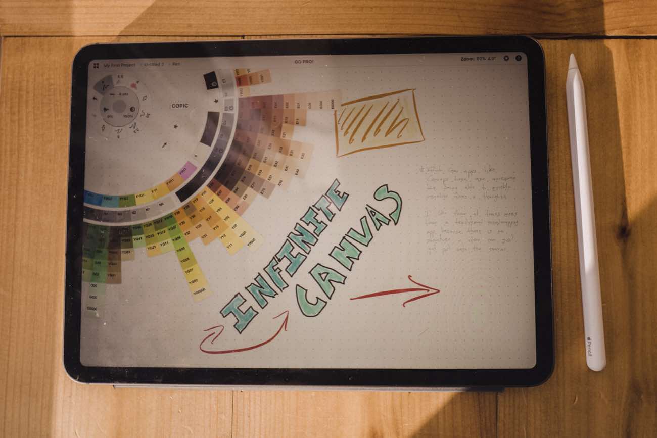
On the west wall of my office is a giant whiteboard. I use it often, but there are times when I want to use my iPad instead. And with the new iPad Pro and its #2 Pencil, I’m finally interested in a good whiteboarding app.

Apps that relied on the Apple Pencil never really stuck for me because I rarely had my Apple Pencil nearby, and if it was nearby it was probably out of battery. As you’ve probably heard a thousand times already, that all changed with the new iPad and the new Apple Pencil.

Now, I’ve long been a fan of Paper by 53 (though it’s now Paper by WeTransfer) for drawing and sketching. I’ve used it many times to draw visuals to accompany my articles from time to time. But the Paper app hits its limits when you start using it to flesh out bigger ideas and mind maps.

For a few weeks during the Christmas holiday I was checking out different whiteboard apps for iPad. (Yes, this was how I spent my free time during my Christmas break and I don’t regret a moment of it.)

I did a bit of my own research, plus asked people on Twitter what they use, and there were a few apps worth mentioning. The two which stood out to me the most were Thoughts and Concepts.

Thoughts

What’s great about Thoughts is how simple and straightforward it is. This app is very easy to use.

There are only 3 tools: a black pen, a color pen, and an eraser. It also has both a light and dark theme. And there is an iPhone app that it syncs with. Thoughts is just a $2.99 one-time purchase to get the app and you’re set.

For me, one big drawback to Thoughts is that you can’t import any types of media onto your canvas. Meaning your whiteboard canvas can’t include images, links, and the like.

Another tidbit which took me a while to get used to is that the pen size is relative. When you’re writing and drawing with the pen, it’s always the same visual point size no matter what “zoom” level you are at. At first this bugged me, as I wanted everything to be the exact same, but I then began to acclimate to it and it actually makes sense given the way Thoughts works.

Thoughts not only has an infinite canvas, it also has infinite zoom. And, what’s funny but not funny about that is that I actually lost my document. I literally lost some work of mine by zooming out too far. It disappeared in the view and I tried zooming back in but must have been off-center and from there I completely lost my bearings and I literally couldn’t figure out where my drawing went. I lost it to the abyss.

So all that to say about Thoughts: it is pretty great because it’s so simple. You just launch the app and get to work. But for me, I found it to be too simple for my ideal workflow. I want to be able to drop in photos, screenshots, text, links, and also have a bit more control over the tools I’m using.

Concepts

The other whiteboarding app I was most drawn to (ha!) was Concepts.

Over on MacStories, John Voorhees saved me a whole lot of time by writing this in-depth review of Concepts before I could write one of my own. (Thanks, John!)

John’s and my use-cases and sentiments are nearly identical. I have no need for drawing or sketching or illustrating. But I do love to be able to quickly visualize bigger ideas / projects into something that make sense. And while there are some excellend mind mapping apps for the iPad, I prefer the free-form drawing nature of a whiteboarding app for the brainstorming and ideation process.

… I realized that the primary value of an app like Concepts lies in helping users record and refine their ideas. Whether your ideas result in something like [Yarrow] Cheney’s whimsical concept art for The Grinch or my messy soup of notes, screenshots, and highlighting, the core utility of Concepts, which is right there in its name, is the way it facilitates the exploration of ideas. That’s an important distinction that makes Concepts an appropriate choice for iPad users regardless of whether you’re an artist.

I haven’t yet spent as much time using Concepts as John has, and so his review taught me a few tips and tricks. And, like John, what I love about the Concepts app is how beautiful and simple it is, and yet how much power lies under the hood.

Compared to the Thoughts app, Concepts still gives you an infinite canvas that can go in any direction you like, but you don’t have complete freedom to zoom in / out forever and thus lose your work to the abyss. Additionally, Concepts puts little arrow darts on the edges of the screen, pointing in the direction that you have any drawings or media. Helping you stay oriented.

Using a whiteboard app like Concepts is definitely a scenario where the 12.9 iPad Pro would shine and be an excellent tool over the 11. But since I can zoom and scroll the canvas, I don’t feel hindered or cramped using the 11-inch iPad Pro.

All in all, the power and flexibility of an infinite canvas, whiteboarding app can be liberating to your ideas. Having both Concepts and the new Apple Pencil at my fingertips is a fantastic combination that has become a go-to in my workflow.

What Drew Me to Infinite Canvas Whiteboard Apps

Initial Photos and Thoughts From My First Live Event

Yesterday we hosted our very first Live workshop for The Focus Course!

We had 32 people here in Kansas City and I led them all through the Focus Course. It was so much fun! And I am so tired!

I’ll be writing quite a bit more about the event in the weeks to come, but I wanted to share a few initial thoughts from my perspective.

For starters, the whole event went just about perfectly! (Thank you Isaac and Joanna!!)

This was our first live event of this scale and polish. It was the content of the Focus Course combined with a live presentation of my whole ethos behind Delight is in the Details. A lot of group training events like this are rich in content but poor in delightful little details. I wanted to do things a bit differently, and seeing it all come together it was clearly worth the effort.

And speaking of the content…

It was so incredible for me to work in person with people and witness as the dots connected and light bulbs went off for them as we all went through The Focus Course. It was amazing to watch people “get it”… From getting their life vision figured out, to finally understanding how habits and scheduling can help them live a better life. Or getting a breakthrough in goal setting, or understating the value of margin. All throughout the day people were getting these little moments of revelation, and it was an honor to be a part of that process and to see it happen in person.

This morning I woke up, and I wrote this in my journal:

“If it is true that health in one area of your life brings about greater health in the other areas… and if it is true that when we align our values with our calendar we can reach our greatest potential with the most joy in the process… and if it is true that we have a finite amount of mental energy within any given day and we need help to keep our life on track…. if those things are true, then therein lies the power of a focused life. Because a focused life enables those things.”

This event was life changing. Can’t wait for the next one!

Initial Photos and Thoughts From My First Live Event

More Blurry Photos

A few weeks ago when I was in downtown Kansas City, I was shooting some photos and my Leica was missing focus a few times. The photos came out blurry, but I really love the aesthetic.

So last week when I was out for a friend’s birthday, I took the Leica of course, but this time I took shots that were intentionally blurry.

These photos are of a few great places here in Kansas City. Come visit and I’ll tell you all about them.

More Blurry Photos

Creating Without Overthinking

Last week I was driving home, and I wanted to send a quick voice message to my friend Sean McCabe. He’s been posting some awesome and fun stuff the past few weeks and it has inspired me and helped me stay motivated with my own desire to write more, here, at shawnblanc.net, in 2019.

Well, Sean took my 60-second voice message and he turned it into this cool little animated snippet. Check it out:

https://youtube.com/watch?v=ej0Ooj8I7aY

On his Instagram account, he also shared three takeaways from this little interaction turned video.

  1. When you show up, you inspire others to do the same.
  2. Opportunities to create content are all around you.⁣
  3. A little encouragement goes a long way.

And then I have a takeaway of my own:

Be intentional about engaging in non-disembodied communication.

In a recent episode of Jocelyn K. Glei’s podcast, she interviewed Cal Newport. And Cal shared about how he views all communication and interaction as either “real” or “not real”. Communication done in person or over the phone is real. Communication done via texting, DMing, etc. is not real.

And it got me thinking that the friends and family members I have the deepest connection with are those whom I talk to on the phone or spend face-to-face time with. Not necessarily those whom I iMessage the most.

And so, something I’ve been doing for the past few months has been to send my friends these voice memos to tell them how awesome they are. It’s not quite as awesome as a phone call (because it’s still just me monologuing), but it’s better than a disembodied text message.

Creating Without Overthinking

Blurry Kansas City

Kansas City Power Light Leica Q Street Photgraphy

Kansas City Power Light Leica Q Street Photgraphy

I was recently downtown in Kansas City’s Power and Light district to go see the new Spider-Man movie (which was absolutely amazing).

Of course I took the Leica Q with me to snap some nighttime shots of the area.

Several of the shots missed focus, but I love how they turned out.

You can download a high-res version of the above two images here and here.

Blurry Kansas City

iOS Shortcut for Importing Photos into Lightroom

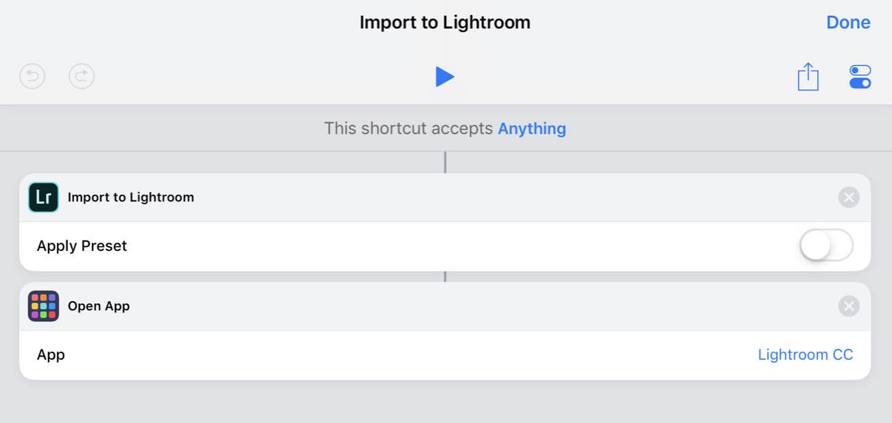
Speaking of very simple shortcuts, the latest update to Adobe Lightroom CC now has support for the Shortcuts app. It’s not much support, but it’s exactly what I wanted for my iPad photography workflow.

Basically the only option you have is that you can import photos into Lightroom and apply a filter to those photos if you want.

This is perfect for me because my iPad photography workflow is already such that I import photos from my Leica Q onto the iPad Photos app, and then I cull my list from there. Then, what I used to do was open up the Lightroom app and import photos. But being able to select a group of photos right within the iOS Photos app and can send those photos directly to Lightroom is much easier and more intuitive for me.

So I created a shortcut that lets me do exactly that:

How I use it that I first select one or more photos, then I tap the iOS Share sheet, I tap the Shortcuts and select my Send to Lightroom shortcut. The photos are then sent to Lightroom and the app is opened up for me to begin editing.

Download the Shortcut here.

Note: You could also create a shortcut that automatically grabs all the photos from a recent import, or from a specific album or something. But since I don’t do my photo culling inside Lightroom, I prefer to choose the specific images I want to send into Lightroom for editing.

iOS Shortcut for Importing Photos into Lightroom

My Travel Packing List Shortcut

Having a pre-populated packing list is one of the greatest “travel hacks” I’ve ever done.

It takes all the guesswork out of packing. And it saves me quite a bit of time as well. I just follow the list and when I’m done I don’t have to worry if I forgot about anything.

I used to keep my packing list in the Apple Notes app. It was easy to use because you could toggle the to-do state of the whole list by selecting all items and then tapping the “checkbox icon” in order to uncheck them in one fell swoop so you can start over with the list.

But with iOS 12, I thought it’d be nice to set up a Shortcut for this instead.

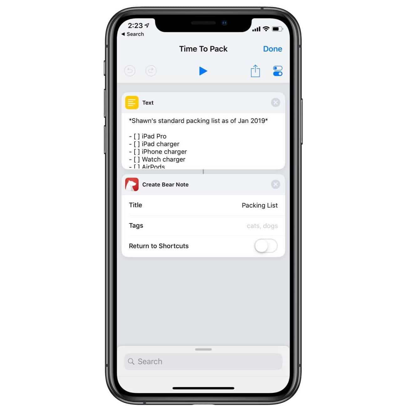
So I built a very simple Shortcut that will create a new note for me with my packing list ready to go.

The way the Shortcut works is very simple: It takes a block of pre-written text (my packing list that I wrote) and then passes it into Bear as a new note filled with check-box items.

The reason I prefer to have the list created in Bear is because then, once I’m done packing, I can just delete the note.

One important thing to note when building this shortcut is that you want to write your list text in Bear’s flavor of Markdown so that it will create your packing list as to-do items so you can check them off as you pack them.

That syntax looks like this:

- [ ] ITEM A

- [ ] ITEM B

- [ ] ITEM C

Download the Shortcut Here.

My Travel Packing List Shortcut

On the Necessity of Rest and Relaxation

Greg McKeown, from his book, Essentialism:

If you believe being overly busy and overextended is evidence of productivity, then you probably believe that creating space to explore, think, and reflect should be kept to a minimum. Yet these very activities are the antidote to the nonessential busyness that infects so many of us. Rather than trivial diversions, they are critical to distinguishing what is actually a trivial diversion from what is truly essential.

On the Necessity of Rest and Relaxation

Snow Day

Leica Q Snow Photos

Leica Q Snow Photos

Leica Q Snow Photos

Leica Q Snow Photos

Leica Q Snow Photos

This morning, we woke up to a dark and cold house with about 10-inches of snow outside. The storm had knocked out the power to our neighborhood sometime in the middle of the night.

I made some “coffee” in the french press by heating up the water on our gas stove (lit with a match) and then “grinding” the coffee beans by putting them into a zip lock bag and crushing them with a rolling pin.

We all spent the morning building Legos and doing crossword puzzles. For a few hours we had no heat, but I discovered that our fireplace (which has an eclectic pilot) also has a battery backup. So I was able to get it started and that was definitely the highlight of our morning.

Alas, around noon, the power came back on.

Snow Day

Also on The Sweet Setup, Rose Orchard posted this quick walkthrough of all the ways you can ensure your iPhone does not disturb you. The Do Not Disturb features in iOS over the past few years have been some of my favorite. Especially Do Not Disturb while driving.

And, speaking of Rose, she shared her Mac Setup on Monday. Is it just me, or are stickers making a massive comeback?

How to Use Do Not Disturb to Your Advantage