Apple sold more than nine million iPhones over the weekend. They haven’t shared the breakdown of sales between the 5s and the 5c (and they probably never will), but I only know of one person who got a 5c: Gedeon Maheux. I’m not trying to imply anything, just share my personal observation and data point.

It’ll be interesting to see in one and two years from now how many of the 5c (and its predecessors) we begin to see in the wild compared to the 5s (and its predecessors). I think the white 5c looks great; if the modern tech of the 5s were also available in the body of a 5c I probably would have gone that route.

Apple: “We’re Doing Very Well”

Stop waiting for your IT department to move off SharePoint and start using an intranet you’ll actually like. Igloo is free to use with your team, it’s built around easy to use apps like blogging and file sharing, and it has social tools built right in to help you get work done.

It works on your desktop, your tablet and your phone. Inside or outside of your office. With your team or with your customers. Igloo is 100% white label, so you can make it look like your brand (with your developers or our in-house design and services team).

And if you’re in San Francisco, come learn how a social intranet can help your business succeed. Hear real world examples from our customers, technologists, and writers from Forbes and The Huffington Post. Our Social Intranet Tour hits San Francisco on October 15. We hope to see you there.

* * *

My thanks to Igloo for again sponsoring the RSS feed this week. Sponsorship by The Syndicate.

Sponsor: Igloo

iPhone 5s Initial Miscellany

iPhone 5s

My day started at 6:45 this morning. With a cup of coffee in hand,1 I was about the 100th person to join the line at my local Apple store.

To make a long story short I decided to ditch my spot in line and go to the local AT&T store where I was the 20th person in line. The store opened at 8:00 and by 8:30 I was being helped by a sales rep to get a Space Gray iPhone 5s.

  • The look of the Space Gray is much nicer than I thought it would be. It’s not as “silver” as the band on the 4/4S was, which makes it look a bit more like the original iPhone.

I’m pretty sure this is the first year that the external appearance of the “s” model of iPhones has been so different than the previous generation. Though the iPhone 5 and 5s look nearly identical, they are less so than the 3G/3GS and 4/4S were.

  • Making a slo-mo video is super fun. On Twitter I joked that we’ll soon have tumblr accounts dedicated to iPhone slo-mo vids that are not as epic as their creators think they are. But who cares, right? If your iPhone can shoot 120FPS HD video and easily select scenes for slo-mo, then go for it.

  • Touch ID feels like equal parts the future and cheating. I have 6 years of muscle memory developed for tap-then-swipe, so I keep forgetting to tap then wait. Instead I swipe, the lock screen keypad shows up and I pause for a second, then oh yeah. Put my thumb back on the Home button and wait a second. The unlocking process truly is near instantaneous.

The way we joke that non-Retina displays are like sandpaper on our eyes, in a few months (days?) time we’ll all be joking that non-Touch ID devices are so annoying to unlock.

When I finished setting up my new phone, I thought back to something I wrote a year ago regarding the iPhone 5:

Here I have this gorgeous object of industrial innovation, and yet its proximity to my life is not due to my above average affinity for fine gadgets. No, the iPhone has earned its place by virtue of usefulness. The curiously-thin slab of glass and aluminum that I carry around in my pocket is my camera, my jukebox, my map, my newspaper, my phone, my email, my photo album, my schedule, my to-do list, my notebook, my Internet, and so much more.

A lot has changed since I wrote that a year ago, and those changes have made the statement even more true.

The iPhone 5s, with its better camera and Touch ID sensor, make it more useful (even if slightly so) to me than the iPhone 5. Moreover, with iOS 7 and so many new and updated 3rd-party apps, we are ever getting more utility, usefulness, and delight from of our iPhones.

That’s saying a lot for a tough little computer that fits in your pocket.


  1. I may or may not keep some to-go cups around for mornings like this.
iPhone 5s Initial Miscellany

My friend and former podcasting partner in crime, Ben Brooks, collaborated with Kyle Rosenbluth to make a to-do list app for the iPhone.

Since I live and breath inside of OmniFocus, Begin hasn’t become my new to-do list app. But that doesn’t mean I’m blind to a cool idea and a nice design when I see one — and Begin is both of those.

It’s simple, fast, and gesture driven. If you like the premise and simplicity of the Bullet Journal method, then Begin might be just the app for you. And gosh, it’s just a buck on the app store.

Begin To-Do App

The New Simplenote Apps

If asked to trim my iPhone and iPad Home screens down to just one app, that app would be Simplenote.

I have been using Simplenote for as long as I can remember. What first won me over to the app was certainly not the icon. Rather, it was (a) Simplenote’s ability to sync my notes over-the-air to my Mac, and (b) its use of Helvetica. These were two huge improvements on Apple’s native Notes app which synced over USB and used Marker Felt as the typeface.

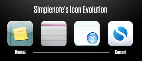
Simplenote shipped in 2008 when the iPhone App Store was fresh and there was only a rumor of an iPad. In many ways, the app has barely changed since its very first version, seeing mostly only refinements and iterations of the original design.

Today, 5 years later, look at the App store today and you’ll find no shortage of minimalistic, well-designed, note-taking apps that sync over-the-air. And many of these apps are absolutely fantastic. But, even after my foray into Simplenote alternatives and doing research and trying out other note-taking apps, I’ve stuck with Simplenote as my iOS note-taking app of choice.

So much of how I use my iPhone and iPad is text based: ideas, articles, to-do items, lists, and more. Because I have an affinity for apps that do one thing well, currently all these “text-based” things are handled by unique apps:

However, I could consolidate them all into just one app if I had to. And that app would be Simplenote. The reason I’d choose Simplenote is because it’s a quick, easy-to-use app with great search and it has fast, reliable sync.

Today we find a significant update to Simplenote on iOS as well as a brand-new, native Simplenote app for the Mac.

These huge updates to Simplenote came as a bit of a surprise to me. When Simperium, the Simplenote development team, was acquired by Automattic, I was hopeful yet also had concerns that the future of Simplenote was in question. The announcement stated that Automattic founder, Matt Mullenweg, was a fan of Simplenote and had plans to keep its development, but that’s not always how things pan out after an acquisition.

Fortunately, I was wrong. And today we see one of the best updates to Simplenote yet.

Simplenote on iOS

The new iOS 7 version of Simplenote for the iPhone and iPad is even more simple (if that were possible) than its predecessor.

From a feature standpoint, what’s new about new Simplenotes is more like a list of what’s gone from the previous version.

In the previous version of Simplenote there was a modicum of preferences that allowed you to adjust a handful of options. Such as how your “timeline” list of notes was sorted, what font size you wanted for reading and editing a note’s text, and more.

However, in the new Simplenote, those options are all gone save one: the option for your list of notes to show a preview of text under each title or not.

Simplenote old and new side-by-side preferences

In one of the early iOS builds I tested, the preference for condensing the note list wasn’t even there. Fortunately, the developers were willing to be persuaded to add back in this preference which I consider essential.

The option to sport a collapsed notes list is huge for how I use Simplenote. Since I usually have around 10 active notes going at any given time, I love being able to see all of them at a glance when I open Simplenote on my iPhone.

I have no doubt that other preferences will slowly be added back in. But this initial purging marks the beginning of the next generation for Simplenote.

In the iOS apps, the most significant change you’ll see right away is Simplenote’s new typeface: Source Sans Pro. Other than the many refinements to several current features (such as sharing and version history) almost all of the biggest changes are under the hood. In fact, iOS apps have been re-written from the ground up in order to lay a new foundation for future iteration and evolution.

Tom Witkin, who also went to work for Automattic a few months back and is now one of the Automattic team members working on Simplenote, said to me that their general thinking throughout the entire Simplenote design process has been “to create a great platform to build Simplenote upon going forward.”

For an app with simple in the name, I’m delighted to see that it’s staying true to its nature. While I do miss a few of my legacy features, after a few weeks with the betas, I would not go back to the old version. The app feels faster, more professional, more modern, and more refined. Everything the new Simplenote does, it does very well.

Search

Search itself remains as great as ever. Simplenote’s search has always been second to none, and it continues to be one of the app’s finest features. I use it often, and it’s one of the primary reasons I chose to stay with Simplenote when looking into alternatives (as mentioned above). I can’t say how glad I am that search in Simplenote continues to be a top-priority for the developers.

In the new Simplenote, search has seen some nice design improvements that makes it a more polished and refined experience. When searching a term, the list of notes is pared down in real time to only those with that term in the title or the body text. If the term exists in the title, that word gets set in blue text. Tapping on a note from the search results takes you to the first result of that term within the note’s body text, and that term is highlighted in a blue rounded rectangle. Arrow buttons at the bottom-right in the note’s toolbar take you to the next and previous instances of the term, and next to those arrows you’re told how many total instances of the search term there are in the current note.

If you’re familiar with search in Simplenote, the overall experience is more or less the same. What’s new is primarily the above mentioned design details (the blue treatment on the words and the better highlighting within a note). But these are details that make the searching experience easier and more efficient.

Collaboration

What used to be called Sharing is now called Collaboration. This works on the Mac and iOS versions of Simplenote.

You collaborate a note with someone by adding their email address as a tag to your note. If you add the email address associated with that person’s Simplenote account then the shared note shows up in your collaborator’s Simplenote list. If you add an email address that’s not associated with a Simplenote account, then that person will get an email and can either (a) log in to Simplenote if they have their Simplenote account associated with a different email, and the note will be added; or else (b) create an account.

In the new Simplenote app, there is no longer an icon letting you know which notes in your list you’re collaborating on. Which means if someone shares a note with me, then the only way I know it’s been shared is because I notice there’s a new note there that didn’t exist before.

Moreover, if someone shares a note with you, the only way to know who has shared it is by the email alert. For an incoming shared note, there are no tags with the originator’s email addresses, nor does their email appear in the “Collaborators” list.

I’d love to see the collaboration area improve even more, by (a) offering better information about who is collaborating on a note regardless of the originator, (b) giving me the option to accept or decline incoming shared notes; and (c) some sort of marker letting me know a note in the list is shared.

Also, I see some options for pro features here, such as a list of trusted collaborators whose notes automatically get added to my list (first assuming Simplenote added the ability to accept/decline incoming shared notes), push notification options for new shared notes and when updates to a note are synced, and better visibility into the changes of a note when peering back at the note’s history. Also it’d be nice to add more email address to my Simplenote account (similar to how you can have several iMessage IDs).

Additional Tidbits Regarding New / Updated Features

  • As mentioned above, the default typeface is no longer Helvetica. Simplenote now uses Source Sans Pro for the note list and note body text. Though, as you can clearly see in the above screenshot, the settings pane still uses Helvetica.

Source Sans Pro: the new Simplenote typeface

  • Simplenote on iOS now auto-completes unordered bullet lists when you start a list and continue it by tapping the return button.

  • Publishing your note to a URL (so you can make that note’s contents public to anyone you like) has a much nicer in-app interface, and an updated look to the Simplenote website is in the works as well.

  • When typing in a note on the iPhone version, the top navigation bar “minimizes” (a la Safari) when scrolling down in your note, and in landscape orientation, the nav bar disappears altogether when you scroll down. A nice touch.

  • The Pro subscription has been temporarily removed. For now, all Pro users will keep on getting their benefits (no API sync limit, Dropbox syncing, etc.) while the Simplenote guys figure out what to do next with the Pro subscription model.

  • Gesture navigations: On the iPhone you can swipe left-to-right on a note to return to the note list. On the iPad, you can “pinch” the note closed.

  • On the iPad there is no longer the 2-column view that sports the list of notes on the left and the text on the right. There is only one view at a time: your list of notes or else the note you’re viewing/editing. I prefer this “simplified” viewport setup because it often saves me an extra tap, since I usually prefer to view my notes in the iPad in fullscreen mode anyway. Now, they always are.

Simplenote on Mac

For the past several weeks that I’ve been testing the new Simplenote apps, I’ve eschewed my regular use of nvALT to give my full attention to the Simplenote Mac app.

Some things I like about it are its clean and classy design that feels very open and yet not wasteful. Also it features full integration with all the Simplenote features (obviously).

However, there is no autocompletion of any syntax such as unordered lists, there is very little keyboard navigation — CMD+F for search and CMD+N for a new note. Though I’m told that the basic syntax completion is planned for a future release.

Since nvALT now uses the new Simplenote API (the same API that the native Simplenote Mac app uses), as someone who’s grown used to the keyboard-friendly features of nvALT I see no advantage of switching to the Simplenote Mac app unless you make heavy use of tags, collaboration, or you prefer the design.

Wrap Up

The new Simplenote apps are free. The Mac app is available only in the Mac App Store, and the iOS apps are, obviously, only available in the iOS App Store.

While there are a lot of things I use my iPhone for — email, text messaging, Twitter, Instapaper, RSS, taking photos and videos, journaling, to-do list managing, music listening, and more — the one thing I would likely miss the most is the ability to take notes, make lists, write ideas, and have those all in sync with my Mac and iPad. Which is why Simplenote continues to be one of my favorite and most-used apps.

The New Simplenote Apps

iOS 7: The Delightful Details

Your iPhone and iPad have never looked so fresh and different. The new look and feel of iOS 7 is the most significant design change since the toggle buttons went from rounded rectangles to circles.

With so much new, I wanted to focus on a handful of the smaller, delightful details.

The Lock Screen

From a purely aesthetic standpoint, I find the design of the Lock screen to be wonderful. I love the open, airy feel and how you can swipe from anywhere on the Lock screen to unlock your iPhone.

If you use a passcode lock, the Pin Pad slides over from the left side of the display. It’s a nice touch, and I bring it up because for future 5s owners, this is something you won’t be seeing very often come Friday.

And one more cool little detail of the Lock screen is that if you’ve snoozed an alarm or set a timer, the Lock screen shows the time remaining.

Launching / Exiting Apps

When you open an app, it expands from the app icon’s location on the Home screen to fill the display. When you exit an app, it minimizes back into the icon.

The Clock App’s Icon

If you look at the icon for the Clock app, you’ll notice that not only does it now show the correct time, even the second hand moves just like an analog clock.

The Music App

When you are looking at an album or playlist list and the currently playing song is in view, an “EQ” graphic is animated to the left of the song that’s now playing.

iOS 7 - bouncing EQ bars in the music app

Your entire iTunes music collection (of songs you’ve purchased from the iTunes music store) is now listed in the Music app. And you can now stream and download any song in your iTunes library even if it’s not downloaded to your iPhone.

Turning your iPhone into Landscape mode to see the new Cover Flow design shows a thumbnail grid of album covers.

Safari

If ever there was a case where you shouldn’t judge an app by its icon, this is it. Safari in iOS 7 has the worst of the new icons, yet it is my favorite new app. In it are a slew of changes and improvements to the graphics, design, and functionality.

  • Reader mode: The look of Safari’s Reader mode is much improved compared to iOS 6. It’s cleaner and ties in with the overall Helvetica-gushing design aesthetic of iOS 7.

Tap the three-line “paragraph” icon that’s in the left of the Address bar and a sheet slides down over the website you’re on presenting you with a reader friendly text-view.

If you see no icon, then Safari doesn’t know how to parse the text, or it doesn’t think there’s text worth parsing.

  • Minimizing Chrome: When you scroll down on a web page you’ll see how Safari’s chrome minimizes: the address bar gets smaller and the icon tool bar on the bottom disappears altogether.

And when viewing a webpage in landscape orientation, Safari will go into full-screen mode with all the chrome disappearing — even the status bar — in order to allow as much vertical space as possible.

Tapping the bottom of the screen will bring up the bottom tool bar.

There are many, many more design changes and improvements to Mobile Safari. Overall, the updates to this app are just fantastic. Well done, Mobile Safari team.

Messages

You’ll notice this right away the first time you scroll an iMessage / SMS conversation: the chat bubbles are slightly springy and bouncy, moving as you scroll the conversation.

I love the use of the circle picture avatars in group message threads. And if no picture is attached to a contact, then the iPhone uses their initials as their “avatar” instead.

And, something else you may not know but which is very awesome: swipe from right to left in a Messages conversation to view the individual timestamps of each sent and received message.

Control Center

This isn’t a “small” detail by any means — it’s one of the headlining features in iOS 7. But it’s one of my favorite additions to iOS. I love having the quick access to toggle certain settings (such as Wi-Fi, Bluetooth, and more), and it’s very helpful to be able to launch certain apps from anywhere in the phone, even the Lock screen.

For example, when I’m brewing my morning cup of AeroPress’d coffee, I can get to the stopwatch with just a swipe up from the Home screen and then a tap to the Clock app.

Also, if you look closely, the on/off button on the flashlight icon toggles up and down as you toggle the actual switch in Control Center.

Toggling Flashlight icon in iOS 7 Control Center

Notification Center

The Today view learns about your commuting habits and gives you information about how far away you are from your next destination. Also, it shows the natural language summary of your day today and tomorrow with weather, appointments, etc.

Checking the Today summary of my day has become part of my morning routine. Notification Center can be called from the Lock screen, so I simply tap the Home button, then swipe down from the top of the screen to see a brief overview of what the weather is going to be and what (if any) appointments I have today.

Scanning in an iTunes gift card

Launch the App Store app, scroll to the bottom of the Featured page, then tap on “Redeem.” Then…

Delight is in the Details

I’ve been running iOS 7 on my iPhone since the day it was first announced. It is a stark contrast to what we’ve been so familiar with on the iPhone and iPad, but it quickly grows on you. And all of these little details that are sprinkled throughout iOS 7 — some obvious, some not so obvious — just go to show that even when doing a major overhaul of their most popular operating system, Apple still takes time to sweat the details and add in those little design decisions which surprise and delight.

iOS 7: The Delightful Details

OmniFocus 2 for iPhone

Today, the OmniFocus app for iPhone gets a huge redesign for iOS 7.

The redesign is two-fold. For one, it’s a complete re-skinning of the app’s look and feel, with a swing of the pendulum deep into iOS 7 territory. Colors and thin weights of Helvetica abound in the new OmniFocus.

The second element of the redesign is the layout and overall UI — it too gets a massive overhaul. The app’s “home” page has been completely re-organized. Gone is the standard list view, and in its stead is a more grid-based layout.

OmniFocus Home screens

I have been using this new OmniFocus for about a week and it’s a mixed bag for me. While there are many great things about it, a few things just don’t sit right. I am a fan of the updated layout and much of the new design aesthetic. And I love that the new look fits right in with iOS 7. But, again, there are a few bits and pieces of the design that cause me to pause when using the app.

Though OmniFocus sits on my iPhone’s first Home screen, it’s not an app I spend a lot of time in. I mostly open it when I’m out and about to either quickly add an item or to check items off from a list.

When it comes to checking items off, you could say the new app is a bit more friendly to right-handed use. The task checkoff boxes (which are now circles) are on the right side of the screen instead of the left, making it a bit easier to reach those tap targets.

The project and context list view has been slightly updated. Now when viewing your list of Projects or Context, under the title of each project/context sits a row of dots signifying the number of tasks still remaining and if any of them are overdue or due soon.

Like before, a quick entry button for adding a new task from anywhere is always available in the bottom right. Unlike before, the quick entry button is now the only thing at the bottom of the screen. The bottom toolbar is now gone, and so the quick entry button simply hovers.

Adding a New Task

For the most part, the item detail view really just doesn’t sit right for me. The previous version, though outdated in style, had a clear visual hierarchy and clarity to it. The new version feels lost in the monotones and subtle tones.

OmniFocus adding new tasks

The design element I like the least is the date and time picker for setting when a task is due and when the task is available. Now, to be fair, OmniFocus is using the iOS 7 default date/time picker. And, unfortunately, I think the default date/time picker is one of the turds of iOS 7.

In the previous OmniFocus for iPhone, when you selected the start/due date(s), a whole new screen would slide up. In the new version, when you tap the “Due” column, the date picker slides into view along with a grid of buttons for quickly going to a predefined timeframe (such as setting the item as being due today, 1 day from now, 1 week, 1 month, or 1 year).

An item’s start date is now called “Defer Until.” Tapping the Defer column gives the same animation as setting the Due date. One cool thing about setting the defer date is there is a button for “Later” and it selects a random time in the future, usually 6-8 weeks out.

While I do think the new layout and experience design is superior to the old version, I miss the easily defined hierarchy. I don’t know the answer here, but I do know that the Omni Group will be working to refine their app. And perhaps I’ll get used to it.

Something new and clever is that when adding a task there is a “Save+” button. Tap that after you’ve entered in a new to-do item and the current view sort of falls down off the screen and a new “card” is then ready to go for a new item. If you have several tasks to enter at once, this is a great time saver.

The iOS 7 Transition

As I stated above, OmniFocus 2 has a lot of great new design and layout elements with a few things that still need work.

The transition to the new iOS 7-esque look and feel won’t be an easy one. For a while, we’re going to see a lot of apps that look and feel very similar to one another. With iOS 7 Apple completely re-wrote the app design language. It is going to take some time for 3rd-party devs begin to get more ideas and more comfort to take risks, try new designs, and innovate in this new space.

By this time next year, if not sooner, I expect that we’ll be seeing a much broader range of mature designs from 3rd-party developers (and from Apple themselves). App designs that feel at home on iOS 7 while also feeling unique, distinct, and full of personality.

OmniFocus 2 for iPhone