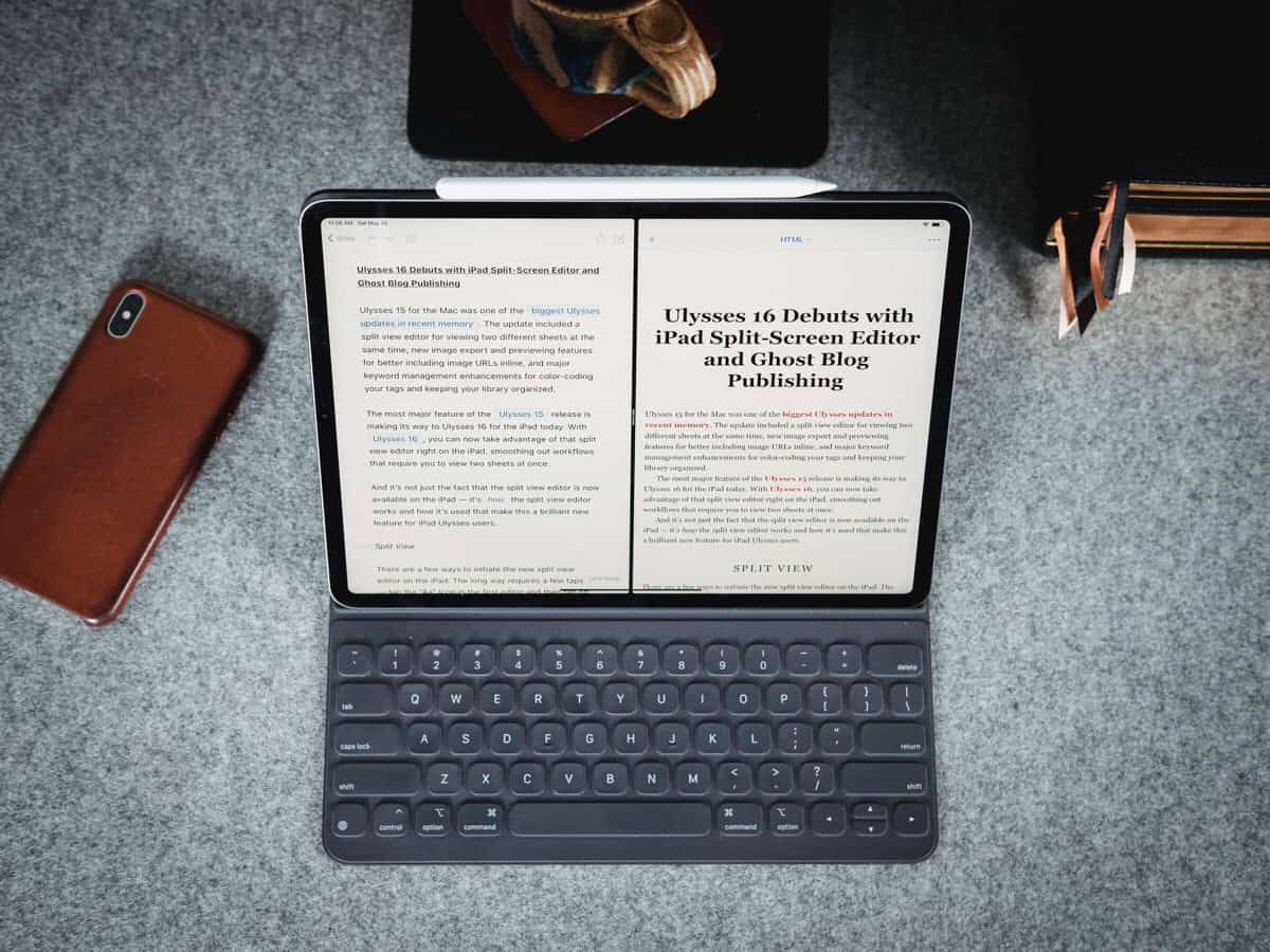
On Monday I officially ran out of feature ideas and improvements for Ulysses. Because the iPad app now offers split-screen editing, and it’s fantastic.

I mostly use Ulysses from my iPad, and this was the last remaining feature request for me.
I don’t need a split screen editor all the time, but it is something that I often incorporate as part of my writing workflow. Usually I will have an outline on one side and my working draft on the other.
Before Ulysses offered split-screen edition on the Mac version, I had a Keyboard Maestro macro that would open up a new editing window and re-size. On the iPad, if I wanted to do side-by-side document work, I would usually copy all the text from my outline out of ULysses and put it into Bear so I could work with those two apps in split view (since iOS supports it, but Ulysses did not).
The way that they’ve implemented split view in Ulysses is just perfect. There are lots of little nuances in it to make it delightful, and it feels just perfect on the iPad. It’s an excellent example of an iOS app feature done right.
And it’s power-user friendly, too, of course. You can use the keyboard to enable the second editor and switch between which document is in focus. Or you can drag a document out of your library and over to the “side” to open that document in the second editor.
(This is one feature that now makes me wish ever-so-slightly that I would have held on to the 12.9-inch iPad Pro instead of trading it in for the 11-inch.)
On the Sweet Setup, we put together a review of this newest version of Ulysses that also walks you through exactly how the new split-screen editor works and how you can use it.
(And, of course, if you’re a Ulysses user — or want to be — we have a pretty fantastic series of training videos for you.)