The Omni Group has been around for 25 years.
Founded in 1989 as a technology consulting firm, they used to build custom software for NextSTEP users until Apple bought NeXT in 1997. Now Omni builds and sells their own software for OS X and iOS. Not least of which is OmniFocus.
But did you know OmniFocus for Mac was somewhat built by chance?
OmniFocus’s roots are as an add-on to OmniOutliner Pro called Kinkless (kGTD), which was built and developed by Ethan Schoonover. Though it was incredibly brilliant, kGTD was a hack. It was a bunch of AppleScripts that sat on top of a single OmniOutliner document with some custom buttons and even some Quicksilver actions for quick entry.
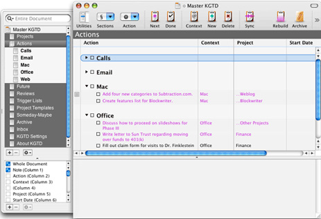
Here is what Kinkless GTD looked like (circa 2006):
In 2006, Omni Group asked Schoonover, along with Merlin Mann, to help take the ideas and functions of kGTD and turn them into an official Omni task-management application…
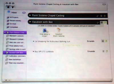
Here’s the first publicly displayed mockup of what OmniFocus could have looked like:

After more than a year of private development with a group of about 500 alpha users, OmniFocus went into public beta in November 2007. At that time they also began pre-selling licenses and OmniFocus pre-sold over 2,500 copies in the first 5 days of the public beta.1
Finally, on January 8, 2008, OmniFocus 1.0 was launched.2
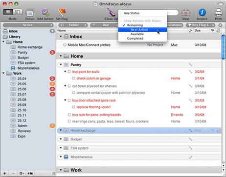
OmniFocus 1.0 (circa January 2008):
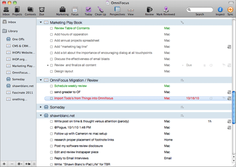
Here’s the latest public version of OmniFocus (version 1.10):
As you can see, not much in the UI has changed from the original Kinkless implementation of 2005 to what OmniFocus is today in 2010. You could say that OmniFocus 2 is kGTD 2.
But all that changed with the beta of OmniFocus for Mac 2.
On February 1, 2013 the beta of OmniFocus 2 for the Mac was introduced.
Beta 1 of OmniFocus 2 (circa Feb 2013):


However, during the beta testing process, the Omni Group realized they needed to go back to the drawing board, and in June 2013 they pressed pause on the public beta.
Last year, during the testing window, I gave the beta 1 a good college try but just kept drifting back to my original version of OmniFocus that I’ve been using for the past 4 years. In short, I never felt all that comfortable navigating the previous OmniFocus beta.
However, earlier this week, Omni Group re-introduced the OmniFocus for Mac beta with a significantly updated design.
Beta 2 of OmniFocus 2 for Mac (circa March 2014)
There are quite a few noticeable changes between the beta 1 and beta 2 designs of the new OmniFocus for Mac.
For one, the left-aligned checkboxes have been swapped out with right-aligned checkcircles (a cue from the iPhone app). Additionally, the whole task hierarchy now has a clear structure that flows from left to right.
On the left-most side are the tabs for different views, then in the next column is the list of information relevant to the selected tab, next to that is the main task list displaying the tasks for the project, context, or date selected, and then on the right-most pane is the task’s information panel where you can fine-tune metadata related to that task if you so desire.
Aside from the right-hand alignment of the new checkcircles, I think every one of the changes in this newest OmniFocus beta is an improvement on an app that has been desperate for a visual overhaul for years.
The new beta version of OmniFocus for Mac feels peaceful to me. It’s open, clean, organized, and logical. I like it.


