iOS 4 is now available, and it is fantastic. But as a long-time iPhone user some old habits die hard.
The unified inbox is great. But I still find myself tapping the “Mailboxes” header on the Inboxes view in attempts to go back one more screen, despite the fact there is no button there.
Folders are great. But I now have to re-learn where my apps are. I used to know where on the screen they were located, now I have to remember which folder I put them in.
Multitasking is great. But double tapping the Home button doesn’t get me to Phone favorites anymore — a function I have used dozens of times a day for the past three years (I’m one of the few who uses my iPhone to make phone calls). In earlier iOS betas you could at least double tap and hold the home button to launch favorites. But alas, that function didn’t make it into the Gold Master.
But eventually I will acclimate and the above quibbles will be non-issues.
Apple’s new mobile OS is the most feature-rich and robust one to date. Just as the iPhone 4 is the biggest leap forward for the hardware since the original iPhone, iOS 4 is the biggest leap forward for the software.
iOS 4 is packed to the brim with features and functions we only dreamt about in 2007. Yet in spite of all the new, nearly everything about this OS is expected. Not because we’ve seen pre-release demos, but because the features are implemented so naturally. There are no new features that require much, if any, explanation. And, save but one, no new features do anything mind blowing.
That is exactly how Apple rolls. The implementation of a feature is just as much a feature as the functionality which it provides. Apple didn’t just add the ability to now create folders, they built the best possible user experience around that functionality that they could.
Current iPhone and iPod Touch users who are able to upgrade to iOS 4 will have no trouble using all the new toys found in iOS 4 without missing a beat. Even the most “hidden” of the new, highlighted features, fast-app switching via the Tray, is easily discoverable to the average user since activating the Tray is now tied to one of the most common functions of double tapping the Home Button.
The New Look
Every major update to the iPhone’s operating system has mostly only provided feature enhancements. iOS 4 is the first to sport a significant change in the look. And it’s beautiful.
Earlier this year I jailbroke my iPhone to install a different GUI and add a Home screen wallpaper and custom icons. But many of the graphical changes in iOS 4 negate my reasons for wanting to jailbreak. From what I’ve noticed, all of the new graphical elements are fantastic. Well, all but one: the default water drops wallpaper is bizarrely ugly. I’m currently using the fun but unobtrusive Pictotype Purple wallpaper from Veer.
I was never, ever, keen on the 3D Dock introduced in Leopard, but on the iPad and iPhone it’s great. For one, it’s much more open than the ‘grid’ Dock in previous iPhone OSes. This makes for a cleaner looking, more simple Home screen. Secondly, the square icons don’t look at all awkward while sitting on the 3D dock, which is not always the case in OS X.
Additionally, I’m a big fan of the scratched fabric texture which shows up in the background when drilling into a folder or when fast-app switching via the Tray. It’s a darker version of what you see behind the Google map if you click on the bottom-right page curl. And it’s the same background Reeder uses for its iPad app.
Folders
Folders are swell, but I suck at naming them.
Choosing a proper and usable name for a folder is proving to be more difficult than I thought. Also difficult is remembering which folder has which apps.
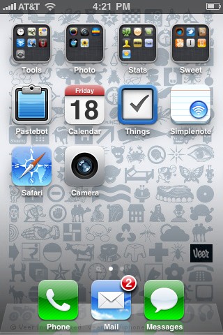
Thanks to folders, my first Home screen now has the apps which used to occupy my first two home screens. These are the apps I use daily or weekly. And the OCD in me decided it would be best to name each folder with names that were five characters long. So: Tools, Photo, Stats, and Sweet.
On my second Home screen, I have seven folders: Rare, Reference, Utilities, A Games, B Games, Misc, and Tools. But off the top of my head I couldn’t even tell you what apps are in each of those folders.
The Rare folder holds all the apps which previously lived on the very last Home screen wasteland. A Games and B Games are just that — except I hardly ever play games on my iPhone so I don’t really know which games are the more or less favorites. And the difference between Reference, Misc, Tools, and Utilities is (embarrassingly) a bit lost on me. I chose those names because I was trying to avoid having four folders with the same name, Utilities. But unfortunately my current solution is just as confusing as the alternative.
Once I’ve nailed down some proper names, my only gripe with folders will be the spacial arrangement of the individual apps. As Lukas Mathis points out, the placement of an app’s icon is in one location in the folder’s icon view, but it’s in another location when you open that folder. (Similar to the same spacial issues the iPad has when you rotate the device from landscape to portrait.)
The Tray and Multitasking
But Apple doesn’t really intend for users to navigate through folders for the apps they use regularly. Instead, they’ve given us the Tray and multitasking.
It used to be that when you were done using an app and you pressed the Home Button you were quitting that app. Some app developers were smart enough to build state persistence into their app. Which meant when you came back to that app, it would load itself at the same spot you left it, but it still had to load.
Now you are no longer quitting the app when you press the Home Button. Instead the app is put into the background and its icon gets slotted into the Tray. You access the Tray by double tapping the Home Button and from there you can swipe through all the apps you’ve recently used. But the computer-savvy geek in me wants to quit out all the apps that I’m not using. It pains me to see an app in that tray which I know I only use once or twice a month. That app is taking up precious memory.
Neven Mrgan wisely advises:
This is not the multitasking you’re used to. The sooner you accept this, the better.
And so I’m learning not to play the Tray because iOS 4 is clever and responsible enough to quit apps on my behalf. The least-recently-used app gets the boot once the system actually begins to run low on memory. And with iPhone 4 rocking twice the memory my 3GS has, there will be even less reason to manually monitor which apps are running in the background.
John Gruber explains the new multitasking quite well:
The new model [of multitasking], […] is that apps are not quit manually by the user. You, the user, just open them, and the system takes care of managing them after that. You don’t even have to understand the concept of quitting an application — in fact, you’re better off not worrying about it.
The Tray and its fast app switching are just one element of multitasking in iOS. There are also a handful of background APIs which 3rd-party apps can now take advantage of. The most heralded have been the APIs for background music, location, and VoIP. Respectively: Pandora can play music while in the background; GPS apps can give directions while in the background; and Skype can host a phone call while in the background. I don’t use Pandora, GPS apps, or Skype, so these new features, while great, do not really change my life for the better at the present moment.
The API which I am most thankful for, in that it affects my day-to-day usage the most, is task completion. Now I don’t have to wait while Twitter uploads my latest tweet or Simplenote syncs my latest note. But unfortunately, the other side of the coin to task completion, background updating, is not baked in to iOS 4. When you open apps like Simplenote, Twitter, or Instapaper, even if they’ve been running in the background, they will not have been able to update. They still have to wait until they are the frontmost app before they can download any new data.