As far back as I can remember I have been fascinated with laptops. Primarily for what I considered to be the coolness factor: they were portable and foldable. Growing up I would cut out and save ads from magazines selling laptops at Best Buy or Wal-Mart.
After high school I took all graduation money and bought my first computer: A Dell Inspiron 3800 (laptop). Five years later I bought my next laptop: A 12-inch PowerBook G4. And two weeks ago I purchased my third laptop: A 15-inch MacBook Pro.1
Last spring, as my PowerBook began to show its age due in the graphics work I was using it for, I decided to buy a tower instead of a new laptop. The idea behind buying the Mac Pro was that (1) it would last for years: I had already been using my PowerBook for more than two years, who’s specs were far below the Mac Pro’s and it was still chugging along well. And then, (2) the ease and affordability to expand the Mac Pro’s specs would make it all the easier to make sure it lasted even longer.
Therefore the PowerBook became my secondary computer. I used it when traveling and when not in the office – which was still quite a lot – and the Mac Pro became my primary work machine. Then, about a month ago my wife got a new position at work and now needed her own laptop. She hooked me up big-time by taking the PowerBook and letting me get the new laptop. (I owe you big-time, babe!)
I ordered the new 15-inch, multi-touch MacBook Pro with a 2.4GHz processor and the 200 GB 7,200 RPM hard drive. I watched FedEX as they picked it up in China, swung by Alaska, and finally dropped it off at my place a week ago.
When you use two computers you have to pick one that will be the “primary” computer; the home base. It’s your only hope for any sort of syncing sanity (if there is hope).
The point of picking one main machine is that you now know where to keep all the most recent versions of files, it’s where all your iTunes purchases are done, and it’s what everything syncs with.
While I was had the PowerBook it was a no-brainer that the Mac Pro would be home base. And even still, when I purchased the MacBook Pro I fully expected that it too would be my secondary computer, just as the PowerBook had been.
However, it quickly became obvious that the MacBook Pro should be the main computer. It just made sense. For several reasons:
- The PowerBook had a 100 GB hard drive, which was enough to keep many important files, some songs and some photos, but not enough to keep all the data I have. The MacBook Pro, on the other hand, can hold all my data. The 200 GB 7,200 RPM hard drive is plenty big enough to store all my files with room to spare.
- The entire reason I purchased the Mac Pro was because the PowerBook couldn’t keep up with the graphics-intensive work I was doing. The PowerBook couldn’t be my “work” computer anymore, and therefore became my “write, email and surf the web, while away from home” computer. However, the MacBook Pro has better benchmarks than the G5 Power Macs, and is even quite comparable to my Mac Pro’s performance in many of the most common tasks I do every day. The MacBook Pro is clearly a capable work and road machine.
- The biggest pain in the butt when using two computers is keeping them synced. Whenever I needed to go on a trip while also in the midst of a major design project I would have to transfer all the relevant files over to the PowerBook. Additionally, I never knew if the one or two other projects which I just finalized may come back to haunt with some pre-print, last-minute emergency; so I would have to transfer them over as well.With the MBP as my main computer I can just put it in my backpack and go to another city without worrying about forgetting an important photoshop file. And that is an ease of mind is worth its weight in gold.
Although I originally didn’t intend it to, the MacBook Pro now has become my primary computer. Which naturally leads me to the next logical question: Do I even need to keep the Mac Pro? The answer is no.
I don’t need the Mac Pro. The loss in horsepower is negligible for what I do, and the gain in simplicity cannot be expressed with words. I’m selling the tower and going back to being a one-computer consumer, and connoisseur of fine laptops.
If I had known this would be the outcome before I ordered the MacBook Pro I would have ordered the mid-level, 2.5GHz processor which has the higher 6MB of L2 cache, the faster bus speed and the better graphics card.
But even still, this thing is a fantastic machine and herein is my review:
Packaging
I very much appreciate the minimum amount of items included in the MacBook Pro’s box. Aside from the computer, the box only contained the power cord, a DVI to VGA adapter, the remote control I paid $19 for and a small black “Designed by Apple in California” box.
In the small black box were two things: One labeled “Everything Mac” and another labeled “Everything Else”. Everything Mac is the user’s manual, and Everything Else is a cardboard sleeve holding the install discs, the bluetooth info sheet, the obligatory Apple stickers and a very nice screen cleaning cloth.
What I love so much about the small amount of peripherals and paperwork included is that it gives more attention to what comes in the box. The concept is similar to a printed flyer: If the flyer is covered in text you won’t read any of it. But if it has just a few phrases you will read those. When un-boxing the MacBook Pro it was like each piece was there for a purpose – not “just because”. Less is more.
And along these same lines is the size itself of the MacBook Pro’s box. It is quite a bit thinner than my PowerBook’s was. Though I remember when un-boxing my PowerBook, there was a great deal of open space underneath the computer.
It’s almost as if the boxes themselves communicate the form factor of the enclosed laptop: Wider and thinner versus shorter and “stubbier”.
Form Factor
After using a 12-inch PowerBook for so long I still haven’t adjusted to the bigger look of the 15-inch when I’m using it. It’s not so much the screen that throws me off as it is the extra space next to the keyboard where the speakers are. I’m used to looking at a bigger screen, but not used to typing on a laptop with an extra inch-and-a-half of hardware on either side.
When I see other people using their 15-inch laptop it doesn’t seem large at all, but when I’m sitting right in front of mine it seems huge. Though a quick glance at the “airplane wing” style 17-inch, and the 15-inch seems quite proportionate again.
Otherwise the size difference is most welcome. The larger footprint makes the MacBook Pro feel safer and more comfortable on my lap. And since it weighs nearly the same as my old PowerBook, it’s a win/win situation for me.
Other differences – such as the better speakers and the extra input jacks (Finally: FireWire 800!!) – are great. I’ve quickly become a fan of my $19 remote control, but the IR sensor on the front of the laptop is a serious eye sore.
And of course, some old habits will die hard – like trying to put CDs in the right-hand side.
Unchanging
Apple’s professional laptops have gone virtually unchanged for nearly 5 years. The new MacBook Pros looks nearly identical to the original aluminum PowerBooks that came out in fall of 2003. I could just imagine a conversation along these lines:
“Hey, is that Apple’s newest laptop?”
“No. It’s my 4 year old PowerBook.” 2
Not that any of you would ever ask that question, but you see my point, don’t you? The above conversation reveals two things: That (a) Apple’s laptop hardware is still attractive and appealing; and (b) that it is not uncommon to see someone still using their four or five-year-old PowerBook on a daily basis. Even though 5 years is a virtual eternity in computer-land, the previous generation of Apple’s laptops – the aluminum PowerBooks – are still hearty machines.
I’m sure that much of the PowerBook’s longevity is due to the fact that Apple fully controls the development and engineering of the operating system and the hardware it runs on. Simply put: Apple doesn’t need to conform to the lowest common denominator.
Set-Up
After un-boxing the first thing I did was install 4 GB of new memory. There’s no reason not to max out your RAM; it’s the single most affordable and effective way to minimize any cases of beach-ball-itis. Laptop memory is just about as cheap as tower memory nowadays, and swapping out the two 1 GB sticks for two 2 GB sticks was just as easy as adding RAM to the Mac Pro (a machine that’s famous for being easy to upgrade).
Migration
With the new memory installed I booted up and migrated my data.
Ideally I would have done a clean install of all my applications, manually transfer the documents and let .Mac sync the rest, but I wasn’t in the mood for the extra time and attention it would take. I had a few meetings to go to that afternoon and I wanted to come back to a ready to use laptop; therefore I used the Migration Assistant instead.
Instead of using the Mac Pro, I used my external FireWire drive which holds a bootable clone of my Mac Pro via SuperDuper. This way my tower wasn’t out of commission while I transfered files, and I saved the time it takes to do a Time Machine restore.
Migrating roughly 180 GBs of data over the FireWire 800 port took about 2.5 hours. And once all the files were successfully migrated the thing booted up perfectly and was ready to roll. Well, except for a few oddities…
Network Settings
Once I had the machine up and running the first thing I had to do was make sure the internet worked. I mean, without internet what good is the thing? Seriously…
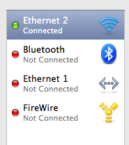
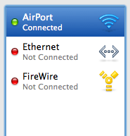
I hadn’t been thinking and I had the migration assistant transfers network settings. Regardless of the network capabilities of the old machine verses the new machine, it just sets up the new network settings to be identical to the old ones. Which means since I was transferring from the Mac Pro, laptop’s Airport option now read as “Ethernet 2”, even though it had the radar icon next to it.

Additionally, the Airport icon up in the menu bar was displayed in the “empty” state, as if it was turned off. Clicking on it said the airport was not configured. But the MBP was getting signal from my wireless network because I had internet with no cables.
The weirdness was easily fixed by simply re-configuring everything using the location setup assistant.

The Keyboard
I have always been jealous of the backlit keyboards. I think they’re brilliant and my 12-inch PowerBook didn’t have one. Naturally, one of the first things I played with was my new keyboard’s backlighting. But, it was broken. At first I thought the mapping for the hardware keys (F5/F6) was broken because in normal light I was totally unable to manually turn on the keyboard’s backlight.
When pressing the adjustment keys this would appear:

I assumed the unresponsive lighting had something to do with the same migration trouble I had with the Network Settings. I repaired the disk permissions, reset the PRAM and still had no luck. After searching online with no results I called Apple..
The general technician was clueless on how to fix it. He assumed I would need to re-install the OS due to the hardware mapping problem from the migration. But before making that giant executive decision, he transfered me to a product specialist.
I again described the problem, and he too was unsure about a solution. I noted how the lights came on when it was dark in the room (or when I put my palms over the speakers), and then, at that point I could adjust the brightness level. But I could not manually turn the backlights on if they weren’t first turned on by the ambient light sensor.
The product specialist concluded it must be a new feature in the latest MacBook Pros since they have the new F1 – F12 keyboard layout and what-not. And that was the end of that.
Those of you who have a 15-inch Mac are probably rolling right now. Since I’ve never owned a laptop with backlit keyboards I had no clue, but apparently this has been the standard function all along! (Read: over four years!)
To recap: You can’t adjust the backlit keyboard unless it’s dark in the room.
Now, as far as real keyboard changes go, there are quite a few (Apple Care phone support, take note):
- As expected, the F1 – F12 layout in the MBP is now the same as the slim keyboard’s, the MacBook Air’s and the MacBook’s.
- The Enter key to the right of the spacebar has been replaced by the option key.
- The num lock key is gone, as are the keypad style numbers.
- The “speed tap safety feature” for the caps lock key (a.k.a. the antiCAPSLOCK campaign) has been implemented. The reason it exists only in the new laptops, and not in all of our computers via some software update, is because as Rentzsch discovered: “The activation delay occurs in the keyboard itself, before the operating system even sees the key-down.”
Point being: all of Apple’s keyboards are now the same. The only differences are the F5 and F6 keys: on the MacBooks and the slim-desktop keyboards those two keys are blank, whereas on the MBPs and MBAs they have the icons for the keyboard’s backlight adjustment.
The Screen
The LED screen is gorgeous. Naturally I got the matte screen, since (no offense, but) glossy is synonymous with cheesy to me. The display is bright, clear and sharp. And even though it’s not quite as bright as my Apple Cinema Display, it is a very satisfactory alternative when not at my desk.
The 1440×900 pixel resolution is the same as the old 17″ PowerBooks used to have a few years back. And it is in-fact a higher pixel per inch density than my 23″ ACD is (114 PPI for the MacBook Pro versus 98 PPI for the Cinema Display). One of the primary advantages of a higher density screen is font-rendering — especially on the Web. If you like to read on the web, the MacBook Pro makes great companion.
Of course, when working at my desk the Cinema Display is still more pleasant – on the eyes and the neck – which means I’ll be diving back into the world of connecting to an external display on a regular basis. I’m reminded of how fantastically my PowerBook handled external monitors. As John Gruber put it:
The PowerBooks’ support for external displays is quite clever. When the PowerBook wakes from sleep (or starts up), it detects which displays are available and uses them. This means you can walk around using the built-in display, set it down, connect an external display, and it automatically recognizes the just-connected external display and uses it. If you keep the PowerBook open, it uses the external display in addition to the built-in display; if you keep the PowerBook closed, it uses the external display instead of the internal. Disconnect the external display, and the right thing will happen, where by “right thing” I mean that any windows which were open on the no-longer-available display will be moved to the internal display, and resized, if necessary, to fit.
Moreover, it seems the MacBook Pro now has instant monitor detection. I’m not sure just how new this is, but it’s new to me. When I plug in an external monitor while the MBP is open and running it detects the new monitor right away and adjusts accordingly with only a few seconds of light-blue-screen down time. Likewise, if I unplug the external monitor the MBP adjusts, and, as John says, “does the right thing.”
Next is the ambient light sensor. It’s a nice feature, but I can’t seriously imagine anyone leaving it on for the internal display. I often have my left hand off to the side of the keyboard (and therefore over top of the left speaker) keeping my thumb on the CMD key and my middle finger on the tab key, and I often bring my right hand up and it would dim the screen every time – not too much, but just enough to make you feel crazy. It only took about 45 seconds of use before I realized I would have to turn it off.
Otherwise, my only gripe about the MacBook Pro’s display is the amount it will tilt back, or rather, won’t tilt back. Compared to my PowerBook the difference in angle is substantial, and I miss it. I’m not sure, but from what I can tell the primary reason for the tighter angle is the slimmer form factor of the new MacBook Pro. Meaning if the screen did tilt back any further I think the outside edge of the display would actually lift the back end of the laptop up.
Multi-Touch
Like I do when almost any of Apple’s new products are announced, I didn’t think of the multi-touch as necessary to my everyday laptop use. That is, until it actually was a part of my everyday laptop use. Sure, I knew it would be nice, and if I could choose between getting a laptop that had it or one that didn’t, I would choose the one that did. But for the most part, I was impartial.
Now, after a week with the multi-touch, I am hooked. Not only are the old multi-touch features (two-finger scrolling) new to me, but the newest features (three-finger swipe, pinch, and etc.) are brilliant.
Just like on the iPhone, the multi-touch gestures make perfect sense in context. Which means I don’t have to think about them. Once I settled that three fingers swiping from left to right means “next” I find myself naturally using it in places I hadn’t even thought about, without thinking about it. It already feels natural.
In iCal the three-finger swipe takes you to the next or previous day/week/month in your calendar. In Apple’s Mail the swipe takes you to the next email message. In Preview, you get the next page. And it’s the same with pinching: On the desktop, pinching enlarges or shrinks your icon sizes. In Preview, it enlarges the image or document. And, more…
Even the short tutorial videos in the trackpad preferences pane are brilliant. What a perfect way to demonstrate how to use all the different options.
Right now, multi-touch to the trackpad is what keyboard shortcuts are to the the keyboard. But But it’s apparent that multi-touch to the trackpad can be what Quicksilver is to the keyboard.
Since multi-touch is really only helpful inside apps which are primarily designed as mostly mouse-input apps (iCal, Safari, iPhoto) versus keyboard-input apps, if you’re in an app that is mostly a keyboard-input app, forcing yourself to use multi-touch instead of keyboard shortcuts is a little more trouble than it’s worth. But, if you’re fingers are already on the trackpad then multi-touch features can be great.
Clearly, multi-touch won’t be able to replace all the keyboard shortcuts. But certainly the most common ones.
To see how multi-touch would work with some of the 3rd Party apps I use regularly, I installed the beta of MultiClutch.
MultiClutch takes keyboard shortcuts and maps them to trackpad gestures for certain applications. I honestly haven’t found it indispensable, since the applications that I find myself using multi-touch functionality already support it: Mail, iCal and Safari. But I have been able to set a couple new convenient gestures.
The MultiClutch setup pane is pretty straight forward. You add an application to the list, select the multi-touch gesture and then pick the keyboard shortcut you want accompany it and.

When I’m in an app that I wish had some multi-touch functionality I can go to MultiClutch, add the gesture, and the new mapping works instantly. As of now I’ve only added four gestures in MultiClutch. Two in NetNewsWire and two global shortcuts.
In NNW I wanted to map three-finger swipe to the space bar — this makes sense because the swipe means “next” and pressing spacebar takes you to your next unread feed. But MultiClutch doesn’t allow me to map the spacebar as a shortcut key.
Fortunately, pressing CMD+/ also takes you to “Next Unread”, and pressing CMD+’ takes you to previous unread. I mapped these to the three-finger swipes for previous and next, respectively. This actually works better though, because CMD+/ takes you directly to the next unread item, whereas spacebar also scrolls down the article until it gets to the end, and then takes you to the next unread item. I can use the swipe shortcut and the two-finger scrolling to read a bit easier in NNW than what just spacebar alone offers.
For the two global shortcuts, I mapped “Swipe Up” and “Swipe Down” to “Page Up” and “Page Down” respectively. This has been great for Safari, and other similar situations where I want to get to the very top or very bottom of the page.
Unfortunately, Adobe CS3 doesn’t get any love from MultiClutch. It would be great if pinching in or out would zoom respectively, and three-finger swiping would take me to the next page in InDesign, but gesture mapping through MultiClutch doesn’t work with Carbon apps.
Obviously multi-touch has a bright future. I think it’s a privilege to be around from the start, so one day I can say something like, “I remember when I had to click on the sidebar and drag down to see the rest of the page.”
Hard Drive
I am determined not to be a digital pack-rat. I delete anything and everything I can and try to keep around only the files which I am quite confident I will need again in the future. I simply hate keeping something on my computer simply because I might, maybe, possibly need it one day.
Needless to say, upgrading the hard-drive’s speed instead of capacity was a no brainer. I paid the $100 upgrade to get the 200 GB 7,200 RPM hard drive. Looking in the System Profiler, I found the drive is from Hitachi.
The MacBook Pro’s hard drive is as quiet as my PowerBook’s used to be before I manually replaced the drive in the G4 a few months ago. (I took out the stock Hitachi 80 GB 4,500 RPM drive it came with and put in a Seagate 100 GB 7,200 RPM drive I bought from NewEgg.) The first thing I noticed with my PowerBook’s new drive was the hum and even some vibration.
The Mac Pro tower currently has two hard drives: The 250 GB Western Digital drive it came with and an additional 500 GB Seagate drive I added later. The drives are quiet, but it’s the fans that make so much noise.
All this to say I am very impressed at how quiet the MacBook Pro is: The fans and the hard drive.
Sleeping
If I leave the MacBook Pro alone for awhile and the screen goes to sleep, the white LED comes on, but at full-strength (not pulsing or breathing). I am not quite sure what the point of that feature is, though. I suppose it’s so I can instantly tell the state of my Mac if the screen is off.
This feature also comes in to play when closing the lid to put the Mac to sleep. The white LED will come on right away at full-strength, but won’t start “breathing” until the laptop actually goes to sleep. I’m used to waiting until the LED comes on, but now I have to watch it and wait for it to start breathing before I can pack up the laptop. I wish they would have left that alone.
Unfortunately, putting the MacBook Pro to sleep takes 30-45 seconds. This is a long time to wait when you’re ready to go. But the reason it takes so long to sleep is because your computer is writing all the information that’s in RAM to your disc. This way you won’t lose any info if your battery dies, or falls out while in sleep mode. But with 2 to 4 GB of RAM it can take quite a while.
There’s a short terminal command (via Paul) to change the sleep-mode from the default “3” to “0” which fixes the slow sleep frustration:
sudo pmset -a hibernatemode 0
You’ll be prompted to enter your administrator password, and then you’re good to go. And make sure you logout before quitting terminal or the change won’t keep.
What this command does is change your laptop’s sleep-mode from “safe” to “instant”. That means if your battery dies while your laptop is sleeping you’ll lose all your session data.
But I always save – and usually quit out of – everything anyway, so it would be no loss if the battery died. And now the laptop sleeps in about 5 -7 seconds instead of 30 – 45. Hallelujah.
UPDATE: SmartSleep.
Proper Baggage
Finding the right bag seems to be a never-ending venture. I knew I would miss my little Brenthaven bag for the 12-inch PowerBook, but Brenthaven’s 15-inch MBP version was a bit too clunky. I found a slick Burton Bandwidth Case from Turntable Labs. It’s slim, has very little extra storage, and is perfect for the times I just need to take my laptop and nothing else.
That case is not my everyday bag, though. For everyday use I’ve decided I need a backpack: One that doesn’t look like it belongs in a sci-fi movie; one that holds my laptop safely; And one that is the right size (not too big, but not too small).
I’m currently using the Case Logic XN Backpack, and so far, it seems to fit the bill. Granted, I have a pretty bad track record of keeping bags. I’ve been through about 8 in the course of my three laptops, but with each one I get closer to perfection.
Odds and Ends
More Reviews
This is just one of a handful of winded and entertaining software reviews.
