These look cool. They’re handmade, custom iPad cases. You get to pick the design and color of your case’s material as well as which type of pockets you want. You could make a very fun case for your iPad.

I asked Simon Barker, who runs Slotzz, if he was running any deals and he set up the coupon code “sblanc10” so you can get 10% off.

Custom-Made iPad Cases

An Interview with Neven Mrgan

Neven Mrgan is a designer, developer, and writer. He works at Panic, Inc., writes a popular weblog (or two), draws video game graphics in his spare time, and his last name is a bit of a mystery.

In this interview Neven and I discuss graphic design, life at Panic, and other miscellany.

The Interview

  • Shawn Blanc: Until you joined Panic in 2008 you mostly did freelance work building web apps, correct?
  • Neven Mrgan: I did freelance design and development work — mostly on the web — for a few years, and I had more or less interesting day jobs that time as well. I worked as an engineer on very straight-laced business web apps until 2007. This wasn’t terribly fun, and to be honest, I wasn’t too good at it either. Early in 2007 I decided to start sticking to graphic design and UI design, since I was never going to be a kung-fu-grade developer.
  • Shawn: Your job with Panic seems like a perfect match in the sense that you fit right in as another clever, funny, nerd. But on the flip side, now you work in a team setting with a company that builds desktop software as opposed working solo on web projects. What led you to take the job with Panic?
  • Neven: Regarding desktop software, it was somewhat new to me indeed. Sorry to bring up iPhone this early in the conversation, but it was a big catalyst for me in several ways; it was the first time I was doing non-web UI design. That was the roundabout route I took to designing desktop software.

    As for Panic, the fit was just ridiculously good. They build excellent software, and they do so in a genuinely friendly, likable way. That combination is very uncommon. I was a recently married and ready-to-settle-down old fogie of near 30, and was big on leading a comfortable, quality lifestyle, and working on solid, long-term projects. Panic has those same goals.

    Working on a team was a change after a year of clicking around in our home office. It’s hard to complain about the freedom of that arrangement, but I’ll do my best: a chair in your own house can be a pretty inert environment. It’s a bit of a bummer on a purely social level, and it can make your creative muscle slack as well. That’s been my experience, anyway. I’m happy to be surrounded by really smart folk as I click around now.

  • Shawn: Do you ever miss working from home?
  • Neven: I have that option currently and I don’t believe I’ve taken advantage of it more than three times (and even then, only because I had to be home for some reason). I can’t emphasize enough how much I like the vibe at my office. It reminds me of how I’d go to my high school’s super-awesome computer lab on the weekend, in the evening, and whenever else I could. I love what I do, projects and people and desk and all — it’s my job and my hobby.
  • Shawn: You’ve got a lot of projects running — your couple cool weblogs, The Incident, your full-time job at Panic, and more. What does a day in your life look like?
  • Neven: I half-wake up around 7:30 and remain in a hazy, floating, brain-puree state for about half an hour. This is when I get all of my stupidest ideas (like you know how some restaurants menus have a little V next to vegetarian items and maybe a clipart chili for “spicy”; what if they put an F next to “foodie” items? “Can the salad be made foodie?” -“Certainly; we can make it with Pouligny-Saint-Pierre and shave a black truffle onto it.”). Stupid ideas are excellent springboards, boosters for your thought and your daily mood.

    I then check my email and RSS in bed; if it takes longer than five minutes, I save it for after I’m dressed. To do that I pick a Panic t-shirt from the stack I was given when I started (“your employee uniform”) and put my socks on in front of the computer. I briefly chat with whoever is online – usually only Matt Comi, my partner on The Incident. I take the bus to work; twenty minutes of book-reading on the ride, ten minutes of iPod while I walk.

    I work ten to six. The morning is usually time for catch-up, unfinished business from the previous day, or quick production of ideas pickled overnight. Lunch is important because it brings the office together. It’s our most regular team meeting. The afternoon means serious work — Photoshop and Coda — and a snack break around four. I drink Coke Zero and endorse Nuvrei pastries.

    Most days, I try to cook at least one meal; if there’s time to make dinner after work, I’ll give it a shot. If not, Portland has an embarrassment of excellent restaurants. Either way, I eat early and spend the evening working on whatever side projects I have going on. I go to sleep disgustingly late —midnight or 1 am.

    This isn’t a schedule I make it a point to stick to. It’s just how things typically play out.

  • Shawn: What are your favorite pieces of software?
  • Neven: Photoshop, Coda, and Birdhouse.

    I know, I know — give me a chance to explain.

    I complain about Photoshop. Lord, do I. But it’s not only the essential tool for what I do, it’s a great tool also. I’ve done my best to give the competition a shot, and the truth is just that they don’t allow me to make the things I want to make (yet). Photoshop is internally and externally inconsistent, it’s bloated, it’s slow, and it crashes. But I use it more than I use my pants, and for that I love it.

    Coda is an app I work on, so feel free to consider this a shameless advertisement. You’ll have to take my word for it: I used it before I started at Panic, and if I found a better app for web development, I’d promptly switch to it. Life is too short and the web too demanding to be a slave to cheap loyalty. It’s a great app.

    Birdhouse is the only not-preinstalled app on my iPhone about which I have zero complaints. I use it regularly, and I don’t remember it crashing, slowing down, or confusing me once. You could argue that it does a tiny thing, but it does it well.

    Sometimes I think that if this whole computer thing turns sour — if Apple becomes monstrously evil, if the Internet collapses, if I get old and stop grokking new technologies — I’ll switch to farming or cooking or poster design and be just as happy. Maybe that’s true. Some not-so-small part of me would, however, miss the wizardry I discovered some time in 1985 or so as I typed BASIC into my C-64: I can make a screen do things, and do things that do other things, and do different things depending on the things I do back to it. It’s a wonderful game.

  • Shawn: Other than for your lack of development skills, why did you begin doing work as a designer and developer?
  • Neven: Two beliefs: 1) Things should look good, and 2) Computers are cool. For the rest of my life I’ll be coming up with complicated explanations which boil down to those motivating principles.

    So, I’ve really always wanted to be doing this or something like this. This or drawing comics, which I quickly learned was kind of not so hot.

  • Shawn: Was it a lack of drawing skills that led you to computer-based design? (And do you have any old comic book drawings you’re willing to share?)
  • Neven: I’m very happy with my drawing skills!

    I decided to stick with computers because they could do things the real world couldn’t. I’m all in favor of creative restrictions — yay Twitter — but pen and ink’s lack of an Undo function doesn’t challenge me to do better work. It just makes me frustrated.

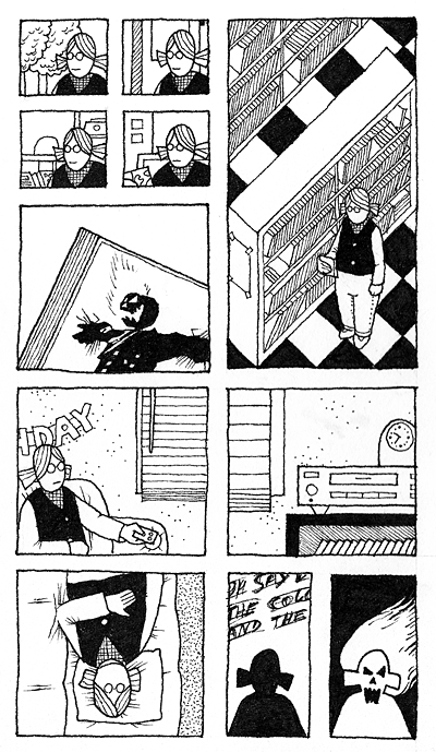
    Now here’s a really out-of-context panel done some time in… 1998 or so, maybe?

    Neven Mrgan Comic Panel circa 1998 or so.

  • Shawn: If I ever want a future in art and design it will have to be with a computer. I can never get pen and ink to translate into what I want.

    You’re not alone in with the belief that things should look good and computers are cool. But everyone has their own definition of what looks good and what the best tools for the job are. How do you define when a design looks good? Has that definition changed since seriously began sticking to graphic design and UI design?


  • Neven: One thing I’m learning quickly is to evaluate designs and design ideas in terms of interaction: how they behave under what circumstances, how they work with other elements. That’s sort of new to me, though designing for the web has always been about flexible, unpredictable layouts and such.

    A thing looks good to me when I fall in love with it; that’s test #1. Test #2 is, ok, that’s sweet – what is it? Does it say something, mean something, is it an “it” or an “It”? Test #3 is the more ponderous goatee-rubbing over how the design scales and translates, whether it’s too trendy or too dated, etc.

    Sometimes I learn to eventually accept designs as excellent solutions even if they didn’t hit me right away. And sometimes designs I greet with a WOW bore me very quickly. But it’s very rare that I will love and cherish a design if it has to be “explained”.

    It’s not important that I love everything I design. But hopefully it happens pretty often.

  • Shawn: How would you recommend someone with no facial hair go about completing test #3 as a part of their own design critiques?
  • Neven: There are a number of question you can ask about a design once it’s grabbed you.
    • Will it scale, not just physically, but across cultures, age groups, platforms, ideas? Will your icon idea make sense to a busy person working in a dark room?
    • Can any part of your design be abstracted and used elsewhere? Would anyone want to steal it? (You better wish they would!)
    • If you’re breaking an established pattern or convention, are you doing so with good reason? With what are you replacing what you’re destroying?
    • What if the things you, yourself, like to use were designed in this way? Remember Kant’s categorical imperative, “Act only on that maxim which you at the same time wish to be a universal law.”

    You will add more questions to your list over time; you will also drop some as times change and as you develop your own priorities (the point is not to be able to answer “yes” to every question on the list).

    Now here’s the important thing: DO NOT write down the list. Don’t put checkboxes next to questions and save it all as a file. Don’t print it out. Don’t ask people you work with to start using it. This way lies madness; or at least boredom, burn-out, and blandness.

    My feeling is that many creative endeavors are like this; you should learn specific techniques and aesthetic guidelines, but ultimately you will want to simply do a lot of work and let the aesthetic judgment become a second nature. A good musician can, for the most part, “let their fingers play” instead of focusing on translating each sound-idea into a specific finger movement. A good baker will measure things, but they will only make consistently awesome bread when the dough “feels” right under their fingers. There’s no magic, destiny, or talent at work here, just a gradual process of practicing until the back of your head can do most of the work, not the front.

    So, long answer short, learn as much as you can about the principles of design, about its history, and about other people’s work. But try to let it all soak into your brain through constant creative and functional use, not through cramming or some sort of workflow standardization.

  • Shawn: How much, then, do you suppose good design sense boils down to talent versus practice?

    Can tools and rules, in and of themselves, produce a quality designed product?


  • Neven: I just realized I’ve been harping on the 90%-perspiration thing without going into why the remaining 10% — “the squishy bit” — is important. It’s frustrating to even think about it because it leads me to a mildly fatalistic state where I just throw my hands up and decide that if good design is a matter of talent and destiny, then it isn’t worth doing since most people won’t even know it when they see it. Which is true, in many ways. Why does a designer spend any time deciding between Helvetica and Univers? Most people won’t know or care either way. Or maybe they will, on some unreachable level — maybe Helvetica will appear more generic (at least today it will), Univers more technical; the former, more “design-y”, the latter, more “informative”.

    A designer will obviously have far more opinions of this sort about the minutiae of design. Now, partially these will be a product of the designer’s education and work experience. Maybe they once read Univers was a good choice for signage, or a teacher told them it was a modern classic. Maybe they’re sick of Helvetica.

    But given enough time, these opinions will become more than restatements of other people’s attitudes. Different aesthetic prejudices — sometimes clashing ones — will come together in one head to create a unique taste and signature.

    A great trick I learned from the science writer Matt Ridley: in debates over nature vs. nurture, remember that one is a function of the other, so it doesn’t make sense to say talent “contributes 30%” or some such thing. They’re linked in a much more complicated way.

    To answer the second question a little more directly: no [tools and rules, in and of themselves, cannot produce a quality designed product].

  • Shawn: You’re right that most people won’t know good design when they see it. But in the context of UI design, that’s the point.

    Jeffrey Zeldman wrote a great definition of Web design in an article, “Understanding Web Design“. He said:

    “Great web designs are like great typefaces: some, like Rosewood, impose a personality on whatever content is applied to them. Others, like Helvetica, fade into the background (or try to), magically supporting whatever tone the content provides.”

    Like you said, Neven, the vast majority of people won’t even notice your design. But the very act of them not noticing is (usually) the proof of a good design. On the flip side, of course, are times when the people should notice the design. It’s the Form Versus Function debate that UI designers are faced with every day. The mark of a great designer is one who knows when to chose which side of the issue and how find the balance between both sides.

    The reputation for Panic when they come to a form-versus-function hurdle is to find a simply stellar solution (like Cabel’s 3-Pixel Conundrum). Has Panic developed any official guidelines for working on UI design? Have they ever conflicted with your personal preference?


  • Neven: I work under surprisingly few constraints as far as what must or mustn’t be done. We’re pretty aggressive about staying ahead of the curve, so we insist on certain not-yet-widespread widespread technologies (resolution-independent graphics, for one). We love a good visual metaphor — Coda’s taped pages in the Sites view — but it has to make sense, and it can’t be realistic at the expense of usability, or to the point of sickening cuteness.

    If we’re adding a feature, we almost never go “ah, there’s already a standard control for that, we’re set.” We might just end up using the existing design, but not before we poke it within an inch of its life. Why does this menu look like this? What if we had never seen it before — how would we build it?

    As Cabel has mentioned, we’re big on weenies: elements that make a design stand out immediately. There’s nothing wrong with a simple metal window, but there’s nothing great about it either, and more things should be great!

    This is the designer’s nastiest temptation — over-designed, needlessly custom chrome which neither fits nor improves the platform. This is the land of Windows Media Player skins. Often we try to “fit the OS better than it fits itself”, if that makes sense; if we think an Apple widget betrays the hand of an intern, we’ll draw our own, better one. This is the thing people notice the least, but it’s a great personal victory.

    To get back to rules and guidelines, nothing is off the table, really. I realize that when I say that I’m excluding things obviously off the table: round windows, animated toolbars, blue chrome, scripty type. Part of this intangible, complex, wavelength-syncing soup we as a team live in is the baseline of quality and aesthetic we all appear to share: let’s not do Thing X, ever.

    As for my personal preferences, I’m probably more conservative than the team as a whole. I’m seeing that (slight) difference as a learning opportunity, so I’m happy to report there have been no freak-out arguments over shades of green. You’ll just have to take my word for it, our tastes are creepily aligned — if we weren’t such motormouths, we’d get along fine with an occasional nod or frown.

  • Shawn: Has the process of completing a design project changed for since joining Panic? Is there a boss or an Art Director who signs off on your work?
  • Neven: “Sign-off” is, like most things with us, a matter of conversation and feeling out people’s reactions more than a structured process. I’m the sort of person who has to get total agreement from others before I’m fully happy, so I usually gauge everyone’s feedback as I work, and this hopefully results in a universally accepted design by the time I’m done.
  • Shawn: I have done freelance work from my home as well as being a designer working with a team in an office environment. When I freelanced I had a handful of creative friends whom I could send drafts of my work to and ask for their feedback. Ultimately if my client liked it and I liked it, then it was a done deal.

    In the team dynamic, I enjoy having the ability to tap a friendly co-worker or two on the shoulder to get instant feedback and dialog about the project I’m working on. But there can, at times, be a downside to that setting insofar that more people need to sign off on the finished piece — it’s not just me and the client anymore.

    I prefer the team setting significantly more because it helps me stay more productive, more creative, and more dynamic in approaching problems. But (and maybe it’s just me. But) it can be frustrating when there is not universal head-nodding approval for every project I’m working on or leading.


  • Neven: I find that a team of our size — about a dozen — is a really good middle ground between the isolation of working alone and the tar-pit indecisiveness and slowness of focus groups, market research, surveys, and gigantic corporate meeting fests. I am constantly getting new ideas from the team (while bouncing them off everyone). At the same time, I don’t have to sit and wait for a design to make the rounds and get approved by a chain of people.

    Other than company size, a few other things about Panic help make this possible. We’re close in age, interests, and general attitude about life and work. Everyone is great at their job, and this makes it very different from working for clients. The client’s preference and criticism may or may not come from actual knowledge of the product, the audience, and the technology we’re talking about.

    Here at Panic, I know I’m getting feedback from a tech-savvy person smarter than me who is also a regular user of the product. If they have a complaint — and I should also mention they’re good at knowing what matters how much when it comes to design — it means there’s likely a real problem I should solve. Maybe there’s something I forgot; maybe the design should be a little more polished. Or maybe my idea was crap to begin with. I am far less likely to defend the design by simply saying “I think it’s good”. Keep in mind that this often happens when working for outside clients, and it’s not good for the designer. Not letting yourself get challenged will keep you from exploring new ideas. The trick is to be challenged by knowledgeable people you like and respect.

    I don’t know of any online resource for those, though, so… Your parents/karate instructors were right: there are no shortcuts, it’s going to take time!

The End…

Thank you, Neven.

For more interviews with extraordinary designers, developers, writers, and web nerds, visit here.

An Interview with Neven Mrgan

Want to know how Instapaper grew into such a wildly popular app for so many iPhone and iPad users? Read this article from Marco Arment, written two years ago, just after the release of Instapaper Pro in the App Store:

Right now, I face a fork in the road: do I continue iterating and improving Instapaper.app, or do I start making other applications and hope for multiple income streams? Instapaper.app is at a relatively stable point. I can stop here and be proud of where I’ve taken such a simple idea. And, theoretically, I’d keep making some money with Instapaper Pro while I work on something else.

But I’m not going to stop here. […]

I want Instapaper to be the essential app for every iPhone and iPod Touch user. I want it to be on every Apple geek’s short list when their friends and family ask them what apps to install. I want it to be one of your bottom four icons.

“The Future of the Instapaper iPhone App”

A new “visual news” app that cycles through hi-res photos and headlines while playing music in the background. The app has a ton of personality, and a lot of the UI elements are pretty fun. But unfortunately, it looks like they put more energy into promoting the app than they did to build it. It is brand new yet not optimized for the Retina Display. If you try to buy one of the cool songs that the app comes with, an in-app browser opens up and sends you to the iTunes website.

But shortcomings aside, how could I not link to this app?

Blancspot iPhone App

I’ve had one of these book study stands for years. And though I usually have my iPad in its Apple case, this stand works fine for propping my iPad up when it’s not in a case.

There are nothing but great reviews for Twelve South’s Compass. And feature-for-feature the Compass is a better stand. It’s built better, too.

But if price is a factor, this book study stand is a quarter the cost shipped. Which means if portability is a factor, you could buy four of these study stands for the price of one Compass and keep one in each room. (And if you buy one using this Amazon link, I’ll get a small kickback.)

Speaking of iPad Stands

Leo Babauta’s Sweet Mac Setup

Who are you, what do you do, and etc…?

I’m Leo Babauta, author of Zen Habits, mnmlist.com, and The Power of Less. I write about simplicity.

What is your current setup?

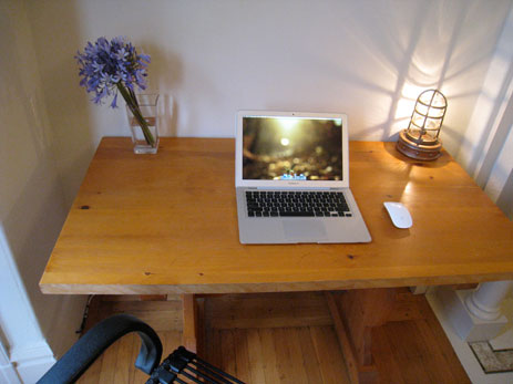
Leo Babauta's Desk

For a couple years, I’ve been using a combination of a 20″ iMac and a first-generation MacBook Air (yes, the ones with heat problems). Since our move to S.F. last month, I’ve been going with just the MacBook Air — I gave the iMac to my wife Eva.

I love using the MacBook Air as my full-time machine — it’s light, simple, and meets all my needs.

I don’t have an iPhone or an iPad, though both are drool-worthy.

Why this rig?

I’m a bit of a minimalist. I like to keep things as simple as possible, without sacrificing the essential functions.

I’m a writer, and all I really need is a browser and a text editor. The MacBook Air does those two things perfectly.

I don’t need a big monitor, as cool as they are. I don’t need a powerful CPU. I like lightness and simplicity and portability and focus.

What software do you use and for what do you use it?

I’m currently using Chrome and Notational Velocity, but sometimes I switch to TextMate or TextEdit or Omm Writer, depending on my mood or need.

Notational Velocity is lightweight, simple, fast. I’ve been doing all my writing in it — from todo lists to notes to full articles and blog posts. This way everything I have is instantly findable, it’s all stored in text (simple and accessible), and backed up via DropBox.

Chrome is lightning fast with a minimalist interface. I’ve tried all the other browsers but they just seem slow and clunky next to Chrome.

Other things I use regularly: LaunchBar for everything, 1Password, Transmit for FTP. Sometimes I also use WriteRoom, Scrivener, and MarsEdit for different writing needs.

How does this setup help you do your best creative work?

I like focus — simple software that doesn’t have a lot of bells and whistles helps me find that focus. I like things that do very little, very well. I try to cut out distractions — Tweetdeck or Tweetie, iChat or Skype, these things distract me.

Notational Velocity is the perfect writing app. All it does is write text, and it stores everything in text files, and you can find them instantly. You don’t need to file, and you don’t need to look for things.

How would your ideal setup look and function?

I’m content with what I have. I love the simplicity of the MacBook Air — when I have to use someone else’s MacBook Pro, it feels heavy and clunky. Don’t get me started on how it feels to use someone else’s Window machine. It would be nice if my Air lasted for 20 years.

My only improvement would be to have the perfection of Mac OS combined with the openness of Linux.

More Sweet Setups

Leo’s setup is just one in a series of sweet Mac Setups.

Leo Babauta’s Sweet Mac Setup

ttttask

I

The problem: You’re online with your iPhone or iPad and you come across something which you want to read, but at the moment you don’t have the time.

The solution: You send the article to Instapaper. It is now bookmarked, and when you have time you open up Instapaper (on your iPhone, iPad, or computer) and the article you wanted to read is ready.

II

Another problem: You’re online with your iPhone or iPad and you come across something you want to do, but at the moment don’t have the time to do it (or perhaps because of the device you’re on you don’t have the ability).

The solution: Something that, so far as I can tell, does not yet exist: A cloud-based, task-management bucket where you can throw links, tips, bookmarks, and the like — all of which are actionable. It would be able to receive these tasks via in-app services, email, or a browser bookmarklet. And I vote we call it ttttask.

Similarly to the way Instapaper as a service is for articles you wish to read later, ttttask would be a service for things you wish to do later.

III

It seems as if every day I bump into things while reading feeds, Twitter, the Web, or email — things I want to download, buy, research, and etcetera. But often I’m unable to take action at that moment. How then can I save it for later?

When on my Mac I use AppleScripts and built-in triggers to throw these items directly into Things. But on my iPhone and iPad there is no such solution. And since even the smallest pebble will make expensive Reeboks uncomfortable to run in, this sore spot of how to handle all the tasks I bump into when on my iPhone or iPad has got me thinking…

We need a universal, cloud-based bucket to throw these items into. A bucket that talks to all our current software instead of asking us start using new tools.

So far as I can see it there are two really great, though currently non-existent, solutions:

  1. A services menu for iOS. If this were a reality, people with the Things app installed on their iPhone and/or iPad could have a “Send to Thing” service available within all their other apps. Thereby allowing them to send tasks into Things on their iPhone directly from Twitter, Reeder, Mail, Mobile Safari, and more.

Some iPhone apps have worked around this by talking to one-another with the in-app APIs. You can save drafts of tweets into Birdhouse from Twitter’s iPhone app, or service reminders in Gas Cubby can be sent into Appigo’s Todo. But these cross-app functions take you out of your current context and sending you to another app — not exactly the ideal way to quickly save something for later.

  1. Another solution would be this universal, cloud-based bucket and its open APIs: ttttask. The caveat is that it would only be as useful as it is available. This is a big slice of why Instapaper is so great: all the various apps which have adopted it as an in-app service so you can hook into your Instapaper account right from within the app.

Ttttask’s APIs would allow for apps to toss items into the bucket and get them out. It would be able to receive these tasks via in-app services, an email, or even a browser bookmarklet. It would be able to pipe your to-do list into other applications. And if it got really fancy, tttask could even work as a syncing agent for other to-do apps to utilize. Then, regardless of which task-management software you use (and even regardless of what OS), you would be able to sync your software with what is in ttttask.1

These aforementioned solutions are tall orders. And unfortunately neither of them are a reality (yet). In the meantime here are some workarounds I’ve considered to at least alleviate the pebble of in-app task capture on iOS.

  • Set up a second Instapaper account. Since Instapaper is basically a long list of items which can be added to from so many other apps, it would seem to be a great interim solution. But there are two problems with using Instapaper as a Do Later list instead of a Read Later list. For one, Instapaper is built for headlines and article links, not tasks. So even though someone could technically use it as a task list, it is certainly not intended or suited for that purpose. Secondly, iPhone and iPad apps only let you access a single Instapaper account at a time. So even if I had two accounts I could only access one of them.

  • Use a bookmarking service other than Instapaper. Such as Delicious, Pinboard, or Read It Later. This could work, but again, it suffers from the same problem as above, in that these are services designed for bookmarking articles and links. Also, if you don’t already use one of these bookmarking services then you’ve just create another inbox to be aware of. I try hard to keep the number of inboxes I need to check at a minimum.

  • Use one of the many online to-do apps that let you create tasks via email. Such as Remember the Milk. Not to be a Negative Nancy, but this would again mean another inbox to check. Moreover, there are no online task management applications with services supported by other iPhone and iPad apps. And so if I am going to go through the trouble of emailing a task it might as well be sent to an inbox I already check.

  • Email the tasks to Simplenote. With the purchase of a premium Simplenote account you get a private email address which can be used to send notes into your Simplnote list. For those who use Simplenote to manage their task lists this just may work well. I, however, use Simplenote (and Notational Velocity) all throughout my day for writing and other note taking. I would prefer not to dilute my list of notes with items I am intentionally trying to deal with later.

And so the solution I’m currently using is perhaps the most obvious of all: email the task to myself.

I set up a new email address. One that is easy to type and is quite unique so I don’t send to someone in my contacts list on accident. (I’m using something along the lines of [email protected] — a couple taps on the “t” button brings this address right up.)

Furthermore, I’ve created a server-side email rule that moves all emails to that address into their own folder. Having the rule be server-side ensures that the emails don’t show up in my inbox on my iPhone or iPad. Moving them to their own folder keeps them out of my way until I’ve got time.

I use Things, and with a little bit of AppleScript and a rule in Mail on my Mac incoming task emails can be dumped into my Things inbox. (If you use OmniFocus you can enable Mail Hooks so that OmniFocus grabs the emails for you.)

However, even this solution has a two-fold downside. For one, it is tedious to always have to email yourself things to do, as opposed to using the quick-access, built-in services that apps like Twitteriffic, Tweetie, Reeder, and others have. Secondly, items don’t end up in my actual to-do app, Things, unless my Mac is turned on, connected to the internet, and both Mail and Things are running.

A service like ttttask has a lot of potential. Imagine being able to switch task-management apps like you switch Twitter clients; or sharing a to-do list with others even if you use different software? 2 But as I said, it would only be as useful as it is available. So building it comes with two big challenges: infrastructure and adoption.
  1. Evernote Trunk is a similarly functional service, in that they offer APIs for other apps to send notes into Evernote and to sync data. For example: in the Twitter app Seesmic they’ve baked in the ability to send a tweet to Evernote. Or BibleReader, which uses Evernote Trunk to sync bookmarks and notes.
  2. There are Web apps which let you share and collaborate to-do lists with your teammates, but for some, functionality alone is not the only goal. There is a lot to be said about using software that you enjoy and having an integrated inbox where all tasks are in the same app.
  3. Much thanks to Patrick Rhone and David Barnard for their editorial help and input on this article.
ttttask

For those who would prefer that visitors on iPhones see their actual website design, there is an option to disable the default mobile theme in tumblr. Go to Customize → Advanced → and uncheck “Use optimized layout on mobile devices”. Another option is to design and upload your own iPhone-optimized theme.

Up next: how to not install the WPtouch theme on your WordPress blog.

How to Disable the Default iPhone-Optimized Theme on a Tumblr Website