Brilliant thoughts on the Mac App Store, Finder, and more.
That Cool Desktop Wallpaper from Aaron Mahnke’s Sweet Mac Setup →
Both Aaron and I got a lot of requests for the link to that red forest image shown on his Cinema Display. Here’s the link and story behind it.
Why Brett Kelly Switched to WordPress →
And just a few months after raving about Tumblr.
The $40 App That Justified Chris Bowler’s iPad Purchase →
Chris Bowler, answering some questions for Ben Brooks about his iPad:
Thanks to OmniFocus, my iPad is now a key part of my work day. I keep an eye on my tasks there and do all of my weekly reviews with the iPad. It’s the first app where using the iPad version is easier and has less friction than the desktop counterpart. I give the biggest kudos to the OmniGroup team for creating an interface that just … flows.
Clever Shortcuts and Other Parameters for Entering Due Dates Into OmniFocus [PDF] →
It got to the point where I didn’t want to add any more info to my 6,000-word review of OmniFocus. But these tips from page 22 of the OmniFocus Manual about how to type in due dates are priceless.
You can be pretty creative with the way you enter dates; OmniFocus is rather smart about guessing what you mean. For example:
2d, -3w, 1h, 1y1m, and so on — Relative dates and times put the date at a certain amount of time from right now. Negative numbers represent times in the past.
2 days, -3 weeks, 1 hour, 1 year 1 month, and so on — You can use the full names of units too.
yesterday, tomorrow, next thursday, last month, this friday, and so on — You can refer to relative dates using common words. “This”, “next”, and “last” have specific meanings: this friday always means the Friday in this week, next friday always means the Friday in the next week, and last friday always means the Friday in last week, regardless of what day today is. Other units work in the same way.
september, thurs, 2019, and so on — If you enter the name of a specific time period, the date will be at its beginning. So september means Septem- ber first.
5/23/08 10a, 9.30.09 2:00 PM, and so on — You can use the short date format as defined in your International system preferences.
A Sledgehammer Called OmniFocus
Despite popular opinion, I do not prefer ultra-powerful task-management tools. I would rather keep my running to-do list inside of Simplenote. Many a weekend I hand write my to-do list onto a sticky note and place it on the fridge or next to my keyboard.
Because the tools — in and of themselves — are not what make me productive. And simply having a to-do list is not the same as doing things.
Unfortunately, low-fi task management is a luxury I cannot afford. In my role as Marketing Director at the International House of Prayer I am personally managing and working on upwards of a dozen projects at any given time. Some of these are personal projects (slowly advancing our approach towards communication and design) and some are group projects (like a website re-design).
One of the things I love about my job is taking complex and/or broken systems and simplifying them. I also enjoy taking nebulous ideas and turning them into clearly defined goals. In many ways, my work is like a giant puzzle I get to solve, and the end results are things like a well-run office, clear pieces of information, and non-complicated designs.
In the office, my team uses Basecamp. At any given time we have as many as 40 active projects — some are print, some web, some editing, and some are all of the above. However, I personally spend very little time in Basecamp. Often my time is spent thinking things through, having meetings and conversations, or doing research before the project is ready for the team to take it on in Basecamp.
Of the several projects I am personally managing at any given time, usually only two or three are truly exciting to me. When a project is the top idea in your mind you don’t need help thinking about it and staying on top of its priorities. But when you are responsible for additional projects which don’t excite you, you need help keeping on track.
Simplicity is not just about whitespace or having the least amount of features possible. It’s about having what you need. A “minimalist” would not do demolition work to their home using a small, lightweight hammer. For that sort of work you need a sledgehammer.
And this is why a powerful task-management tool such as Things or OmniFocus is so helpful to me. I lean towards the feature rich, powerful task managers because it is an area where I am in need of a sledgehammer.
When contemplating the minutia of a task management app it’s important to root out the false notion that a task list in and of itself will make you more productive. Task lists are not your boss; they are more like your assistant. OmniFocus is something I can talk to and tell what I need to get done, and then it assists me in doing that task.
But the tools and systems are just one side of living a focused life. Productivity as a vehicle for getting things done is more like a pair of running shoes: on your left foot is your system and tools, and on your right foot is time management. And you need both feet to run the marathon.
For me, the biggest hinderance to staying focused and productive has never been the tools I use. For the most part I have my “system” down. And so my greatest hindrance for living focused is staying away from the multitude of available distractions. It is amazing how easy it is, in a moment of feeling un-focused, to simply check Twitter or email real quick for anything new (this is why Inbox Zero is not about email).
And so, admittedly, reading in great detail about my sledgehammer of choice will not make you a better worker. But, if, like me, you feel as though you are trying to demolish a house every day, then perhaps you too are in want of a better hammer…
In Praise of Sledgehammers
Finding the right tool to keep track of your projects sometimes feels more like a journey than a destination. Many task-management apps have come and gone (some of us have tried them all). But in the past few years, as task-management software has increased its footprint on the Mac, the one app which has stayed in active development and which continues to grow and improve is OmniFocus.
Everyone in the GTD fraternity knows how easy it is to incessantly fiddle with our systems yet never actually work. And that is the trap door with an app such as OmniFocus. It is so powerful, so robust, and so tweakable that it’s easy to spend more time fiddling with our action items than it is to actually do them.
This is one of the obvious praises for simple and straightforward task managers: they seem to lend themselves to better productivity by the sole virtue that there’s nothing there to fiddle with.
However, my to-do list is sacred ground. I interact with many projects, tasks, notes, and clippings all day long — it doesn’t matter if I’m at work, at home, on the go, or at the amusement park. Which is why this nerd needs a to-do list manager with both brains and brawn. So yes, OmniFocus is a behemoth of an application. It is, in fact, one of the most feature-rich apps I own (second only to the beloved Creative Suite (how ironic!)).
Long-time readers know this is not how I usually roll — I much prefer light-weight, simple apps which do one thing and one thing well. OmniFocus can do so much it’s virtually overwhelming to get your mind wrapped around it. You’re sitting there, staring at all those options, knobs, levers, and buttons, and thinking: I just want to write out a to-do list. And that is a valid feeling. With OmniFocus it can be difficult to feel as if you actually have control over your action items — almost as if there’s a fear that once they’ve left the inbox will you ever seem them again?
This is why simple and straightforward apps like TaskPaper are so popular. Or why folks just keep their to-do list in a plain text file or even a Moleskine journal. I believe it is the same reason the average computer user keeps all sorts of stuff on their computer’s Desktop. They fear that if they can’t see it, they may never find it again.
But what I have found with OmniFocus is that once you’ve taken the time to learn it and get acclimated to its features, it just may be the best thing that ever happened to your task list.
An Aside About Things
It should be noted that I have used and adored Things for more than two years. It is a beautiful and powerful app which worked quite well for me, and so a dissertation in praise of OmniFocus is in no way an indictment against Things.
In my review of Things almost two years ago, I said:
Each of us has our own way of dealing with responsibility and our own expression of productivity. Tinkering and then switching is usually not the fault of the software. We’re not looking for the best app, but rather the best app for us.
Or — to continue with the hammer analogy — my reason for switching to OmniFocus from Things is not the same as buying a new hammer because my old hammer broke. Things still does exactly as promised on the tin. But for me, today, some of the features are no longer powerful enough. That does not imply Things is broken, simply that I now have a different sort of house in need of demolishing.
OmniFocus: A Brief History
The Omni Group has been around over over 20 years. Wil Shipley founded it in 1989 as a technology consulting firm, and at the very beginning brought on Ken Case (who is now the CEO) and Tim Wood. Omni used to build custom software for NextSTEP users until Apple bought NeXT in 1997. Now Omni builds their own software for OS X.
OmniFocus was sort of built by chance. It’s roots are in an add-on to OmniOutliner Pro called Kinkless (kGTD), which was built and developed by Ethan Schoonover. Though it was incredibly clever, Kinkless was really just a hack. It was a bunch of AppleScripts that sat on top of a single OmniOutliner document with some custom buttons and even some Quicksilver actions for quick entry.
In 2006 the Omni Group asked Ethan along with Merlin Mann to help take the ideas and functions of Kinkless and turn them into a bonafide Omni Task-Management Application.
After more than a year of private development with a group of about 500 alpha users, OmniFocus went into public beta in November 2007. At that time they also began pre-selling licenses and OmniFocus pre-sold over 2,500 seats in the first 5 days.
And finally, on January 8, 2008, version 1.0 was launched.
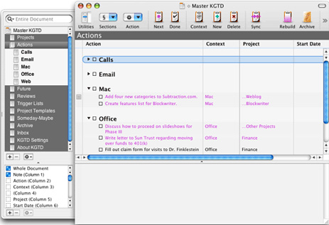
What Kinkless GTD looked like:
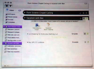
The first publicly displayed mockup of OmniFocus:
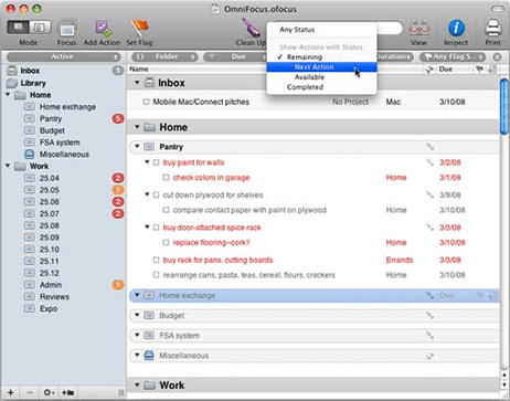
OmniFocus 1.0:
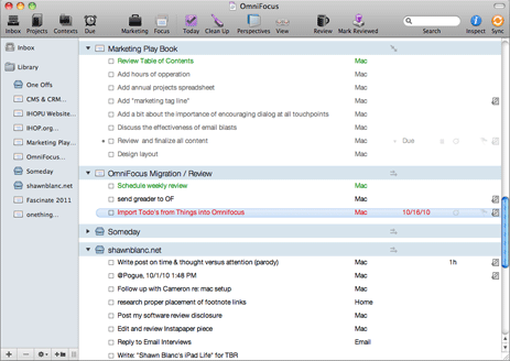
OmniFocus today (version 1.8):
As you can see, not much in the UI has changed from the original Kinkless implementation of 2005 to what OmniFocus is today in 2010. You could say that OmniFocus is Kinkless 2. And though the front end is still quite familiar, the back end has been significantly supercharged.
The User Interface
Though I confess I am not very familiar with the design and development team at Omni Group, but it seems to me, more or less, that OmniFocus was primarily built by thinkers and developers. Which is why it works so well, but still looks a little rough around the edges.
In a way, it reminds me of the early days with Instapaper. Marco confesses to being an engineer and not a designer, and for a while Instapaper was not exactly the most attractive app on your iPhone. But the functionality and ease-of-use blew any ill feelings towards the UI right out of the water. And over time the UI of Instapaper has been refined into the piece of art that it is today.
So it goes with OmniFocus on the Mac. In fact, I think the biggest hinderance to using it is the user interface. At times I find the interface for the actual list of tasks somewhat difficult to navigate. After a bit you become familiar with it, but I usually have this feeling that there is too much going on at once and I’m not quite sure that it’s all staying together.
In part, this is why perspectives are so important and useful. They allow you to drill down into the right lists at the right times and only see what makes sense to you.
The UI has certainly been refined from that initial mockup, and yes you can refine bits of the UI yourself by using custom icons in the menu bar and custom colors, fonts, and spacing for the lists. But overall the app’s interface could still use some refinement and some breathing room.
And as I’ll talk about later, interacting with the iPad version only reinforces that. The iPad app feels much more “held together”, if that makes any sense, and the design of the iPad app is part of what makes it the best version of OmniFocus out there.
But so long as we’re discussing the UI, one fun feature of OmniFocus on the Mac is the ability to customize the style for your lists. From the application’s Preferences window choose the Style tab. From there you can tweak the colors, line height, and fonts of all your projects and lists. No doubt, many procrastinators have wasted some time fiddling with these options. I know I have.
But in addition to fiddling, you can load and save themes. There are websites which have themes posted for download, or you can download my simplistic theme if you like.
Using OmniFocus
Many of the task-management apps available today are a just another designer’s unique approach towards the same fundamental functionality: the ability to add tasks, organize them by project, assign a due date, etcetera. Put another way: a lot of today’s to-do apps are, more or less, the same app but with different skin.
Of the five areas of Getting Things Done are capturing, processing, organizing, acting, and reviewing, you want the least amount of friction. OmniFocus doesn’t just let you capture, process, organize, and review — once you’ve captured and processed an idea, OmniFocus almost does the rest of the work for you.
This is why OmniFocus is different. It was built from the inside out, meaning it’s a database first and a UI second. It may not win the beauty contest, but in my experience, compared to other to-do apps, OmniFocus handles your projects better than any other tool I’ve used.
For capturing tasks and information, OmniFocus leaves little to be desired:
- There is a quick entry box you can bring up at any time on your Mac.
- If you email yourself items and use OmniFocus’ Mail Clip-O-Tron 3000 you can pull messages from your email into OmniFocus. OmniFocus will even write Mail rules for you.
- You can add files and clippings to your action items.
- There is a bookmarklet which works on your desktop, iPhone, and iPad to send whatever website you’re viewing to OmniFocus.
- It is scriptable.
- And more…
But once you’ve captured your tasks and ideas they need to be processed and organized so they can be done. And the area in OmniFocus with the most friction is processing.
OmniFocus forces you to process your actions. Items just sit mercilessly in your Inbox until you’ve at least assigned them a context or a project (but preferably both). It doesn’t stop there. You can assign a start date and due date, you can flag it, you can mark it as being on hold or delegated, and a then some.
At times, the need for processing your stuff can be frustrating. But the truth is it’s good for you. It’s like your mom reminding you to brush your teeth before you go to bed. Taking that time will mean much better results in the future.
A properly processed Inbox is what leads the way to the two most addicting and powerful features of OmniFocus: the review and perspectives.
The Review
I love how OmniFocus helps you review your projects. Again, like a good personal assistant, OmniFocus brings to your attention each project, one at a time, and lets you review the tasks in that project. This is your chance to refresh yourself on what you’ve committed yourself to and make sure it is all still relevant and accurate.
Moreover, OmniFocus keeps track of your reviews for you. It knows when you last reviewed a project and only brings it to your attention when it is time to review it again. And, like everything else, your reviews sync over the air. Which is fabulous news, because the best way to review your projects is with OmniFocus on the iPad (but more on that in a bit).
In Things, I had to review manually. I would sit down at my laptop and scrub the Today List. Then, if I had the time or energy I would manually go through each project to see what tasks were in there and if any were in need of being done soon, or were no longer necessary. Because everything in Things was centered around the “Today” list in a way, managing my to-do list felt like I was perpetually processing. And since reviews had to be done manually I rarely ever got to them.
Perspectives
Perspectives is a backbone feature in OmniFocus. It is one of many ways to sort and present your action items in a meaningful manner. But perspectives are so powerful, it is as if OmniFocus were thinking for you.
It’s through the perspectives that give OmniFocus a much more robust approach towards that final and all-important stage of getting things done: doing.
As I mentioned earlier, getting actions into OmniFocus is easy. But processing of those actions is where the most friction exists. But that is because the organization and output of your tasks is what makes OmniFocus so powerful. I’m not exaggerating when I say that OmniFocus pretty much organizes your lists for you. It will take your relevant tasks and intelligently order them for you so you only see what you need to see without worrying about other stuff. After years of keeping a to-do list, I just may now be finally understanding what people mean by a “trusted system”.
As Tyler Hall wrote:
It’s hard to describe how incredibly powerful Perspectives are until you actually spend a few days with them in your workflow. Other task managers have smart folders or dedicated “Today” lists, but they absolutely pale in comparison to the flexibility that Perspectives afford.
The perspective I live in the most is one I made myself. It’s called “Today” and only shows me available actions which are due and any flagged items. What I like about having flagged items appear in my Today perspective is that sometimes I know a new action item needs to be done today but don’t want to fiddle with assigning a context or project or due date (especially when entering it via my iPhone or iPad). Thus, flagging the item is the quickest way to get that task into Today’s list.
Defining custom perspectives is easy. You can start by manipulating your “View”. Then from the Perspectives menu chose to Show Perspectives. From there, clicking the gear icon allows you to save your current OmniFocus window as a new perspective or update a currently defined perspective.

While in the Perspectives Menu, you can also adjust unique Status settings only available from this pane, and you can set custom icons by dragging them into the icon box. This is how my “Today” perspective is built:
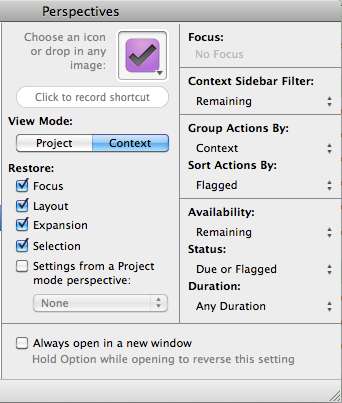
Once you’ve got your very own perspective you can add it to the toolbar and it will sync to your iPhone and iPad. From the iPad, if you star a perspective it will show up on your home toolbar (a feature I’d like to see come to the iPhone).
Over-the-Air Syncing
Despite all that OmniFocus as a task-management application can do, for me, one of the hallmark features is its ability to sync over the air.
One thing that’s important to understand about why over-the-air sync is so vital to my day is that I don’t spend my whole day working in one location. I spend part of my work day at home, part of it in my office, part of it in meetings, part of it on the go commuting between campuses, and part of it in our on-site coffee shop. Sometimes my location and the device I’m using will switch by the hour, and so I need my tasks and references to be available to me regardless of where I am or what I’ve got with me.
This is partly why I keep a folder of all my current projects and files — “Currently Working On” — in Dropbox. Not only does this keep those files in real-time backup, but it also gives me access to them from my iPhone, iPad, and Mac.
As I said in an aforelinked post about 1Password, apps that don’t sync are becoming increasingly arduous to use and maintain. And it truly did reach the point where Things was nearly useless to me. I would throw tasks in there to get them out of my head and to save them for later, but between my iPhone, iPad, and Mac my lists were so out of sync just by lunchtime that I rarely went to Things when it was time to actually accomplish anything.
Instead I would keeping urgent tasks in my email inbox (horror of horrors!) and would do a daily mind sweep of anything I knew needed to be done that day and build my to-do list in Simplenote / Notational Velocity so I would have access to it throughout my day.
As I said an the outset of this article, in a simpler world I would be delighted to use Simplenote as my task list. But I wear too many hats and have too many plates spinning at the same time for such a low-fi system. And that is ultimately why I switched to OmniFocus from Things.
Clippings and Attachments
When on your Mac you can clip a file to your task. For example, suppose you get an email from your boss asking you to do something. If you’re a clever employee you will do what your boss asks right away. But, perhaps you would rather ignore your boss for the moment and continue reading about Inbox Zero.
You can take that email message from your boss and send it to OmniFocus. Simply hit the Clippings Shortcut key (which can be defined in the Clippings Preference pane) to bring up the quick entry pane with your email message attached as a note. Now you can define the action item your boss needs, and save the email as a reference for later when you get around to doing it.
A clipping is basically an alias to a file on your Mac. You can clip just about any file you want: photos, videos, documents, audio… anything. In fact, I don’t know of any file type that you cannot clip to OmniFocus.
Some clippings — such as email messages and website URLs — get synced to your iPhone and iPad as notes. Other clippings — such as images or files — are treated as aliases, and thus can only be accessed from your Mac.
By default, OmniFocus on the Mac does not embed files you attach to your items. It simply links to them. This offers a tremendous gain of speed for syncing your database between multiple devices. However, if you do have a file that you want to embed in your database from your Mac so it will sync to your iPhone and iPad, then you have to embed it manually.
To embed a file into an action item select the item and click Edit → Attach File…, then from the file picker choose the file you want and pick the option to embed the file in the document (rather than create a link to the file).
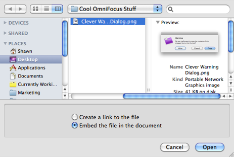
Now the embedded attachment exists within your database and will sync to all your devices.
In the iPhone and iPad apps, however, there is no such thing as clippings; there are only attachments. From the iPhone or iPad you can attach a photo (by taking a new one or pulling one from your device’s photo library) and you can attach audio.
There seems to be no limit as to how many photos and audio tracks you can attach to an item. And though the process and feature is overall very polished, I do have a few quibbles.
- Recording Audio: To record an audio attachment on your iPhone you tap “Record Audio”. But then, all you’re presented with is a blank white box. If you’re not familiar with how the UI changes you may be wondering (as I did) if the audio recording is actually taking place.
In the iPhone’s native Voice Memos app you get a big red bar on top of your screen letting you know you are now recording. In OmniFocus you see nothing, until you begin talking. The you see a green line which is a volume-level indicator.
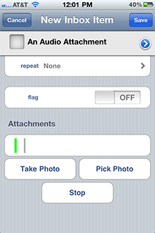
Surely a pulsing red UI element signifying “now recording” would be more helpful? It wouldn’t even have to replace the volume-level indicator, it could sit right on top of the “Stop” button.
After you’ve finished recording your voice note in OmniFocus it will sync to your database as a .caf — Core Audio Format — file, which is an audio container file used by Apple. The sound quality of a synced audio track is actually quite fantastic and clear.
- Attaching Photos: When adding a photo attachment from your device’s image library the iPad has the right approach. It says “Image added Today, 2:46 PM”. The iPhone however says “Picture taken Today, 12:14 PM” (or whatever time you added it). On the iPhone, for image attachments that are added from the iPhone’s photo library, it should say “Image added” not “Image Taken”. (And to get especially nit-picky, why is “Today” capitalized? I see no reason.)
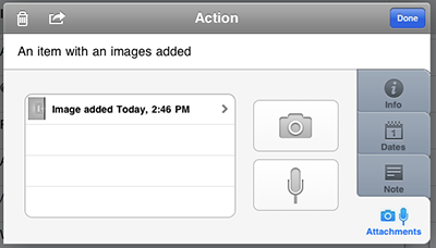
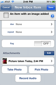
The only downside to attachments is wireless syncing. Aside from being able to sync over-the-air the next most important thing is to be able to sync quickly, and big file attachments hinder that.
In day-to-day usage I rarely need to attach audio or photos to a task when adding it on my iPhone or iPad. It is much more common for me to add a clipping to an action item when on my Mac. But since these files are usually are only needed for a project I’m working on when I’m actually at my computer, I don’t attach the clippings I simply link to them. By keeping attachments to a minimum, it helps my database sync quickly when I’m launching OmniFocus on my iPhone or iPad.
Worth pointing out is that when syncing your OmniFocus database, only what is new and/or what has been changed gets synced. This means when your desktop app syncs to the cloud, it only pushes tasks that have been updated since the last sync. And when you launch the iPhone app, it only downloads the tasks which have been created or updated since the last sync. It does not download the entire database every time.
This is, of course, standard operating procedure — it’s the same way programs like SuperDuper, Time Machine, and Dropbox work.
The Omni Sync Server
On the iPad’s sync options you are given the opportunity to join the Omni Group’s beta Sync Server. It is, more or less, their own WebDAV server. The iPad is the only one of the three apps which recognize this as Omni’s own sync server. On the desktop and iPhone versions of the app you have to set up the service under the Advanced WebDAV settings.
Currently all the Omni Sync Server does is sync your data. Though my perception is that it does seem to respond much quicker than the MobileMe sync I used for the first month. Hopefully Omni Group has some exciting features in the pipeline for their sync server beyond just syncing (the ability to email directly to your cloud-based database would be one such feature).
A Few More Miscellaneous Observations About OmniFocus’ Over-the-Air Sync Options
- Changes to your database don’t get pushed to the desktop app, nor are they pushed to the server in real time. The desktop app syncs on a schedule every 60 minutes; however you can manually initiate a sync anytime you like and it always syncs when quitting.
-
On the iPhone and iPad you cannot sync if OmniFocus is not running in the foreground. Unlike sending an email or a text message, where once you hit send you can lock your iPhone or iPad and the message will still be sent, OmniFocus must be open and running to complete its sync.
Likewise, if your iPhone is locked it will still fetch new emails. OmniFocus however, just like other iPhone apps, can only sync when it is open. And alas, it does not have “sync completion” — this means if you initiate a sync and then exit out of the app the sync will lose its connection to the server.
This lack of non-background syncing can be especially annoying when you’ve completed a task, checked it off on your laptop, but then later it beeps your phone reminding you the task is due. The only way around this is to turn off reminders for OmniFocus on your iPhone. This is done in the Settings pane from the OmniFocus home screen on your iPhone.
OmniFocus on iPhone
In the beginning, the best way have your OmniFocus task list while on the go was to print it out. The first version of OmniFocus for iPhone was an iPhone optimized Web interface.
On July 10, 2008 the native iPhone app launched. Unlike the printout or Web interface before it, the iPhone app was a full-featured, stand-alone task management app. Meaning you didn’t need OmniFocus on your desktop to use OmniFocus on the iPhone. But if you did have the desktop counterpart then you could sync your tasks with your Mac. And you could sync them wirelessly, over the air via MobileMe or your own generic WebDAV server. Syncing over the air is something that many applications have still yet to implement, yet Omni Group had it done right out of the gate.
And even before the iPhone app was available in the App Store it had already won an Apple Design award. The iPhone app has come a long way in the past two years, but it’s that initial hallmark feature of OTA syncing that caused me to switch to OmniFocus in the first place.
Perhaps the most clever and thought-through feature on the iPhone (and iPad) app is the ability to quickly enter a task even when the app itself is syncing and updating. The nature of over-the-air sync means the app has to check for changed data and then update itself every time you launch the app. During the updating process the iPhone app’s database is momentarily locked out. Yet you can still add an action item to the inbox via the Quick Entry button.
This is a dream feature for the many times you are launching OmniFocus for the sole purpose of jotting something down.
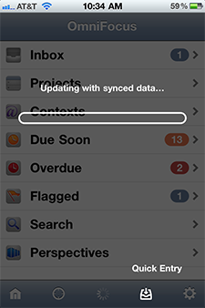
And so long as we’re discussing the Quick Entry button, it’s worth noting that there is a functional difference between the plus (+) button and the quick entry button. The quick entry is for something to simply go directly to the inbox (hence why the icon is an arrow pointing into an inbox). The plus button will add a task with your currently viewed project or context pre-populated (though you can change it).
As mentioned above, in the settings of the app this is where you can turn off notifications of due items. It’s also where you can set your badge count (I keep my badge count off; I’m already aware that I have things to do). I also have all the current “Experimental features” turned on. Such as Landscape Mode, Undo Support, and Perspectives. The latter is one of the backbones of OmniFocus, so being able to sync your perspectives between your iPad, Mac, and iPhone seems like a requirement not an experiment.
OmniFocus on iPad
The iPad app was released on July 30, 2010 and is, without a doubt, the best of all three versions. Moreover, it is one of the most robust, feature-rich, easy-to-use apps on my iPad. $40 is big ticket compared to many other iPad apps, but you are getting what you pay for.
It seems to be a common practice that for apps with a strong presence on the desktop, their iPhone and iPad counterparts are portals into the desktop app, or light versions. But OmniFocus on the iPad is the current king of the OmniFocus hill. Ask anyone.
Every successful computing platform has to have a “VisiCalc moment” — the moment it goes from fun toy and technology demo to “holy crap this thing is useful.”
I don’t think there’s a single VisiCalc moment that everyone will have for the iPad — but, for me personally, it was OmniFocus. That’s when my iPad went from toy to indispensable tool.
Before OmniFocus, my iPad wandered around my desks without a real place. Now it has a place right next to my dev machine’s keyboard.
OmniFocus [on the] iPad is the best of the three. It is indeed, but I’ll go one further: it’s the best task management tool that I’ve used. Period.
This is partly due because the platform itself is present — and usable — on the three main devices I use. But I must profess my love for the Forecast feature that was added to this client. It is not present on the Mac or the iPhone clients.
After a couple of days of using the Forecast ‘view’, I asked myself, “Why has no other Mac task application used this exact interface?” Indeed, even the Mac client for OmniFocus pales in my usage. The ability to quickly see a timeline of what’s coming down the pipe, no matter the project or context — has been a boon to my tool belt. To have all overdue items available in one quick glance is also beneficial.
In particular, the iPad version soars in two areas: (a) Reviewing your projects; and (b) the Forecast view.
Review
As mentioned earlier, one of the most splendid functions within OmniFocus is the way it helps you review your projects. You currently cannot review them in the iPhone app, but that’s okay because once you’ve done your weekly review with your iPad there’s no going back.
In perfect form the Review pane comes equipped with a coffee cup-bearing icon. Tap that and OmniFocus brings up all the projects you have not reviewed in the past week. (If, perhaps, you need to review more often than once a week you can set your time allotment of choice from within the settings.)
Once in the Review pane you see one project at a time. On the left sidebar is your list of all projects pending your review, and on the bottom are some attractive buttons to let you chose what sorts of projects you want to review (active projects, those you’ve put on hold, those you’ve completed, or those you’ve flat out dropped), and your stamp to mark the project as reviewed.

The review pane on the iPad app is a textbook example for why good design is important. The functionality on the iPad app is no different than the desktop version, yet the interface is so well designed it makes the review process faster and significantly more pleasant.
Forecast
The Forecast view is just that, a high-level look at upcoming tasks for the next 7 days; also included is everything past due and everything with a future due date. I second Chris’ statement above: why has no other task manager implemented this view? I use it more than my custom-defined “Today” perspective.

Since switching to OmniFocus I’ve had many people ask me if the iPad version is worth getting in addition to the desktop version. I would argue it’s the other way around: is the desktop version worth getting in addition to the iPad?
By nature of how I work, I use the desktop version of OmniFocus significantly more throughout the day than either of the mobile apps. But I prefer and enjoy the iPad and iPhone apps over the desktop. And I especially prefer the iPad version.
Hopefully OmniFocus for iPad will be leading the way for future versions of its iPhone and Mac counterparts and the Omni Group will take what it’s learned on the iPad back to the Mac.
Conclusion
I switched to OmniFocus because of its ability to sync. I’m staying because of its ability to do everything else.
More software reviews can be found here.
[Sponsor] DomainBrain: Domain Management Software for Mac OS X →
DomainBrain is a handy tool for Mac OS X that helps webmasters and web designers keep track of server and login information for their websites. Now with customizable fields and data categories, DomainBrain remembers exactly the information you need. Visit domainbrainapp.com to give it a try.
Idea Cafe →
Many thanks to Idea Cafe for sponsoring this week’s RSS feed. Idea cafe is a classy one-stop-shop for notebook nerds where only the best notebooks are sold. Each one is reasonably priced and has large, detailed photos to help you decide. But if you’re not sure what to get, check out the bundles — they’ve been pre-selected and aptly named for different types of users.
“Avoiding the Blogger Trap” →
One of Marco Arment’s oldies but goodies:
I have enough readers now to cause two problems
Dave Caolo’s Review of PlainText for iPad →
PlainText is Dave’s preferred text editor on the iPad. I still use Simplenote and Notational Velocity, but the options for writing and syncing between Macs and iPads seem to get better and more vast every day.
Aaron Mahnke’s Sweet Mac Setup
Who are, what do you do, etc…?
My name is Aaron Mahnke. I’m a freelance graphic designer in the Boston area. I work under the banner of Wet Frog Studios, focusing on identity and brand design, though I do a ton of print design and even a bit of web design as well. I blog sometimes at aaronmahnke.com, and share resources for freelancers on my other site, abetterfreelancer.com.
What is your current setup?
My desktop computer is a 27-inch 2.66 GHz Quad-Core i5 iMac with 4GB of RAM. I recently made the switch from the wired Apple aluminum keyboard to the bluetooth version in order to allow my Bamboo Fun (1st gen, medium size) tablet to sit closer to the center of my iMac, eliminating some unnecessary strain on my right shoulder. I’ve found that the mouse that came with the Bamboo tablet is perfect for my work style, and I can easily switch to the pen when needed.
I have a secondary work station set up beside my red reading chair that consists of a newer 2.4 GHz i5 MacBook Pro (also 4GB of RAM) and a 23-inch Apple Cinema Display. I use it mostly as a hub for three Western Digital 1TB MyBook external hard drives that contain years of video production work, as well as an external Sony DVD burner for churning out multiple copies of client work while I read in the red chair.
When I’m mobile I rely on my iPhone 4 and a 32GB 3G iPad to keep me connected and creating. The iPhone is my main device for task capture (via the Things app), RSS feeds (via Reeder) and reading (via Kindle, iBooks and Instapaper). I rarely use it as a phone, though during the work day it’s docked beside my iMac with a pair of Apple in-ear headphones connected and ready.
The iPad is a fantastic work device for me. I keep it naked at home, but it travels in a DoDoCase outside the house. It goes to every meeting with me, and I rely on a combination of SimpleNote and Penultimate for capturing the information I need. I rely heavily on the Photos app to hold my logo design portfolio and digital samples of my print design work. And the Dropbox app is the perfect tool for presenting potential clients with my logo design service information, my contract and glimpses of in-progress work.
Why this rig?
Power and flexibility are my driving motivations, honestly. I put my iMac to work every day, sometimes running Illustrator, Final Cut Pro, VMWare Fusion and a handful of smaller applications all at the same time. I am in this eternal struggle between wanting to be parked at a desk with extreme power and screen space, and being able to pick up and work from anywhere, so this setup allows me to live with a foot in each world for now.
What software do you use and for what do you use it?
The first piece of software I always tell people about is Dropbox. I have a 50GB account to hold all my design projects, which means I can work whether I’m at my desk or using my laptop away from home. The natural back-up that Dropbox brings to the table also helps me sleep easy knowing my clients’ work is always safe.
The applications I launch every day when I sit down at my desk would be Mail.app, Things, Illustrator, Numbers and Billings. On occasion I have to launch Pages, Keynote, Final Cut. Other applications are always running, though, like Notational Velocity, Yojimbo, MailActOn, 1Password, Littlesnapper and Tweetie. I have a few Fluid instances for things like Basecamp and Rdio, but prefer Propane for Campfire chats. And finally, my menu bar plays host to Droplr, which I use a few times a week at most.
How does this setup help you do your best creative work?
I’ve tried my best to surround myself with tools that help me get the job done faster. I take notes in Notational Velocity, which is connected with SimpleNote, so that I never have to save, rename, or move the files again. I keep inspiration logged in Yojimbo and Littlesnapper, both of which sync across my computers. And I try my best to master hot keys to save time and effort.
Creativity is all about reducing the distance from inspiration to retention. I might not be able to react to a moment of inspiration right away, but if I can capture it properly (via screenshot, dragging into Yojimbo, or typing the idea out) I can come back to it when I’m ready. This isn’t multitasking, though. This is all about knowing your tools and having a solid system.
How would your ideal setup look and function?
Honestly, the Apple ecosystem is getting really close to perfect for my needs. I would love to upgrade the RAM in both computers someday soon, and a SSD in the MacBook Pro would be next on my list after that. I can dream about better app syncing between the Mac and iOS devices, but Dropbox really gets the job done for me. My only other “fantasy device” would be a big fat Drobo, but I think that’s because I’m an external storage junkie.
More Sweet Setups
Aaron’s setup is just one in a series of sweet Mac Setups.
Marco Arment on the New MacBook Air →
A great “buyer’s guide” article from Marco; yea more than a buyer’s guide.
From the Archives: My Yojimbo Review →
4,300 words regarding the best Anything Bucket in town.
Yojimbo 3.0 →
The hallmark feature of 3.0 is sync support for the brand new Yojimbo iPad app. The Desktop version syncs to the iPad version over a local Wi-Fi network. Alas, the notes and items on your iPad will be read only, and it does not sync over the air. But it’s a good looking, easy-to-use repository of your Yojimbo information right on your iPad.
The 3.0 upgrade is free if you already own 2.x — Bare Bones will send you a free 3.0 license seat in the next several days, and in the mean time you can just download the 3.0 demo. The iPad app is $10 in the iTunes store.
