Great thoughts from Kyle Baxter on Apple’s obsession with making amazing products. They don’t leapfrog their competitors by adding or improving to the feature checklist, they make a product which redefines the rules of the game altogether.

Related (and recommended) reading: Marco Arment’s “Feature Checklist Dysfunction“.

“Apple Is Interested in Making a Truly Great Product, Not Just Selling It.”

My AT&T Wireless Data Usage

My AT&T iPhone Wireless Data Usage

Here is a look at how many megabytes of data I have used in the last seven months.

I expected December to be high since that is when we host the onething conference. Everything gets progressively more erratic during the last few weeks leading up to onething, and flat out ballistic once the four-day event starts. But I am shocked to see October as my highest month of usage. That was the month Anna and I took a week-long vacation to the Ozarks and my phone was literally turned off for seven days.

Being able to tether my iPhone to my laptop, as cool as it is, is not worth the more expensive plan and the $20 a month tethering fee. So I won’t be keeping my current “unlimited” plan and will instead be downgrading to the 200MB for $15 plan. Even if I do need an additional 200MB on occasion it will still just be equal to the $30 I’m paying now.

Here is a roundup from Macworld on the new data plan changes. Here are directions for how you can create your own iPhone data usage report. And here is Neven’s report, from whom I was spurred to post my own.

My AT&T Wireless Data Usage

A great review of Marco’s indispensable read-it-later service, Instapaper.

And Instapaper on my iPad is one of my most-used apps. So much so that I’ve even started sending articles to Instapaper which I want to read right now. It’s just that I would rather read them in Instapaper on my iPad than in Safari on my MacBook Pro.

P.S. I don’t star a lot of articles in Instapaper, but if you want to read the ones I do star, my username is “shawnblanc”.

Instapaper is a Mac Gem

Network Speed Tests on my Three Devices

Sitting at my desk which is about seven feet from my wireless router I ran the Speed Test on my MacBook Pro, iPhone 3GS and iPad. My cable internet provider is Time Warner. I ran the test five times on each device and averaged the times. Here are the results.

Device Download Speed Upload Speed Latency (Ping)
iPhone 3GS 1.206 Mbps 0.452 Mbps 596.8 ms
iPad 3.256 0.462 223.4
MacBook Pro* 9.532 0.49 53.8

** My MBP is the early 2008 model with a 2.4 GHz Intel Core 2 Duo, “Penryn” processor and 4GB or memory.*

Since the above info is pretty unexciting, be sure to check out Craig Hockenberry’s iPad benchmarks for native app and website javascript performance compared to the 3GS and original iPhone.

Network Speed Tests on my Three Devices

An Initial Miscellany of the iPad

Early this morning I drove to Kansas City’s Apple retail store with two of my friends. One of whom is quite nerdy and the other who is quite not nerdy. We stood in line to buy an iPad. Well, technically I stood in line to buy an iPad — my friends came along because I convinced them it’d be fun.

When we arrived at 7:30am there were about 75 people in line already. The first few folks had arrived the night before around 8:00pm, the next group came at 2:00am, and all the others began trickling in around 6:00am.

While waiting in line we were awkwardly interviewed by a young college student, given the opportunity to order breakfast from the California Pizza Kitchen, and had awkwardly-geeky conversations with those in line around us.

The store opened at 9:00am and our line (which had grown to about 200 people by then) was directed to split in two: those who had pre-ordered their iPads and those who had not. Those of us who did not pre-order outnumbered those who had five to one. However, those in the pre-order line were served by the Apple sales team about four to one versus those of us in the non-pre-order line.

Once the line began moving rumors kept murmuring amongst our line that the store was already approaching sold out status, and that all of us who had come so early to buy our iPads would have to come back at 3:00pm to pick up the leftovers, if there were any.

After three hours waiting in line I finally made it into the store. A nice old lady named Linda helped me gather my order and she checked me out on her iPhone. I bought the 16GB iPad, Apple’s black fitted case, and a bluetooth keyboard. Linda had me sign for the purchase using my index finger, and the receipt was emailed to my Mobile Me account. Amazing.

I had a lot of people ask me why I didn’t pre-order mine. Well, three weeks ago I wasn’t entirely convinced that I wanted one on day one. Secondly, I knew that if I did want one I would have no trouble standing in line at an Apple Stores in Kansas City. And lastly, I did not want to hope in UPS to deliver an iPad to my home first thing in the morning.

After a day of using the iPad not only is the battery still not dead, but this thing is what I have always wanted my iPhone to be. The iPad is an easy, fun-to-use device for the day-to-day at my job (which on many days is comprised mostly of emails, instant messaging with my team, attending or leading meetings, and writing).

I am very much looking forward to how the iPad will affect my day-to-day life at work. Or perhaps, how my day-to-day will be affected by the iPad. This little tablet is so different than what I was expecting that really I haven’t found the words for it yet. That doesn’t mean, however, that I don’t have at least a few words to write about my experience with the iPad so far…

Setting it up (iTunes)

Unexpectedly, after unboxing my iPad, I found it was already powered on. Clicking the home button showed you the “connect to iTunes” image.

You can’t do anything until you connect it to iTunes on your Mac or PC. Once you do, you can then begin registering it in iTunes and simultaneously fiddling with the iPad itself.

I didn’t realize how persnickety I am, but I was more distracted with getting the right apps, songs, and photos installed first than I was to start fiddling with the actual device. Since I already knew what I wanted on there (practically down to what apps in what places), to fiddle with it before I had it set up felt like trying to ride a bike without the handlebars put on yet.

Thoughts on the Hardware

It’s what’s inside that counts, and the haters are wrong: this thing does have flash. It’s called Apple’s A4 processor. Oh. my. word. This thing is so smooth and so fast. Combine that with the longest battery ever for an Apple device and you’ve got a machine that was built to be used. Thank you.

But it’s not just the guts that make the iPad so fantastic. I mean, the shell is just as clever as the pieces it holds together. Although the form factor is smaller and heavier than I thought it would be, it feels just right. And yes the bezel looks large and awkward on all the pictures, but it is the perfect size when holding in your hands (if anything, there could be more bezel).

The aluminum back is beautiful, but it’s also that same slip-friendly metal that was on the first-generation iPhone. And since it’s a bit heavy, I am somewhat nervous about dropping the sucker. Though Jony Ive says the iPad was designed to be tossed around:

If it works beautifully, it should also work robustly,” he says. “It’s made for people to chuck onto the car seat and thrust into luggage without thinking. It’s not to be delicate with.

And so it’s true: the iPad is tough. And honestly, my concerns with dropping it have more to do with how it would interrupt my workflow than if it would break the darn thing.

My only quibble with the hardware is that I wish you could set the double click home button to more options. On my MacBook Pro i have multiple keyboard shortcuts to get to apps and settings that I frequently use. To be able to have a super-fast way to launch Mail or Notes or something would be lovely. (Perhaps this is a software quibble and not a hardware one. But regardless it’s a quibble.)

Accessories

I picked up Apple’s iPad case and a Bluetooth keyboard. The keyboard can be usable for much more than just pairing to the iPad, and the Apple case is useful for much more than propping the device up slightly for better typing.

The case is fantastic. I have never had an iPhone case or screen cover, but the iPad case is great. It allows for a better grip to the iPad, and makes it much easier to use when on a table or on your lap. And like I tweeted this morning, about 9 out of 10 folks coming out the Apple store had this Apple case in hand along with their iPad.

Thoughts on the OS and Apps

There is so much good on this device when it comes to software. I am looking forward to see what sorts of UI and UX settings from the iPad also end up in the next major OS release for iPhone and iPod Touches. For instance, home- and lock-screen rotation based on device orientation would likely be excruciatingly annoying on an iPhone.

What irks me the most is the springboard spatiality which Lukas Mathis wrote about a few days ago. Unless you have your home screen completely full with icons there will always a randomly-displaced app icon, and the only one ever in the same location is the top left one.

And the only bug I came across in the OS was that two times today I found myself “stuck” in an app. For instance in the photo album when trying to adjust the size and placement of a picture of my old Jeep, Champ, I got stuck in a spot where all i could do was pinch and zoom the image — no other controls were available and i had to quit out to get back in.

Similarly, when I clicked on a music video that came with a John Mayer album i got stuck on music videos section with no way in the UI to get back to the iPod main controls without quitting and then going back in.

Mobile Safari

My first thought was that the iPad actually is the best way to experience the Web. Safari is so fast, and navigating around with your fingertips is so natural.

As far as the UI of Safari, the thing I’m most thrown off by is the design of the navigation and address bar at the top.

It’s a logical choice to move the navigation, bookmarks and etcetera buttons to the top address bar area on iPad’s mobile safari, rather than having it sit on the bottom. In iPhone’s Mobile Safari the address bar disappears when you scroll down a web page. On the iPad it doesn’t.

I frequently found myself wanting to go to the navigation buttons based on where they would be on the iPhone. While many apps (such as the App Store app) maintain a similar navigation structure as on the iPhone some apps redo it altogether. Just enough to make sense in context, yet still be a bit confusing to a dude who’s been using his iPhone for nearly three years.

Safari on iPad includes a built-in bookmarks bar, just like the on you see in Safari on your Mac. But many of my synced bookmarks in the bookmarks are not usable on my iPad. Six out of the nine aren’t website bookmarks but are javascript bookmarklets, and two of them don’t work with my iPad (MarsEdit and Yojimbo).

Things (to-do app) for iPad

Things for iPad is, by far, the most attractive iteration of Things yet. It looks very much like an iPad app with the papery-texture added to the UI. And it acts very much like an iPad app: you can pinch open a project to peek at its tasks just like you would to pinch open a photo album to peek at its images.

And the latest update of Things on the Mac (1.3.3.) adds smart syncing if you have multiple devices (like an iPhone and iPad) all with a copy of Things on them. I tested it out by adding or checking off different to-do items on my iPad, iPhone, and MacBook Pro and then launched the apps all to sync. And it worked like a charm.

1Password

The genius of 1Password never sank in for me until I began using its iPad version today. It is like a pre-meditated version of Yojimbo for your iPad. You can safely slot all your vital info into it and have it available whenever you need it. There have been more than one occasions when I’ve need access to my license plate number, bank routing number, etc., but wasn’t at my computer and didn’t have the info committed to memory.

Many of those items are encrypted in my Yojimbo library but if I’m not at my laptop I’m out of luck. 1Password does way, way more than keep website login information. It keeps helpful and necessary information, and it keeps it safe. (Thanks, Dave!)

iCal

Once a meeting or event is added to iCal on the iPad then, just like in iPhone, you cannot change the calendar it’s in. This is always frustrating for me because in have a couple calendars that are synced to my assistant’s iCal and a few that are personal. If i make a meeting in the wrong calendar my assistant won’t see it unless I delete and start over, or remember to change it on my MacBook Pro.

NetNewsWire

Arguably the best feed reader on the iPad. Not that there are many, but NNW on the iPad is very much in its element. I adore NNW on my Mac and using its iPad counterpart feels like home.

Pages

Currently Pages is the top paid app in the iPad App Store. No doubt it’s due to promotion by Apple and simply from people wanting to know how a word processor works on a touch device. “If this tablet is going to replace my laptop I’d better have a word processor on it.”

I downloaded it. And yeah, Pages is a very clever and usable App. But the touch interface is not nearly as robust as having one hand on the mouse and one hand on the keyboard. Moreover, I’m a keyboard Junkie — I use keyboard shortcuts like they’re going out of style(!).

Something else in Pages which throws me off is that there is not a save function. By no means is this a bad thing; I’m just so used to saving regularly (and manually). While typing with my Bluetooth keyboard I kept hitting command+s regularly (Partly because I kept thinking I would get interrupted by a phone call (on the iPad).).

Universal Apps, HD Apps, and Standard iPhone Apps

You can identify a universal app by the little plus symbol (+) parked in the top-left corner of the price of an iPhone or iPad app. A universal app is one that has a working version of itself for both iPhone and iPad.

For example: Instapaper Pro is universal, so all you have to do is buy it once and install it on both devices. Things however has an iPhone version and an iPad version — if you want it on both devices you have to buy both apps (which I did).

It is these iPhone apps which have also been built for the iPad that are now the best version of themselves. Twitterrific for iPad is the best version of Twitterrific on any device.

If the next iPhone is going to be called the iPhone HD and ship with a 640×960 screen, what will the App Store be like with all these current iPad apps coming out with names like “Cool App HD” and combined with all the newly-designed-for-iPhone-HD apps which will also be called “Cool App HD”?

Yikes! I think “Cool App for iPad” is a better name — it tells you precisely what it is (an iPad app) and precisely what you’re getting (an app for your iPad). Say what you mean and mean what you say.

And finally, when using iPhone apps on the iPad there is a nice bezel around the edge of the app, and a bar in place where the status bar normally is. But that is just about as far as the joy goes.

Most of my iPhone apps (even many of my favorite ones in all the world) suck on the iPad. Especially when pixel doubled.

I get that the graphics would have to be pixel doubled, but text too? Is that really necessary? It’s the text-based apps that are totally unusable on an iPad. Some of my favorite iPhone apps, like Birdhouse and Simplenote, are virtually useless on the iPad.

There are some other apps though that survive pixel doubling just fine, like FlightControl. It looks a little pixelated but is totally usable and still quite addicting. And Canabalt looks great as a matter of fact. Its finely-drawn pixel art blows up quite nicely.

If an iPhone app doesn’t support landscape mode then it won’t rotate its orientation with the iPad. Even at 1x size they won’t flip to be right-side-up if you’re holding the iPad upside-down.

Additional Miscellany

  • Wallpapers: I love that you can set different wallpapers for the lock screen and the home screen.

  • The delete key is in a different place on the iPad keyboard than it is on the iPhone’s. It’s in the place it should be, but it throws me off.

  • My wife is going to steal this thing.

  • Reading an iBook: It is ingenious how you can see the ink through the back of a page as you’re turning it in an iBooks book.

  • Mute: Hold the volume rocker button down for two seconds to mute the iPad (Via Twitterrific.)

  • Setting the viewport for your website: In my site’s header I used to have the following code to get it to render properly on an iPhone:

<meta name="viewport" content="width=780, initial-scale=0.4, minimum-scale=0.4" />

But it wasn’t filling up enough of the iPad’s screen when browsing. So I updated it to this:

<meta name="viewport" content="width=800” />

  • “Multitasking”: I have never been frustrated by iPhone’s lack of “multitasking” and on the iPad I actually prefer to be restrained to one thing at a time. (It helps me focus and stuff.) Just so long as apps have state persistence.

  • Apps currently in my iPad Dock: Safari, Notes, Mail, Calendar, Things

The apps that were on the iPhone which have now been re-built and designed for the iPad feel as if they belonged on the iPad all along. Even the apps that originated on the iPhone (such as Instapaper) now feel much more native, and all around more fantastic, on the iPad.

The iPad is not a giant iPod Touch. If anything, my iPhone is now an iPad Mini.

An Initial Miscellany of the iPad

The whole demo is with the iPhone using EDGE, and it’s fast. The app was submitted a few hours ago and Opera has a countup to when/if Apple lets the new browser into the App Store.

As Chris Forseman said about a month ago on Ars Technica, the reason Opera is so quick on EDGE compared to Mobile Safari is because “It sends URL requests to a proxy server run by Opera, which renders a page into an image that is sent to the phone for display. This method typically offers much faster browsing than downloading an entire page and all its resources and rendering it on most underpowered mobiles, and is especially nice for devices limited to EDGE or slower connections.”

Video Demo of Opera Mini 5 for iPhone

iPhone’s Missing Feed Reader

I spend a prodigious amount of time reading on my iPhone.

Half the apps on my iPhone’s Home screen alone involve reading as a predominant, if not exclusive, feature. Mail, Messages, Safari, Tweetie, Instapaper Pro, Simplenote, and Reeder: these are my most-used apps, and each one is used for reading in some way or another. And yet the app which serves no other purpose than to read, seems to be the most frustrating to use for said purpose.

  • In Mail I read and reply.
  • In Messages I read and text.
  • In Safari I read and surf.
  • In Tweetie I read and tweet.
  • In Instapaper I read and drink coffee.
  • In Simplenote I read and write and edit.
  • In Reeder (or any other feed reader app, such as Byline, Fever, Google Reader, NetNewsWire, NewsRack, MobileRSS, etc.) I read.

The predicament with feed reading apps is most certainly not in the quantity of the selections; rather, the quality. This is not to say that most of the legitimate feed reading apps on the iPhone have not been developed with care — but as agents of delivery for my favorite authors, and as contrivances meant for enjoying lengthy bits of text, I prefer a simple app that does less and does it better.

In total fairness asking for the “best feed reader app” is like asking for the “best shirt”. Just as John Gruber so aptly laid out last April when writing on the the UI playground of Twitter clients. John said:

[D]ifferent people seek very different things from a Twitter client. TweetDeck, for example, is clearly about showing more at once. Tweetie is about showing less. That I prefer apps like Tweetie and Twitterrific doesn’t mean I think they’re better. There is so much variety because various clients are trying to do very different things. Asking for the “best Twitter client” is like asking for the “best shirt”.

It is my safe assumption that readers of this website also prefer apps which do less, but do it well. And so read on for a high-level look at some of the more popular iPhone feed readers, what I find good and not-so-good about them, and my suggestions for amelioration.

Reedie

As of this writing the iPhone App Store has nearly 4,000 apps in the News category. This is where all the RSS reading apps are listed. If you search for just “RSS” you’ll get over 700 results, or roughly 18% of the 4,000 news apps. Searching for “RSS Reader” nets you 203 results, and if you get even more specific and search for “Google Reader”, you get 50 apps.

But now compare this to the Social Networking category. It has 2,600 apps, and searching for “Twitter client” returns only about 65 results. There are over three times as many RSS reader apps than there are Twitter Clients in the App Store (based on search results).

Of the 4,000 news apps, the most downloaded are the dedicated apps provided by popular news sources such as the New York Times, USA TODAY, the Associated Press, NPR News, Wall Street Journal, and etc. The first RSS feed reading app you listed amongst the most popular News apps is “Free RSS Reader“; with NetNewsWire Free right on its heals. Surely “Free RSS Reader” is the most downloaded RSS reader by virtue of name alone.

In the most popular social networking apps, the first Twitter client listed is the free version of Twitteriffic. Over its life in the App Store it has received 139,000 reviews, mostly positive. Now compare that to Free RSS Reader which has about 17,000 reviews (mostly negative).

And thus we find a conundrum: the amount of RSS readers for the iPhone that of Twitter client apps, and yet the tables are turned when it comes to quality.

According to a small poll I conducted via Twitter, the app people spend the most amount of time reading from while on their iPhone is Instapaper, followed closely by Tweetie and then Mail.

Tweetie and Instapaper are two classy apps. They are easy to read from, easy to get around in, and a ton of fun. But tweeting and reading things later should not be the only place where all the action is. I would love to see a top-notch, Tweetie-level, RSS reader for the iPhone…

Reedie.

Why? Because when Tweetie 2 blew every other Twitter client out of the water it also sunk a few apps that were in a different part of the pool, and it’s time for a comeback.

There are tons of nerds who were using Twitter way before Ashton was and who have been riding the RSS train for years and years. And since nerds are the pickiest of all when it comes to usability and interface design, they are the ones most in need of a great feed reader app for their iPhone.

Secondly, what Twitter has done for Twitter clients, so has Google Reader done for feed reader apps. As Loren Brichter said during his interview with Macworld:

One of the fantastic things about Twitter clients is how easy it is for users to jump from one to another. Just type in a username and password and off you go. It’s possible for anyone to write a Twitter client nowadays and have the opportunity to completely blow everyone else out of the water.

Granted, the initial set up of a new Twitter account is really simple compared to the same for Google Reader. Twitter asks for your name, desired username, and password, and then you’re free to follow friends and strangers at will. A process significantly more straightforward than creating a Google account, activating Reader, and then finding and populating it with RSS and Atom feeds.

But the type of people that would use a feed reader (nerds!) are also the types of people who already have Google accounts (we’ve been beta testing Gmail since 2004), and who are even more likely to have an OPML file sitting around ready to be imported.

– – –
Up until today, all of my software reviews have been about programs which I find fantastic. But today I’m trying to get out there that I see a chance for improvement in the iPhone App market. But the only way I know how to pinpoint the opportunity is to highlight those who are trying to meet it, and (in my opinion) not quite hitting the mark. It’s not that I have only negative things to say about the following apps, it’s just not all moonbeams and rainbows. Also note that I hold Brent, Sean, Milo, and the other developers all in the highest regard. They are busting their butts to make great software; thank you, guys. Please keep it up.

Google Reader (Mobile Web App)

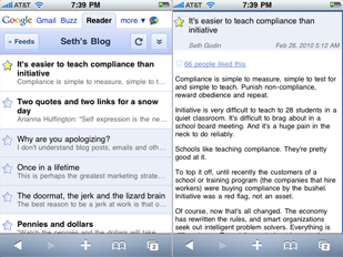
The online RSS feed reader that took over the world. It was a big day when they began offering public APIs for developers to sync to and from G-Reader, and it was a smart move for NewsGator to abandon their home-brewed syncing platform to allow NetNewsWire (on desktop and iPhone) and FeedDemon to sync via Google Reader.

The mobile version of Google Reader is not too shabby. More than one well respected nerd uses it instead of any number of native iPhone apps which sync to it. And I actually prefer the mobile version over the full web version. However, the mobile version doesn’t support many of the favorite features found in a native iPhone app such as emailing articles and links, saving to Instapaper, and a few others. But it is a classy, speedy mobile web app. And it’s free. Hello.
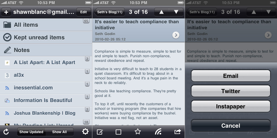
Byline

Version 1.0 came out in July 2008. It cost a whopping $10 and sported a much more Mail-like UI. Three months later Milo release Byline 2. Then version 2.5 came out in July 2009, and now 3.0 is due for release soon (and will be free for existing users).

Version 3 will finally support Instapaper and Twitter, as well as a few other cool new features and UI refinements. But for the most part it will still look and feel just like the most current version. If you’re not already sold on Byline, version 3.0 will surely not be Just What You Always Wanted. But for the many, many fans of Byline that already exist this next release is sure to be a home run worth waiting for.

There’s quite a bit to like about Byline. For starters, it’s been around for nearly two years — it was one of the original iPhone feed reading apps and has continued to see forward movement. What makes Byline stand out is its caching of your feeds. If you do a lot of offline reading (or if you live in New York or San Francisco) a huge motivation to use Byline may be its ability to store the text and images of your feeds, as well as linked-to Web pages, right on your iPhone. It will also remember stars and unread/read state, and it all syncs back to Google Reader when you’re next online. (The 3.0 version will even have the ability to cache your feed content while the screen is locked.)

However, my biggest quibble with Byline is the GUI. I know that Milo has to develop graphics that look good on many different generations of iPhones and iPod touches, and that he is proud of the look and feel of his app. But in my opinion the heavy gradients used throughout the app are too much, and give an overall impression of immaturity to the app. If it’s not a delight to look at and read from, it’s less of a delight to use.

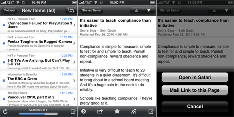
Since most people voted that if they were reading, chances are they were in Instapaper or Tweetie, I thought it would be interesting to contrast the heavy gradients used in Byline to the subtle gradients used in Tweetie to to the complete lack of gradients used in the iPhone’s Mail app:

Mail vs Tweetie vs Byline in regards to fradients

(FYI: Even though Instapaper won the “most read from app” question, since it uses the same no-gradient design as Apple’s own Mail, I chose Mail for the comparison so as to have a native Apple app in the mix.)

NetNewsWire

Though NNW is arguably the best desktop RSS reader on the planet the iPhone version is not quite as mind blowing as its older brother.

NetNewsWire for iPhone is quick, reliable, and just the right balance of feature-richness versus simplicity. One of its most clever feature by far is the option to choose which feeds are downloaded and synced by your iPhone. Especially handy for those crazy folks that like to sit right in front of the RSS fire hydrant. However NNW feels more like a utility program built for accessing feeds, rather than a contrivance for enjoying them.

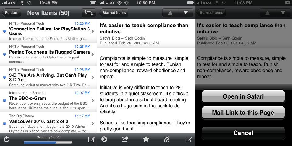
Mobile RSS Pro for Google RSS

Here is a clever app. Clearly the developers have put a ton of time and thought into this. And though a few of the features are simply re-works from some of Loren’s popular Tweetie 2 user interactions (such as swipe to reveal options below a listed item, and pulling down a list to refresh), they’ve got some additional great things going for them:

  • MobileRSS Pro saves state perfectly (better than any of the feed readers listed here).
  • It’s fast.
  • It’s got a good-looking, ‘dark’ theme (it’s called “Black” but it’s actually blue).
  • The way they implemented the unread badge count for each feed as a little tag that hangs over the edge of the feed list columns is very cute.

But despite all this, the app just doesn;t feel right due to a handful of little things which make it feel unbalanced:

  • Such as the way my gmail account in shown large type at the top.
  • The large vector icons for “All items”, etc., contrasted against the small favicons for the each feed.
  • I only have one folder, and at the bottom of the root screen it says, “52 Feeds, 1 Folders” (oops).
  • On the item view list of any given feed it has my gmail account name crammed into the back; arrow, with the title of the feed somewhat off center, and then a little “info circle” icon pushed to the right-hand side.
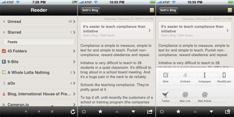
  • It uses the familiar “share” / “export” icon at two different places in the app, yet for for two completely different things: (1) when viewing an individual article, tapping the icon brings up options to email the article’s link, save it to Instapaper, etc.; (2) when viewing an entire feed with its list of articles the same icon is there, and tapping it in this context gives you the options to sort by oldest/newest or to mark all as read.

With a little bit more polish and attention to detail, MobileRSS Pro could be a much more classy app.
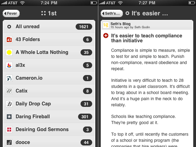
Fever

Shaun Inman’s Fever is the best dressed web-based feed reader out there. (I wrote about it at length when it first came out last June.) And the mobile-optimized version of Fever is just as great. It is a delight to use, easy to read from, and is always in sync with itself (duh!).

The downside to Fever’s mobile version is the same as any other mobile web app: no state saving, no caching for offline reading, and little to no sharing/saving features.

I stopped using Fever about four or five months ago when I took a break from RSS feeds all together. Through the holiday season I hardly ever checked my feeds. Similar to the olden days I would visit individual sites on occasion by typing the URL in by hand; and I was happy.

So happy in fact I decided to slash my OPML and only subscribe to that small handful of sites which have a history of enriching my day.

I wanted to keep Fever fully loaded so as to make use of the Hot list on occasion, but I didn’t want the bloat of loading all those feeds in a browser every time I wanted to check RSS. So about six weeks ago I came back to NetNewsWire on my desktop and populated it with only 25 time-worthy feeds.

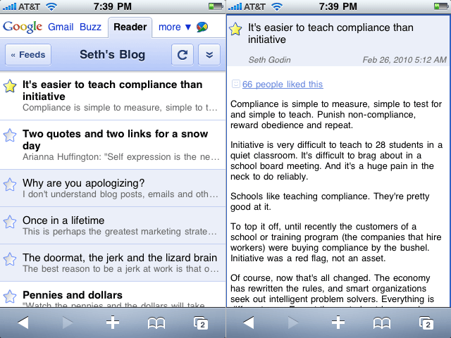
Now, my current RSS setup is Reeder on my iPhone and NetNewsWire on my Mac — all synced via Google Reader.
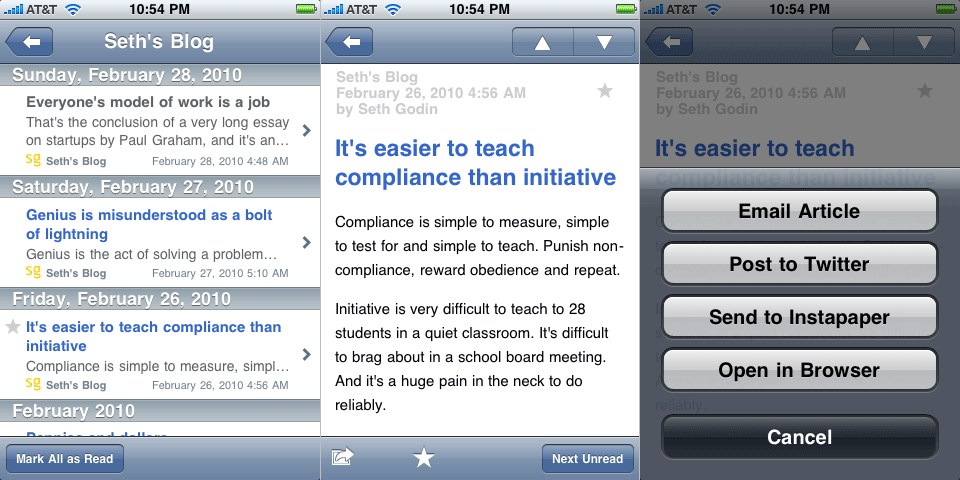
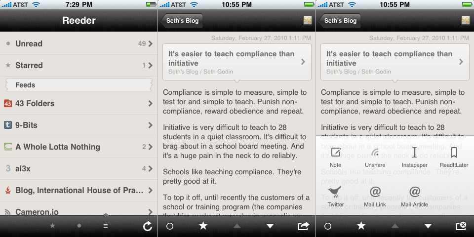
Reeder

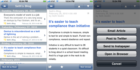
Reeder’s approach to their app design is brilliant. They’ve sought to bring back some of the nostalgia of reading while on a digital device by virtualizing the look and feel of an old, trusted book. And they did this without sacrificing the ‘touchability’ of a well-designed iPhone app.

The custom GUI goes beyond just the torn-paper markers and off-white background. The pop-up menu for sharing an item unique, being more akin to what you may see on Android OS instead of using the standard buttons on iPhone OS. And there are a few custom, intuitive swipe gestures which can be used to mark individual articles as read, unread, or starred.

In his review of Reeder on Download Squad, Nik Fletcher aptly wrote: “Reeder balances the familiar with custom elements, and as a result the interface looks great when browsing (and reading) content.”

So yes, Reeder is more unique than any of the aforementioned feed reading apps while still feeling familiar and friendly. It is by far the best feed reader app available in the App Store right now. Yet some of its cleverness feels too clever, and since Reeder is so close to being beyond great, its shortcomings seem so much shorter.

For instance, the status bar takeover is neat, but is it necessary? I find myself distracted by it every time open the app. It always makes me think of the stoplight countdown before a Super Mario Kart race begins: Beep. Beep. BEEEEEEEP!1

Secondly, the GUI is not contrasty enough. I love the texture and the vintage, off-white coloring, but it can be difficult to quickly see the difference between a read and an unread item, as well as the lighter colored text which makes it not quite as easy to read on. But this is a subtle quibble…

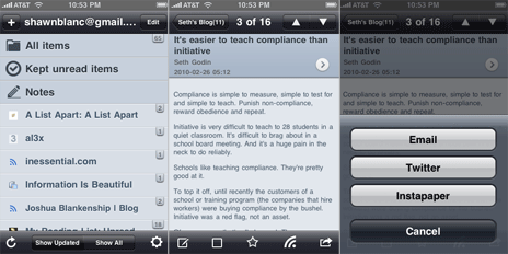
My primary gripe is the lack of saving state. Regardless of where you are in the app when you quit out of it you will always start back at the beginning when you re-launch it. Compare this against the convenience of state saving found in Instapaper. Instapaper actually saves two types of states: (1) those of individual articles: if you are reading an article and then return to the item list view, and then come back to that article later, it will open in the same place you left it; and (2) overall state: upon a re-launch of Instapaper you will always find it just as you left it.

Reedie

A good feed reader is quick, reliable, and readable. But a great feed reader has to be all of those and more. It has to be clever, very polished, and, of course, fun.

My ideal feed reader app would look like some sort of marriage between Tweetie 2, Instapaper, and Reeder. It would have the sounds and UI elegance of Tweetie 2, the typographic and state saving bliss of Instapaper,2 and the uniqueness of Reeder. (For bonus points it would swipe the swipe-top-navigation-bar-to-go-home feature from Tweetie 2.)

I don’t want another iPhone feed reader, I want a better one. Because apps like Tweetie, Twitteriffic, Birdhouse, and Birdfeed are all outstanding Twitter clients — each one is clever, polished, and fun. And who says feed reading can’t be as enjoyable as tweeting?


  1. Tapping the menu bar while Reeder is syncing will change it back and forth from total menu bar takeover to showing the upating status via icon over the battery.
  2. And speaking of state saving bliss, the 2.0 version of Reeder will have state persistence. (Hat tip to Michael.)
iPhone’s Missing Feed Reader