Speaking of good information design, check out this examination of CNN.com’s entire history of daily web stats (13 years worth!).
Design, Typography, and the Like
What Makes Good Information Design →
Is it interesting, easy, beautiful, and true?
A Newspaper Serves Its Community →
Perusing the PBS video archives I came across this old, 13-minute documentary of the writing, editing, typesetting, printing, and delivery of the LA Times.
And boy has advertising changed since this video was made. I’m not too sure how many people today would buy a clothes dryer because the ad showed a smiling sun on the inside.
Daily Drop Cap →
A Better One-on-One Form
If you are a manager you need 1:1s with your team. My Tuesday afternoon is pre-booked with my direct reports. I meet with them all, one at a time, and it’s worth every minute.
Since I don’t have the world’s most amazing memory, I use a form to jot down the things I want to talk about during our 30 minutes and to keep record of what they have to say. Also, since it’s not uncommon to end up talking about things we need to do, there needs to be a spot for action items.
At first I used a generic form I found on the Internet. But I kept getting frustrated by its horrendous layout and lack of flexibility. So I designed my own. And then re-designed it. And re-designed it again. I’ve gone through many different 1:1 forms over past Tuesdays, and I’ve finally found a minimal and flexible design that woks.
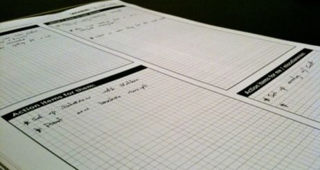
The font is Gotham Bold, each text box has a quarter-inch grid, the headings are written in very plain and inviting terminology, and the color is 1/0 so a lot of these can be printed for dirt cheap.
I keep used and empty forms in a binder near my desk. It helps me not think about Tuesday afternoon until it’s Tuesday afternoon, when I just pull out last week’s forms and jot down any left-over items onto this week’s. If something comes up in-between Tuesdays I just pull out the binder. Or if I’m not at my desk, there’s a text file on my Mac that I throw things into.
If you’d like to use the form, redesign it and make it better, or anything else, feel free to go nuts:
-
Download the source files (InDesign and EPS)
“Typographers Are Actors” →
A fantastic article by the aforelinked Josh Farmer:
As with any supreme art, great typography lets us become absorbed in the unspoken feeling of the moment because the artists themselves were able to inhabit and express that aura. In this, typographers are actors. They step out of themselves and become something else: the ’70s, velvety, robotic, disinterested, love, fearful, regal, luscious. They transfer the feeling to us—not just the letter or the word. And they do it with aplomb, convincing the public of the time and place the typeface represents.
Josh is an amazing writer, and his weblog, Words From a Father, is by far one of my favorite sites to read. He was keeping his site under the radar for a while, but now that he’s written this full-length essay I have no choice but to link to it and introduce you guys to his writing. Enjoy.
“Marty McFly Meets the Star Trek Crew and Both Battle The Terminator” →
David McCandless’ avant-garde infographic of time travel from popular movies and TV shows:
What I really love about this image, though, is the idea that this information has never been seen before. Despite the fact that it exists, in some way,somewhere, wrapped in various plots, it’s never been given form in this way.
This is just one page from his upcoming book, The Visual Miscellaneum, due out a month from tomorrow in the US.
‘Typography Experiment’ →
Also makes for one hot iPhone wallpaper.
iQ Font →
That’s one way to create a new font.
Coldplay’s Strawberry Swing Video →
Absolutely incredible sidewalk chalk and stop-motion music video for Coldplay’s song, Strawberry Swing.
Designing of The Rakes’ Third Album, Klang
Designing of The Rakes’ Third Album, Klang
Mark Sinclair:
Work Associates looked to some of the Germanic influences on The Rakes’ third album, Klang, to create their entrancing typographic sleeve for the release and the supporting singles. Here’s how they did it…
(Via Khoi.)
A Brief Comparison of Font and Background Colors Rendered Across Major Browsers in Mac OS X
There is an unfortunate side-effect to Websites that sport light text on a dark backgrounds: in general, the light-on-dark font appears as more bold than its dark-on-light counterpart.
The truth is, it is not actually more bold (in terms of the actual number of pixels that make up the stroke width), it simply appears more bold due to the anti-aliasing of the font by the browser and operating system.
It is easy to notice Web fonts rendering differently on different operating systems. But, fonts also render differently in different browsers, even within the same operating system.
There are three things I want to look at regarding font and background coloring, and how it renders in various browsers in Mac OS X.
First of all, we’ll compare the way dark text on a light background looks in a browser next to light text on a dark background in the same browser. Secondly, we’ll compare the rendering (anti-aliasing) of the text in various rendering engines. And finally, for fun, we’ll look at the un-expected differences in kerning.
Color Comparisons
The screenshots below are taken from each of the major Web browsers for Mac OS X.1 Firefox and Camino both use Mozilla’s Gecko rendering engine, Safari uses Webkit, and Opera uses Presto.
On the left side the background color is #a0a08b, and the font color is #393831. The right side is the flip-flopped style of that — background: #393831; color: #a0a08b; — and is the same styling as this website. The large, serif font is 16px Times New Roman (this site’s h1 tag) and the smaller sans-serif is 11px Lucida Grande (this site’s default body font).
Safari 4 Public Beta

Firefox 3.0.6

Camino 1.6.7

Opera 9.64

At first glance, it is easy to spot how the dark text on light background appears less bold than the light text on the dark background. Especially in Times New Roman. Regardless of which browser is rendering the font, comparing and contrasting the stroke of the letters between light and dark you can see how the dark letters on the light background appear thinner, sharper, and better rendered.
Also worth noting before moving on is that the two Gecko-run browsers (Firefox and Camino) render both the light text on dark and the dark text on light thinner than Safari or Opera do.
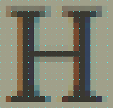
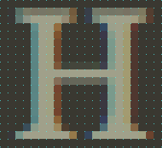
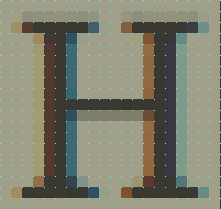
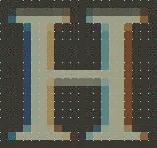
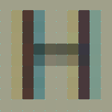
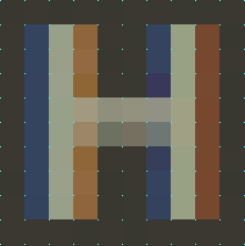
The main contributing factor to a font appearing as more or less bold is the color of the pixels that make up the stroke width. You’ll notice in the screenshots below, that the stroke for the leg of the “H” set in Times New Roman is five pixels wide. You have to look closely to count all five pixels of the H set on a light background, whereas you can easily see the five pixels of the light H on the dark background.
Browser-Specific Display of Pixel Colors Within the Stroke
As visible from the previous screenshots, when it comes to stroke width, the four browsers end up boiling down into two: Safari and Firefox.
Since Safari and Opera rendered identicaly in this comparison, I removed Opera. Firefox and Camino both use Gecko and they render identical to one another, so I removed Camino. This is convenient for the comparisons, because Safari and Firefox are the two most common browsers used in Mac OS X.
When looking at the below letters zoomed in, not only does it become clear as to why one color combination appears thinner than another, but it is fascinating to study the pixel-by-pixel differences between the colors and the strokes.
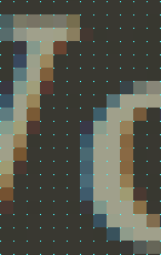
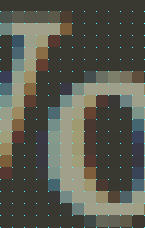
For example, compare how the Times New Roman “H” renders on the dark-background in Safari versus Firefox. In Safari, there is one pixel of space between the inside of the top and bottom serifs. However, in Firefox, they actually — though barely — touch.
Safari vs Firefox Rendering of Times New Roman at 1,100% (The cyan dots mark the pixel grid)
Safari 4 Beta
|
Safari 4 Beta
|
Firefox 3
|
Firefox 3
|
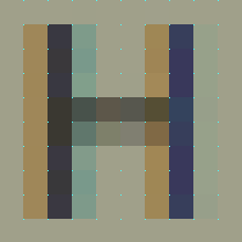
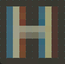
Safari vs Firefox Rendering of Lucida Grande at 2,250% (Again, The cyan dots mark the pixel grid)
Similar to the H set in Times New Roman, you can easily see how the anti-aliasing of this H set in Lucida Grande differs in contrast depending on the color it is placed on.
Safari 4 Beta
|
Safari 4 Beta
|
Firefox 3
|
Firefox 3
|
Kerning
A final point of nerdery: beyond anti-aliasing differences, each browser also has its own opinion for kerning as well.
It is most noticeable between the “W” and the “o” in “World” for the font Times New Roman:
Safari, Camino, and OperaX-Height = 13px |
Firefox 3X-height = 13px |
And the Point is?
Not only does anti-aliasing vary based on operating systems, monitors and which fonts you’re rendering, it also can change based on the rendering engine of the browser you’re using to view the Web page. But, in general, RGB anti-aliasing of dark fonts on light backgrounds appear as more crisp than for light fonts on dark backgrounds.
- Originally I included screenshots from Safari 3 and Firefox 2, since they are still in wide circulation. But they rendered identical to their more-recent-version counterparts, and there comes a point where “thorough” crosses the line and becomes “too much information”. ↵
New Site Design for FaceOut Books
New Site Design for FaceOut Books
They’ve got fantastic book designs accompanied by interviews and/or clever and relevant info on the design, the layout, and the sometimes book itself.
Designers are not Programmers
Another intelligent piece by Lukas Mathis:
Designers who know how to code – or even worse, who have to implement their own designs – are beholden to two different, contradicting aspects of software creation. This corrupts their ability to come up with the best possible design.
