I use Safari sans Flash, and so I launch Chrome for times when Flash is needed (which is a few times a week). I was having the same problem as TJ: setting a global shortcut key to launch Chrome via the Developer menu wasn’t always working. However, this AppleScript works like a charm.

Be sure to download the “updated” script found at the bottom of TJ’s post. It fixes a bug in the original script.

And for the curious nerdy, my keyboard shortcut for this is CMD+OPT+G and I’m using FastScrips of course.

(Via DF.)

An AppleScript for Opening the Current Safari URL in Google Chrome

Tim Carmody, who guest wrote for Jason Kottke last week, wrapped up his stint with a post about why he loves Kottke.org and, really, what makes for a great weblog.

These [link, pull, and response] are also the elements that help establish bloggers’ identity as readers in conversation with other readers: I have seen something that I feel strongly enough to think and write about, and what would make me happiest is if you look at it, then think and write about it too.

What I like about Tim’s post is how he relates the structure of a weblog to its voice. Especially for sites that post a high frequency of links to other sites, the structure of link posts can contribute greatly to the voice of the author. The words used are not the only elements which establish voice. Other key players include structure and site design.

“Link, Pull, Response”

In a contact’s entry you can add a phonetic first and last name. This is great for making sure the Voice Command says the names of your friends and family correctly as well as understanding you when you are trying to voice dial someone.

For example, I used to drive 10 minutes to my office every morning and would use that time to call my mom and say hi. Her name is Bea Blanc but my iPhone wanted me to pronounce it “Bee-ahh Blank”. It was bad enough that the iPhone fumbled up her name, but making me mispronounce it as well was just plain rude.

And so I entered her phonetic first and last name as “Bee Blonk” respectively. Now I don’t have to mispronounce her name when calling via voice dial. I know not everyone uses the Voice commands, but I like them. It’s like having your own assistant. iPhone, get my mother on the line, would you?

To set a phonetic field just go to a contact’s entry from your iPhone, scroll to the bottom, and tap “Add Field”. From there you’ll find the fields you’re looking for.

(Thanks Sean for the tip!)

The Phonetic Field

I want to thank Renkara Media Group for sponsoring the feed this week to promote their upcoming app for the iPhone and iPad, KanjiPictoGraphix.

Renkara Media Group has been working with Michael Rowley to turn his best-selling mnemonics book for learning Japanese, Kanji Pictographix, into an app for the iPhone and iPad. To help with the creation of this app Michael re-drew many of the visuals from his book. The app contains not just Michaels mnemonic visuals, but also stroke order diagrams, vocabulary words, and a dynamic filtering and sorting system.

It’s due out soon. You can check out the website to see a promo video and to sign up via email to be notified once the app is available.

KanjiPictoGraphix

Fantastical Preview

For the past several weeks I have had the privilege to beta test the soon-to-be-released Mac calendar app, Fantastical. It is still in private beta, and is due out later this month.

The developers over at Flexibits have given me permission to share a little bit about Fantastical with you guys, and I’m honored to do so because I am really loving this app.
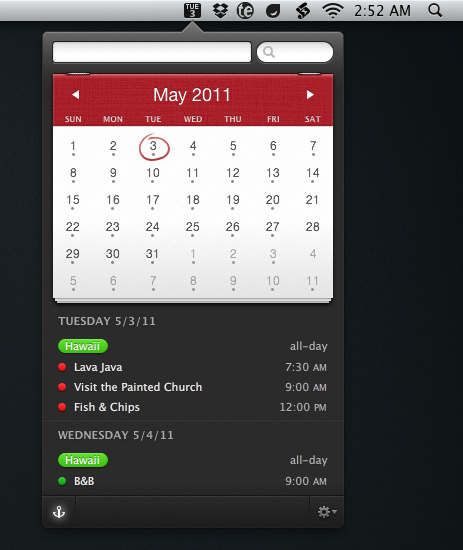
Fantastical Interface

There is a fine line between not enough and just enough — between usability and unnecessary lack. That line is defined in part by the developer but also by the user.

We, the users, define what is too much, not enough, or just right for the software we use. Often times, the best of developers will be able to aptly build in the appropriate features for all sorts of users. So that those users with less needs do not feel overwhelmed and those with more needs do not feel any lack.

In many ways I think Fantastical has hit that sweet spot.
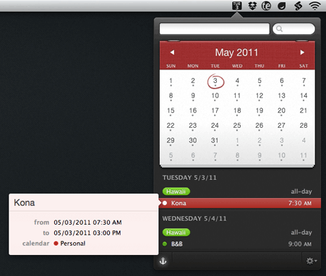
Fantastical Interface with Detail Popover

Fantastical started out with the intentions of being a counterpart to your current calendar app. It syncs with iCal, Entourage, BusyCal, Google Calendar et al., and it works quite well as a nimble access point for viewing and adding new events.

Other plugins and utilities have sought to do this in the past. However, in all my years of experimenting with those various “helper” apps for iCal, none have ever stuck with me. Fantastical is the first one that has.

After daily usage for the past several weeks I have found that Fantastical is near wholly a stand-alone calendar app. The only thing it doesn’t do (yet) is allow you to edit an event once it’s been created. If you’re not always editing events, then Fantastical very well could replace iCal for most of your day-to-day calendaring needs. It has for me.

What I like most about Fantastical is how quick and accessible it is. It lives in your Menu Bar and you invoke it via a global hotkey (I use command+option+c), or by clicking on the Menu Bar icon, and it appears instantaneously. It is both keyboard and mouse friendly. The power users in the room will be glad to know you can navigate and operate the app without leaving the keyboard — if it were not so then I certainly would not find the same amount of utility from the app.

And what blows me away every time I use it is the entry panel for an event — Fantastical uses a natural language parser in addition to the standard new-event, iCal interface. So far, in my usage, the natural language parsing has been superb; the best I’ve ever used.
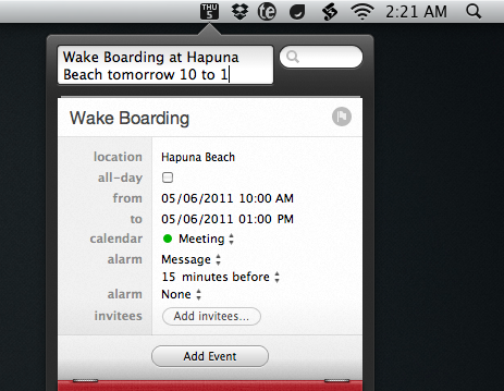
Fantastical Interface

The parsing is not only good at actually understanding what I’m entering it also makes me feel quite confident that it understands me. There are some clever visuals that come to life as you type in the title, time, and location of your event. The words move to their corresponding spot in the date and time list, letting you know that the event is being created.

Fantastical is set to launch later this month. You can sign up on the teaser site if you want to be notified via email once it launches.

Fantastical Preview

Lately I’ve been writing the initial drafts of my longer-form articles using Byword and I really like it. Its glory is that it’s a very simple application.

When you work on a 23-inch monitor a good full-screen writing app can be hard to find. Apps that look good in full-screen mode on a 13- or 15-inch screen don’t necessarily scale well to 23 inches. Byword, however, scales quite well. It looks great regardless of if I’m writing on my laptop display or my cinema displays. And the dark color scheme is just splendid.

And the latest version (1.1.1) which shipped just about a week ago now includes autosaving and QuickCursor support among other improvements.

Byword

High ceilings, open areas, and light colors help to foster creativity. Lower ceilings, tighter areas, and darker colors help with focusing in on detail-oriented tasks.

So is this why I usually am the most inspired and creative in the morning when the early light is in my office, and I am more productive at getting those ideas hammered out into something written during the evenings when it’s just the desk lamp providing light? And is this why we get outside when we just need to think, and we burn the midnight oil on that project because that’s when we’re finally in the zone to get things done?

Also, I’m curious if a similar study has been done regarding music and background noise and which types foster creativity and which types help with doing focused, detail-oriented work. This article about working at coffee shops because they’re “just enough distraction” is somewhat along that vein, but not quite.

(Via Ben Brooks.)

How the Space and Color of a Room Affects Creativity and Focus