I agree with Nick in that many of my most-used and most-beloved iPhone and iPad apps are the ones which look and feel like they were made by Apple. A good rule of thumb is, when in doubt, use the same UI design found in Apple’s native apps. If you are going to do something custom then have a good reason why and do it better than Apple would do it.

See also this article from Marco Arment on optimal iPhone UI.

Nick Schaden on iOS App Design

Tweetbot’s Got Personality

Using an app by Tapbots feels like a privilege.

There is this addictive cleverness and playful uniqueness to the way Mark and Paul build their apps. The sounds, the animations, and graphics don’t feel or act like a standard app, they feel more like a toy. A toy you get to use for work.

They say a man buys something for two reasons: a good reason and the real reason. And I have always thought that with Tapbots their apps cater to that. There is a good reason to buy an app from Tapbots, but there is also another (and perhaps, more real) reason. And the real reason is that you want to play with the app. Because, like I said, to use it feels like a privilege.

For the previous Tapbots apps the function of the apps has been very niche. Weightbot is for people who want to lose weight; Convertbot is for folks who want to know how many ounces are in a liter; and Pastebot, well, Pastebot is for nerds.

These are niche markets when it comes to iPhone apps. Weight-tracking applications, unit converters, and clipboard managers are not exactly in high demand on the app store when compared to games, news aggregators, or even Twitter clients.

Today, however, Tapbots has taken a plunge by making a Twitter client amongst a pre-existing sea of them. It’s called Tweetbot, and it is everything you would expect it to be.

There are too many Twitter apps to count; what is it that makes Tweetbot better than any other? Well, in some regards you could say that nothing makes it better. It doesn’t really do anything that [insert your favorite Twitter client of choice] doesn’t already do. I mean, it’s a Twitter client, right? It shows you tweets, lets you reply to them, save links to Instapaper, upload pictures, and generally get distracted.

However, you could also say that everything about Tweetbot makes it better. Tweetbot has more personality than any other Twitter client out there. Every single pixel has been hand crafted in order to build the most custom looking UI of any Twitter client I’ve seen. Moreover, the sounds, the animations, the actions — everything has been thought through with intent, care, and fun. It all adds up to create a Twitter Experience Extravaganza.

Using Tweetbot

When I launch Twitter from my Mac, iPad, or iPhone these seem to be the most common things I end up doing or finding:

  • Discover links that get sent to Instapaper for reading later
  • Discover news
  • Eavesdrop on conversations
  • Reply to someone
  • Post a tweet of my own
  • Direct message people

I have been using Tweetbot since its early stages of alpha development and all that time it has been my exclusive Twitter client when on my iPhone. Now, I don’t beta test that many apps and having one find its way to my home screen and wiggle its way into my daily life is not common behavior. More often than not, when I am helping to test out an app I use it enough to provide feedback to the developer, but it doesn’t become one of my most-used apps.

There are three reasons Tweetbot has wiggled its way into my life: (1) I use Twitter far too often; (2) it seemed a disservice to nerds everywhere to not use Tweetbot when I had the opportunity; and, most importantly, (3) many of the ways which I most use Twitter have been extremely well integrated into Tweetbot.

Below are a few of the reasons why I find Tweetbot so fantastic.

Tap and hold a tweet

When you tap and hold on an individual tweet, a list of options comes up and you can instantly send to Instapaper, email the tweet, etc…
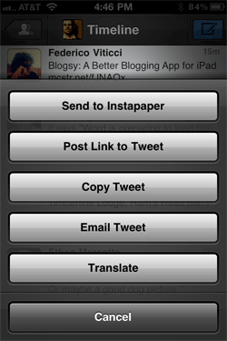
Tweetbot's tweet options when you tap and hold

This is great because far and away I populate my Instapaper queue in Twitter more than any other place (such as my RSS reader or browsing the web). But this is bad because it is so easy to add items to Instapaper in Tweetbot that I get ahead of myself and am sending more items to Instapaper than I have time to read. And so, alas, my Instapaper queue is longer than my arm.

Using lists as the main timeline

Tweetbot does something that, so far as I know, no other Twitter client lets you do. It lets you use a list as your main timeline. Any list that you have created or that you follow can become your main timeline. Simply tap the center of the top bar in (where it says “Timeline”) and you’ll be presented with a screen showing all the lists you have created or that you follow.
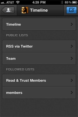
Tweetbot's lists as main timeline

For example, I have a list of sites who’s RSS feeds are available via Twitter. I tap that list and it becomes my main timeline.

This is also a great feature as you find yourself following more and more people on Twitter. Simply create a list — funny folks; best friends; awesome writers; etc. — and set the list as your main timeline. In short, you’re curating your own mini-timeline within your larger, Master Timeline.

Every other Twitter client I have used has treated lists as second-class citizens. But, thanks to Tweetbot’s treatment of lists, I’ve begun using them and am wanting to use them even more than I already am.

Moreover, you can edit your lists from within Tweetbot via Tab Bar. The two right-most buttons are customizable and can be set for bringing up the lists editor as well as your favorites, saved searches, or retweets.

Tweetbot lets you choose your own adventure

Swiping left to right for a conversation view

This probably happens to you as well. I will often “walk in” on the middle of a conversation that is happening in Twitter between people whom I follow and I want to read the rest of the conversation thread. In Tweetbot you simply swipe an individual tweet from left to right and it will load the conversation view. I do this enough that having such a simple and accessible gesture for it has proven to be extremely useful.

Similarly, swiping on a tweet from right to left will show you all the replies to a tweet.

A Few of My Favorite Things

It’s the little things that make a good app great. As you use Tweetbot those little details pop out and give Tweetbot its personality. The animations are beyond cool, and as I said earlier, every single pixel is custom. There is nothing that is not custom except the keyboard itself, and yet it all feels familiar.

Below are a few of the little things about Tweetbot that really stand out as being extraordinary.

  • The falling dialog box: When you go to sign in to your Instapaper account, try using the wrong email address or password.
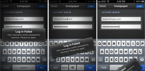
Tweetbot's falling dialog box
(Click for full-size and more images.)

  • Finding a user: When you type the “@” symbol while composing a tweet a small little user profile icon appears. Tap on that icon and you’ll be brought to a list of all the people you follow and you can quickly search for and find users.
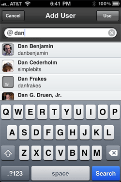
Tweetbot Twitter users lookup pane

I absolutely adore this feature because I for one do not have all the usernames of the people I follow on Twitter memorized.

  • Direct Messages: The Direct Message threads are top-posted like your Twitter timeline, rather than bottom posted like Instant Messenger or the official Twitter apps. (Though the Twitter website has top-posted DM threads rather than bottom-posted.)

Technically, bottom posting the DM threads is the proper way to do it. However, I am jarred by it every time. I spend far more time in my main timeline and my @replies list than I do in the DM pane, and all the rest of Twitter has the newest tweets on top.

  • Success!: When using Twitter there can be a lot going on in the background, such as your tweets being posted or your links being saved to Instapaper. Most Twitter and even RSS reader apps will have a small, somewhat opaque box that spins while the link is being saved and then gives a check box once the link is saved successfully.

Tapbots already has their own version of this sort of feedback box that was designed and implemented in Pastebot. For example, when making edits to an image you get the little spinning lines while the iPhone processes the edits and then a checkmark and a ding once the edits are completed.

In Pastebot a success notification looks like this…

Pastebot’s Success Notification

…and so I assumed that in Tweetbot the exact same element would be used for letting me know when my tweet had been posted or a link successfully saved.

However, Tapbots rethought even this bit of their Twitter client and instead of a box getting in your way and sitting over the top of your Timeline, a notification slides down from the top letting you know that your tweet was successfully posted or that your link has been saved to your ever-growing Instapaper queue.
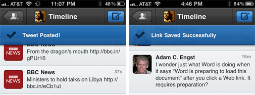
Tweetbot’s Success Notifications

Extraordinary

For me, what makes a good app great is the little things — the small areas where attention to detail was given and where something that could have been normal was instead made extraordinary.

Tweetbot’s Got Personality

Is Your Site Missing its Custom WebClip Icon?

When I open up Reeder on my iPad I am always reminded by how many websites do not have a WebClip Bookmark Icon.

Missing Apple Touch Icons

Fortunately, setting up a custom WebClip Bookmark Icon is quite easy. Here’s how:

  1. Create a 129×129-pixel png image titled apple-touch-icon.png
  2. Upload it to your website’s root folder:
    http://example.com/apple-touch-icon.png

  3. That’s it.

This png file is the image that Reeder will use when listing your site in the feeds folder. And this is the image that iOS will use as the icon when saving your site as a web clip to the Home screen.

So why 129×129? Because that’s the size Apple uses. However, the exact size that the icon should be is debatable. Mine is actually 158×158 pixels (left over from when Nathan Borror suggested that size in 2008). Jeffery Zeldman’s is 120×120 pixels, Marco Arment’s is 128×128 pixels, and 5by5’s is 144×144 pixels, for example.

And, so long as we’re on the subject, here are four of my favorite WebClip Icons. Left to right it’s Zeldman, Blankenship, Kottke, and Van Damme.

Favorite Apple Touch Icons

Is Your Site Missing its Custom WebClip Icon?

Instacast

There is a problem with subscribing to podcasts on your iPhone, and it has to do with iTunes. Here’s how it works:

  • You discover a podcast you like via one of many ways. Perhaps you are simply browsing the multitude of shows in the iTunes Podcast directory. Or perhaps you’ve come to a website promoting their podcast, or a friend told you about a certain one.

  • Once deciding you want to subscribe to that podcast, you end up on that show’s page in iTunes and you subscribe for free.

  • The show is added to your own podcast subscription list and the most recent show is downloaded onto your computer.

  • You are now subscribed to a podcast.

Now, if you want to listen to that podcast on your iPhone, iPod touch, or iPad, you must plug your device into your computer and sync it. Making sure that your new podcast has been hand-selected to be one of the ones which sync to your iPhone.

Up until this point it all is fine. However, the frustrating part of subscribing to podcasts on your iPhone happens once you’ve synced the podcast and its episodes to your device. Because at that point the content on your iPhone becomes static — as if podcasts are treated like albums and episodes like songs.

Treating music or movies that you’ve synced to your your iPhone as static content is fine. I listen to the same album many, many times and only have my favorite albums and artists synced to my iPhone. But for a podcast, it’s like a radio or television show — I listen to it once and that’s it. With a podcast there is always something new to add and something old to get rid of.

We don’t listen to podcast episodes over and over. We listen to new ones as they get published. Out with the old and in with the new. However, when the podcast you are subscribed to publishes a new episode there is no easy way to get it.

The two ways to get a new podcast episode onto your iPhone are either: (a) tap “get more episodes”, be taken to the iTunes app and then pick a single episode to download to your iPhone, wait for it to download, return to the iPod app and play the episode; or else (b) sync your iPhone to your computer and transfer any new episodes which have downloaded to your computer onto your iPhone.

(If you are subscribed to more than one podcast, you have to repeat step “a” for each individual subscription, and manually download each new episode.)

When at my desk working I either listen to music or silence. There are only a few podcasts which I listen to on a regular basis, and when I do listen to them it is usually during some activity which has me away from my computer. Such as driving, mowing the lawn, or working in the garage.

Since I use MobileMe to keep my contacts and calendars in sync I rarely have need to sync my iPhone. Which means that up until a few weeks ago my Podcasts were virtually never up to date. If I was in the car and wanted to listen to the latest episode of The Pipeline I either had to plan ahead and sync or just listen to the most recent version I had on my iPhone. Which meant that in reality, I just rarely ever listened to podcasts.

Now, I realize that to have already written almost 600 words may seem like a lot to simply describe the awkwardness of trying to keep a podcast up to date. But: (a) I think we’ve all figured out by now that I have an affinity for writing about these types of things in detail; and (b) I’m trying to paint a picture for why I hardly ever listened to podcasts — up until a few weeks ago there was just no simple way to keep up with them.

A Better Way

What some people may not realize is that a podcast feed is just like an RSS feed. Which means that, when it comes to podcasts, iTunes is just a fancy (and bloated) feed reader.

This also means that apps other than iTunes can subscribe to podcast feeds. Instacast is one such app.

Instacast

Instacast is not the first iPhone app dedicated to managing your podcasts, but it is the first I have ever truly liked. Its most notable feature is that it offers over-the-air updating of your podcasts.

You can update all your podcasts at once, or just one subscription, or even just one episode at a time. It will update the listing of all the new shows their descriptions, length, and more. From there you can stream the episode right away or download it for listening to when you’re not online. Instacast even remembers your spot for each episode you’re listening to and you can resume where you left off — even if you were streaming.

To fill Instacast with your favorite podcast subscriptions you may want start by rescuing your current podcasts directly from your iPhone’s iPod app.

Tapping the + button at the bottom-left corner of Instacast’s home screen (the screen which shows your complete list of subscriptions) will open up the area of Instacast where you find and add new broadcasts. Tap on the iPod icon and Instacast will look up all the podcast subscriptions you’ve been syncing over to your iPhone from your computer and will then pull the feeds for those and subscribe to Instacast for you.

Moreover, you can search for a specific podcast, browse the directory of Popular1 or Just Added podcasts, or thumb in the URL of a podcast feed which is not public. Instacast even supports authenticated feeds.

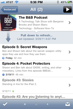
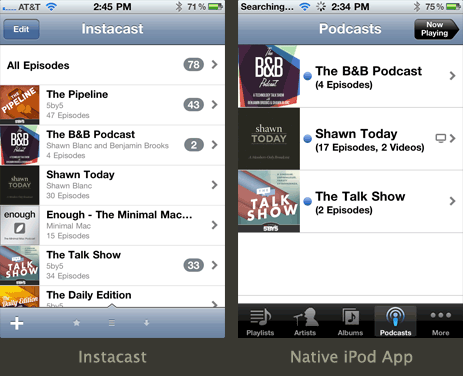
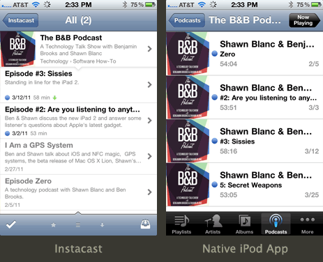
Thankfully Instacast not only acts the way a dedicated podcast app should, it looks like it was designed in Cupertino. And once you use it a bit, it really begins to make the native podcast section of the iPod app look as if it was even less thought through. Meaning, Instacast not only works better than the native podcast functionality of your iPhone, it looks better too.

Side-by-side comparison of the all-subscriptions list

Side-by-side comparison of Instacast and the iPod app

Side-by-side comparison of an individual subscription

Side-by-side comparison of Instacast and the iPod app

After using it for a while it’s clear that it was thought through with this sole functionality in mind. Instacast has a much more elegant design for podcasts than the iPod app does, and it’s made the native iPod app feel bulky to me.

Another great feature is the price: just 2 bucks in the App Store. Which should make it a staple for even the most casual of podcast listeners.

Conclusion

I am as nitpicky about user interface as I am about user experience. There are some apps which, even though they offer a great service, I just never use because I don’t like to look at them. And on the other side you have those apps which look cute but are not very useful.

Instacast, however, is of my favorite breed of apps: one with pitch-perfect design and that does one thing and does it very well.


  1. The popular podcast list is populated by the podcasts most subscribed to via the other users of Instacast. It more or less reads like the What’s Hot list in iTunes for technology. Clearly, the iPhone-toting podcasts junky demographic is full of nerds.
Instacast

Many, many thanks to Jitouch for sponsoring the RSS feed this week to promote Midori. Midori is a beautiful and powerful Japanese dictionary and translation app for iPhone and iPad. It has hundreds of thousands of entries, example sentences, and names to help you translate and learn Japanese.

Midori’s sponsorship was booked well before last week’s tsunami in Japan, but I can’t think of a more fitting app to be promoted on the RSS feed this week. And it’s worth noting that purchasing a copy of Midori means you’ll be directly supporting the work of a Japanese iOS developer.

You can pick it up for ten bucks as a universal app from the iTunes App Store.

Midori

This is the way beta testing for iOS devices should be. At any given time I am helping beta test a handful of apps. A few of the developers have been using TestFlight while it was still in private beta. And keeping up to date with their latest builds became so much easier I became a more useful tester.

If you’re an iOS developer, you should be using TestFlight. If your a beta tester, tell your developer friends to sign up.

TestFlight