There is an unfortunate side-effect to Websites that sport light text on a dark backgrounds: in general, the light-on-dark font appears as more bold than its dark-on-light counterpart.
The truth is, it is not actually more bold (in terms of the actual number of pixels that make up the stroke width), it simply appears more bold due to the anti-aliasing of the font by the browser and operating system.
It is easy to notice Web fonts rendering differently on different operating systems. But, fonts also render differently in different browsers, even within the same operating system.
There are three things I want to look at regarding font and background coloring, and how it renders in various browsers in Mac OS X.
First of all, we’ll compare the way dark text on a light background looks in a browser next to light text on a dark background in the same browser. Secondly, we’ll compare the rendering (anti-aliasing) of the text in various rendering engines. And finally, for fun, we’ll look at the un-expected differences in kerning.
Color Comparisons
The screenshots below are taken from each of the major Web browsers for Mac OS X.1 Firefox and Camino both use Mozilla’s Gecko rendering engine, Safari uses Webkit, and Opera uses Presto.
On the left side the background color is #a0a08b, and the font color is #393831. The right side is the flip-flopped style of that — background: #393831; color: #a0a08b; — and is the same styling as this website. The large, serif font is 16px Times New Roman (this site’s h1 tag) and the smaller sans-serif is 11px Lucida Grande (this site’s default body font).
Safari 4 Public Beta

Firefox 3.0.6

Camino 1.6.7

Opera 9.64

At first glance, it is easy to spot how the dark text on light background appears less bold than the light text on the dark background. Especially in Times New Roman. Regardless of which browser is rendering the font, comparing and contrasting the stroke of the letters between light and dark you can see how the dark letters on the light background appear thinner, sharper, and better rendered.
Also worth noting before moving on is that the two Gecko-run browsers (Firefox and Camino) render both the light text on dark and the dark text on light thinner than Safari or Opera do.
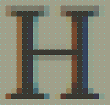
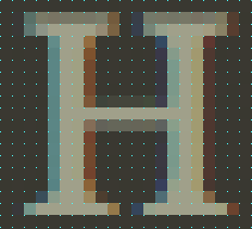
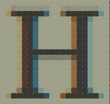
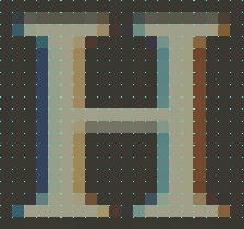
The main contributing factor to a font appearing as more or less bold is the color of the pixels that make up the stroke width. You’ll notice in the screenshots below, that the stroke for the leg of the “H” set in Times New Roman is five pixels wide. You have to look closely to count all five pixels of the H set on a light background, whereas you can easily see the five pixels of the light H on the dark background.
Browser-Specific Display of Pixel Colors Within the Stroke
As visible from the previous screenshots, when it comes to stroke width, the four browsers end up boiling down into two: Safari and Firefox.
Since Safari and Opera rendered identicaly in this comparison, I removed Opera. Firefox and Camino both use Gecko and they render identical to one another, so I removed Camino. This is convenient for the comparisons, because Safari and Firefox are the two most common browsers used in Mac OS X.
When looking at the below letters zoomed in, not only does it become clear as to why one color combination appears thinner than another, but it is fascinating to study the pixel-by-pixel differences between the colors and the strokes.
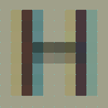
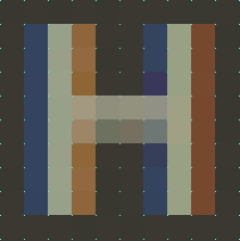
For example, compare how the Times New Roman “H” renders on the dark-background in Safari versus Firefox. In Safari, there is one pixel of space between the inside of the top and bottom serifs. However, in Firefox, they actually — though barely — touch.
Safari vs Firefox Rendering of Times New Roman at 1,100% (The cyan dots mark the pixel grid)
Safari 4 Beta
|
Safari 4 Beta
|
Firefox 3
|
Firefox 3
|
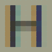
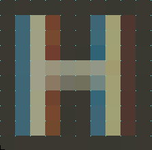
Safari vs Firefox Rendering of Lucida Grande at 2,250% (Again, The cyan dots mark the pixel grid)
Similar to the H set in Times New Roman, you can easily see how the anti-aliasing of this H set in Lucida Grande differs in contrast depending on the color it is placed on.
Safari 4 Beta
|
Safari 4 Beta
|
Firefox 3
|
Firefox 3
|
Kerning
A final point of nerdery: beyond anti-aliasing differences, each browser also has its own opinion for kerning as well.
It is most noticeable between the “W” and the “o” in “World” for the font Times New Roman:
Safari, Camino, and OperaX-Height = 13px |
Firefox 3X-height = 13px |
And the Point is?
Not only does anti-aliasing vary based on operating systems, monitors and which fonts you’re rendering, it also can change based on the rendering engine of the browser you’re using to view the Web page. But, in general, RGB anti-aliasing of dark fonts on light backgrounds appear as more crisp than for light fonts on dark backgrounds.
- Originally I included screenshots from Safari 3 and Firefox 2, since they are still in wide circulation. But they rendered identical to their more-recent-version counterparts, and there comes a point where “thorough” crosses the line and becomes “too much information”. ↵
