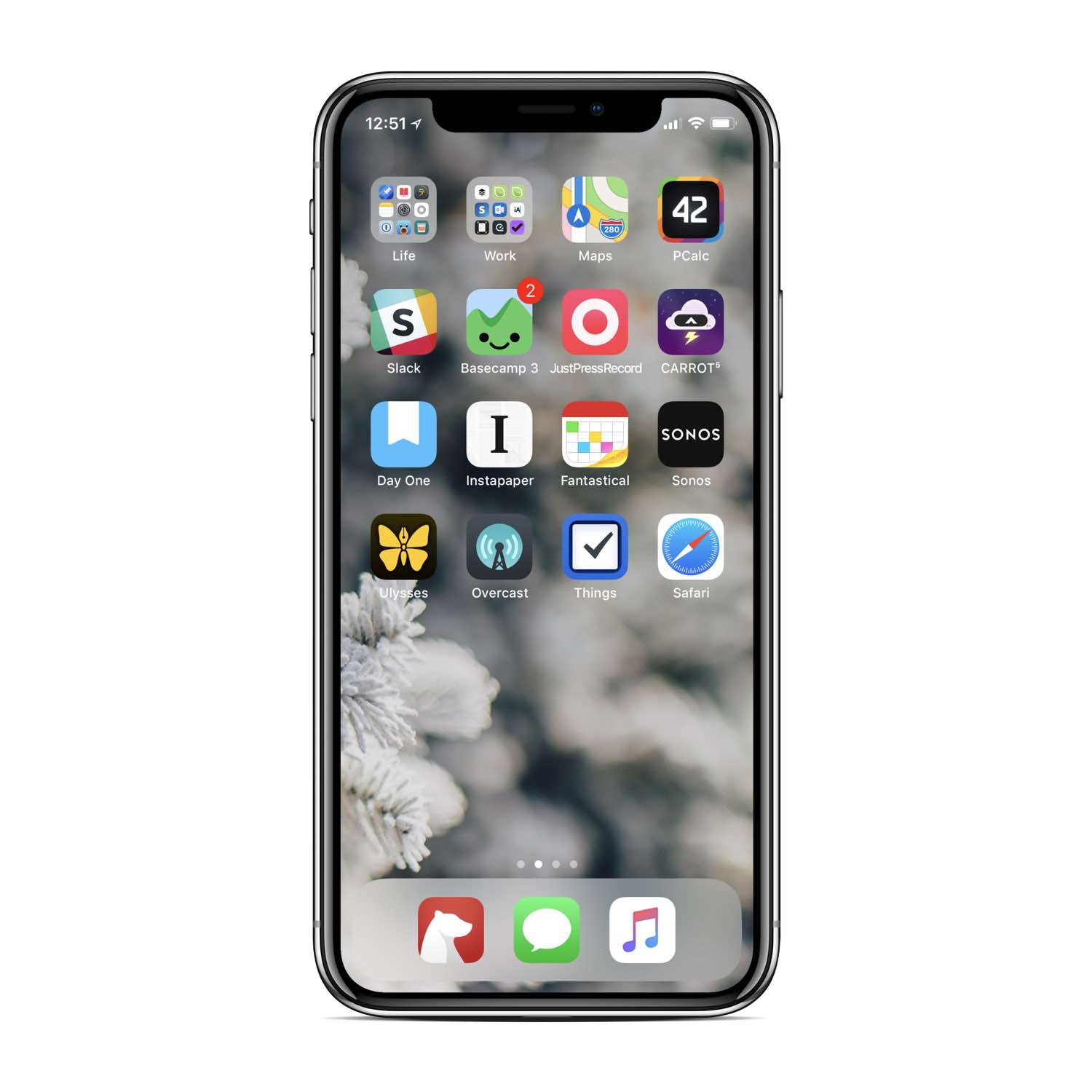
- A very big thanks to James Thomson for hooking me up with with the pro version of his fantastic calculator app, PCalc. It was super thoughtful of him, and there’s a long and boring story about it.
You see, way, way, way back in the day I had purchased the Lite version because it had an orange icon and it seemed in those days that every other app icon was blue. I upgraded, of course, via in-app purchases to the “pro” version, but even still my iPhone home screen’s icon said “PCalc Lite” and I would get heckled every time I shared a screenshot. I didn’t mind, but nevertheless, James took pity on me.
- Also, after nearly a decade of using Simplenote, I’m giving Bear a try. Bear is, without a doubt, far more polished and sophisticated than Simplenote. But it’s the — ahem — simplicity of Simplenote that has always been its charm.
My two biggest quibbles with Bear are that: (a) it won’t let me remove the few lines of preview from the notes list (I’d prefer to see only the note title); and (b) the first line of a note doesn’t automatically get formatted as a title.
- Just Press Record is my new go-to app for voice memos. There are times when, at the end of my workday or workweek, I still have loose ends floating around in my head. And it can be a tremendous help to simply speak them all out loud into a voice memo. Now, they’re captured and tomorrow I can listen to that memo and pick up right where I left off.
-
I’m using Things 3, of course. It is, by far, the most elegant of all the most popular task management apps.
Early this year I switched from OmniFocus to Todoist. But never really felt comfortable with it. When Things 3 came out in May, I switched to it and have been using it ever since. There are a few little things that irk me, but that’s the way it is with every single task app out there. Most are great, but none are perfect.
Moreover, I think it’s worth mentioning that Things 3 has been getting consistent updates since it shipped nearly 7 months ago. And many of those updates have been some of the most commonly requested features that I’ve seen, such as adding in the ability to have repeating to-dos within projects, keyboard shortcuts to iPad (basic, but still better than none at all), iOS drag and drop support.
Things has been around for quite a while, and over the years Cultured Code has developed somewhat of a reputation for shipping awesome updates and then going silent and letting their product begin to stagnate.
Hopefully the past 7 months is a look at Cultured Code’s new development cycle, and if so then that’s awesome.
* * *
Sidebar, so long as we’re talking about apps and Home screens…
Wouldn’t it be nice if we could have some blank space at the top row of apps, not just the bottom rows?
I would certainly prefer to have fewer apps on my Home screen, but not at the expense of having those few apps be anchored way up at the top virtually unreachable by any mere mortal’s single hand. So, instead, I have more apps in order to keep a few of the most-used ones within one-handed reach.