“What Kind of Designer Hires Out the Creation of His Own Brand?”
The fabulous rebranding of Squared Eye.
(Via Phil)
“What Kind of Designer Hires Out the Creation of His Own Brand?”
The fabulous rebranding of Squared Eye.
(Via Phil)
The New Yorker Interviews Dave Cullen
Dave is the author of Columbine, which is due out next week. His interview with Lila Byock from The New Yorker is excellent, but is especially worthwhile if you are, or ever have been, a Colorado resident.
Tabpots’ second iPhone app. Holy gorgeous.
“After 149 years and 311 days, the Rocky Mountain News published its final edition on February 27, 2009.”
The Rocky was a fantastic newspaper. It covered stories better than The Post did, had a personality not many big-city newspapers have, and the comics section was top shelf.
Be sure to check out the “Goodbye, Colorado” permalink which has the text and a picture of the front page of the Rocky’s final issue. I love that the design is directly from the very first issue and the article’s byline is simply, “The Rocky”.
It’s a lot like Evite, except that it is more simple, easy, clean, fun, and awesome and is less obnoxious and sucky.
See also, “How is this any better than Evite?” on their Help page.
“The Best Choice for All Your Front End Developer Needs”
Sweet mutherfuton mercy.
Mandy Brown on Writing, Reading and Advertising on the Web
Wasn’t there a promise that we could generate money and meaning, not merely the former?
My guess is that most of the writers whom I habitually read would chose to generate meaning over money if forced to chose. I certainly would.
William Faulkner once said:
Really the writer doesn’t want success. […] He knows he has a short span of life, and that the day will come when he must pass through the wall of oblivion, and he wants to leave a scratch on that wall — Kilroy was here — that somebody a hunderd, or a thousand years later will see.
Mandy is right that advertisers will continue to invent new tricks to make money and distract the reader. Fortunately, there are also people who will continue to write with mustard and keep the reading experience on the web in tact.
(Via DF)
Another intelligent piece by Lukas Mathis:
Designers who know how to code – or even worse, who have to implement their own designs – are beholden to two different, contradicting aspects of software creation. This corrupts their ability to come up with the best possible design.
A Year Ago Today: My Review of the Then New MacBook Pro
Hard to believe I’ve owned this machine for over a year already. It still runs great, and is now the last of a dying breed…
Monday mornings may be the best time to publish a new article. Everyone is getting into their weekly routine, and checking up on their feeds to see what’s new. That’s why feeds stats are always highest for Mondays.
This, in fact, is one reason I often publish my longer articles on Monday mornings: it’s the “prime-time” of blog reading. Well, that, and I usually do my writing on the weekends.
As many of you are checking your feeds I simply want to say that I hope you have a good day. I don’t know what you have planned for the day, but I will be in meetings, catching up on email, and finalizing a report. (It sounds less exciting than it actually is.) I spend my day with incredible people at an incredible ministry, and I love my job very much — especially when there’s a hot americano next to my keyboard.
Have a happy Monday, friends.
&mdash Shawn
The Daring Gradient Bar style by John Gruber is one of the better default themes that ships with NetNewsWire. It is a simple, good looking style that adapts to any type of post from any site’s feed.
The same can not be said for most of the styles available for NNW — default or not. Even the non-ugly ones that sport fancy CSS don’t necessarily mold well to the array of sites in a subscription list.
I have been using a modified version of the Daring Gradient Bar style for a while. Daring Serif sports Georgia for the body with red links. I prefer it, and I thought I’d share the love.
Generating HTML footnotes with AppleScript and MarsEdit
A lazy Saturday afternoon seems like a great time to clean out some old Safari bookmarks. In the process I re-stumbled across this trick by Shimone Samuel that uses AppleScript, pre-formatted Markup and placeholders to create footnotes in MarsEdit. (It sounds more complicated that it is.)
I have always used my own pre-formatted markup in MarsEdit to create footnotes but let’s face it, footnotes can be a pain to format and insert. Shimone’s AppleScript addition makes the whole process a bit easier.
If you publish via MarsEdit and use footnotes in your writing, you may want to give this a try.
I have now owned my iPhone longer than any other mobile.
Over the past decade or so, I’ve gone through a slew of pagers and cell phones. None of them sticking around as long as my iPhone. They each got boring or broken or sold on eBay. The iPhone, however, still feels brand new to me even though it currently holds the longest tenure of any other phone I’ve owned.
After 18 months of daily use, I’ve develop quite a few habits and familiarities. Such as the position I hold the phone when talking on it; or the direction it goes into my pocket; where I place in my car; the way I spin it when I’m bored; or how I hit the Lock button to end a phone conversation.
There is one thing that I still have not gotten used to: the location of the ‘Decline’ and ‘Answer’ buttons when there’s an incoming call and the phone’s screen is not locked. This throws me off every single time.
My screen is nearly always locked; it’s another one of my habits. I always lock it when I’m done with it, even if it’s sitting on my desk. Leaving the screen unlocked is like leaving the top off a bottle of Coke — it just feels wrong. And besides, it wastes the battery.
And so, when my phone rings, it usually looks something like this:
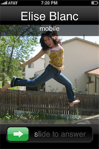
But inevitably there are the times when I get an incoming call and, for whatever reason, the screen is not locked. (Usually because I’m using the phone for any number of reasons other than talking on it.) And when that is the case, the incoming call screen looks a bit different:
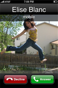
The reason you have to “slide to answer” an incoming call on a locked screen is so you don’t accidentally reach into your pocket and answer a call you didn’t want to. But if the screen is already unlocked you are given a different way to answer. You now have the option to simply tap a button to answer or tap another to decline.
The locked versus unlocked options make sense. If you’re in the middle of using your phone and someone calls but you want to decline, it doesn’t make sense to wait 15 seconds for the thing to finally stop ringing, or be forced to lock your phone. The feature here isn’t the ease of answering a call — tapping the Answer button is just about as simple as sliding — rather, it’s the ability to quickly decline the call and get right back to what you were doing.
The trouble happens if you do want to answer the call. Now you’re dealing with the fact that iPhone offers two different locations to touch in order to answer an incoming call. If answering from a locked-screen state, you touch the bottom-left corner and slide to the right; if answering from a non-locked-screen state you touch the bottom-right corner.
If my screen is not locked and I answer an incoming call by muscle memory alone, chances are good I will accidentally decline the call when what I wanted was to answer it. Usually what happens is I press the area of the screen where the Decline button is by habit, but then realize I’m pressing ‘Decline’ and not ‘Answer’. So I hold my thumb down and slide it off the Decline button and then tap the Answer button.
If you do push the Decline button, and slide over onto the Answer button nothing happens because the Decline button is activated on release. Unlike the single-tap-hack for the period button before the 1.1.1 software update, you can’t answer a phone call by starting on the Decline button, sliding over to Answer and then releasing (a gesture that would duplicate the “slide to answer” action).
Furthermore, there are times that I press the Decline button, but realizing I pressed the wrong one, panic by letting off quickly and (in this case) sending my sister straight to voicemail. (Sorry Sis.)
If your standard response to an incoming call is to answer it, then the standard location is actually not where you’re used to it being—the bottom left corner.
On the other hand, if your standard response to an incoming call is to not answer it, this still doesn’t justify the placement of the Decline button. When locked, if you want to decline the call you can (a) ignore it, or (b) press the Lock button on the top of the phone two times (one press to silence the ringer and another press to send the caller to voicemail). You can still do this if the screen is unlocked and the Decline button is there, though it will interrupt your previous task.
This flip-flopped button placement doesn’t end here…
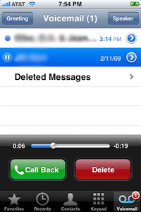
On the Visual Voicemail screen, the green Call Back button can be found on the bottom-left.
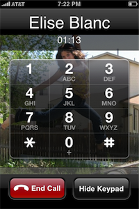
During a phone call, if you navigate to the keypad, the red End Call button is the one on the bottom-left of the screen, whereas the “continue-type” button (‘Hide Keypad’), though not green, is on the bottom-right.
Finally, the default location of the Phone App’s green icon is the bottom-left corner of the iPhone’s Dock.
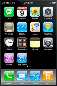
As Jason Fried pointed out regarding the seemingly strange, right-hand alignment of the iTunes icon in the iPhone OS 1.1 update, button placement is not always done for the sake of consistency. Sometimes it’s for the sake of context.
They didn’t put it where consistency tells you to put it. That would be on the left side. They put it where context tells you to put it. On the right side right above the iPod icon. Even the icon’s arrow points right down to the iPod.
[…]
I love that Apple favored context over consistency in this design decision. Consistency is the easy choice. Context is the thinking choice.
Although the flip-flopping placement of iPhone’s “initiate a phone conversation” buttons is not consistent, they may be rightly placed given each one’s context.
On iPhone, standard movement between screens means that to get more detailed, or to “drill down” within an app, you should move to the right. Getting less detailed, or “drilling up”, means you move to the left.
In context to the “slide to answer” button on a locked screen, the thumb moves from left to right — in essence, drilling down to the next screen which is, in this case, a live phone conversation.
If this is truly the case, then the Decline and Answer buttons on a non-locked screen — though opposite in terms of consistency — are accurate in terms of context. To “drill down” to the next screen (which is the live phone call) you should be led to the right. Thus, the placement of the Answer button on the right-hand side.
But wait…
Even though drilling down to more detail means moving to the right, and drilling up means moving to the left, those directions are almost always led by the buttons on the top of an application’s screen, not the bottom (i.e. Mail, Text, Settings, iPod, Notes and others).
On a phone with physical buttons there is no choice but to design by consistency because the buttons are always in the same place. Since iPhone’s screen has no physical buttons, the placement of each screen’s buttons can also be designed to be relevant given the context of the current screen. Thus, there are times when a design decision can be based on more than just consistency — it can also include context.
When writing about my MacBook Pro in early 2008, I wrote about the implementation of multi-touch on the trackpad, saying:
Just like on the iPhone, the multi-touch gestures make perfect sense in context. Which means I don’t have to think about them. Once I settled that three fingers swiping from left to right means “next†I find myself naturally using it in places I hadn’t even thought about, without thinking about it. It already feels natural.
In iCal the three-finger swipe takes you to the next or previous day/week/month in your calendar. In Apple’s Mail the swipe takes you to the next email message. In Preview, you get the next page. And it’s the same with pinching: On the desktop, pinching enlarges or shrinks your icon sizes. In Preview, it enlarges the image or document.
My point being: when you are designing by context the user is best served when they do not have to stop and think about how to make the choice they’re being presented with.
Consider context verses consistency in a car. When driving forward, turning the steering wheel to the left turns the car to the left. When driving in reverse, turning the steering wheel to the left turns the car to the right. Imagine if auto engineers decided that turning the steering wheel to the left should always steer the car to the left rather than the wheels. If that were the case, the front wheels may react completely opposite to the steering wheel’s input depending on what gear the transmission was in.
There are times when designing by context is better than designing by consistency alone. Though the placement of the Decline and Answer buttons may make sense in context, it is so far from consistency that, in this case, it is the wrong decision. And after 18 months of use the dumb thing still throws me off.