Applications are solutions.
At the very core, the entire point of developing an application is to solve a problem; inasmuch as a program fills a need, it succeeds.
Furthermore, if an application can not only solve a problem, but help the user enjoy the process, it succeeds even more. And often, the most popular applications of all are those which solve problems that didn’t necessarily need to be solved in the first place. These apps provide a solution that is so enjoyable and makes so much sense to the user the app becomes a necessity. And this is where the desktop publisher, MarsEdit, takes off…
Originally, desktop publishers were developed to fix a problem: The ugly, clunky and sluggish integrated editors that were part of blogging applications such as Blogger and Movable Type.
With the advancement that content management apps and their integrated editors have had over the years – along with the advent of high-speed internet (remember when 14.4k was blazing?) – many people don’t see the need for a desktop publisher. The “problem” sorta fixed itself by default.
Desktop Publishers
The most widely assumed purpose of a desktop publisher is so you can “write your blog posts offline.” Well we all know that you don’t need a desktop publisher to write a blog post while you’re on an airplane. (Ironically, I am doing just that right now. Seriously. I’m in seat 12F; next to my wife and a middle aged woman reading some Oprah endorsed romance novel.)
Let me briefly mention here that MarsEdit tackles the “writing offline issue” like nobody has ever tackled it before with a feature called “Perfect Preview”. But I’ll get to that in a bit…
Other advantages of desktop publishers include features like storing login and relevant meta info for multiple weblogs, (and multiple CMS platforms) which gives you the ability to publish to several sites from one spot.
To genuinely grasp the solution a desktop publisher offers, you have to think outside your paradigm of what you think a desktop publisher is. For starters it is much more than word processors with a “send to weblog” button.
You may not have thought about the fact that when you write a post from your CMS’s “Write a Post” browser interface you are typing into a text field. All the tags are black and blend right in with all the text (also black). There are no shortcut keys for custom tags, and you’re subject to the speed of your internet connection and availability of your server. (Have you ever tried posting an update or edit to an article while on Digg’s homepage?)
Not to say that CMS browser interfaces are the world’s biggest nightmare; I have gone back and forth several times…
My first blog started a few years ago with Blogger. That was a clunky publisher to say the least. I later moved to a self-hosted WordPress blog and went in and out between the WordPress interface and another popular desktop publisher, ecto.
Even though ecto was full of features, my user experience never seemed to “settle”, so I went back to using the online WordPress interface. But that wasn’t a long-term solution either, because as I began writing longer posts (specifically interviews which contain quite a bit of markup), WordPress’ lack of editing features and tag coloring became a deal breaker.
I finally landed with MarsEdit as my preferred method for publishing. I think I made a pretty good choice too, because the more I use it the more I feel it’s a Mac app which truly is out of this world. (Get it?)
Daniel Jalkut –
I don’t think anybody doubts that the web (and by extension, the world) is in the midst of a personal-publishing revolution, and most Mac users want to take part in it. I see MarsEdit today as the best-of-class application for achieving that…
MarsEdit
The fact that MarsEdit is still around – let alone in continued development as a fantastic application – is nearly a miracle. It has certainly seen quite a bit of action over the years.
Brent Simmons is the author of MarsEdit. It was originally a feature of the 1.x version NetNewsWire; you could read all your favorite weblogs and publish your own, all from the same application. But the feature (Notepad) eventually split off into its own app.
The name and icon for MarsEdit are actually spawns from another app that never even made it past the drawing board: MarsLiner.
MarsLiner was meant to be the outliner of Brent’s dreams. But alas, the market was too small to justify the time and energy it would take to develop. So instead, Brent took the MarsLiner logo kept the “Mars”, dropped the “Liner”, added the “Edit” and turned it into the stand-alone weblog editing application, MarsEdit.
After its original conception with NNW in 2002, MarsEdit 1.0 was released at the end of 2004. Brent Simmons expounds:
The genesis of MarsEdit was the idea of mitosis, that we could remove NetNewsWire’s weblog editor and create a new, separate weblog editor—and thereby create a better newsreader and a better weblog editor. […]
When we decided to bag MarsLiner and do a separate weblog editor instead, I wanted to use the name Mars somehow and use Bryan’s cool icon. Hence the name MarsEdit. We rationalized the name by saying it represents editing at a distance, since you’re not editing local documents, you’re editing documents that live on the web somewhere.
But really it was because I like Mars and spaceships and we already had a great Mars icon.
And icon designer, Bryan Bell, was kind enough to show off the stages of the design process:
![]()
Later, NewsGator bought MarsEdit as part of its acquisition of Ranchero Software in 2005, and Gus Mueller got contracted out to work on the 1.1.2 release.
Finally, Daniel Jalkut – who launched Red Sweater Software in 2000 while he was working for Apple as a software engineer until going indie in 2002 – bought MarsEdit on February 22nd, 2007.1
With a talented, and motivated developer, MarsEdit finally graduated to version 2.0 in September 2007. The 2.0 release brought a wave of much needed attention to the app, and highlighted it to a much broader audience; breathing fresh life back into it.
This weekend, Daniel has released the next major update, 2.1, with some great new features and fixes.
Your Very Own Editor
Perhaps one of the finest features of the desktop publisher is that it is also a text editor.
When publishing from your CMS’s online text field you’re using just that: a text field, not a text editor. Thus there’s no tag highlighting, no find & replace, etc… You can get around the text field problem by using a stand-alone text editor to write your posts, copy/paste to the online text field and then publish. But what makes having a desktop publisher for your weblog the better solution is that all the ‘stuff’ involved with writing and publishing is in one dedicated location.
In MarsEdit the default editor window is not quite the ideal layout. Well, at least not for me. It is small and doesn’t display the options I want. Opening the application dozens of time each week and having to adjust the editor window every time sure made for an annoying workflow thus making my primary turn-off towards MarsEdit the seeming innability to customize the default editor window’s size, layout or features.
Fortunately, after a bit of looking around I found out Daniel actually made it quite a breeze to adjust the default editor’s layout, size and features. I’m just blind sometimes:
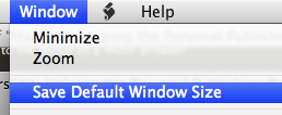
So here is how I have customized my editor window:
- I prefer to have the options open at all times. This can be set from the Prefs in the “Editing” tab. Select “Open The Options Pane”.
- With the options pane set, adjust your editing window to the width and length you want, then in the “Window” menu click “Save Default Window Size”.
- I also prefer to name my own slugs for post permalinks. This can easily be done in the “Slug” field, which sits right under the “Title” field. To enable it, click on the “View” menu and check “Slug Field”.

WYSIWYG
Something to note about MarsEdit is the blatant absence of a WYSIWYG editor, which many people might see as a fault.
In all my experience with WYSIWYG editors I have found them a clumsy enemy of fine web typography. Typing a weblog post in a WYSIWYG editor is a bit like laying out a book in Microsoft Word.
MarsEdit’s long-time competition, ecto, offers both a HTML editor and a WYSIWYG editor. Unfortunately, when writing in ecto, you cannot switch between the two editor windows without shooting you markup in the foot. If you begin in ecto’s HTML editor and switch to the WYSIWYG, ecto turns all your hand-coded CSS-friendly tags into HTML spans, which is, to say the least, highly annoying and extremely counter-productive.
If you have spent any time at all tweaking your site’s style sheet, and if you have any pride in your weblog’s type then using a WYSIWYG editor is most likely a crutch, not a tool.
I suspect most of you are at least a bit HTML savvy and prefer the use of monospace type and a HTML editor anyway. But for those who are getting weak in the knees at the thought of having to type your own HTML relax. MarsEdit has combined many of the WYSIWYG concepts and implemented them into the HTML editor making it all very easy to use.
For example, CMD+B will place <strong>strong</strong> tags around your text; CMD+I places
<em>em</em> tags, etc.
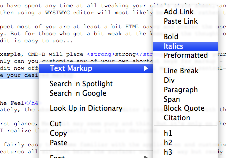
Not only can you customize any of your own shortcut keys for markup – such as setting CMD+SHIFT+A as a link tag – MarsEdit 2.1 now offers markup right in the contextual menu.
Just control-click on a highlighted passage of text or a single word and choose your desired markup…
The Feel Factor
The absence of the WYSIWYG editor fits perfectly into context with the overall feel of MarsEdit.
Making an application which at first glance feels thin is always a risk to developers. Folks may try out your program for a day or two, and when they don’t instantly see the exact features they want they assume your app is only half-full, so they leave it untouched and un-registered in their Applications folder to collect little bits of binary dust particles.
But if a developer can successfully create an application that feels light, though in truth is quite capable and feature-rich, they will succeed in the long run.
The more I use MarsEdit, the more I discover it functions exactly how it was intended to. It does not take much time to familiarize yourself with the application and customize it to work precisely how you want it to: with all the features sitting just below the surface, out of the way and ready to be utilized.
This is precisely the way a good weblog editing application should work.
An app like this must have the ability to offer all you want and need to publish your weblog according to the way you have it set-up. It must work seamlessly with over a dozen popular content management systems, and offer an interface for each one in a clean, simple fashion so as not to get in your way, slow you down or distract you while you’re writing. And this is where MarsEdit excels.
This feel of MarsEdit has been there from the very beginning. Even in the initial development and design phases, Brent had it as a part of his vision for the app: “The phrase ‘maximum elegance’ was just a personal reminder to myself to simplify as much as possible. With something as complicated as weblog editing, you have to be relentless about simplification, or it will get away from you.”
I am extremely impressed by how intuitive MarsEdit is and how well it serves the writer.
Perfect Preview
Hands down one of the finest features of MarsEdit is the Preview.
MarsEdit takes your post content and puts it into a preview template so you can read sans-markup. Cool, but not cutting edge.
What does make it so amazing is the ability to edit your preview template which allows you to read your article just as it would appear on your site after being published. You can set the Preview window right next to the editor window to watch changes and updates as you type them.
Daniel wrote a very succinct how-to on the Red Sweater Blog. Additionally you can find directions in MarsEdit’s help menu.
However, to step your “Perfect Preview” up an extra notch you may want to try tweaking the preview template to use localized files instead of your server-based, hosted files.
By doing this, not only will your preview window load and refresh faster, you will be able to write offline and still have the “live” preview of what your post will look on your own website.
If you are online – as you no doubt usually will be – you can preview remote files (such as uploaded images which are part of your post) and the localized files, which makes this desktop publisher all the more enticing.
Tweaking the preview template to become localized is extremely easy if you are even the least bit code savvy.
- Start by following MarsEdit’s instructions for editing the Preview Template. They can be found in the help menu.
- Once your initial Preview template is set up and working, download your weblog’s theme folder, or at least the style sheet.2
- Download each of the images in use on your ‘single post’ page. Place all these files into the same folder as your CSS file, and place the folder somewhere out of the way for safe, long-term keeping.
- If your Masthead image is a CSS background you’ll need to download that image and go in and adjust the the CSS code to point to the local file instead of the remote one.
- Now go into the local folder and control click the CSS file you just downloaded and open it in Safari.Copy all the text in the address field. This is the local address of your CSS file. It will look something like, file:///Users/……../style.css
- Return to the MarsEdit Preview Template, and find the line of code referencing your CSS file. Replace the current
hrefaddress with the local address you just copied. - Scroll through the rest of the template and find the code for each of the images you downloaded. In the
srctags, replace whatever the online address was with the new local address.
Something to keep in mind now that your preview template has been localized is that changes you make to your website won’t be reflected in MarsEdit’s preview window. You’ll have to make the changes your local files separately if you want everything to match.
Media Manager
If you’ve used WordPress’ built-in uploader you know that anything can be better than that. My previous workflow would be to upload any images via Transmit and then code the img tags by hand.
MarsEdit has the ability to upload images to your weblog for you. You can drag an image right into the editor – dropping it in the location you want it to appear in your post. The Media Manager will then pop up, giving you a few options and a button to “Upload & Insert”. MarsEdit then generates all the code for you right where you wanted it.
There is one major drawback which I’ve found regarding the file uploader: There is no way to adjust the auto-generated code. I have custom image classes set in my style sheet that I want to use instead of MarsEdit’s default markup styles. Since I can’t make my own I have to ‘fix’ the code for images I upload through MarsEdit.3
Something you may not know is that the Media Manager auto detects what folder to upload files to. It would be nice to have the option hard code your own custom folder, but that requires MarsEdit to have FTP support which it currently doesn’t.
Right now it simply auto detects what folder to upload to by talking to your CMS. Fortunately, most CMSs allow you to customize the folder yourself. Since I prefer to send any images to my site’s /images/ folder as opposed to the standard /wp-content/uploads/ folder, I went to my WordPress admin panel, clicked on Options, Miscellaneous, and then changed the default uploads folder.
The Little Things…
Post Status
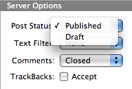
Something new in 2.1 is that you can now adjust the post status of your post.
This gives you the ability to send your post to your weblog as a Draft instead of a Published article. Assuming your CMS handles drafts, and assuming your CMS knows how to communicate draft status. WordPress and Movable Type suck at this right now, but Daniel created a little built-in hack for us:
…add a category “MarsDraft” to any of your posts, and when MarsEdit sees the category, it will automatically assume that the post is to be treated as a draft. So to make sure you don’t accidentally publish something early, just add the magic category, and remember to turn it off when you change the status to Published.
Anyway, the Post Status drop-down menu sits in the bottom of the options pane along with the Text Filter, Comments and TrackBacks options:
I would love to see local draft syncing between multiple Macs. But since that feature is still MIA at the moment one of the cool advantage of the new “Post as Draft” feature is the ability to have (jimmy-rigged) synced drafts between versions of MarsEdit on multiple computers.
Unfortunately this is certainly not the ideal way to sync drafts. When you post the article it goes from your local drafts folder into the main weblog article list. As it sits there, it will eventually get pushed down the list until it disappears if you post too many real articles before publishing the draft. One way to work around this by setting the time-stamp to a date far in the future.
Another problem with remote drafts is that if you open one, edit it and save it (not re-send it), the edited version of your post becomes a local second copy. You have to send the local draft to your weblog to send the edits and get back down to one copy of your post. This is all very confusing and I see lots of potential for accidentally publishing the wrong version of a post or even deleting the right version.
If you use Daniel’s category workaround and my time-stamp workaround, if you want to take a draft and publish it you have to open it, re-adjust the time-stamp, uncheck the MarsDraft category, change the Post Status to “Published” and then send it to your weblog again as a bona fide post. Not exactly the best solution. Ah well.
To recap, I see three options for draft syncing: (a) Create your own workflow based on the workarounds; (b) don’t try to sync your drafts; or (c) wait for true local draft syncing via .Mac/FTP or something else. (Will us dual-computer folks ever get a break?)
The good news is, if you’re not worried about syncing to multiple Macs the draft feature as a draft feature works just fine.
Scriptable
MarsEdit is scriptable. Which means that in addition to having several, intelligent scripts built-in, you can also add your own.
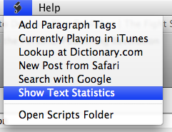
The Text Statistics script may be my favorite, simply because I’m a nerd for stats and info. Though the text counter always seems to be generous; according to MarsEdit, this article weighs in at 4,160 words.
Safari Bookmarklet
MarsEdit has a built in bookmarklet which can be used to generate a brand new post from any webpage. To set it up choose Install Bookmarklet from the MarsEdit menu.
Now if you find a sweet article in Safari, and you want to write about that article on your own weblog, just highlight the text you want to use in your post and then click your new fandangled bookmarklet. MarsEdit will open – if it’s not already – and generate a new post for you.
The webpage’s title will be your new post-title, and the text you had highlighted will show up in the body along with a link back to the article. But that’s just the start…
From the prefs window click the “Attribution” tab to go nuts customizing the markup and the layout you want to be used when you generate a new post with the Safari bookmarklet.
My customized syntax looks like this:
<a href="#url#">#title#</a> -
<blockquote>#body#</blockquote>
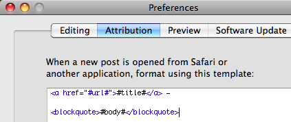
What the above code does is put the name of the article as a link back to the web address I’m quoting, and then any selected text into block quotes from there. I usually tweak this a bit but it’s a great starting place for all of my asides and link-posts.
Command, Shift, D
Perhaps the feature that stands out to me the most is the shortcut key-command to publish your post: CMD+SHIFT+D.
It is the same shortcut used in Apple Mail to send an email. It’s a smart feature, and although it’s small it makes the app instantly more coherent and familiar to the Mac user.
Here is a free tip: When I customized my toolbar I took the “Send to Weblog” button right out. I found it is almost as easy to accidentally click the send button instead of save as it is to press command, shift, D when you’re actually ready to publish.
More Reviews
This is just one of a handful of winded and entertaining software reviews.
- There was a great Q&A done by NewsGator with Brent Simmons and Daniel Jalkut, but the origial page has gone missing from NewsGator’s site. Fortunately you can still find it on the Wayback Machine, and if that happens to go gone, I also saved a screenshot of the Q&A webpage here. ↵
- If you’re not sure where your site’s CSS file is, simply open up your homepage and view your source. Look for a line of code that reads something like this:
<link rel="stylesheet" type="text/css" media="screen" href="...style.css" />Copy the href location and paste it into your browser’s address bar, hit return and you should see your style sheet. Save it to your hard drive, and put into a new folder.↵
- Daniel has told me this is high on his list of feature additions.↵